Create a FREE Account
Instant access to 1,000+ real slides from top companies like McKinsey, BCG, Goldman Sachs, Google and many more!
First Name
Last Name
Email
Password
I agree to all
Terms & Privacy Policy
Thank you! Your submission has been received!
Oops! Something went wrong while submitting the form.
Have an account?
Sign in
Library
Templates
Courses
Pricing
My Account
My Slides
My Templates
✦ AI
AI Prompt Library
AI Search
Sign in
Start Here
Logout
My Saved Slides
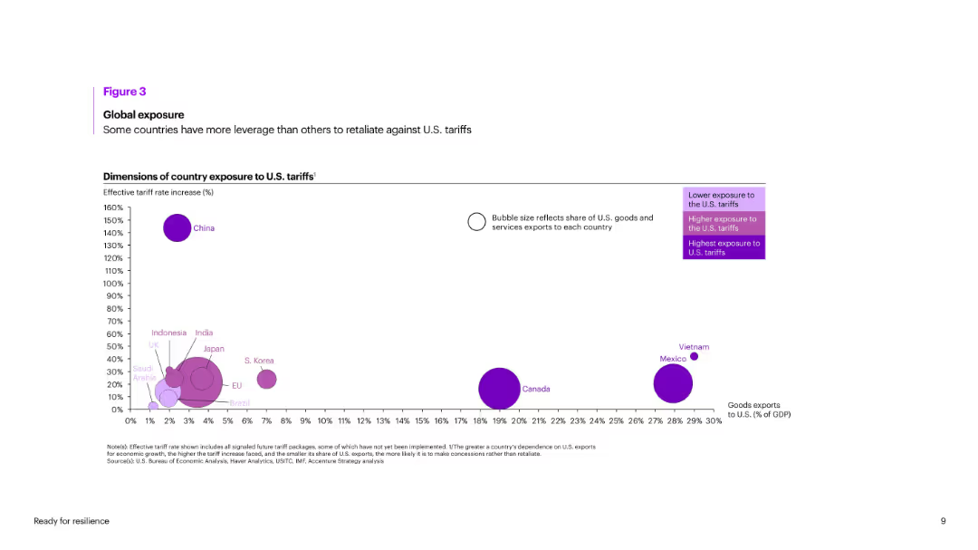
Bubble chart showing countries’ exposure to U.S. tariffs based on increase % and goods export share to the U.S. Bubble size reflects trade dependence.
Risk Assessment and Management
Government & Public Sector
Visualizes tariff impact using effective rate increases and share of exports to the U.S. China, Vietnam, and Mexico are the most exposed. Canada has high dependence but moderate rate impact. EU, Japan, and India show varying degrees of vulnerability.
tariffs, exposure, exports, U.S. trade, vulnerability, retaliation, global impact, China, Vietnam, GDP
Single Chart
Accenture
Saved
Features two column charts comparing Macquarie's earnings volatility against other banks and investment firms over 5 and 10-year periods, with a focus on stability.
Risk Assessment and Management
Financial Services
Showcases Macquarie's earnings stability relative to peers, intended to emphasize risk management strength to investors and stakeholders concerned with financial resilience.
stability, earnings, volatility, comparison, risk, management, investment, banks, financial, resilience
Multiple Chart
Goldman Sachs
Saved
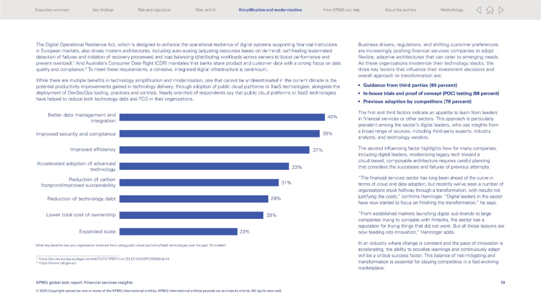
Left: horizontal bar graph listing tech benefits; right: text insights and key influencing factors.
Operational Efficiency
Financial Services
Discusses benefits from public cloud/XaaS like better data integration and security. Key transformation drivers include third-party guidance, in-house testing, and competitor adoption. Also addresses modernization of legacy tech stacks.
XaaS, cloud platforms, modernization, security, integration, third-party advice, financial sector
Mixed Chart
KPMG
Saved
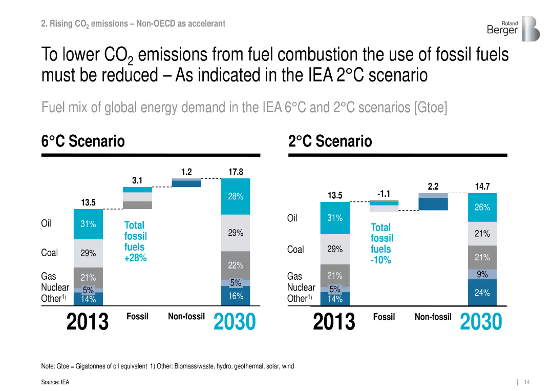
Bar charts of energy mix by fuel type for 2013 and 2030 under 2°C and 6°C IEA scenarios.
Strategic Planning
Environmental Services & Sustainability
Compares projected global energy demand and fossil fuel use under different warming scenarios, showing reductions in fossil fuel share needed to achieve the 2°C target.
energy mix, fossil fuels, IEA scenario, global warming, CO₂ reduction
Multiple Chart
Roland Berger
Saved
Consists of a mixture of infographics including icons and a small bar graph. Green and black are the primary colors used, enhancing the readability and focus on the statistics.
Financial Performance
Education & Training
Analyzes the social return on investment from the National Community Hubs Program, breaking down benefits into engagement, early childhood, English proficiency, and vocational pathways. The slide quantifies benefits in monetary terms and describes impact on community services.
social return, community hubs, investment, education, employment
Pillar
Deloitte
Saved
Visuals include column charts for financial data, textual content for context, and a line graph for market trends.
Financial Performance
Financial Services
Reviews the performance of the CIB against industry wallet size and market share, including revenue and adjusted return on equity.
industry wallet, market share, CIB performance, capital requirements, return on equity, financial trends
Multiple Chart
JP Morgan
Saved
A slide with a night traffic long exposure image, bar graphs, and detailed text analysis of investment trends.
Investment Analysis
Technology & Software
Reviews significant investment trends in Southeast Asia's technology sector, with a focus on venture capital and private equity.
Investment Trends, Southeast Asia, Venture Capital, Private Equity, Technology Sector, Market Growth
Mixed Chart
Bain
Saved
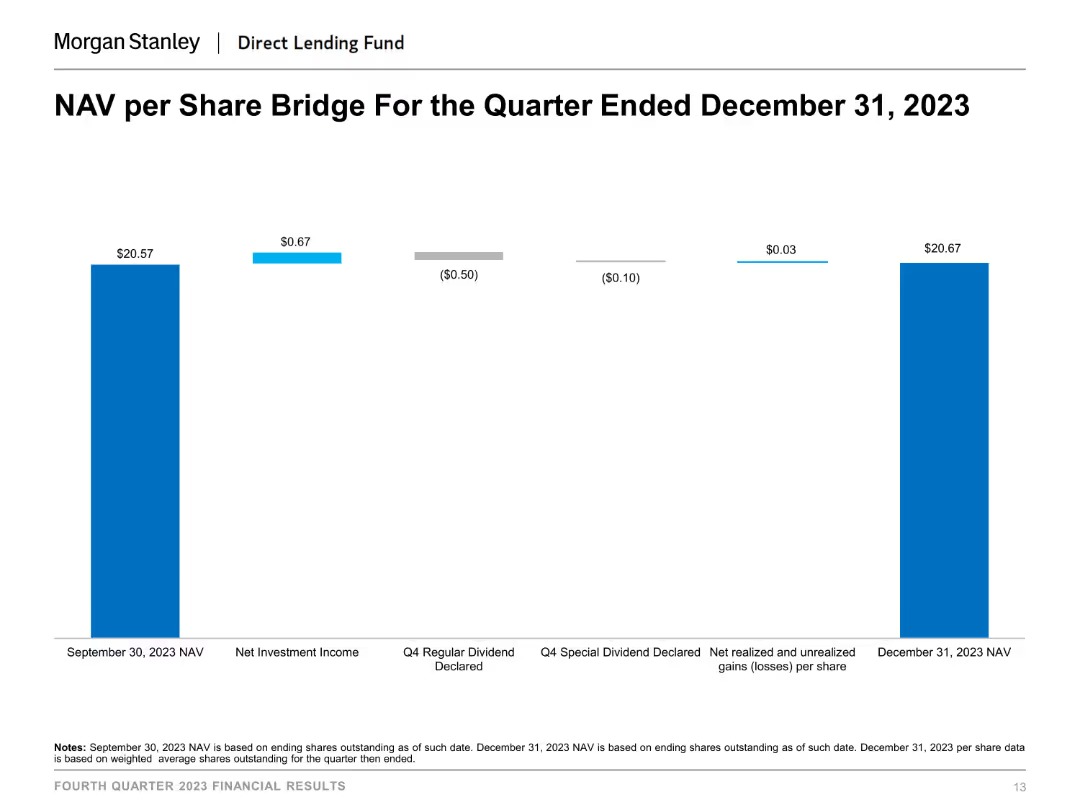
This slide shows a column chart illustrating the NAV per share bridge for the quarter ended December 31, 2023. The chart uses different colors to indicate various components affecting NAV, such as net investment income and dividends declared.
Financial Performance
Financial Services
The slide presents the changes in NAV per share over a quarter, breaking down the impact of different financial activities like net investment income and dividends declared, useful for understanding NAV fluctuations and financial performance.
NAV per share, financial performance, investment income, dividends, financial analysis, quarter-end NAV
Single Chart
Morgan Stanley
Saved
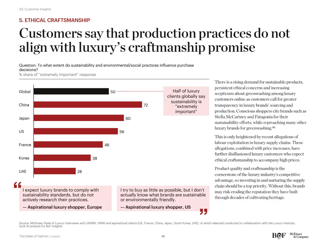
Left: bar graph showing importance of sustainability by region; Right: supporting analysis and customer quotes. Red bars highlight gaps between brand promises and consumer expectations.
Customer and Market Segmentation
Consumer Goods
The slide reveals that 50% of global luxury clients find sustainability “extremely important,” with China ranking highest. Consumers are skeptical of greenwashing and expect brands to uphold ethical craftsmanship and transparency, especially amid labor controversy reports.
sustainability, ethical sourcing, craftsmanship, greenwashing, consumer trust, transparency, environmental standards
Mixed Chart
McKinsey
Saved
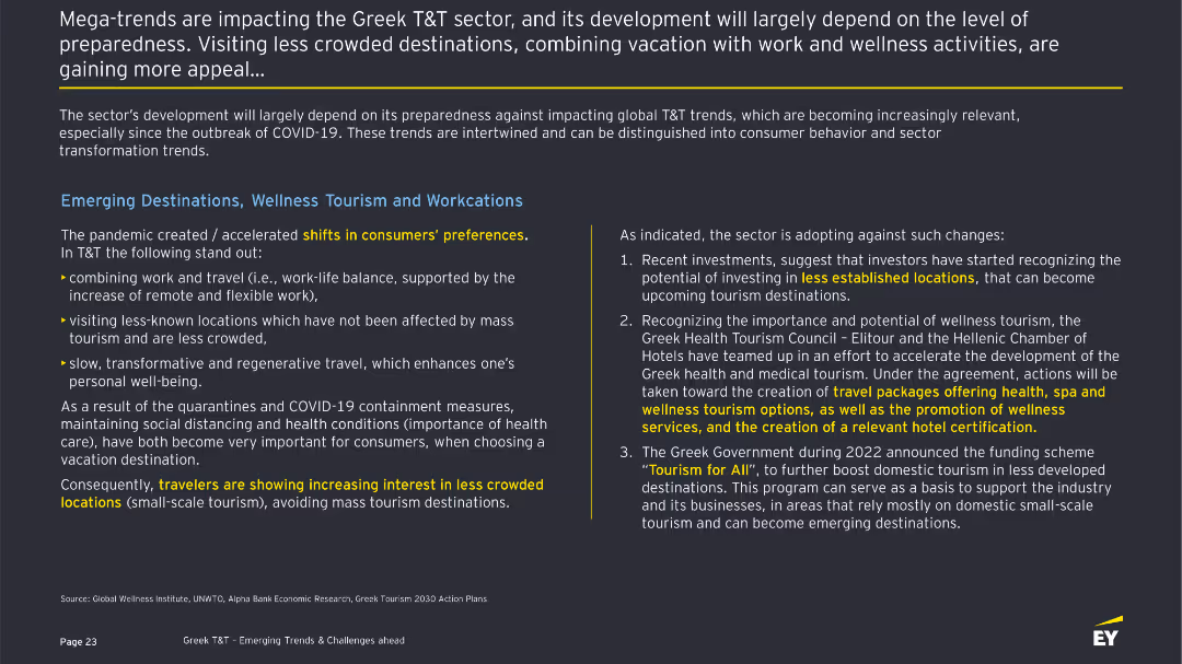
The slide discusses mega-trends impacting the Greek T&T sector, highlighting shifts in consumer preferences towards less crowded destinations, wellness tourism, and workcations. It includes bullet points and a summary of sector preparedness.
Strategic Planning
Hospitality & Tourism
Describes the impact of COVID-19 on consumer preferences in the T&T sector, with a focus on wellness tourism and workcations. It outlines key trends such as remote work, less crowded destinations, and the importance of health and safety measures.
Wellness, Workcations, Tourism, COVID-19, Trends
Header Horizontal
EY
Saved
Column charts showing operating expenses, RWA, and achievements in cost reduction
Operational Efficiency
Financial Services
Details cost reductions, balance sheet management, and underlying operating expenses
cost, balance, reductions, efficiency
Multiple Chart
UBS
Saved
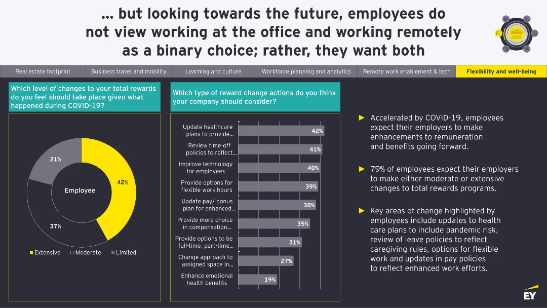
A pie chart shows the level of changes needed in total rewards. A bar chart details specific reward change actions employees think companies should consider.
Human Resources and Talent Management
Financial Services
The slide discusses the expected changes in total rewards and benefits due to COVID-19, with a focus on healthcare plans, leave policies, and flexible work options.
Rewards, Benefits, Compensation, COVID-19, Employee Expectations
Multiple Chart
EY
Saved
Moderate visual complexity with numerical data and demographic analysis.
Market Analysis and Trends
Government & Public Sector
Focuses on structural factors influencing long-term prospects in Southeast Asia, useful for policy-making and business strategy development.
demographic shifts, economic growth, Southeast Asia, structural factors
Multiple Chart
Bain
Saved
Features a split layout with half dedicated to card highlights including photos and logos, and the other half displaying line graphs comparing market performance. The design is sleek with a corporate color scheme.
Product and Service Analysis
Financial Services
Showcasing ongoing efforts to innovate in card products, the slide highlights new launches and market performance data. It notes the success in sales share and outstandings share, suggesting strong market engagement and strategic partnerships.
Card Products, Market Performance, Product Launch, Strategic Partnerships, Engagement
Multiple Chart
JP Morgan
Saved
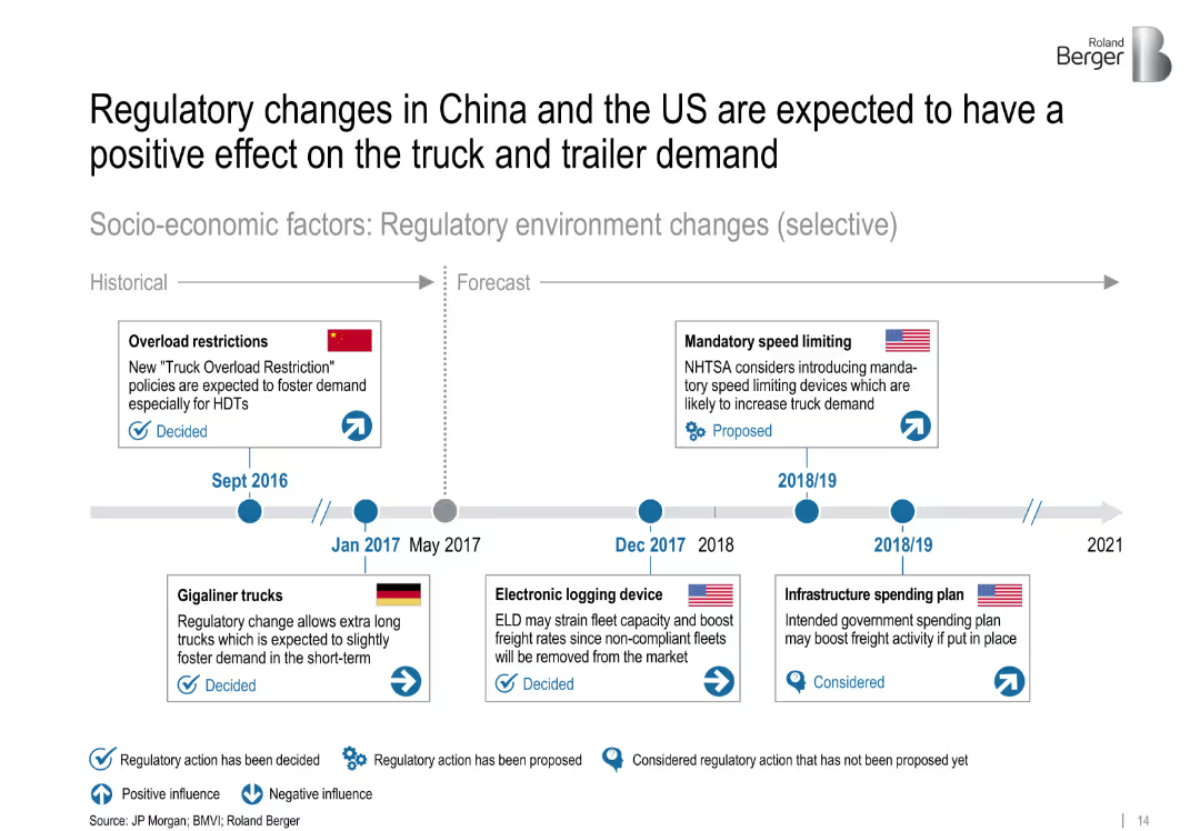
Timeline with icons indicating regulatory events and their impact on demand. Visual coding for positive/negative effects and decision status.
Strategic Planning
Transportation & Logistics
This timeline outlines selected regulatory changes between 2016 and 2021 in China, the US, and Germany. These include overload restrictions, speed limiting proposals, and infrastructure plans that influence heavy truck and trailer demand.
['regulations', 'truck demand', 'policy', 'China', 'US', 'timeline', 'logistics', 'forecast', 'strategic planning']
Uncategorized
Roland Berger
Saved
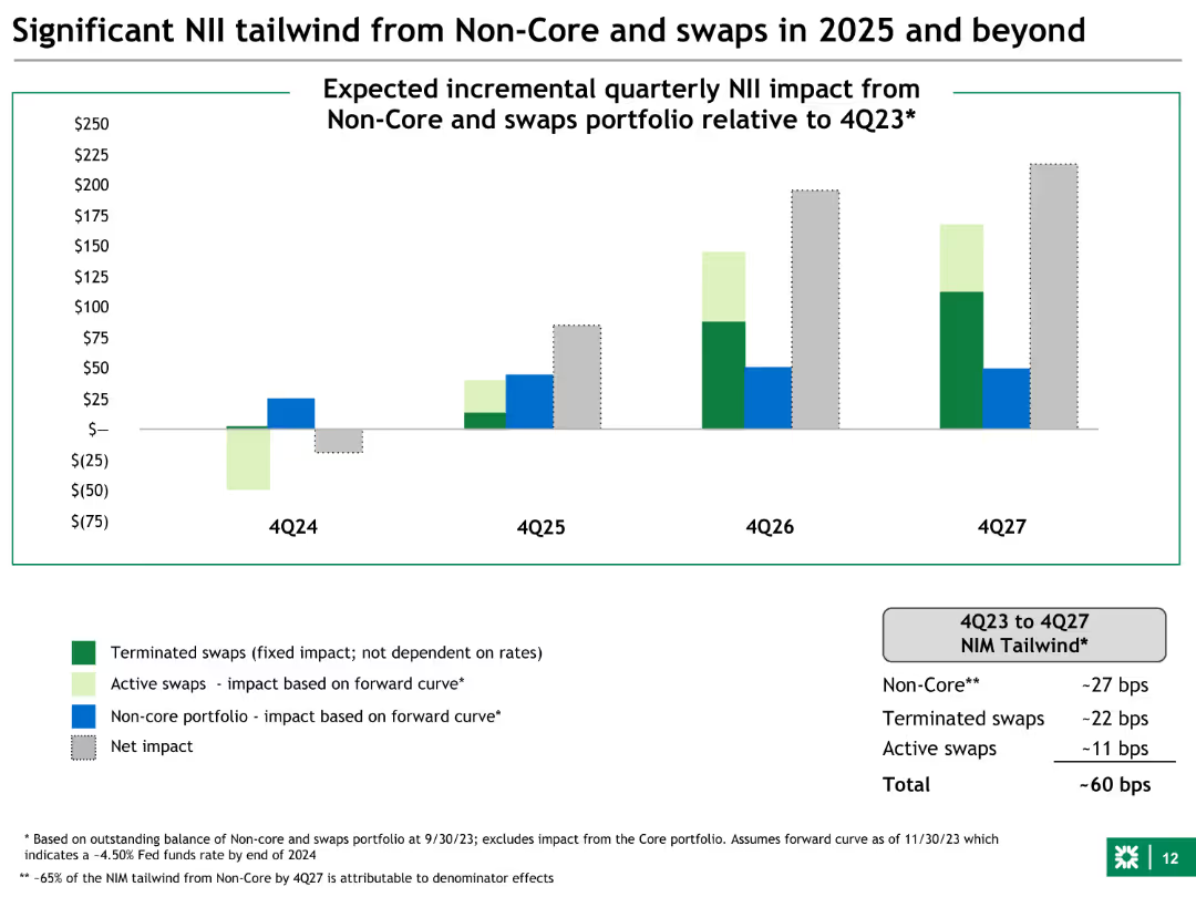
The slide features a column chart with four sets of bars representing expected quarterly NII impacts from non-core and swaps portfolios relative to 4Q23, spanning from 4Q24 to 4Q27. The bars are color-coded for terminated swaps, active swaps, non-core portfolio, and net impact.
Financial Performance
Financial Services
This slide shows the projected quarterly NII (Net Interest Income) impact from non-core and swaps portfolios for the years 2025 to 2027. It is used to illustrate the financial benefits of maintaining these portfolios, highlighting the substantial positive effects on the overall financial performance.
NII, non-core, swaps, financial performance, projections, 2025, 2026, 2027, portfolio, impact
Mixed Chart
Goldman Sachs
Saved
Complex slide with a materiality matrix diagram, accompanied by a descriptive analysis of how AI is leveraged for ESG-related risk management.
Regulatory and Compliance
Environmental Services & Sustainability
Discusses the importance of materiality in ESG efforts and showcases how AI tools aid in identifying and managing ESG-related risks and opportunities.
ESG, Materiality, AI, Risk Management, Sustainability
Diagram
Booz Allen Hamilton
Saved
This slide presents a column chart depicting liquidity. The column chart shows 'Cash & Equivalents' and 'ESG linked RCF 2021', and shows 'Unconfirmed Credit Lines' and 'Available Liquidity', highlighted in red. Each bar/column has a monetary value labeled.
Financial Performance
Financial Services
The slide details the group's financial flexibility through available credit lines and cash in hand. New ESG Credit Line and existing credit lines are quantified, culminating in total liquidity. Used for illustrating financial stability and analyzing credit strategy.
liquidity, ESG, credit, financial flexibility, stability
Single Chart
Goldman Sachs
Saved
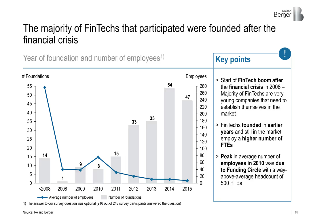
Left: bar chart showing foundations/year; Right: key insights in bullet form; uses grey and blue for emphasis
Industry Overview
Financial Services
Tracks the foundation years of FinTech companies, revealing a boom post-2008 financial crisis. Notes that older firms have more employees and highlights a peak due to a major player.
FinTech origins, post-crisis, startup growth, employment, Funding Circle
Mixed Chart
Roland Berger
Saved
A slide with three vertical column charts showing the percentage share of respondents' preferences for car body styles (SUV, Sedan, Hatchback) across global, new car, and used car segments.
Customer and Market Segmentation
Transportation & Logistics
This slide presents survey data on car body style preferences, showing that 43% of respondents favor SUVs for new cars, while preferences for used cars are more evenly distributed.
car body style, SUV, sedan, hatchback, survey, market preference, new cars, used cars, global, data visualization
Mixed Chart
EY
Saved
Column charts showcasing sector contributions
Investment Analysis
Hospitality & Tourism
Highlights the sectorial contributions of high-end tourism to employment and economic activity, illustrating a multiplier effect on jobs and spending.
tourism, economic impact, employment, Europe
Multiple Chart
Bain
Saved
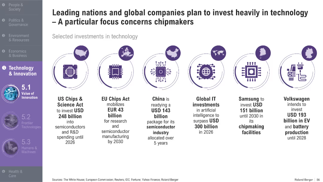
Horizontal infographic featuring icons and text describing investment commitments by countries and companies; purple theme with circular icons
Technology and Digital Transformation
Technology & Software
The slide showcases major semiconductor and technology-related investment plans from the US, EU, China, and companies like Samsung and Volkswagen. It highlights growing geopolitical and economic focus on chip manufacturing.
semiconductors, chipmakers, investment, US Chips Act, EU, China, AI, EV, technology strategy, R&D
Pillar
Roland Berger
Saved
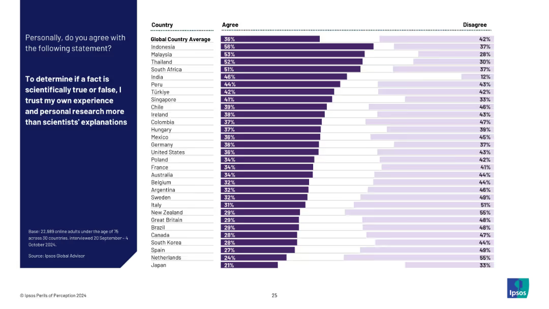
Horizontal bar chart ranking countries by agreement with the statement: “I trust my own experience and personal research more than scientists’ explanations.” Blue panel on left for question, with white background chart.
Strategic Planning
Education & Training
This slide ranks countries by trust in personal research over scientific consensus. A significant portion of global respondents (especially in Indonesia, Malaysia, Thailand) value personal experience more, raising concerns about misinformation resilience.
science skepticism, personal research, trust in experts, misinformation, public belief, education, Ipsos survey, international ranking
Mixed Chart
IPSOS
Saved
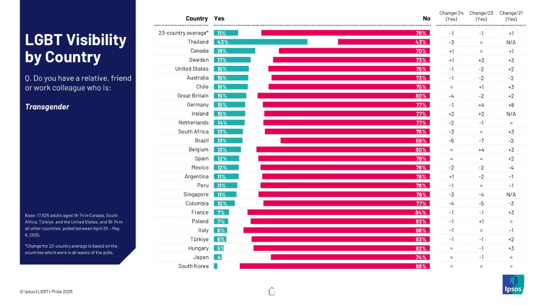
Bar chart showing % who know someone transgender; ranked by country with yes/no breakdown.
Market Analysis and Trends
Government & Public Sector
This slide assesses how many respondents know a transgender person, broken down by country. Thailand shows the highest visibility; South Korea and Japan the lowest. Change data is also displayed.
transgender, visibility, country ranking, social awareness, Ipsos survey
Mixed Chart
IPSOS
Saved
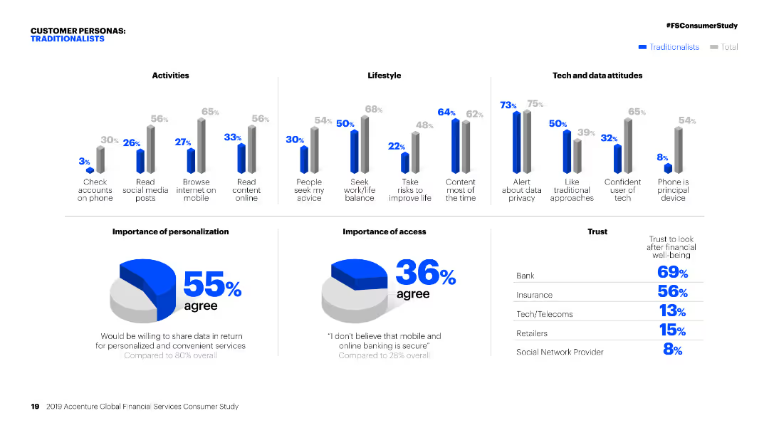
Column charts showing activities, lifestyle, and tech attitudes of 'Traditionalists' compared to the total. Pie charts on personalization and access.
Customer and Market Segmentation
Financial Services
Detailed segmentation of 'Traditionalists' in financial services, focusing on their activities, lifestyle, attitudes towards tech, and personalization preferences.
Personas, financial services, segmentation, traditionalists, activities, lifestyle, tech attitudes, personalization, market study, access
Multiple Chart
Accenture
Saved
Previous
Next
If nothing, comes up, please save your slides first
Create a FREE account to continue browsing
Receive Instant Access to 1,000+ slides from companies like McKinsey, Google, and Goldman Sachs
First Name
Last Name
Email
Password
I agree to all
Terms & Privacy Policy
Thank you! Your submission has been received!
Oops! Something went wrong while submitting the form.
Have an account?
Sign in
Column Chart
Heatmap
Chevron
Org Chart
Infographic
Callouts
Timeline
List
Graphic
Picture
Process Flow
Diagram
Paragraph
Map
Table
Framework
Subtitle
Takeaway Box
Icon
Other Chart
Radar Chart
Waterfall Chart
Mekko Chart
Pie Chart
Scatter Plot
Line Chart
Bar chart
Bullet points