Create a FREE Account
Instant access to 1,000+ real slides from top companies like McKinsey, BCG, Goldman Sachs, Google and many more!
First Name
Last Name
Email
Password
I agree to all
Terms & Privacy Policy
Thank you! Your submission has been received!
Oops! Something went wrong while submitting the form.
Have an account?
Sign in
Library
Templates
Courses
Pricing
My Account
My Slides
My Templates
✦ AI
AI Prompt Library
AI Search
Sign in
Start Here
Logout
My Saved Slides
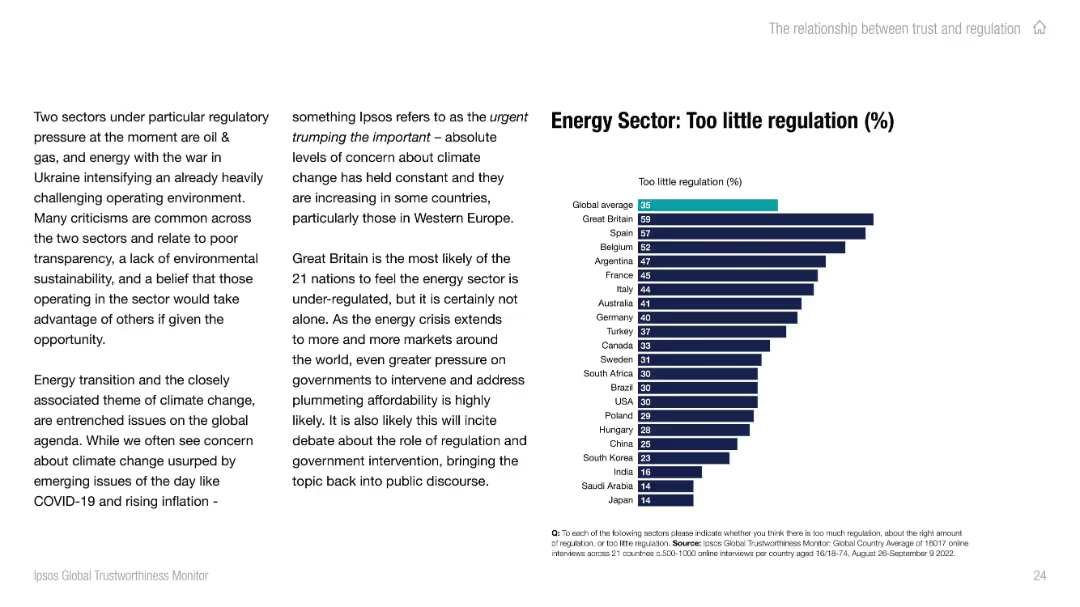
Split slide layout; left side contains paragraph text, right side features a horizontal bar chart comparing "Too little regulation (%)" by country with bold headings and teal/navy color scheme.
Regulatory and Compliance
Energy & Utilities
The slide highlights global perceptions of under-regulation in the energy sector, emphasizing the impact of climate concerns and geopolitical issues. A chart shows country-specific sentiment, with the UK having the highest concern and Japan the least.
regulation, energy, trust, climate, public opinion, global, Ipsos, chart, UK, Western Europe
Mixed Chart
IPSOS
Saved
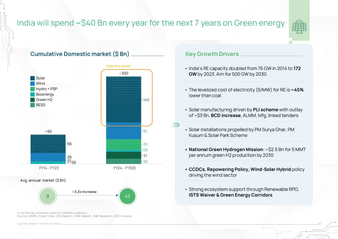
Left-aligned bar chart of projected cumulative market, right-aligned list of growth drivers, with colored segments by energy source
Market Analysis and Trends
Energy & Utilities
The slide projects India's annual green energy investment, reaching $40B/year through 2030. A bar graph illustrates historical vs. forecasted market growth by energy type. Key drivers include solar capacity expansion, cost reduction, hydrogen missions, and policy supports like PLI and repowering.
green energy, India, investment, solar, wind, hydrogen, policy, renewables, market growth, capacity
Mixed Chart
BCG
Saved
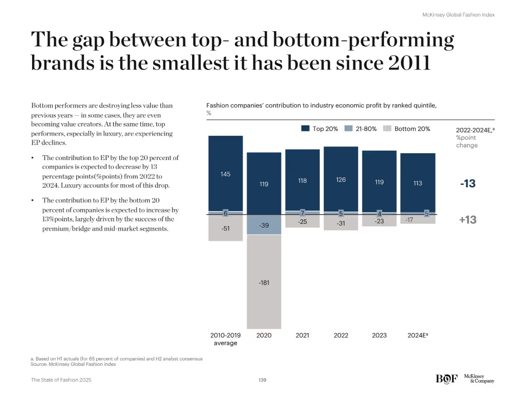
Left-aligned headline with bullet points beneath it; right side features a vertical stacked bar chart showing contribution to economic profit by company quintile from 2010 to 2024. Clear labels and dark-toned colors.
Performance Metrics and KPIs
Retail & E-commerce
The slide shows that the economic profit gap between top- and bottom-performing brands is narrowing. From 2022 to 2024, the bottom 20% of companies are expected to improve their EP contribution by 13 percentage points, while the top 20% drop by the same. Mid-market and premium segments are helping shrink the gap historically dominated by luxury.
economic profit, performance gap, quintiles, retail, premium, luxury, mid-market, EP contribution, fashion
Mixed Chart
McKinsey
Saved
A pie chart dominates this slide, showing the percentage of employees in offices pre-pandemic. A subdued image in the background depicts two individuals in a work setting, adding contextual relevance. The chart's colors correspond to the legend, aiding in data interpretation and visual appeal.
Organizational Structure and Change
Professional Services
Reflecting on the pre-pandemic office presence, this slide offers a statistical breakdown to facilitate discussions on how workplace dynamics have shifted. It could serve as a baseline for measuring the impact of the pandemic on work arrangements and informing future work policies.
Pandemic, Workplace Trends, Pre-Pandemic Office, Employee Statistics, Policy
Single Chart
EY
Saved
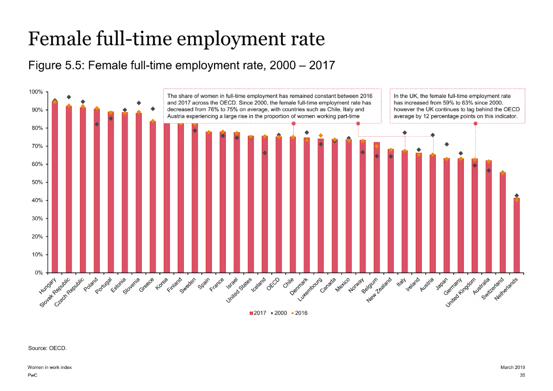
The slide contains a column chart depicting female full-time employment rates from 2000 to 2017 across multiple countries. Key observations for the OECD, UK, and Austria are highlighted with text boxes.
Risk Assessment and Management
Government & Public Sector
This slide presents the full-time employment rates for women over a 17-year period, noting the constancy in some regions and significant changes in others, such as the UK and Austria.
Full-time employment, female, OECD, UK, Austria, employment trends
Single Chart
PwC/Strategy&
Saved
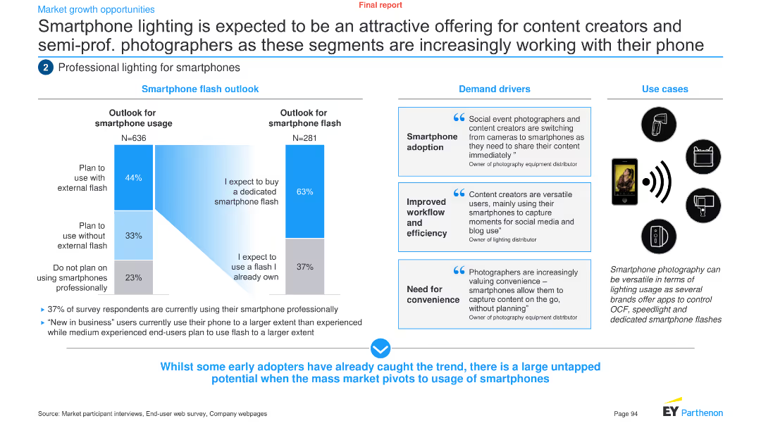
The slide uses a combination of column charts and text boxes to analyze the outlook and demand drivers for smartphone lighting among content creators and semi-professional photographers.
Product and Service Analysis
Technology & Software
It discusses the potential of smartphone lighting for content creators and semi-professional photographers, highlighting demand drivers and use cases.
Smartphone lighting, content creators, semi-professional, demand drivers, outlook, technology, analysis, trends, product, service
Multiple Chart
EY
Saved
Features concentric pie charts detailing the equity and CIE portfolios, with additional charts breaking down the data by geography and sector.
Investment Analysis
Financial Services
The slide presents the equity balance sheet for asset management, showcasing the distribution of investments by type, region, and sector. It's valuable for reviewing asset allocations and identifying trends in private equity investments.
Asset Management, Equity Balance, Private Equity, Real Estate, TMT, Healthcare, Consumer, Financials, Geography, Vintage, Sector Distribution
Multiple Chart
Goldman Sachs
Saved
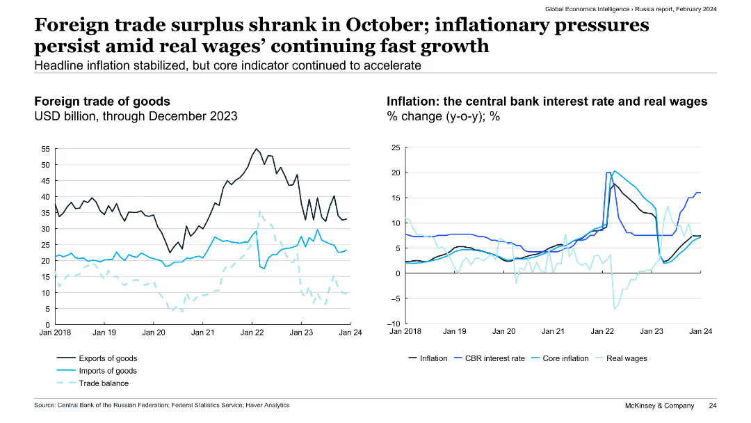
The slide includes two line charts: the left chart shows the foreign trade of goods in USD billion, while the right chart depicts the central bank interest rate, real wages, and inflation rates in Russia.
Market Analysis and Trends
Transportation & Logistics
The slide examines the shrinkage of Russia's foreign trade surplus in October, ongoing inflationary pressures, and real wage growth. It provides insights into economic conditions and policy responses in Russia.
foreign trade, surplus, inflation, real wages, economic conditions
Multiple Chart
McKinsey
Saved
This slide includes a column chart showing assets under management (AUM) by strategy as of 1Q24, with different hedge fund strategies such as equity hedge, event-driven, macro, and relative value.
Investment Analysis
Financial Services
The slide presents the distribution of hedge fund assets under management across various strategies, offering insights into the allocation of capital within the hedge fund industry.
hedge funds, AUM, investment strategies, capital allocation, financial services
Multiple Chart
JP Morgan
Saved
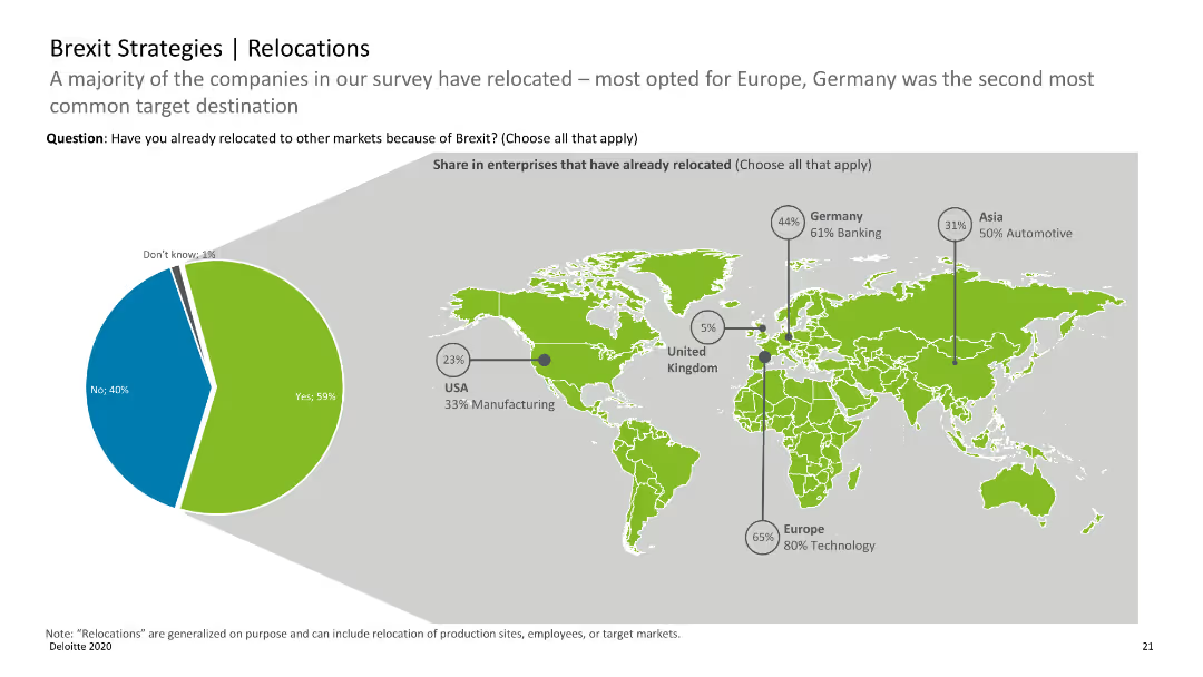
World map with pie charts indicating the share of enterprises that have relocated due to Brexit, with regional data.
Strategic Planning
Professional Services
Highlights the relocation trends of companies post-Brexit, with Europe and Germany being key relocation destinations.
Brexit, relocations, enterprises, map, trends
Mixed Chart
Deloitte
Saved
Contains column charts with a trend line illustrating the bank's 10-year performance, including ROE, pretax income, and card sales market share. The layout is data-centric with a clear hierarchy.
Financial Performance
Financial Services
The slide is a retrospective view of the bank's decade-long performance metrics and market share growth, demonstrating sustained profitability and market presence.
growth metrics, profitability, market share, financial analysis, long-term performance
Single Chart
JP Morgan
Saved
Multiple column charts comparing percentages of spending increases across different types of marketing knowledge areas from 2017 to 2022.
Market Analysis and Trends
Professional Services
Analyzes investment trends in marketing knowledge, highlighting significant increases in spending across multiple areas.
marketing investment, education, professional services, spending trends
Single Chart
Deloitte
Saved
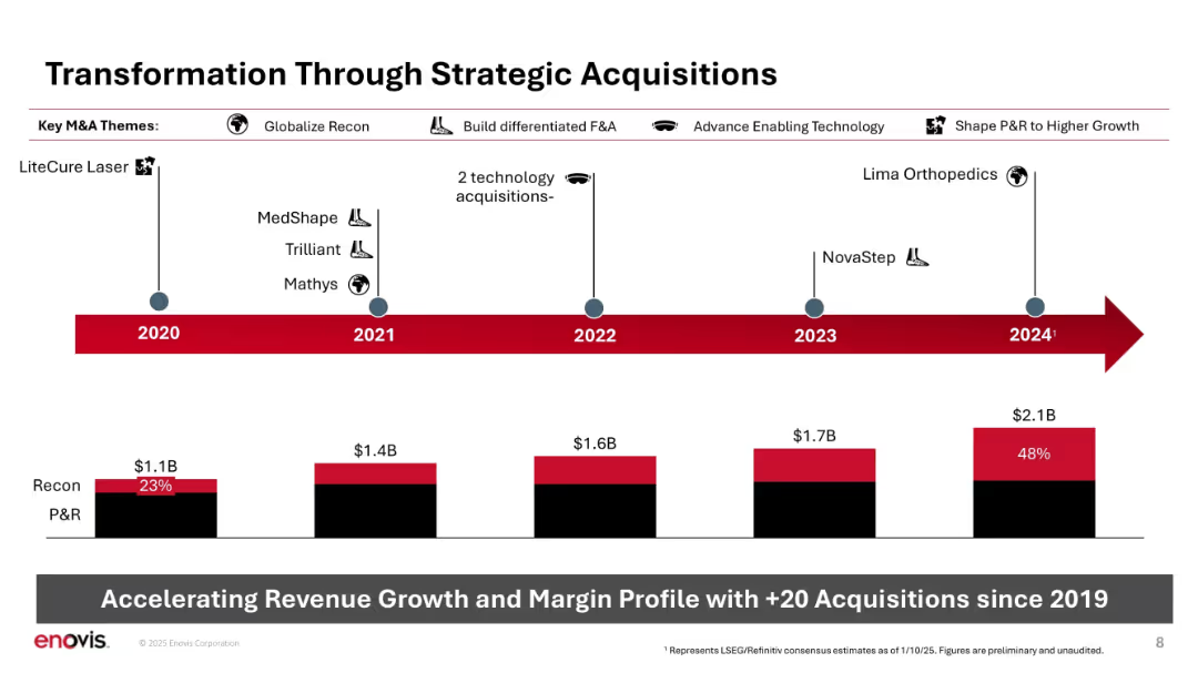
Horizontal timeline with icons and acquisition names; bar chart at bottom showing Recon vs. P&R growth.
Strategic Planning
Healthcare & Pharmaceuticals
Depicts Enovis’s strategic acquisitions since 2020, categorized by theme (e.g., globalize Recon, enabling tech). Shows revenue growth over time and increase in Recon's share of sales. Emphasizes +20 acquisitions as a key driver of transformation.
M&A, acquisitions, Recon, P&R, strategy, timeline, revenue growth, expansion
Mixed Chart
JP Morgan
Saved
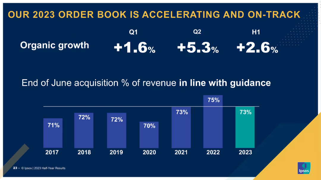
Single-column layout with a bar chart showing quarterly and half-year organic growth rates. Uses callouts for specific growth percentages and year comparisons.
Market Analysis and Trends
Financial Services
Highlights the acceleration of the order book in 2023, showing organic growth percentages for Q1, Q2, and H1, and acquisition revenue percentages compared to previous years.
order book, growth, 2023, Q1, Q2, H1
Single Chart
IPSOS
Saved
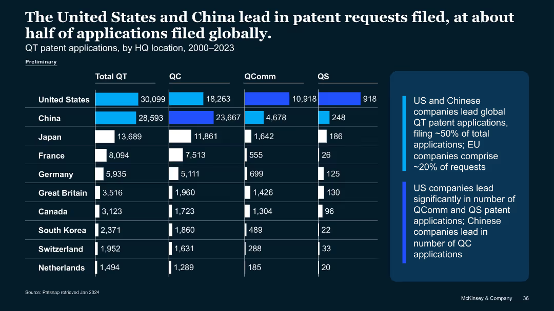
Similar structure to previous slide, showing bar chart of quantum patent applications (2000–2023) by country and QT type.
Strategic Planning
Technology & Software
Compares quantum tech patent filings, showing U.S. and China dominate with ~50% of global submissions. Breaks down QC, QComm, QS patent applications. Notes China leads QC filings; U.S. leads QComm and QS.
patent applications, QT, China, U.S., QC, QComm, QS, IP filings
Mixed Chart
McKinsey
Saved
The slide includes two line charts, one showing nominal house prices indexed to 2015 for various countries and another showing household debt as a percentage of GDP.
Market Analysis and Trends
Financial Services
This slide presents data on house price trends and household debt levels, providing insights into consumer balance sheets and potential economic vulnerabilities.
House prices, household debt, consumer balance sheets, economic trends, GDP
Multiple Chart
JP Morgan
Saved
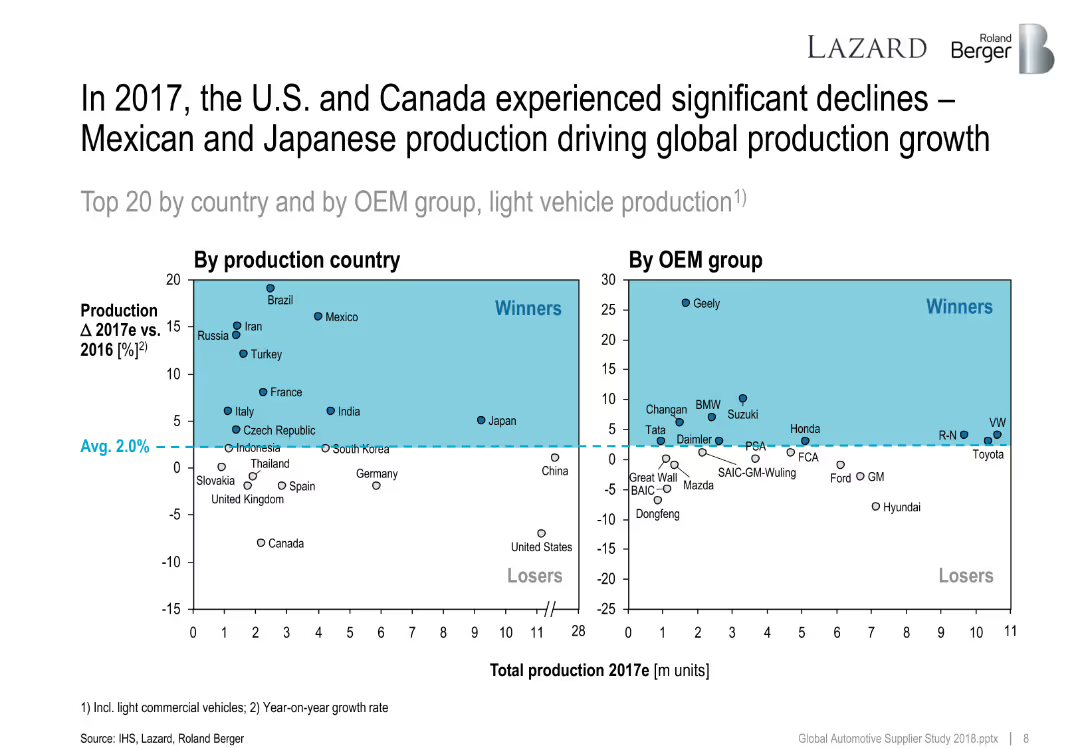
Two quadrant scatter plots showing production country and OEM group changes in 2017 vs. 2016. Average growth line divides winners and losers.
Performance Metrics and KPIs
Industrial & Manufacturing
This slide maps growth in vehicle production by country and OEM group. Winners include Mexico and Geely, while the U.S. and Canada declined. It highlights global shifts in automotive output.
production growth, OEMs, countries, vehicle output, 2017, performance, global ranking
Multiple Chart
Roland Berger
Saved
The slide features a bubble chart showing the importance of various factors in campaign performance, with audience targeting and ad creative being the most critical.
Market Analysis and Trends
Professional Services
This slide highlights the critical role of audience targeting in campaign performance, showing its significant impact compared to other factors like ad creative and data quality.
audience targeting, campaign performance, ad creative, data quality, marketing
Mixed Chart
Nielsen
Saved
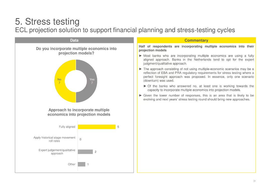
A pie chart on the incorporation of multiple economics into projection models, with a column chart detailing the approaches used by banks, and accompanying commentary.
Risk Assessment and Management
Financial Services
Examines whether banks incorporate multiple economic scenarios into their projection models for stress testing, detailing the different approaches taken.
ECL, stress testing, projection models, multiple economics, banks, scenarios, incorporation, approaches, testing
Multiple Chart
EY
Saved
The slide has three blue rectangular boxes with financial target metrics like ROE/ROTE, Efficiency Ratio, and CET1 Ratio, featuring percentage values.
Financial Performance
Financial Services
This slide presents Goldman Sachs' financial targets, highlighting ROE/ROTE, Efficiency Ratio, and CET1 Ratio as measures of their commitment to generating returns.
Goldman Sachs, ROE, ROTE, Efficiency, CET1 Ratio, Financial Targets, Value Driving, Business Growth
Table
Goldman Sachs
Saved
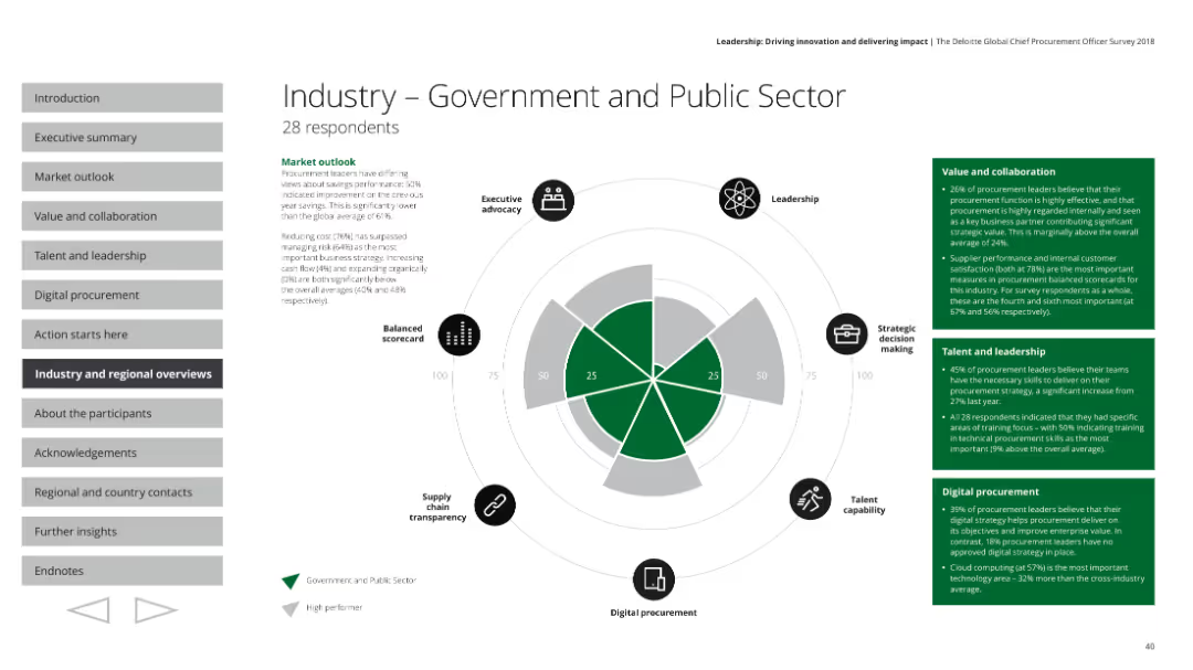
The slide features a radar chart, text boxes with survey results, and small icons indicating various aspects of performance.
Industry Overview
Government & Public Sector
This slide provides an overview of the government and public sector's procurement performance based on a survey. It covers executive advocacy, leadership, strategic decision making, talent capability, digital procurement, and supply chain transparency, with detailed market outlook and specific metrics on value, collaboration, talent, and leadership.
Government, public sector, procurement, radar chart, performance
Mixed Chart
Deloitte
Saved
This slide provides a timeline of NVIDIA's market capitalization, paired with text descriptions on a white and purple background. Icons are used to depict various sectors like autonomous vehicles, smart city solutions, and intelligent stores.
Market Analysis and Trends
Technology & Software
Highlighting NVIDIA's evolution, the slide outlines the company's growth from a graphics chip company to a comprehensive industry solution provider. It showcases various end-to-end hardware, software, and service solutions that NVIDIA has developed.
NVIDIA, market cap, E2E industry solutions, autonomous vehicles, smart city, intelligent stores, smart hospitals, graphic chips, tech evolution, industry activator
Boxed
Accenture
Saved
The slide includes two doughnut charts comparing Asia’s investment values for 2012 and 2016, highlighting the rise in China and Southeast Asia.
Market Analysis and Trends
Financial Services
Discusses the rapid increase in investment values within Asia, particularly in China and Southeast Asia, over the four-year period.
Asia, Investment, China, Southeast Asia, Trends
Multiple Chart
Kearney
Saved
Column chart showing the private funding value by country with a legend, set against a white background with a bold title at the top.
Market Analysis and Trends
Financial Services
Highlights Singapore and Indonesia as the top investment destinations in 2022, presenting the private funding values and market shares.
Singapore, Indonesia, investment destinations, private funding, market share, SEA, column chart, 2022
Single Chart
Bain
Saved
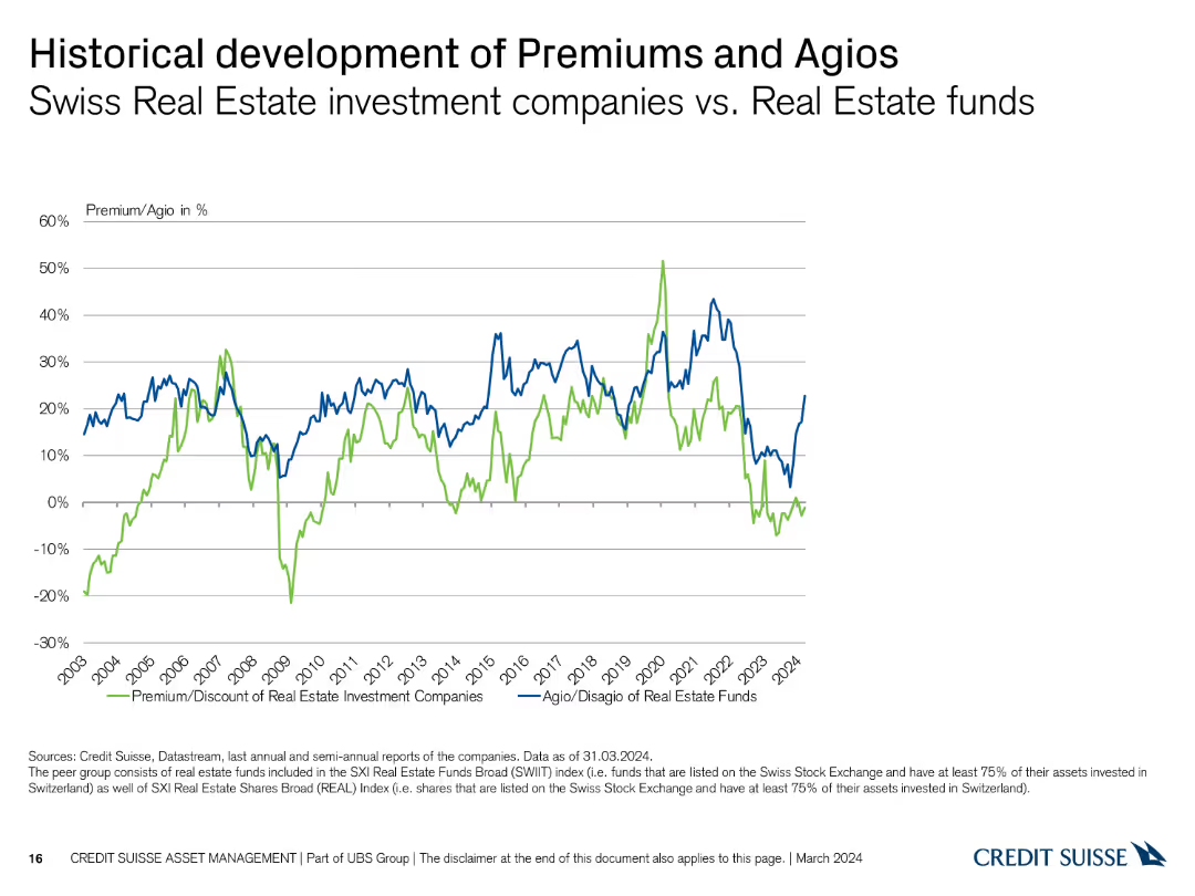
A line chart with two lines, one representing Premium/Discount of Real Estate Investment Companies and the other for Agio of Real Estate Funds. The chart spans from 2003 to 2024, with values on the Y-axis ranging from -30% to 60%.
Market Analysis and Trends
Real Estate & Construction
The slide shows the historical development of premiums and agios for Swiss real estate investment companies versus real estate funds.
premiums, agios, real estate, investment, historical, comparison, Swiss, development, trends, analysis
Single Chart
Credit Suisse
Saved
Previous
Next
If nothing, comes up, please save your slides first
Create a FREE account to continue browsing
Receive Instant Access to 1,000+ slides from companies like McKinsey, Google, and Goldman Sachs
First Name
Last Name
Email
Password
I agree to all
Terms & Privacy Policy
Thank you! Your submission has been received!
Oops! Something went wrong while submitting the form.
Have an account?
Sign in
Column Chart
Heatmap
Chevron
Org Chart
Infographic
Callouts
Timeline
List
Graphic
Picture
Process Flow
Diagram
Paragraph
Map
Table
Framework
Subtitle
Takeaway Box
Icon
Other Chart
Radar Chart
Waterfall Chart
Mekko Chart
Pie Chart
Scatter Plot
Line Chart
Bar chart
Bullet points