Create a FREE Account
Instant access to 1,000+ real slides from top companies like McKinsey, BCG, Goldman Sachs, Google and many more!
First Name
Last Name
Email
Password
I agree to all
Terms & Privacy Policy
Thank you! Your submission has been received!
Oops! Something went wrong while submitting the form.
Have an account?
Sign in
Library
Templates
Courses
Pricing
My Account
My Slides
My Templates
✦ AI
AI Prompt Library
AI Search
Sign in
Start Here
Logout
My Saved Slides
Contains a bar chart comparing greenhouse gas emissions by country in Sub-Saharan Africa, using distinct colors for visual clarity and emphasis.
Regulatory and Compliance
Environmental Services & Sustainability
Details Nigeria's position among Sub-Saharan countries in greenhouse gas emissions, highlighting the need for renewable energy solutions like solar power.
GHG emissions, Nigeria, renewable energy, Sub-Saharan Africa, environmental impact
Single Chart
BCG
Saved
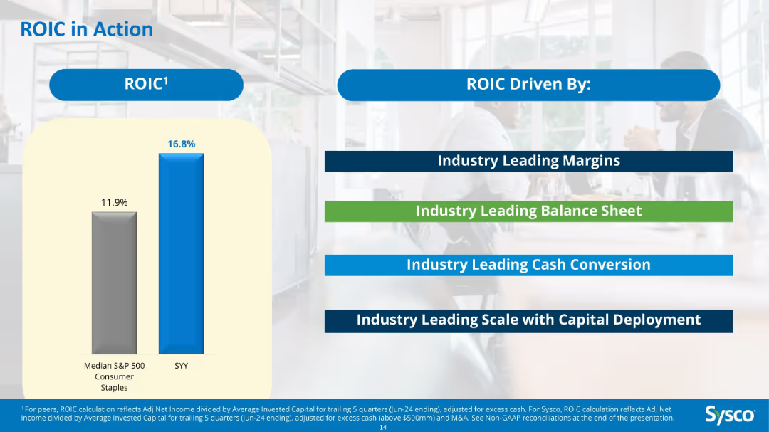
Bar chart comparing ROIC of Sysco vs S&P 500 median; text boxes listing drivers like margins, balance sheet, and capital deployment.
Investment Analysis
Consumer Goods
Demonstrates Sysco’s superior 16.8% ROIC compared to the 11.9% median for S&P 500 consumer staples. The slide attributes this to leadership in margins, balance sheet strength, cash conversion, and capital scale.
ROIC, Sysco, capital efficiency, investment, consumer staples, return metrics, comparison
Mixed Chart
Barclays
Saved
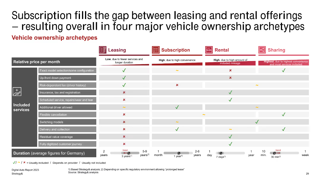
A comparative table outlining four major vehicle ownership archetypes: leasing, subscription, rental, and sharing, with included services and relative prices.
Market Analysis and Trends
Transportation & Logistics
Compares leasing, subscription, rental, and sharing vehicle ownership models, focusing on the services included, costs, and duration.
subscription, leasing, rental, sharing, vehicle ownership
Table
PwC/Strategy&
Saved
Split layout: value perception (left) vs. service priorities (right); color-coded circles and percentages.
Customer and Market Segmentation
Financial Services
The slide shows how commercial banks currently and expect to derive value from service providers, highlighting a shift from functional to ecosystem transformation over two years to enhance digital experience.
Digital hygiene, banking, transformation, cost reduction, AI, onboarding, value delivery
Mixed Chart
Accenture
Saved
Scatter plot comparing the Global Innovation Index and GDP per capita PPP for 2011 and 2019, focusing on emerging countries like India, Brazil, Mexico, Indonesia, Turkey, Russia, and China.
Technology and Digital Transformation
Technology & Software
The slide illustrates the progress of emerging countries in terms of innovation capabilities and economic development from 2011 to 2019. It shows how increased innovation has led to higher GDP per capita, highlighting the importance of sustained investment in technology and innovation for long-term growth.
Emerging Countries, Innovation, GDP, 2019
Mixed Chart
Roland Berger
Saved
Includes a circular design and pie charts to represent statistical data, with an emphasis on workplace experiences of minority groups.
Organizational Structure and Change
Professional Services
This slide provides statistics on workplace microaggressions, particularly among LGBT+ women and ethnic minorities, useful in diversity and inclusion training sessions or discussions on improving corporate culture and sensitivity training.
microaggressions, LGBT+, workplace, diversity
Multiple Chart
Deloitte
Saved
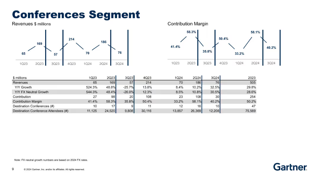
Updated version of 18623, includes 1Q24–3Q24 with revenue and margin charts and revised attendee and event data.
Product and Service Analysis
Technology & Software
Offers latest updates on the Conferences segment including revenue, margin, and key operating statistics. Illustrates growth in destination events and attendees, tracking effectiveness of the event strategy.
conferences, growth, margin, events, attendees, revenue update
Multiple Chart
Gartner
Saved
The slide displays column charts showing the gender distribution of Black employees across various professional levels within the venture capital industry. Textual notes on survey data are also provided.
Human Resources and Talent Management
Professional Services
This slide examines the gender distribution of Black employees within the venture capital industry, comparing data from 2018, 2020, and 2022, and highlighting trends and disparities.
Black employees, Gender distribution, Diversity, VC industry, Professional levels
Multiple Chart
Deloitte
Saved
The slide has four sections: two bar charts, one column chart, and a textual explanation with graphs and diagrams.
Client Case Studies
Professional Services
Showcases benchmark results from the AEP feedback report, comparing participant performance across different metrics.
benchmarks, AEP, procurement, performance, comparison, feedback, bar charts, column chart, graphs, metrics
Multiple Chart
Kearney
Saved
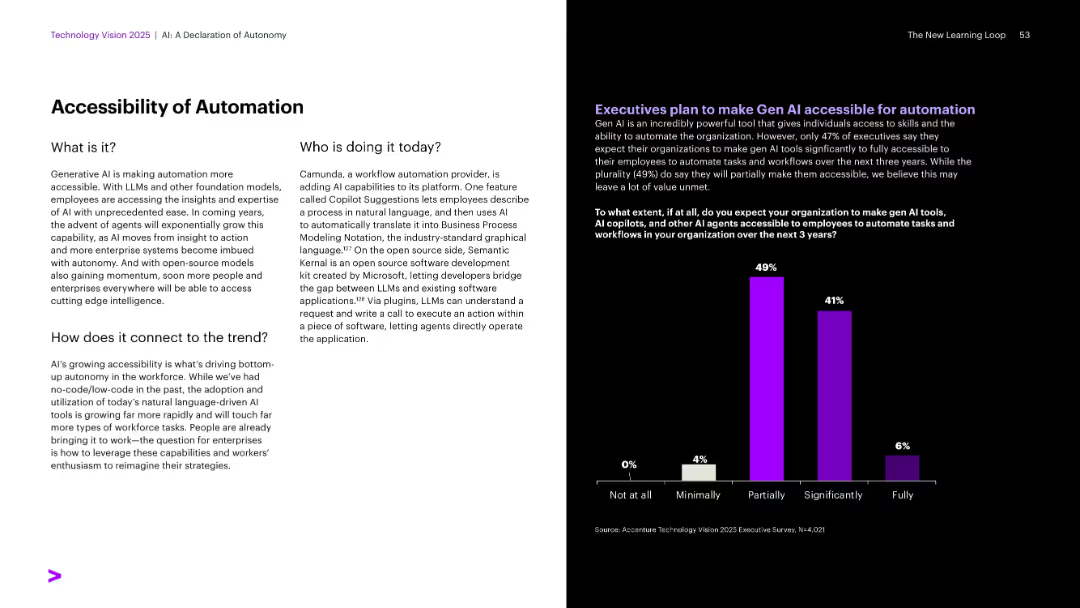
Classic split layout with survey bar graph on right in purple; text-heavy left.
Human Resources and Talent Management
Technology & Software
Describes how generative AI is improving accessibility to automation for employees. It names Camunda and Microsoft as current implementers. A bar chart shows executive expectations on enabling employee access to AI tools over the next three years, with most planning only partial accessibility.
Automation, Gen AI access, Camunda, Semantic Kernel, Microsoft
Mixed Chart
Accenture
Saved
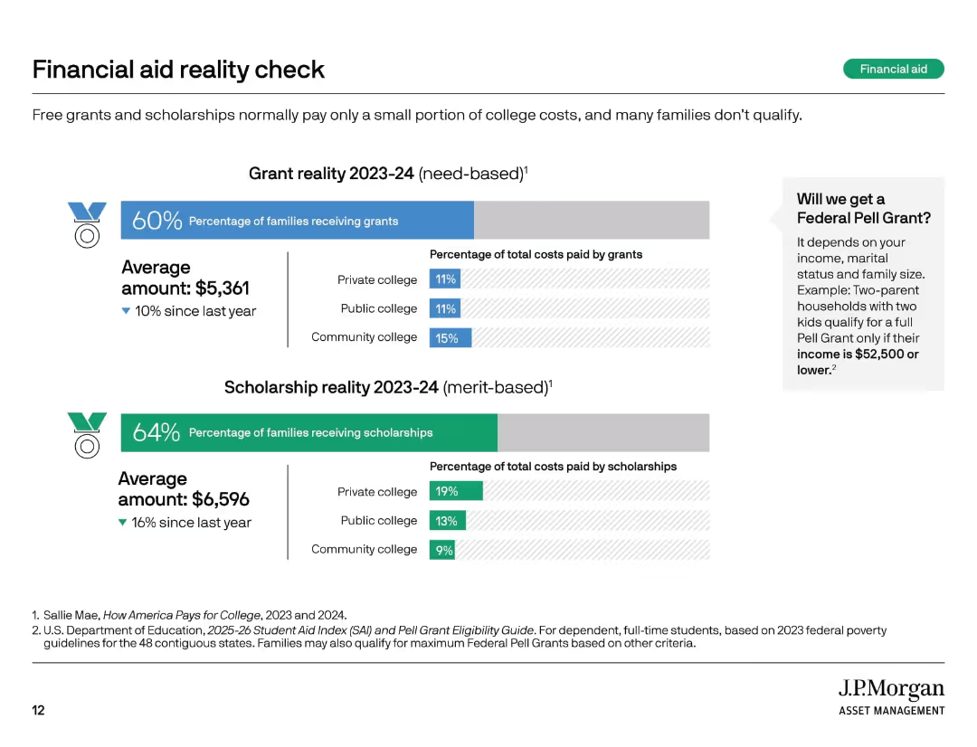
Two horizontal bar charts with icons and labels, side-by-side text block, light background with color-coded segments.
Market Analysis and Trends
Education & Training
This slide contrasts the realities of need-based grants and merit-based scholarships for the 2023–24 academic year. It highlights the percentage of families receiving each, average dollar amounts awarded, and the typical percentage of college costs covered. A sidebar explains Pell Grant eligibility criteria.
financial aid, grants, scholarships, college cost, Pell Grant, education
Multiple Chart
JP Morgan
Saved
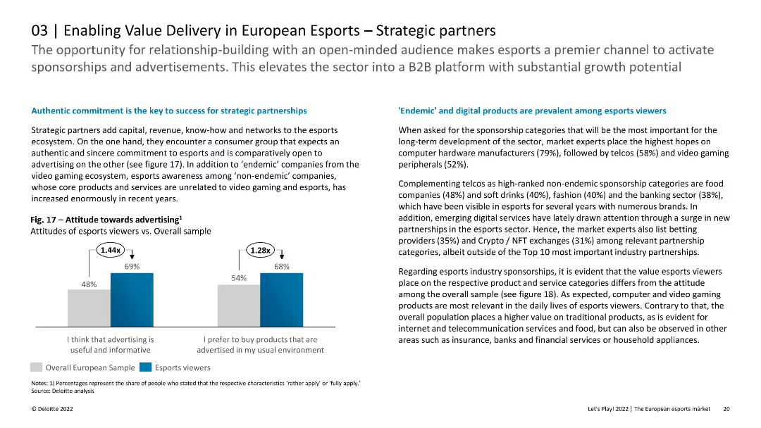
The slide includes column charts showing attitudes towards advertising among esports viewers compared to the overall sample. The layout is clean and focused on data presentation.
Strategic Planning
Media & Entertainment
This slide discusses the importance of strategic partnerships in the esports ecosystem, highlighting the positive attitudes of esports viewers towards advertising. It provides insights into the preferred sponsorship categories and the relevance of different products and services.
Esports, Strategic Partnerships, Advertising, Europe
Mixed Chart
Deloitte
Saved
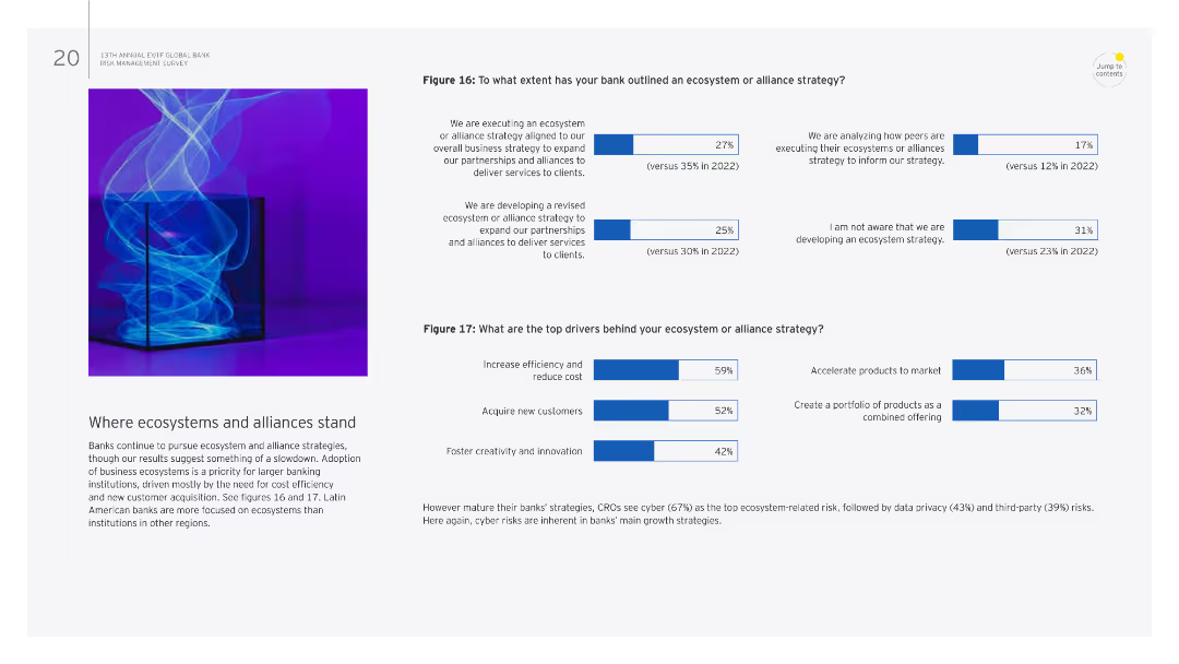
The slide features text and two column charts. The charts detail the extent of ecosystem or alliance strategies and top drivers behind these strategies.
Strategic Planning
Financial Services
It discusses the current state of ecosystem and alliance strategies in banks, including the extent of implementation and key drivers such as efficiency and innovation.
Ecosystems, alliances, strategies, efficiency, innovation
Multiple Chart
EY
Saved
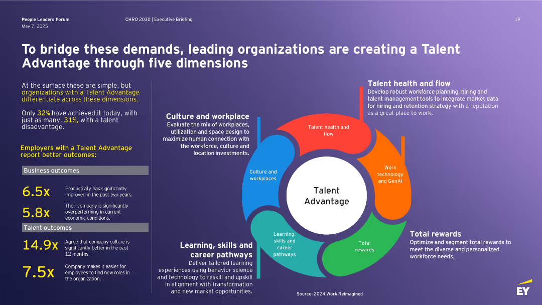
Left block of stats and outcomes; right side features a circular infographic with five dimensions of Talent Advantage: culture, learning, rewards, health, and tech.
Human Resources and Talent Management
Professional Services
Describes how leading companies build a Talent Advantage across five dimensions to address workforce challenges. Includes stats on performance outcomes for talent-advantaged firms and emphasizes the strategic value of culture, learning pathways, reward systems, technology, and workforce planning to stay competitive.
Talent Advantage, workforce strategy, learning, rewards, culture, technology, retention
Vertical Flow
EY
Saved
The slide features a text box with a quote and a circular diagram showing the stakeholder consultation process, with various industry icons.
Strategic Planning
Environmental Services & Sustainability
The slide discusses the company's commitment to Science Based Targets and the recurring themes from stakeholder consultations on fashion returns.
Science Based Targets, sustainability, stakeholder, consultation, themes
Diagram
Roland Berger
Saved
A comparison of rating movements from Standard & Poor's and Moody's for Macquarie and other banks from 2007 to 2020. Each bank has a track line with markers indicating rating changes over time.
Risk Assessment and Management
Financial Services
Focuses on Macquarie Bank's credit ratings stability over 13 years, comparing it with other major banks, which is crucial for risk assessment and confidence among investors and stakeholders.
ratings, stability, Macquarie, banks, credit, Standard & Poor's, Moody's, risk, assessment, confidence
Multiple Chart
Goldman Sachs
Saved
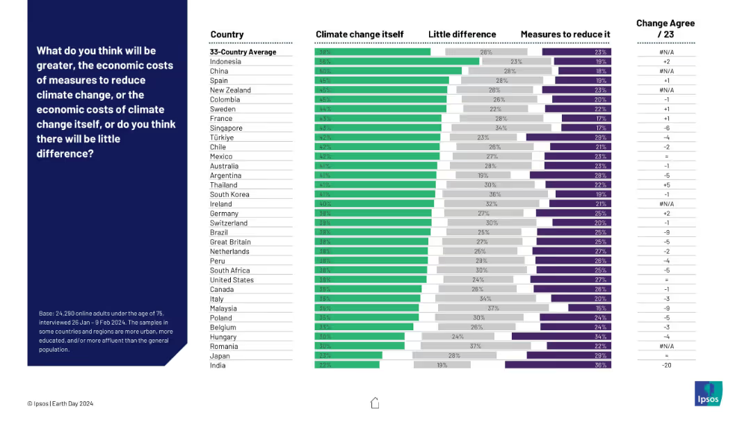
Horizontal stacked bar chart comparing beliefs on whether climate change itself or the measures to reduce it will cost more. Countries listed on the left with agreement levels for each opinion.
Strategic Planning
Environmental Services & Sustainability
The slide presents perceptions across various countries regarding whether the economic cost of addressing climate change outweighs the cost of climate change itself. Most respondents believe climate change is the more costly threat, though views vary by country.
economic costs, climate change, mitigation measures, global perception, Ipsos, cost analysis, country comparison, sustainability policy
Mixed Chart
IPSOS
Saved
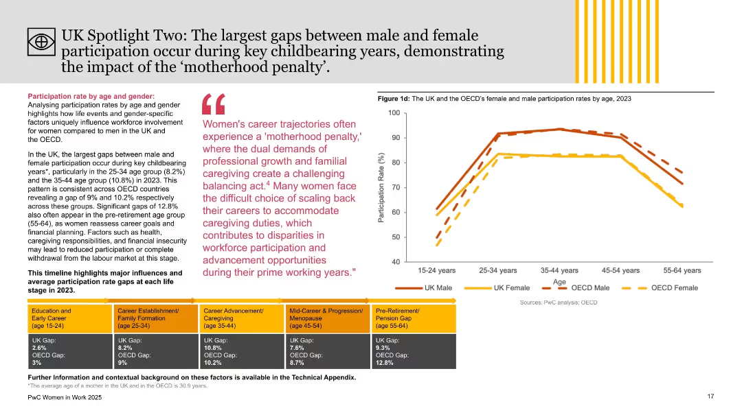
Right side features age-segmented participation chart; left side includes thematic analysis with colored blocks and quote on ‘motherhood penalty.’
Market Analysis and Trends
Government & Public Sector
This slide explores age-related gender participation gaps in the UK and OECD, emphasizing childbearing years (25–44) as periods with the widest disparities. It links challenges like caregiving and career progression with reduced female workforce involvement, using the “motherhood penalty” concept.
motherhood penalty, gender gap, age analysis, workforce participation, UK, OECD, PwC, employment trends, caregiving, labor market
Mixed Chart
PwC/Strategy&
Saved
This slide contains a large heading, three primary metric highlights, and three pie charts displaying product lines, geographies, and revenue models. The slide is visually balanced with significant use of purple.
Financial Performance
Healthcare & Pharmaceuticals
Highlights the financial performance and distribution of QuidelOrtho's Point of Care Business Unit for Q3 2023. It includes revenue figures, product line distribution, geographical reach, and revenue models.
Financial, Product, Geography, Revenue, Healthcare
Multiple Chart
JP Morgan
Saved
The slide shows column charts comparing percentages of net sales before and after portfolio divestiture in pet categories.
Financial Performance
Consumer Goods
Analyzes changes in a company's sales structure within the pet industry, emphasizing improvements in margin and sales mix after strategic divestitures.
portfolio, net sales, pet industry, divestiture, financial analysis, margin improvement, sales mix, column chart
Single Chart
Barclays
Saved
Features a column chart showing survey results on companies' strategies to manage cost increases in 2023 and 2024, with opinions from various industry leaders about cost management challenges.
Financial Performance
Financial Services
Explores corporate strategies for offsetting cost increases due to inflation and other economic challenges, highlighting different industry perspectives on transferring costs to consumers.
cost management, inflation, economic challenges, consumer prices, efficiency plans, industry strategy, financial planning, cost offsetting, corporate strategy
Mixed Chart
Bain
Saved
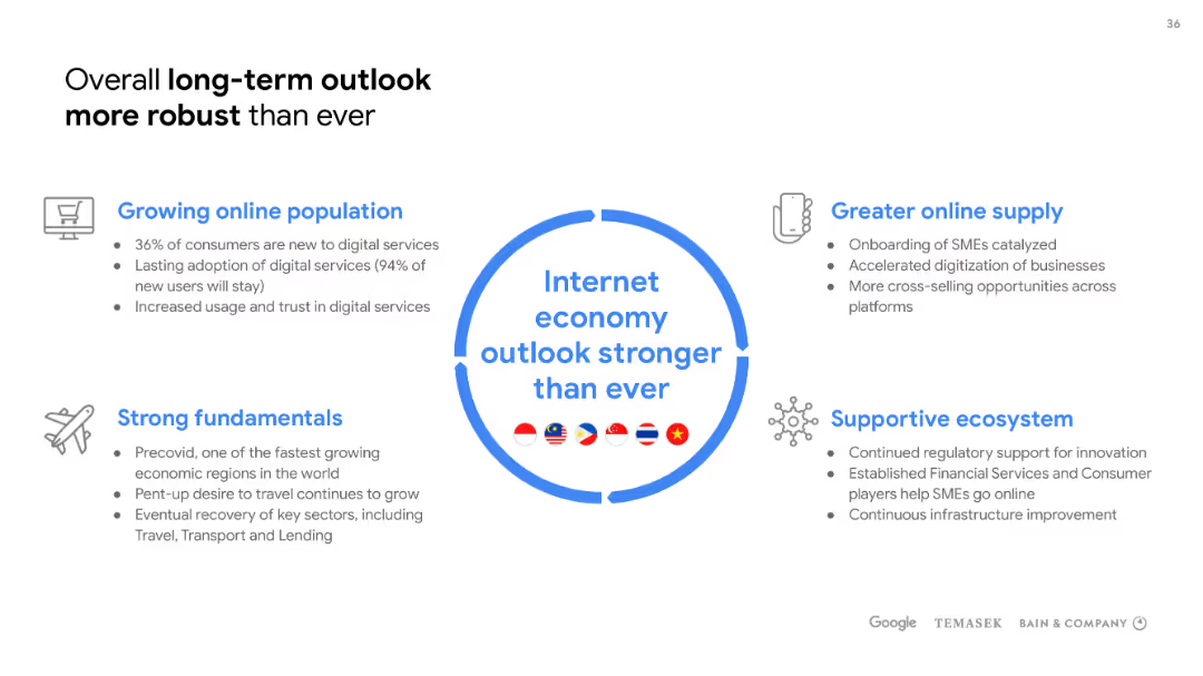
Dominated by a large circular infographic in the center, with descriptive bullet points around it, the slide uses a balance of icons, text, and graphics on a white background.
Strategic Planning
Technology & Software
Focuses on the long-term positive outlook of the internet economy, citing growing online population, strong fundamentals, greater online supply, and a supportive ecosystem. Useful for strategic planning discussions.
Internet economy, outlook, online population, fundamentals, ecosystem
Header Vertical
Bain
Saved
The slide shows a column chart with different colors representing various types of financial instruments and their maturities spread over the coming years. A legend on the right details the amounts and maturity years. The Michelin logo is at the bottom left.
Financial Performance
Financial Services
Displaying a company's debt profile, this slide helps in assessing financial health and planning for debt management. It visually represents the maturity of different debt instruments over time, which is essential for investors, stakeholders, and financial managers within the financial services industry.
debt maturities, financial planning, bar chart
Single Chart
Morgan Stanley
Saved
This slide features a line chart with annotations for specific years and acquisitions, a sidebar with bullet points emphasizing revenue growth, and a company logo. The color scheme is blue, green, and black on a white background. The chart is the central visual element, with textual information in the sidebar presented in a clear, hierarchical layout with the use of bold fonts and contrasting colors.
Financial Performance
Industrial & Manufacturing
The slide illustrates the company's economic revenue growth over the years, highlighting significant acquisitions. The sidebar emphasizes a nine-fold increase in revenue since 2000, with equal contributions from organic growth and mergers and acquisitions. It appears to be used for showcasing the company's financial growth trajectory and strategic acquisitions to stakeholders or investors.
Growth, Acquisitions, Revenue, Organic, M&A, Economic, Line Chart, Annotations, Industrial, Strategic
Single Chart
Goldman Sachs
Saved
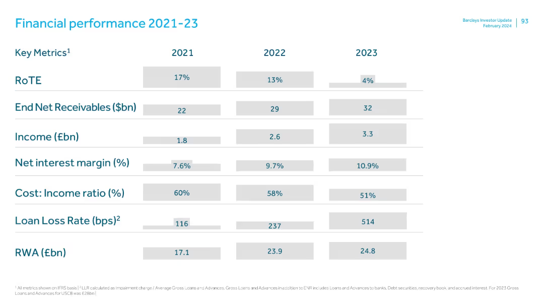
Tabular format showing annual metrics for three years, clearly segmented rows and columns, clean layout with shaded cells.
Financial Performance
Financial Services
Summarizes Barclays' key financial metrics from 2021 to 2023, showing trends in RoTE, receivables, income, net interest margin, cost-income ratio, loan loss rates, and risk-weighted assets. Notable decline in RoTE and rising loan loss rate in 2023.
financials, RoTE, income, net interest margin, receivables, cost-income ratio, RWA, loan loss
Single Chart
Barclays
Saved
Previous
Next
If nothing, comes up, please save your slides first
Create a FREE account to continue browsing
Receive Instant Access to 1,000+ slides from companies like McKinsey, Google, and Goldman Sachs
First Name
Last Name
Email
Password
I agree to all
Terms & Privacy Policy
Thank you! Your submission has been received!
Oops! Something went wrong while submitting the form.
Have an account?
Sign in
Column Chart
Heatmap
Chevron
Org Chart
Infographic
Callouts
Timeline
List
Graphic
Picture
Process Flow
Diagram
Paragraph
Map
Table
Framework
Subtitle
Takeaway Box
Icon
Other Chart
Radar Chart
Waterfall Chart
Mekko Chart
Pie Chart
Scatter Plot
Line Chart
Bar chart
Bullet points