Create a FREE Account
Instant access to 1,000+ real slides from top companies like McKinsey, BCG, Goldman Sachs, Google and many more!
First Name
Last Name
Email
Password
I agree to all
Terms & Privacy Policy
Thank you! Your submission has been received!
Oops! Something went wrong while submitting the form.
Have an account?
Sign in
Library
Templates
Courses
Pricing
My Account
My Slides
My Templates
✦ AI
AI Prompt Library
AI Search
Sign in
Start Here
Logout
My Saved Slides
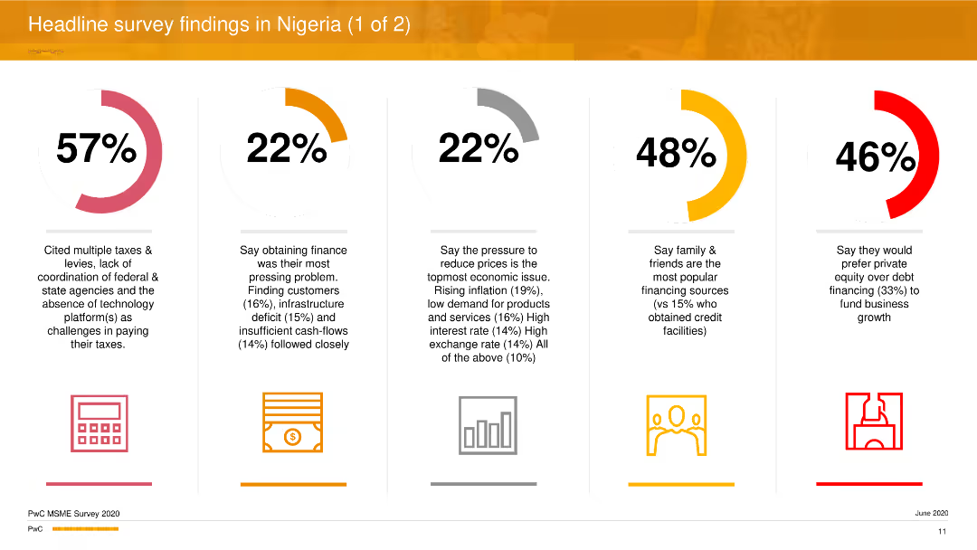
The slide is divided into five sections, each with a percentage and corresponding icon, summarizing key survey findings. These include challenges in paying taxes, obtaining finance, economic pressures, popular financing sources, and preferences for private equity.
Market Analysis and Trends
Professional Services
The slide presents headline findings from a survey of MSMEs in Nigeria, detailing the major challenges they face, such as tax issues, financing difficulties, economic pressures, and financing preferences. It highlights significant statistics and provides insights into the financial landscape for Nigerian MSMEs.
survey findings, MSMEs, Nigeria, financing challenges, economic pressures
Multiple Chart
PwC/Strategy&
Saved
Includes a mix of text and two sets of pie charts. The text emphasizes the importance of empowering employees and the positive impact on job loyalty. The pie charts compare responses of Gen Zs and millennials on empowerment and loyalty.
Human Resources and Talent Management
Professional Services
The slide discusses the significance of empowering employees in fostering a sense of belonging and loyalty within organizations. It presents data on how empowerment affects job retention and satisfaction, with supporting pie charts showing comparative data between empowered and non-empowered employees.
Empowerment, job loyalty, belonging, Gen Z, millennials
Mixed Chart
Deloitte
Saved
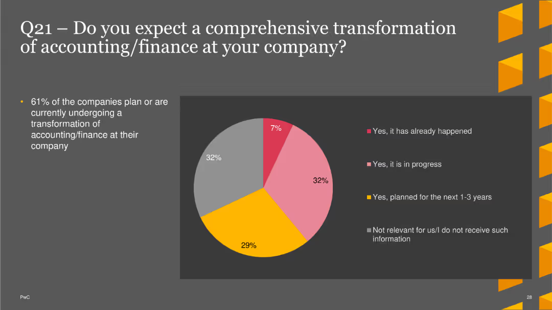
The slide features a pie chart showing expectations for comprehensive transformation in accounting/finance. Options include transformations that have already happened, are in progress, planned for the next 1-3 years, or not relevant. The chart uses different colors for each option. A brief text section explains the percentage of companies undergoing or planning transformations.
Technology and Digital Transformation
Financial Services
This slide illustrates survey results regarding companies' plans for comprehensive transformations in their accounting/finance functions, with a focus on current and future transformation efforts. It helps in understanding the adoption of transformative practices in finance.
finance transformation, accounting, digital transformation, trends, finance
Single Chart
PwC/Strategy&
Saved
This slide contains multiple elements: column charts for GDP share per industry, a table for total NY private sector GDP and incremental UI claims. Each industry's impact on GDP and UI claims is detailed.
Market Analysis and Trends
Financial Services
The slide gives a detailed breakdown of New York's private sector GDP by industry in 2019, correlating it with unemployment insurance claims during the pandemic to show economic impact across sectors.
GDP, unemployment, NY private sector, industries, bar chart, pie chart, pandemic impact
Single Chart
BCG
Saved
Slide features heatmap showing career aspirations in younger generations.
Market Analysis and Trends
Professional Services
Discusses evolving career aspirations among the next generation, emphasizing non-traditional roles.
future careers, generational change, management roles, aspirations, survey data
Table
BCG
Saved
Three pie charts illustrating the popularity of technologies like Cloud Computing, Automation, and Business Intelligence & Analytics in digital transformations.
Technology and Digital Transformation
Financial Services
Discusses the importance of selecting practical technology solutions for digital transformation in finance, focusing on benefits such as cost reduction and improved efficiency.
digital transformation, technology, finance, cloud computing, automation, business intelligence, cost reduction, efficiency
Multiple Chart
Deloitte
Saved
Column charts display the top three supply chain impacts across different regions, with corresponding icons for each impact. Commentary is on the right.
Market Analysis and Trends
Transportation & Logistics
The slide presents survey results showing CEOs' concerns about supply chain disruptions due to geopolitical instability, climate change, and other challenges, highlighting regional differences.
Supply chain, CEO concerns, regional impacts, disruptions, survey
Mixed Chart
Accenture
Saved
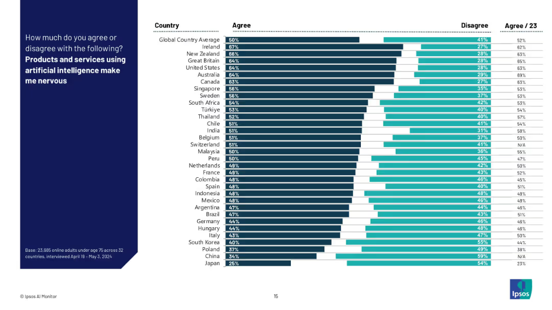
Bar chart with dark and light horizontal bars comparing “Agree” vs “Disagree” responses across countries; aligned country labels on the left.
Market Analysis and Trends
Artificial Intelligence
This slide visualizes the share of respondents across multiple countries who express nervousness about AI-powered products and services. It ranks countries by agreement level and highlights global sentiment towards AI adoption and unease.
AI perception, fear, country comparison, Ipsos, survey, consumer sentiment, technology anxiety, trust, global average, nervousness
Mixed Chart
IPSOS
Saved
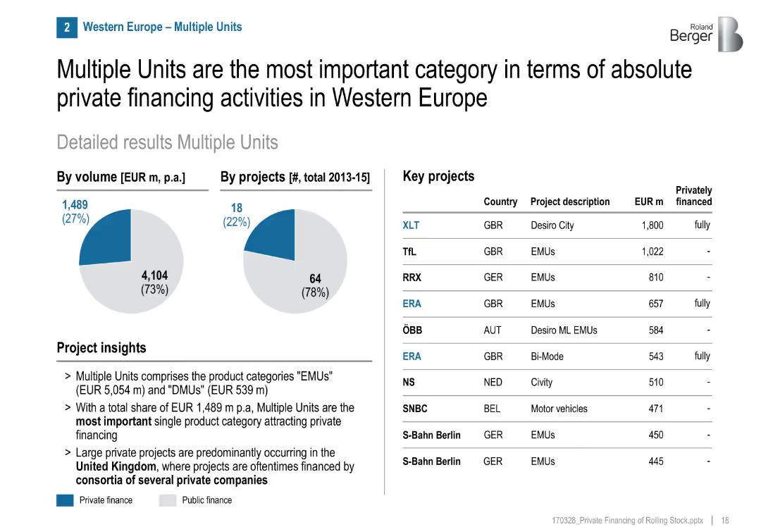
Pie charts for volume/projects, list of key projects, project insights section
Financial Performance
Transportation & Logistics
Multiple Units (EMU/DMU) are the leading category in private rail financing in Western Europe, especially in the UK. Several fully private projects were executed, often via consortia.
EMUs, DMUs, private investment, UK, consortia, rail, multiple units, GBR, financing structure
Mixed Chart
Roland Berger
Saved
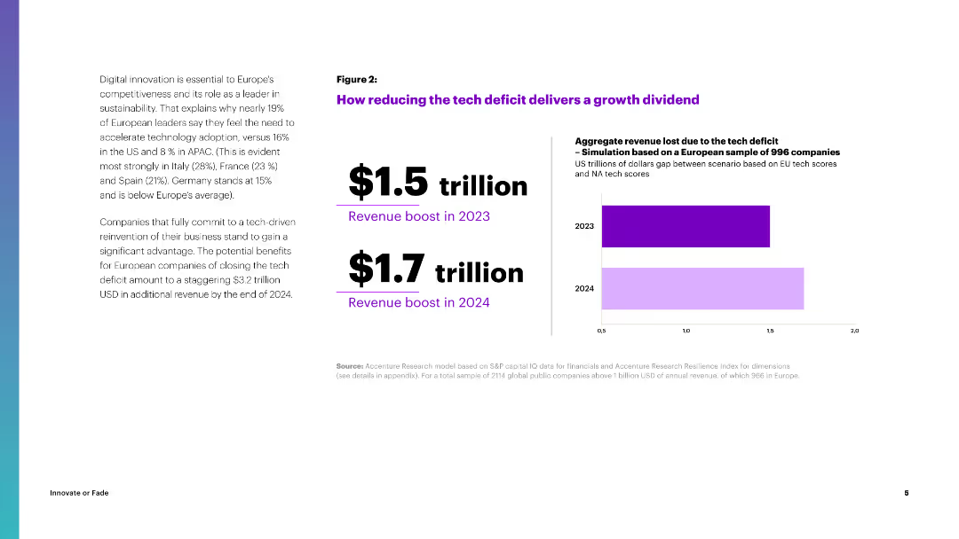
The slide features a column chart illustrating the projected revenue boost from reducing the tech deficit in Europe, with figures for 2023 and 2024.
Strategic Planning
Financial Services
It explains the potential revenue gains from reducing the tech deficit in Europe, projecting significant financial benefits by 2024, emphasizing the importance of tech adoption.
Tech Deficit, Revenue, Growth, Europe, Financial Benefits
Mixed Chart
Accenture
Saved
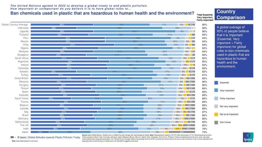
Vertical bar chart showing public opinion across countries. Uses multiple shades to represent importance levels, with a global insight box.
Risk Assessment and Management
Environmental Services & Sustainability
The chart reveals that 90% of global respondents support banning hazardous chemicals in plastics. The strongest support is seen in countries like Indonesia, Uganda, and Peru.
hazardous chemicals, plastic ban, public health, environment, UN treaty, global support, Ipsos
Mixed Chart
IPSOS
Saved
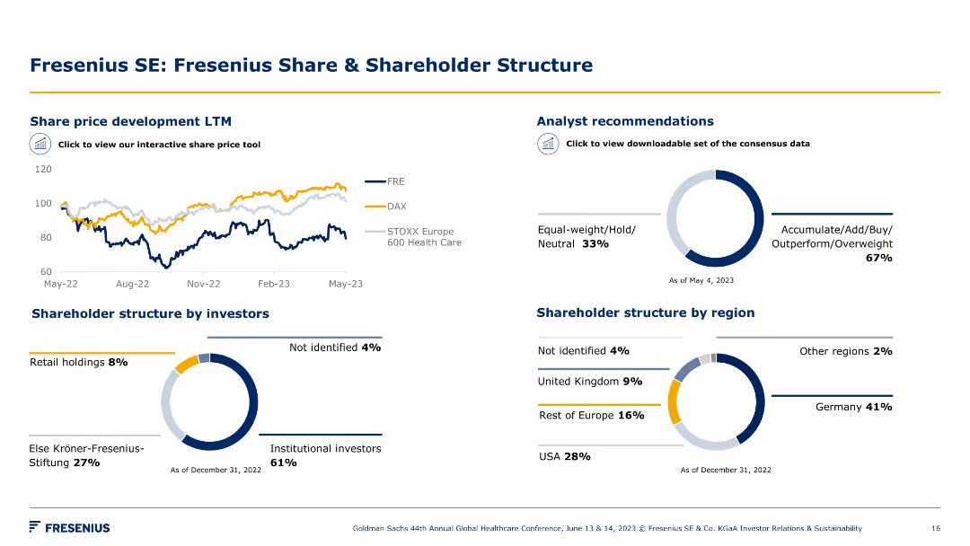
Multiple charts showing share price development, analyst recommendations, and shareholder structure. Visual elements include pie charts and line charts.
Financial Performance
Healthcare & Pharmaceuticals
The slide provides an overview of Fresenius' share price trends, analyst recommendations, and the shareholder structure by investor type and region.
share price, shareholder structure, financial performance, analyst recommendations, investment, strategy, healthcare, Fresenius, growth, trends
Multiple Chart
Goldman Sachs
Saved
The slide uses a white background with two large, concentric pie charts contrasting shades of blue and green to depict changes over the years 2020 and 2021. Adjacent to the charts, explanatory text and percentages are provided in a clear, readable font. The layout is simple and focuses the viewer’s attention on the comparative data of the pie charts.
Market Analysis and Trends
Financial Services
The slide highlights the growing importance of innovation and increased budgets for it over the span of one year. It is likely to be used for demonstrating the trend towards innovation in business strategy, showing a substantial percentage increase in companies prioritizing innovation and allocating budgets accordingly. This slide could serve as a tool for convincing stakeholders of the necessity of increased investment in innovation.
innovation importance, budgets, business strategy, trends, year-over-year increase
Multiple Chart
BCG
Saved
The slide includes text and circular charts depicting use cases selected by marketing leaders, such as ad copy and content production, and common uses for sales leaders.
Financial Performance
Technology & Software
This slide presents the common use cases for Generative AI as selected by marketing and sales leaders, including ad copy generation and sales enablement materials.
Generative AI, Use Cases, Marketing Leaders, Sales Leaders, Ad Copy
Mixed Chart
Gartner
Saved
This slide features a large image of a person walking towards wind turbines on the left side, with a multi-colored column chart on the right depicting total energy consumption under LCE scenarios in 2020 and 2050.
Technology and Digital Transformation
Energy & Utilities
It discusses the expected rise in total energy consumption globally by 23% in 2050 versus 2020 levels, driven by population growth and economic development, particularly in emerging economies, while highlighting the role of sustainable energy technologies in managing CO2 emissions.
Energy, Consumption, LCE, CO2, Sustainability
Mixed Chart
EY
Saved
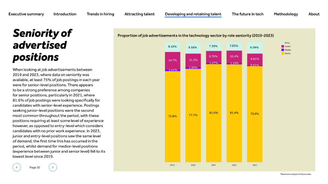
Title and paragraph left-aligned; vertical stacked bar chart on right showing role levels (2019–2023)
Human Resources and Talent Management
Technology & Software
This slide presents the distribution of job advertisements in tech by role seniority from 2019 to 2023. Senior roles consistently dominate, peaking at 81.6% in 2021. Entry and junior positions remain minor but saw parity in 2023. The slide illustrates a clear preference for experienced candidates across years, highlighting hiring practices in tech recruitment.
seniority, job levels, entry-level, hiring trends, experience, recruitment, talent demand, HR, tech roles, 2023 hiring
Mixed Chart
Barclays
Saved
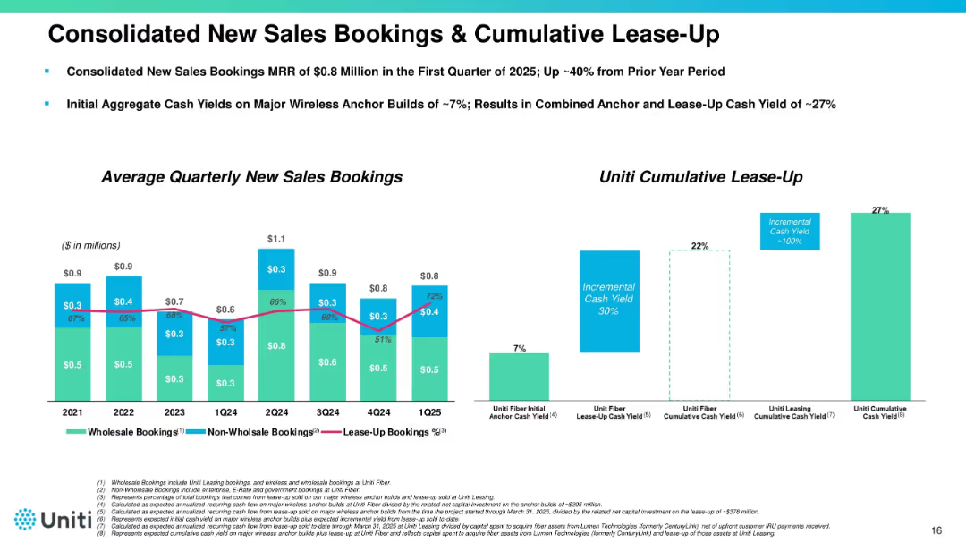
Split into two main sections: bar chart on the left showing quarterly sales bookings (2021–1Q25), and a vertical bar chart on the right illustrating cumulative lease-up metrics. Uses blue, green, and pink colors with a clean layout.
Performance Metrics and KPIs
Telecommunications
Highlights trends in wholesale and non-wholesale sales bookings, with a focus on lease-up contribution over time. Also shows cash yield improvement from initial anchor builds to cumulative impact, demonstrating a 27% cumulative cash yield.
sales bookings, lease-up, MRR, cash yield, wholesale, telecom, 2025
Multiple Chart
Goldman Sachs
Saved
Slide contrasts column charts depicting optimism and concern about AI across different organizational roles, with direct color-coded comparisons.
Organizational Structure and Change
Technology & Software
Discusses differing AI perceptions between managerial levels, useful for organizational strategy and understanding internal stakeholder perspectives.
AI perceptions, organizational strategy, managerial levels, stakeholder perspectives, technology impact
Multiple Chart
BCG
Saved
The slide features a column chart forecasting aviation energy consumption by fuel type (oil, electricity, biofuels) from 2018 to 2040 under a stated scenario. It also includes a detailed analysis of the industry environment and bioenergy economic competitiveness.
Market Analysis and Trends
Transportation & Logistics
This slide projects energy consumption in the aviation industry, emphasizing the role of biofuels as the only reliable renewable alternative, and analyzing the economic competitiveness and industry environment.
aviation industry, energy consumption, fuel type, biofuels, 2018-2040, economic competitiveness, industry environment
Mixed Chart
Kearney
Saved
This slide has a dual-column format with bullet points. The left column lists customer and client experiences improvements under different bank divisions, while the right column highlights product and platform development initiatives. Each section includes relevant icons and a succinct description.
Strategic Planning
Technology & Software
This slide discusses a $4.1B investment across various business segments, aimed at enhancing customer experiences and driving returns through product development.
Investment, Client Experience, Product Development, Financial Services, Strategy, Banking Sectors, Innovation, Returns
Table
JP Morgan
Saved
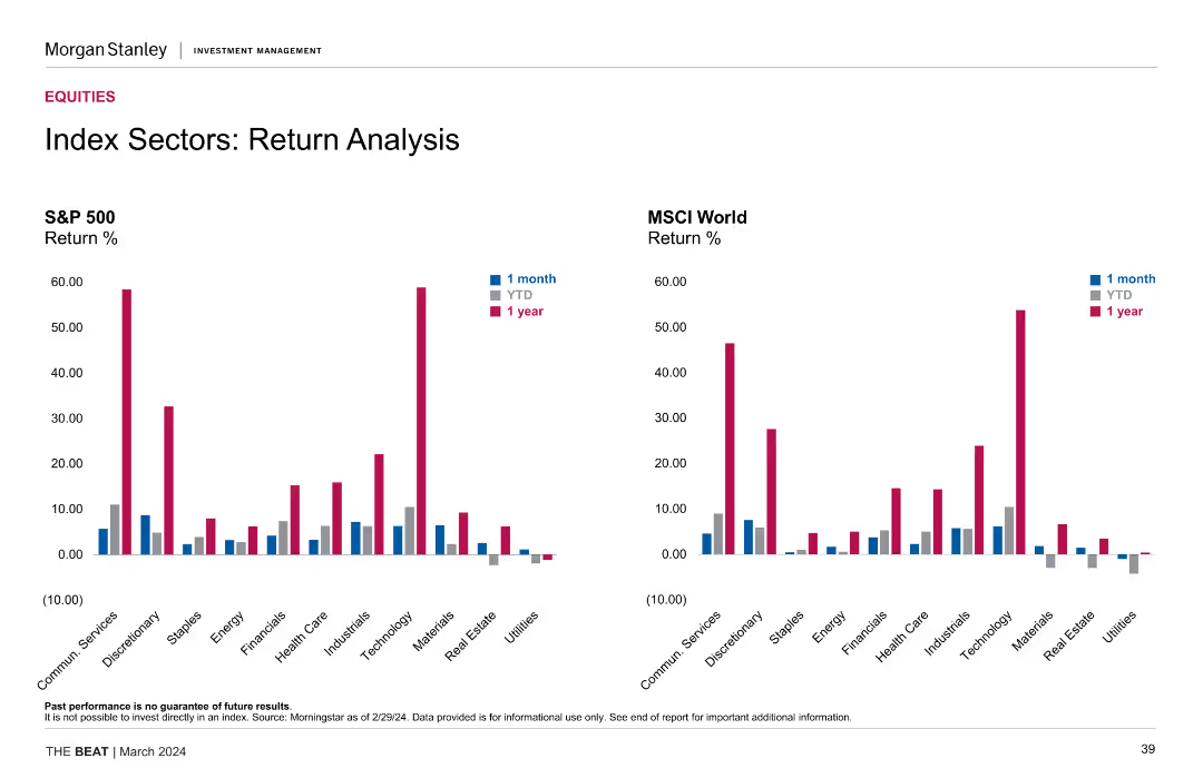
This slide showcases two sets of column charts comparing the 1-month, YTD, and 1-year returns of the S&P 500 and MSCI World indices across various sectors. Each chart uses distinct colors to differentiate between the time periods.
Financial Performance
Financial Services
The slide compares the performance of different sectors within the S&P 500 and MSCI World indices, showing returns over 1-month, YTD, and 1-year periods, helping in understanding sector-specific performance trends.
sector analysis, return analysis, S&P 500, MSCI World, performance comparison, financial metrics, sector returns
Multiple Chart
Morgan Stanley
Saved
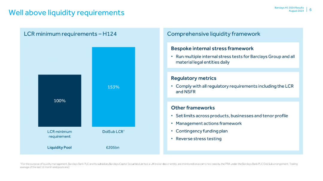
Two-part layout: bar chart on left and bullet summary on right; simple visual style with blue color theme
Risk Assessment and Management
Financial Services
Highlights Barclays’ liquidity coverage ratio (LCR) significantly above minimums in H1 2024. Also describes the comprehensive liquidity framework including stress testing, regulatory compliance, and contingency planning.
liquidity, LCR, Barclays, H1 2024, stress testing, funding plan, risk management, liquidity pool
Mixed Chart
Barclays
Saved
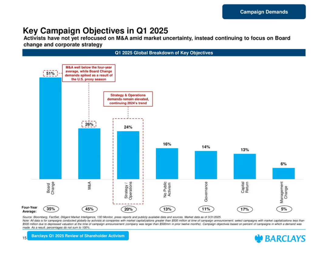
Tall vertical bar chart with annotated highlights and color-coded categories. Sparse layout with white background.
Strategic Planning
Financial Services
Highlights global activist campaign objectives in Q1 2025, with Board Change leading at 51%. M&A is down compared to average. Strategy & Operations and other categories are also tracked, with comparison to historical averages.
Campaigns, Objectives, Board Change, M&A, Strategy, Governance, 2025, Shareholder, Activism
Single Chart
Barclays
Saved
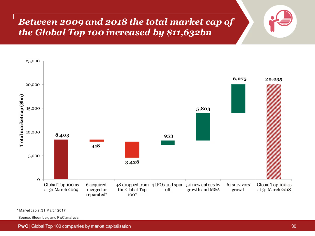
Column chart depicting the total market cap increase of the Global Top 100 companies from 2009 to 2018, highlighting growth areas and key contributors.
Financial Performance
Financial Services
Analysis of the market cap increase of the Global Top 100 companies over a decade, emphasizing significant growth and contributing factors.
market cap, global top 100, 2009, 2018, increase
Single Chart
PwC/Strategy&
Saved
Includes a flow diagram illustrating the CCS value chain, from CO2 capture to transport and storage, with text explanations for each stage.
Regulatory and Compliance
Energy & Utilities
Describes the carbon capture and storage (CCS) process, detailing the stages from capturing CO2 emissions to transporting and storing them, emphasizing abatement technologies.
Carbon capture, storage, CCS, CO2 emissions, value chain
Linear Flow
Kearney
Saved
Previous
Next
If nothing, comes up, please save your slides first
Create a FREE account to continue browsing
Receive Instant Access to 1,000+ slides from companies like McKinsey, Google, and Goldman Sachs
First Name
Last Name
Email
Password
I agree to all
Terms & Privacy Policy
Thank you! Your submission has been received!
Oops! Something went wrong while submitting the form.
Have an account?
Sign in
Column Chart
Heatmap
Chevron
Org Chart
Infographic
Callouts
Timeline
List
Graphic
Picture
Process Flow
Diagram
Paragraph
Map
Table
Framework
Subtitle
Takeaway Box
Icon
Other Chart
Radar Chart
Waterfall Chart
Mekko Chart
Pie Chart
Scatter Plot
Line Chart
Bar chart
Bullet points