Create a FREE Account
Instant access to 1,000+ real slides from top companies like McKinsey, BCG, Goldman Sachs, Google and many more!
First Name
Last Name
Email
Password
I agree to all
Terms & Privacy Policy
Thank you! Your submission has been received!
Oops! Something went wrong while submitting the form.
Have an account?
Sign in
Library
Templates
Courses
Pricing
My Account
My Slides
My Templates
✦ AI
AI Prompt Library
AI Search
Sign in
Start Here
Logout
My Saved Slides
A content slide featuring text on the left with two column charts on the right. The columns compare various ESG growth opportunities and tracking methods.
Risk Assessment and Management
Financial Services
The slide discusses banks' progress in sustainable finance and ESG, highlighting opportunities in ESG products and banks' early stages in tracking environment-related products.
ESG, sustainable finance, opportunities, risks, tracking
Multiple Chart
EY
Saved
Slide displays 4 critical management practices as icons with descriptions below each. Blue and black color scheme.
Organizational Structure and Change
Professional Services
Explains critical management practices for evaluating organizational health during transformation. Helps in management training.
transformation, management, health, practices, organizational
Linear Flow
McKinsey
Saved
Illustrates the segmentation of customer base into free and premium members, with a diagram showing current features and expansion potential.
Market Analysis and Trends
Financial Services
This slide provides an analysis of the premium membership model, showcasing the transition from a free user base to a more comprehensive premium service, highlighting the potential for substantial growth through added features and services.
premium membership, customer base, expansion, segmentation, services
Mixed Chart
Barclays
Saved
Includes a line chart detailing the historical and projected demand drivers for iron ore, marked against steel and scrap consumption.
Market Analysis and Trends
Industrial & Manufacturing
The slide analyzes the past and future challenges of the iron ore industry, highlighting the influence of steel demand and scrap consumption on iron ore demand.
iron ore, challenges, steel demand, scrap consumption, line chart
Multiple Chart
McKinsey
Saved
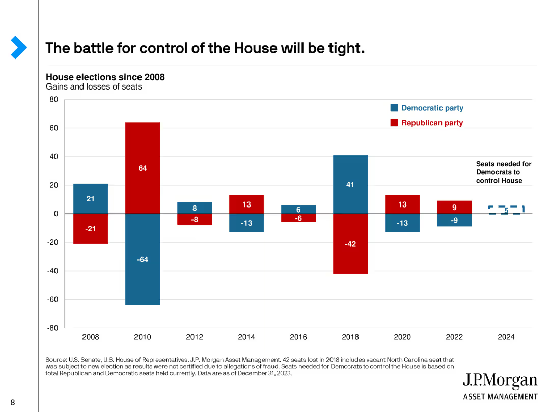
This slide features a bar chart showing the gains and losses of seats in the House of Representatives by party since 2008, with red for Republicans and blue for Democrats.
Market Analysis and Trends
Government & Public Sector
Discusses the competitive nature of the House of Representatives elections, showing historical gains and losses for each party and the current balance of power.
House, Representatives, Elections, Gains, Losses
Single Chart
JP Morgan
Saved
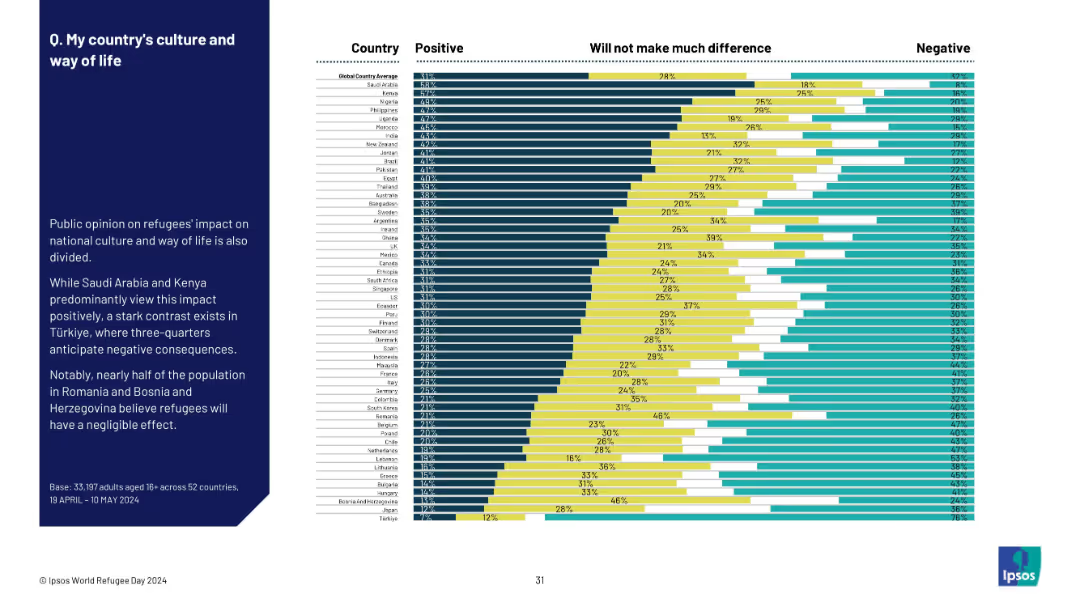
Similar visual style: bar chart by country with summary on the left; divided by impact perception.
Market Analysis and Trends
Government & Public Sector
This slide shows how public opinion on refugees' impact on national culture varies by country. While Saudi Arabia and Kenya are optimistic, countries like Türkiye are more negative. Bosnia sees the impact as mostly neutral.
refugees, culture, national identity, public opinion, Ipsos, global perception, sentiment, national values, integration
Mixed Chart
IPSOS
Saved
Features column charts showing the growth of loans originated and deposits, with a side bar detailing key attributes of the Marcus platform. The design is clean, with visual emphasis on data points.
Product and Service Analysis
Financial Services
Highlights the performance of Marcus, a consumer lending platform, with emphasis on technology, risk management, and growth since its inception, as well as customer-friendly features and deposit growth.
Marcus, Consumer Lending, Technology, Risk Management, Growth, Deposits, Loans Originated, Customer Experience, NerdWallet
Multiple Chart
Goldman Sachs
Saved
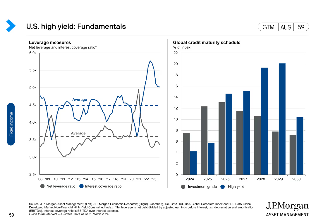
The slide features two charts: a line chart on the left showing net leverage and interest coverage ratio, and a column chart on the right showing global credit maturity schedule.
Market Analysis and Trends
Financial Services
It presents fundamental data on U.S. high-yield bonds, including leverage and maturity schedules, useful for analyzing financial health and risks in the high-yield market.
high yield, fundamentals, leverage, maturity, credit
Multiple Chart
JP Morgan
Saved
This slide consists of four column charts contrasting average attendances for final order finalisation in FCoA and FCC, split into non-trial and trial attendances, annotated with percentage differences. The design is clear with red and yellow colors.
Regulatory and Compliance
Government & Public Sector
The slide analyzes court attendances per final order finalisation, revealing a stark contrast between trial and non-trial cases, and between FCoA and FCC, suggesting a double attendance requirement for FCoA litigants proceeding to trial.
court attendances, trial, non-trial, FCoA, FCC, final order finalisation
Mixed Chart
PwC/Strategy&
Saved
The slide has a title at the top, six paired bars (column charts) with projections for 2021, 2030 high case, and 2030 base case. Below each pair is the name of a Southeast Asian country. On the right side are bulleted points with projections for each country’s internet economy growth. The slide is clean, with a white background and blue elements.
Market Analysis and Trends
Technology & Software
This slide provides a comparison of the projected internet economy GMV in various Southeast Asian countries for 2030. It serves as an analytical tool for understanding the potential economic scale and growth in different SEA markets, making it useful for strategic planning and investment decisions targeting these regions' internet economies.
SEA, GMV, 2030, Internet Economy, Growth Projections, Indonesia, Malaysia, Philippines, Singapore, Thailand, Vietnam
Multiple Chart
Bain
Saved
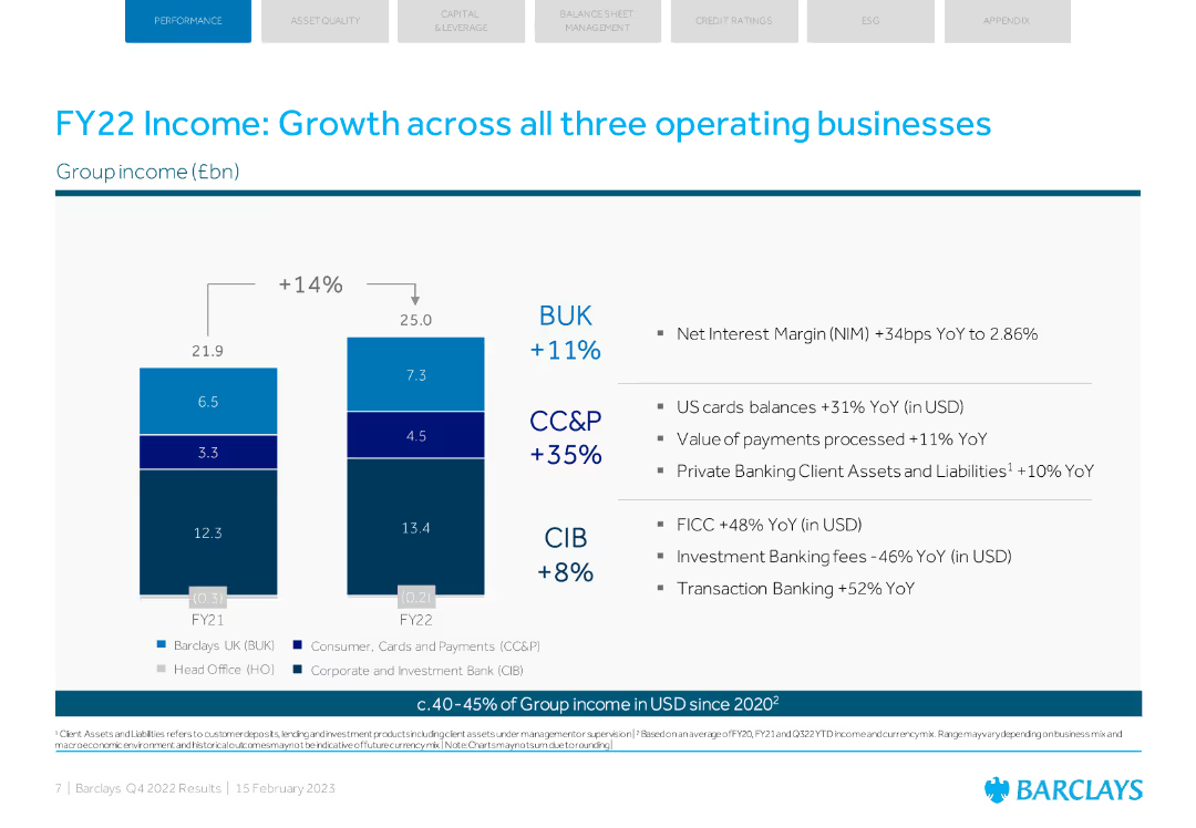
The slide includes a column chart showing income growth across different business units with supporting bullet points. The layout is clear and professional with blue and white colors.
Financial Performance
Financial Services
The slide showcases FY22 income growth across Barclays' business units, emphasizing a 14% overall increase and specific growth metrics for each unit.
income growth, business units, Barclays, FY22, financial performance
Mixed Chart
Barclays
Saved
Includes a column chart for sustainable finance volumes, lists, and bullet points highlighting key activities and achievements.
Operational Efficiency
Environmental Services & Sustainability
Highlights Deutsche Bank's Q1 2023 sustainability efforts, focusing on increased finance volumes, new policies, and significant achievements in promoting sustainability in banking practices.
sustainability, finance volumes, policies, Q1 2023, banking
Mixed Chart
Deutsche Bank
Saved
Includes a column chart and text describing trends in satellite payload manufacturing and launches globally.
Market Analysis and Trends
Technology & Software
Explores global trends in the Earth Observation upstream market, including investments and technological advancements.
Market trends, satellite payloads, global scale, investments
Mixed Chart
PwC/Strategy&
Saved
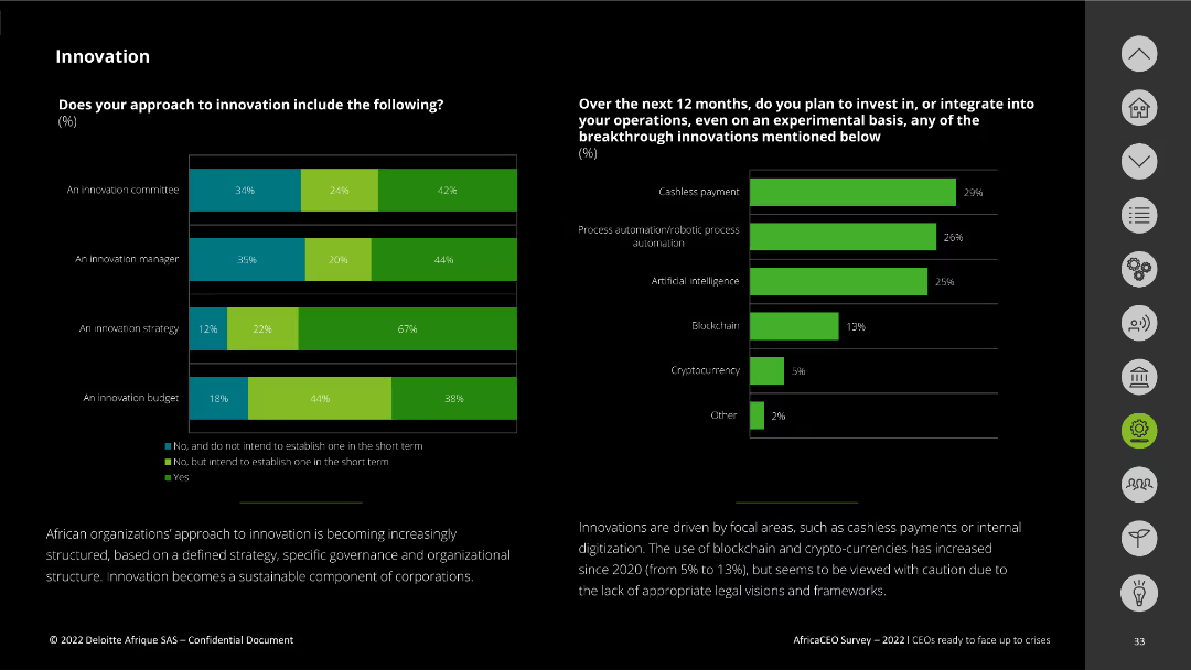
The slide includes two bar charts. The first chart shows the presence of innovation-related roles and strategies within companies. The second chart highlights planned investments in technological innovations over the next 12 months.
Technology and Digital Transformation
Technology & Software
This slide assesses the inclusion of innovation roles and strategies in companies and planned investments in technology such as cashless payments, process automation, AI, blockchain, and cryptocurrency. It highlights the strategic importance of innovation.
innovation, strategy, investment, technology, digital transformation
Multiple Chart
Deloitte
Saved
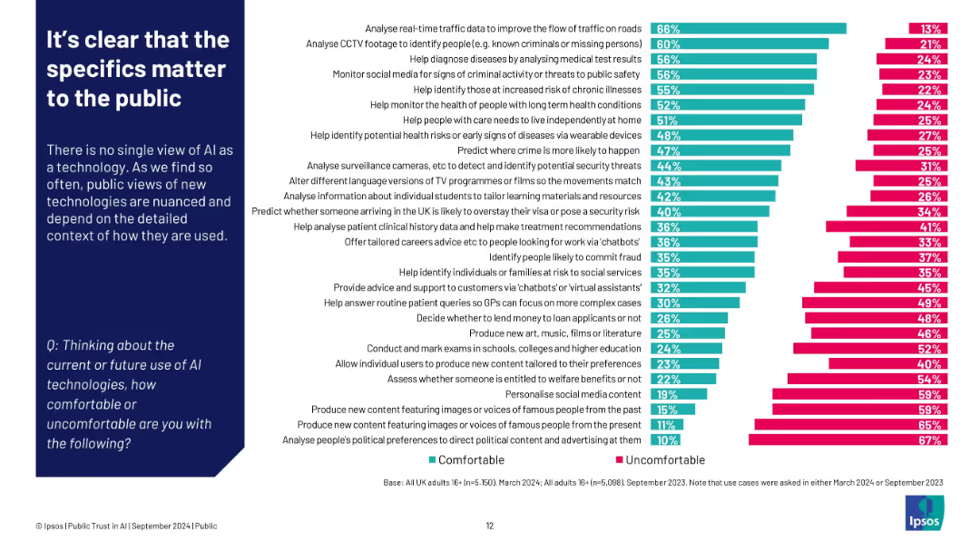
Left: paragraph explaining context dependence; right: bar chart ranking comfort vs discomfort by use case
Customer and Market Segmentation
Artificial Intelligence
Public comfort with AI varies greatly depending on its application. People feel most comfortable when AI supports societal needs (e.g., traffic, healthcare), but uncomfortable with tasks involving content creation, surveillance, or political manipulation.
AI use cases, public comfort, Ipsos, detailed context, segmentation, content creation, healthcare
Single Chart
IPSOS
Saved
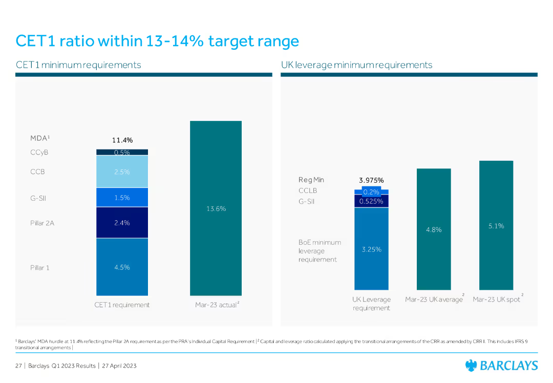
The slide includes two column charts; one for CET1 minimum requirements and another for UK leverage minimum requirements, showing various regulatory levels and actual values.
Financial Performance
Financial Services
The slide provides a detailed breakdown of the CET1 ratio requirements and actual performance, emphasizing regulatory minimums and the current status within the target range for capital adequacy.
CET1, target range, leverage, regulatory, financial
Multiple Chart
Barclays
Saved
A stacked column chart showing household wealth distribution by asset type and a column chart showing the average household savings rate by region.
Market Analysis and Trends
Financial Services
The slide provides a comparison of household wealth distribution by asset type across different countries and the average household savings rates in Asia versus other regions.
household wealth, savings rate, asset type, financial comparison, regions, economic trends, Asia, global, wealth distribution, financial insights
Multiple Chart
JP Morgan
Saved
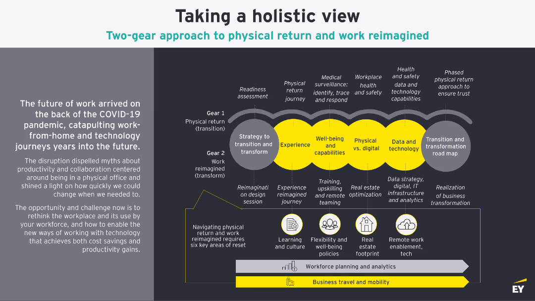
This slide features a detailed diagram illustrating a two-gear approach to physical return and work reimagined. It includes various sections and icons that represent different phases and components of the strategy.
Strategic Planning
Professional Services
The slide discusses how COVID-19 has accelerated changes in the workplace, focusing on physical return and reimagined work strategies. It outlines phases and key areas of reset required for this transition.
COVID-19, workplace, strategy, return, reimagined
Boxed
EY
Saved
The slide includes two charts. The left scatter plot shows allowed returns versus inflation, and the right column chart shows household utility spending trends.
Financial Performance
Energy & Utilities
It compares utility allowed return on equity against CPI changes and analyzes household utility spending as a percentage of personal consumption.
utility, profitability, consumption, returns, inflation, spending, equity, CPI, household
Multiple Chart
JP Morgan
Saved
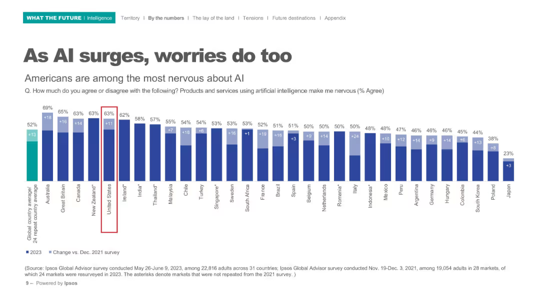
Horizontal bar chart with comparison of global nervousness about AI products/services; dark blue bars on white background.
Risk Assessment and Management
Artificial Intelligence
Depicts nervousness levels around AI across 31 countries, highlighting the U.S. as one of the most apprehensive. Bar chart includes percentage increase from 2021 to 2023.
AI concerns, public perception, international comparison, nervousness, Ipsos, technology anxiety, 2023 survey
Single Chart
IPSOS
Saved
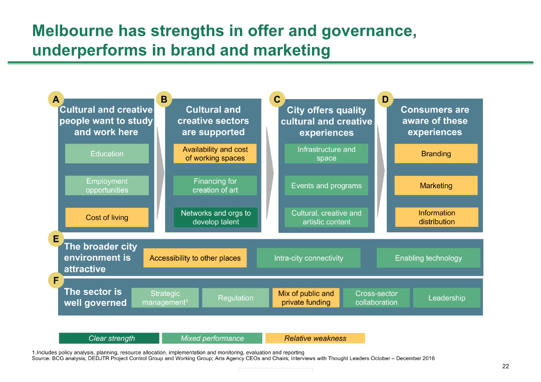
Grid with six categories of metrics; color-coded for strengths, mixed performance, and weaknesses
Market Analysis and Trends
Hospitality & Tourism
Analyzes Melbourne's strengths and weaknesses in various aspects of cultural and creative sector performance
Melbourne strengths, governance, cultural sectors, performance analysis, city metrics
Diagram
BCG
Saved
The slide presents a line chart with projections from 2019 to 2023F, marked with data points and growth percentages.
Market Analysis and Trends
Retail & E-commerce
This slide provides a forecast for the personal luxury goods market, showing projected recovery trends from 2019 through 2023 with an emphasis on COVID-19 impacts.
luxury, market, forecast, COVID-19, growth
Mixed Chart
Bain
Saved
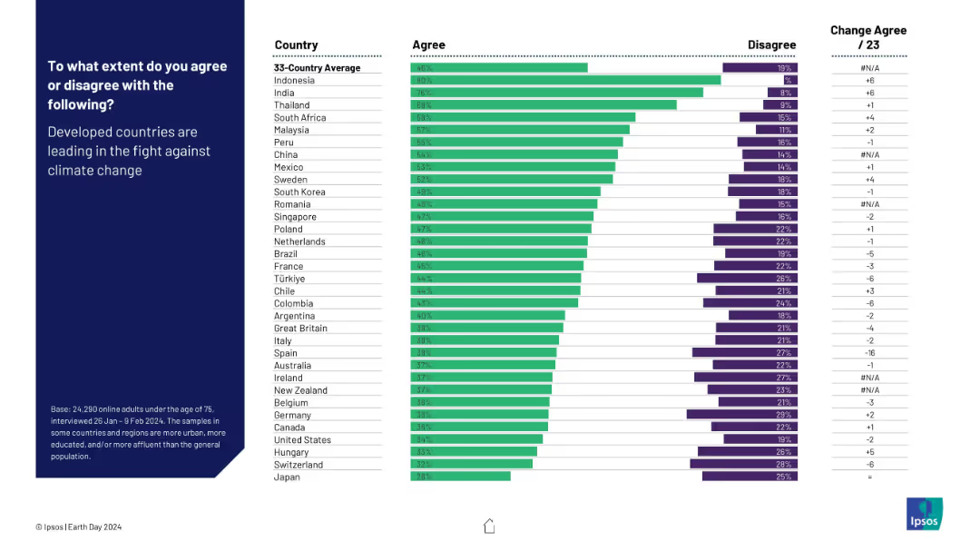
Horizontal bar chart comparing country-level agreement and disagreement on whether developed countries are leading the climate fight. Includes change from 2023.
Competitive Landscape
Environmental Services & Sustainability
This slide examines perceptions of leadership in the climate crisis. Developing countries (like Indonesia and India) show high agreement, while developed nations display skepticism. It highlights disparities in trust and accountability perceptions regarding global climate leadership.
climate leadership, developed countries, perception, public opinion, environment, global roles, Ipsos, Earth Day
Mixed Chart
IPSOS
Saved
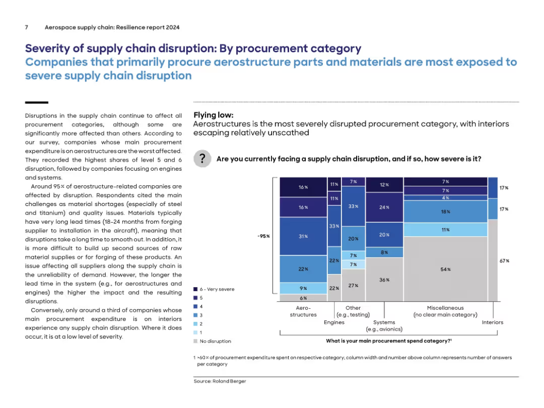
Similar layout to previous slide, now segmented by procurement categories; stacked bar chart on right with color-coded severity levels by category.
Risk Assessment and Management
Environmental Services & Sustainability
Aerostructure-related procurement is the most disrupted category, with 95% of companies affected. Disruptions are driven by material shortages (e.g., steel, titanium), long lead times, and quality issues. By contrast, interiors experience far fewer disruptions. The chart compares severity of supply chain disruption across categories like engines, systems, and miscellaneous.
procurement, aerostructures, supply chain, engines, severity, disruption, lead time, materials
Mixed Chart
Roland Berger
Saved
Features a bar chart displaying the share of podcast ad revenue by ad placement (pre-roll, mid-roll, post-roll) from 2019 to 2021, showing growth in pre-roll ad placement.
Market Analysis and Trends
Media & Entertainment
Discusses the adaptation of podcasters to increased ad demand, particularly through the use of more pre-roll ads over the years.
Podcast, Ads, Placement, Trends
Single Chart
PwC/Strategy&
Saved
Previous
Next
If nothing, comes up, please save your slides first
Create a FREE account to continue browsing
Receive Instant Access to 1,000+ slides from companies like McKinsey, Google, and Goldman Sachs
First Name
Last Name
Email
Password
I agree to all
Terms & Privacy Policy
Thank you! Your submission has been received!
Oops! Something went wrong while submitting the form.
Have an account?
Sign in
Column Chart
Heatmap
Chevron
Org Chart
Infographic
Callouts
Timeline
List
Graphic
Picture
Process Flow
Diagram
Paragraph
Map
Table
Framework
Subtitle
Takeaway Box
Icon
Other Chart
Radar Chart
Waterfall Chart
Mekko Chart
Pie Chart
Scatter Plot
Line Chart
Bar chart
Bullet points