Create a FREE Account
Instant access to 1,000+ real slides from top companies like McKinsey, BCG, Goldman Sachs, Google and many more!
First Name
Last Name
Email
Password
I agree to all
Terms & Privacy Policy
Thank you! Your submission has been received!
Oops! Something went wrong while submitting the form.
Have an account?
Sign in
Library
Templates
Courses
Pricing
My Account
My Slides
My Templates
✦ AI
AI Prompt Library
AI Search
Sign in
Start Here
Logout
My Saved Slides
The slide presents two sets of column charts. The left chart shows a slight increase in technology expenses from 2019 to 2022. The right side shows infrastructure costs remaining steady from 2015 to 2021 alongside a dramatic doubling of compute and storage volumes. Each chart includes annotations like percentage changes.
Financial Performance
Financial Services
The slide illustrates control over banking operational expenses against a backdrop of doubling technology volumes, indicating efficient resource allocation.
Banking, Expense Management, Technology Investment, Operational Efficiency, Growth, Infrastructure, Financial Services, Cost Control, Computational Volume, Scalability
Multiple Chart
JP Morgan
Saved
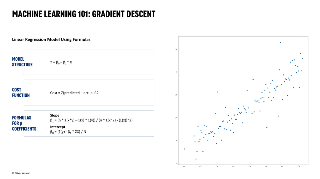
Left half shows linear regression formulas and cost function breakdown; right half displays a raw scatterplot. Simple and clean black-and-blue academic-style layout.
Technology and Digital Transformation
Artificial Intelligence
This introductory slide explains gradient descent using a linear regression example. It defines the model equation, cost function, and formulas for computing coefficients. A raw scatterplot helps visualize the data points the model is intended to fit. This slide is foundational and educative in nature.
gradient descent, machine learning, regression, cost function, linear model, scatterplot, formula
Single Chart
Oliver Wyman
Saved
The slide showcases a dashboard with multiple data visualizations, including line and bar charts, detailing customer debt, active debt, and highest debt customers.
Financial Performance
Energy & Utilities
This slide details customer debt metrics, including total debt amount, active debt, and highest debt customers, presented through various graphical elements for clear understanding.
customer debt, active debt, highest debt, utilities, metrics
Multiple Chart
EY
Saved
Features multiple column charts detailing the revenue share within the DTC sector by category from 2019 to 2020, highlighting Health/Wellness.
Market Analysis and Trends
Media & Entertainment
Focuses on the DTC sector within podcast advertising, underlining the continued dominance of the Health/Wellness category.
DTC, health/wellness, podcast advertising, revenue share, 2019-2020
Single Chart
PwC/Strategy&
Saved
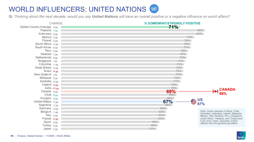
Horizontal bar graph showing international views on the UN’s influence
Market Analysis and Trends
Government & Public Sector
Depicts positive perception of the United Nations across countries. Canada (69%) and the U.S. (67%) both fall slightly below the global average (71%). Change from previous year is indicated for each country.
United Nations, public opinion, global sentiment, Canada, US, Ipsos, UN influence, future impact, world affairs, trends
Single Chart
IPSOS
Saved
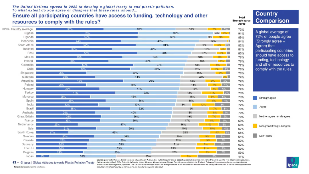
Country comparison via horizontal stacked bars with clear response categories.
Regulatory and Compliance
Environmental Services & Sustainability
The slide explores support across nations for ensuring equitable access to resources for treaty compliance. Highest support comes from Nigeria, Uganda, and South Africa. The global average for agreement is 72%.
global equity, treaty implementation, resource access, plastic rules, funding support, Ipsos survey, environmental policy, country views
Mixed Chart
IPSOS
Saved
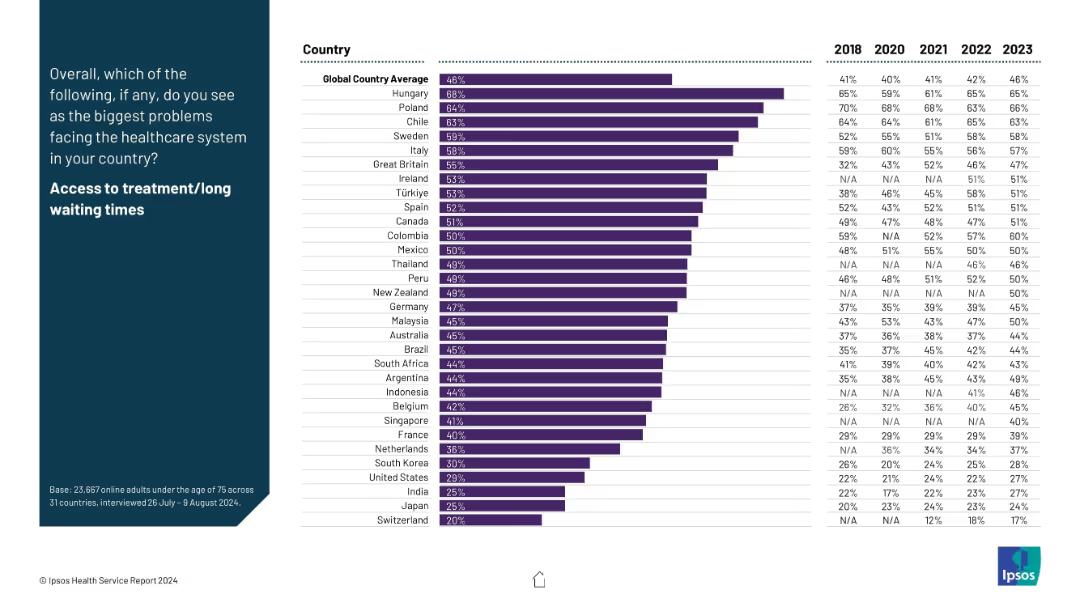
Bar chart showing agreement with this specific problem across countries, with historical data from 2018 to 2023.
Risk Assessment and Management
Healthcare & Pharmaceuticals
This slide details perceptions around treatment accessibility and long wait times, considered one of the most pressing healthcare issues. The data spans multiple years and highlights which countries report it most often as a concern.
healthcare access, waiting times, global comparison, Ipsos, system pressure, trend, treatment delays
Mixed Chart
IPSOS
Saved
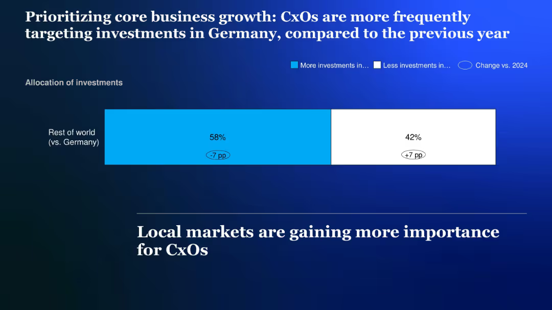
Horizontal stacked bar chart showing investment shifts between Germany and the rest of the world; color-coded bars on a blue gradient background
Strategic Planning
Financial Services
The slide shows that CxOs are increasingly prioritizing investments in Germany over international markets, reflecting a +7 percentage point increase in domestic investment focus.
Investment shift, Germany, local market, core business, allocation, CxOs, prioritization
Single Chart
McKinsey
Saved
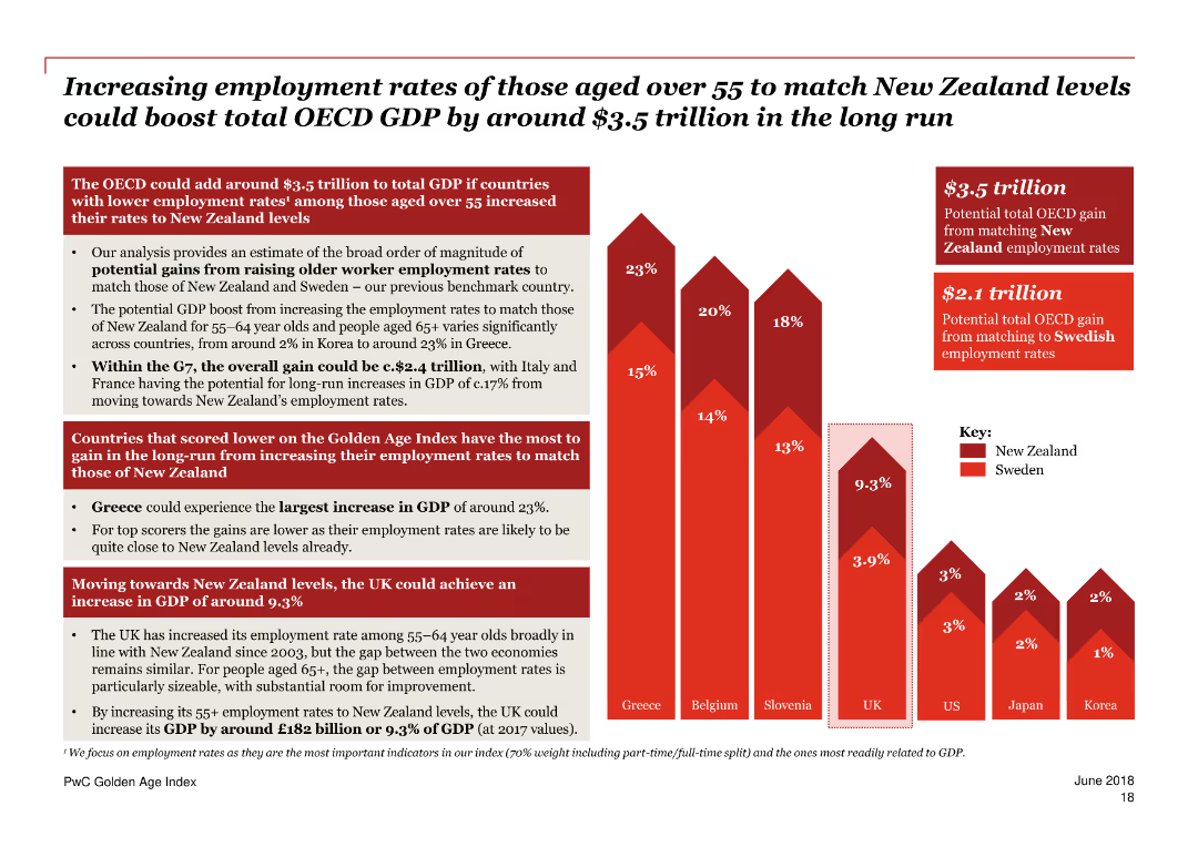
A column chart with varying shades of red, showing potential GDP boost percentages for different countries.
Market Analysis and Trends
Government & Public Sector
Highlights countries scoring lower on the Golden Age Index that have the most to gain from boosting employment rates for older workers to New Zealand levels.
GDP boost, Golden Age Index, employment, older workers, New Zealand, countries, comparison, trends, analysis, potential gains
Mixed Chart
PwC/Strategy&
Saved
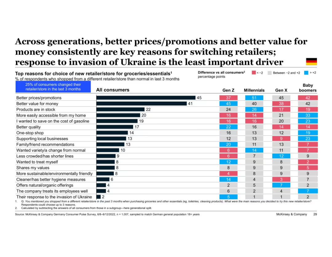
Table displaying generational comparison of reasons for switching retailers; color-coded differences from average and German flag included
Customer and Market Segmentation
Retail & E-commerce
This slide breaks down the generational drivers for switching grocery retailers in Germany. All generations cite price and value as key drivers. Baby boomers prioritize accessibility and promotions, while Gen Z is more influenced by values and ethical stances. The Ukraine conflict was least influential across all groups.
generational comparison, price sensitivity, retailer switching, value for money, promotions, Gen Z, baby boomers, Germany
Multiple Chart
McKinsey
Saved
The slide contains a mix of text and column charts. The left side has a textual overview while the right side includes two column charts with horizontal bars.
Risk Assessment and Management
Financial Services
The slide discusses the top emerging risks identified by CROs, including climate change and AI, and how these risks are viewed by risk organizations and boards.
Emerging risks, CRO, climate change, AI, risk management
Multiple Chart
EY
Saved
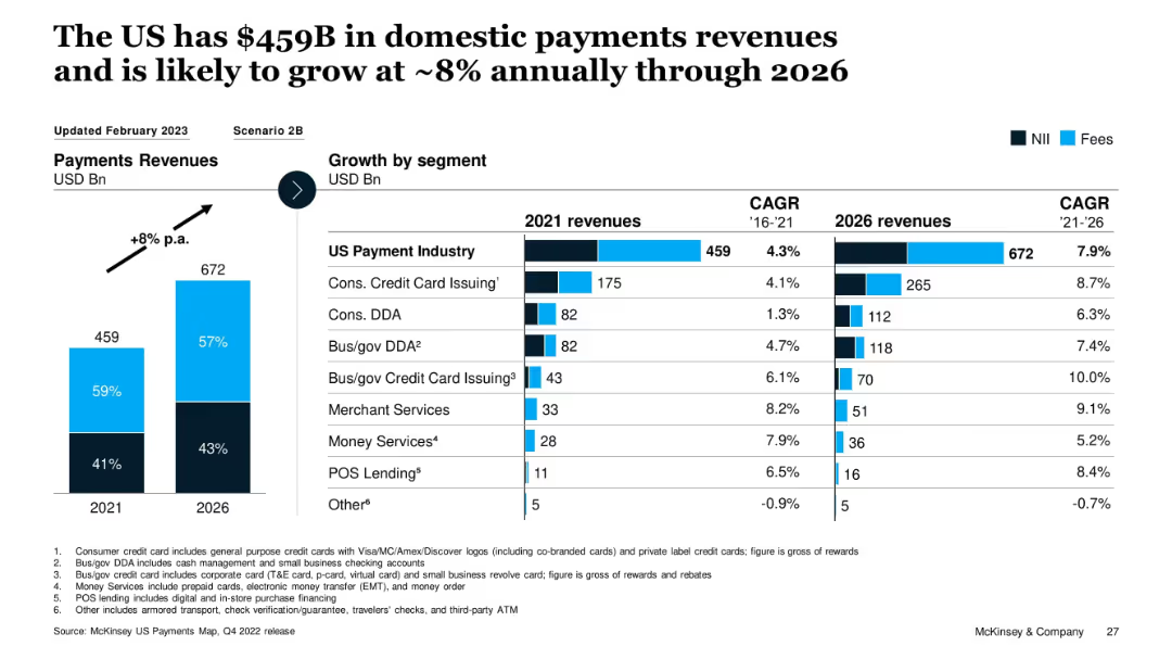
Vertical bar graph with growth projections and CAGR table by segment; color-coded NII and Fees split
Market Analysis and Trends
Financial Services
This slide shows the current and projected revenue for the US payments industry, expecting growth from $459B in 2021 to $672B by 2026 (~8% CAGR). It breaks down growth by segment, with high growth seen in POS Lending, Merchant Services, and Bus/gov Credit Card Issuing. Segment-wise CAGR from 2021–2026 is also provided.
payments, revenue growth, POS, CAGR, segments, forecast, McKinsey, fees, interest income, US market
Multiple Chart
McKinsey
Saved
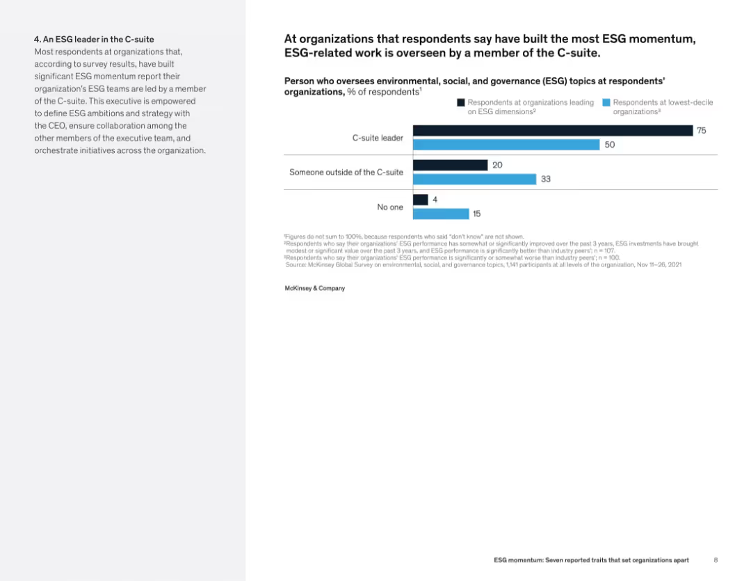
Left-aligned text alongside a horizontal bar chart showing who manages ESG at leading vs. lagging organizations.
Organizational Structure and Change
Professional Services
This slide indicates that C-suite leadership is a hallmark of high-performing ESG organizations. 75% of such firms have ESG led by C-level executives, compared to just 50% of bottom performers. The data suggests that senior oversight enhances ESG outcomes.
ESG governance, executive leadership, C-suite, organizational structure, ESG performance, oversight roles
Mixed Chart
McKinsey
Saved
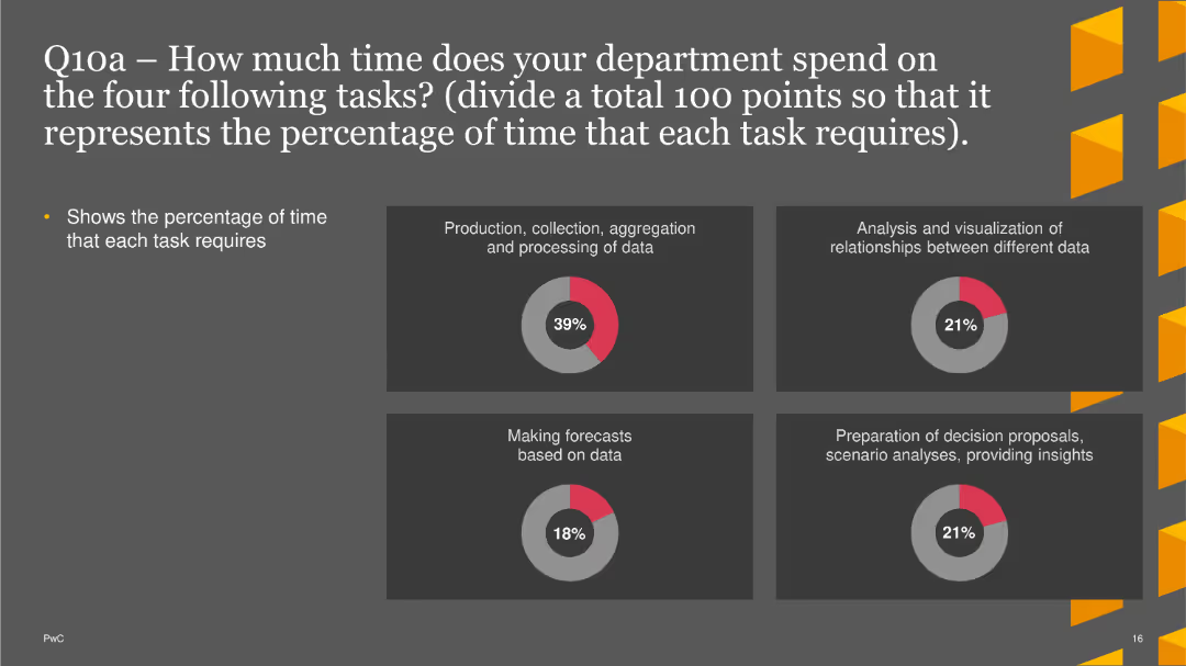
Four pie charts showing the percentage of time required for different tasks in five years. Each chart is labeled with a task and its corresponding percentage
Strategic Planning
Financial Services
This slide asks about expectations for time allocation in five years for tasks like data processing, analysis, forecasting, and decision-making.
strategic planning, time allocation, future tasks, data processing, decision-making
Multiple Chart
PwC/Strategy&
Saved
This column chart has a blue color scheme with contrasting green and red markers indicating increases and decreases in ROE from 2018 to 2019. Two large vertical columns represent ROE percentages for each year, with smaller markers above and below the main columns represent contributing factors to the ROE change.
Financial Performance
Financial Services
The slide is titled "ROE decreased from 15.9% in 2018 to 14.0% in 2019, primarily driven by capital." It visualizes ROE change and contributing factors such as revenue, rates, expenses, and credit costs. Each factor's impact is quantified with percentages.
ROE, financial, capital, revenue, rates, expenses, credit cost, decrease, JPMorgan Chase & Co.
Single Chart
JP Morgan
Saved
A split-layout design with two content blocks for text. It uses a blue and grey color scheme with bulleted lists to present information. The layout is simple and focuses on textual information.
Risk Assessment and Management
Financial Services
Discusses the short-term factors affecting different sectors of the company, useful for risk management and forecasting. It provides an analysis of the impact of market conditions on various business areas.
Short-Term Outlook, Annuities, Market Conditions, Risk Management, Banking
Table
Goldman Sachs
Saved
The slide features bar charts showing US consumer behavior in terms of price sensitivity (sticker shock) and substitutability (trading down) from March 2022 to February 2023. Commentary on the right explains observed trends.
Market Analysis and Trends
Consumer Goods
The slide analyzes US consumer behavior under inflationary pressures, showing reduced price sensitivity and trading down trends since early 2023. It suggests that consumers are still cautious about prices despite slight easing of headline inflation.
US consumer behavior, price sensitivity, inflation, trends, trading down
Multiple Chart
Accenture
Saved
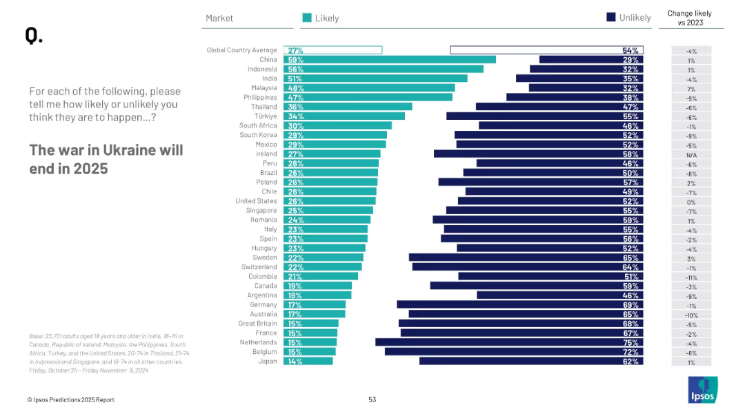
Bar chart showing countries' perceived likelihood; vertical list of countries with teal and navy bars; clean white background
Strategic Planning
Government & Public Sector
This slide depicts survey responses about the expected end of the Ukraine war in 2025. The results are sorted by percentage of people per country who consider it likely, with trends vs. 2023 included for comparison.
Ukraine war, 2025 prediction, global views, peace, likelihood, international sentiment, Ipsos, geopolitics
Mixed Chart
IPSOS
Saved
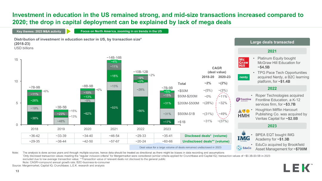
A stacked column chart detailing the distribution of investment in the US education sector by transaction size from 2018 to 2023. It highlights large deals and their impact on overall investment patterns.
Market Analysis and Trends
Education & Training
The slide presents the distribution of investments in the US education sector, focusing on transaction sizes and their influence on the market. It also lists major transactions within the time frame.
investment distribution, US education, transaction size, major deals, investment patterns
Mixed Chart
LEK
Saved
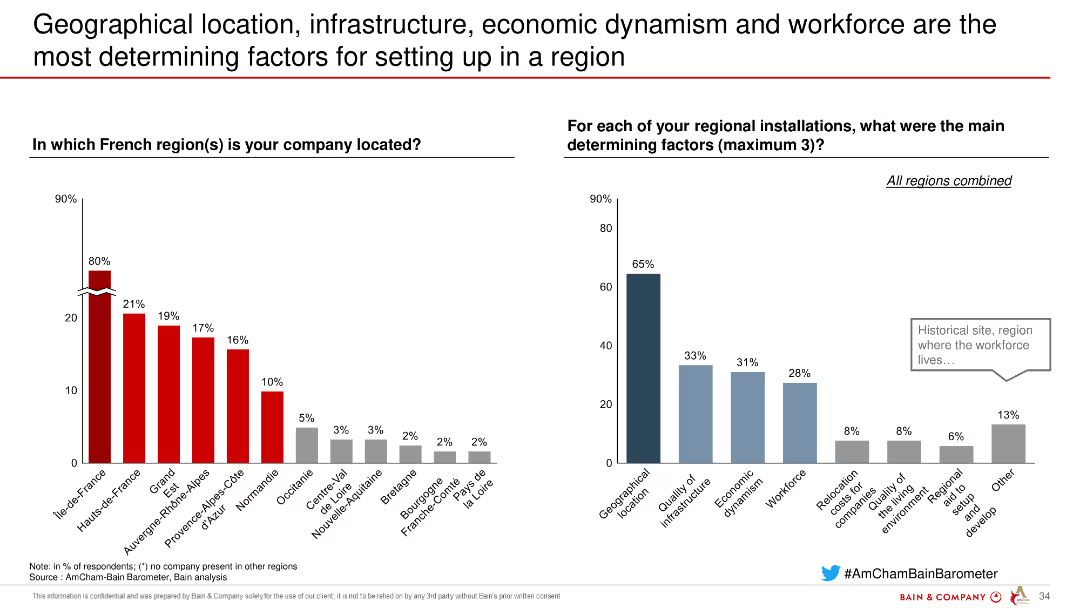
Two column charts showing factors for choosing a location in French regions, highlighting the importance of geographical location and infrastructure.
Strategic Planning
Industrial & Manufacturing
Highlights the key factors influencing company location decisions in French regions, emphasizing geographical and infrastructural considerations based on respondent data.
location, infrastructure, economic, workforce, factors
Multiple Chart
Bain
Saved
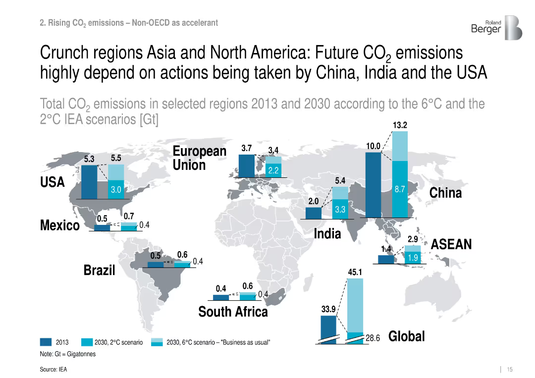
World map with vertical bar comparisons for CO₂ emissions by region (2013, 2030 2°C/6°C).
Risk Assessment and Management
Environmental Services & Sustainability
Highlights key countries driving future CO₂ emissions, stressing the role of the US, China, and India under different climate action pathways.
regional CO₂, emissions forecast, climate policy, Asia, North America
Mixed Chart
Roland Berger
Saved
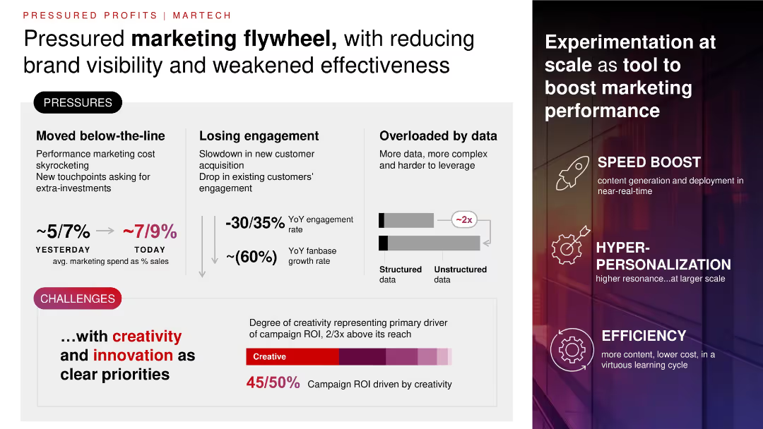
Split layout with left panel showing challenges (text + data), right panel showing solutions (icons + keywords); muted background with gradient overlay.
Product and Service Analysis
Consumer Goods
Details challenges in marketing efficiency—rising spend, lower engagement, data overload. Advocates for experimentation, personalization, and creative ROI to boost campaign impact. Emphasizes creativity's disproportionate contribution to ROI.
marketing, ROI, creativity, engagement, personalization, data overload, spend
Multiple Chart
Bain
Saved
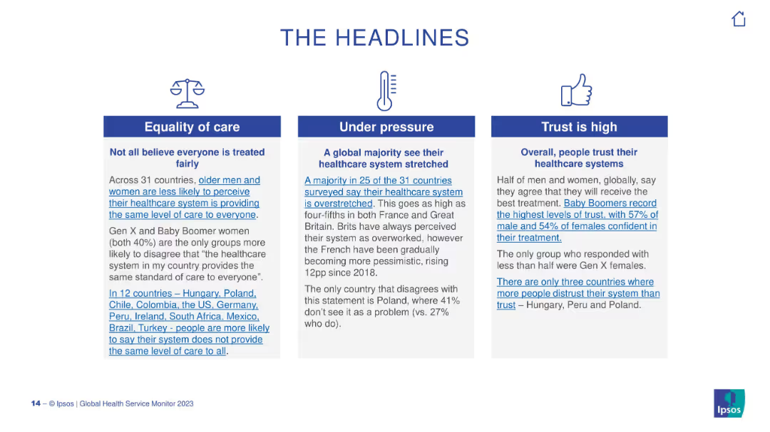
Three-column layout with icons above short paragraphs. Each column presents a headline topic on healthcare themes.
Strategic Planning
Healthcare & Pharmaceuticals
The slide highlights three main insights from the global healthcare survey: inequality in care, system overstretch, and public trust. It emphasizes that older generations and some countries report lower trust and fairness in their systems.
healthcare, trust, access, equity, global survey, system pressure, Ipsos, public opinion
Pillar
IPSOS
Saved
This slide is divided into two main columns. The left side has two purple boxes with bullet points, each labeled as 'Infrastructure' and 'Resiliency'. The right side has two teal boxes, labeled 'Client Experiences' and 'Teammate Experiences'. There are four icon bullet points at the bottom.
Strategic Planning
Financial Services
The slide presents a technology strategy with a focus on modernizing infrastructure and enhancing client and teammate experiences. The content is strategically laid out to compare foundational improvements with benefits for users and employees.
Strategy, Technology, Infrastructure, Client Experience, Teammate Experience, Resiliency, Modernization
Table
Goldman Sachs
Saved
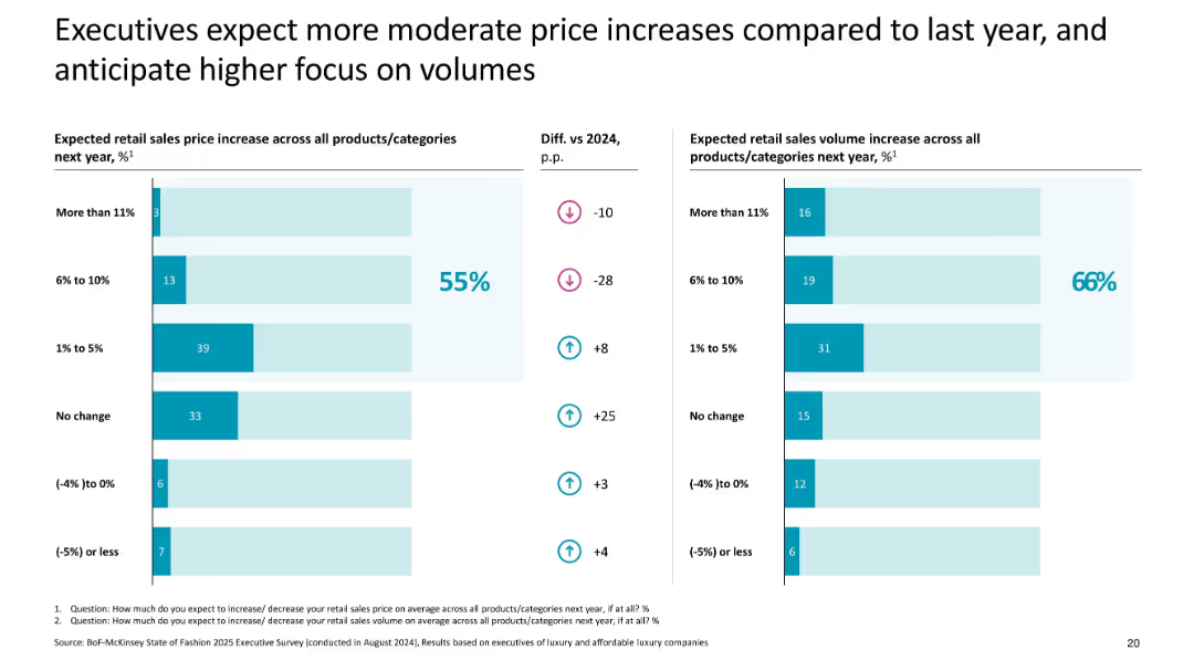
Dual bar charts with pricing and volume expectations; uses % comparisons and trend arrows
Pricing Strategies
Consumer Goods
Highlights expected moderation in retail price increases across luxury categories in 2025, with 55% of execs forecasting small increases and 66% expecting sales volume growth, shifting focus from pricing to volume.
pricing, volume, 2025 forecast, executive expectations, luxury, moderate increases, price strategy
Multiple Chart
McKinsey
Saved
Previous
Next
If nothing, comes up, please save your slides first
Create a FREE account to continue browsing
Receive Instant Access to 1,000+ slides from companies like McKinsey, Google, and Goldman Sachs
First Name
Last Name
Email
Password
I agree to all
Terms & Privacy Policy
Thank you! Your submission has been received!
Oops! Something went wrong while submitting the form.
Have an account?
Sign in
Column Chart
Heatmap
Chevron
Org Chart
Infographic
Callouts
Timeline
List
Graphic
Picture
Process Flow
Diagram
Paragraph
Map
Table
Framework
Subtitle
Takeaway Box
Icon
Other Chart
Radar Chart
Waterfall Chart
Mekko Chart
Pie Chart
Scatter Plot
Line Chart
Bar chart
Bullet points