Create a FREE Account
Instant access to 1,000+ real slides from top companies like McKinsey, BCG, Goldman Sachs, Google and many more!
First Name
Last Name
Email
Password
I agree to all
Terms & Privacy Policy
Thank you! Your submission has been received!
Oops! Something went wrong while submitting the form.
Have an account?
Sign in
Library
Templates
Courses
Pricing
My Account
My Slides
My Templates
✦ AI
AI Prompt Library
AI Search
Sign in
Start Here
Logout
My Saved Slides
The slide features column chart for revenue and net income, with lines illustrating return on equity (ROE) trends for different sectors. The columns are deep blue, while the lines are in purple and green, set against a white background. A red circle highlights a specific point of interest.
Financial Performance
Financial Services
The slide highlights JPMorgan's strong financial performance in 2019, showing increased revenue and net income. It details the company's return on equity (ROE) for different sectors with bar charts and line graphs, emphasizing their market position and successful business strategy in the financial sector.
JPMorgan, Financial Results, Revenue, Net Income, ROE, Bar Chart, Line Graph, Market Position, Business Strategy
Single Chart
JP Morgan
Saved
The slide utilizes a clean layout with icons and text to discuss key factors like Equity Story and Financial Reporting in IPO processes.
Strategic Planning
Financial Services
This slide discusses the key elements that maximize value in an IPO, including equity stories, financial reporting, and the importance of internal setup and partners.
IPO, value, equity, financial reporting, partners, transparency, control
Pillar
PwC/Strategy&
Saved
Column chart showing projected dividend growth over years. Information rich with forward-looking statements.
Financial Performance
Energy & Utilities
Projects long-term dividend growth, discussing factors that might influence future financial policies.
dividends, growth, financial, outlook, policy
Single Chart
Barclays
Saved
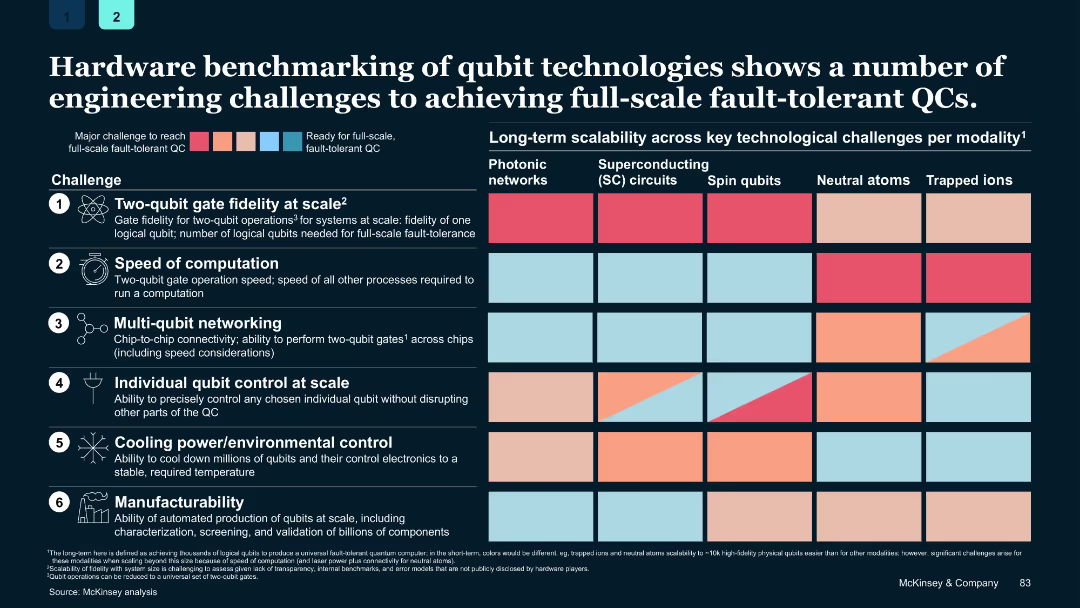
Grid-based chart with color-coded challenge levels per modality and modality categories in columns
Performance Metrics and KPIs
Technology & Software
Details six key engineering challenges for achieving full-scale fault-tolerant quantum computing and compares the readiness of various qubit technologies across these metrics.
quantum hardware, qubits, benchmarking, fault tolerance, scalability, engineering challenges
Single Chart
McKinsey
Saved
This slide features a bar chart showing the relevance of various SDGs among Danish executives, coupled with a key takeaway box emphasizing SDG 12, 8, 13, 9, and 3 as most relevant to businesses.
Market Analysis and Trends
Professional Services
The slide displays survey results from Danish executives highlighting the perceived relevance of SDGs to their businesses, emphasizing SDGs related to responsible production, economic growth, and climate action as most pertinent.
SDGs, survey, Danish executives, business relevance
Single Chart
McKinsey
Saved
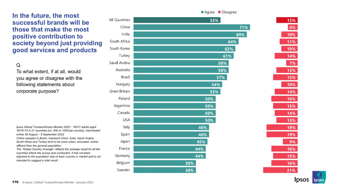
Bar chart presentation, horizontal country comparisons with green “Agree” and red “Disagree” bars
Strategic Planning
Consumer Goods
Respondents believe that brand success will hinge on societal contributions beyond just product/service quality. China, India, and South Africa show the strongest agreement, while Western Europe trails. The global average is 53% agreement.
brand success, social contribution, corporate purpose, Ipsos, consumer perception, CSR, societal value
Mixed Chart
IPSOS
Saved
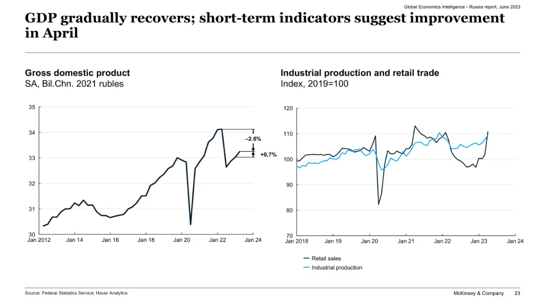
Side-by-side charts: GDP trend (left) and indexed industrial production vs. retail trade (right), Russia.
Market Analysis and Trends
Government & Public Sector
The slide shows a slight recovery in Russia's GDP and industrial output, following prior contractions. Retail sales and industrial production indicators show signs of improvement as of April, suggesting short-term economic stabilization despite previous volatility.
Russia economy, GDP recovery, industrial production, retail trade, short-term indicators, April improvement, economic stabilization
Multiple Chart
McKinsey
Saved
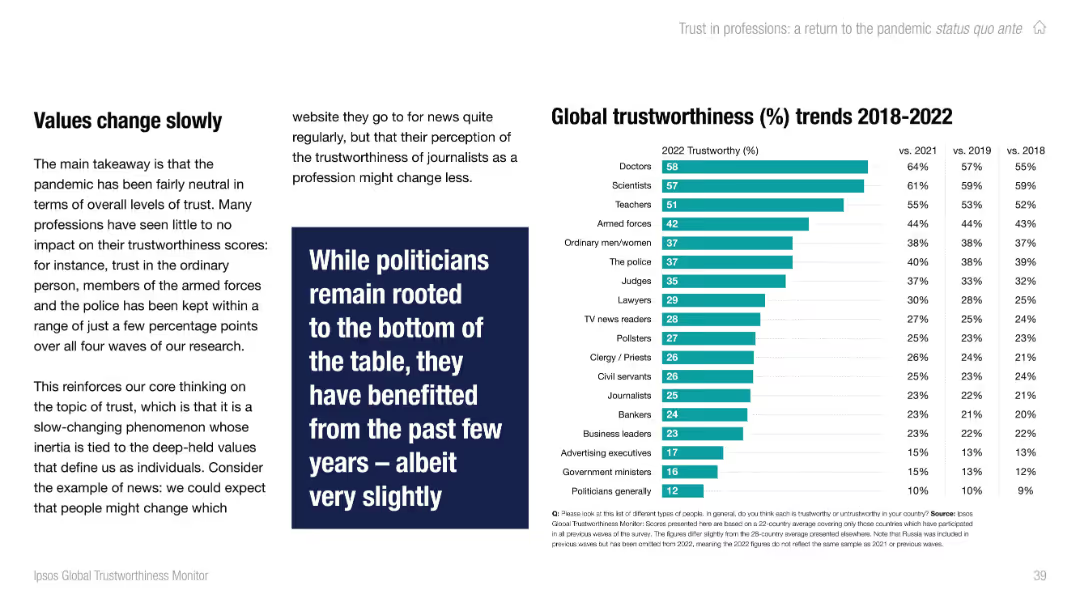
Left-aligned text with full-height vertical bar chart on the right showing trust ratings by profession. Teal color palette.
Performance Metrics and KPIs
Professional Services
This slide presents global trustworthiness scores for various professions from 2018–2022. Doctors and scientists rank highest in trust, while politicians and government ministers remain at the bottom. Changes since 2018 are relatively small, showing trust inertia.
trust, professions, global, Ipsos, doctors, scientists, politicians, stability, chart
Mixed Chart
IPSOS
Saved
Shows various graphs and charts detailing the segmentation of the European Earth Observation market over time.
Market Analysis and Trends
Technology & Software
Examines the changes and strategies within the European Earth Observation market, focusing on large satellite segments.
Market evolution, strategy, European EO market, satellite segmentation
Multiple Chart
PwC/Strategy&
Saved
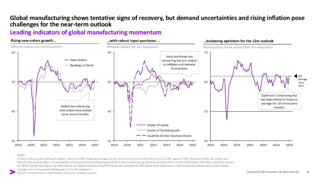
Three time-series charts (new orders, input purchases, output outlook) tracking manufacturing trends globally. Callouts and long-term average line.
Performance Metrics and KPIs
Industrial & Manufacturing
This slide presents key indicators of global manufacturing momentum—new orders, input purchases, and 12-month output outlook. While signs of recovery are emerging, challenges like inflation and demand uncertainty still cloud near-term expectations.
manufacturing, global, indicators, new orders, output, inflation, input
Multiple Chart
Accenture
Saved
Contains multiple column charts comparing the market share of different retail channels for luxury goods from 2014 to 2025, with an emphasis on the growth of online sales.
Technology and Digital Transformation
Retail & E-commerce
Analyzes the trend towards online shopping for luxury goods, projecting significant growth and integration with physical retail channels by 2025. Discusses how technology will enhance shopping experiences.
Online Shopping, Luxury Goods, Market Trends, Growth
Mixed Chart
Bain
Saved
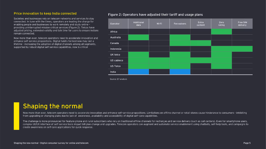
The slide includes a table comparing operators' tariff adjustments and a textual explanation. The visual elements are straightforward but informative.
Market Analysis and Trends
Telecommunications
The slide presents how various telecom operators have adjusted their tariff and usage plans to keep consumers connected during COVID-19.
tariff adjustments, telecom operators, COVID-19, India, connectivity, digital channels, pricing strategies, customer retention
Header Vertical
EY
Saved
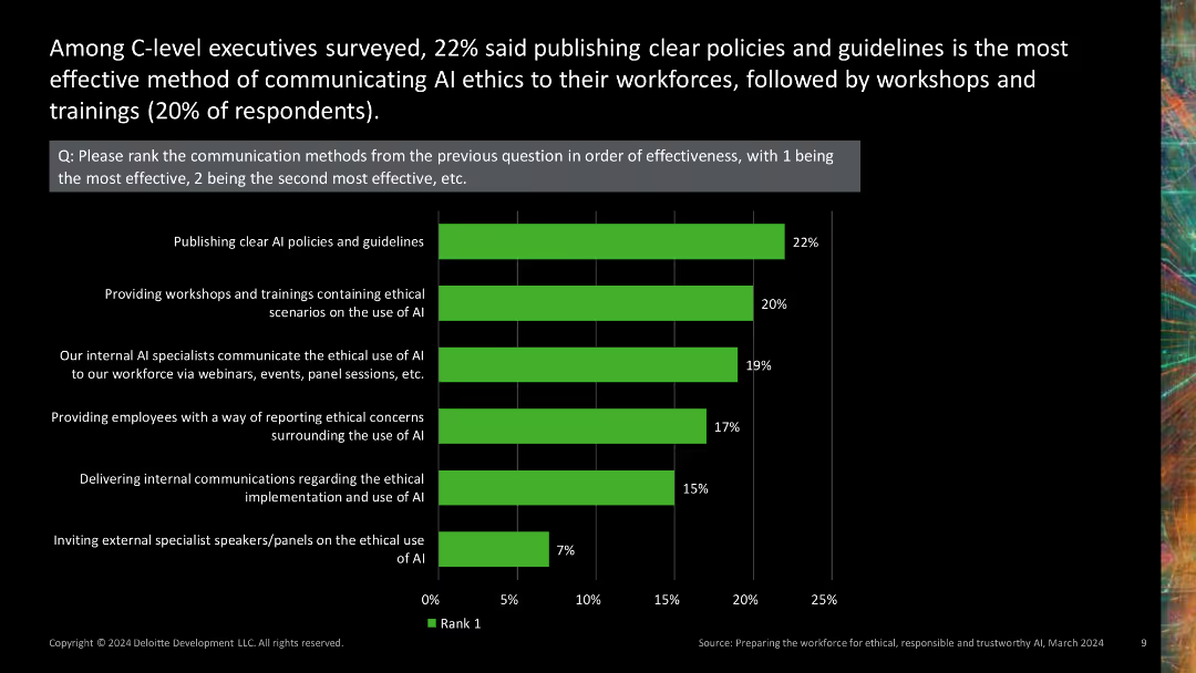
Column chart ranking the effectiveness of different AI ethics communication methods.
Regulatory and Compliance
Technology & Software
Ranks various methods of communicating AI ethics to the workforce, highlighting which methods are perceived as most effective by C-level executives.
AI ethics, communication effectiveness, ranking, workshops, guidelines
Single Chart
Deloitte
Saved
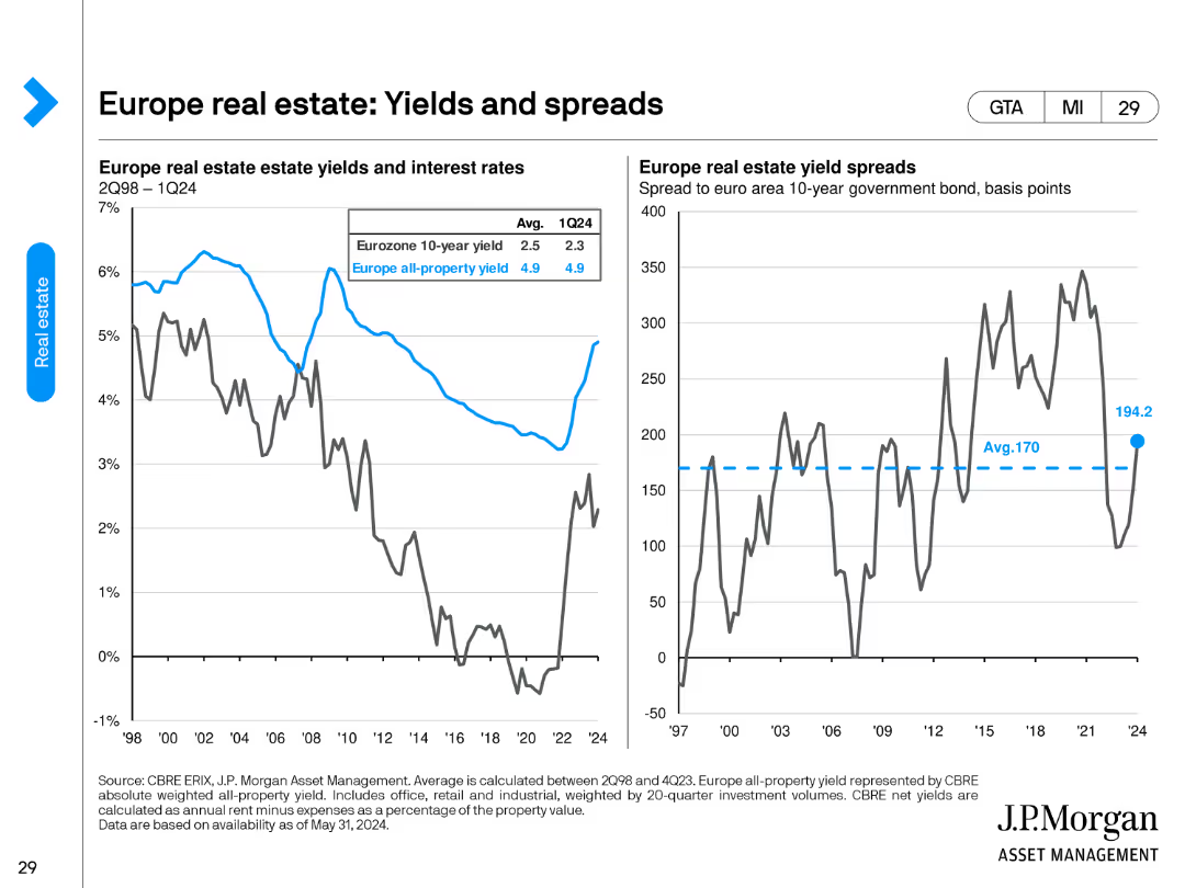
This slide features two column charts. The left chart compares Eurozone 10-year yield with all-property yield, while the right chart shows yield spreads.
Financial Performance
Real Estate & Construction
It compares Eurozone 10-year government bond yields with all-property yields, highlighting trends from 2Q98 to 1Q24, useful for investment analysis.
real estate, yields, spreads, Eurozone, investment, property, trends, analysis
Multiple Chart
JP Morgan
Saved
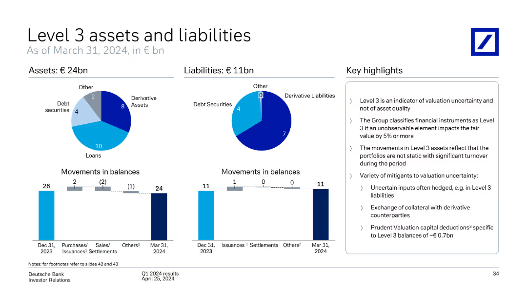
This slide includes pie charts and bar charts showing Deutsche Bank's Level 3 assets and liabilities, movements in balances, and key highlights as of March 31, 2024.
Financial Performance
Financial Services
The slide provides an overview of Deutsche Bank's Level 3 assets and liabilities as of March 31, 2024, detailing movements in balances and key highlights of the valuation and uncertainty of these assets.
Level 3 assets, liabilities, movements, balances, valuation, uncertainty, Deutsche Bank, March 31, 2024
Multiple Chart
Deutsche Bank
Saved
This slide shows a combination of text, a pie chart, and a column chart. The pie chart represents the split of new and long-term podcast listeners, while the column chart shows frequency and number of podcasts listened to.
Market Analysis and Trends
Media & Entertainment
The slide discusses the growth in podcast listenership and spending. It shows that half of daily podcast listeners started in the past two years and that they now spend significant time listening to podcasts, indicating a growing market.
Podcast growth, listener engagement, spending trends, Nielsen study, podcast market, new listeners, long-term listeners, daily listening habits, podcast revenue
Multiple Chart
Nielsen
Saved
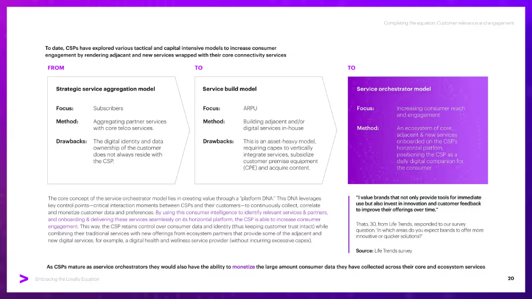
Three-column "FROM–TO–TO" visual structure with boxed content. Bottom has a paragraph block and a quote with purple highlights. Consistent use of purple theme and gradient for emphasis.
Strategic Planning
Telecommunications
Compares three CSP service models: aggregation, service build, and orchestrator. Emphasizes the orchestrator model’s benefit in owning data and driving engagement via a horizontal platform, providing tailored, adjacent services to customers.
CSP models, aggregation, platform DNA, engagement, monetization, orchestrator
Header Horizontal
Accenture
Saved
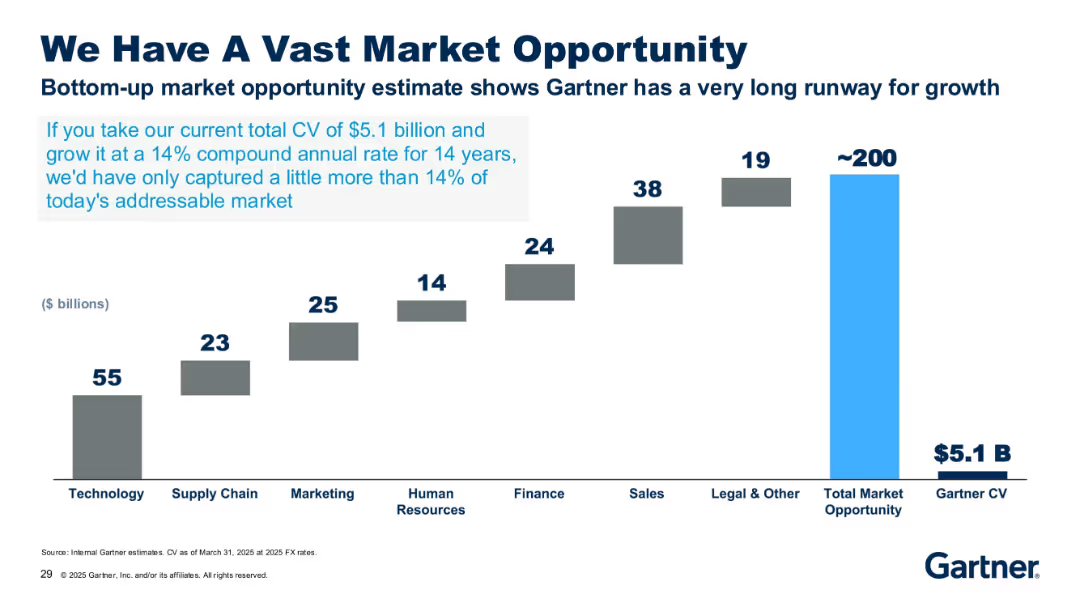
Bar chart with stepped grey bars and one bright blue bar, labeled with market size in billions.
Market Analysis and Trends
Technology & Software
The slide highlights Gartner’s potential market opportunity of ~$200B across several sectors, compared to its current $5.1B CV. It emphasizes the growth potential if Gartner continues growing at a 14% CAGR over 14 years.
market opportunity, CAGR, technology, finance, growth, Gartner, $5.1B, CV, potential, industry size
Single Chart
Gartner
Saved
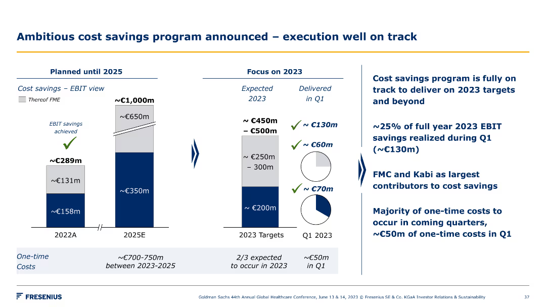
Bar chart illustrating cost savings from 2022 to 2025 and another chart focusing on 2023 targets. Bullet points detail the execution progress and main contributors to savings.
Operational Efficiency
Healthcare & Pharmaceuticals
This slide outlines Fresenius's ambitious cost savings program, highlighting the progress towards 2023 targets, main contributors to savings, and planned cost-saving measures.
cost savings, targets, execution, progress, savings
Multiple Chart
Goldman Sachs
Saved
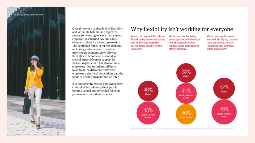
Combination of text and pie charts detailing women's dissatisfaction with work flexibility options and their perceived career impacts. Image of a professional woman on the left adds a visual context to the discussion.
Human Resources and Talent Management
Professional Services
The slide discusses why flexibility programs are not meeting the needs of women, highlighting statistics on dissatisfaction and negative career impacts for women taking advantage of flexible work options.
flexibility, women, career, dissatisfaction, work
Multiple Chart
PwC/Strategy&
Saved
The slide features a column chart with different colored sections representing the number of digital transformation projects. Another set of graphical rockets with different colors represents expected impacts of digital investments.
Market Analysis and Trends
Technology & Software
The slide examines how many digital transformation projects organizations have embarked on during the pandemic and the expected impacts of these investments.
digital transformation, investment, local market, projects, pandemic
Multiple Chart
EY
Saved
Contains a table and textual information arranged in a balanced format. Visual elements are used to represent data effectively, with contrasting colors for different categories and detailed annotations for clarity.
Investment Analysis
Environmental Services & Sustainability
Details the investment opportunities in project development for carbon credit trading in Indonesia and Malaysia, discussing the market size, potential profits, and strategic development opportunities in the forestry sector.
carbon credits, Indonesia, Malaysia, forestry, investment opportunities
Header Horizontal
Bain
Saved
A bar chart showing responses to an investment scam during the pandemic, with a small pie chart indicating whether respondents reported the scam to authorities.
Risk Assessment and Management
Financial Services
This slide covers how Canadian investors responded to investment scams during the pandemic, showing percentages of those who invested, realized it was a scam, or reported it to authorities.
scam, investment, pandemic, response, report
Multiple Chart
IPSOS
Saved
The slide has a dark background, a yellow text box for the quote, and a question followed by a bar chart illustrating percentages of consumers' openness to virtual care.
Customer and Market Segmentation
Healthcare & Pharmaceuticals
The slide discusses Canadian consumers' willingness to consider switching to virtual primary care consultations instead of in-person visits.
Virtual primary care, healthcare, consumer behavior, openness, Canada
Mixed Chart
EY
Saved
Features a timeline graphic showing the progression of contract values over years, along with icons representing different business sectors.
Market Analysis and Trends
Technology & Software
This slide presents the growth of Experian's Ascend platform, illustrating its increasing contract value over time and its potential in the analytics market.
Ascend platform, market growth, analytics, contract value, business expansion
Linear Flow
Barclays
Saved
Previous
Next
If nothing, comes up, please save your slides first
Create a FREE account to continue browsing
Receive Instant Access to 1,000+ slides from companies like McKinsey, Google, and Goldman Sachs
First Name
Last Name
Email
Password
I agree to all
Terms & Privacy Policy
Thank you! Your submission has been received!
Oops! Something went wrong while submitting the form.
Have an account?
Sign in
Column Chart
Heatmap
Chevron
Org Chart
Infographic
Callouts
Timeline
List
Graphic
Picture
Process Flow
Diagram
Paragraph
Map
Table
Framework
Subtitle
Takeaway Box
Icon
Other Chart
Radar Chart
Waterfall Chart
Mekko Chart
Pie Chart
Scatter Plot
Line Chart
Bar chart
Bullet points