Create a FREE Account
Instant access to 1,000+ real slides from top companies like McKinsey, BCG, Goldman Sachs, Google and many more!
First Name
Last Name
Email
Password
I agree to all
Terms & Privacy Policy
Thank you! Your submission has been received!
Oops! Something went wrong while submitting the form.
Have an account?
Sign in
Library
Templates
Courses
Pricing
My Account
My Slides
My Templates
✦ AI
AI Prompt Library
AI Search
Sign in
Start Here
Logout
My Saved Slides
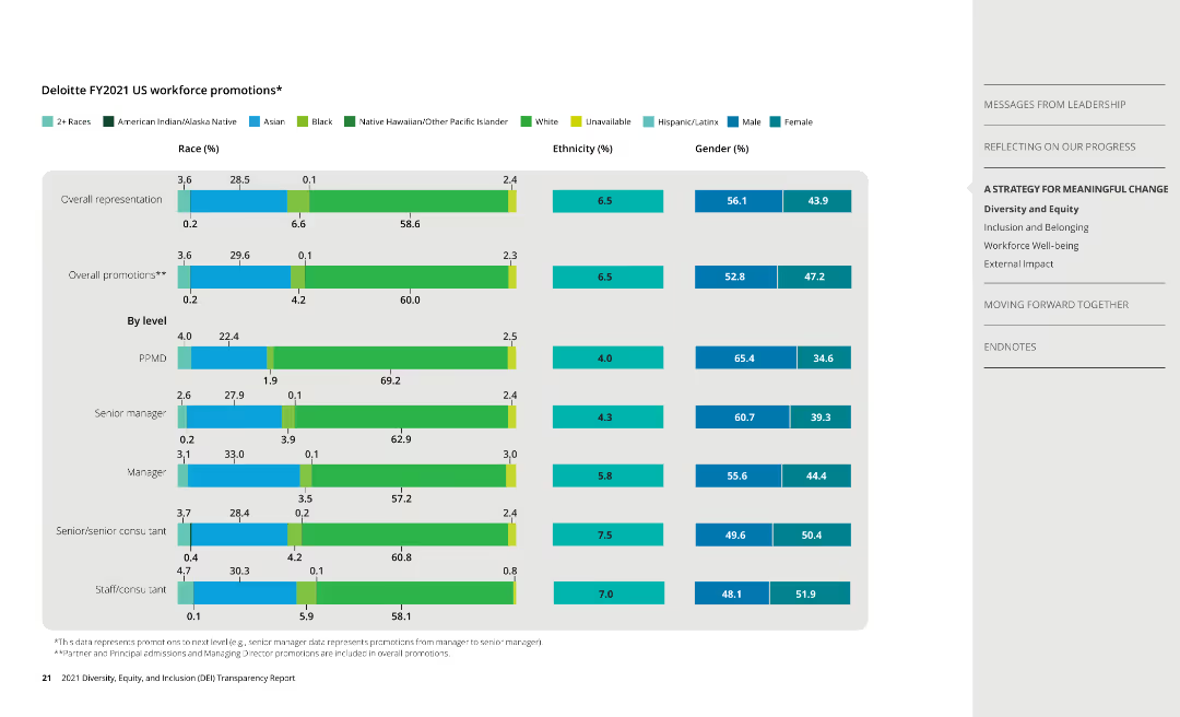
Column charts display promotion data by race, ethnicity, and gender, along with overall representation data.
Human Resources and Talent Management
Professional Services
Presents promotion statistics at Deloitte, analyzing diversity in career advancement opportunities.
promotions, diversity, race, ethnicity, gender
Single Chart
Deloitte
Saved
A simple agenda slide with a two-column bulleted list detailing the topics to be covered in the presentation, with a focus on industry dynamics and profitability drivers.
Strategic Planning
Financial Services
Sets the agenda for a discussion on distribution industry dynamics, profitability drivers, and an overview of EY-Parthenon's experience.
agenda, distribution industry, profitability drivers, EY-Parthenon, presentation, organization
Agenda
EY
Saved
This slide features multiple column charts displaying NII sensitivity to hypothetical +/- 25bps shifts in yield curve for years 2024, 2025, and 2026. Each chart is presented with two columns for potential increases or decreases in Euros, alongside breakdowns by currency (EUR and USD) showing the estimated impacts per year.
Risk Assessment and Management
Financial Services
The slide analyzes the sensitivity of net interest income to shifts in the yield curve, broken down by year and currency. It provides financial projections and potential impacts, helping in risk assessment and financial planning. Used to guide strategic financial decisions and risk management in banking.
NII, yield curve, risk management, financial planning, currency impact, EUR, USD, 2024-2026, projections
Multiple Chart
Deutsche Bank
Saved
Multiple column charts present data on the orderbook as a percentage of the total drybulk fleet, comparing several quarters and highlighting industry trends.
Market Analysis and Trends
Transportation & Logistics
Highlights trends in new vessel orders within the drybulk sector, offering insights into fleet development and investment opportunities.
newbuilding orderbook, drybulk fleet, market trends, investment opportunities, fleet development
Single Chart
Deutsche Bank
Saved
Bar chart showing recent average Z-spread and change relative to average for various sectors with commentary on the right.
Risk Assessment and Management
Financial Services
Highlights the perceived credit risk in the financial, real estate, and energy sectors due to recent US bank failures.
Bond spreads, financial sectors, risk, credit, US
Mixed Chart
Accenture
Saved
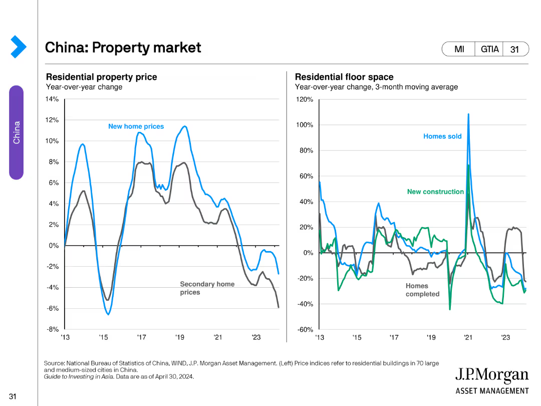
The slide includes two line charts. The left chart shows year-over-year changes in residential property prices. The right chart illustrates year-over-year changes in residential floor space for homes sold and new constructions.
Market Analysis and Trends
Real Estate & Construction
This slide evaluates the property market in China, analyzing trends in residential property prices and residential floor space changes.
Property, Market, China, Prices, Construction
Multiple Chart
JP Morgan
Saved
Line graph detailing quarterly podcast advertising revenue from Q1 2015 to Q4 2016, illustrating a steady increase. A compound quarterly growth rate (CQGR) is noted, showing the progression of growth.
Market Analysis and Trends
Media & Entertainment
Focuses on the detailed quarterly growth of podcast advertising revenue, highlighting consistent increases and providing a compound growth rate. Useful for detailed financial analysis and planning in media.
podcast, quarterly, revenue, CQGR
Single Chart
PwC/Strategy&
Saved
Slide shows a timeline from pre-kickoff planning to becoming a public company post-IPO. Uses icons and a linear path with timeline checkpoints.
Strategic Planning
Financial Services
Provides a timeline of the various stages involved in a company going public, including the key activities at each stage.
going public, IPO, timeline, process overview, strategic planning, public company
Linear Flow
PwC/Strategy&
Saved
Features multiple bar charts comparing app usage across different company sizes and sales volumes, with industry categorization.
Technology and Digital Transformation
Professional Services
Discusses app adoption rates across varying company sizes and sales volumes, key for digital strategy in retail and tech sectors.
app usage, company size, sales volume, retail, technology, adoption, digital strategy, comparison, industry, rate
Multiple Chart
Deloitte
Saved
Light background with green accents, multiple bar charts comparing cyber maturity levels and their impact on business, with explanatory text in columns.
Strategic Planning
Technology & Software
The slide explains how different levels of cyber maturity affect business outcomes, with examples of cyber planning strategies and activities from high-maturity organizations.
Cyber maturity, business impact, planning strategies, survey, bar charts
Mixed Chart
Gartner
Saved
Pie charts and statistic blocks highlighting customer data interaction and trust issues.
Strategic Planning
Professional Services
Discusses how strategic data use can improve customer relations and retention, focusing on trust and personalization in business approaches.
data use, customer trust, strategic plan
Multiple Chart
BCG
Saved
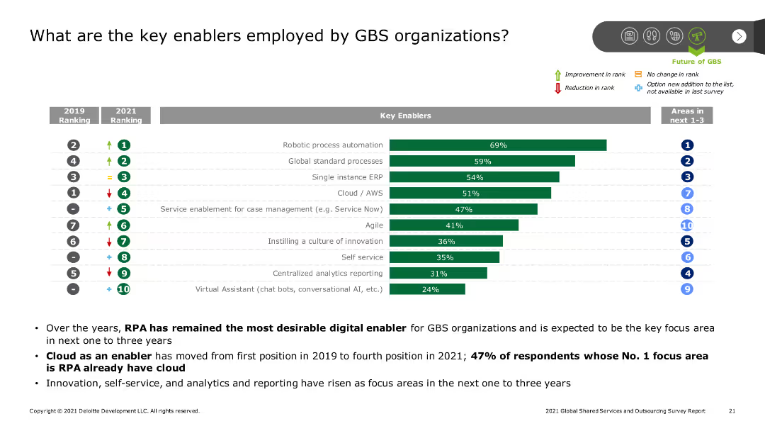
A bar chart ranks key enablers employed by GBS organizations, such as robotic process automation and cloud services, with indicators of rank changes from 2019 to 2021. Additional text provides context and key findings.
Technology and Digital Transformation
Professional Services
The slide identifies key enablers for GBS organizations, highlighting the importance of robotic process automation, cloud services, and global standard processes, along with changes in their ranking over time.
GBS, key enablers, RPA, cloud services, ranking changes
Mixed Chart
Deloitte
Saved
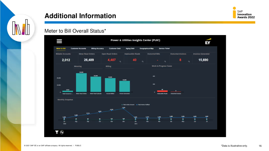
The slide features a detailed dashboard with multiple data visualizations, including column charts and metrics for meter to bill status, customer accounts, and billing accuracy.
Performance Metrics and KPIs
Energy & Utilities
This slide provides detailed metrics on the meter-to-bill process, including the number of billable accounts, meter read orders, and billing accuracy, displayed through various data visualizations.
meter to bill, status, utilities, customer accounts, billing accuracy
Multiple Chart
EY
Saved
The slide includes a bar chart showing the projected electricity demand growth by end-use technologies (TWh) from 2022 to 2050. Categories include Industrial, Commercial, Residential, Road Transport, and Other Transport. Each category has a detailed breakdown for the years 2022 and 2030.
Market Analysis and Trends
Energy & Utilities
This slide forecasts the doubling of power demand by 2050 due to electrification across various sectors. It emphasizes the significant growth in industrial and transport electricity demand, driven by technological advancements and increased adoption of electric vehicles.
Electrification, Power, Demand, Growth, 2050, Industrial, Transport
Mixed Chart
EY
Saved
Displays pie charts to show the percentages of buyers purchasing different categories of products in collaborations.
Product and Service Analysis
Retail & E-commerce
Details top-purchased product categories in luxury brand collaborations, such as handbags and sneakers.
Collaborations, luxury products, purchasing behavior, handbags, sneakers, consumer preferences, top products
Multiple Chart
BCG
Saved
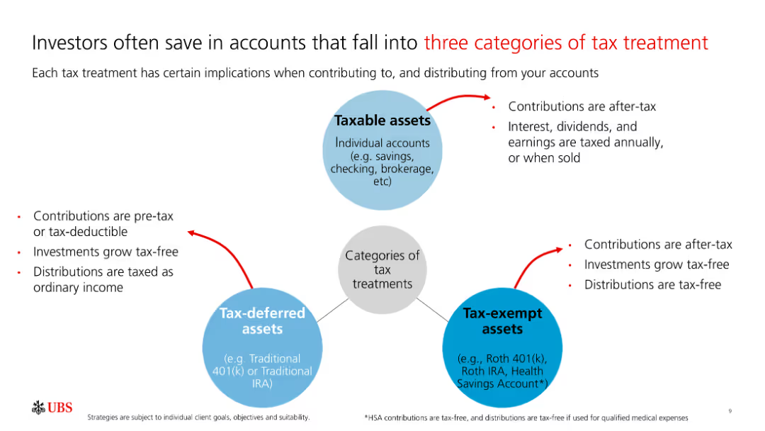
The slide includes three connected diagrams representing taxable, tax-deferred, and tax-exempt assets with descriptions of their tax implications.
Financial Performance
Financial Services
The slide details different tax treatment categories for investment accounts, explaining the tax benefits and considerations of each type.
Taxable, Tax-deferred, Tax-exempt, Investment, Tax
Diagram
UBS
Saved
This slide shows pie charts and a data table illustrating the diversification of the loan book and deposit base of Deutsche Bank. It includes percentage breakdowns and geographical distribution, employing a clear and concise visual representation.
Risk Assessment and Management
Financial Services
Examines the risk management strategies of Deutsche Bank through the diversification of its loan and deposit portfolios. It highlights the bank’s robust financial positioning, making it suitable for discussions on financial stability and risk mitigation in banking.
banking, risk management, capital, liquidity, stability
Multiple Chart
Deutsche Bank
Saved
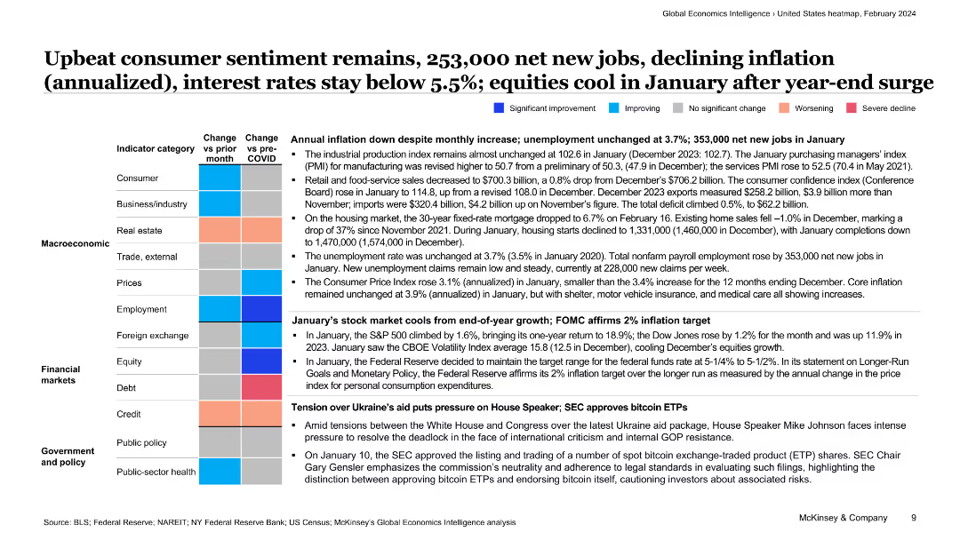
The slide features a colorful table summarizing key economic indicators with text providing context on consumer sentiment, job creation, and inflation trends.
Market Analysis and Trends
Financial Services
This slide presents an overview of the US economy, highlighting consumer sentiment, job creation, and inflation, supported by a detailed table of economic indicators.
consumer sentiment, jobs, inflation, economy, financial services, overview, trends, economic indicators, analysis, market conditions
Table
McKinsey
Saved
The slide contains two sections: one with a line chart on IOC capital expenditures and another with a line chart comparing confirmed COVID-19 infections and crude oil prices. Supporting text provides additional context for each chart.
Market Analysis and Trends
Energy & Utilities
The slide discusses the muted investment in the IOC for 2022 and the resilience of markets amidst COVID-19. It provides a historical view of capital expenditures and the correlation between COVID-19 cases and crude oil prices.
IOC, capital expenditure, COVID-19, crude oil prices, market resilience
Multiple Chart
EY
Saved
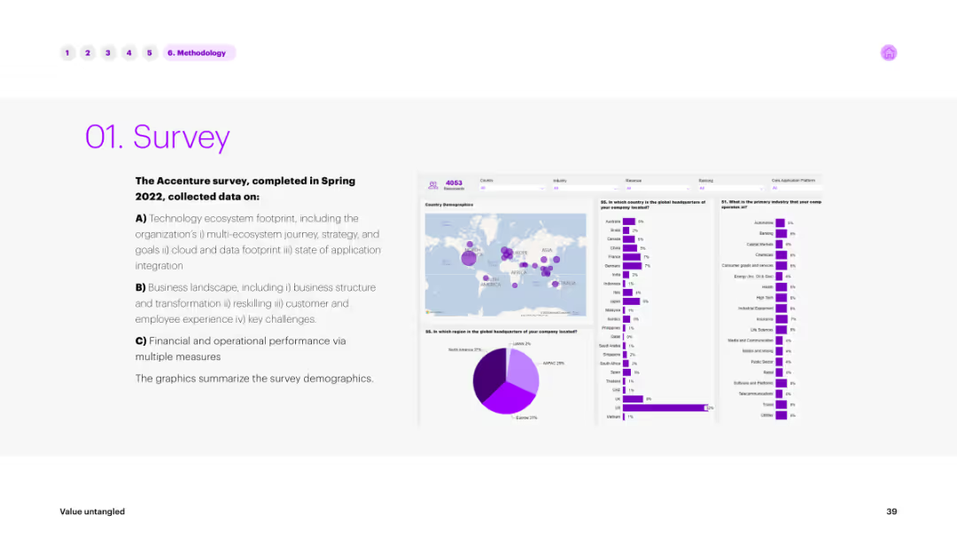
The slide contains text on the left outlining the survey methodology and a series of maps and charts on the right displaying survey demographics and data points in purple.
Market Analysis and Trends
Technology & Software
Summarizes the methodology and key findings of the Accenture survey conducted in Spring 2022. It includes data on technology ecosystem footprints, business landscapes, and financial performance of various companies.
survey, methodology, demographics, data, analysis
Multiple Chart
Accenture
Saved
Contains two pie charts contrasting current and future revenue composition, with an arrow indicating the strategic direction. The charts are supported by a clean, minimalist design.
Financial Performance
Financial Services
Highlights strategies to improve revenue durability and return on equity, indicating a planned shift in segment revenue composition, and emphasizing the growth of management and incentive fees.
Revenue, Durability, Returns, Management Fees
Diagram
Goldman Sachs
Saved
This slide features a multi-colored stacked heatmap detailing Hong Kong's competitiveness in various ESG-related areas. The chart uses different shades to represent degrees of competitiveness.
Market Analysis and Trends
Financial Services
The data visualizes Hong Kong's position in the financial market maturity, presence in international markets, and local enthusiasm for ESG, among others. Each area is assessed for competitiveness, showcasing Hong Kong's strengths and areas for improvement in the context of ESG finance.
Competitiveness, Financial markets, Hong Kong, ESG, Sustainability
Table
PwC/Strategy&
Saved
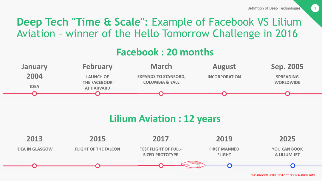
The slide features a timeline comparing the development and market entry times of Facebook and Lilium Aviation. Key milestones are marked along a horizontal timeline with distinct points for each company's progress.
Market Analysis and Trends
Technology & Software
This slide provides a comparative timeline showing the rapid growth of Facebook (20 months) versus the longer development period of Lilium Aviation (12 years). It highlights differences in market readiness and scaling between the two companies.
Facebook, Lilium Aviation, Timeline, Market Entry, Comparison, Development
Linear Flow
BCG
Saved
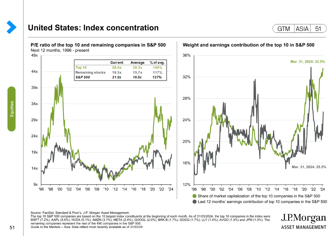
The slide features two line charts. The first chart shows the P/E ratio of the top 10 and remaining companies in the S&P 500 from 1996 to the present. The second chart shows the weight and earnings contribution of the top 10 in the S&P 500.
Market Analysis and Trends
Financial Services
The slide analyzes index concentration in the United States, focusing on the P/E ratio and earnings contribution of the top 10 companies in the S&P 500. It is used for market analysis and investment decision-making.
United States, index concentration, S&P 500, P/E ratio, earnings contribution, market analysis
Multiple Chart
JP Morgan
Saved
Features multiple pie charts depicting the company's revenue breakdown by business segment, property type, and geographic region. The design is clean, with the use of blue tones and percentage labels on each pie chart sector.
Market Analysis and Trends
Real Estate & Construction
The slide breaks down the company's revenue sources, highlighting diversification across business activities, property types, and geographic regions. It's used to demonstrate market positioning and growth strategy in real estate and investment services.
revenue diversification, business segments, growth strategy
Multiple Chart
Goldman Sachs
Saved
Previous
Next
If nothing, comes up, please save your slides first
Create a FREE account to continue browsing
Receive Instant Access to 1,000+ slides from companies like McKinsey, Google, and Goldman Sachs
First Name
Last Name
Email
Password
I agree to all
Terms & Privacy Policy
Thank you! Your submission has been received!
Oops! Something went wrong while submitting the form.
Have an account?
Sign in
Column Chart
Heatmap
Chevron
Org Chart
Infographic
Callouts
Timeline
List
Graphic
Picture
Process Flow
Diagram
Paragraph
Map
Table
Framework
Subtitle
Takeaway Box
Icon
Other Chart
Radar Chart
Waterfall Chart
Mekko Chart
Pie Chart
Scatter Plot
Line Chart
Bar chart
Bullet points