My Account
My Slides
Search by Category
Templates
View All Templates
Download Template Slides
Leave Feedback
Login
Logout
Get Started
Browse all Slides
Browse all Slides
Create a FREE Account
Instant access to 1,000+ real slides from top companies like McKinsey, BCG, Goldman Sachs, Google and many more!
First Name
Last Name
Email
Password
I agree to all
Terms & Privacy Policy
Thank you! Your submission has been received!
Oops! Something went wrong while submitting the form.
Have an account?
Sign in
Saved Slides
Total No. of slides saved
0
↻ Refresh
✖ Clear all
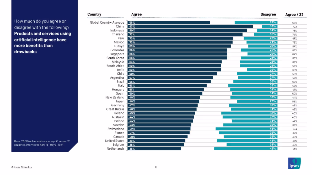
Bar chart format showing % “Agree” and “Disagree” by country with global averages; sorted in descending order of agreement.
Technology and Digital Transformation
Artificial Intelligence
The slide shows the percentage of respondents in each country who believe AI’s benefits outweigh its drawbacks. It reflects overall optimism or skepticism towards AI's societal value and utility.
AI benefits, technology value, opinion survey, Ipsos, optimism, tradeoffs, international data, AI perception, public confidence
false
Technology and Digital Transformation
Artificial Intelligence
Mixed Chart
IPSOS
Add to my slides
Remove from favorites
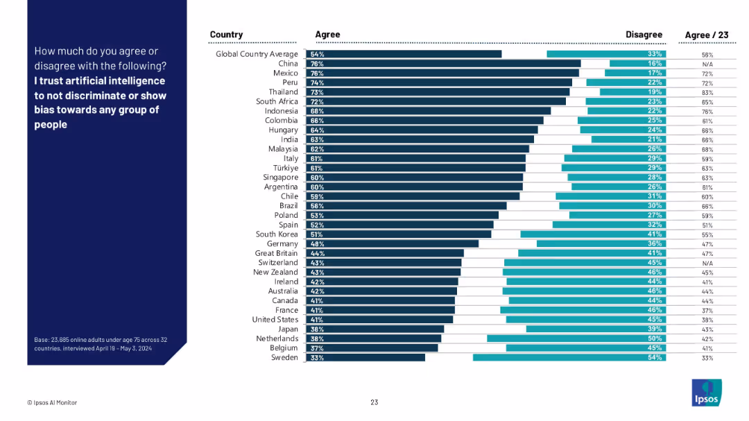
Bar chart by country with % agree and disagree; countries sorted by trust in AI to be unbiased.
Regulatory and Compliance
Artificial Intelligence
This slide presents how much respondents across countries trust AI systems to avoid discrimination or bias. It highlights global perceptions of fairness in AI and potential ethical concerns.
AI bias, fairness, discrimination, trust in AI, ethics, global comparison, Ipsos, regulation, responsible AI
false
Regulatory and Compliance
Artificial Intelligence
Mixed Chart
IPSOS
Add to my slides
Remove from favorites
Contains a list of US proprietary data assets and their uses, paired with textual descriptions of AI advantages in Equifax’s operations, emphasizing the integration of AI technologies and data assets.
Technology and Digital Transformation
Technology & Software
The slide provides an overview of how Equifax leverages its proprietary data alongside advanced AI capabilities to enhance decision-making processes and product development, highlighting the strategic use of technology in business.
AI capabilities, proprietary data, technology, Equifax
false
Technology and Digital Transformation
Technology & Software
Header Horizontal
Barclays
Add to my slides
Remove from favorites
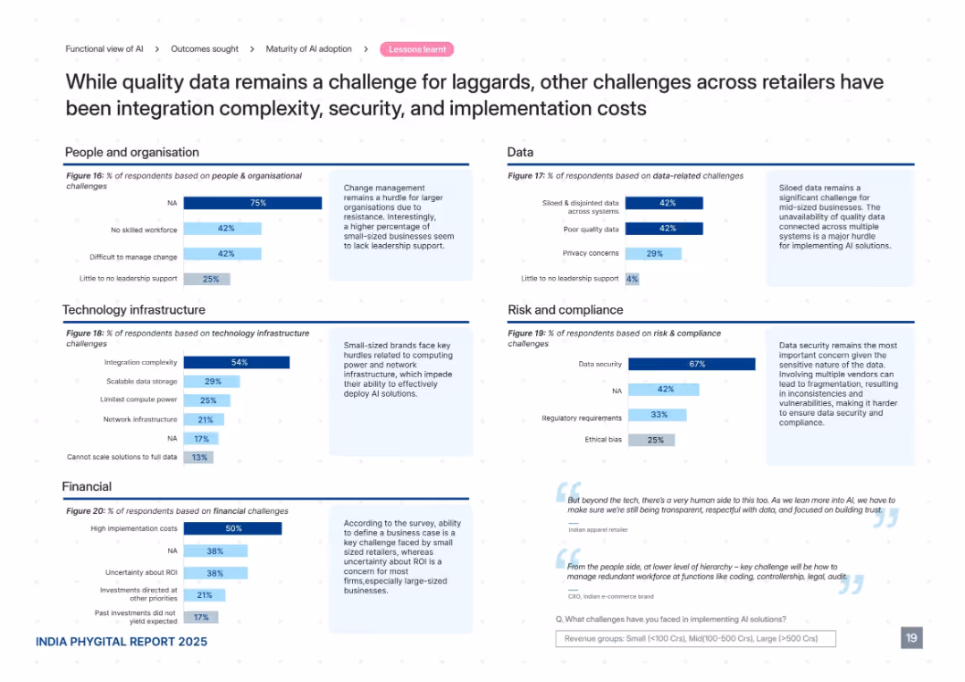
Grid of five charts across categories: People, Tech, Data, Risk, Financial. Each includes horizontal bar graphs with accompanying contextual notes. Soft blue color palette with sectioned layout.
Risk Assessment and Management
Retail & E-commerce
This slide presents challenges to AI adoption among retailers, including data fragmentation, poor quality, integration complexity, high costs, lack of leadership, and ethical concerns. It segments these barriers into five core domains and provides insight into how small and mid-sized businesses especially struggle with foundational AI readiness factors.
AI challenges, data issues, integration, security, cost, leadership, ethics
false
Risk Assessment and Management
Retail & E-commerce
Mixed Chart
PwC/Strategy&
Add to my slides
Remove from favorites
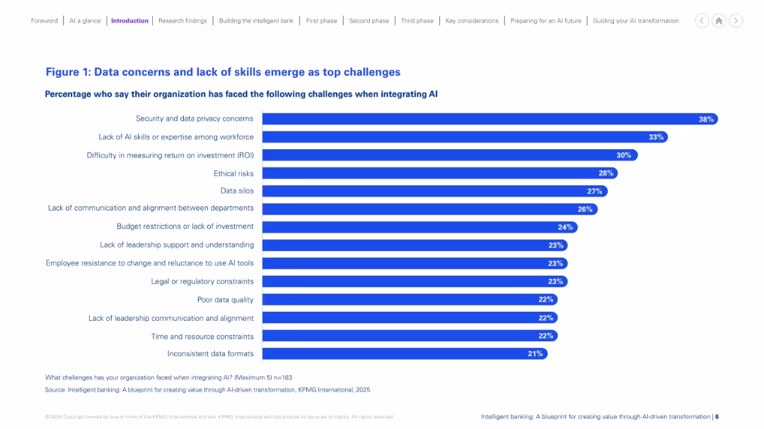
Horizontal bar chart layout on a white background, with bold blue bars and percentage values aligned to the right. Title and subtitle in blue, legend and source at bottom. Clean, structured, minimal visuals.
Risk Assessment and Management
Financial Services
The slide presents the top challenges organizations face when integrating AI. Security and data privacy concerns top the list, followed by lack of AI expertise, and difficulty measuring ROI. Additional barriers include ethical risks, data silos, and lack of leadership support. The data highlights common obstacles that hinder successful AI adoption in financial services.
AI challenges, data privacy, ROI, skills gap, risk, silos, investment, resistance
false
Risk Assessment and Management
Financial Services
Single Chart
KPMG
Add to my slides
Remove from favorites
Features multiple bubble charts overlaid on a light blue background. Each bubble represents a different challenge or inefficiency in AI implementation, with varying sizes indicating prevalence. The layout is uncluttered, focusing on the visual data representation.
Technology and Digital Transformation
Technology & Software
This slide highlights the various challenges and inefficiencies faced by organizations in scaling AI initiatives. It is useful for understanding barriers to technology adoption and strategizing on overcoming these challenges.
AI challenges, inefficiencies, technology adoption, scaling AI, barriers, strategic planning, technology implementation
false
Technology and Digital Transformation
Technology & Software
Multiple Chart
Deloitte
Add to my slides
Remove from favorites
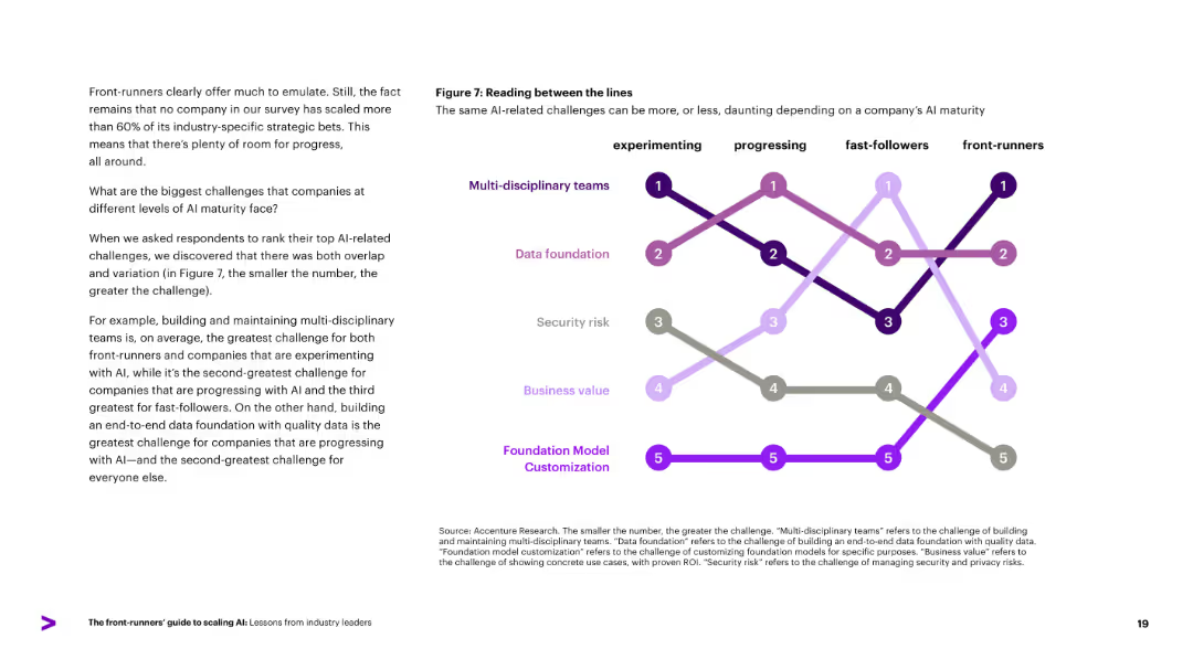
Line chart ranking AI-related challenges (e.g., multi-disciplinary teams, data foundation) across AI maturity levels. Left-aligned explanatory text.
Risk Assessment and Management
Artificial Intelligence
Identifies top AI-related challenges companies face at different maturity levels. Multi-disciplinary teams are the greatest challenge across most groups, followed by data foundation and security risk. Reinforces the idea that challenges evolve as companies mature in AI adoption.
AI challenges, maturity, data foundation, security, cross-functional
false
Risk Assessment and Management
Artificial Intelligence
Diagram
Accenture
Add to my slides
Remove from favorites
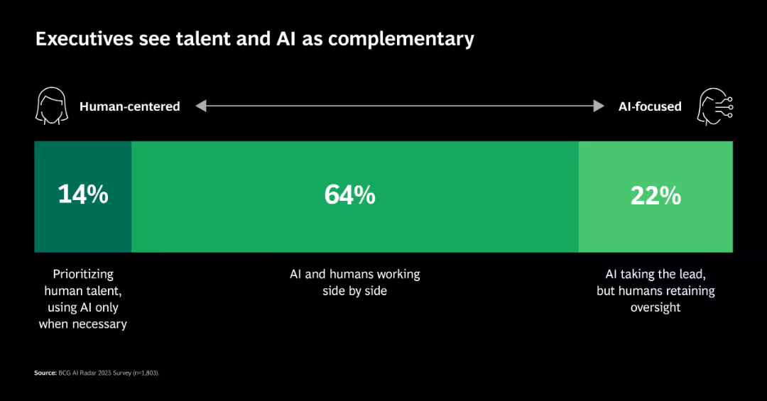
Single segmented horizontal bar showing distribution across a continuum: human-centered, hybrid, and AI-focused approaches.
Human Resources and Talent Management
Artificial Intelligence
Shows that 64% of executives prefer AI-human collaboration, with fewer choosing either extreme (AI-led or human-led). This reflects a trend toward integration rather than substitution.
AI collaboration, workforce, leadership, hybrid roles, talent strategy
false
Human Resources and Talent Management
Artificial Intelligence
Single Chart
BCG
Add to my slides
Remove from favorites
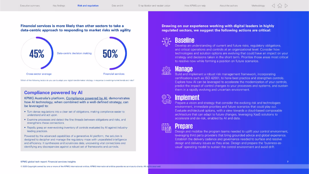
Split layout: left side uses pie-style progress indicators and a text box; right side uses a gradient purple background with white icons and bold headings for 4 steps (Baseline, Manage, Implement, Prepare).
Risk Assessment and Management
Financial Services
The slide highlights the financial services sector's tendency toward data-centric risk responses. It introduces KPMG Australia's AI compliance platform and outlines key strategies for regulated sectors to manage digital transformation, with a strong focus on AI-driven regulatory response and risk framework evolution.
AI compliance, risk management, data-centric, KPMG, regulated sectors, baseline, manage, implement, prepare
false
Risk Assessment and Management
Financial Services
Mixed Chart
KPMG
Add to my slides
Remove from favorites
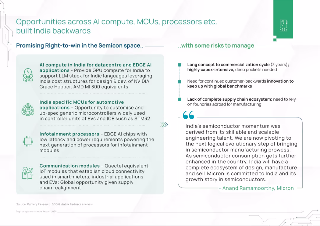
Two-column layout with opportunity areas (left) and risks (right). Includes a quote from Micron executive at the bottom.
Strategic Planning
Artificial Intelligence
The slide identifies semiconductor opportunities in AI compute, automotive MCUs, infotainment processors, and IoT modules. It balances this with risks like long commercialization cycles and supply chain gaps, stressing India's strategic positioning.
AI compute, MCUs, processors, semiconductors, India, risks, IoT, data centers, automotive, supply chain
false
Strategic Planning
Artificial Intelligence
Header Horizontal
BCG
Add to my slides
Remove from favorites
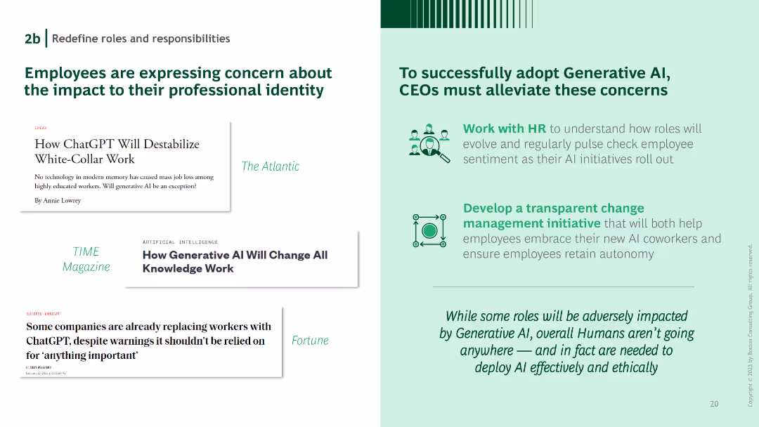
Headlines from major publications on the left, a list of CEO action items on the right. Green text and icons emphasize the points made.
Organizational Structure and Change
Technology & Software
Highlights concerns employees have about AI's impact on professional identity and suggests actions CEOs can take to address these concerns.
AI concerns, professional identity, CEO actions, employee sentiment, organizational change
false
Organizational Structure and Change
Technology & Software
Boxed
BCG
Add to my slides
Remove from favorites
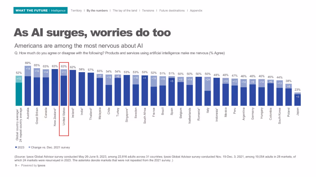
Horizontal bar chart with comparison of global nervousness about AI products/services; dark blue bars on white background.
Risk Assessment and Management
Artificial Intelligence
Depicts nervousness levels around AI across 31 countries, highlighting the U.S. as one of the most apprehensive. Bar chart includes percentage increase from 2021 to 2023.
AI concerns, public perception, international comparison, nervousness, Ipsos, technology anxiety, 2023 survey
false
Risk Assessment and Management
Artificial Intelligence
Single Chart
IPSOS
Add to my slides
Remove from favorites
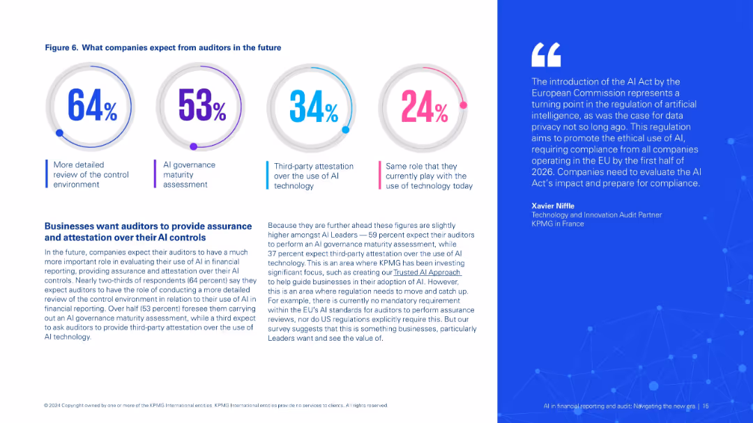
Circular infographic with four expectations, paired with detailed explanation and expert quote on AI auditing trends.
Regulatory and Compliance
Financial Services
Shows what companies expect from auditors regarding AI controls, including more thorough reviews, governance assessments, and attestation roles. Discusses gaps in current regulatory frameworks and future compliance needs.
AI controls, auditing, governance, compliance, EU AI Act, assurance, risk
false
Regulatory and Compliance
Financial Services
Mixed Chart
KPMG
Add to my slides
Remove from favorites
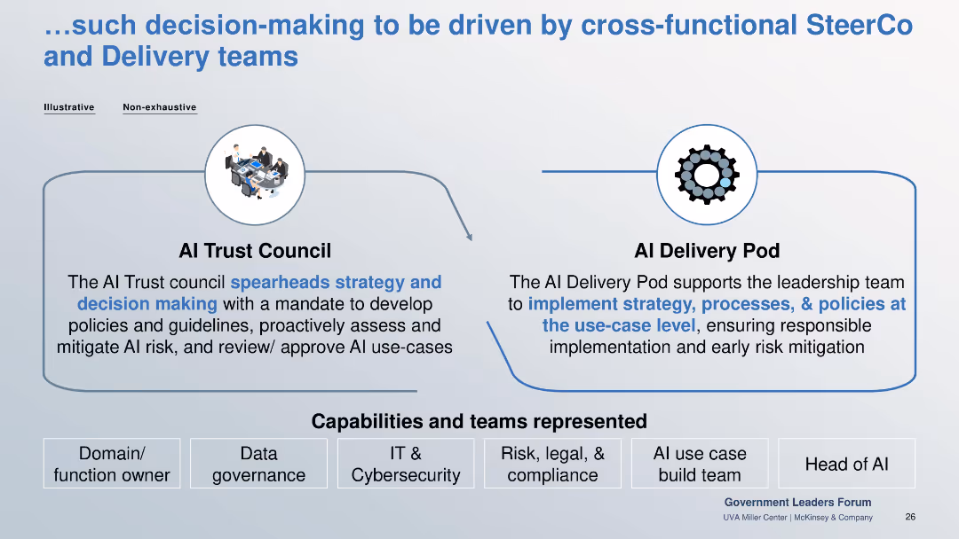
Two-box structure for AI Trust Council and AI Delivery Pod. Capabilities listed below include cybersecurity, legal, and AI use case teams.
Organizational Structure and Change
Government & Public Sector
Describes decision-making structure for responsible AI: a strategy-setting AI Trust Council and execution-focused AI Delivery Pod, backed by multidisciplinary teams.
AI council, delivery pod, cross-functional, risk mitigation, governance, compliance
false
Organizational Structure and Change
Government & Public Sector
Linear Flow
McKinsey
Add to my slides
Remove from favorites
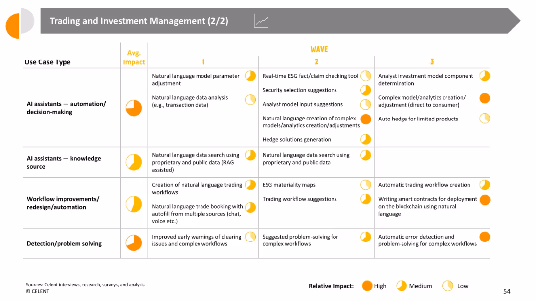
Continuation of tabular matrix; more technical/decision-making AI use types; average impact highlighted for each use case
Risk Assessment and Management
Financial Services
Shows advanced AI use cases including automation/decision-making, workflow redesign, and error/problem detection. Highlights advanced automation of trading logic, smart contracts, and risk management processes across three waves.
AI decision-making, risk models, workflow automation, smart contracts, GenAI in trading
false
Risk Assessment and Management
Financial Services
Single Chart
Oliver Wyman
Add to my slides
Remove from favorites
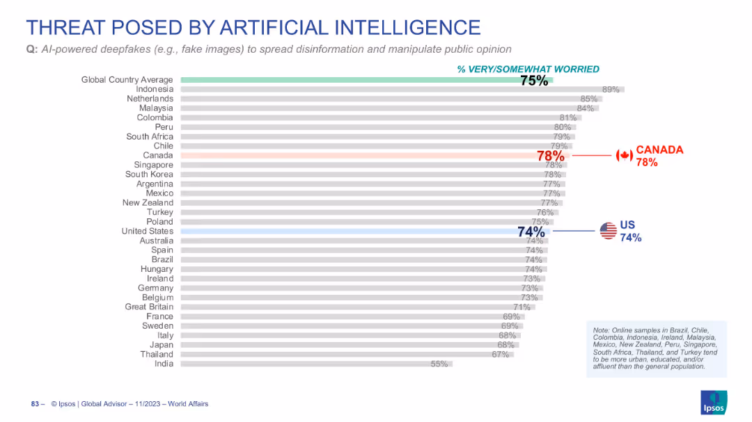
Horizontal bar chart displaying concern over AI-powered deepfakes
Risk Assessment and Management
Artificial Intelligence
Public concern about deepfakes as a tool for disinformation is high globally (75%). Canada (78%) and the US (74%) also show significant concern on this issue.
AI deepfakes, disinformation, public opinion, global perception, misinformation
false
Risk Assessment and Management
Artificial Intelligence
Single Chart
IPSOS
Add to my slides
Remove from favorites
This slide features a large pie chart, presented in a green and white color scheme for clear differentiation of data points. The layout is clean and focuses on the main data visualization elements.
Technology and Digital Transformation
Technology & Software
Analyzes trends in AI deployment and investment, showing a significant increase in AI applications and investment plans. It is relevant for discussions on technology budgeting and strategic investment in the tech industry.
AI deployment, investment trends, technology, strategic investment, tech industry, application increase, budgeting
false
Technology and Digital Transformation
Technology & Software
Mixed Chart
Deloitte
Add to my slides
Remove from favorites
Contains four numbered sections, each describing a different strategy for overcoming AI deployment challenges, presented in a clear and structured manner. The use of icons and minimal text helps emphasize the strategies effectively.
Technology and Digital Transformation
Technology & Software
Offers strategies for optimizing AI deployment, including investing in culture and leadership, transforming operations, and orchestrating tech and talent. This slide is ideal for strategic planning sessions in technology sectors.
AI deployment, strategies, culture investment, operations transformation, tech orchestration, strategic planning
false
Technology and Digital Transformation
Technology & Software
Linear Flow
Deloitte
Add to my slides
Remove from favorites
Contains lists, bold headers, and a central illustrative panel showing a group discussion around a table, signifying collaboration and strategy in AI implementation.
Technology and Digital Transformation
Technology & Software
Advocates for a strategic approach to AI ecosystems, emphasizing the need for collaboration, data access, and careful partner selection to optimize AI technologies and cost efficiency.
AI ecosystem, collaboration, data access, strategic planning, cost management
false
Technology and Digital Transformation
Technology & Software
Header Vertical
BCG
Add to my slides
Remove from favorites
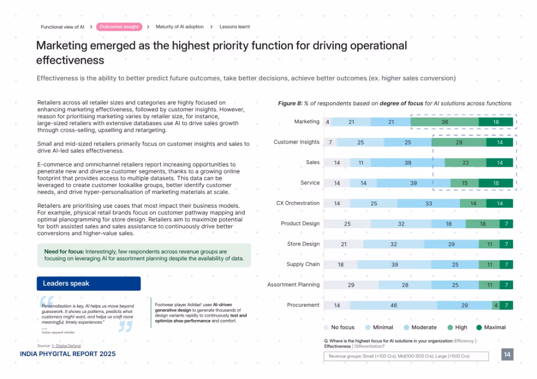
Clear, structured layout with explanatory text, bar graph on right, and quotes below. Uses light greens and blues with white space.
Performance Metrics and KPIs
Retail & E-commerce
This slide shows that marketing is the most focused AI function for driving effectiveness in retail. It outlines how AI is used to predict outcomes and enable data-driven decision-making, with small and mid-sized retailers focused on customer insights and sales. It also mentions the rise of omnichannel approaches and use of customer lookalike models.
AI effectiveness, marketing, customer insights, personalization, retail analytics, targeting, KPIs, sales conversion
false
Performance Metrics and KPIs
Retail & E-commerce
Mixed Chart
PwC/Strategy&
Add to my slides
Remove from favorites
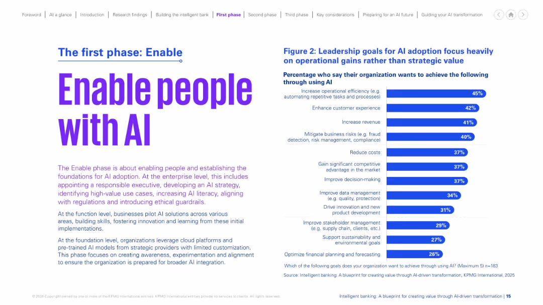
Left-aligned title and explanatory paragraph. On the right, a bar chart showing leadership goals for AI. Purple accents on a white background with clean layout.
Strategic Planning
Financial Services
The slide focuses on the "Enable" phase of AI adoption, emphasizing the need to prepare people and foundational systems. It outlines top leadership goals, such as improving efficiency, customer experience, and mitigating risks. It underscores the importance of AI literacy, ethical alignment, and building a strong initial base for scaling AI.
AI enablement, goals, leadership, preparation, ethics, literacy, transformation
false
Strategic Planning
Financial Services
Mixed Chart
KPMG
Add to my slides
Remove from favorites
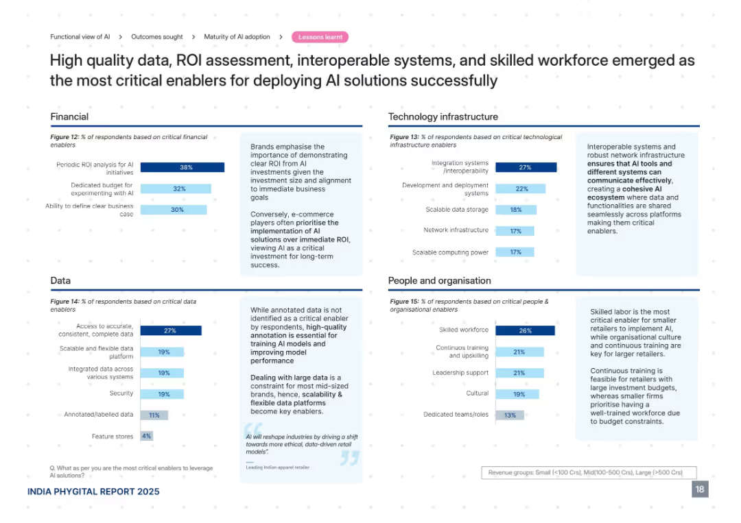
Four quadrant layout divided by themes: Financial, Data, Technology Infrastructure, and People. Each quadrant includes a bar chart with accompanying textual insights. Dark blue accent color.
Technology and Digital Transformation
Retail & E-commerce
The slide identifies key enablers for successful AI deployment, such as ROI evaluation, data accuracy, interoperable systems, and skilled workforce. It highlights that e-commerce players prioritize AI investment more than ROI and stresses the importance of annotated data and skilled teams for long-term AI integration success.
AI enablers, data quality, ROI, interoperability, workforce, budget, infrastructure
false
Technology and Digital Transformation
Retail & E-commerce
Mixed Chart
PwC/Strategy&
Add to my slides
Remove from favorites
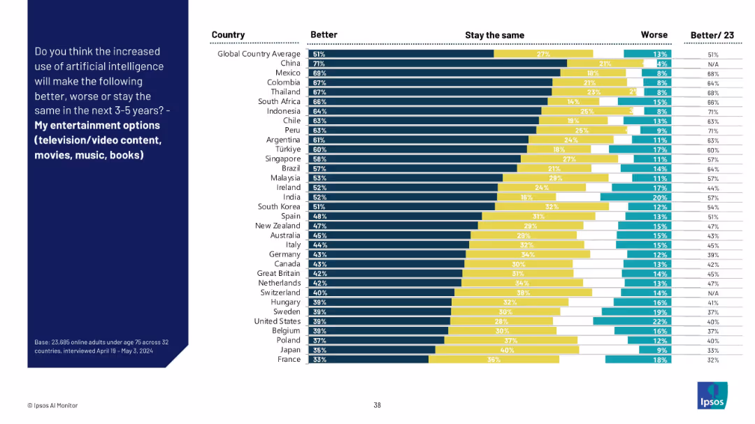
Similar format to previous slide with a left-aligned question panel and right-side bar chart comparing countries.
Market Analysis and Trends
Media & Entertainment
This slide shows how people across different countries believe AI will influence their entertainment options such as TV, music, movies, and books. The data shows generally high optimism, especially in China and Latin America.
AI entertainment, public perception, global survey, future trends, digital media, Ipsos, country opinions, optimism, movies, music
false
Market Analysis and Trends
Media & Entertainment
Mixed Chart
IPSOS
Add to my slides
Remove from favorites
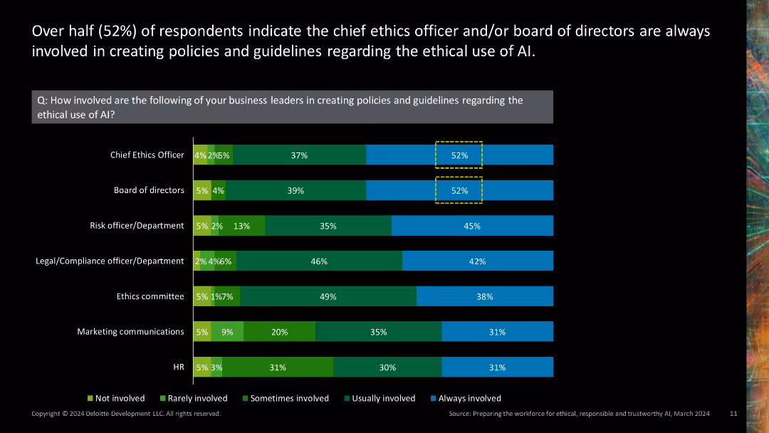
Stacked bar chart showing involvement of various business leaders in creating AI ethics policies.
Regulatory and Compliance
Technology & Software
Highlights the involvement of different business leaders, such as chief ethics officers and boards of directors, in developing AI ethics policies.
AI ethics policies, business leaders, chief ethics officer, board of directors, policy development
false
Regulatory and Compliance
Technology & Software
Single Chart
Deloitte
Add to my slides
Remove from favorites
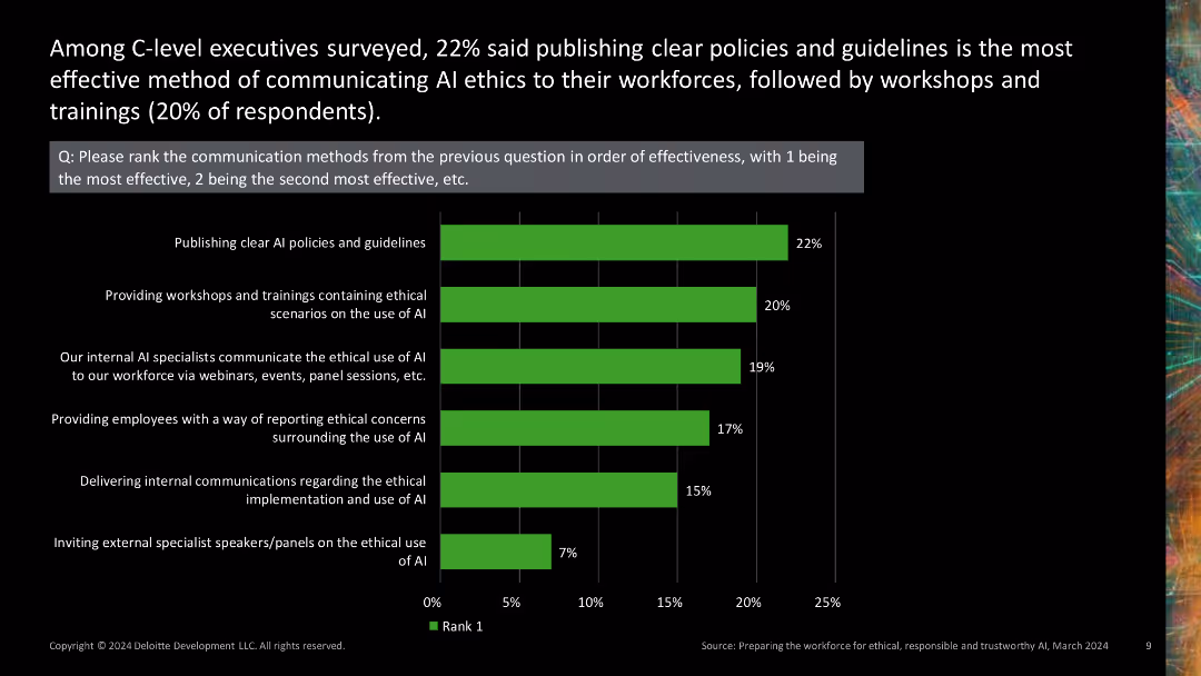
Column chart ranking the effectiveness of different AI ethics communication methods.
Regulatory and Compliance
Technology & Software
Ranks various methods of communicating AI ethics to the workforce, highlighting which methods are perceived as most effective by C-level executives.
AI ethics, communication effectiveness, ranking, workshops, guidelines
false
Regulatory and Compliance
Technology & Software
Single Chart
Deloitte
Add to my slides
Remove from favorites
Stacked bar chart showing methods of communicating AI ethics to workforce.
Regulatory and Compliance
Technology & Software
Discusses how companies communicate AI ethics to their employees, including workshops, internal specialists, and ethical reporting methods.
AI ethics, communication, workshops, internal specialists, ethical reporting
false
Regulatory and Compliance
Technology & Software
Mixed Chart
Deloitte
Add to my slides
Remove from favorites
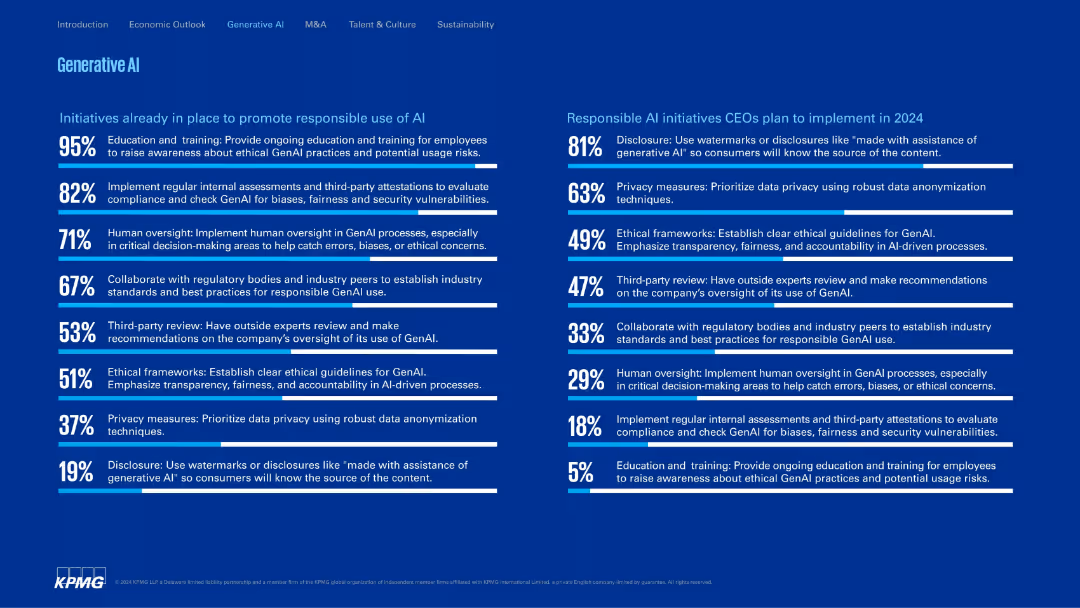
Dual-column layout with bar-style bullet points; symmetrical and text-rich; white and blue typography.
Regulatory and Compliance
Artificial Intelligence
Lists current and planned initiatives for responsible AI use. These include employee education, third-party reviews, ethical frameworks, and disclosures. Distinguishes between what’s already in place and what CEOs aim to implement in 2024.
AI ethics, compliance, oversight, privacy, transparency, training
false
Regulatory and Compliance
Artificial Intelligence
Single Chart
KPMG
Add to my slides
Remove from favorites
This slide features a horizontal bar chart indicating the percentage of respondents hiring for various ethical positions in AI and technology. The chart is predominantly green and black, with bars labeled for clarity.
Human Resources and Talent Management
Technology & Software
The slide highlights the percentage of organizations hiring or planning to hire for various ethical positions in AI and technology, such as AI ethics researchers, compliance specialists, and policy analysts.
AI ethics, compliance, policy, hiring, chart
false
Human Resources and Talent Management
Technology & Software
Mixed Chart
Deloitte
Add to my slides
Remove from favorites
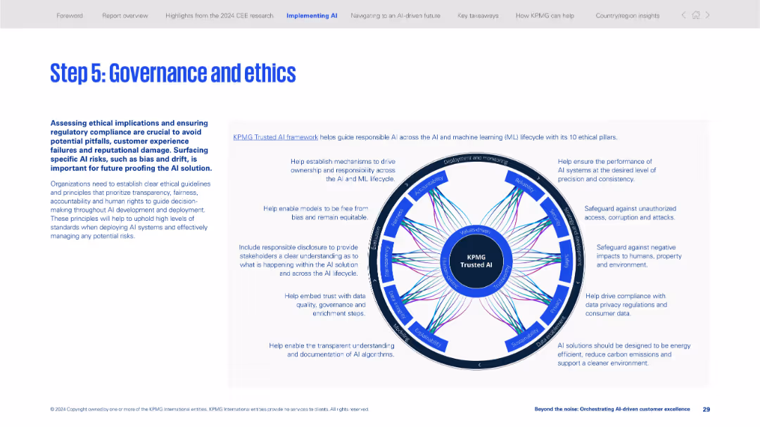
Two-section layout with explanatory text on left and a circular infographic on the right visualizing KPMG Trusted AI ethical pillars.
Regulatory and Compliance
Artificial Intelligence
Emphasizes the importance of ethics and governance in AI deployment. Introduces the KPMG Trusted AI framework and its 10 ethical pillars to ensure responsible, transparent, and compliant AI implementation.
AI ethics, governance, compliance, trusted AI, responsible AI, fairness, transparency, data security, bias, regulations
false
Regulatory and Compliance
Artificial Intelligence
Framework
KPMG
Add to my slides
Remove from favorites
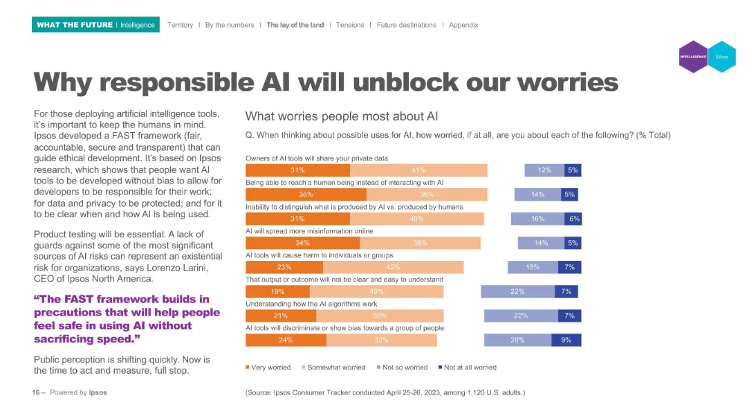
Left panel text; right panel horizontal bar chart indicating worry levels; categories use color-coded segments.
Risk Assessment and Management
Artificial Intelligence
Lists top public concerns regarding AI (e.g., privacy, bias, misinformation). Visual data shows levels of worry using segmented bar charts to represent varying degrees of concern from "Very worried" to "Not worried". Tied to Ipsos' FAST (fair, accountable, secure, transparent) framework.
AI ethics, public concerns, privacy, misinformation, bias, accountability, FAST framework
false
Risk Assessment and Management
Artificial Intelligence
Mixed Chart
IPSOS
Add to my slides
Remove from favorites
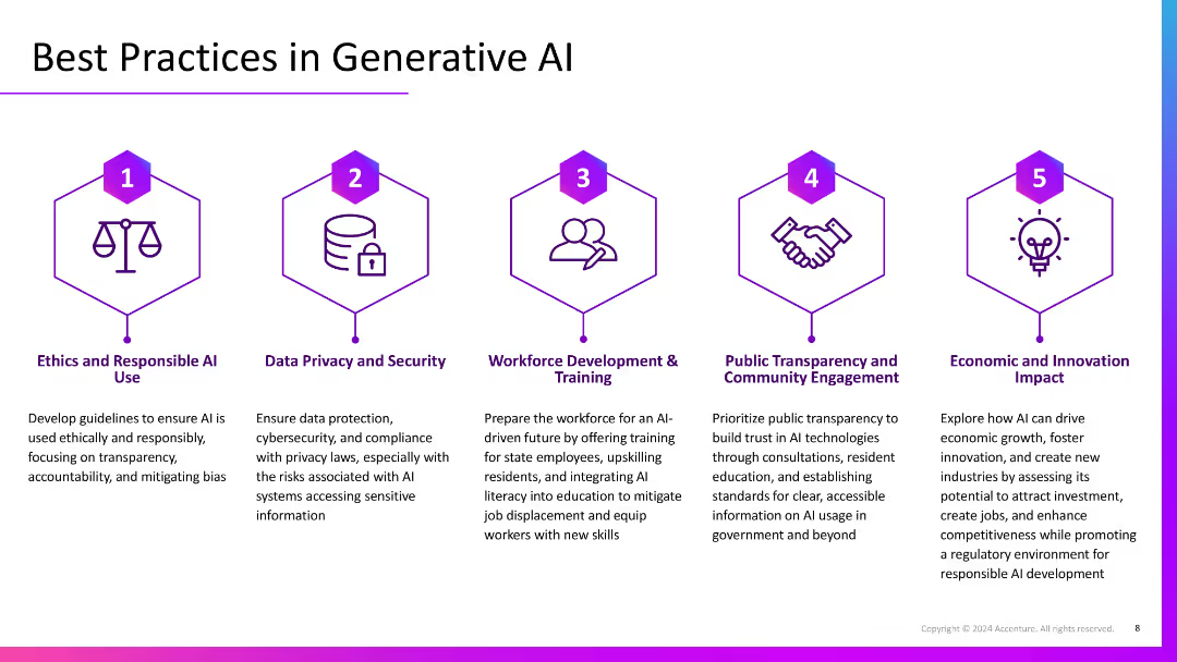
Five-column layout with numbered icons and headers, each describing a best practice. Uses visual symmetry and hexagonal icons with consistent purple theme.
Regulatory and Compliance
Artificial Intelligence
Lists five best practices for generative AI: ethical use, privacy/security, workforce training, public transparency, and fostering economic impact. Each section outlines strategic and regulatory considerations.
AI ethics, security, workforce training, transparency, innovation, best practices
false
Regulatory and Compliance
Artificial Intelligence
Pillar
Accenture
Add to my slides
Remove from favorites
Features several graphs and icons depicting ethical concerns in AI, with global data presented to show variations in public perception.
Technology and Digital Transformation
Technology & Software
Addresses the ethical challenges AI faces, such as decision-making transparency and bias. It provides statistical insights into public perceptions and concerns across different countries.
AI ethics, transparency, public perception, bias, global insights
false
Technology and Digital Transformation
Technology & Software
Multiple Chart
BCG
Add to my slides
Remove from favorites
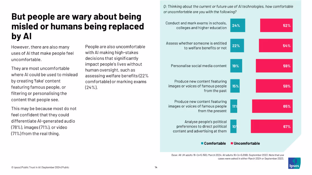
Left: concerns about fake content and high-stakes use; right: chart on comfort with certain use cases
Risk Assessment and Management
Artificial Intelligence
This slide highlights that people feel most uncomfortable with AI-generated fake content (images, voices) and high-stakes decisions like welfare assessment. The discomfort stems from lack of trust in AI's ability to act responsibly without human oversight.
AI ethics, trust, fake content, Ipsos, discomfort, replacement, manipulation, oversight
false
Risk Assessment and Management
Artificial Intelligence
Mixed Chart
IPSOS
Add to my slides
Remove from favorites
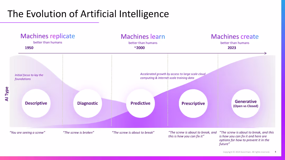
Stylized timeline graph with a curved gradient background showing AI progression from Descriptive to Generative across decades. Includes annotations under each AI type.
Industry Overview
Artificial Intelligence
Outlines AI evolution from descriptive to generative stages. Shows how AI capabilities have grown over time, with modern AI capable of generating solutions and foresight, building on foundational descriptive and diagnostic insights.
AI evolution, generative AI, descriptive, predictive, timeline, machine learning
false
Industry Overview
Artificial Intelligence
Single Chart
Accenture
Add to my slides
Remove from favorites
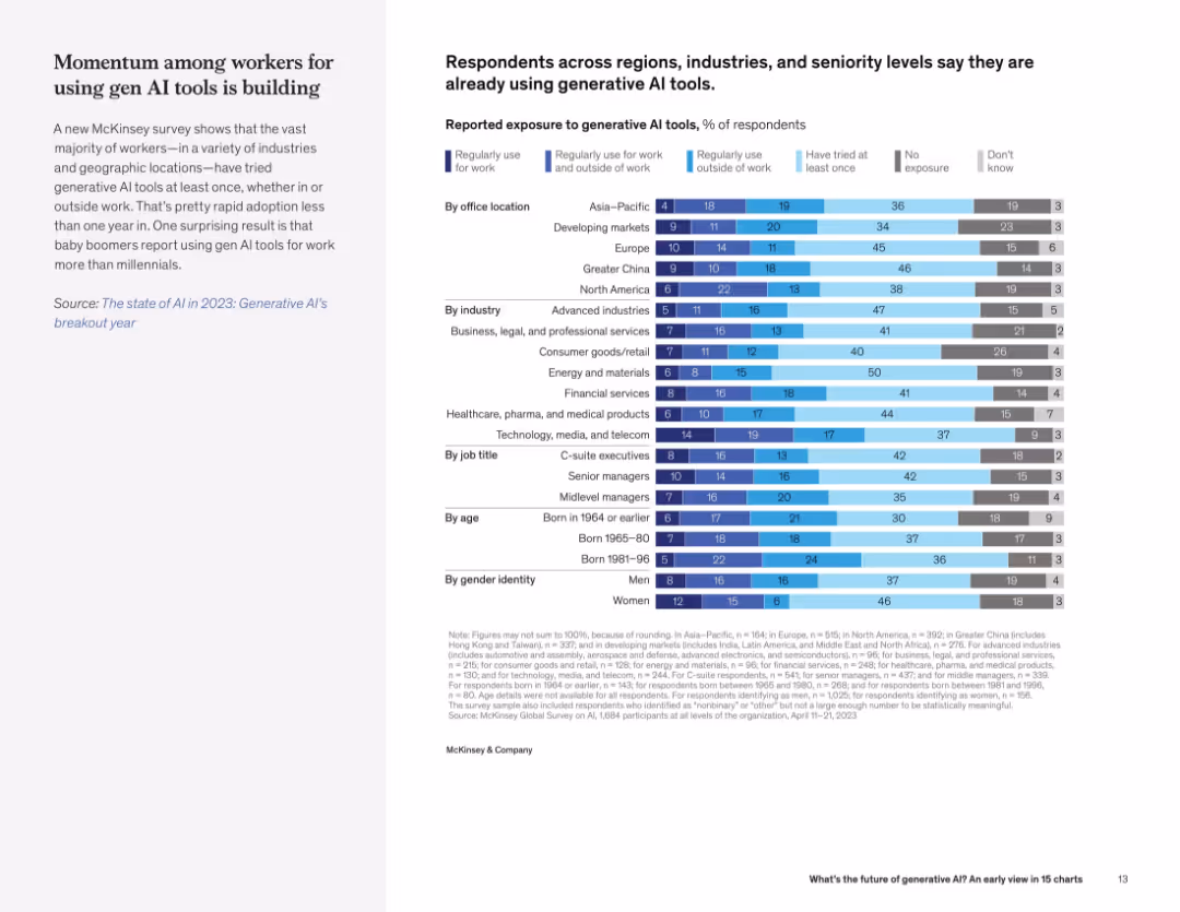
Text on left, with a detailed segmented bar chart on right showing AI exposure levels by region, industry, role, age, and gender.
Market Analysis and Trends
Artificial Intelligence
The slide details generative AI adoption across demographics and geographies, indicating widespread early use and notable surprises (e.g., boomers using it more than millennials).
AI exposure, workforce adoption, demographics, region, industry, generational use, workplace tools
false
Market Analysis and Trends
Artificial Intelligence
Mixed Chart
McKinsey
Add to my slides
Remove from favorites
Comparative column charts show differing levels of optimism and concern about AI based on user frequency, accompanied by concise textual analysis.
Technology and Digital Transformation
Technology & Software
Analyzes how familiarity with AI influences perceptions, important for understanding market readiness and potential resistance or advocacy for AI initiatives.
AI familiarity, market readiness, user perception, technology advocacy, optimism
false
Technology and Digital Transformation
Technology & Software
Multiple Chart
BCG
Add to my slides
Remove from favorites
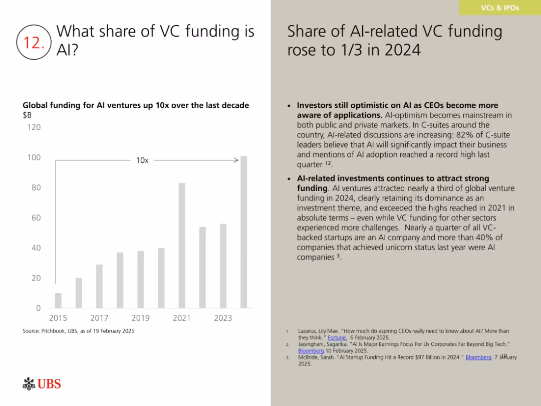
Bar chart showing 10x growth in AI VC funding since 2015; right side gives context and supporting data.
Investment Analysis
Artificial Intelligence
The slide shows that AI companies received one-third of global VC funding in 2024, with strong CEO support for AI adoption. AI dominates VC portfolios, particularly in unicorns and early-stage ventures, maintaining its position as a leading investment theme despite broader sectoral challenges.
AI funding, venture capital, startups, unicorns, tech investment
false
Investment Analysis
Artificial Intelligence
Mixed Chart
UBS
Add to my slides
Remove from favorites
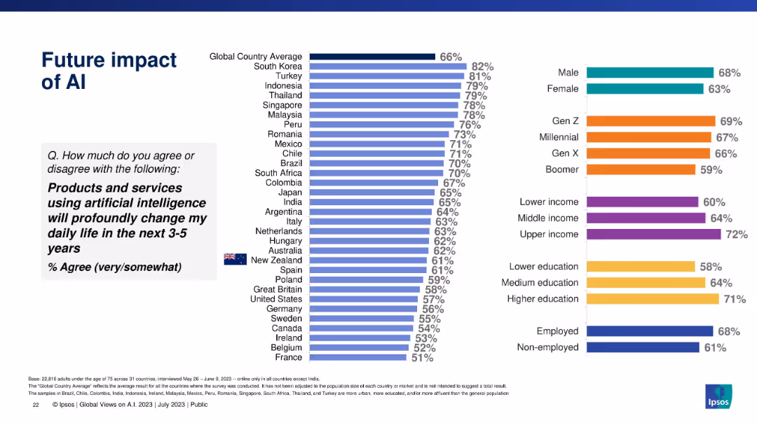
Similar bar chart format measuring expected AI impact in the next 3–5 years, globally and demographically.
Technology and Digital Transformation
Artificial Intelligence
Predicts anticipated future change in daily life due to AI technologies. High agreement levels in Asia-Pacific regions and younger, wealthier, and more educated groups.
AI future impact, digital forecasting, expectations, innovation, demographic trends, Ipsos, AI adoption
false
Technology and Digital Transformation
Artificial Intelligence
Multiple Chart
IPSOS
Add to my slides
Remove from favorites
Vertical bar chart with agreement and disagreement metrics by country. Countries listed on the left; bars on the right reflect opinion breakdown.
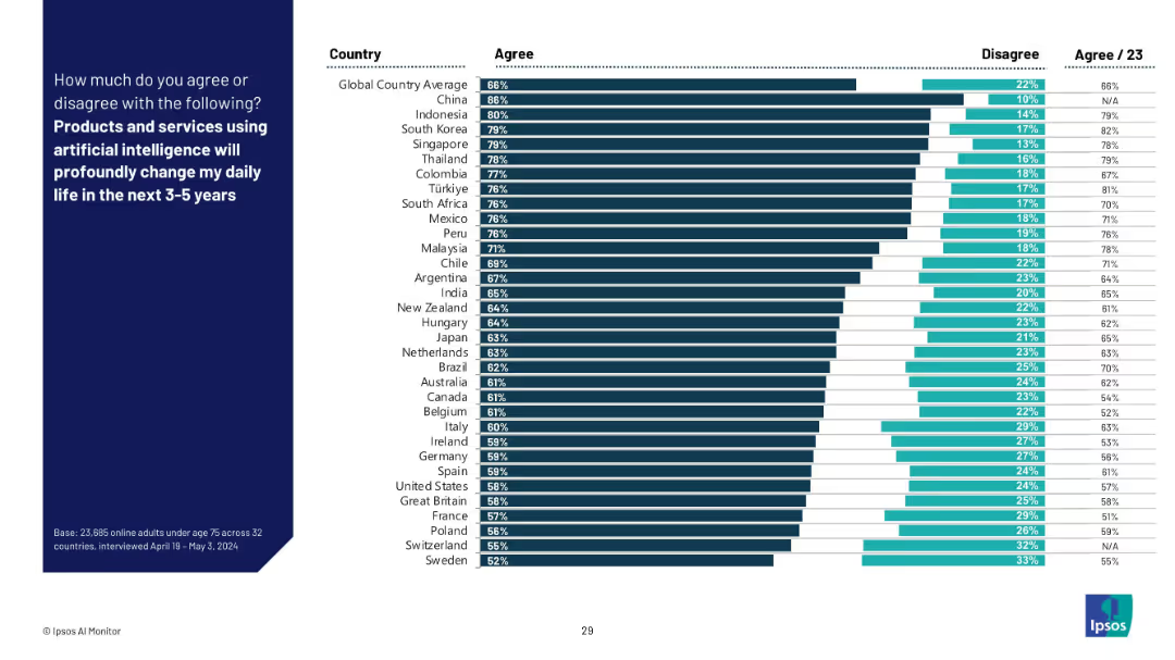
Market Analysis and Trends
Artificial Intelligence
This slide highlights expected future impact of AI, showing global anticipation that AI will significantly shape lives in the coming 3–5 years. Agreement is generally higher than in the retrospective view (Slide 19082), with strongest expectations from China, Indonesia, and South Korea.
AI future, impact prediction, global views, digital transformation, AI products, 3–5 year outlook, survey, anticipation, emerging markets
false
Market Analysis and Trends
Artificial Intelligence
Mixed Chart
IPSOS
Add to my slides
Remove from favorites
Presents a flow chart linking current job roles with future roles in an AI-driven scenario. Uses a gradient of purple to indicate shifts and capacity changes.
Organizational Structure and Change
Technology & Software
Demonstrates potential changes in job roles and work distribution with the integration of AI, aiming at operational optimization and enhanced efficiency.
AI future, job roles, workforce transformation, operational efficiency, role reallocation, capacity increase, technology integration, AI impact, work evolution
false
Organizational Structure and Change
Technology & Software
Diagram
Accenture
Add to my slides
Remove from favorites
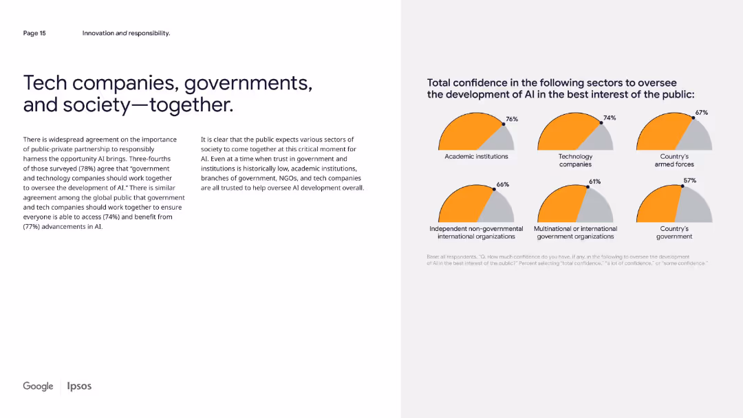
Two-column layout; left side contains text paragraphs, right side shows a pie chart grid with sector confidence levels.
Regulatory and Compliance
Artificial Intelligence
This slide emphasizes the importance of collaboration between governments, tech companies, and the public in the development of AI. It shows that trust is highest in academic institutions and tech companies, despite generally low institutional trust globally.
AI governance, public-private, confidence, oversight, technology, trust, partnership, regulation, sectors, Ipsos
false
Regulatory and Compliance
Artificial Intelligence
Mixed Chart
IPSOS
Add to my slides
Remove from favorites
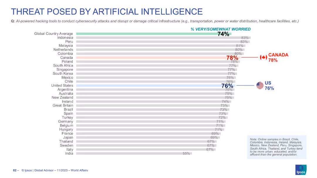
Horizontal bar chart ranking countries' concerns over AI-powered hacking tools
Risk Assessment and Management
Artificial Intelligence
Survey data highlighting global concern (74%) about AI-driven cybersecurity threats. Canada and the US show above-average levels of concern at 78% and 76% respectively.
AI hacking, cybersecurity, critical infrastructure, global survey, public worry
false
Risk Assessment and Management
Artificial Intelligence
Single Chart
IPSOS
Add to my slides
Remove from favorites
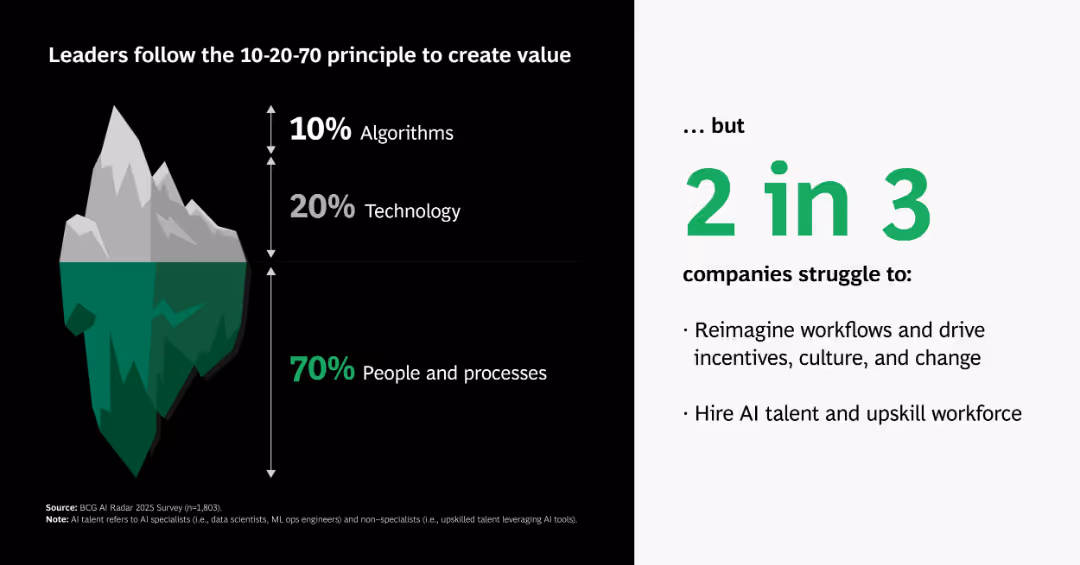
Iceberg visual metaphor breaking down AI value sources into algorithms, tech, and people/processes; supporting text on right.
Organizational Structure and Change
Artificial Intelligence
Explains that true AI value comes 70% from people and processes, 20% from technology, and only 10% from algorithms—contrasting perception with operational reality.
AI iceberg, 10-20-70, people, processes, tech, algorithms, value creation, organizational change
false
Organizational Structure and Change
Artificial Intelligence
Boxed
BCG
Add to my slides
Remove from favorites
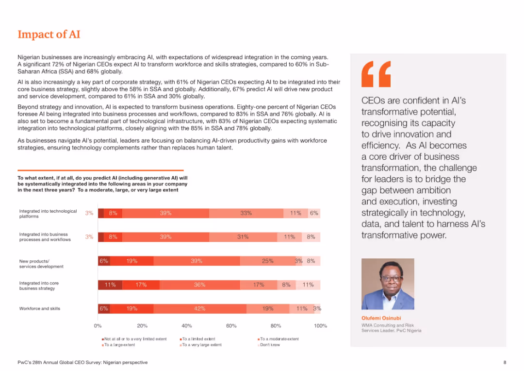
Bar chart showing predicted AI integration in five business areas. Right side contains explanatory paragraph and an executive quote. Red gradient color palette.
Technology and Digital Transformation
Professional Services
This slide illustrates Nigerian CEOs’ expectations of AI becoming a core part of business strategy, workforce transformation, and product development. It emphasizes high integration in business processes and technology platforms, underlining the growing relevance of AI in long-term planning and operations.
AI impact, Nigeria, integration, business strategy, workflows, generative AI
false
Technology and Digital Transformation
Professional Services
Mixed Chart
PwC/Strategy&
Add to my slides
Remove from favorites
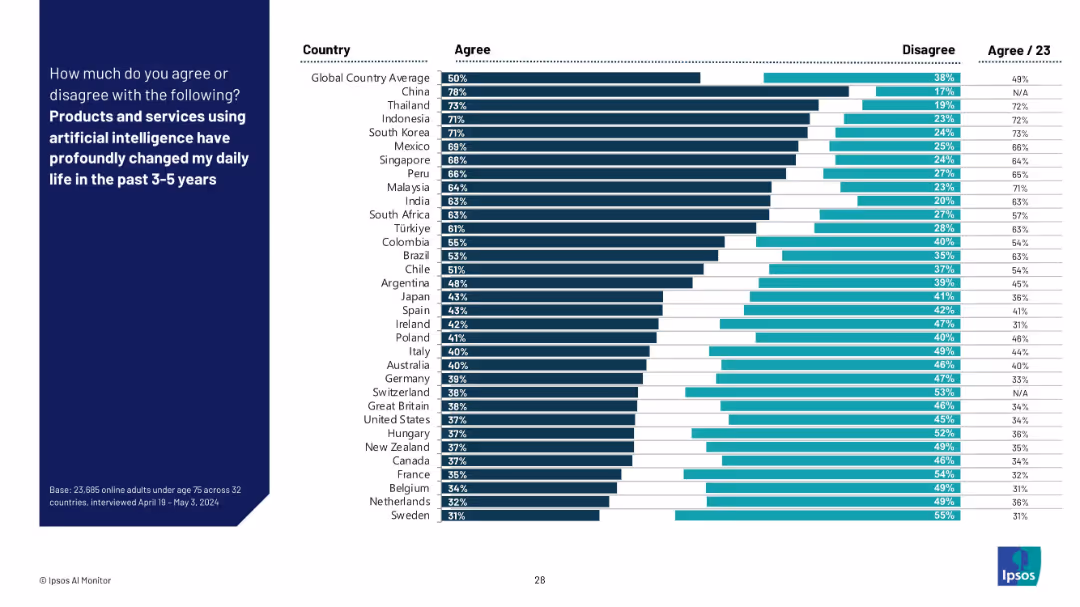
Vertical bar chart ranking agreement by country. Dark bars show agreement; adjacent lighter bars show disagreement. Country names listed left, percentages right.
Market Analysis and Trends
Artificial Intelligence
This slide shows country-by-country agreement on whether AI products and services have significantly impacted daily life in the past 3–5 years. Agreement is highest in China, Southeast Asia, and South Korea, while Western countries show lower agreement.
AI impact, country comparison, user experience, global sentiment, lifestyle change, technology adoption, daily life, survey results, Ipsos
false
Market Analysis and Trends
Artificial Intelligence
Mixed Chart
IPSOS
Add to my slides
Remove from favorites
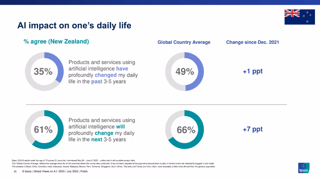
Two donut charts with New Zealand percentages vs. global averages for past and future AI impact.
Technology and Digital Transformation
Artificial Intelligence
Evaluates how people in New Zealand perceive the current and future impact of AI on their daily lives. Forecast shows higher expectations for the future than past experiences.
AI impact, daily life, digital change, New Zealand, Ipsos, future trends, consumer sentiment
false
Technology and Digital Transformation
Artificial Intelligence
Single Chart
IPSOS
Add to my slides
Remove from favorites
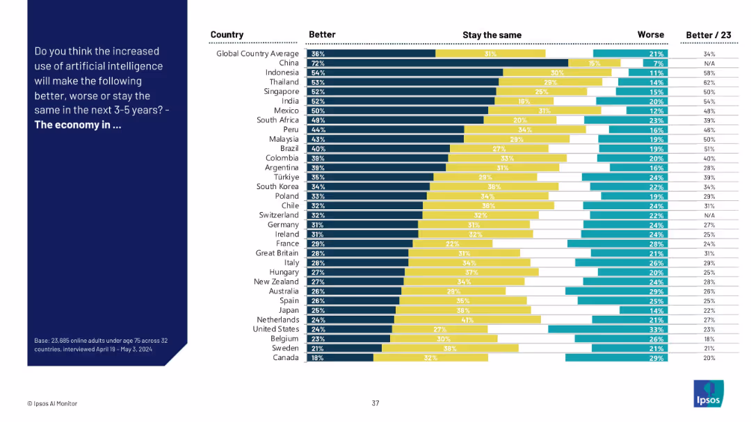
Split-panel layout with a dark blue sidebar containing the question text and a bar chart on the right showing responses across countries.
Market Analysis and Trends
Artificial Intelligence
The slide presents a global comparison of public opinion on whether AI will improve, worsen, or not affect the economy in the next 3–5 years. Results are shown for multiple countries, highlighting optimism in places like China and Indonesia.
AI impact, global economy, country comparison, public opinion, Ipsos, survey, optimism, AI perception, economic outlook, trends
false
Market Analysis and Trends
Artificial Intelligence
Mixed Chart
IPSOS
Add to my slides
Remove from favorites
A color-coded horizontal bar graph contrasted against a black background, assessing CEO beliefs about the impact of AI compared to the internet.
Market Analysis and Trends
Technology & Software
Evaluates CEO perspectives on AI's potential impact versus the internet revolution, highlighting significant regional insights.
AI impact, internet revolution, CEO survey, global regions, data comparison, technology adoption, business insights, future outlook, market research
false
Market Analysis and Trends
Technology & Software
Mixed Chart
PwC/Strategy&
Add to my slides
Remove from favorites
This simple slide juxtaposes bar charts with text to discuss the optimism and concern regarding AI's impact on work, highlighting changes over time.
Technology and Digital Transformation
Technology & Software
Compares public sentiment about AI from different years, useful for discussions on technology adoption and workforce transformation.
AI impact, technology adoption, workforce transformation, public sentiment, optimism
false
Technology and Digital Transformation
Technology & Software
Single Chart
BCG
Add to my slides
Remove from favorites
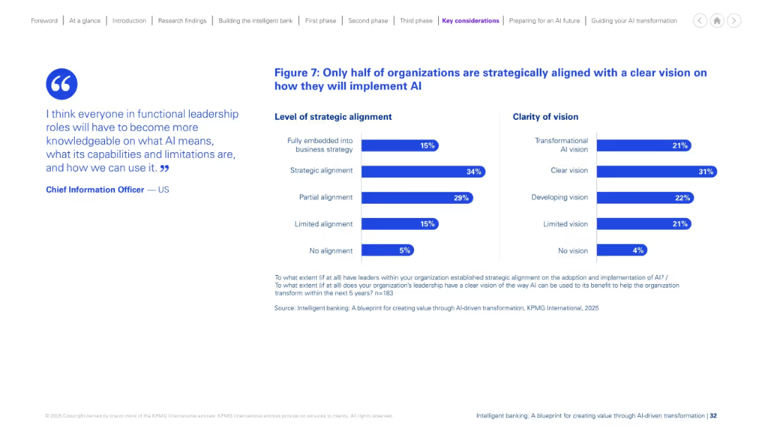
Split-layout slide with a quote on the left and two horizontal bar charts on the right, each showing survey percentages.
Strategic Planning
Financial Services
This slide presents findings on AI strategy alignment and vision clarity in organizations. Only 15% are fully embedded into strategy, and only 31% have a clear vision. It emphasizes gaps in strategic alignment and AI foresight.
AI implementation, strategic alignment, clarity, transformation, survey, statistics, business strategy, vision, leadership, organizational change
false
Strategic Planning
Financial Services
Mixed Chart
KPMG
Add to my slides
Remove from favorites
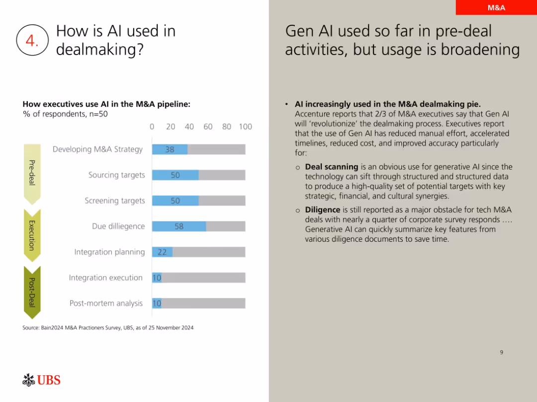
Bar chart on executive AI use across M&A phases; right column text explanation
Technology and Digital Transformation
Artificial Intelligence
Describes how AI is being integrated into various stages of M&A, from strategy development to due diligence. Most usage is in early stages (pre-deal) but is expanding. Gen AI is credited with improving speed, cost, and accuracy.
AI in M&A, due diligence, sourcing targets, generative AI, integration, survey, automation
false
Technology and Digital Transformation
Artificial Intelligence
Mixed Chart
UBS
Add to my slides
Remove from favorites
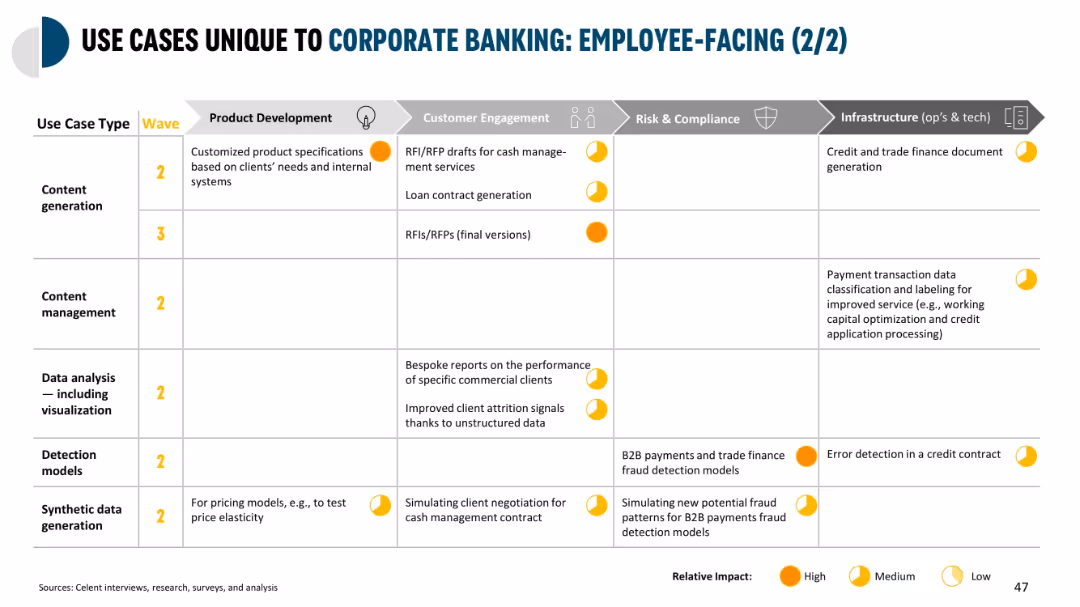
Grid layout table with colored impact indicators (high, medium, low); 5 columns for business functions; categorized by use case type; minimal illustrations
Operational Efficiency
Financial Services
Details AI-enabled employee-facing use cases in corporate banking across five categories—product development, customer engagement, risk & compliance, and infrastructure. Focuses on areas like content generation, detection models, synthetic data use, and improved analysis.
AI in banking, employee tools, risk detection, synthetic data, infrastructure
false
Operational Efficiency
Financial Services
Single Chart
Oliver Wyman
Add to my slides
Remove from favorites
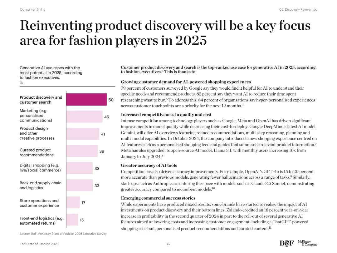
Two-column layout with left bar chart and right-aligned text. Uses black and pastel colors. Bar chart ranks AI use cases by importance. Right side includes detailed bullet points with bolded subheadings.
Technology and Digital Transformation
Retail & E-commerce
Discusses AI use cases in fashion, highlighting "product discovery and customer search" as the top priority. Explains customer demand, AI improvements, competitive tech developments, and emerging commercial success stories for 2025.
AI in fashion, product discovery, personalization, generative AI, Gemini, Claude, GPT-4o
false
Technology and Digital Transformation
Retail & E-commerce
Mixed Chart
McKinsey
Add to my slides
Remove from favorites
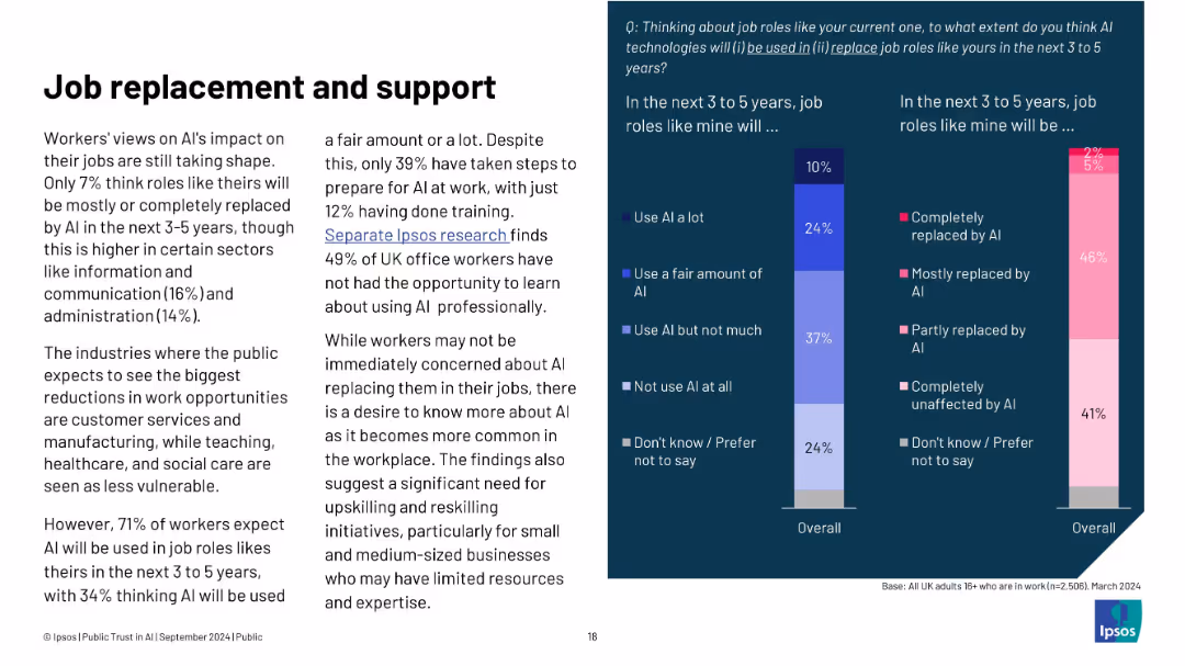
Left: summary of worker sentiment and expectations; right: bar charts on AI job use and replacement
Human Resources and Talent Management
Artificial Intelligence
Most workers don’t believe AI will fully replace their jobs in the near term, but many expect it to be used in their roles. Still, few are taking steps to prepare. The slide stresses the need for reskilling, especially in sectors likely to be most affected by AI.
AI in work, job replacement, Ipsos, upskilling, training, worker sentiment, automation, career support
false
Human Resources and Talent Management
Artificial Intelligence
Mixed Chart
IPSOS
Add to my slides
Remove from favorites
Slide with a dark background and a color-coded horizontal bar graph examining the introduction of AI initiatives in various regions.
Regulatory and Compliance
Technology & Software
Investigates the adoption of AI initiatives across global regions, reflecting on current business practices and future trends.
AI initiatives, global trends, CEO survey, regional adoption, business practices, technology integration, market analysis, future planning
false
Regulatory and Compliance
Technology & Software
Single Chart
PwC/Strategy&
Add to my slides
Remove from favorites
Left side presents a survey result in gradient bar chart format; right side contains detailed explanatory text on experimentation strategies.
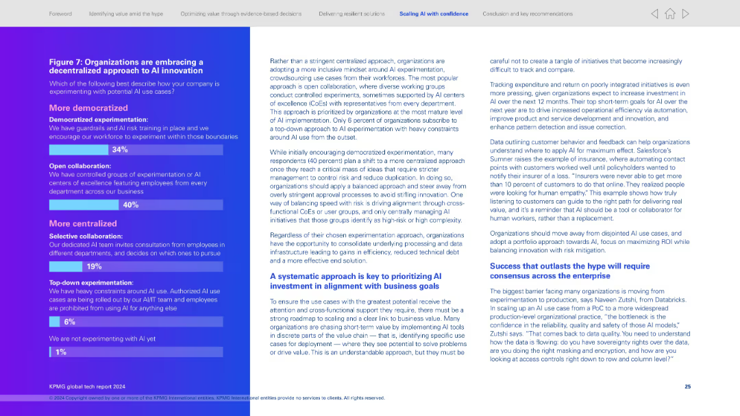
Technology and Digital Transformation
Artificial Intelligence
Highlights shift from centralized to decentralized AI experimentation. Shows most organizations prefer open collaboration (40%) or democratized approaches (34%). Right panel elaborates on balanced experimentation models and aligning AI with business outcomes.
AI innovation, decentralized experimentation, collaboration, democratized AI, strategic alignment, innovation culture, organizational maturity
false
Technology and Digital Transformation
Artificial Intelligence
Mixed Chart
KPMG
Add to my slides
Remove from favorites
Contains a simple, clear layout with purple headers and subheaders over a white background. It outlines steps such as "Gen AI in Your Enterprise" and "Scale AI Responsibly" with concise bullet points under each section.
Operational Efficiency
Technology & Software
Provides a structured plan for incorporating AI into business practices, focusing on scalability, workforce transformation, and ethical considerations.
AI integration, business strategy, scalability, ethical AI, workforce transformation, leadership, digital transformation, operational efficiency, AI roadmap
false
Operational Efficiency
Technology & Software
Header Vertical
Accenture
Add to my slides
Remove from favorites
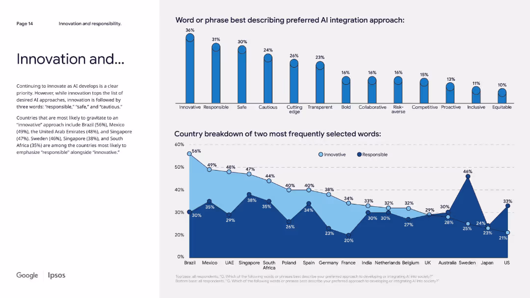
Two-part layout: left narrative and two bar charts on the right—top for integration terms, bottom for country preferences.
Technology and Digital Transformation
Artificial Intelligence
This slide explores preferred values for AI integration, with "innovative" topping the list globally. Many also emphasize “responsible,” “safe,” and “cautious,” showing the tension between progress and regulation. Country-level data shows how cultural values shape attitudes.
AI integration, responsible innovation, global preferences, terminology, country trends, public values
false
Technology and Digital Transformation
Artificial Intelligence
Multiple Chart
IPSOS
Add to my slides
Remove from favorites
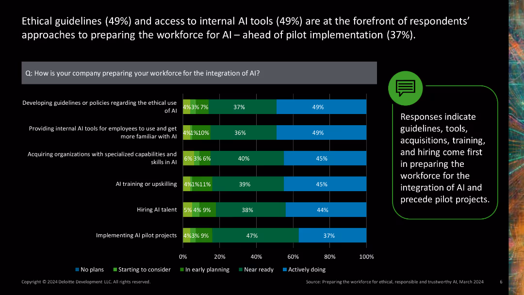
Stacked bar chart showing various approaches companies take to prepare their workforce for AI integration.
Human Resources and Talent Management
Technology & Software
Illustrates different strategies companies use to ready their workforce for AI, such as developing guidelines, providing AI tools, and acquiring AI skills.
AI integration, workforce preparation, guidelines, AI tools, skill acquisition
false
Human Resources and Talent Management
Technology & Software
Mixed Chart
Deloitte
Add to my slides
Remove from favorites
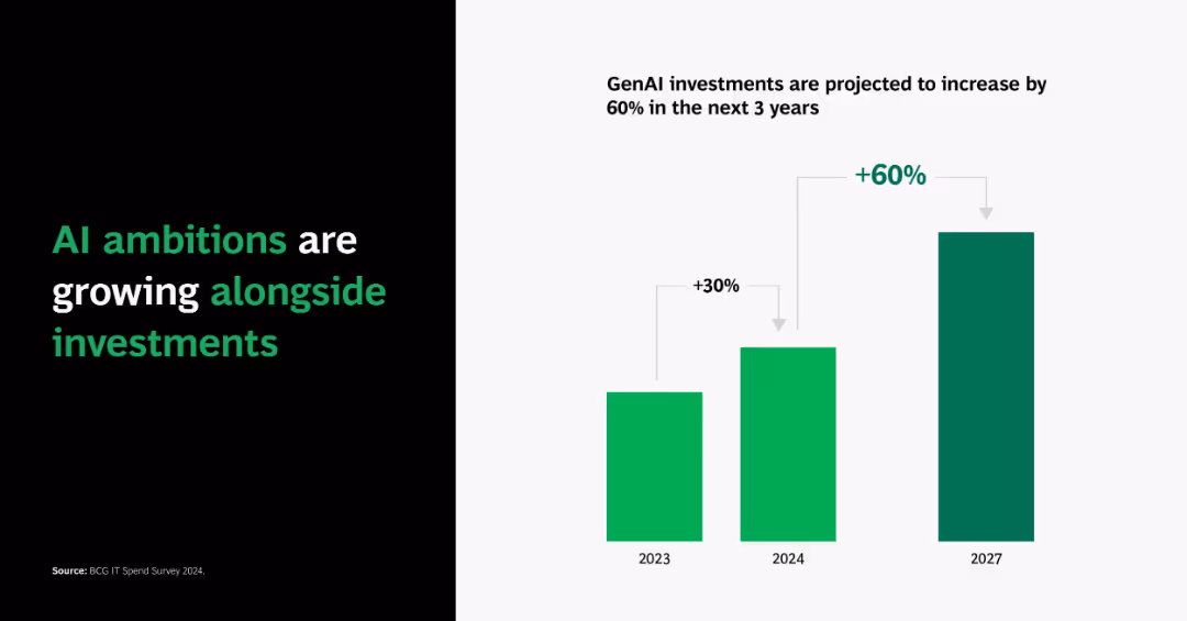
Split layout: black left panel with bold green/white typography; right side shows a vertical bar chart with 2023–2027 projections and growth percentages.
Strategic Planning
Artificial Intelligence
Highlights a 60% projected increase in GenAI investments over 3 years, starting from a 30% increase in 2024, indicating rising ambitions and commitment to AI.
AI investment, GenAI, growth, projections, 2023, 2024, 2027, chart, ambitions, funding
false
Strategic Planning
Artificial Intelligence
Single Chart
BCG
Add to my slides
Remove from favorites
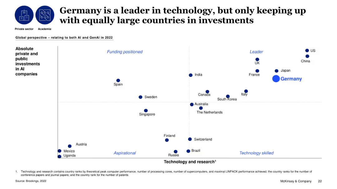
Global scatterplot comparing countries on AI investments vs. tech/research capabilities; Germany is large but middle-tier.
Investment Analysis
Artificial Intelligence
The slide maps countries based on their technology strength and AI investment levels. Germany appears as a tech leader but lags behind nations like the US and China in investment. The visual reinforces the point that Germany needs to increase AI investment to match its technical capability.
AI investment, Germany, global comparison, technology, research, funding, public-private
false
Investment Analysis
Artificial Intelligence
Single Chart
McKinsey
Add to my slides
Remove from favorites
Two-column format: left side text-heavy with insights; right side features a vertical bar chart of AI budget allocation by sector and maturity.
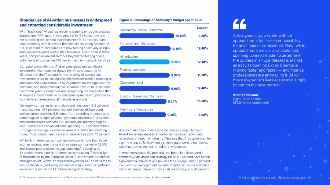
Investment Analysis
Financial Services
Describes expanding use of AI in businesses and increasing investment. Charts AI budget share by sector and maturity level. Highlights governance, strategic alignment, and the EU AI Act's anticipated impact.
AI investment, IT budget, digital maturity, sector comparison, governance, compliance
false
Investment Analysis
Financial Services
Mixed Chart
KPMG
Add to my slides
Remove from favorites
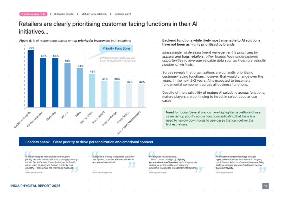
Mixed chart and commentary layout. Bar graph on left side, supporting commentary on right with highlighted callout box and quotes at the bottom. Follows dotted grid background.
Product and Service Analysis
Retail & E-commerce
This slide reveals that retailers are prioritizing customer-facing AI functions such as customer insights, CX orchestration, and marketing over backend operations. It highlights the trend of using AI for personalization and emotional connection. Despite backend potential, most investments are going toward functions with visible customer impact and faster returns.
AI investment, customer insights, marketing, CX orchestration, personalization, emotional connect, priorities
false
Product and Service Analysis
Retail & E-commerce
Mixed Chart
PwC/Strategy&
Add to my slides
Remove from favorites
Split layout with bar chart on right and dense text on left, uses bold headers and blue highlights
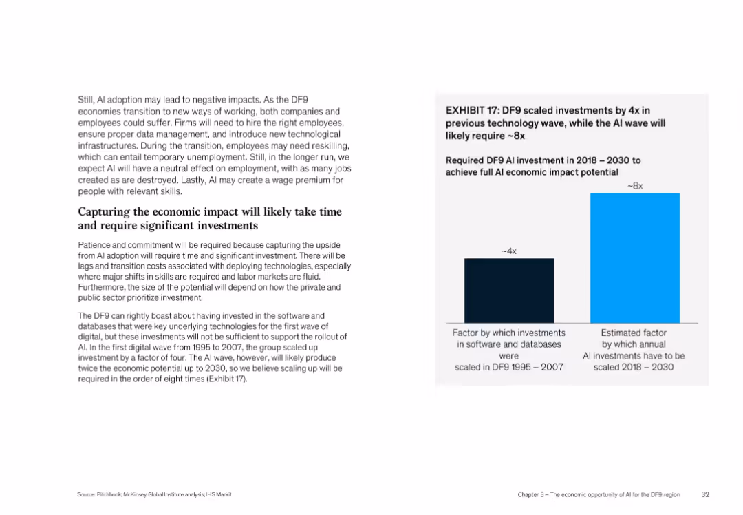
Investment Analysis
Artificial Intelligence
This slide highlights that AI's economic potential in DF9 will require scaling investment by 8x compared to a 4x increase during earlier tech waves (1995–2007). It discusses the need for reskilling, proper infrastructure, and how private/public sectors must prioritize investment to capture AI benefits.
AI investment, economic impact, scaling, DF9, reskilling, infrastructure
false
Investment Analysis
Artificial Intelligence
Mixed Chart
McKinsey
Add to my slides
Remove from favorites
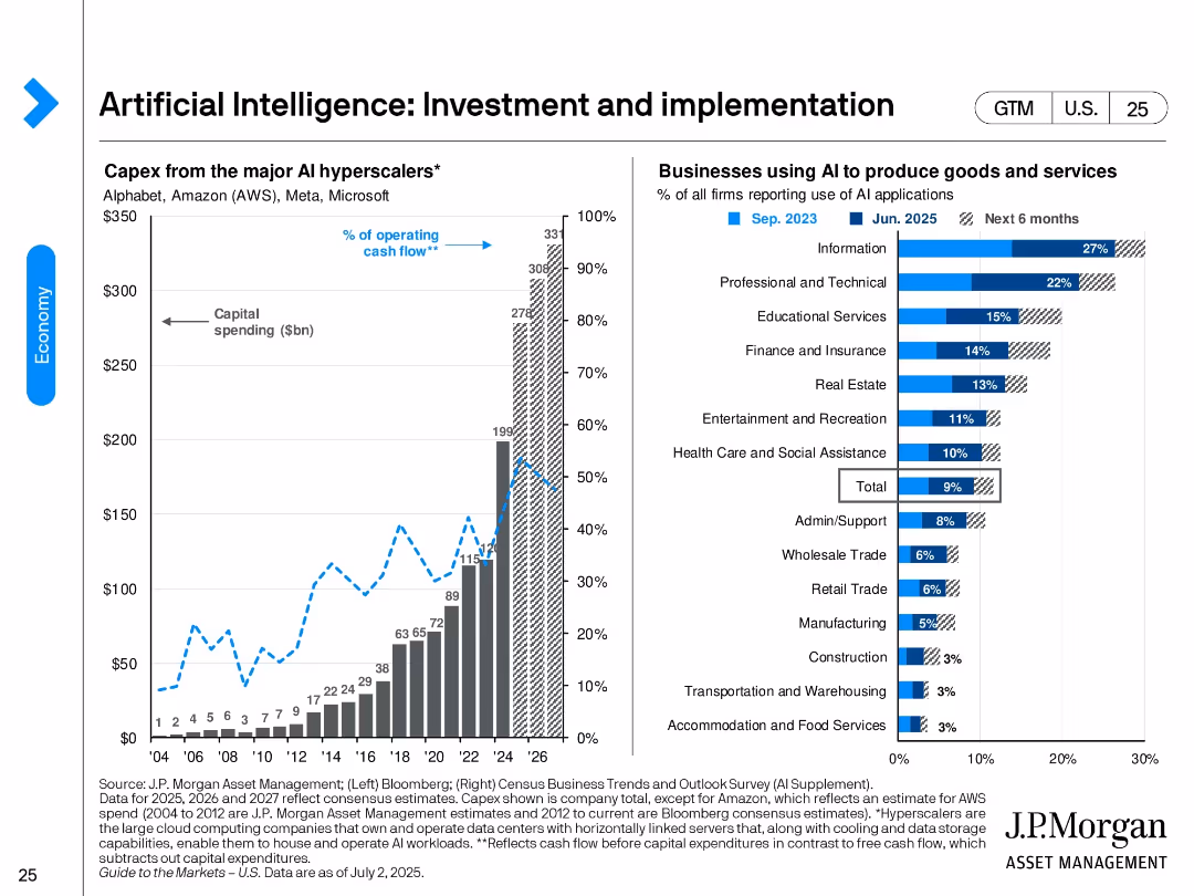
Split design. Left: bar and line chart showing capex by major AI hyperscalers from 2004 to projected 2026. Right: bar chart ranking industry AI adoption rates as of June 2025 and future intent.
Technology and Digital Transformation
Artificial Intelligence
Shows the surge in AI investment by major hyperscalers like AWS, Microsoft, and Alphabet. It also identifies sectors with highest AI adoption—led by Information and Professional Services—and expectations for broader deployment in the next 6 months.
AI investment, hyperscalers, technology adoption, AI implementation, industry adoption, digital transformation, capex, cloud
false
Technology and Digital Transformation
Artificial Intelligence
Multiple Chart
JP Morgan
Add to my slides
Remove from favorites
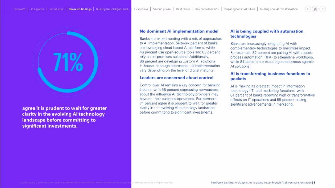
Split design: large purple section with percentage graphic on the left, text and multiple headers in blue on white background on the right. Structured and color-contrasted layout.
Investment Analysis
Financial Services
The slide shows 71% of respondents believe it's wise to delay major AI investments until the tech landscape is clearer. It highlights lack of a dominant AI model, leadership concerns about control, and the role of automation. It reveals banks’ cautious yet evolving stance towards AI, with adoption happening selectively and with reservations around operational impact.
AI investment, risk, caution, automation, control, banking strategy
false
Investment Analysis
Financial Services
Mixed Chart
KPMG
Add to my slides
Remove from favorites
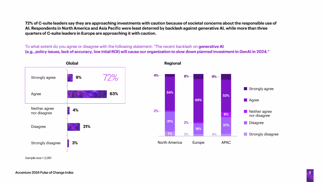
This slide features horizontal bar charts showing the extent to which C-suite leaders agree or disagree with statements about societal concerns affecting AI investments, segmented globally and regionally.
Technology and Digital Transformation
Technology & Software
The slide discusses how societal concerns about the responsible use of AI are affecting investments, with a significant number of leaders approaching AI investments cautiously due to these concerns.
AI investments, societal concerns, caution, responsible use, global, regional
false
Technology and Digital Transformation
Technology & Software
Multiple Chart
Accenture
Add to my slides
Remove from favorites
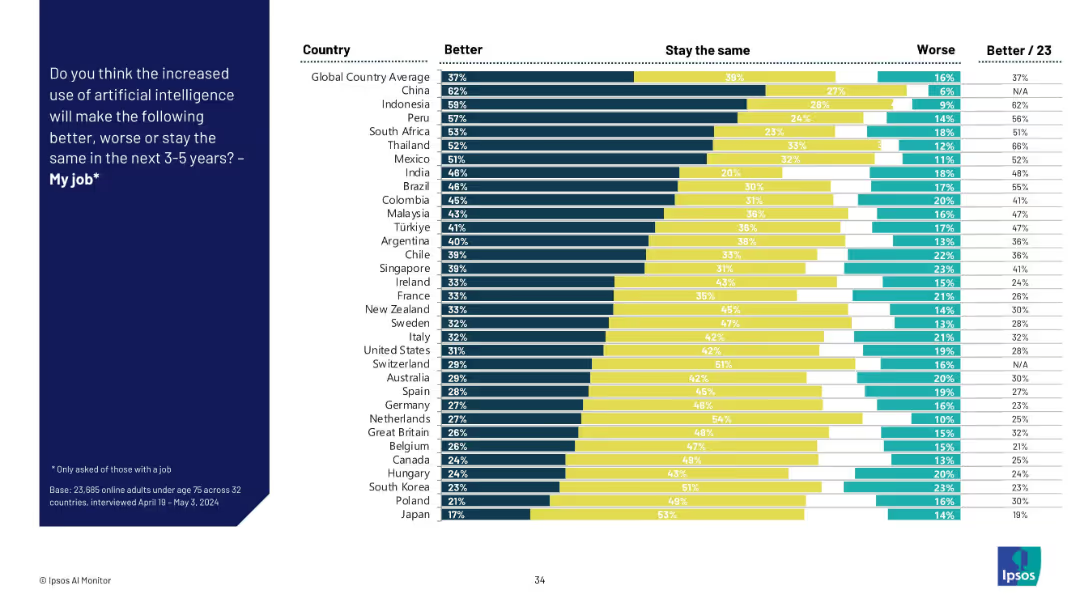
Stacked bar chart by country showing "Better," "Stay the same," and "Worse" views on AI’s job impact. Colors separate the three opinions.
Human Resources and Talent Management
Artificial Intelligence
This slide captures perceptions across countries about whether AI will improve, worsen, or not affect their job over the next 3–5 years. Optimism is highest in Asia and Latin America, while skepticism is more prevalent in Western Europe.
AI job impact, country analysis, workplace outlook, sentiment distribution, talent management, job improvement, technology shift
false
Human Resources and Talent Management
Artificial Intelligence
Mixed Chart
IPSOS
Add to my slides
Remove from favorites
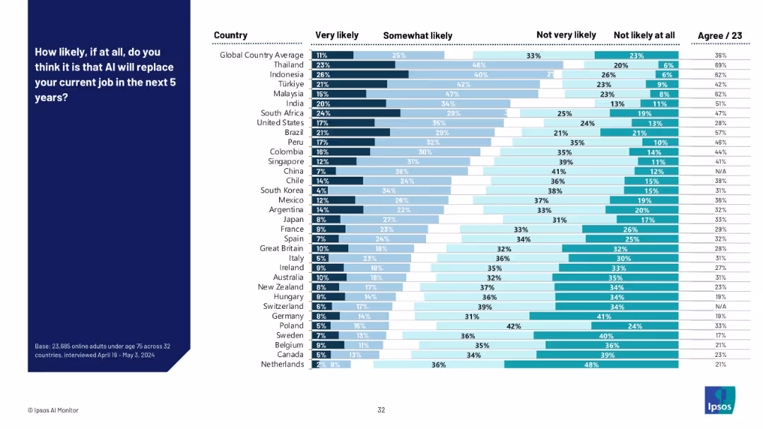
Mixed bar chart with four response categories across countries, color-coded by likelihood level.
Risk Assessment and Management
Artificial Intelligence
This slide examines perceived risk of AI replacing jobs within five years across different countries. Southeast Asia expresses greater concern compared to Europe and North America. The data reflects varying levels of anxiety about job displacement.
AI job replacement, employment risk, automation, country comparison, fear of displacement, labor market, survey analysis, AI threat
false
Risk Assessment and Management
Artificial Intelligence
Mixed Chart
IPSOS
Add to my slides
Remove from favorites
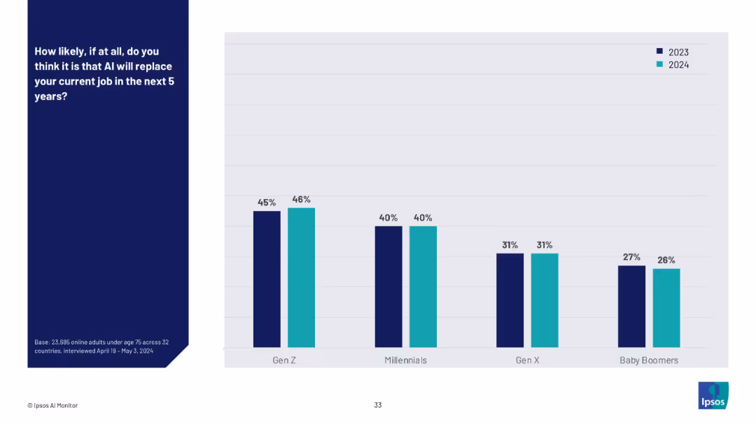
Vertical bar chart comparing 2023 vs. 2024 responses across generational groups (Gen Z to Baby Boomers).
Risk Assessment and Management
Artificial Intelligence
This slide tracks the year-over-year change in belief that AI will replace current jobs. Gen Z maintains the highest level of concern, while Baby Boomers show the least concern. Overall, responses have remained relatively stable between 2023 and 2024.
AI job risk, generational perception, technology anxiety, automation, workplace displacement, year-on-year trend, AI adoption
false
Risk Assessment and Management
Artificial Intelligence
Mixed Chart
IPSOS
Add to my slides
Remove from favorites
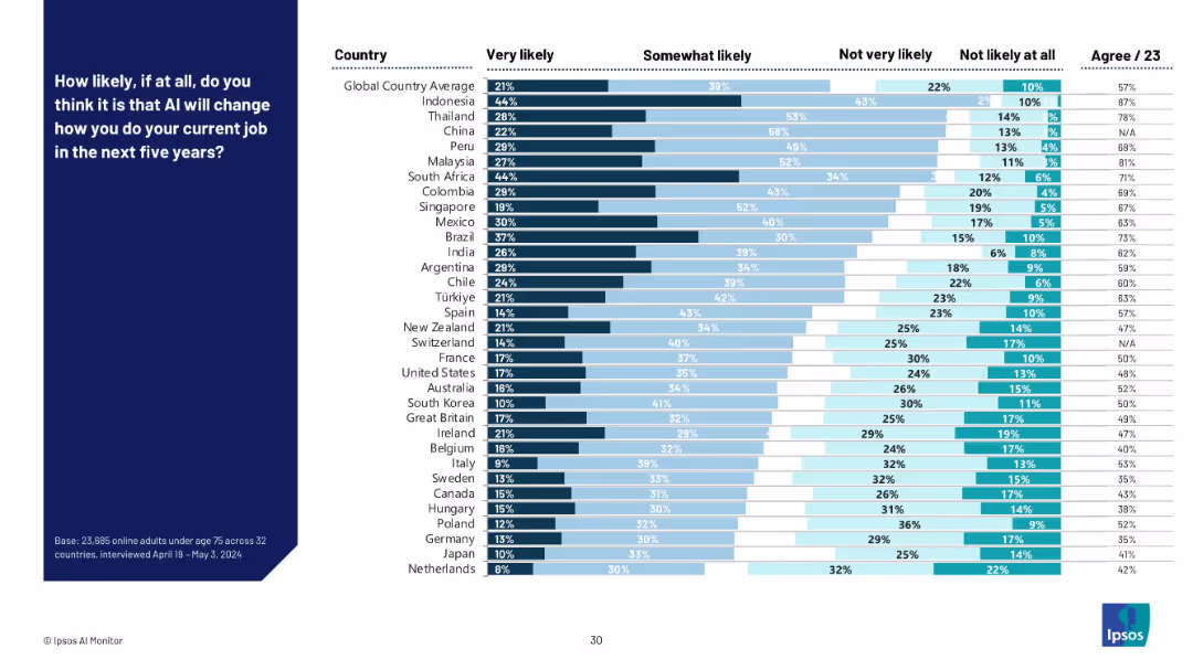
Mixed bar chart with four response categories (very likely to not likely at all) across countries. Bars are color-coded by intensity of likelihood.
Technology and Digital Transformation
Artificial Intelligence
This slide shows perceived likelihood across countries that AI will change how people perform their current jobs in the next five years. Asian countries like Indonesia and Thailand show the highest perceived likelihood, while Western European countries show more skepticism.
AI jobs, workplace transformation, future of work, employment outlook, country breakdown, likelihood perception, digital tools, survey
false
Technology and Digital Transformation
Artificial Intelligence
Mixed Chart
IPSOS
Add to my slides
Remove from favorites
This slide features a roadmap with five steps, each represented by a point on the path. The steps are indicated with numbered markers and include brief descriptions. The background is dark with a network pattern, and the text is in white and purple.
Strategic Planning
Technology & Software
The slide outlines guiding principles for driving an AI journey, emphasizing prioritizing value creation, encouraging innovation, assessing capabilities, involving the organization, and using AI responsibly.
AI journey, roadmap, strategy, innovation, governance
false
Strategic Planning
Technology & Software
Vertical Flow
Kearney
Add to my slides
Remove from favorites
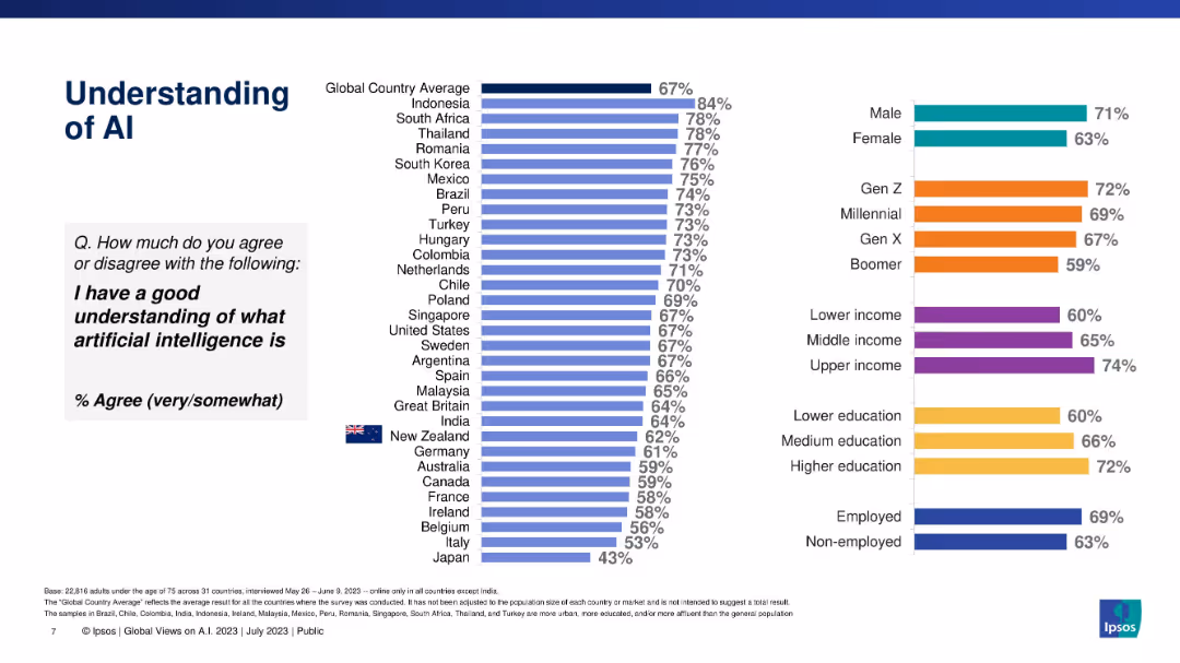
Vertical bar chart ranking countries by % agreement with understanding AI; right side shows demographics.
Industry Overview
Artificial Intelligence
This slide visualizes how well citizens of various countries understand what artificial intelligence is. It ranks countries and breaks down understanding by gender, generation, income, education, and employment status, highlighting demographic differences in awareness.
AI knowledge, global comparison, demographics, Ipsos, awareness, education, income, employment, understanding
false
Industry Overview
Artificial Intelligence
Multiple Chart
IPSOS
Add to my slides
Remove from favorites
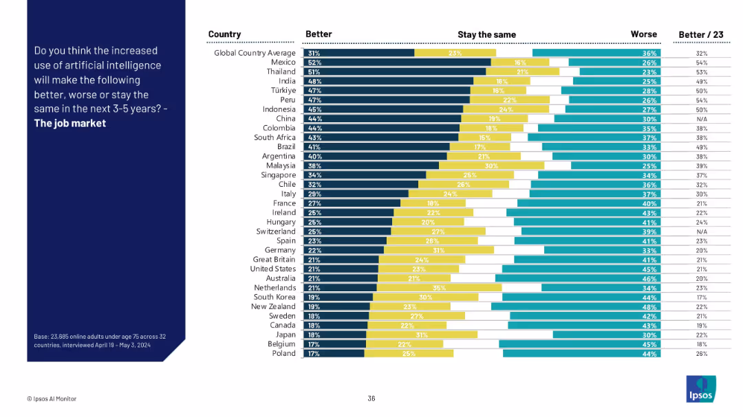
Stacked bar chart showing global country responses on whether AI will improve, harm, or leave the job market unchanged.
Strategic Planning
Artificial Intelligence
This slide evaluates opinions across countries on AI’s effect on the broader job market in the next 3–5 years. Results are mixed, with Latin America and Asia leaning optimistic, and European nations showing concern or neutrality.
AI labor market, workforce trends, employment future, strategic planning, technology impact, global perception, jobs outlook
false
Strategic Planning
Artificial Intelligence
Mixed Chart
IPSOS
Add to my slides
Remove from favorites
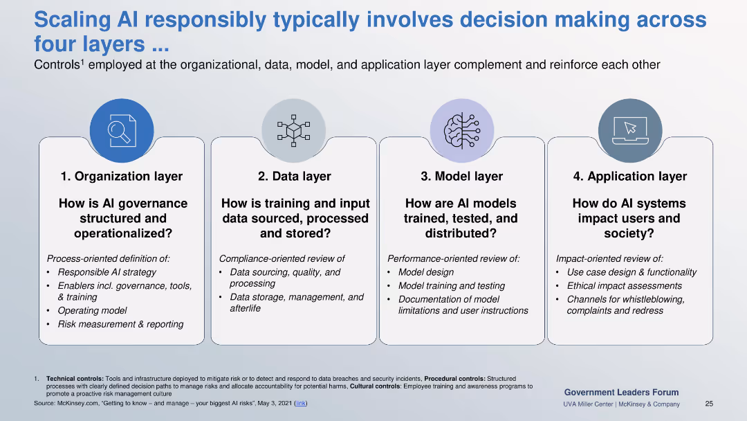
Four-column layout showing Organizational, Data, Model, and Application layers. Each column details control areas and review types.
Risk Assessment and Management
Government & Public Sector
Explains layered AI governance: organizational processes, data compliance, model performance testing, and user impact review. Designed to support safe, ethical AI at scale.
AI layers, governance, compliance, model testing, user impact, risk measurement
false
Risk Assessment and Management
Government & Public Sector
Pillar
McKinsey
Add to my slides
Remove from favorites
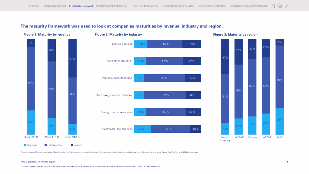
Full-width layout with three vertical bar charts showing AI maturity distribution across revenue, industry, and geography.
Operational Efficiency
Financial Services
Illustrates AI maturity levels (beginner, implementer, leader) across company revenue bands, industries, and regions. Highlights disparities in adoption and positioning for AI leadership across sectors and regions.
AI maturity, benchmarking, revenue, industry comparison, regional trends, implementation, leader status, AI adoption
false
Operational Efficiency
Financial Services
Multiple Chart
KPMG
Add to my slides
Remove from favorites
The slide features a large section of text explaining the importance of AI maturity, accompanied by a column chart illustrating the projected time for AI transformation compared to digital transformation.
Market Analysis and Trends
Technology & Software
This slide emphasizes the critical role of AI in gaining competitive advantage, highlighting survey data on the importance of AI, and showing a projection of AI transformation timelines.
AI maturity, competitive advantage, transformation, digital transformation, survey data
false
Market Analysis and Trends
Technology & Software
Pillar
Accenture
Add to my slides
Remove from favorites
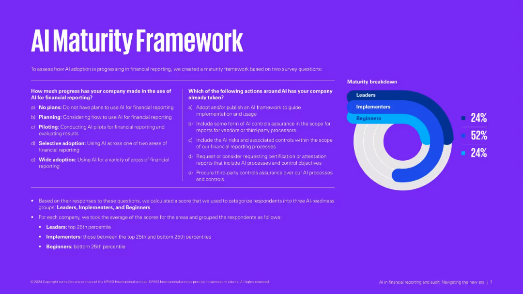
Purple background with side-by-side matrices and a donut chart breakdown of maturity levels: Leaders, Implementers, Beginners.
Technology and Digital Transformation
Financial Services
Defines an AI maturity model based on usage and actions taken. Categorizes companies into three groups based on their AI implementation readiness. Provides criteria and scoring method for classification.
AI maturity, financial reporting, implementation stages, digital transformation, assessment
false
Technology and Digital Transformation
Financial Services
Mixed Chart
KPMG
Add to my slides
Remove from favorites
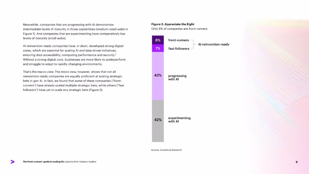
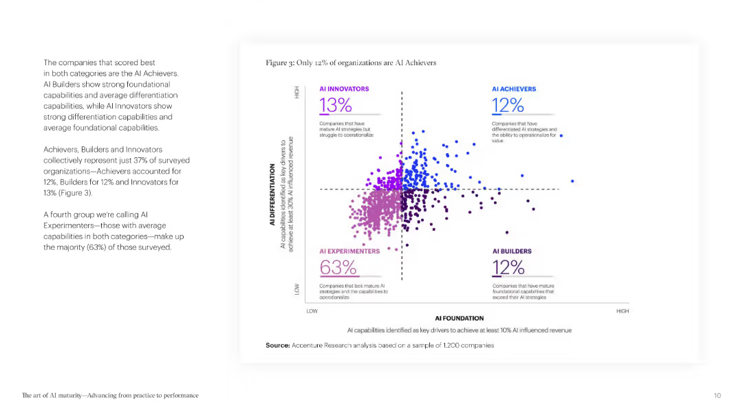
Vertical bar chart categorizing company AI maturity levels: experimenting, progressing, fast-followers, and front-runners. Percentages listed next to each category.
Market Analysis and Trends
Artificial Intelligence
Highlights distribution of AI maturity across surveyed companies, showing that only 8% are front-runners. Notes distinctions between fast-followers and front-runners, with most companies still in early AI phases. Suggests significant room for growth in scaling strategic AI capabilities.
AI maturity, front-runners, adoption stages, market segmentation
false
Market Analysis and Trends
Artificial Intelligence
Mixed Chart
Accenture
Add to my slides
Remove from favorites
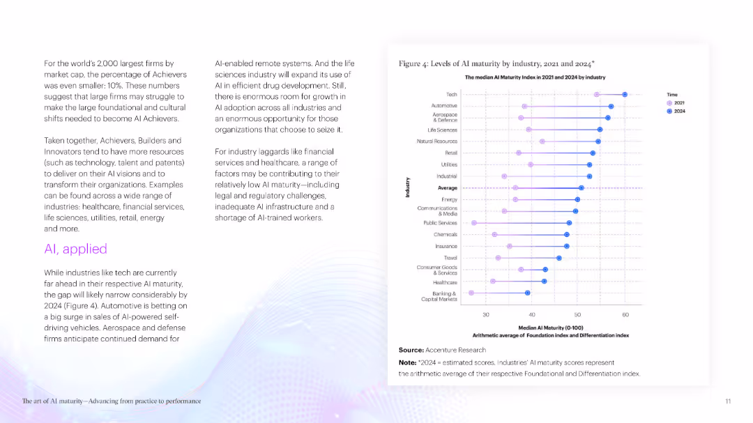
The slide presents a column chart comparing AI maturity across different industries in 2021 and 2024. Each industry is represented by a color-coded line, providing a clear visual comparison.
Market Analysis and Trends
Technology & Software
It analyzes AI maturity levels across various industries, showing current standings and future projections. The data helps in understanding which industries are leading in AI adoption.
AI maturity, industry comparison, projections, data analysis, industry trends
false
Market Analysis and Trends
Technology & Software
Mixed Chart
Accenture
Add to my slides
Remove from favorites
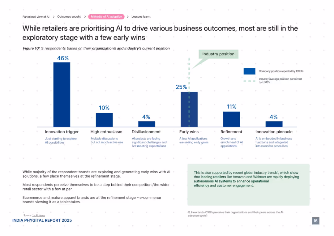
Centered vertical bar chart showing AI adoption stages, supported by paragraph analysis and green-highlighted insights box.
Technology and Digital Transformation
Retail & E-commerce
This slide maps AI maturity levels in retail, indicating most brands are in the exploratory or early-win stages. Very few are in the refinement or pinnacle phases. Commentary highlights perceived lag in progress relative to competitors and industry norms. E-commerce brands are further ahead.
AI maturity, innovation trigger, retail adoption, early wins, refinement, digital transformation, Amazon, Walmart
false
Technology and Digital Transformation
Retail & E-commerce
Mixed Chart
PwC/Strategy&
Add to my slides
Remove from favorites
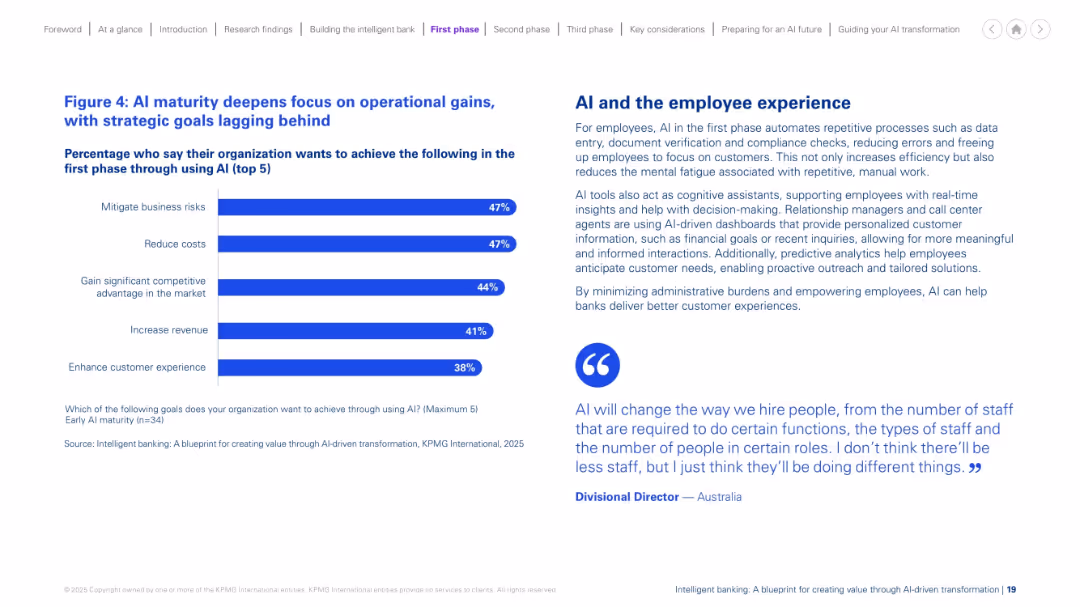
Split design: bar chart on the left with top 5 AI goals; descriptive text and a quote on the right. Blue and purple color scheme. Balanced and minimalistic.
Performance Metrics and KPIs
Financial Services
The slide shows that at early AI maturity, organizations prioritize operational improvements such as risk mitigation and cost reduction over strategic goals. It explains how AI enhances employee experience through automation, reducing manual effort and improving decision-making and customer interactions. A quote adds perspective on AI’s workforce impact.
AI maturity, operations, efficiency, cost, employee, experience, early phase
false
Performance Metrics and KPIs
Financial Services
Mixed Chart
KPMG
Add to my slides
Remove from favorites
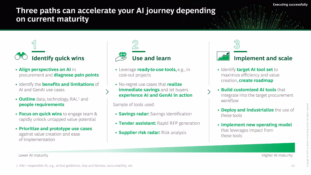
Three-column layout with numbered icons and progressive titles: Identify Quick Wins, Use and Learn, Implement and Scale. Each has bulleted text and a sample tools list. Gradient green arrow indicates maturity path.
Technology and Digital Transformation
Artificial Intelligence
The slide outlines three phases for accelerating AI adoption based on organizational maturity. It provides tactical steps for identifying AI opportunities, piloting tools, and implementing them at scale. Specific AI tools and maturity considerations are also included.
AI maturity, quick wins, implementation, roadmap, procurement AI, tools, savings, scaling
false
Technology and Digital Transformation
Artificial Intelligence
Linear Flow
BCG
Add to my slides
Remove from favorites
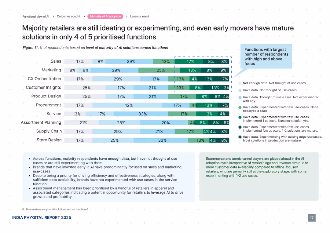
Horizontal bar chart with 10 AI functions, color-coded by level of maturity. Informational text boxes explain insights and patterns. Clean, data-heavy design with a right-aligned legend.
Technology and Digital Transformation
Retail & E-commerce
This slide analyzes the maturity levels of AI adoption across various retail functions, revealing that most brands are still experimenting or ideating. Only a few functions such as sales and marketing show mature solutions. The visual compares ten functions and explains trends in AI data usage and implementation, highlighting areas of opportunity and early adoption.
AI maturity, retail functions, experimentation, early adoption, customer insights, data use, sales, marketing, CX, assortment planning
false
Technology and Digital Transformation
Retail & E-commerce
Mixed Chart
PwC/Strategy&
Add to my slides
Remove from favorites
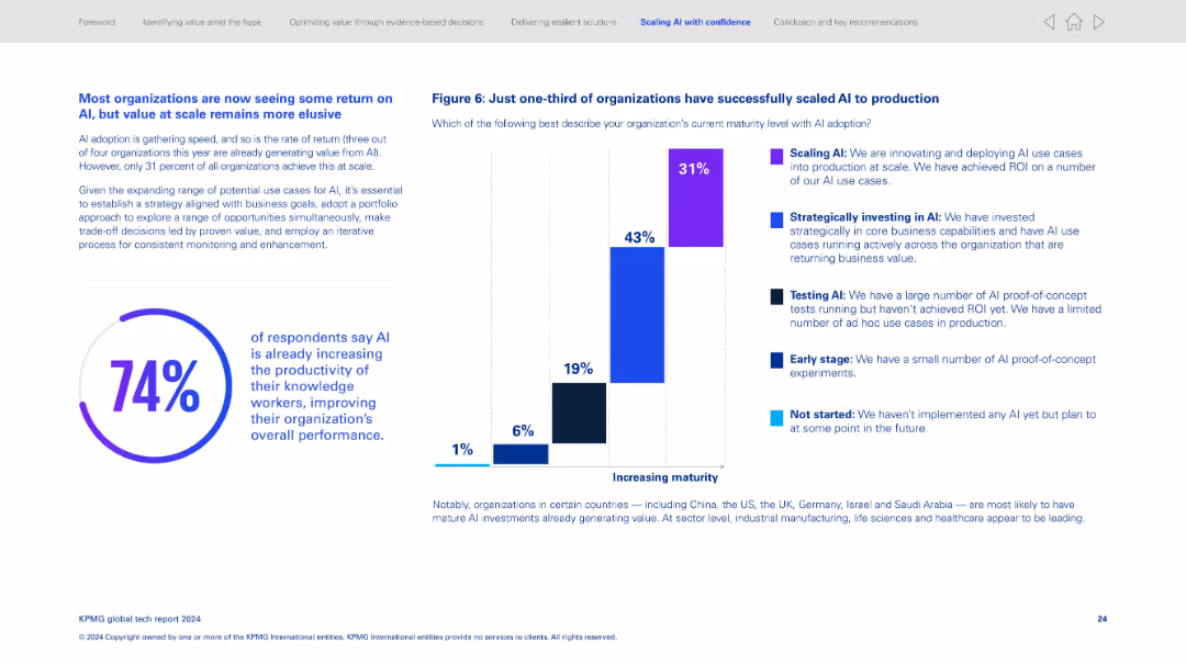
Two-column format; left has paragraph text and large circular stat (74%), right features a stacked vertical bar chart for AI maturity levels.
Technology and Digital Transformation
Artificial Intelligence
Discusses AI adoption stages, revealing only 31% have scaled AI to production. Most organizations are still in early or testing phases. It notes the productivity gains from AI and the importance of aligning AI strategy with business goals.
AI maturity, scaling AI, adoption stages, ROI, AI productivity, business alignment, digital transformation, tech return
false
Technology and Digital Transformation
Artificial Intelligence
Multiple Chart
KPMG
Add to my slides
Remove from favorites
The slide is populated with multiple bar charts detailing different business outcomes achieved through AI, colored in shades of blue to differentiate levels of achievement. The layout is straightforward and focuses on presenting the outcome data clearly.
Technology and Digital Transformation
Technology & Software
Reviews business outcomes from AI initiatives, with a focus on revenue generation and market expansion. Useful for evaluating the effectiveness of AI strategies and planning future business models in tech-driven industries.
AI outcomes, revenue generation, business models, effectiveness evaluation, tech-driven industries, market expansion
false
Technology and Digital Transformation
Technology & Software
Multiple Chart
Deloitte
Add to my slides
Remove from favorites
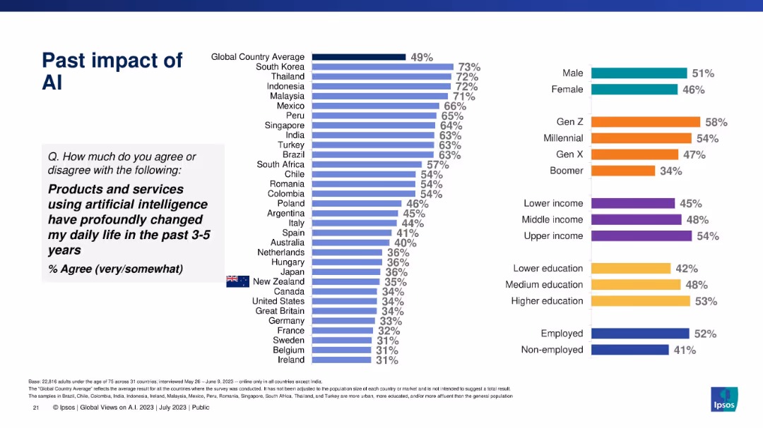
Vertical bar chart showing agreement that AI has changed life in past 3–5 years, globally segmented.
Technology and Digital Transformation
Artificial Intelligence
This slide reflects global and demographic agreement levels regarding the influence of AI on daily life in the recent past, with South Korea and Thailand at the top.
AI past impact, transformation, public opinion, life changes, Ipsos, historical perspective, AI usage
false
Technology and Digital Transformation
Artificial Intelligence
Multiple Chart
IPSOS
Add to my slides
Remove from favorites
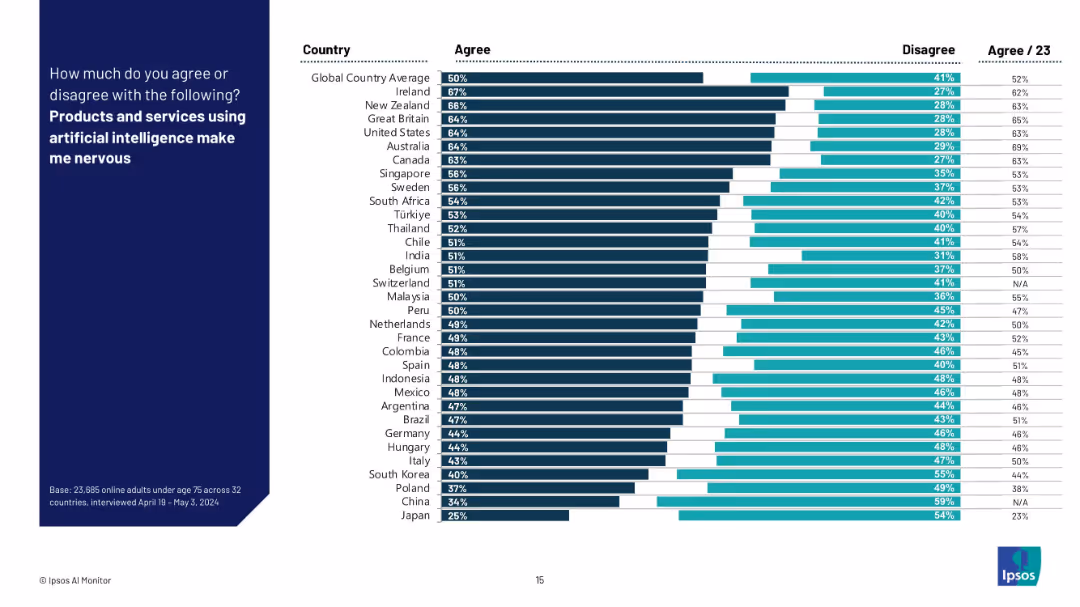
Bar chart with dark and light horizontal bars comparing “Agree” vs “Disagree” responses across countries; aligned country labels on the left.
Market Analysis and Trends
Artificial Intelligence
This slide visualizes the share of respondents across multiple countries who express nervousness about AI-powered products and services. It ranks countries by agreement level and highlights global sentiment towards AI adoption and unease.
AI perception, fear, country comparison, Ipsos, survey, consumer sentiment, technology anxiety, trust, global average, nervousness
false
Market Analysis and Trends
Artificial Intelligence
Mixed Chart
IPSOS
Add to my slides
Remove from favorites
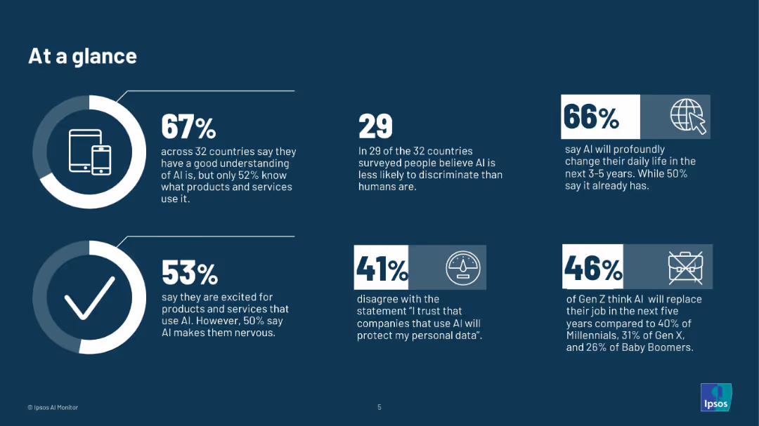
Dark-themed slide with infographic-style layout, featuring 6 key AI statistics and icons in individual blocks.
Technology and Digital Transformation
Artificial Intelligence
Provides high-level statistics from 32 countries about attitudes toward AI: understanding, trust, job risk, and excitement/nervousness. Highlights generational differences in perception and expectations regarding AI’s future impact.
AI perception, global attitudes, trust in AI, AI jobs, public sentiment, infographic, Ipsos, technology, AI adoption, generational data
false
Technology and Digital Transformation
Artificial Intelligence
Multiple Chart
IPSOS
Add to my slides
Remove from favorites
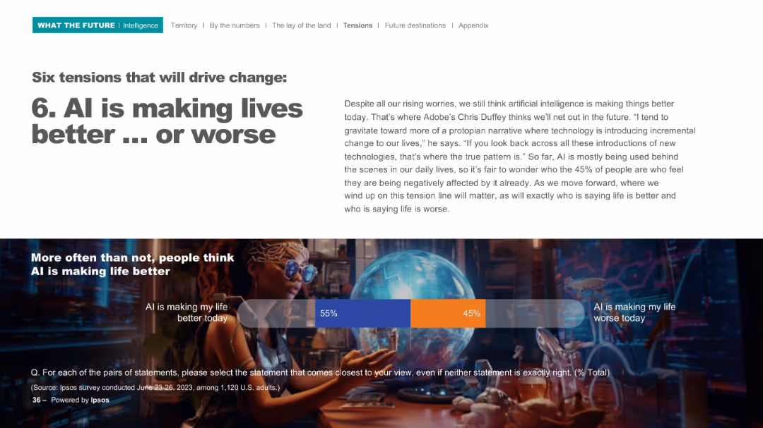
Split layout with bold title on left, paragraph text on right, and infographic bar below featuring survey percentages.
Market Analysis and Trends
Artificial Intelligence
This slide explores public sentiment toward AI's impact, showing a split in opinion: 55% say AI is improving life, while 45% feel it's making life worse. It emphasizes that while many see incremental benefits, concerns persist about AI's broader societal effects.
AI perception, life impact, survey, sentiment, technology change, Chris Duffey, Ipsos, better vs worse, societal impact, public opinion
false
Market Analysis and Trends
Artificial Intelligence
Mixed Chart
IPSOS
Add to my slides
Remove from favorites
Slide contrasts column charts depicting optimism and concern about AI across different organizational roles, with direct color-coded comparisons.
Organizational Structure and Change
Technology & Software
Discusses differing AI perceptions between managerial levels, useful for organizational strategy and understanding internal stakeholder perspectives.
AI perceptions, organizational strategy, managerial levels, stakeholder perspectives, technology impact
false
Organizational Structure and Change
Technology & Software
Multiple Chart
BCG
Add to my slides
Remove from favorites
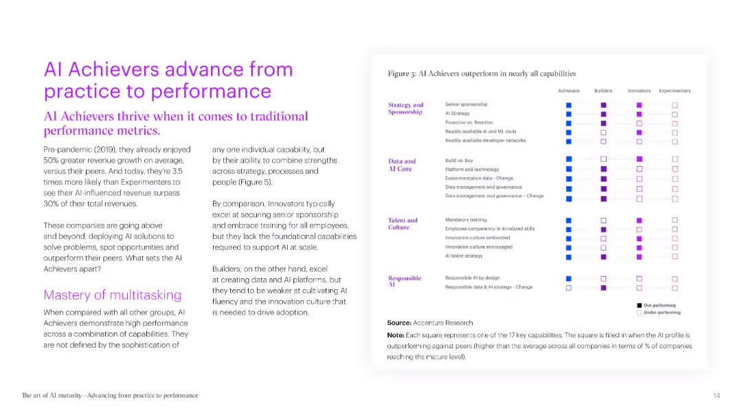
This slide contains a series of bar charts highlighting various capabilities and performance metrics of AI Achievers compared to other categories. The use of bold colors makes the data stand out.
Performance Metrics and KPIs
Technology & Software
It explains how AI Achievers outperform others in multiple areas such as strategy, data management, talent, and responsible AI practices. The slide focuses on the key differentiators of successful AI implementation.
AI performance, metrics, strategy, data management, talent
false
Performance Metrics and KPIs
Technology & Software
Mixed Chart
Accenture
Add to my slides
Remove from favorites
This slide contains a series of bar charts highlighting various capabilities and performance metrics of AI Achievers compared to other categories. The use of bold colors makes the data stand out.
Performance Metrics and KPIs
Technology & Software
It explains how AI Achievers outperform others in multiple areas such as strategy, data management, talent, and responsible AI practices. The slide focuses on the key differentiators of successful AI implementation.
AI performance, metrics, strategy, data management, talent
false
Performance Metrics and KPIs
Technology & Software
Multiple Chart
Accenture
Add to my slides
Remove from favorites
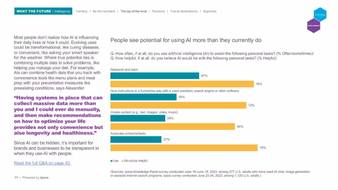
Bar chart comparing current usage and perceived helpfulness; left paragraph with AI use case examples; clean layout.
Strategic Planning
Artificial Intelligence
Explores the gap between current AI usage and perceived potential. It emphasizes how people believe AI could help with scheduling, research, content creation, etc., more than they currently use it for. Includes forward-looking perspectives and examples of future applications.
AI potential, usage gap, helpfulness, perception, voice assistants, productivity, Ipsos
false
Strategic Planning
Artificial Intelligence
Mixed Chart
IPSOS
Add to my slides
Remove from favorites
Features a bar chart depicting top AI priorities in privacy, explainability, and specific functions.
Strategic Planning
Technology & Software
Outlines the main priorities for AI and ML implementations for the year 2021, focusing on responsible AI tools.
AI priorities, 2021, tools, privacy, explainability
false
Strategic Planning
Technology & Software
Single Chart
PwC/Strategy&
Add to my slides
Remove from favorites
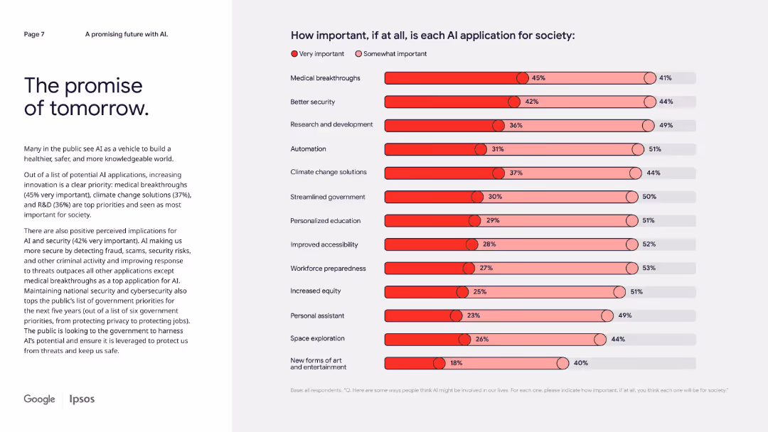
Narrative left column with a right-side stacked bar chart on perceived importance of AI applications.
Technology and Digital Transformation
Artificial Intelligence
This slide focuses on what society considers the most important AI applications, with medical breakthroughs, security, and climate solutions ranked highest. It reflects public preference for innovations that solve real-world problems.
AI priorities, medical AI, cybersecurity, education, climate, innovation, societal value
false
Technology and Digital Transformation
Artificial Intelligence
Mixed Chart
IPSOS
Add to my slides
Remove from favorites
The slide includes a horizontal bar chart showing the stages of AI use in different functions. It features clear distinctions between Achievers and Experimenters, making the data easy to interpret.
Technology and Digital Transformation
Technology & Software
It discusses the transition of AI projects from pilot phases to full production, using Procter & Gamble as a case study. The slide highlights the effectiveness of scaling AI solutions across enterprises.
AI production, case study, scalability, implementation, pilot projects
false
Technology and Digital Transformation
Technology & Software
Boxed
Accenture
Add to my slides
Remove from favorites
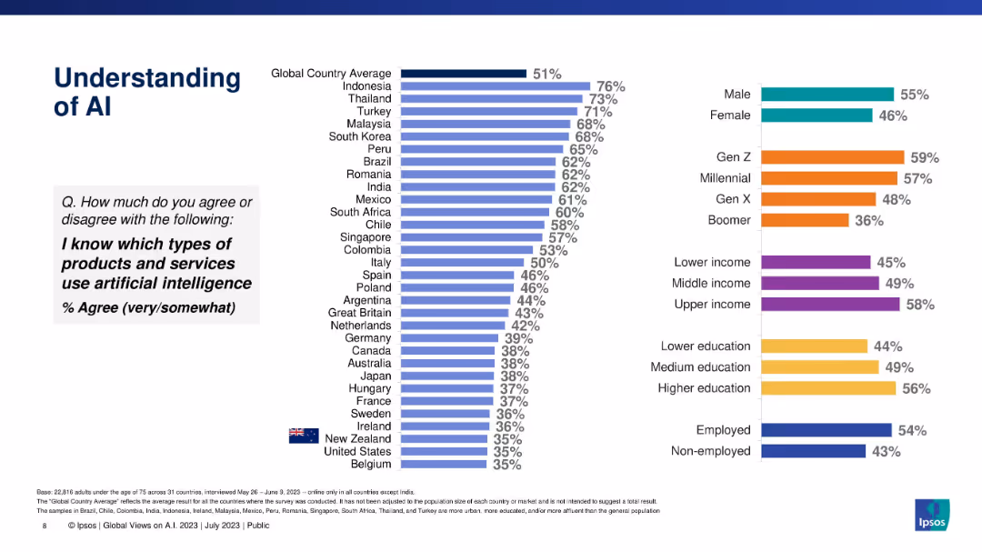
Vertical bar chart showing % of people who know which products/services use AI, by country and demographics.
Industry Overview
Artificial Intelligence
This slide measures familiarity with AI-powered products and services. It ranks countries by agreement and shows demographic patterns by gender, generation, income, and education, revealing significant differences in functional AI literacy.
AI products, awareness, demographics, Ipsos, product use, literacy, global view, services
false
Industry Overview
Artificial Intelligence
Multiple Chart
IPSOS
Add to my slides
Remove from favorites
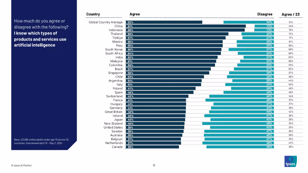
Horizontal bar chart showing agreement/disagreement by country for knowledge of AI-enabled products.
Technology and Digital Transformation
Artificial Intelligence
This slide displays the percentage of respondents in 32 countries who claim to know which products and services use AI. Results show significant variation, with higher knowledge in Asia and lower in Europe/North America. Includes 2023 data comparison.
AI products, public awareness, global comparison, country-level knowledge, survey, Ipsos, AI-enabled technology, regional variation
false
Technology and Digital Transformation
Artificial Intelligence
Mixed Chart
IPSOS
Add to my slides
Remove from favorites
Utilizes icons and color-coded risk categories to explain the EU's proposed AI regulations. It includes detailed descriptions of risk categories and compliance implications.
Regulatory and Compliance
Government & Public Sector
Discusses the proposed EU regulations for AI, detailing risk categories, compliance requirements, and the impact on AI applications across various sectors.
AI regulation, EU policies, compliance, risk management, regulatory impact
false
Regulatory and Compliance
Government & Public Sector
Table
BCG
Add to my slides
Remove from favorites
Previous
Next
You don't have any favorites yet.
Please wait loading your favorites slides...
Create a FREE account to continue browsing
Receive Instant Access to 1,000+ slides from companies like McKinsey, Google, and Goldman Sachs
First Name
Last Name
Email
Password
I agree to all
Terms & Privacy Policy
Thank you! Your submission has been received!
Oops! Something went wrong while submitting the form.
Have an account?
Sign in
Upgrade to PRO to Save slides
Advanced Search and Filters
Access to 15,000+ slides
Access to Category Pages
Save/Bookmark Slides
PowerPoint Template Library
Pick a Plan
MONTHLY
$12/month
Billed every month, Cancel anytime.
YEARLY
$9/year
Billed $108 annually, Cancel anytime.
Checkout for $12/month
Checkout for $108/yr
Secured by Stripe | AES-256 bit encryption