My Account
My Slides
Search by Category
Templates
Leave Feedback
Login
Logout
Get Started
Browse all Slides
Browse all Slides
Create a FREE Account
Instant access to 1,000+ real slides from top companies like McKinsey, BCG, Goldman Sachs, Google and many more!
First Name
Last Name
Email
Password
I agree to all
Terms & Privacy Policy
Thank you! Your submission has been received!
Oops! Something went wrong while submitting the form.
Have an account?
Sign in
Saved Slides
This slide uses three line charts with shaded areas to compare the projected impacts on real GDP in different regions of New York, including NYC, Greater Metro (excluding NYC), and the rest of NY State. Each region is highlighted in a different color.
Market Analysis and Trends
Financial Services
The slide analyzes the economic impact of the COVID-19 pandemic on different regions of New York, focusing on real GDP declines and recoveries. It highlights specific impacts and recovery timelines up to 2025.
economic impact, GDP, NYC, Greater Metro, NY State, pandemic, forecast, recovery, line chart
Multiple Chart
BCG
Saved
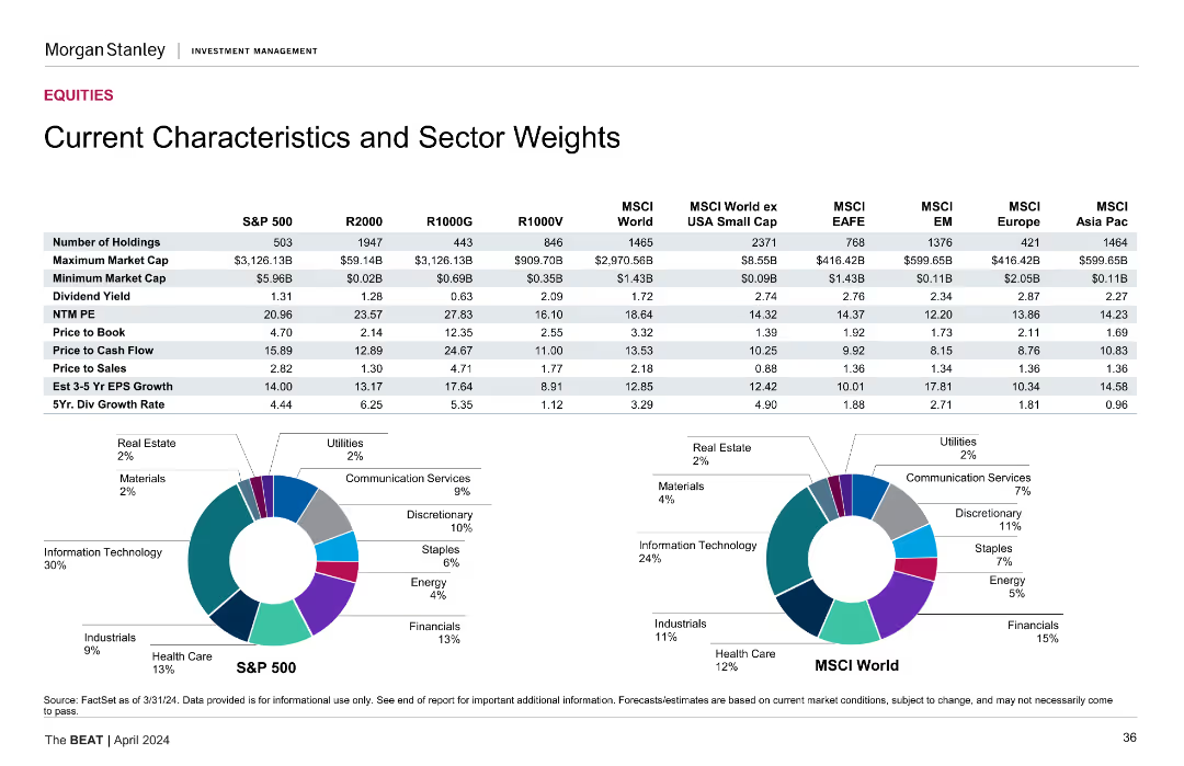
The slide includes a detailed table listing various characteristics and sector weights of different indices, along with two pie charts showing sector weights distribution.
Market Analysis and Trends
Financial Services
It provides detailed data on the characteristics and sector weights of several indices, such as S&P 500, R2000, MSCI, highlighting differences in market cap, P/E, etc.
sector weights, indices, financial characteristics, market cap
Multiple Chart
Morgan Stanley
Saved
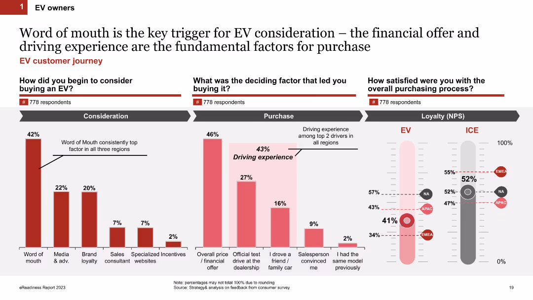
Three sections: column charts on factors triggering EV consideration, deciding factors, and satisfaction levels (NPS) comparing EV to ICE vehicle owners.
Market Analysis and Trends
Transportation & Logistics
Discusses the influence of word-of-mouth on EV purchase consideration, key decision factors, and loyalty (NPS) differences between EV and ICE vehicle owners.
word of mouth, purchase consideration, loyalty, NPS, EV owners
Multiple Chart
PwC/Strategy&
Saved
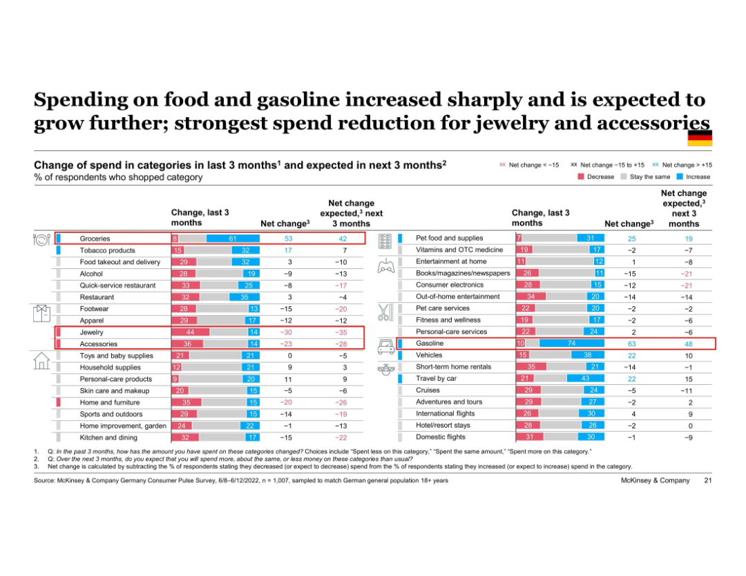
Large, detailed table chart ranking change in spend for 30+ product categories over past and next 3 months. Columns show net change with red/blue color scales. Categories sorted by net change.
Market Analysis and Trends
Financial Services
This slide offers a deep dive into German consumer spend patterns by product category. Groceries and gasoline show sharp increases, while categories like jewelry and accessories are seeing sharp cuts. Net change indicators highlight trends in both past and expected future consumption shifts.
spending trends, category spend, Germany, groceries, gasoline, discretionary cutbacks, inflation impact, purchase behavior
Single Chart
McKinsey
Saved
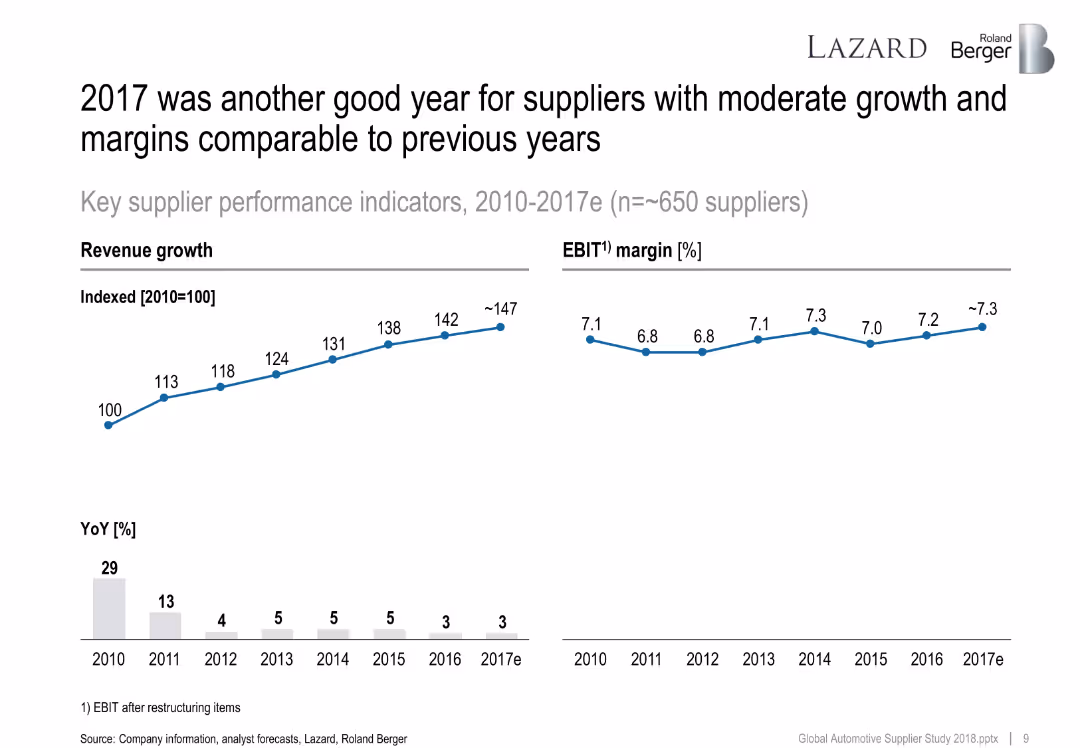
Line chart showing revenue growth index (2010–2017e) and EBIT margin. Below, a bar chart tracks year-over-year revenue growth percentages.
Financial Performance
Industrial & Manufacturing
The slide presents consistent revenue and margin performance for suppliers from 2010 to 2017e. EBIT margins remain stable while revenue index shows progressive growth, despite slight YoY slowdown.
revenue growth, EBIT, automotive suppliers, KPI, YoY, 2017, Roland Berger
Multiple Chart
Roland Berger
Saved
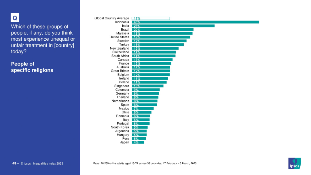
Country-level bar chart with teal bars on white background, global average shown at top
Market Analysis and Trends
Government & Public Sector
This slide explores perceptions of religious discrimination globally. Indonesia and India report the highest perceived inequality toward religious groups, with a global average of 12%. Japan shows the lowest perception at 4%.
religion, inequality, discrimination, Ipsos, global views, survey, religious bias, 2023
Mixed Chart
IPSOS
Saved
The slide has a title at the top, text in the middle, and a column chart at the bottom depicting changes in working situations or hours due to the pandemic.
Operational Efficiency
Professional Services
Provides data on changes in working situations due to the pandemic, with 43% reporting changes. Details include working from home, decrease/increase in hours, and furlough.
Working Situation, Pandemic, Survey, Work, Data
Mixed Chart
IPSOS
Saved
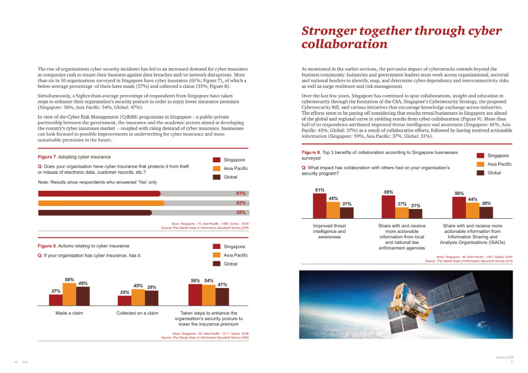
This slide shows two bar charts, one on adopting cyber insurance and another on the benefits of cyber collaboration.
Risk Assessment and Management
Telecommunications
Highlights the importance of collaboration in cybersecurity, showcasing benefits and adoption rates of cyber insurance across regions.
cyber collaboration, cyber insurance, survey benefits, regional data, security measures
Multiple Chart
PwC/Strategy&
Saved
Features a line graph projecting economic growth under different AI adoption scenarios against a baseline. The graph is color-coded to distinguish between aggressive, cautious, and people-centric adoption scenarios, showing potential gains in trillions of dollars.
Strategic Planning
Technology & Software
Outlines the economic potential of adopting AI responsibly, highlighting different scenarios and their impact on economic growth.
AI, Economy, Growth, Adoption Scenarios, Potential, Trillions, Impact, Responsible, Technology
Single Chart
Accenture
Saved
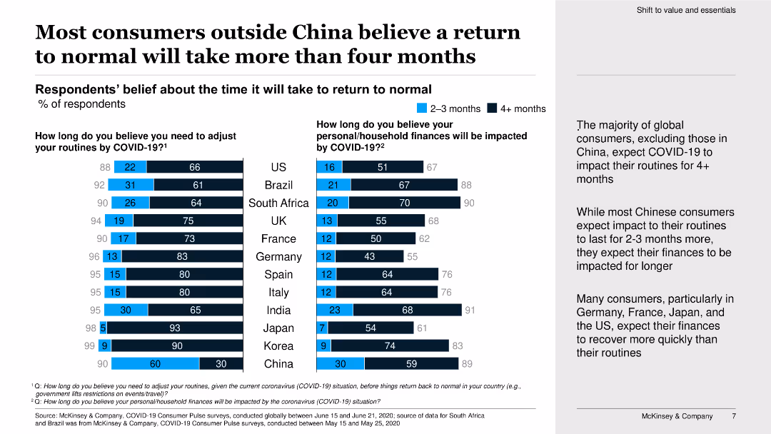
This slide has a horizontal bar chart and a column chart showing respondents' beliefs about the time it will take to return to normal and financial impact by COVID-19.
Market Analysis and Trends
Consumer Goods
The slide details global consumer expectations on the duration of adjustments due to COVID-19, with emphasis on differences between China and other countries.
return to normal, consumers, COVID-19, financial impact, survey, global, bar chart, column chart, expectations, adjustment
Multiple Chart
McKinsey
Saved
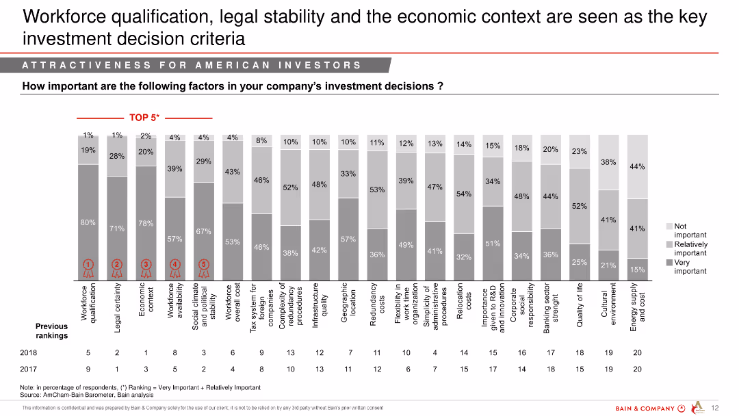
Column chart illustrating the importance of various factors in investment decisions for American investors in 2018 and 2017, with "Top 5" factors highlighted.
Market Analysis and Trends
Professional Services
This slide discusses key factors influencing investment decisions by American investors, highlighting workforce qualification, legal stability, and economic context.
workforce qualification, investment, decision criteria, American investors, key factors
Single Chart
Bain
Saved
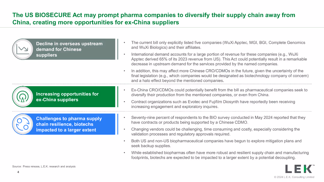
The slide features a mix of text and bullet points, organized into sections with icons, summarizing the decline in demand for Chinese suppliers and the rise in opportunities for others.
Strategic Planning
Healthcare & Pharmaceuticals
The slide discusses the opportunities and challenges for pharmaceutical companies due to the US BIOSECURE Act, focusing on supply chain resilience and the potential shift from China.
BIOSECURE Act, supply chain, opportunities, challenges, pharma
Table
LEK
Saved
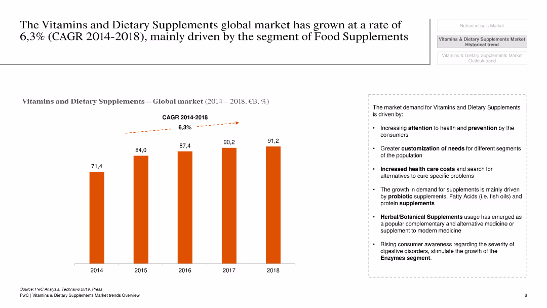
The slide has a white background with a column chart showing global market growth of vitamins and dietary supplements from 2014 to 2018.
Market Analysis and Trends
Healthcare & Pharmaceuticals
This slide presents the growth rate of the global market for vitamins and dietary supplements, highlighting the CAGR and key growth drivers.
Vitamins, dietary supplements, market growth, CAGR, global, healthcare, pharmaceuticals, trends, analysis
Mixed Chart
PwC/Strategy&
Saved
This slide is highly detailed, containing both textual information and multiple graphical elements. There's a pie chart detailing commercial portfolio balances by industry, a column chart comparing CRE as a percentage of total loans, and a small table with key statistics about office CRE. The color scheme is blue and green, with the graphs clearly labeled and information bullet-pointed for clarity.
Financial Performance
Financial Services
The slide presents a disciplined client selection strategy and a well-diversified commercial portfolio. It's aimed at showcasing strong credit results through economic cycles, indicating a conservative approach to commercial real estate concentration among peers and a stable criticized asset ratio. Intended to convey the company’s robust underwriting standards and focused banking coverage.
Credit, Underwriting, Portfolio, CRE, Diversification, Strategy, Risk, Financial Stability, Commercial Banking, Asset Ratio
Multiple Chart
Morgan Stanley
Saved
The slide contains a line chart tracking IPO activity and volatility from July 2021 to June 2022, with annotations highlighting key trends.
Market Analysis and Trends
Financial Services
This slide analyzes the impact of rising volatility on IPO activity, showing a correlation between increased market volatility and a decline in the number of IPOs over the specified period.
IPO, Volatility, Market trends, Financial services, Analysis
Single Chart
EY
Saved
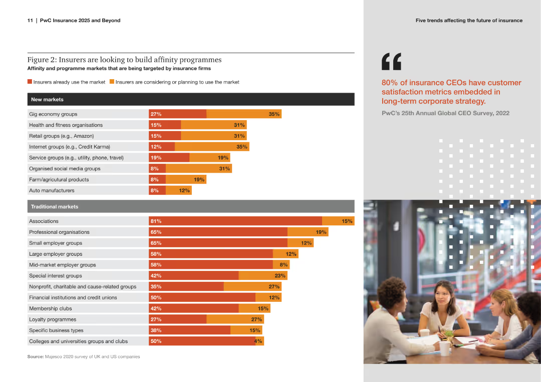
The slide includes a bar chart listing various new and traditional markets that insurance firms are targeting for affinity programs, with percentages indicating the level of current and planned market usage.
Strategic Planning
Financial Services
The slide explores the focus of insurance companies on developing affinity programs across different markets. It compares current usage and future plans for both new and traditional markets, emphasizing strategic expansion efforts.
Affinity Programs, Insurance, Market Strategy, New Markets, Traditional Markets, Strategic Planning, Bar Chart, Expansion, Trends, Analysis
Multiple Chart
PwC/Strategy&
Saved
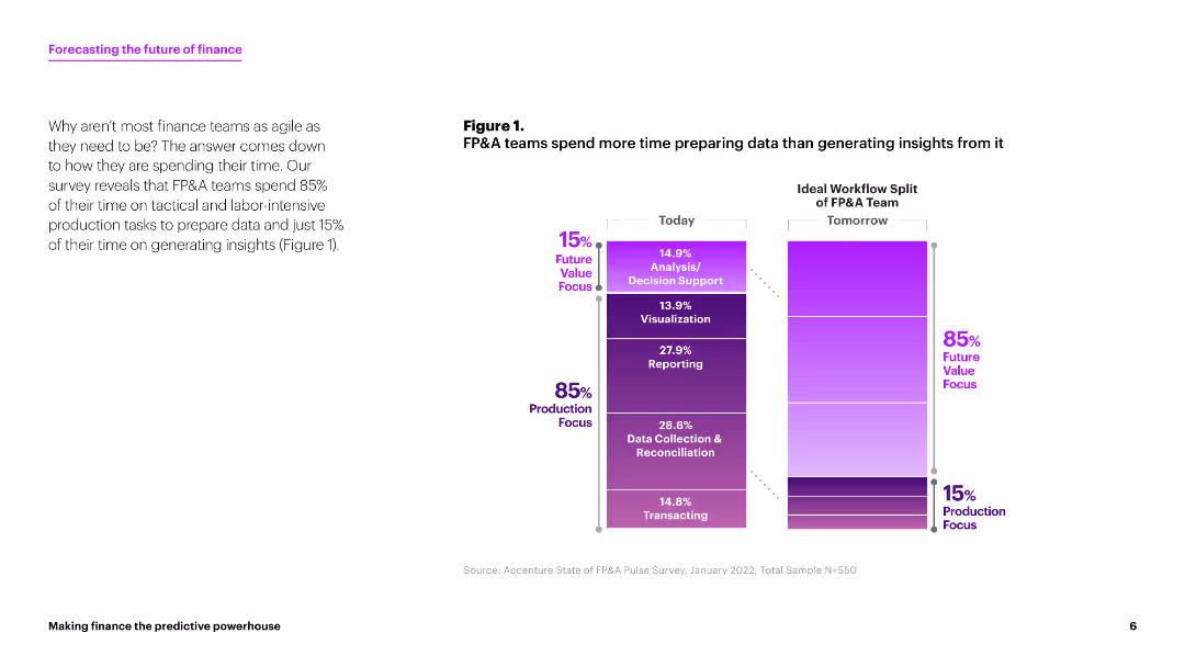
This slide contains a column chart comparing the time FP&A teams spend on various tasks today versus the ideal workflow split for tomorrow. The chart uses shades of purple to indicate the percentages of time spent on different tasks. The layout is clean with ample white space.
Strategic Planning
Financial Services
The slide discusses how FP&A teams currently spend 85% of their time on production tasks and only 15% on generating insights. It suggests a shift towards more analysis and decision support activities.
FP&A, data preparation, insights generation, workflow, finance
Mixed Chart
Accenture
Saved
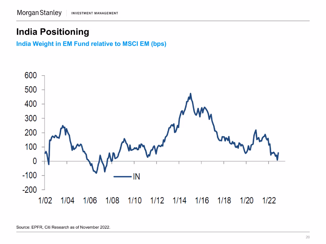
A line chart showing India's weight in EM Fund relative to MSCI EM (bps) from 1/02 to 1/22. The chart shows fluctuations in India's position within the EM Fund.
Market Analysis and Trends
Financial Services
The slide shows the positioning of India in the Emerging Market Fund relative to MSCI EM over time, highlighting its trends and fluctuations.
India, EM Fund, MSCI, Weight, Positioning
Single Chart
Morgan Stanley
Saved
The slide presents a horizontal bar chart depicting the percentage of people from various countries who agree or disagree with feeling more like a citizen of the world than their country. The bars are colored in teal and orange to indicate agreement and disagreement, respectively.
Market Analysis and Trends
Media & Entertainment
This slide showcases a survey result comparing the national and global affinity sentiments of individuals from various countries, highlighting the levels of agreement and disagreement.
affinity, survey, global sentiment, national sentiment, country comparison
Multiple Chart
IPSOS
Saved
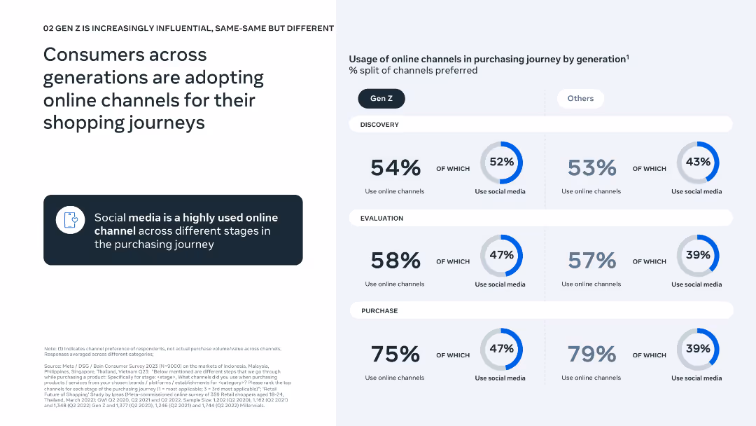
Simple left-aligned text with a three-stage funnel chart (discovery, evaluation, purchase) comparing Gen Z vs. others.
Technology and Digital Transformation
Retail & E-commerce
This slide outlines the adoption of online channels during the shopping process across age groups. It emphasizes the strong role of social media in discovery and evaluation, particularly for Gen Z.
e-commerce, online shopping, social media, Gen Z, purchase journey, consumer behavior, discovery, evaluation, purchase, digital influence
Mixed Chart
Bain
Saved
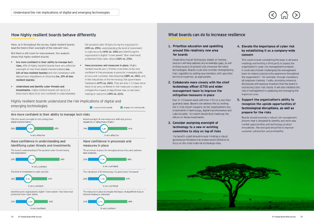
This two-column slide contains detailed text on both sides, with a horizontal line separating sections. It includes several comparative statistics and recommendations. The visual complexity is moderate.
Risk Assessment and Management
Technology & Software
The slide details how highly resilient boards manage tech risks better and what boards can do to increase resilience. It compares the confidence levels of different boards in managing technology risks and provides strategies for improvement, such as prioritizing education and upskilling.
Digital, Risk, Technology, Resilience, Boards
Multiple Chart
EY
Saved
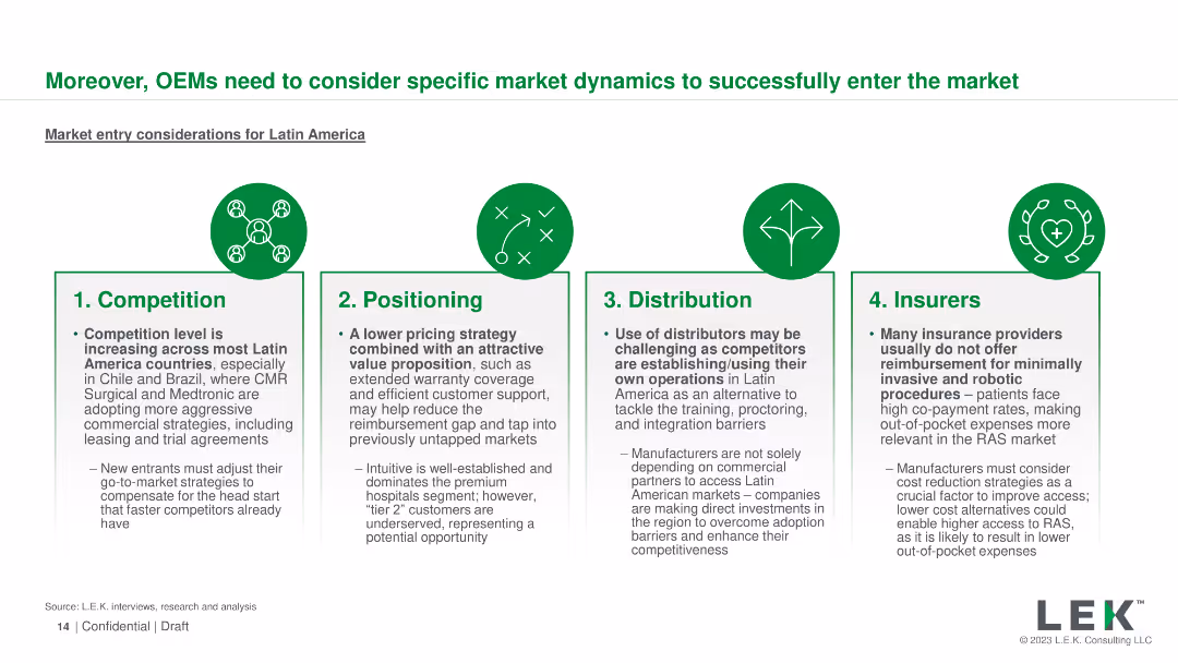
Four sections with icons detailing competition, positioning, distribution, and insurers
Market Analysis and Trends
Healthcare & Pharmaceuticals
Outlines key market entry considerations for OEMs in Latin America, including competition, positioning, and insurance coverage
OEMs, market entry, Latin America, competition, positioning
Pillar
LEK
Saved
This slide features a diagram comparing cost differences in the wheat supply chains of Australia and Canada, with annotations highlighting key findings.
Operational Efficiency
Transportation & Logistics
The slide compares the cost structures of the wheat supply chains in Australia and Canada, emphasizing the higher domestic supply chain costs in Australia and identifying areas for potential improvement.
Supply chain costs, Australia, Canada, transportation, logistics, wheat supply chain, cost comparison, operational efficiency
Single Chart
LEK
Saved
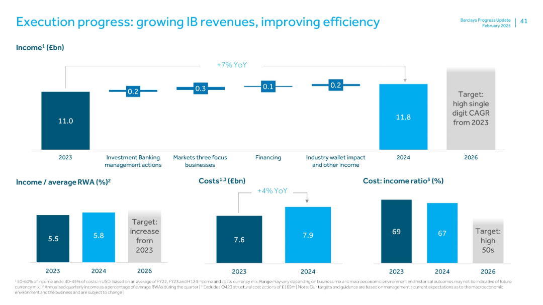
Bar and line charts with annotations showing revenue, cost, and efficiency metrics (CIR). Balanced white space and grid layout.
Performance Metrics and KPIs
Financial Services
Summarizes year-on-year improvements in Investment Bank income (+7%), cost increases (+4%), and cost:income ratio decrease from 69% to 67%. Highlights 2024 performance (£11.8bn income) and targets for 2026.
investment banking, revenue growth, CIR, cost efficiency, CAGR, YoY, income
Multiple Chart
Barclays
Saved
A clean layout with multiple text boxes summarizing key takeaways, including advertiser objectives, channel measurement, and data challenges. Each box contains a brief summary and a small icon representing the concept.
Strategic Planning
Media & Entertainment
This slide provides key takeaways on brand awareness, measurement, and data strategies. It emphasizes the importance of leveraging multiple channels and addressing data challenges to enhance marketing effectiveness.
Takeaways, Strategy, Brand, Measurement, Data
Multiple Chart
Nielsen
Saved
Previous
Next
If nothing, comes up, please save your slides first
Create a FREE account to continue browsing
Receive Instant Access to 1,000+ slides from companies like McKinsey, Google, and Goldman Sachs
First Name
Last Name
Email
Password
I agree to all
Terms & Privacy Policy
Thank you! Your submission has been received!
Oops! Something went wrong while submitting the form.
Have an account?
Sign in
Column Chart
Heatmap
Chevron
Org Chart
Infographic
Callouts
Timeline
List
Graphic
Picture
Process Flow
Diagram
Paragraph
Map
Table
Framework
Subtitle
Takeaway Box
Icon
Other Chart
Radar Chart
Waterfall Chart
Mekko Chart
Pie Chart
Scatter Plot
Line Chart
Bar chart
Bullet points