My Account
My Slides
Search by Category
Templates
Leave Feedback
Login
Logout
Get Started
Browse all Slides
Browse all Slides
Create a FREE Account
Instant access to 1,000+ real slides from top companies like McKinsey, BCG, Goldman Sachs, Google and many more!
First Name
Last Name
Email
Password
I agree to all
Terms & Privacy Policy
Thank you! Your submission has been received!
Oops! Something went wrong while submitting the form.
Have an account?
Sign in
Saved Slides
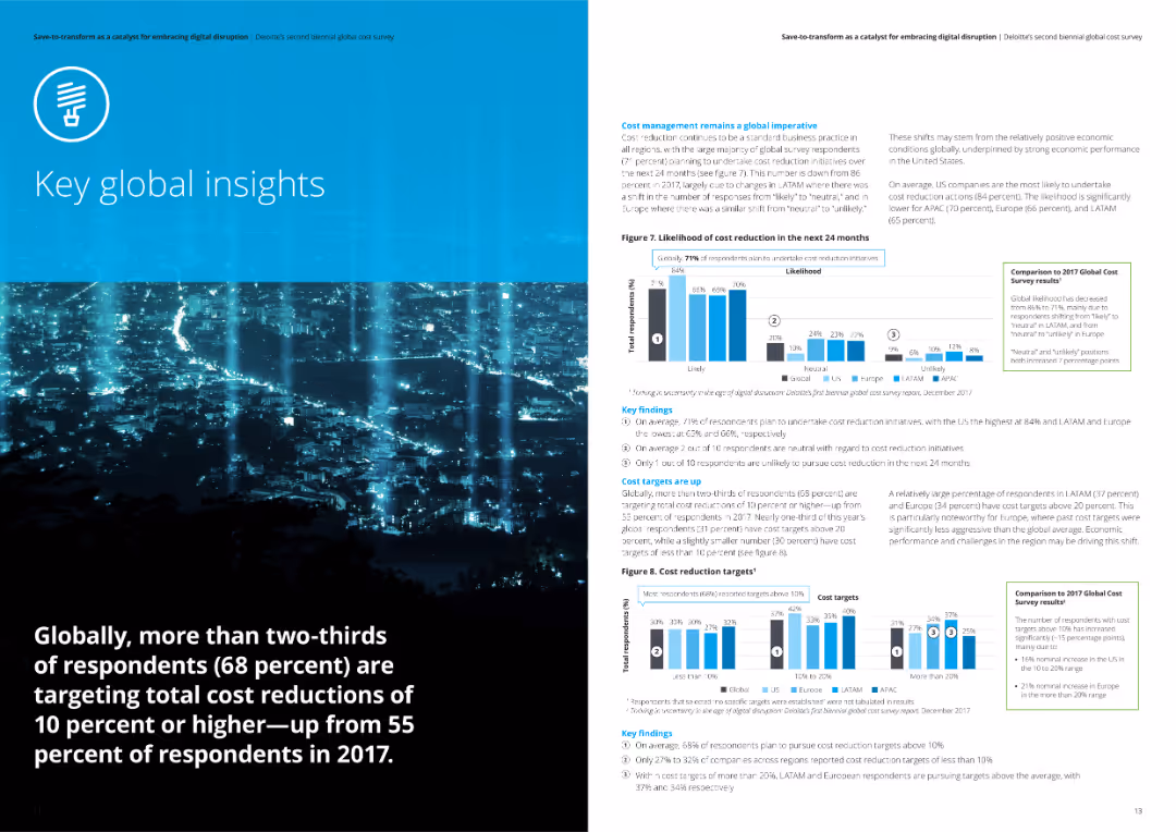
The slide includes a column chart and multiple pie charts analyzing the success rates of respondents in meeting cost reduction targets. It shows different levels of success across regions with key findings summarized on the right.
Performance Metrics and KPIs
Professional Services
This slide evaluates the success rates of meeting cost reduction targets from Deloitte's survey. It includes comparative data across regions and highlights key findings on the failure rates and levels of success in achieving cost savings.
cost targets, success rates, Deloitte, survey, cost reduction
Multiple Chart
Deloitte
Saved
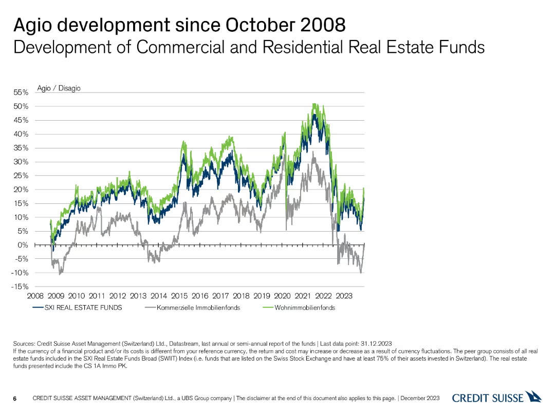
A line chart showing the development of Agio/Disagio percentages for commercial and residential real estate funds, with multiple colored lines.
Market Analysis and Trends
Financial Services
This slide presents the Agio/Disagio development for Swiss commercial and residential real estate funds from 2008 to 2023, highlighting significant market shifts.
Agio, Disagio, Commercial, Residential, Trends
Single Chart
Credit Suisse
Saved
Comparative flowchart showing current and proposed task-based approaches for FSS workers. Includes detailed explanations of service disruptions and improvements.
Operational Efficiency
Professional Services
Slide includes a detailed flowchart comparing case-based and task-based approaches to managing applications within DEHS.
Explores different approaches to handling service delivery within DEHS, contrasting the current case-based model with a proposed task-based approach to improve efficiency.
Linear Flow
Alvarez & Marsal
Saved
The slide has a two-column format comparing supportive and opposing views on clean-energy trends. Each column contains bullet points and an icon at the top. The design is straightforward with a blue and black color scheme that provides a professional and clear presentation of information.
Strategic Planning
Energy & Utilities
This slide presents contrasting perspectives on the viability and future of clean-energy technologies. It's structured for strategic planning sessions, offering a platform for debate on the sustainability of traditional renewables, the feasibility of 100% renewable energy adoption, and the growth potential in clean tech markets. This is aimed at stakeholders who are formulating long-term strategies and considering the varying opinions and data points in the clean-energy discourse.
clean energy, renewables, debate, sustainability, technology viability, market growth, strategic planning, renewable adoption, contrasting views, business opportunities
Header Horizontal
McKinsey
Saved
Features simple icons and text highlighting key statistics about the green economy in Southeast Asia, including financial commitments and investment figures.
Financial Performance
Financial Services
Offers a numerical summary of recent investments and environmental commitments in Southeast Asia, highlighting the potential economic opportunities and necessary investments to achieve net zero emissions targets.
net zero, investments, Southeast Asia, green economy
Table
Bain
Saved
Contains two column charts: one showing GVA growth in UK regions for 2023 and another showing GVA growth by sector.
Market Analysis and Trends
Government & Public Sector
Discusses the expected recession in 2023, detailing forecasted declines in GVA growth across UK regions and sectors, driven by consumer spending declines.
recession, 2023, GVA growth, UK regions, sectors, column chart
Multiple Chart
EY
Saved
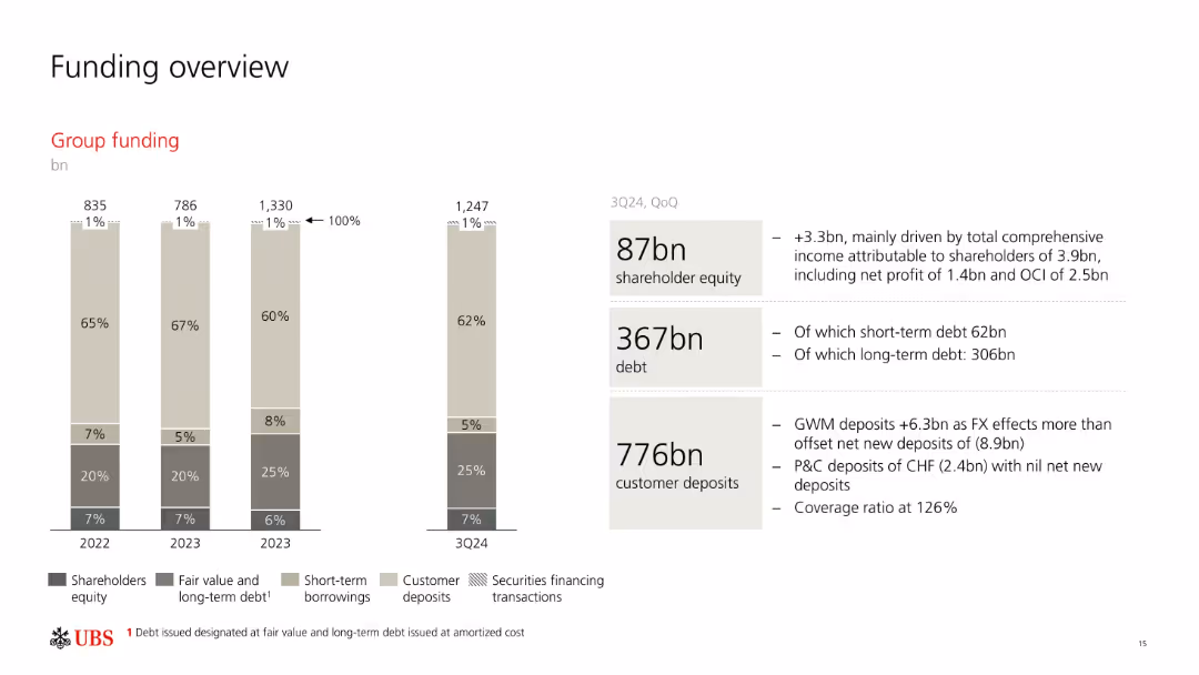
Stacked bar chart showing group funding composition over time; side panel with 3Q24 funding stats.
Corporate Finance and Valuation
Financial Services
Summarizes UBS’s funding structure including equity, debt, and deposits. Breaks down short-term and long-term funding and customer deposits. Commentary highlights quarterly changes and contributing factors like FX and deposit flows.
funding, equity, debt, deposits, UBS, 3Q24, capital sources
Mixed Chart
UBS
Saved
Features multiple bar charts representing demographics of a workforce survey, including employment status, age, and education levels.
Industry Overview
Professional Services
Presents demographic data of a large survey of highly skilled workers across three regions, useful for HR and market analysis.
workforce demographics, survey data, skilled workers, employment status, education level, age distribution, HR analytics
Multiple Chart
Accenture
Saved
Simplified journey map with percentages, showing the online preference at each stage of the purchase journey.
Customer and Market Segmentation
Retail & E-commerce
Breakdown of the consumer purchase journey, focusing on the online preference in the decision-making process.
purchase journey, consumer behavior, online preference, retail
Multiple Chart
Bain
Saved
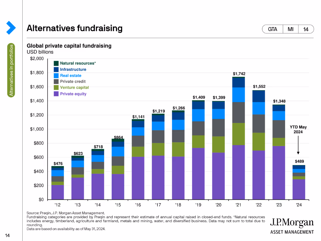
This slide contains a stacked column chart illustrating global private capital fundraising amounts in USD billions from 2012 to 2024. Different colors represent categories like natural resources, infrastructure, and private equity.
Market Analysis and Trends
Financial Services
The slide tracks global private capital fundraising by asset class over time, highlighting the amounts raised annually from 2012 to 2024, with a breakdown by categories such as natural resources, infrastructure, and private equity.
Fundraising, Private Capital, Asset Classes, USD Billions, Trends
Single Chart
JP Morgan
Saved
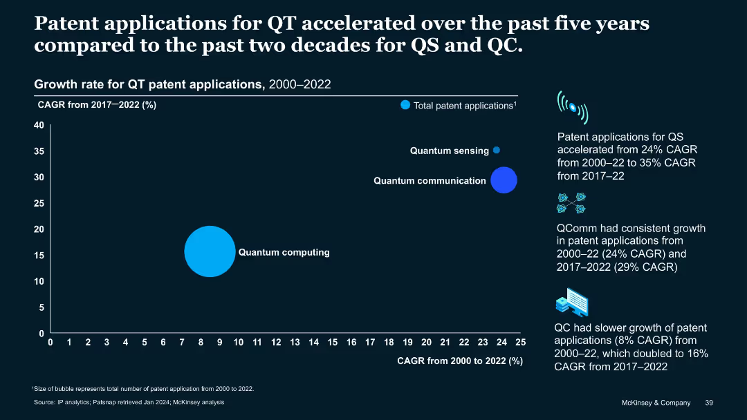
Bubble chart comparing CAGR of QT patent apps in QS, QC, QComm over 2000–2022 and 2017–2022 periods.
Performance Metrics and KPIs
Technology & Software
Visualizes how QT patent application growth accelerated from 2017–2022, especially in QS (35%) and QComm (29%). QC had slower historical growth but doubled in the last five years. Demonstrates growing momentum in quantum technology subfields.
CAGR, growth rate, quantum sensing, quantum communication, QC, patent growth, acceleration
Mixed Chart
McKinsey
Saved
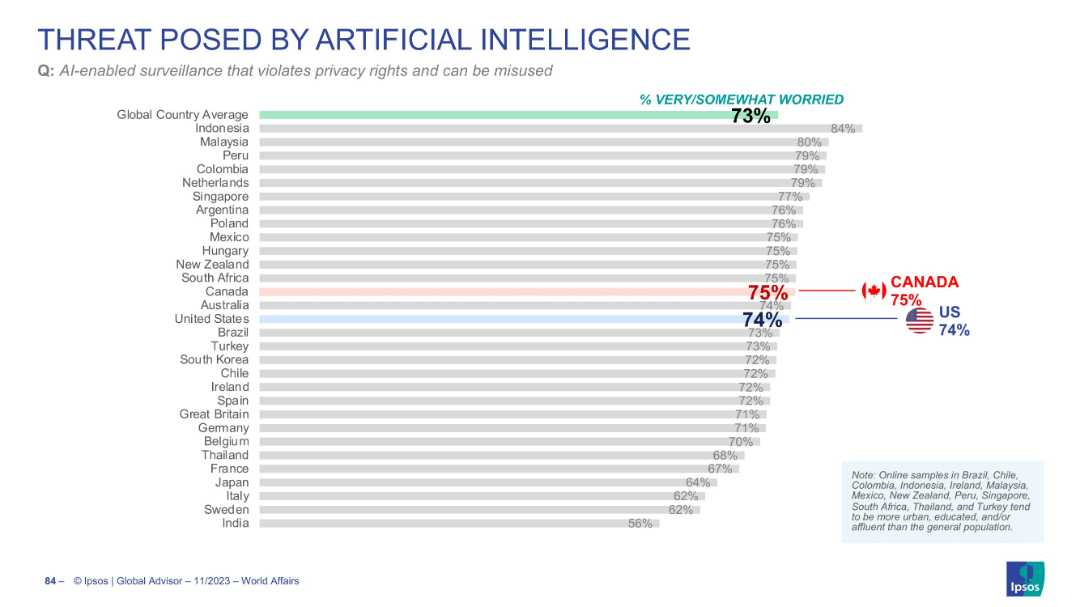
Horizontal bar chart ranking concern over AI surveillance and privacy violations
Risk Assessment and Management
Artificial Intelligence
The slide shows widespread worry (73%) over AI-enabled surveillance violating privacy. The US (74%) and Canada (75%) align closely with global concern levels.
AI surveillance, privacy, civil liberties, public concern, misuse of AI
Single Chart
IPSOS
Saved
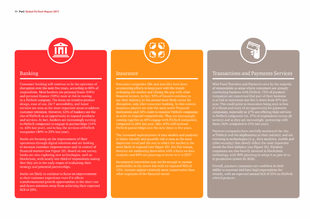
Three colored sections provide a detailed overview of trends and developments in Banking, Insurance, and Transactions and Payments Services, with corresponding icons.
Industry Overview
Financial Services
The slide gives an overview of consumer banking, insurance sector trends, and payment services, highlighting the increasing role of FinTech in these areas.
Banking, Insurance, Payments, Trends, FinTech
Pillar
PwC/Strategy&
Saved
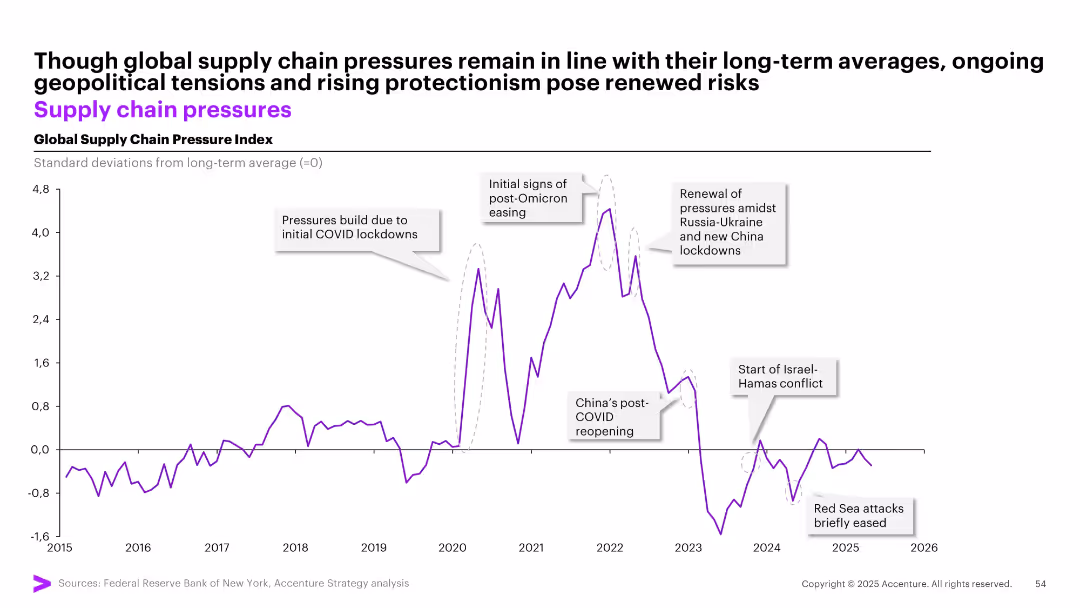
Line chart with annotations and key geopolitical events labeled, showing deviations in global supply chain pressures from the long-term average.
Market Analysis and Trends
Transportation & Logistics
Tracks global supply chain pressure index from 2015 to 2026, highlighting disruptions from events such as COVID-19 lockdowns, Russia-Ukraine conflict, and Red Sea attacks. Despite fluctuations, pressures are nearing long-term average, but risks from protectionism persist.
supply chain, COVID-19, geopolitical risk, logistics, index, pressure, trend, Russia, China, Omicron, Hamas
Single Chart
Accenture
Saved
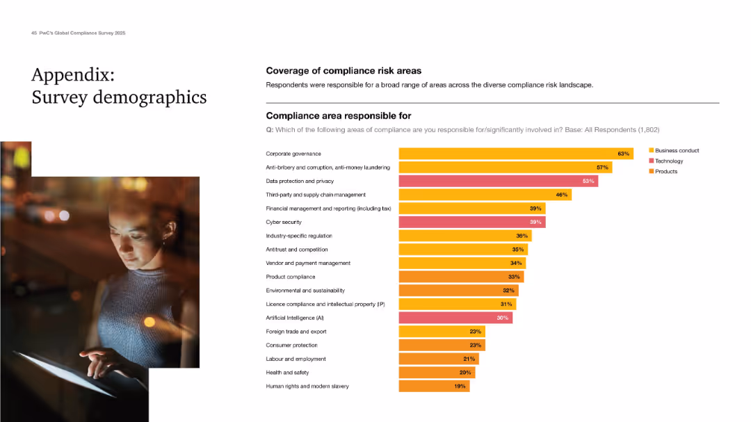
Clean design with a demographic chart showing responsibility across compliance areas.
Industry Overview
Professional Services
Final appendix slide showing the range of compliance areas respondents are responsible for. Corporate governance, anti-bribery, and data privacy top the list. Categorized into business conduct, tech, and product areas. Demonstrates the breadth of responsibilities handled by compliance professionals today.
survey demographics, compliance areas, governance, data privacy, AI
Mixed Chart
PwC/Strategy&
Saved
The slide showcases horizontal bar charts comparing the superior ratings in talent management from two different years across various criteria. Each bar is distinctly color-coded to represent different years, enhancing the visual comparison between them.
Human Resources and Talent Management
Financial Services
Compares talent management performance across two surveys, showing trends over time in aspects like collaboration and career path development. It’s instrumental for longitudinal analysis and strategic planning in human resources within the financial sector.
talent management, trends, comparison, historical data, HR, financial services
Single Chart
Accenture
Saved
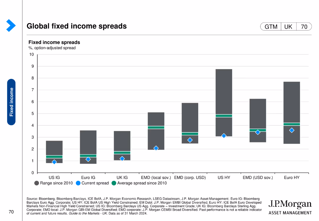
This slide features a column chart comparing fixed income spreads across various regions and asset classes, with current spread, average spread, and range since 2010 indicators.
Market Analysis and Trends
Financial Services
The slide provides an overview of global fixed income spreads, illustrating the differences and trends in spreads across regions and asset classes since 2010.
fixed income, spreads, global, regions, trends
Single Chart
JP Morgan
Saved
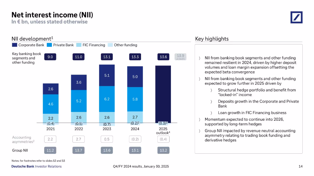
Bar chart showing annual NII trends from 2021 to 2025 outlook. Key segments are color-coded. Includes right-hand bullet highlights of drivers and projections.
Market Analysis and Trends
Financial Services
Tracks Deutsche Bank’s NII from 2021 to 2024, with 2025 outlook. Shows growth across business segments with emphasis on deposit volumes, loan growth, and income stabilization. Describes momentum drivers and structural hedge impacts.
NII trends, interest income, deposits, loans, hedging, segment revenue
Mixed Chart
Deutsche Bank
Saved
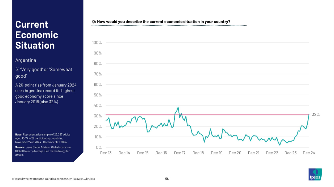
Single-line time series chart focused on Argentina; left-aligned sidebar text with a key stat.
Market Analysis and Trends
Financial Services
Highlights a 26-point surge in Argentina’s economic sentiment since January 2024, reaching its highest rating (32%) since 2018, as visualized on the line graph.
Argentina, economic improvement, sentiment rise, 2024 spike, Ipsos data, long-term chart, positive trend, macroeconomic view
Mixed Chart
IPSOS
Saved
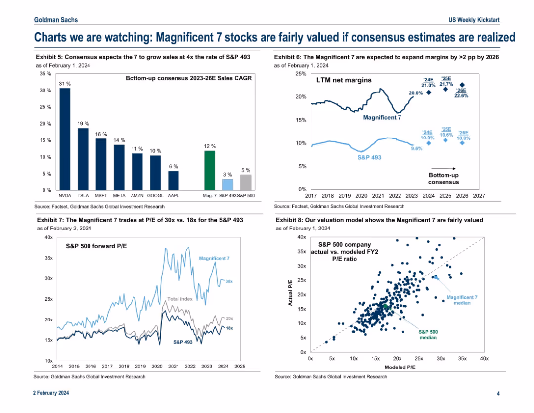
Four-panel chart layout showing growth estimates, valuation metrics, and modeled P/E ratios for the Mag 7 vs. the rest of the S&P 500.
Investment Analysis
Technology & Software
This slide justifies the current valuations of the Magnificent 7 by comparing their projected sales growth and margin expansion to the broader market. It concludes they are fairly valued given consensus estimates. P/E comparisons and a modeled valuation chart reinforce the analytical viewpoint.
valuation, Magnificent 7, sales growth, P/E ratio, consensus, margin expansion, fair value
Multiple Chart
Goldman Sachs
Saved
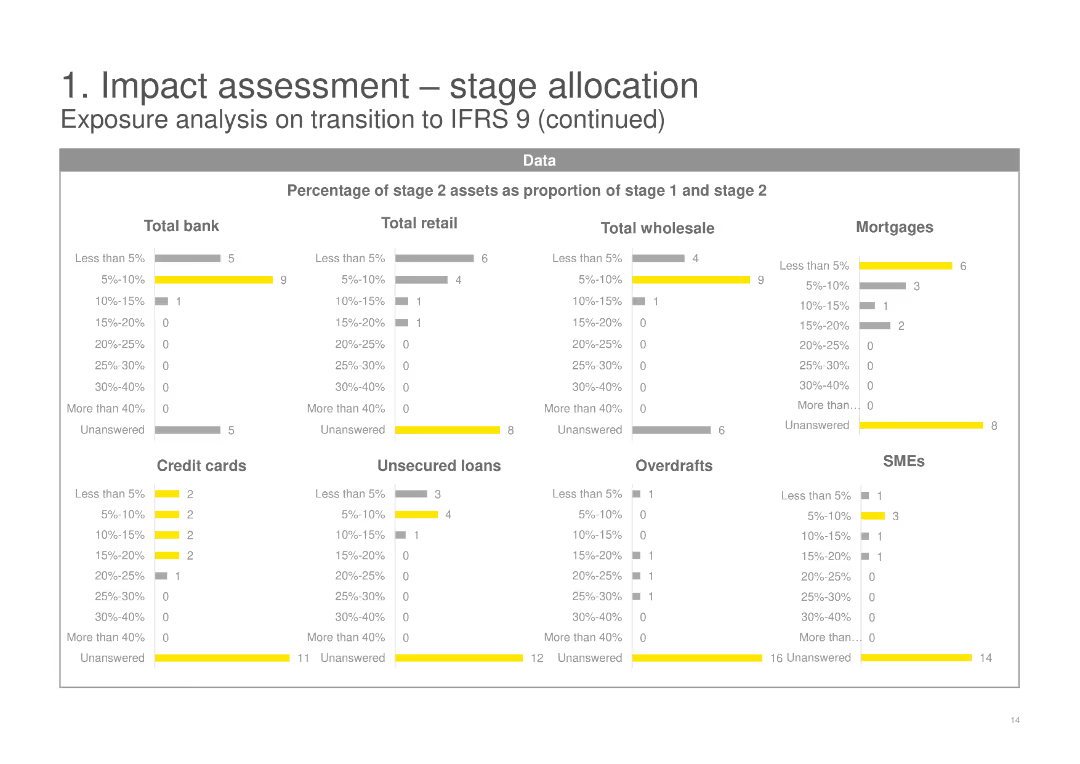
This slide contains multiple sets of horizontal bar charts, showing the percentage of stage 2 assets as a proportion of stage 1 and stage 2 across various categories including Total bank, Retail, Wholesale, Mortgages, and SMEs.
Risk Assessment and Management
Financial Services
It continues the analysis from the previous slide, breaking down the percentage of stage 2 assets for different financial products and segments, providing deeper insights into the IFRS 9 transition impacts.
stage 2 assets, percentage, IFRS 9, financial products, mortgages, SMEs
Multiple Chart
EY
Saved
Presents a multi-series column chart comparing podcast advertising revenue share across various content genres from 2019 to 2020.
Market Analysis and Trends
Media & Entertainment
Analyzes shifts in podcast advertising revenue share among different genres, noting significant gains in Science and Health & Fitness.
podcast advertising, market share, content genres, science, health & fitness, 2019-2020
Single Chart
PwC/Strategy&
Saved
Contains comparative data and visual representations, including a column chart and side-by-side comparisons, on CO2 intensity and environmental impacts of nickel and lithium mining in Australia versus other countries. The slide uses distinct colors to differentiate between countries and includes detailed annotations explaining the significance of the data presented.
Competitive Landscape
Energy & Utilities
Showcases Australia's comparative advantage in mining due to lower CO2 emissions and stronger environmental credentials, which could appeal to ESG-sensitive customers and markets.
Australia, mining, environmental impact, CO2 emissions, nickel, lithium, competitive advantage, ESG credentials, global market, sustainable practices
Mixed Chart
Accenture
Saved
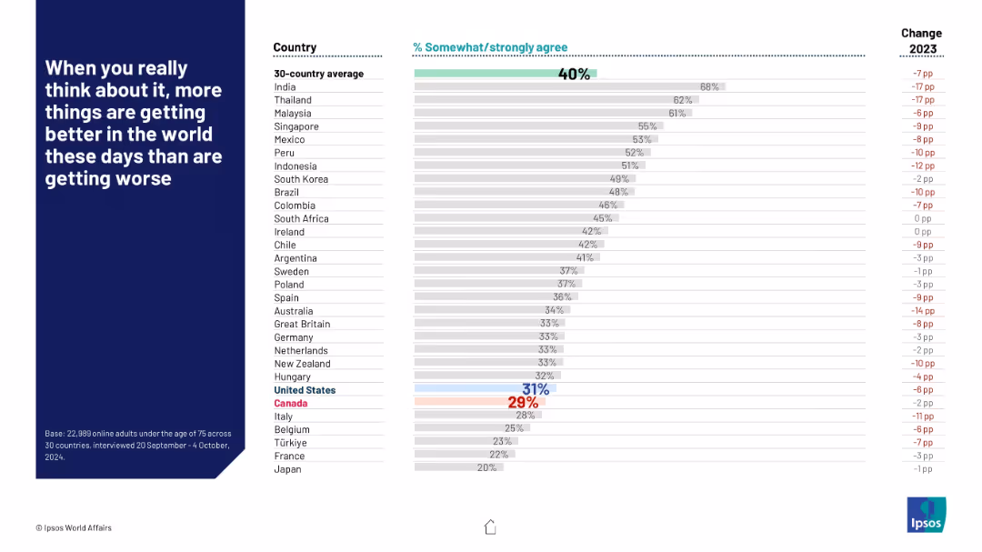
Horizontal bar chart by country showing optimism, with a change column on the right; emphasis on global average and outliers.
Market Analysis and Trends
Government & Public Sector
This slide presents optimism levels by country, measuring agreement with the idea that the world is improving. India leads with 68%, while Japan is the lowest at 20%. The global average stands at 40%, with most countries seeing a drop from the previous year.
optimism, global attitudes, improvement perception, world trends, Ipsos, pessimism, public opinion, yearly change, survey results, 2024
Mixed Chart
IPSOS
Saved
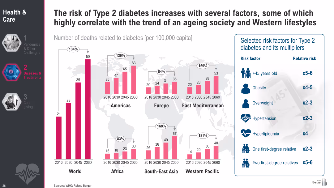
Regional bar charts showing diabetes death rates (2016–2060); sidebar lists key risk factors with relative risks
Risk Assessment and Management
Healthcare & Pharmaceuticals
This slide illustrates the correlation between Type 2 diabetes mortality and contributing risk factors such as age, obesity, and hypertension. It highlights regional trends and emphasizes how modern lifestyles amplify diabetes risk.
Type 2 diabetes, obesity, aging, risk factors, hypertension, mortality, lifestyle diseases, public health, metabolic disorders
Multiple Chart
Roland Berger
Saved
Previous
Next
If nothing, comes up, please save your slides first
Create a FREE account to continue browsing
Receive Instant Access to 1,000+ slides from companies like McKinsey, Google, and Goldman Sachs
First Name
Last Name
Email
Password
I agree to all
Terms & Privacy Policy
Thank you! Your submission has been received!
Oops! Something went wrong while submitting the form.
Have an account?
Sign in
Column Chart
Heatmap
Chevron
Org Chart
Infographic
Callouts
Timeline
List
Graphic
Picture
Process Flow
Diagram
Paragraph
Map
Table
Framework
Subtitle
Takeaway Box
Icon
Other Chart
Radar Chart
Waterfall Chart
Mekko Chart
Pie Chart
Scatter Plot
Line Chart
Bar chart
Bullet points