My Account
My Slides
Search by Category
Templates
Leave Feedback
Login
Logout
Get Started
Browse all Slides
Browse all Slides
Create a FREE Account
Instant access to 1,000+ real slides from top companies like McKinsey, BCG, Goldman Sachs, Google and many more!
First Name
Last Name
Email
Password
I agree to all
Terms & Privacy Policy
Thank you! Your submission has been received!
Oops! Something went wrong while submitting the form.
Have an account?
Sign in
Saved Slides
A bar chart with overlaid line graph titled "Global buyout fund capital contributions and distributions". It contrasts contributions and distributions from 2005 to Q3 22, with a red line indicating net cash flows. There's a notable shift towards negative net cash flows in the recent quarter.
Investment Analysis
Financial Services
Highlights the trends in capital contributions versus distributions to Limited Partners (LPs) in global buyout funds, key for analyzing fund performance, investor returns, and market health.
Buyout Funds, LPs, Capital Contributions, Distributions, Cash Flows, Fund Performance
Single Chart
Bain
Saved
This slide includes column chart showing revenue trends and a table comparing company rankings. The color scheme is primarily blue and white.
Risk Assessment and Management
Financial Services
It analyzes the firm's response to market changes with data on revenue trends and market risk reduction, leading to a top 3 industry ranking.
revenue, rankings, market risk, global markets, disciplined response, financial performance, change management
Mixed Chart
Goldman Sachs
Saved
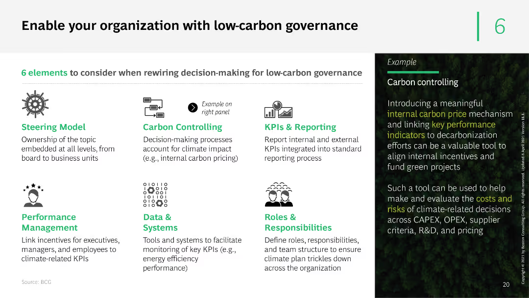
The slide features a series of icons and text boxes outlining six elements of low-carbon governance. It uses a clean layout with green accents to highlight key points and examples of carbon controlling mechanisms.
Organizational Structure and Change
Professional Services
The slide presents six elements to consider for low-carbon governance, including steering models, carbon controlling, KPIs, performance management, data systems, and roles. It provides a practical example of implementing internal carbon pricing.
low-carbon governance, carbon controlling, KPIs, performance management, data systems
Boxed
BCG
Saved
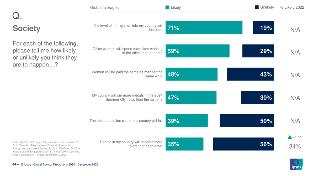
Horizontal bar chart with six societal predictions; teal for Likely and dark blue for Unlikely; global averages only, no country breakdown.
Strategic Planning
Education & Training
This slide summarizes global expectations on key societal trends: increased immigration, return to office work, gender pay equality, Olympic success, population decline, and tolerance. Immigration increase is most likely (71%), while tolerance growth ranks lowest (35%).
society trends, global opinion, gender equality, immigration, office work, tolerance, population, Ipsos, 2024, expectations
Mixed Chart
IPSOS
Saved
Features a combination of textual content and simple graphics to illustrate Barclays' strategies for deepening client relationships and expanding services.
Client Case Studies
Financial Services
Focuses on Barclays' strategies for revenue growth through enhanced client relations, detailing initiatives like hiring in key regions, expanding digital and sustainable offerings, and investing in data capabilities.
client relationships, growth, digital, sustainability
Linear Flow
Barclays
Saved
Moderate complexity with three column charts representing funding in FinTech, HealthTech, and EdTech sectors, alongside descriptive text blocks.
Investment Analysis
Financial Services
Reviews the consistent increase in funding value for emerging sectors like FinTech, HealthTech, and EdTech, with specific mentions of significant deals and momentum.
Funding, FinTech, HealthTech, EdTech, growth
Mixed Chart
Bain
Saved
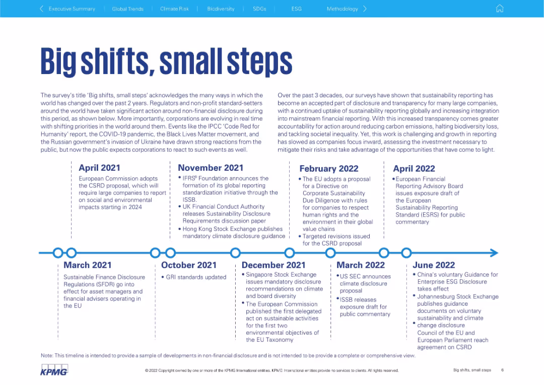
Horizontal timeline with text boxes summarizing major ESG policy/regulatory events from 2021 to 2022.
Regulatory and Compliance
Government & Public Sector
Summarizes regulatory and policy milestones impacting corporate sustainability disclosures from 2021–2022. Highlights actions by the EU, UK, ISSB, and other governing bodies. Supports the idea that corporations must adapt to evolving environmental and social disclosure mandates.
ESG, disclosure, regulation, corporate reporting, timeline, sustainability policy, compliance, EU, ISSB
Linear Flow
KPMG
Saved
The slide includes two line charts: one comparing the S&P 500 price index vs. earnings through Q3 2023, and another showing bull and bear markets over the post-WWII period.
Investment Analysis
Financial Services
This slide analyzes the S&P 500's performance relative to earnings and highlights the historical trends of bull and bear markets.
S&P 500, price index, earnings, bull market, bear market, historical trends
Multiple Chart
Goldman Sachs
Saved
Circle charts with net positive/negative financial statuses compared across SEA countries.
Market Analysis and Trends
Financial Services
The slide compares the financial status of respondents to a year ago, indicating a general decrease in financial wellbeing.
financial status, SEA, comparison, circle chart, survey
Multiple Chart
IPSOS
Saved
The slide presents a line chart showing technology adoption rates in US households over time, color-coded by technology type. Key observations about the impact of world events on technology adoption are summarized on the right.
Market Analysis and Trends
Technology & Software
This slide examines the historical trends in technology adoption among US households, noting that major world events generally do not hinder technological progress, with some delays observed during WWII.
Technology adoption, US households, historical trends, world events, resilience
Mixed Chart
EY
Saved
The slide presents a column chart illustrating the division of capital across different factors, with negative impacts represented in gray and positive in blue. A summary box on the right provides context with key drivers in bulleted form. The design is simple yet informative.
Financial Performance
Financial Services
Analyzes financial results for Macquarie Capital, including areas such as investment-related income and credit impairments, suited for discussions on capital allocation, financial strategy, and performance evaluation in the financial sector.
Macquarie Capital, financial results, investment income, credit, performance evaluation, financial strategy
Mixed Chart
Goldman Sachs
Saved
Map of Denmark, regional highlights, infographic style with icons and color coding.
Regulatory and Compliance
Government & Public Sector
Surveys regional focus on SDGs in Denmark, showing varying priorities such as climate action and economic growth.
Regional strategy, Denmark, SDGs, climate action, economic growth
Graphic
McKinsey
Saved
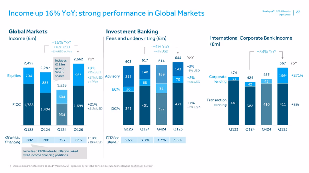
Detailed bar charts with segmented income by business lines including Global Markets and Investment Banking
Financial Performance
Financial Services
Illustrates strong income growth in Global Markets and Investment Banking with a 16% YoY rise. Highlights income sources (equities, FICC, advisory, ECM, DCM) and strong gains in International Corporate Bank.
Global Markets, YoY Income, Investment Banking, FICC, ECM, ICB, Equities, Q125
Multiple Chart
Barclays
Saved
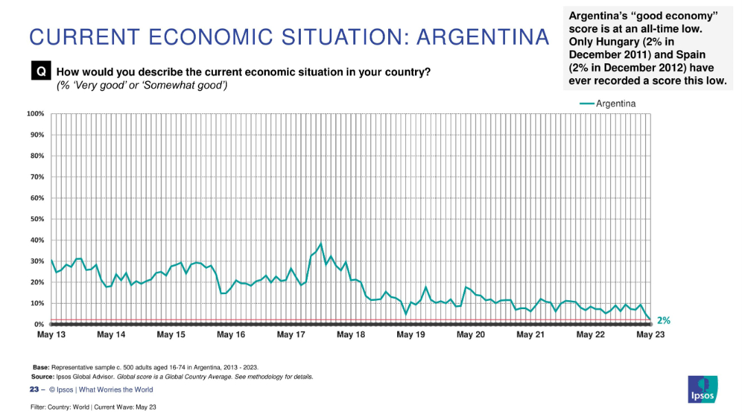
Line graph tracking Argentina’s economic sentiment over time (2013–2023); includes explanatory text in top right.
Strategic Planning
Financial Services
This historical chart shows Argentina’s declining public perception of its economy, reaching an all-time low of 2% in May 2023. The graph displays consistent long-term pessimism with brief periods of improvement. Text highlights how this ties for lowest global record alongside Hungary and Spain.
Argentina, economic crisis, sentiment trend, historical data, public opinion, Ipsos, lowest score, economic outlook
Single Chart
IPSOS
Saved
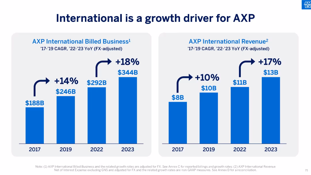
Dual-bar chart slide showing growth in billed business and revenue from 2017 to 2023.
Market Analysis and Trends
Financial Services
The slide illustrates AXP’s strong international growth, with billed business rising from $188B to $344B and revenue increasing from $8B to $13B. It reflects compounded annual growth rates (CAGR) and year-over-year (YoY) increases post-2022.
international growth, AXP, CAGR, billed business, revenue, financial growth, global expansion, FX-adjusted, business strategy
Single Chart
McKinsey
Saved
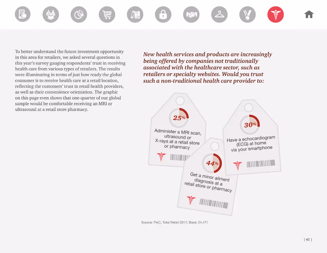
The slide shows a series of tag-shaped graphics with percentages, illustrating consumer willingness to receive healthcare services from non-traditional providers. It uses minimal text and a clean design.
Market Analysis and Trends
Healthcare & Pharmaceuticals
It discusses the trend of non-traditional companies offering health services, with a significant percentage of consumers willing to receive services like MRI scans, echocardiograms, and minor ailment diagnoses from retailers or online providers.
Health services, non-traditional providers, consumer trust, retail health, survey
Mixed Chart
PwC/Strategy&
Saved
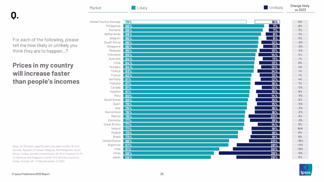
Horizontal bar chart showing perceived likelihood of rising prices vs income across countries; sorted by likelihood; includes year-over-year change.
Market Analysis and Trends
Financial Services
Survey respondents gave their views on whether prices would outpace income growth in 2025. The slide presents likelihood across markets and changes from 2023 sentiment.
inflation perception, price growth, cost of living, income disparity, global sentiment, Ipsos, 2025
Mixed Chart
IPSOS
Saved
Column chart slide tracking the historical growth of deposits across different business units over multiple quarters, with emphasis on growth rates.
Financial Performance
Financial Services
Examines the historical growth patterns of Citibank's deposits across various sectors, offering insights into trends and future expectations. Crucial for long-term financial planning and investment strategies.
deposit growth, Citibank, historical trends, financial forecasting, business analysis
Single Chart
Citigroup
Saved
The slide showcases multiple column charts representing various financial metrics over time, with a clear labeling system and visual cues for easy interpretation.
Financial Performance
Financial Services
This slide offers insight into the robustness of the client business, with operating income and client numbers trends. The depiction of regulatory capital also illustrates the financial health and compliance of the division, serving as a basis for analyzing market stability and growth potential.
client business, operating income, regulatory capital, market analysis, financial health, trends
Multiple Chart
Morgan Stanley
Saved
This slide features a column chart with vertical bars representing FL CET1 erosion under adverse scenarios, labeled with numerical values. There are dotted lines indicating peer and system averages, with a mix of icons representing different countries. The slide has a header with the Santander logo, a slide number, and the word 'Strength' in the top right corner. It employs a color scheme of light and dark blue tones.
Financial Performance
Financial Services
The slide displays the bank's resilience in adverse conditions by comparing the CET1 capital erosion against peers, indicating Santander's position as the strongest bank. It would be used in presentations to show financial stability and strength to stakeholders such as investors or analysts.
Santander, EBA Stress Test, Financial Resilience, Adverse Scenarios, European Banking, Capital Erosion, Peer Comparison, Strength, Financial Stability
Single Chart
Morgan Stanley
Saved
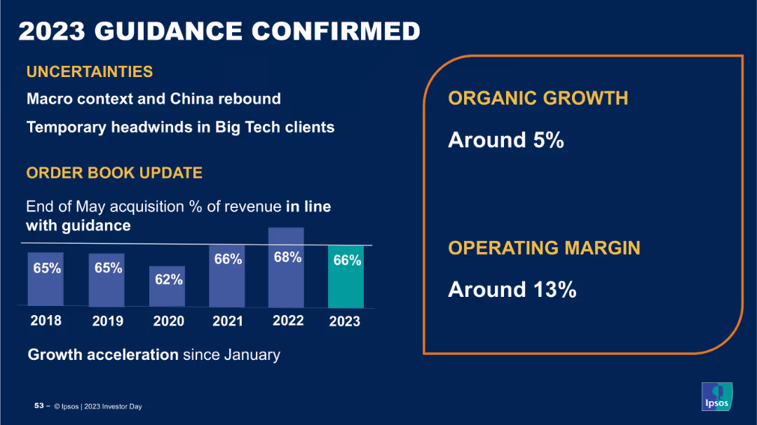
The slide contains a column chart showing percentage of revenue over years from 2018 to 2023, and a section with growth and operating margin percentages. The layout is structured and uses clear data visualizations.
Strategic Planning
Financial Services
The slide confirms Ipsos' 2023 guidance, highlighting uncertainties, organic growth, and operating margin targets, providing an update on order book and revenue projections, indicating stability and future growth prospects.
guidance, revenue, growth, operating margin, projections
Mixed Chart
IPSOS
Saved
Two pie charts show home internet connection status and data download sources. Text blocks provide explanatory notes.
Market Analysis and Trends
Telecommunications
Discusses the prevalence of home internet in Australia and the dominant use of home broadband for data downloads, highlighting technological reach and utility.
internet, Australia, broadband, connectivity, data usage, mobile, technology, pie charts
Multiple Chart
Accenture
Saved
Two graphs juxtapose U.S. goods imports and business inventory/sales ratio, marked by a distinct visual separation. Contains numerical data and is moderately text-dense.
Operational Efficiency
Industrial & Manufacturing
Focuses on the recovery of the service sector and manufacturing, analyzing inventory levels and trade growth, relevant for operational and financial planning.
Service Recovery, Manufacturing, Inventory Levels, Trade Growth, Operational Planning, Financial Analysis
Single Chart
Citigroup
Saved
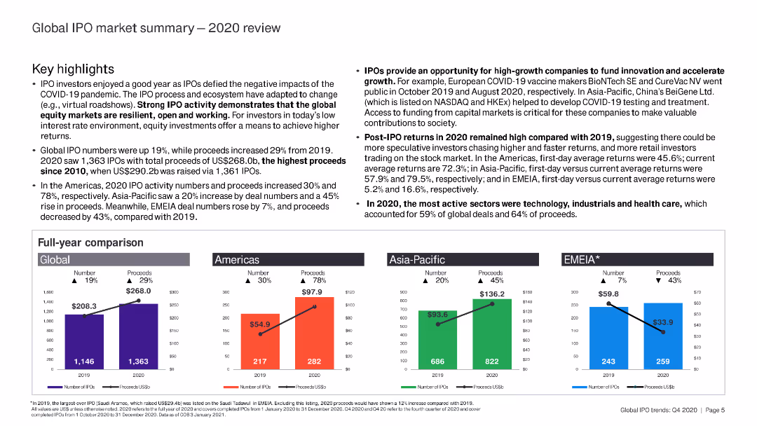
The slide contains detailed text with key highlights and a full-year comparison of IPO activities. It includes small bar charts for regional comparisons.
Market Analysis and Trends
Financial Services
This slide reviews the global IPO market in 2020, summarizing annual performance, key highlights, and regional breakdowns.
IPO, 2020 review, global market, key highlights, annual performance
Multiple Chart
EY
Saved
Detailed horizontal bar chart showcasing the percentage of respondents planning major technology upgrades in areas like ERP and supply chain analytics.
Technology and Digital Transformation
Retail & E-commerce
Focuses on the growing emphasis on technology upgrades in inventory and warehouse management, crucial for improving operational efficiency in businesses.
technology upgrades, inventory management, ERP, warehouse management, operational efficiency, business, analytics, supply chain
Mixed Chart
Deloitte
Saved
Previous
Next
If nothing, comes up, please save your slides first
Create a FREE account to continue browsing
Receive Instant Access to 1,000+ slides from companies like McKinsey, Google, and Goldman Sachs
First Name
Last Name
Email
Password
I agree to all
Terms & Privacy Policy
Thank you! Your submission has been received!
Oops! Something went wrong while submitting the form.
Have an account?
Sign in
Column Chart
Heatmap
Chevron
Org Chart
Infographic
Callouts
Timeline
List
Graphic
Picture
Process Flow
Diagram
Paragraph
Map
Table
Framework
Subtitle
Takeaway Box
Icon
Other Chart
Radar Chart
Waterfall Chart
Mekko Chart
Pie Chart
Scatter Plot
Line Chart
Bar chart
Bullet points