My Account
My Slides
Search by Category
Templates
Leave Feedback
Login
Logout
Get Started
Browse all Slides
Browse all Slides
Create a FREE Account
Instant access to 1,000+ real slides from top companies like McKinsey, BCG, Goldman Sachs, Google and many more!
First Name
Last Name
Email
Password
I agree to all
Terms & Privacy Policy
Thank you! Your submission has been received!
Oops! Something went wrong while submitting the form.
Have an account?
Sign in
Saved Slides
This slide contains a large heading, three primary metric highlights, and three pie charts displaying product lines, geographies, and revenue models. The slide is visually balanced with significant use of purple.
Financial Performance
Healthcare & Pharmaceuticals
Highlights the financial performance and distribution of QuidelOrtho's Point of Care Business Unit for Q3 2023. It includes revenue figures, product line distribution, geographical reach, and revenue models.
Financial, Product, Geography, Revenue, Healthcare
Multiple Chart
JP Morgan
Saved
This slide features a world map showing the geographic distribution of survey respondents. Different sizes of green and blue dots indicate the number of Millennials and Gen Z participants from various regions.
Market Analysis and Trends
Media & Entertainment
The slide visualizes the geographic distribution of respondents from the primary survey conducted between November 2019 and January 2020. It provides a clear view of the global reach of the survey, highlighting regions with the highest participation, which is useful for understanding the demographic spread and diversity of opinions.
Geographic Distribution, Survey, Millennials, Gen Z, Map
Graphic
Deloitte
Saved
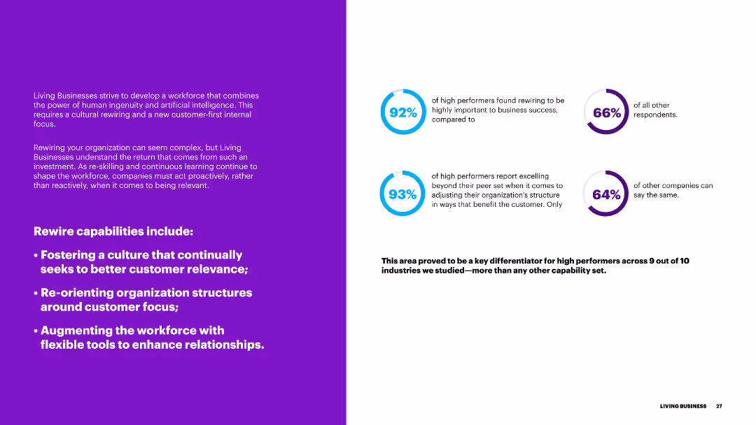
The slide features a purple background on the left and text on the right, with blue circular progress indicators. It discusses the importance of rewiring capabilities for better customer relevance.
Organizational Structure and Change
Government & Public Sector
This slide outlines the rewiring capabilities necessary for businesses to enhance customer relevance, including fostering a customer-focused culture and restructuring organizational frameworks.
rewiring, capabilities, customer relevance, culture, organizational structure
Multiple Chart
Accenture
Saved
Bar charts compare the top countries for inbound and outbound student numbers in 2018, highlighting major destinations and sources of international students.
Market Analysis and Trends
Education & Training
Focuses on global student mobility in 2018, detailing the leading countries for inbound and outbound educational travel. It discusses trends and predicts future changes in international student flows by 2030.
student mobility, global, 2018, trends
Multiple Chart
Roland Berger
Saved
Multiple charts showing various economic indicators, including restructuring cases, profit warnings, volatility, and early warning indicators.
Market Analysis and Trends
Financial Services
The slide presents the initial consequences of a fragile economic environment, using various indicators to highlight trends in restructuring, profit warnings, market volatility, and early warning signals. It emphasizes the impact of these factors on the overall economic outlook and business climate.
Economic Indicators, Fragile Environment, Market Volatility
Multiple Chart
Roland Berger
Saved
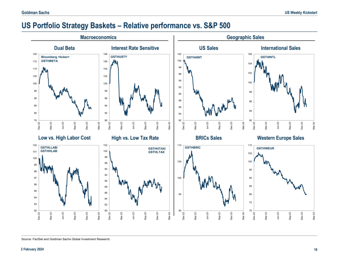
Grid layout of 8 line charts split by themes like Macroeconomics and Geographic Sales. Shows comparative trends of strategy baskets vs. S&P 500 with Bloomberg tickers labeled.
Investment Analysis
Financial Services
This slide visualizes the relative performance of strategy baskets vs. the S&P 500 across macroeconomic (e.g., dual beta, tax sensitivity) and geographic sales themes (e.g., BRICs, Western Europe). All charts use a time series format, providing clarity on how themes evolve over time and under different macroeconomic backdrops.
macro themes, geographic sales, S&P 500, relative trends, dual beta, BRICs, tax strategy, Europe sales, performance charts
Multiple Chart
Goldman Sachs
Saved
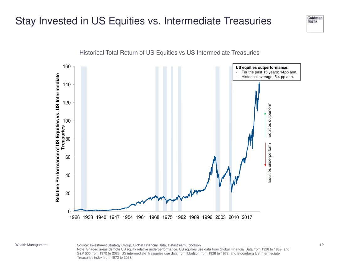
The slide displays a line chart showing the historical total return of US equities versus US intermediate treasuries from 1926 to 2023. Annotations highlight periods of outperformance and underperformance.
Investment Analysis
Financial Services
This slide compares the total return of US equities to US intermediate treasuries, indicating the significant outperformance of equities over the long term.
US equities, intermediate treasuries, historical return, investment, performance comparison
Single Chart
Goldman Sachs
Saved
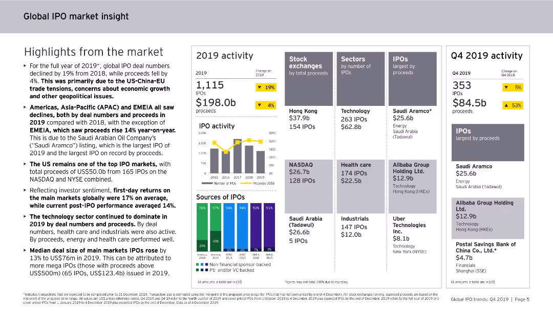
Includes column charts, bar charts, and data tables. The slide is information-rich with visual elements presenting global IPO market activities and trends.
Market Analysis and Trends
Financial Services
Provides insights into the global IPO market for 2019, covering regional performances, sector-specific trends, and the overall impact of geopolitical events on IPO activities.
global, IPO, market insight, 2019, trends
Multiple Chart
EY
Saved
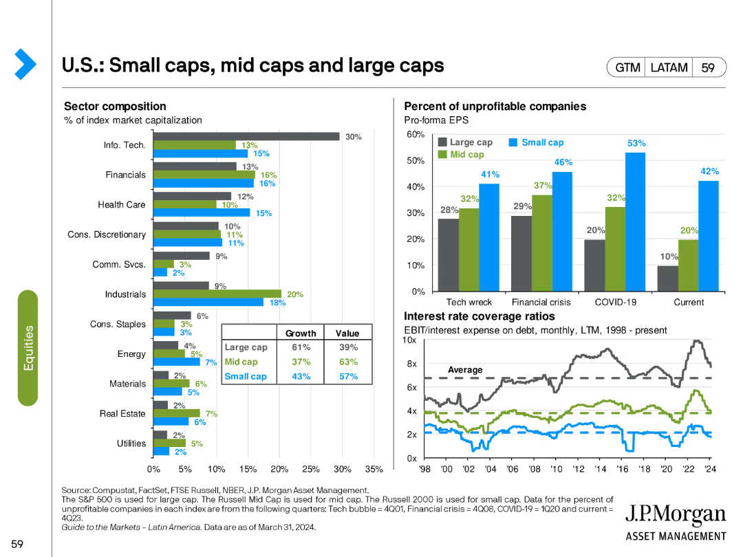
The slide features two bar charts and two line charts. The bar charts show sector composition and percentage of unprofitable companies. The line charts depict interest rate coverage ratios.
Market Analysis and Trends
Financial Services
This slide analyzes the composition and performance of small, mid, and large-cap stocks, focusing on sector distribution and financial metrics like profitability and interest coverage.
small caps, mid caps, large caps, sector composition, interest coverage
Multiple Chart
JP Morgan
Saved
Slide features a title on top, two-column charts comparing Chase's delinquency rate to industry, and Chase's servicing cost per unit from FY14 to FY18. Red highlights draw attention to specific data points. Small text and footnotes are at the bottom.
Financial Performance
Financial Services
The slide presents financial data from 2014 to 2018, comparing Chase's mortgage delinquency rates and servicing costs against the industry average, emphasizing the company's risk management and cost efficiency.
delinquency rate, servicing cost, financial data, risk management, efficiency
Multiple Chart
JP Morgan
Saved
Features a bar chart listing top challenges faced by underwriters, including outdated systems, lack of information, and poor organization, with percentage impacts.
Risk Assessment and Management
Financial Services
Highlights the main challenges faced by insurance underwriters, such as inefficient systems and insufficient data, critical for assessing operational and risk management issues.
challenges, insurance, underwriters, risk management, inefficient systems, data accessibility, training needs
Mixed Chart
Accenture
Saved
Features a combination of icons and text outlining diversity and operational goals, with a clear emphasis on sustainability and inclusion within the firm's strategy.
Organizational Structure and Change
Financial Services
Describes the company's goals for improving operational efficiency and diversity, including specific targets for hiring, energy efficiency, and waste reduction, reinforcing the company's commitment to sustainable operations and an inclusive work environment.
Diversity, Operations, Sustainability, Inclusion, Energy Efficiency, Waste Reduction
Table
Goldman Sachs
Saved
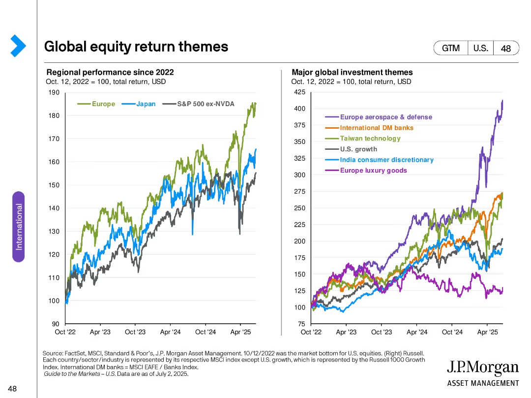
Two line charts: Left shows regional equity performance since 2022; Right shows specific sector/theme performance indexed to 100.
Market Analysis and Trends
Financial Services
Compares regional performance of equities post-2022 and highlights the most prominent global investment themes, including sectors such as aerospace & defense, technology, and luxury goods, with Europe and Japan emphasized.
equity themes, regional performance, sector trends, Europe, Japan, investment strategy, chart analysis, index tracking
Multiple Chart
JP Morgan
Saved
The slide includes column charts for the UK, Spain, France, Italy, and Germany, depicting the growth in tax-free shopping by tourists during 2016-2017. The bars are in shades of gray, and each country's performance is noted along with changes in transaction volumes and average ticket sizes.
Market Analysis and Trends
Consumer Goods
Provides data on the increase in tax-free shopping in Europe due to returning long-haul tourists. Highlights significant growth in countries like the UK and Spain, while noting a decline in Germany, aiding in understanding market recovery and tourist spending trends post-crisis.
tourism, Europe, luxury goods, tax-free shopping, market growth
Single Chart
Bain
Saved
The slide displays multiple product images under the brand "The Vegetarian Butcher," with accompanying text boxes and a pie chart detailing market segments.
Product and Service Analysis
Consumer Goods
Focuses on the growth and expansion of The Vegetarian Butcher, detailing product offerings and market integration strategies post-acquisition.
plant-based, growth, product expansion, market strategy, acquisition
Mixed Chart
Deutsche Bank
Saved
Features column charts and additional commentary sections detailing liquidity ratios and available resources, presented with clarity and depth.
Financial Performance
Financial Services
Discusses Citibank's liquidity coverage ratios, providing insights into financial health and regulatory compliance. Important for risk management and ensuring operational continuity.
liquidity coverage, financial health, Citibank, regulatory compliance, risk management
Multiple Chart
Citigroup
Saved
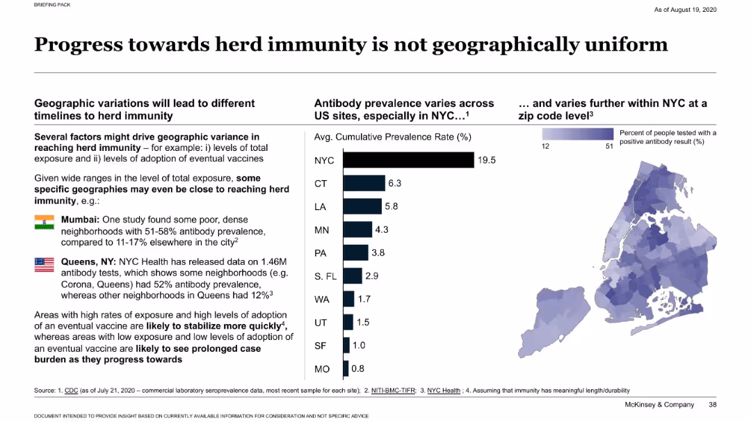
Dual layout with bar graph of antibody prevalence across U.S. states and a heatmap of NYC ZIP code data; includes callouts for Mumbai and Queens.
Market Analysis and Trends
Healthcare & Pharmaceuticals
Demonstrates wide geographic variation in antibody prevalence across U.S. cities and globally. Highlights that some dense areas (like Queens and Mumbai) have much higher rates, suggesting uneven progress toward herd immunity based on exposure and vaccine adoption.
herd immunity, antibody prevalence, NYC, Mumbai, geographic variation
Multiple Chart
McKinsey
Saved
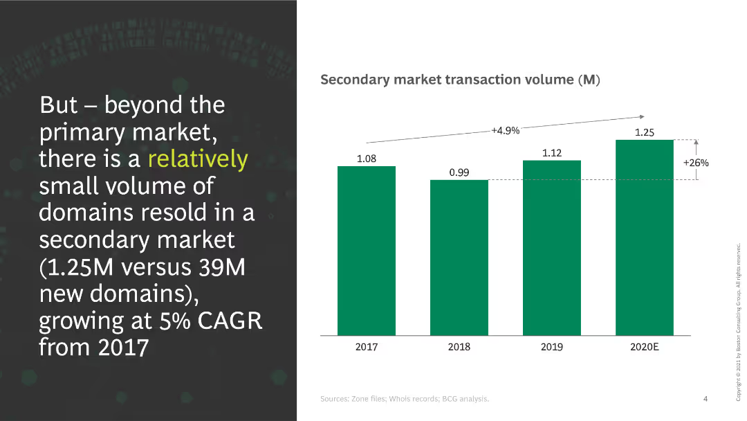
This slide shows a column chart indicating secondary market transaction volumes from 2017 to 2020E. A significant increase in transactions is noted, with a CAGR of 5%.
Market Analysis and Trends
Retail & E-commerce
The slide discusses the volume of domains resold in the secondary market, emphasizing the growth rate and the small volume compared to the primary market.
secondary market, transactions, growth, domains, volume, CAGR
Mixed Chart
BCG
Saved
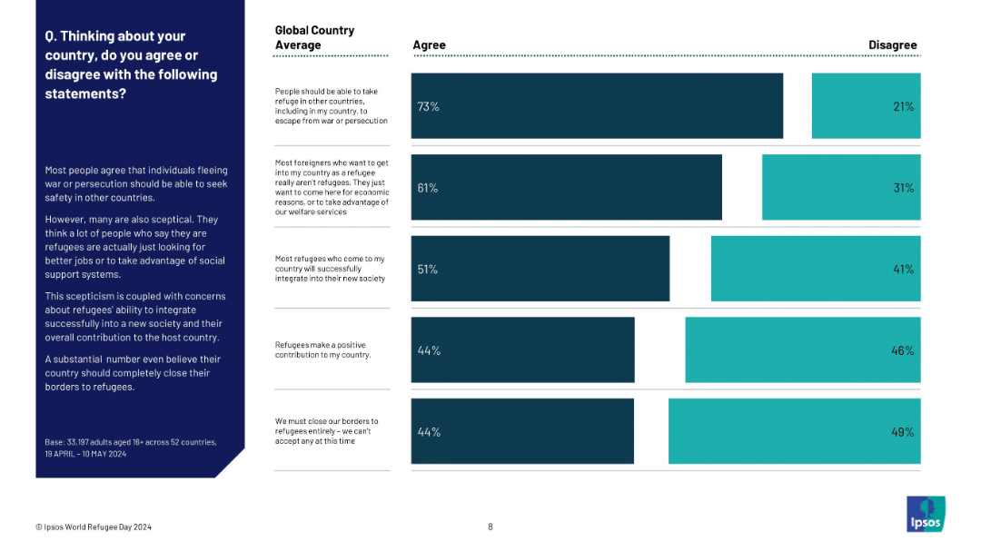
Vertical bar chart with multiple statements showing global average agreement and disagreement percentages about refugee policies. Dark blue bars indicate agreement, teal bars indicate disagreement.
Regulatory and Compliance
Government & Public Sector
This slide aggregates global public opinion on refugee issues such as asylum rights, refugee integration, economic motivation skepticism, and border closures. Highest agreement (73%) is for offering asylum to those fleeing war, while only 44% believe refugees make a positive contribution or oppose closing borders. Skepticism and division are evident in responses.
refugees, asylum, global opinion, skepticism, integration, welfare concerns, Ipsos, public perception, refugee policy
Mixed Chart
IPSOS
Saved
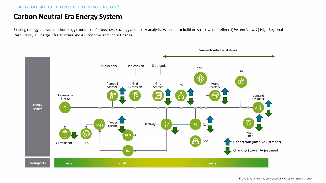
Includes a complex flow diagram illustrating an energy system with elements like renewable energy, grid expansion, and demand-side flexibilities. The diagram is color-coded and detailed, with arrows indicating the flow and interaction between different components. Text at the top explains the need for a new tool.
Technology and Digital Transformation
Energy & Utilities
Describes the necessity of building a new tool for energy analysis that incorporates system views, regional resolution, infrastructure, and social change. The detailed flow diagram maps out the interactions within a carbon-neutral energy system.
Energy System, Renewable, Grid, Flexibility, Tool
Diagram
Deloitte
Saved
Bar charts and a pie chart detail the status and origins of forcibly displaced people, with emphasis on Syria and Turkey.
Market Analysis and Trends
Government & Public Sector
Highlights the global refugee crisis, focusing on the scale of displacement from Syria.
displacement, refugees, Syria, Turkey, crisis
Multiple Chart
Roland Berger
Saved
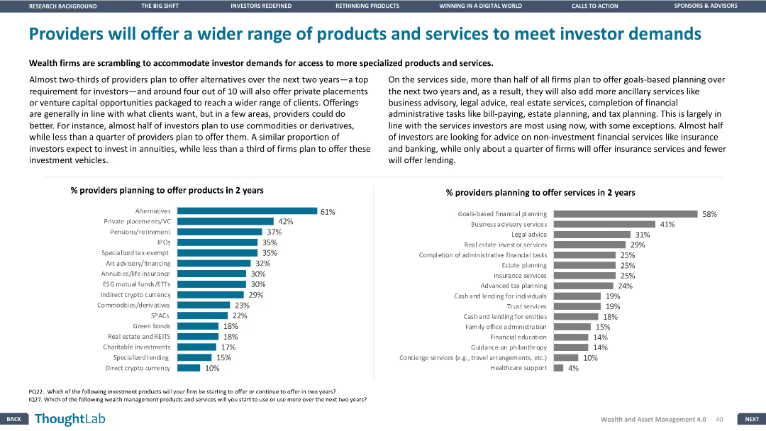
Column charts showing percentage of providers planning to offer new products and services in the next two years. Design is balanced, with clear data visualization.
Product and Service Analysis
Financial Services
Details plans of wealth firms to offer a broader range of products and services, with emphasis on specialized products and ancillary services to meet investor demands.
products, services, providers, investor, demands
Multiple Chart
Deloitte
Saved
The slide is an advanced visual complexity level with multiple charts, including a central comparative list differentiating examples of technologies, expected outcomes, benefits, and risks in bioengineering.
Market Analysis and Trends
Technology & Software
Discusses potential disruptions in chemicals, materials, and energy due to bioengineering, showing financial impact forecasts and contrasting benefits vs. risks.
bioengineering, chemicals, energy, risks, benefits, materials, sustainability, disruption, forecast, impact
Text Only
McKinsey
Saved
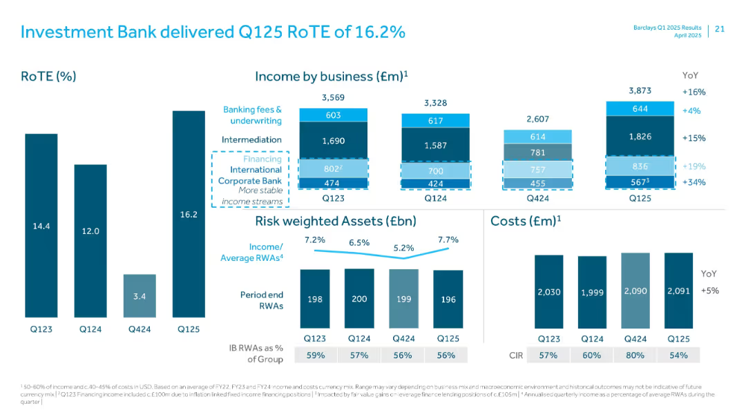
Clustered vertical bar charts for RoTE, income by business, risk weighted assets, and cost overview.
Financial Performance
Financial Services
Summarizes Investment Bank’s Q125 performance. RoTE reached 16.2%, with 16% YoY income growth. Shows income split across various business lines and notes RWA and cost trends. Highlights stable financing income and improved CIR.
Investment Bank, RoTE, Income, RWA, Financing, CIR, Q125, Intermediation, Fees
Multiple Chart
Barclays
Saved
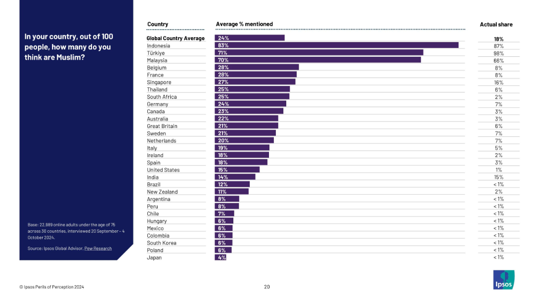
Bar chart listing countries with average perceived % Muslim and actual % side-by-side.
Market Analysis and Trends
Government & Public Sector
This slide displays the public perception of Muslim populations across different countries, comparing them with actual data. It highlights consistent overestimation, particularly in countries with small actual Muslim populations.
religious demographics, Muslim population, public misperception, belief vs fact, Ipsos survey, minority estimate, global religion stats
Mixed Chart
IPSOS
Saved
Previous
Next
If nothing, comes up, please save your slides first
Create a FREE account to continue browsing
Receive Instant Access to 1,000+ slides from companies like McKinsey, Google, and Goldman Sachs
First Name
Last Name
Email
Password
I agree to all
Terms & Privacy Policy
Thank you! Your submission has been received!
Oops! Something went wrong while submitting the form.
Have an account?
Sign in
Column Chart
Heatmap
Chevron
Org Chart
Infographic
Callouts
Timeline
List
Graphic
Picture
Process Flow
Diagram
Paragraph
Map
Table
Framework
Subtitle
Takeaway Box
Icon
Other Chart
Radar Chart
Waterfall Chart
Mekko Chart
Pie Chart
Scatter Plot
Line Chart
Bar chart
Bullet points