My Account
My Slides
Search by Category
Templates
Leave Feedback
Login
Logout
Get Started
Browse all Slides
Browse all Slides
Create a FREE Account
Instant access to 1,000+ real slides from top companies like McKinsey, BCG, Goldman Sachs, Google and many more!
First Name
Last Name
Email
Password
I agree to all
Terms & Privacy Policy
Thank you! Your submission has been received!
Oops! Something went wrong while submitting the form.
Have an account?
Sign in
Saved Slides
Presents multiple line graphs showing search trends for online selling-related queries across various countries. The design is simple, with emphasis on trend lines and minimal text.
Market Analysis and Trends
Technology & Software
Discusses the increasing efforts of suppliers to meet rising online demand, as indicated by search trends. It is useful for understanding supply dynamics in the e-commerce market.
e-Commerce, suppliers, online demand, search trends, market dynamics
Multiple Chart
Bain
Saved
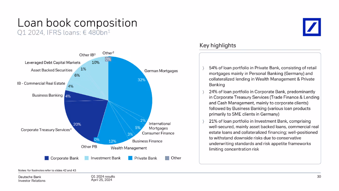
This slide includes a pie chart showing the composition of Deutsche Bank's loan book by type (German Mortgages, Corporate Treasury Services, etc.) as of Q1 2024.
Financial Performance
Financial Services
The slide details the composition of Deutsche Bank's loan book as of Q1 2024, breaking down the types of loans (German Mortgages, Corporate Treasury Services, etc.) and providing key highlights of the portfolio distribution.
loan book, composition, types, portfolio, German Mortgages, Corporate Treasury Services, Deutsche Bank, Q1 2024
Mixed Chart
Deutsche Bank
Saved
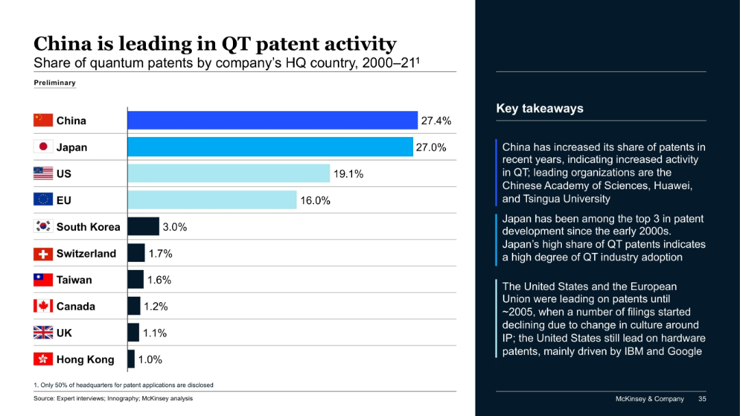
Horizontal bar chart ranking countries by share of quantum patents (2000–2021), with key insights listed on the right.
Competitive Landscape
Artificial Intelligence
China leads with 27.4% of quantum technology (QT) patents, closely followed by Japan. The US and EU trail at 19.1% and 16%, respectively. The commentary highlights China's rapid growth, Japan's consistent top-3 presence, and a decline in US/EU filings since ~2005 due to changing IP cultures.
QT patents, China, Japan, US, EU, intellectual property, competitive analysis
Mixed Chart
McKinsey
Saved
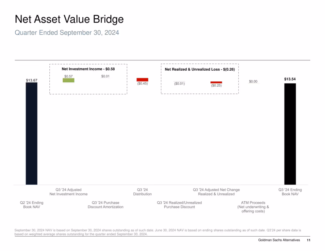
Bar chart "bridge" style; shows progression of NAV from start to end of quarter using segmented columns with color-coded gains and losses.
Financial Performance
Financial Services
The slide illustrates the change in Net Asset Value (NAV) for Q3 2024, detailing sources of gains and losses. It breaks down net investment income, realized/unrealized losses, and distributions, highlighting how the NAV declined slightly from $13.67 to $13.54 during the quarter due to negative market valuation adjustments.
NAV, investment income, unrealized loss, realized loss, distribution, equity performance, Q3 2024
Single Chart
Goldman Sachs
Saved
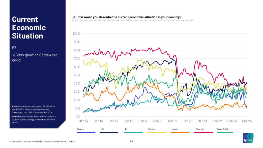
Multi-line trend chart showing % “very good” or “somewhat good” for G7 countries over time; clean line graph.
Market Analysis and Trends
Financial Services
This line chart tracks the economic sentiment over time for G7 nations from Dec 2013 to Dec 2024, showing trends in perceived economic positivity.
G7, trend lines, economic sentiment, long-term data, country comparison, Ipsos, 2024, line graph, public perception, macro trends
Mixed Chart
IPSOS
Saved
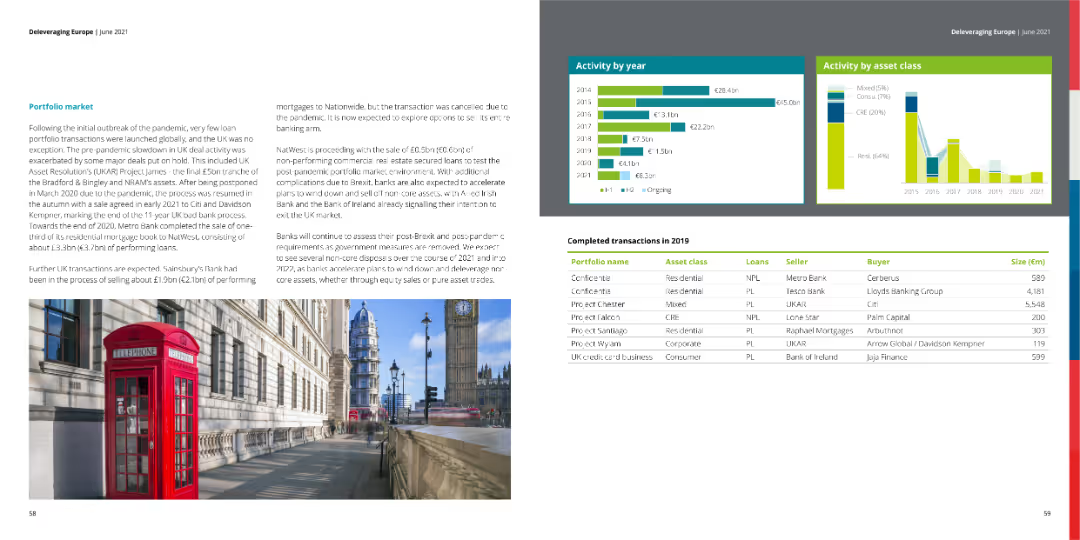
The slide includes column charts depicting activity by year and asset class, along with a table of completed transactions in 2019. An image of a city street scene complements the data.
Market Analysis and Trends
Financial Services
This slide reviews the portfolio market, focusing on transaction activity by year and asset class, with detailed information on completed transactions in 2019.
portfolio market, transactions, asset class
Multiple Chart
Deloitte
Saved
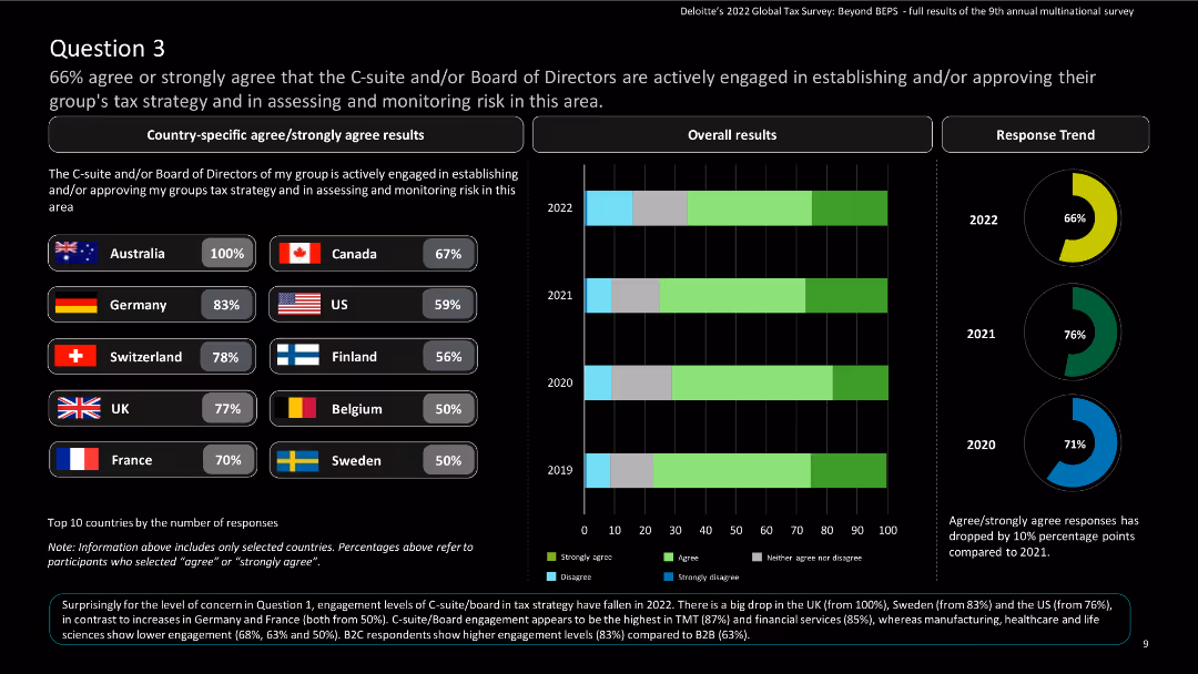
The slide features country-specific results and a column chart showing overall and response trend results over the years.
Regulatory and Compliance
Financial Services
The slide highlights C-suite and board engagement in tax strategy and monitoring risk, indicating high engagement in most countries.
Tax strategy, risk monitoring, C-suite, board engagement, global tax, Deloitte, agree, strongly agree, survey, multinational
Multiple Chart
Deloitte
Saved
This slide presents a structured list with the table of contents for the ESG report, detailing different sections such as leadership, business, and approaches to ESG.
Regulatory and Compliance
Professional Services
The table of contents for the 2022 ESG report, outlining key sections and page numbers, functioning as a navigational guide for readers.
Contents, ESG, Sections, Structure, Professional
Agenda
Booz Allen Hamilton
Saved
The slide features a green color scheme with a large column chart comparing the average maturity scores of brands with different levels of senior sponsorship. On the right, a quote in white text from a chairman of a Thailand-based company emphasizes the importance of digital marketing development.
Market Analysis and Trends
Media & Entertainment
This slide compares the maturity scores of brands with limited senior sponsorship and those with CEO sponsorship, illustrating a significant difference. A quotation from a travel company's chairman highlights leadership's role in digital marketing initiatives.
digital marketing, leadership, maturity, brands, sponsorship, Thailand, CEO
Mixed Chart
BCG
Saved
World map with red dots indicating company locations, larger red circles marking specific cities (Helsinki, Oslo, etc.) with numbers, large bold title text at the top.
Industry Overview
Professional Services
This slide highlights Bain & Company's position as a leading consulting firm in the Nordics, showcasing their staff and collaboration with QVARTZ. Ideal for corporate presentations and company overviews.
consulting, Nordics, Bain & Company, QVARTZ, global, local knowledge, powerhouse
Graphic
Bain
Saved
Uses a bar graph to compare the CAGR of off-grid solar PV installed capacity across several countries.
Market Analysis and Trends
Energy & Utilities
Compares the growth rates of off-grid solar PV capacity across multiple countries, highlighting Nigeria's position relative to its peers.
solar market, CAGR, comparative analysis, off-grid, international markets
Single Chart
BCG
Saved
The slide features a line graph depicting the expenditure execution rate over several years. Each data point is marked clearly, showing a trend over time.
Performance Metrics and KPIs
Government & Public Sector
This slide tracks the efficiency of expenditure execution in Namibia over recent fiscal years, illustrating trends that are crucial for evaluating financial management and operational effectiveness in government spending.
expenditure rate, fiscal management, efficiency analysis
Single Chart
PwC/Strategy&
Saved
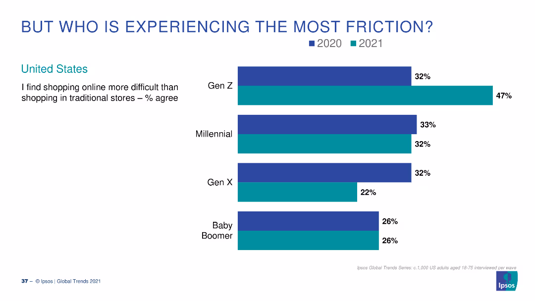
A column chart showing percentages of different generational groups in the US who find online shopping more difficult than traditional shopping for the years 2020 and 2021.
Market Analysis and Trends
Retail & E-commerce
This slide compares the percentage of various generational groups in the US who found online shopping more difficult in 2020 and 2021, focusing on Gen Z, Millennials, Gen X, and Baby Boomers.
generations, online shopping, friction, US, survey
Single Chart
IPSOS
Saved
The slide includes text boxes and icons describing the primary end markets and demand drivers for in-plant services, focusing on refinery, petrochemical, automotive, and power generation.
Market Analysis and Trends
Industrial & Manufacturing
It discusses the near-term challenges and long-term outlook for in-plant services, particularly in refinery, petrochemical, and automotive sectors.
In-plant, services, refinery, petrochemical, automotive, challenges, long-term, near-term, markets
Table
LEK
Saved
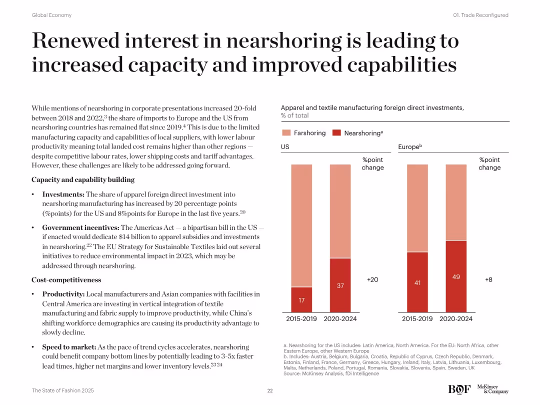
Bar charts on nearshoring vs farshoring FDI changes in the US and Europe. Bullet-point text explains investments, policies, and productivity. Modern clean layout.
Operational Efficiency
Consumer Goods
This slide highlights rising foreign direct investments in nearshoring for apparel manufacturing in the US and Europe. It attributes the growth to new policy incentives, improved productivity, and faster speed to market. The Americas Act and EU sustainability goals are noted as enablers.
nearshoring, farshoring, FDI, US, Europe, productivity, policy incentives, apparel, capacity building, local manufacturing
Mixed Chart
McKinsey
Saved
The slide consists of several sections, including icons and charts. It features rankings and a pie chart for client distribution. The color palette is blue, gray, and white, maintaining brand consistency.
Market Analysis and Trends
Financial Services
The slide discusses continued growth through comprehensive services and client excellence at JPMorgan Chase. With statistics on market share, revenue, and client distribution, it's useful for presentations that aim to highlight market leadership, growth trends, and commitment to client service across various business sectors.
Markets, Revenue, Growth, Excellence, Client Distribution, Global Expertise, Service Provider, Omnichannel, Trading
Mixed Chart
JP Morgan
Saved
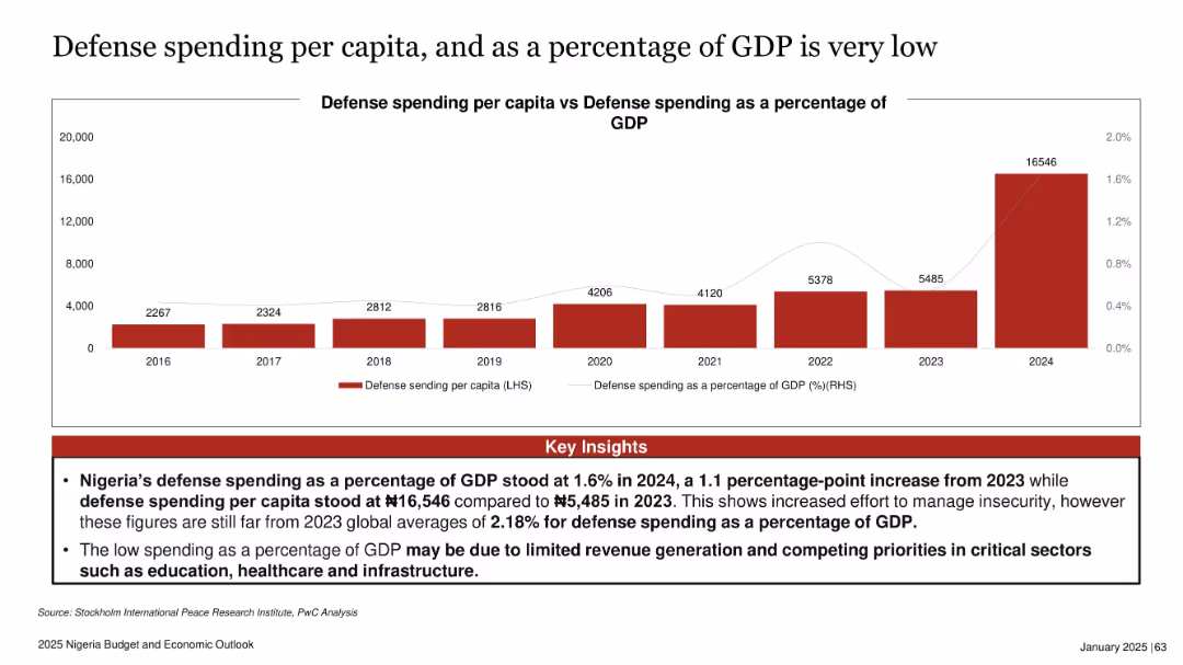
Dual-axis bar and line chart with red bars for per capita spending and a thin grey line for % of GDP
Financial Performance
Government & Public Sector
This slide compares Nigeria’s defense spending per capita with its GDP percentage from 2016 to 2024. While there’s a sharp increase in per capita spending in 2024, it still remains below global averages. Insights explain that low spending relative to GDP is due to revenue challenges and competing sectoral priorities like education and infrastructure.
defense, Nigeria, GDP, budget, security, spending, inflation, infrastructure, public finance
Mixed Chart
PwC/Strategy&
Saved
Side-by-side comparison of full-service and self-directed investment services, with icons and key metrics.
Financial Performance
Financial Services
Highlights the foundation and growth of investment services, presenting opportunities in the context of client assets and digital engagement.
Investment Services, Client Assets, Digital Engagement, Financial Growth, Wealth Management, Market Opportunity
Boxed
JP Morgan
Saved
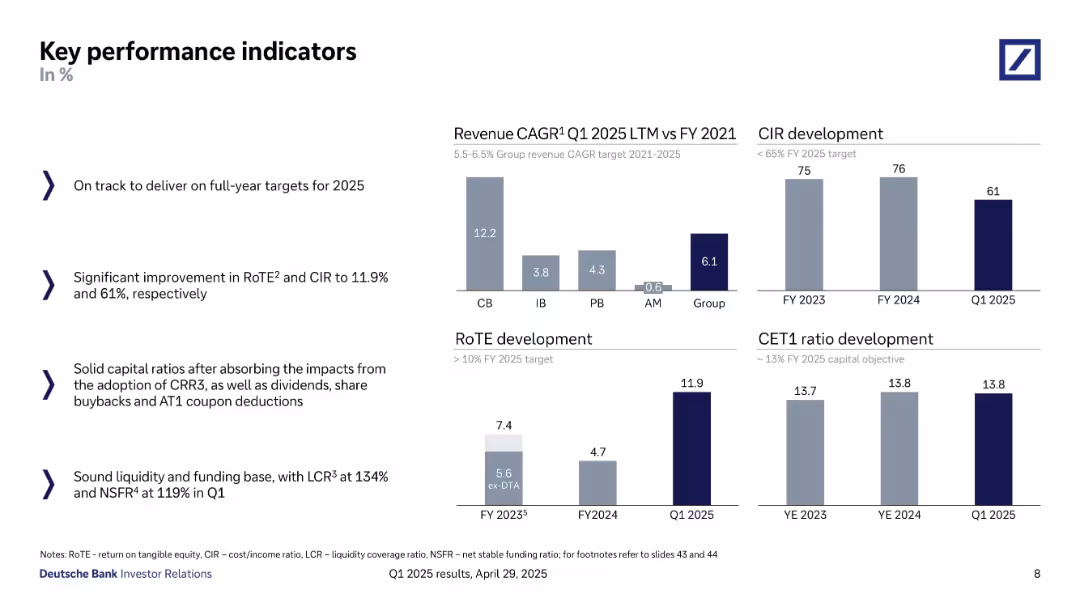
Bar charts and text blocks; displays revenue CAGR, CIR, RoTE, CET1 ratio with supporting commentary
Performance Metrics and KPIs
Financial Services
A snapshot of Deutsche Bank’s KPIs including CIR, RoTE, and CET1 ratio through Q1 2025. It tracks progress toward 2025 targets, showcasing strong revenue CAGR and improved cost/income ratio.
KPIs, RoTE, CIR, CET1 ratio, revenue CAGR, Deutsche Bank, performance targets, Q1 2025
Multiple Chart
Deutsche Bank
Saved
The slide features a column chart displaying the percentage growth of urban agglomerations with the highest population growth from 2015-35. The chart differentiates between African and Asian cities. Below the chart are annotations and additional notes regarding urbanization trends in Africa.
Market Analysis and Trends
Technology & Software
This slide analyzes the fastest-growing cities in terms of population, comparing urban agglomerations in Africa and Asia. It highlights the impact of rapid urbanization on consumption expenditure in Africa, suggesting significant opportunities for economic growth in these regions.
urban growth, population, Africa, Asia, urbanization
Mixed Chart
LEK
Saved
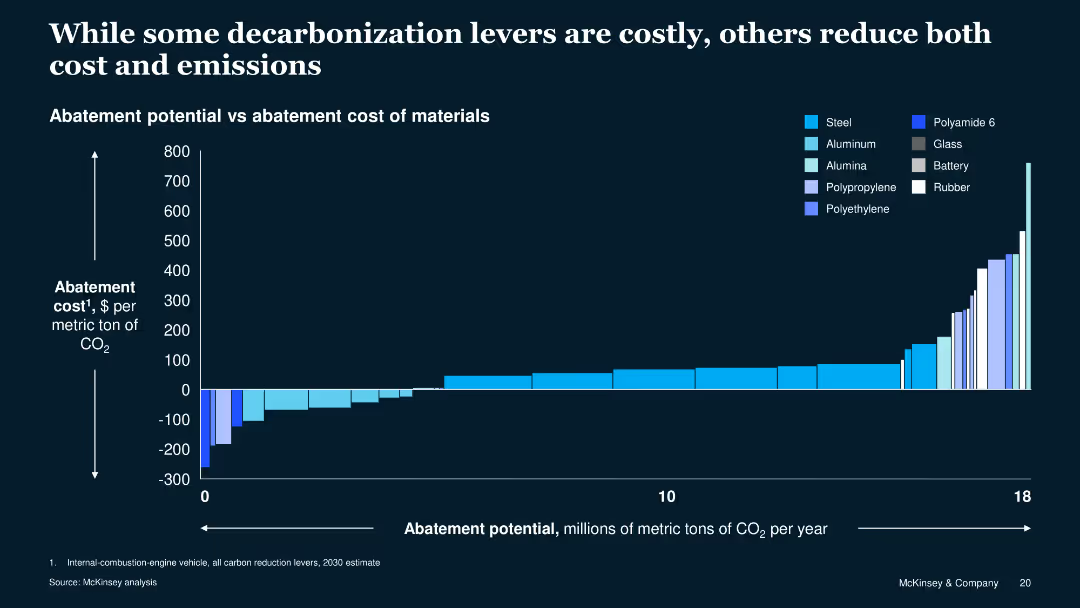
The slide includes a column chart showing abatement potential versus cost for various materials. The chart uses different shades of blue to represent different materials.
Operational Efficiency
Energy & Utilities
This slide compares the cost and potential CO2 reduction of various materials used in manufacturing, illustrating that some options can reduce both costs and emissions.
abatement, cost, emissions, materials, comparison, manufacturing, energy, efficiency, sustainability, decarbonization
Single Chart
McKinsey
Saved
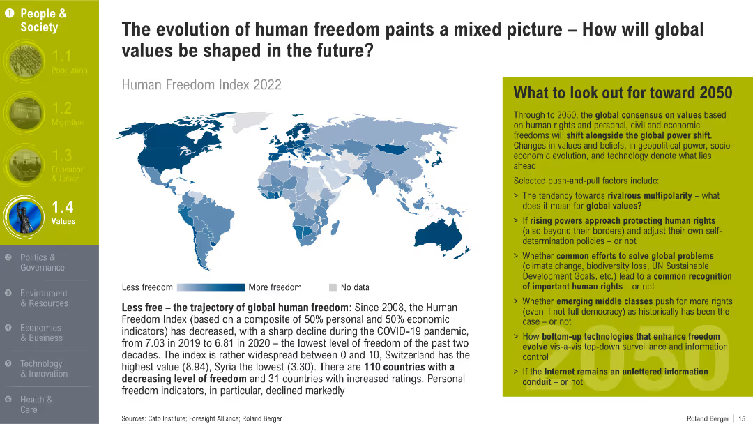
World map shaded by Human Freedom Index levels; supported by text on trends since 2008 and forecast implications toward 2050.
Strategic Planning
Government & Public Sector
The slide illustrates global trends in freedom using the Human Freedom Index. It discusses declining personal freedoms post-COVID and raises key geopolitical and social questions affecting global values by 2050.
human freedom, values, Human Freedom Index, civil liberties, geopolitical trends, personal rights
Mixed Chart
Roland Berger
Saved
Column charts illustrate the SEA online ad market size for 2015 and 2025, with digital percentages and a descriptive sidebar.
Market Analysis and Trends
Media & Entertainment
The slide predicts a fivefold increase in the SEA online ads market by 2025 and emphasizes the significance of Indonesia and Thailand in the market.
online ads, SEA, market growth, Indonesia, Thailand
Multiple Chart
Bain
Saved
The slide features two column charts. The first chart shows the relationship between activism and strategic reviews over time. The second chart presents the global M&A quarterly announced volumes for 2023.
Strategic Planning
Financial Services
The slide discusses the link between activist campaigns and strategic reviews, and how this affects M&A activity. It suggests that increased activism will drive strategic actions.
activism, strategic reviews, M&A, financial services, 2023 trends
Multiple Chart
JP Morgan
Saved
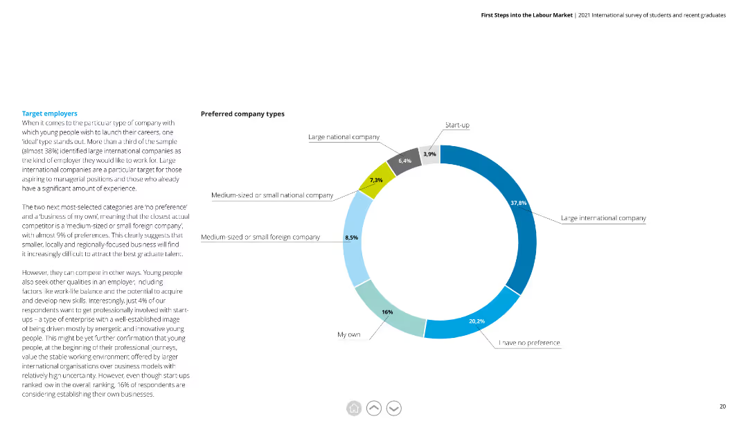
A pie chart showing preferred company types among respondents, with segments labeled for clarity.
Market Analysis and Trends
Professional Services
Displays respondent preferences for company types, including large international companies and medium-sized national companies.
Company Types, Preferences, Large International, Medium-Sized, National, Respondents
Mixed Chart
Deloitte
Saved
Previous
Next
If nothing, comes up, please save your slides first
Create a FREE account to continue browsing
Receive Instant Access to 1,000+ slides from companies like McKinsey, Google, and Goldman Sachs
First Name
Last Name
Email
Password
I agree to all
Terms & Privacy Policy
Thank you! Your submission has been received!
Oops! Something went wrong while submitting the form.
Have an account?
Sign in
Column Chart
Heatmap
Chevron
Org Chart
Infographic
Callouts
Timeline
List
Graphic
Picture
Process Flow
Diagram
Paragraph
Map
Table
Framework
Subtitle
Takeaway Box
Icon
Other Chart
Radar Chart
Waterfall Chart
Mekko Chart
Pie Chart
Scatter Plot
Line Chart
Bar chart
Bullet points