My Account
My Slides
Search by Category
Templates
Leave Feedback
Login
Logout
Get Started
Browse all Slides
Browse all Slides
Create a FREE Account
Instant access to 1,000+ real slides from top companies like McKinsey, BCG, Goldman Sachs, Google and many more!
First Name
Last Name
Email
Password
I agree to all
Terms & Privacy Policy
Thank you! Your submission has been received!
Oops! Something went wrong while submitting the form.
Have an account?
Sign in
Saved Slides
The slide has three pie charts detailing the survey methodology, including the number of employees, investment stage focus, and primary investment sector focus.
Market Analysis and Trends
Professional Services
The slide outlines the survey methodology used to gather data, including firm size, investment stages, and sector focus of the firms surveyed.
survey methodology, firm size, investment focus, sector focus, VC firms
Multiple Chart
Deloitte
Saved
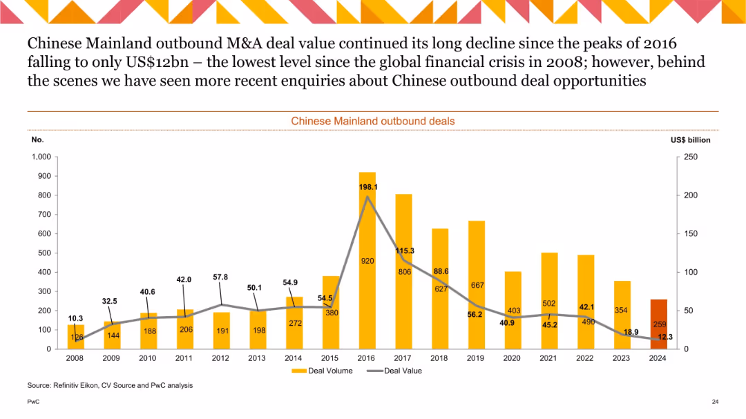
Line and bar combo chart (2008–2024) tracking deal volume and value, labeled bars for volume and line for value.
Strategic Planning
Government & Public Sector
This historical chart tracks outbound M&A activity from Mainland China, showing a major peak in 2016 followed by a significant decline through 2024. The value in 2024 is the lowest since the 2008 financial crisis, despite a modest uptick in deal count. It reflects tightening investment flows and cautious international expansion.
China outbound, M&A, deal value, historical trend, foreign investment, deal volume, strategic outlook
Single Chart
PwC/Strategy&
Saved
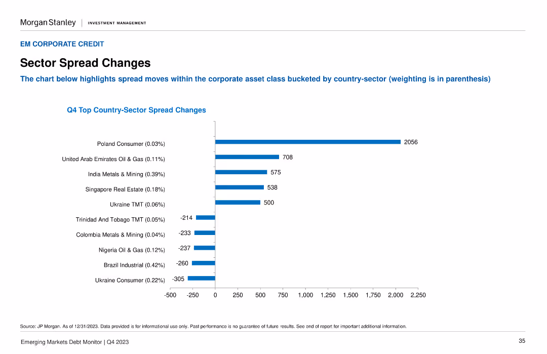
A column chart illustrates the Q4 Top Country-Sector Spread Changes, with the highest spread changes highlighted for different sectors and countries.
Market Analysis and Trends
Financial Services
It highlights the significant spread changes within the corporate asset class, broken down by country-sector combinations. Useful for sector-specific market analysis.
sector spreads, corporate asset, Q4, country-sector, market changes
Single Chart
Morgan Stanley
Saved
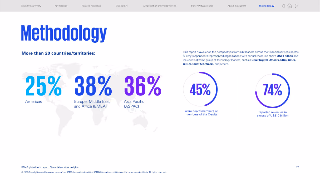
Clean design with a world map, percentage breakdown by region, and two large statistic circles on right.
Strategic Planning
Financial Services
Explains the methodology of the study, which included tech leaders across global financial sectors. Provides a regional breakdown of respondents and outlines their roles and revenue levels to validate the report's credibility.
methodology, survey, financial services, regional distribution, C-suite, high revenue firms
Mixed Chart
KPMG
Saved
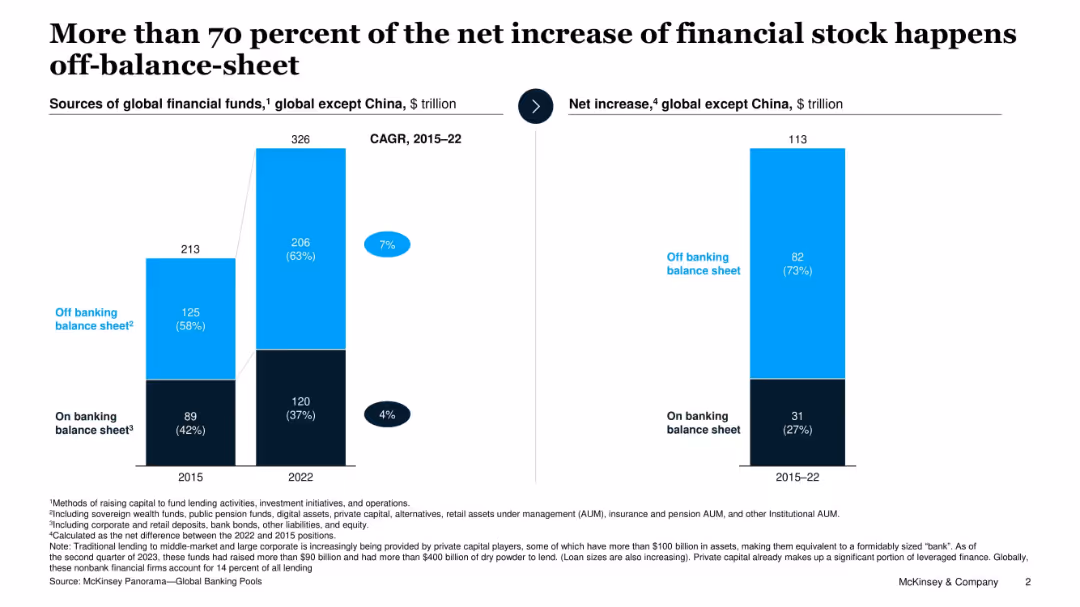
Two bar charts: left showing global financial stock by source, right showing net increase 2015–22; color-coded for on/off balance sheet.
Corporate Finance and Valuation
Financial Services
This slide presents the dominance of off-balance-sheet sources in global financial stock growth from 2015 to 2022. It highlights the increasing role of private capital and institutional AUM in financial flows, making up over 70% of the net increase in financial stock.
financial stock, off-balance-sheet, global finance, AUM, banking, capital sources, 2022
Single Chart
McKinsey
Saved
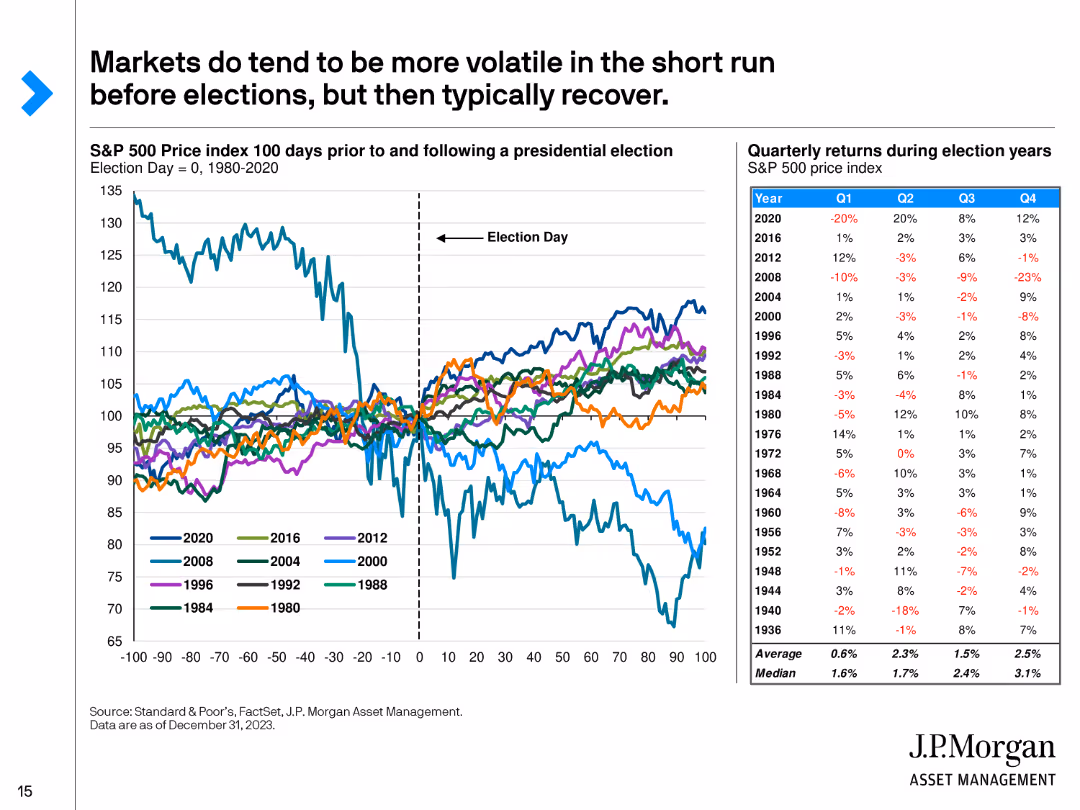
The slide includes a line chart showing the S&P 500 Price Index 100 days before and after presidential elections from 1980 to 2020, and a table of quarterly returns during election years.
Market Analysis and Trends
Financial Services
This slide analyzes market volatility around presidential elections, demonstrating that although markets can be volatile in the short term, they typically recover. It includes historical data and quarterly returns.
Market Volatility, Presidential Elections, Recovery, Historical Data, Analysis
Mixed Chart
JP Morgan
Saved
Slide shows a map of Namibia with key economic statistics presented in a segmented arrow design, highlighting data like unemployment rate, GDP growth, and inflation.
Industry Overview
Government & Public Sector
Provides a concise overview of Namibia’s current economic status, detailing key statistics like unemployment, GDP growth, and inflation rates.
Namibia, economic statistics, unemployment, GDP growth, inflation, economic overview
Graphic
PwC/Strategy&
Saved
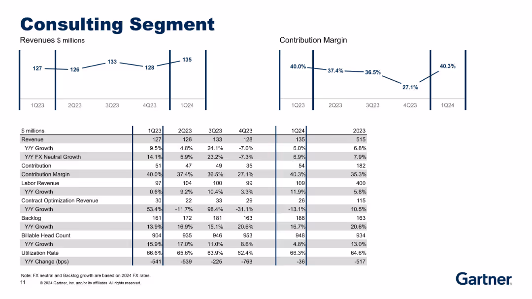
Two line charts on top (Revenue and Contribution Margin) with a detailed multi-row table below; simple, clean layout with alternating gray/white rows.
Performance Metrics and KPIs
Professional Services
Highlights financial performance of the Consulting segment, including revenue breakdowns, Y/Y growth, contribution, backlog, labor vs. contract revenue, headcount, and utilization rates. It shows variability across quarters and operational indicators.
consulting, margin, headcount, backlog, utilization, revenue, growth
Multiple Chart
Gartner
Saved
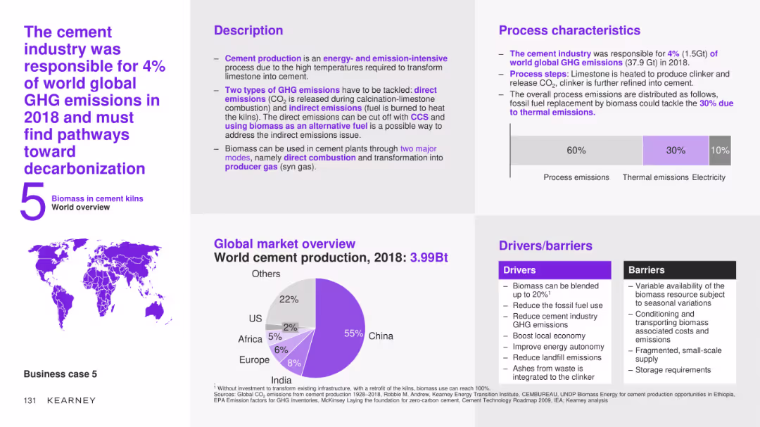
The slide features a detailed case study on the use of biomass in the cement industry, covering the description, process characteristics, global market overview, and drivers/barriers. It includes a pie chart showing world cement production by region for 2018.
Client Case Studies
Industrial & Manufacturing
This slide provides an in-depth analysis of the use of biomass in the cement industry, detailing the process steps, market potential, and the benefits and challenges of integrating biomass to reduce greenhouse gas emissions and improve sustainability.
cement industry, biomass, case study, process description, market overview, drivers, barriers, decarbonization
Multiple Chart
Kearney
Saved
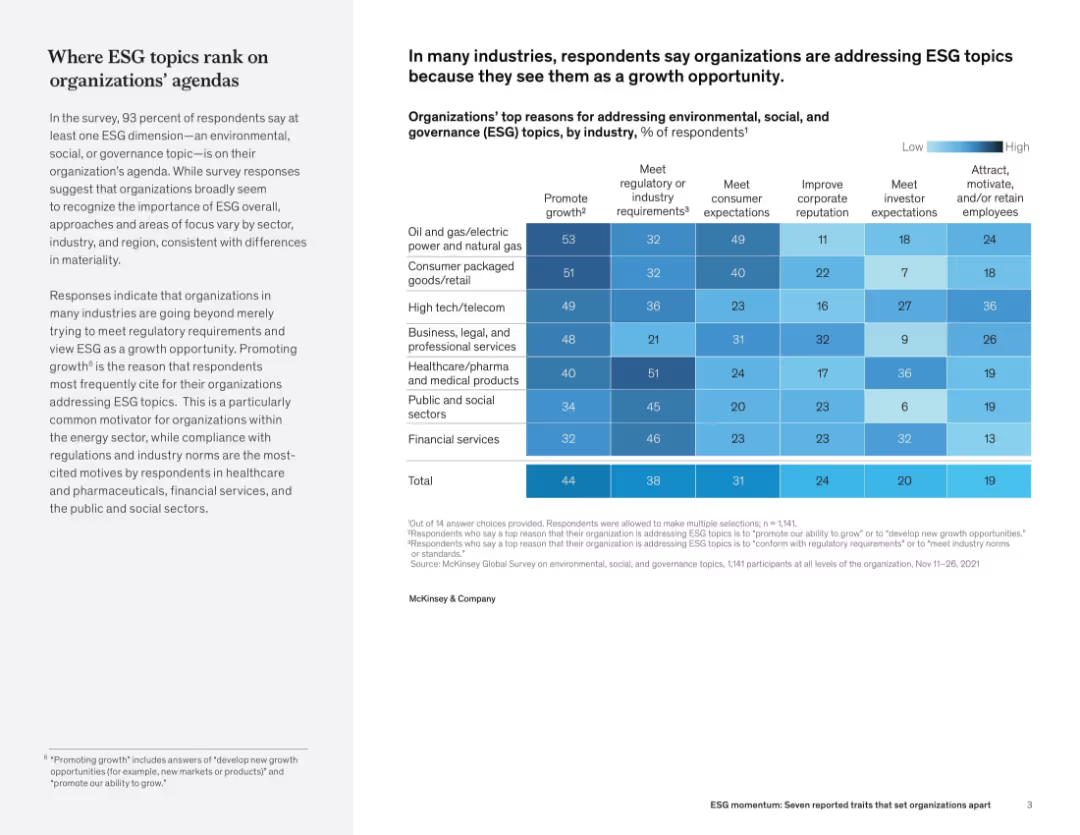
Split layout with narrative on the left and a heatmap chart on the right showing percentages of organizations addressing ESG topics by industry and reason.
Regulatory and Compliance
Professional Services
The slide details how different industries prioritize ESG issues and their reasons—primarily to promote growth or meet regulatory demands. The chart breaks down ESG motivations (e.g., compliance, reputation, employee retention) across multiple sectors, showing strong emphasis in energy, healthcare, and public services.
ESG, regulation, industry comparison, sustainability, corporate responsibility, survey data, public sector, compliance
Mixed Chart
McKinsey
Saved
This slide includes three pie charts and textual analysis. The layout is structured with headers and bullet points discussing survey data.
Strategic Planning
Financial Services
Highlights the lack of tax function involvement in strategic decision-making related to new business or product lines. The slide provides survey data and emphasizes the need for proactive tax role in business strategy to avoid costly retractions.
tax, business development, product lines, strategy, pie chart, involvement
Multiple Chart
PwC/Strategy&
Saved
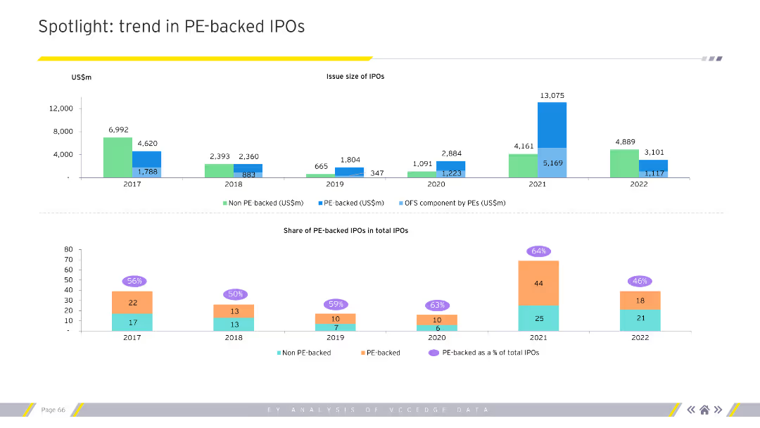
The slide features two charts. The top chart is a column chart showing the issue size of IPOs over several years. The bottom chart shows the share of PE-backed IPOs in total IPOs.
Market Analysis and Trends
Financial Services
This slide highlights trends in PE-backed IPOs, showing issue sizes and shares of total IPOs over multiple years.
PE, IPO, trends, issue size, share, financial services
Multiple Chart
EY
Saved
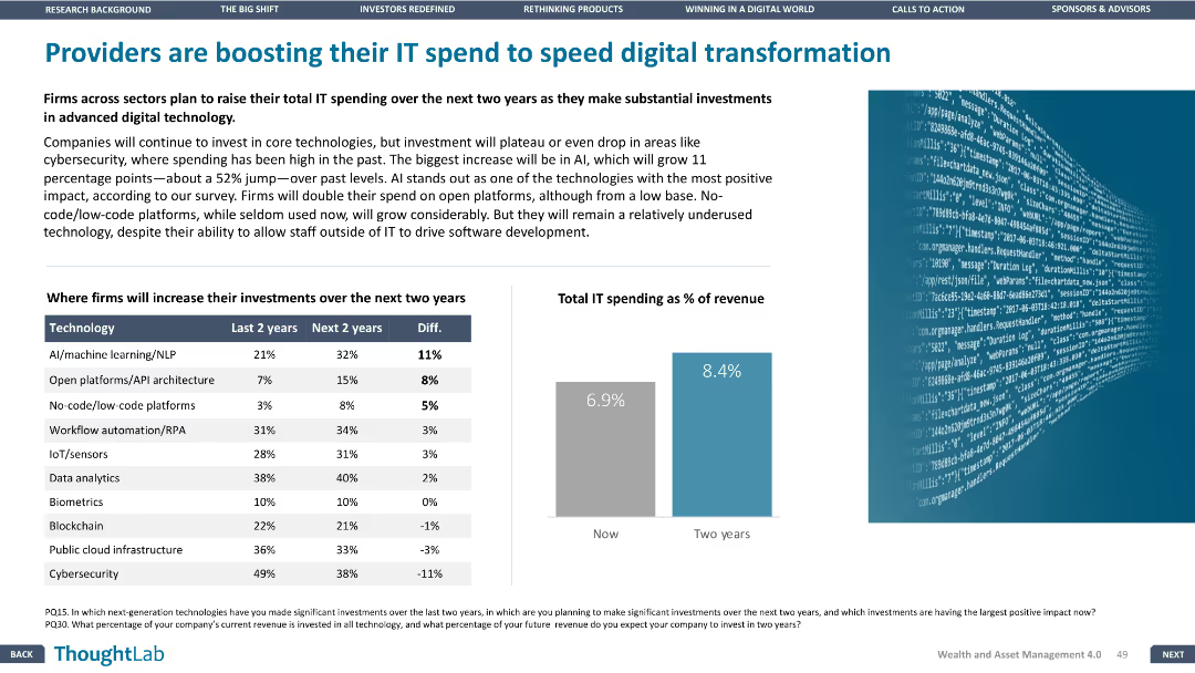
The slide has a column chart and a bar chart, with a focus on the differences in IT spending over the last two years and the next two years. The layout is moderately dense.
Technology and Digital Transformation
Financial Services
The slide discusses the planned increase in IT spending by firms over the next two years, particularly in advanced digital technologies like AI, open platforms, and workflow automation.
IT spending, digital transformation, advanced technologies, AI, workflow automation
Mixed Chart
Deloitte
Saved
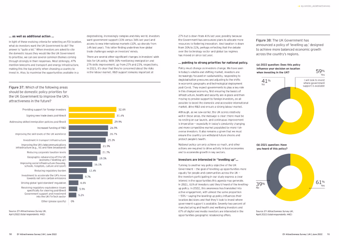
Text and a bar chart. The chart lists policy priorities for the UK government to improve attractiveness post-Brexit.
Regulatory and Compliance
Financial Services
The slide outlines policy priorities for the UK government to enhance attractiveness, focusing on foreign investment and trade deals.
policy priorities, UK government, post-Brexit, foreign investment, column chart
Multiple Chart
EY
Saved
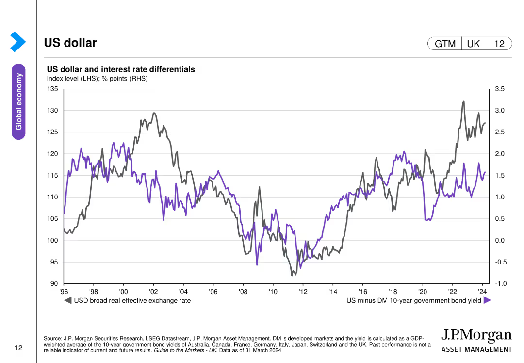
The slide contains a line chart depicting the US dollar's broad real effective exchange rate and interest rate differentials between the US and developed markets.
Investment Analysis
Financial Services
The slide analyzes the performance of the US dollar and its relationship with interest rate differentials, relevant for currency and investment strategies.
US dollar, exchange rate, interest rates, currency performance, investment
Single Chart
JP Morgan
Saved
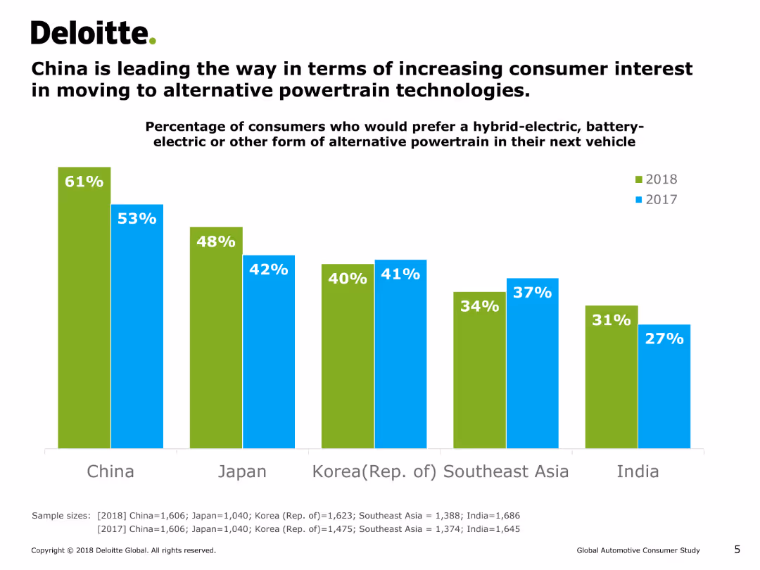
This slide features a vertical bar chart (column chart) comparing the percentage of consumers in different countries who prefer hybrid-electric, battery-electric, or other alternative powertrains in their next vehicle for the years 2017 and 2018.
Market Analysis and Trends
Energy & Utilities
The slide shows that China has the highest percentage of consumers interested in alternative powertrains, followed by Japan, Korea, Southeast Asia, and India. It highlights the growth in interest from 2017 to 2018.
consumer interest, alternative powertrain, hybrid-electric, battery-electric, column chart, market trends, energy, consumer preferences
Single Chart
Deloitte
Saved
The design is simple and clear, employing icons and bullet points to outline uncertainties associated with emerging software development trends. The use of colors distinguishes different areas of concern, with a good balance of text and visuals for a non-cluttered presentation of complex information.
Risk Assessment and Management
Technology & Software
This slide articulates the challenges and uncertainties faced by the next wave of software development technologies, including low-code platforms and AI-based testing. It's geared towards an audience looking for insights into potential obstacles in adopting these technologies on a larger scale.
Uncertainties, Software Development, Scale, Low-Code, AI, Risk Management
Header Horizontal
McKinsey
Saved
This slide features multiple charts including a pie chart and bar chart, and a text section summarizing the data.
Market Analysis and Trends
Financial Services
The slide presents data from a survey profiling investors by wealth level, generation, region, and gender.
investors, survey, wealth, generation, region, gender, financial services
Multiple Chart
Deloitte
Saved
Column chart slide showing the average time spent per day on various media, with different colors representing different activities like TV, radio, and internet.
Market Analysis and Trends
Media & Entertainment
Details the average daily media usage, emphasizing the significant amount of time adults spend consuming various forms of media.
media usage, time spent, TV, radio, internet, daily consumption
Single Chart
Nielsen
Saved
A comprehensive slide with pie charts and data points that break down credit distribution by segments, FICO scores, and regional exposure. The use of blue and black color segments in the charts aligns with Citigroup's branding.
Risk Assessment and Management
Financial Services
The slide presents an overview of Citigroup's consumer and corporate credit distribution, showcasing the company's credit risk management strategies and the diversity of its credit portfolio. It is designed to communicate credit risk profiles to stakeholders and illustrate the company's financial resilience.
Citigroup, Credit Overview, Consumer Credit, Corporate Lending, FICO Score, Regional Exposure, Credit Management, Risk Analysis
Multiple Chart
Citigroup
Saved
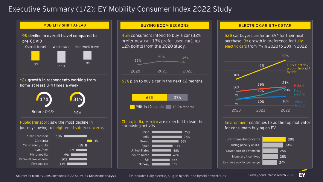
This slide includes column charts and textual highlights. It covers the shift in mobility trends, car buying intentions, and the rise of electric vehicles based on survey responses.
Market Analysis and Trends
Transportation & Logistics
The slide provides a summary of mobility trends, including changes in travel behavior, car buying intentions, and the increasing preference for electric vehicles among consumers in the EY Mobility Consumer Index 2022 Study.
Mobility, Consumer Trends, Electric Vehicles, Survey, Transportation, 2022, Car Buying, Market Analysis, Travel Behavior
Multiple Chart
EY
Saved
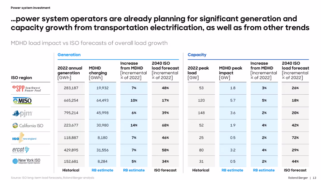
Tabular comparison of power generation, load forecast, and MDHD impact across ISO regions. Organized and data-heavy format.
Performance Metrics and KPIs
Energy & Utilities
The slide provides a detailed forecast of how MDHD vehicle electrification will impact generation and peak load in major U.S. ISO regions. It quantifies incremental demand and contextualizes it within broader electricity system planning.
MDHD, power, ISO, forecast, generation, load, electrification, capacity, utilities, metrics
Table
Roland Berger
Saved
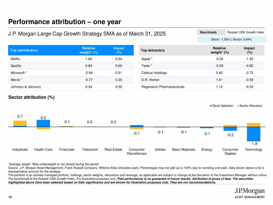
Two-column table layout with top contributors and detractors, a sector attribution bar chart, and clean color-coded impact visuals
Financial Performance
Financial Services
This slide presents a one-year performance attribution for the J.P. Morgan Large Cap Growth Strategy SMA, showing the top contributing and detracting stocks with respective weights and impacts. It also includes a sector-level attribution chart, highlighting stock selection and sector allocation contributions.
performance, attribution, sector, impact, contributors, detractors, stocks, strategy, J.P. Morgan, Russell 1000
Mixed Chart
JP Morgan
Saved
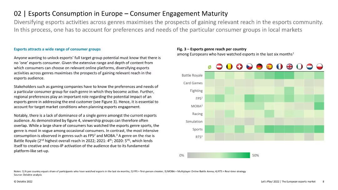
Heatmap chart showing the reach of different esports genres per country, with intensity varying by genre and country.
Market Analysis and Trends
Media & Entertainment
Explores the reach of various esports genres across European countries, highlighting the diversity in consumer preferences and engagement levels.
esports, genres, reach, countries, engagement, diversity, preferences
Header Horizontal
Deloitte
Saved
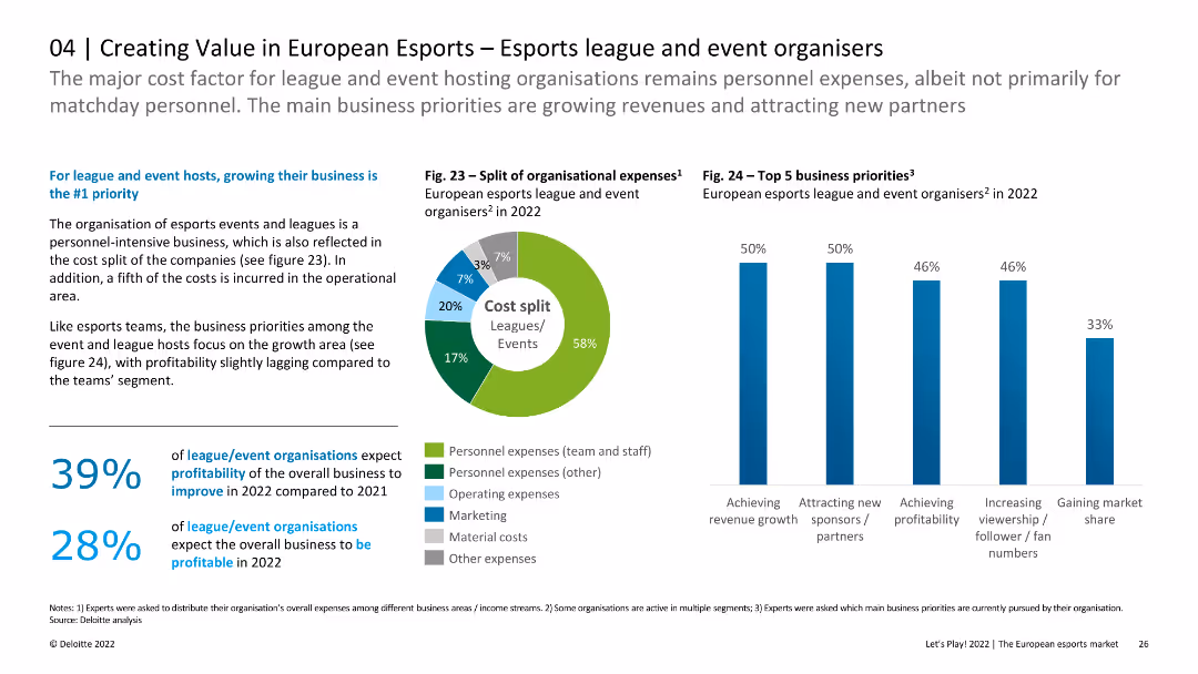
The slide includes a pie chart showing the split of organizational expenses and a column chart listing top business priorities for leagues and event organizers. It also contains text discussing profitability and growth priorities.
Market Analysis and Trends
Media & Entertainment
This slide focuses on the cost structure and business priorities of European esports leagues and event organizers. It highlights the emphasis on growing business, achieving revenue growth, and attracting new sponsors.
esports, expenses, business priorities, growth, sponsors
Multiple Chart
Deloitte
Saved
Previous
Next
If nothing, comes up, please save your slides first
Create a FREE account to continue browsing
Receive Instant Access to 1,000+ slides from companies like McKinsey, Google, and Goldman Sachs
First Name
Last Name
Email
Password
I agree to all
Terms & Privacy Policy
Thank you! Your submission has been received!
Oops! Something went wrong while submitting the form.
Have an account?
Sign in
Column Chart
Heatmap
Chevron
Org Chart
Infographic
Callouts
Timeline
List
Graphic
Picture
Process Flow
Diagram
Paragraph
Map
Table
Framework
Subtitle
Takeaway Box
Icon
Other Chart
Radar Chart
Waterfall Chart
Mekko Chart
Pie Chart
Scatter Plot
Line Chart
Bar chart
Bullet points