My Account
My Slides
Search by Category
Templates
Leave Feedback
Login
Logout
Get Started
Browse all Slides
Browse Slides (Pro)
Create a FREE Account
Instant access to 1,000+ real slides from top companies like McKinsey, BCG, Goldman Sachs, Google and many more!
First Name
Last Name
Email
Password
I agree to all
Terms & Privacy Policy
Thank you! Your submission has been received!
Oops! Something went wrong while submitting the form.
Have an account?
Sign in
Saved Slides
A series of circular graphics and arrows guide the eye through various stages of talent development. Ample text supports the visuals, creating a moderately dense slide.
Operational Efficiency
Education & Training
This slide outlines the stages in building and managing a talent pool for the Tempest partners. It addresses workforce development strategies from school outreach to inclusive opportunities.
talent management, school outreach, apprenticeships, graduates, skills policy, inclusive opportunities, STEM, workforce development
Linear Flow
PwC/Strategy&
Saved
The scatter plot correlates the average years of education completed to GDP per capita PPP across various countries, highlighted by dots labeled with country names.
Market Analysis and Trends
Education & Training
Discussing the correlation between the length of education and economic prosperity measured in GDP per capita PPP in 2020, this slide illustrates significant positive relationships across various countries, with detailed data points.
GDP, education, correlation, economic, prosperity
Single Chart
Roland Berger
Saved
The slide presents three bar charts, showing the share of NY employees, payroll, and small businesses across six key industries, each represented with its respective color and percentage.
Market Analysis and Trends
Financial Services
This slide provides an overview of six major industries in New York State, showing their share in terms of employees, payroll, and small business ownership, illustrating the sectors' sizes and economic weight.
NY State, industries, employees, payroll, small businesses, economic overview, column chart
Multiple Chart
BCG
Saved
Text boxes and icons on a dark background describe potential disruptions in network services and the enablement of new services, painting a picture of the future landscape altered by edge computing.
Technology and Digital Transformation
Technology & Software
Discussing the transformative potential of edge computing, this slide explores how the trend could improve network services and unlock new services for both B2B and B2C segments. It delves into how this technological advancement can lead to improvements in content delivery, active-device location tracking, and more immersive end-user experiences.
Network Services, B2B, B2C, Technological Disruption
Header Horizontal
McKinsey
Saved
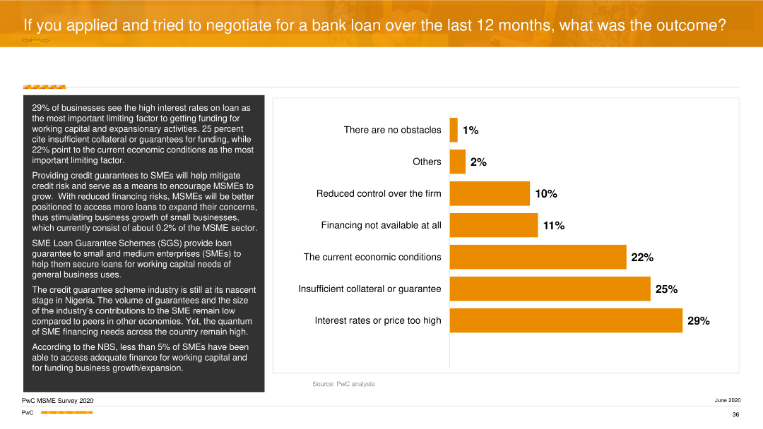
A vertical column chart detailing limiting factors in obtaining loans, such as high interest rates and insufficient collateral. Text on the left elaborates these factors.
Risk Assessment and Management
Financial Services
The slide focuses on the barriers to securing bank loans, emphasizing high interest rates and insufficient collateral as major obstacles. It discusses the potential impact of credit guarantee schemes on improving access to finance for SMEs.
Loans, Barriers, Financing, SMEs, PwC
Mixed Chart
PwC/Strategy&
Saved
Features a line graph showing the size of carbon capture projects per industry application (1972-2030), with various industries color-coded.
Industry Overview
Energy & Utilities
Analyzes the development of CCUS projects across different industries over time, highlighting oil & gas, power generation, and other sectors leading in CCUS initiatives.
CCUS, oil & gas, power generation, industry application, carbon capture, development trends
Mixed Chart
Kearney
Saved
Contains column charts, pie charts, bar graph overlay.
Market Analysis and Trends
Retail & E-commerce
Discusses growth in luxury goods retail, market trends.
luxury, retail, growth, 2019, Asia
Multiple Chart
Bain
Saved
This slide is highly detailed, containing both textual information and multiple graphical elements. There's a pie chart detailing commercial portfolio balances by industry, a column chart comparing CRE as a percentage of total loans, and a small table with key statistics about office CRE. The color scheme is blue and green, with the graphs clearly labeled and information bullet-pointed for clarity.
Financial Performance
Financial Services
The slide presents a disciplined client selection strategy and a well-diversified commercial portfolio. It's aimed at showcasing strong credit results through economic cycles, indicating a conservative approach to commercial real estate concentration among peers and a stable criticized asset ratio. Intended to convey the company’s robust underwriting standards and focused banking coverage.
Credit, Underwriting, Portfolio, CRE, Diversification, Strategy, Risk, Financial Stability, Commercial Banking, Asset Ratio
Multiple Chart
Morgan Stanley
Saved
The slide features a heat map showing the intended engagement with various out-of-home activities over the next two weeks by respondents from different countries. It uses a gradient color scheme to represent different levels of engagement.
Market Analysis and Trends
Consumer Goods
The slide outlines the varying intentions of consumers in different countries to engage in out-of-home activities in the next two weeks. It highlights activities like shopping for necessities, dining out, and attending large events, showing significant differences between countries.
Intent to engage, out-of-home activities, heat map, country comparison, consumer intentions, short-term plans, COVID-19 impact, market analysis
Boxed
McKinsey
Saved
Features a column chart comparing sectoral performance in 2023 across agriculture, industries, and services.
Financial Performance
Financial Services
Analyzes GDP performance in 2023, highlighting the significant growth in the services sector despite challenges in other sectors.
economic performance, 2023, services sector, GDP growth, agriculture, industries, sectoral performance
Mixed Chart
PwC/Strategy&
Saved
The slide shows a column chart representing the connected population in different countries.
Customer and Market Segmentation
Media & Entertainment
The slide illustrates the necessity of speaking to people in real life despite high levels of internet connectivity.
real life, internet connectivity, countries, necessity, communication, World Bank
Single Chart
IPSOS
Saved
This slide includes a column chart series showing trends over years and a separate opportunity section with two vertical bar charts. There are icons with brief text descriptions at the bottom, and the design is structured with a mix of blue tones.
Financial Performance
Financial Services
The slide depicts strategic growth through advisor hiring, client referrals, and assets, along with investment in future planning, innovation, and market awareness, showcasing trends and future opportunities in the private banking sector.
Growth, Strategy, Investment, Banking, Trends, Opportunities, Innovation, Planning, Financial Services, Market Share
Multiple Chart
JP Morgan
Saved
Uses pie charts and column charts in blue tones. Visualizes complex financial data about asset levels and movements.
Risk Assessment and Management
Financial Services
Details the uncertainty in asset valuation and changes in level 3 assets and liabilities, with focus on risk management.
Level 3 assets, liabilities, financial risk, valuation, asset management, financial reporting
Multiple Chart
Deutsche Bank
Saved
Gartner Hype Cycle diagram for blockchain applications in 2021, showing different stages from innovation trigger to plateau of productivity.
Technology and Digital Transformation
Technology & Software
This slide presents the Gartner Hype Cycle for blockchain applications, illustrating the different stages of technology maturity. It predicts that blockchain will significantly decentralize markets and make trade more efficient, highlighting the expected timeline for various blockchain applications to reach mainstream adoption.
Blockchain, Hype Cycle, Decentralization
Mixed Chart
Roland Berger
Saved
The slide compares a hedged equity fund's performance with benchmarks using multiple column charts and showcases AUM growth in infrastructure with a large arrow.
Financial Performance
Financial Services
This slide focuses on JPMorgan’s innovation in financial products, including a top-performing hedge fund and infrastructure investment, reflected in high annual returns and AUM growth.
innovation, hedge fund, infrastructure, JPMorgan, annual return, AUM growth, investment products
Multiple Chart
JP Morgan
Saved
This slide is data-driven, containing three separate graphs: two bar graphs and one pie chart. It has a clear, concise layout with annotations and a side panel with textual information about Kredivo's services.
Customer and Market Segmentation
Financial Services
The slide presents growth metrics for a lending company, Kredivo, focusing on the expansion in non-tier 1 cities. It highlights the increase in loan disbursement, user activation, and transaction frequency.
Lending, Growth, Non-Tier 1 Cities, Kredivo, Loan Disbursement, User Activation, Transaction Frequency
Multiple Chart
Kearney
Saved
This slide showcases a global map highlighting major FoodTech hubs worldwide with detailed annotations and icons representing various regions.
Industry Overview
Agriculture & Food Production
Discusses the global distribution of FoodTech hubs, emphasizing the strengths and innovations of different regions, including the role of academic and governmental support in fostering these ecosystems.
FoodTech, global hubs, innovation, startups, academic support
Graphic
Accenture
Saved
Slide compares decarbonization technologies across three readiness levels: proven, market ready, and emerging, with clear categorization.
Technology and Digital Transformation
Environmental Services & Sustainability
Discusses various technologies for decarbonization and their stages of readiness for investment in Southeast Asia.
decarbonization, technology readiness, investment, SEA
Header Horizontal
Bain
Saved
Text-based slide with a title, several paragraphs of text, and two column charts. The charts show labor productivity growth and business investment as a percentage of GDP from 1997 to 2021 for the UK, G7, and OECD.
Market Analysis and Trends
Technology & Software
The slide discusses the challenges in tech investment in the UK, highlighting lower productivity growth compared to G7 and OECD countries, and the impact of business investment on economic performance.
tech investment, productivity, business investment, UK economy, G7, OECD
Multiple Chart
Accenture
Saved
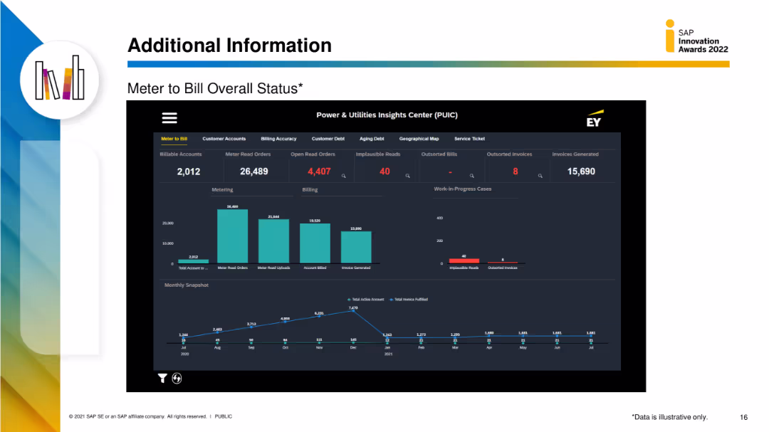
The slide features a detailed dashboard with multiple data visualizations, including column charts and metrics for meter to bill status, customer accounts, and billing accuracy.
Performance Metrics and KPIs
Energy & Utilities
This slide provides detailed metrics on the meter-to-bill process, including the number of billable accounts, meter read orders, and billing accuracy, displayed through various data visualizations.
meter to bill, status, utilities, customer accounts, billing accuracy
Multiple Chart
EY
Saved
This slide uses three line charts with shaded areas to compare the projected impacts on real GDP in different regions of New York, including NYC, Greater Metro (excluding NYC), and the rest of NY State. Each region is highlighted in a different color.
Market Analysis and Trends
Financial Services
The slide analyzes the economic impact of the COVID-19 pandemic on different regions of New York, focusing on real GDP declines and recoveries. It highlights specific impacts and recovery timelines up to 2025.
economic impact, GDP, NYC, Greater Metro, NY State, pandemic, forecast, recovery, line chart
Multiple Chart
BCG
Saved
The circular diagram is split into four quadrants with icons, blue and gray color themes, and focused text blocks.
Strategic Planning
Environmental Services & Sustainability
Details how SDGs can enhance business strategies in four key areas: organizational performance, growth, risk management, and return on capital.
SDGs, business growth, risk management, sustainability, return on capital
Framework
McKinsey
Saved
The slide includes a flowchart detailing the preliminary engineering forecasting process, alongside a bullet list of key challenges and a bar graph summarizing budget versus actual adjustments.
Regulatory and Compliance
Government & Public Sector
Focuses on the challenges of robust forecasting in preliminary engineering within NCDOT, highlighting the discrepancies between budgeted and actual expenditures and the impact on project pipeline development.
forecasting, engineering, budget, NCDOT, process flow
Uncategorized
McKinsey
Saved
This slide features bullet points summarizing recent sustainability achievements alongside a column chart of sustainable finance volumes. It is visually balanced between text and graphic elements.
Regulatory and Compliance
Environmental Services & Sustainability
Provides an overview of sustainability efforts and achievements, including financial volumes and strategic initiatives in sustainable practices.
sustainability, finance, corporate responsibility, environmental impact
Mixed Chart
Deutsche Bank
Saved
Displays a bar chart showing the percentage of international migrants in different regions over time.
Strategic Planning
Professional Services
Discusses the impact of globalization on international migration, emphasizing its significance in socio-political debates and policies.
globalization, migration, international, socio-political impact, migration trends
Mixed Chart
Roland Berger
Saved
Previous
Next
If nothing, comes up, please save your slides first
Create a FREE account to continue browsing
Receive Instant Access to 7,500+ of the internet's best slides
First Name
Last Name
Email
Password
I agree to all
Terms & Privacy Policy
Thank you! Your submission has been received!
Oops! Something went wrong while submitting the form.
Have an account?
Sign in
Column Chart
Heatmap
Chevron
Org Chart
Infographic
Callouts
Timeline
List
Graphic
Picture
Process Flow
Diagram
Paragraph
Map
Table
Framework
Subtitle
Takeaway Box
Icon
Other Chart
Radar Chart
Waterfall Chart
Mekko Chart
Pie Chart
Scatter Plot
Line Chart
Bar chart
Bullet points