My Account
My Slides
Search by Category
Templates
Leave Feedback
Login
Logout
Get Started
Browse all Slides
Browse Slides (Pro)
Create a FREE Account
Instant access to 1,000+ real slides from top companies like McKinsey, BCG, Goldman Sachs, Google and many more!
First Name
Last Name
Email
Password
I agree to all
Terms & Privacy Policy
Thank you! Your submission has been received!
Oops! Something went wrong while submitting the form.
Have an account?
Sign in
Saved Slides
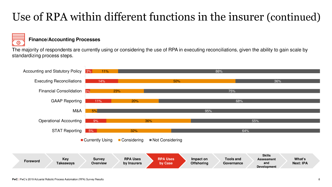
Another horizontal bar chart presenting RPA adoption in finance/accounting processes such as reconciliations, GAAP reporting, and STAT reporting, with levels indicated by colors.
Operational Efficiency
Financial Services
The slide outlines RPA usage in finance and accounting within insurance, showing that tasks like reconciliations and GAAP reporting are increasingly automated, providing efficiencies and standardization benefits.
RPA, Finance, Accounting, Insurance, Reconciliation
Single Chart
PwC/Strategy&
Saved
The slide includes a column chart comparing the housing development intensity across various European countries, along with accompanying text. Visual elements are moderately complex with clear labeling and distinct color coding.
Market Analysis and Trends
Real Estate & Construction
This slide compares the intensity of residential housing development in different European countries, measured by the number of completed dwellings per 1,000 citizens. It's useful for analyzing housing market trends and regional development.
Housing, development, residential, market, Europe, intensity
Mixed Chart
Deloitte
Saved
This slide includes tables, column charts, and bullet points highlighting Q4 and full-year financial results. It is densely packed with information and uses contrasting colors for differentiation.
Financial Performance
Financial Services
Offering a comprehensive overview of financial results, this slide compares quarterly and annual data, showcasing revenues, expenses, net income, and other key financial metrics. It's suitable for analysts and stakeholders needing a detailed financial analysis.
financial, results, overview, comparison, revenue, expenses, net income
Mixed Chart
Citigroup
Saved
The slide features a column chart comparing 'Efficiency Ratio' for 2023 YTD and 2022 YTD, alongside a comprehensive table detailing financial expenses in various categories such as compensation, transaction-based fees, and total operating expenses with percentage changes from the previous year.
Financial Performance
Financial Services
This slide analyzes financial expenses, showing year-on-year and year-to-date comparisons. It includes insights on significant changes in non-compensation expenses and the impact of taxes on earnings, aimed at providing a snapshot of financial health and operational efficiency.
Expenses, Financial Analysis, Efficiency Ratio, Depreciation, Compensation, Year-to-Year Comparison, Taxes, Operating Expenses
Mixed Chart
Goldman Sachs
Saved
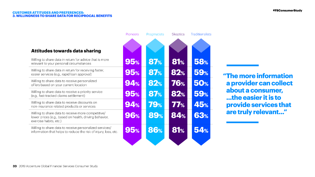
Column chart showing percentages of different customer segments (Pioneers, Pragmatists, Skeptics, Traditionalists) and their willingness to share data for various benefits.
Customer and Market Segmentation
Financial Services
The slide displays customer attitudes towards data sharing, highlighting percentages of willingness among different customer segments for various data sharing incentives.
Data sharing, Customer segments, Financial services, Attitudes, Incentives
Table
Accenture
Saved
Bar chart showing the share of consumers by age who describe themselves as addicted to social media in 2019, and a column chart showing the average daily time spent on social media from 2012 to 2021.
Market Analysis and Trends
Media & Entertainment
The slide highlights the impact of social media addiction, particularly among younger age groups. It presents data on the percentage of users addicted to social media by age and the increasing amount of time spent on social media daily, raising concerns about the negative societal effects of pervasive social media use.
Social Media, Addiction, Time Spent, Age Groups
Multiple Chart
Roland Berger
Saved
Detailed graphical representations including column charts and pie charts on the slide demonstrate the composition and performance of Citigroup's card portfolio over 2014 to 2017, focusing on proprietary and non-core products. Uses blue tones, clear labels, and a structured layout to present data neatly.
Financial Performance
Financial Services
Reviews the strategic composition of Citigroup’s card portfolio, emphasizing the shift towards high-revenue proprietary products. It illustrates the evolution of the portfolio mix and its revenue impact, particularly highlighting the role of strategic acquisitions like Costco and their contribution to the portfolio. Serves to discuss strategic investment decisions in product offerings.
portfolio management, revenue impact, proprietary products, acquisitions, strategy
Multiple Chart
Citigroup
Saved
The slide includes a series of column charts showing the adoption status of various technologies and a line chart indicating concerns for cybersecurity risks.
Technology and Digital Transformation
Technology & Software
This slide outlines the current status of emerging technologies in the workplace, with a focus on cybersecurity concerns and the classification of technologies into established, emerging, and futuristic.
emerging technologies, workplace, cybersecurity, technology status, adoption status
Single Chart
EY
Saved
The slide includes images and text discussing data-driven, social media, and omnichannel strategies for efficient digital marketing in the luxury sector.
Technology and Digital Transformation
Media & Entertainment
The slide emphasizes the need for luxury brands to adopt efficient digital marketing strategies, focusing on data-driven approaches, social media engagement, and omnichannel marketing to maximize their impact and reach.
digital marketing, data-driven, social media, omnichannel, luxury brands
Pillar
BCG
Saved
Three charts: a line chart for labor supply percentage change (US and Euro area), a line chart for global supply chain pressure index, and a line chart for global commodity prices from 2016-2023.
Market Analysis and Trends
Financial Services
The slide emphasizes the importance of supply conditions on inflationary dynamics in 2024, with a better balance between supply and demand expected, but lingering risks remain.
supply conditions, inflation, labor supply, supply chain pressure, commodity prices, 2024
Multiple Chart
EY
Saved
Contains multiple charts: a bar chart for federal budget composition, line charts for deficit and net interest outlays, and a line chart for federal net debt. Colorful and data-dense.
Market Analysis and Trends
Government & Public Sector
Examines the U.S. federal budget, deficit, and debt projections, suggesting that fiscal policy will be a significant issue in the upcoming election campaign.
Budget, Deficit, Debt, Fiscal Policy, Campaign
Multiple Chart
JP Morgan
Saved
Shows pie charts in soft blue and teal, focused on AI's role in patient care and hospital operations.
Operational Efficiency
Healthcare & Pharmaceuticals
Highlights specific AI applications in healthcare operations and patient management, detailing the adoption rates and areas like imaging and diagnostics where AI is prominently used.
healthcare, AI, patient experience, operations, diagnostics
Multiple Chart
Deloitte
Saved
This slide has two charts: a stacked bar chart showing global emissions covered by carbon pricing initiatives and a line chart showing emission trading system prices over time.
Regulatory and Compliance
Environmental Services & Sustainability
The slide provides data on the effectiveness of carbon pricing in reducing global emissions and compares the prices of emission trading systems across different regions.
carbon pricing, emissions, sustainability, regulatory compliance, emission trading system, global impact, J.P. Morgan, environmental policy, carbon tax, climate change
Multiple Chart
JP Morgan
Saved
Column charts showing traffic distribution by type, focusing on mobile
Market Analysis and Trends
Technology & Software
Analyzes the predominant focus of luxury consumers on mobile platforms
Luxury, Consumer Attention, Mobile, Traffic Distribution
Single Chart
BCG
Saved
A vertical column chart projecting hydrogen consumption by 2050 in various sectors, including mobility, industrial energy, and power generation.
Market Analysis and Trends
Energy & Utilities
The slide projects potential hydrogen consumption by 2050, emphasizing industrial processes and transportation as key drivers for the increase, with detailed numerical data.
hydrogen, consumption, projection, 2050, industry, transportation, energy, column chart, data
Single Chart
Kearney
Saved
Contains two bar charts showing the top investors and acquirers in advanced materials deep tech companies, highlighting the absence of France.
Competitive Landscape
Industrial & Manufacturing
Analyzes the lack of French PI funds in advanced materials investment and acquisition, contrasting it with other global investors.
advanced materials, PI funds, investment, France, deep tech
Multiple Chart
BCG
Saved
The slide features country-specific results and a column chart showing overall and response trend results over the years.
Regulatory and Compliance
Financial Services
The slide highlights cross-border tax disputes due to uncoordinated implementation of BEPS measures.
Cross-border, tax disputes, BEPS, global tax, Deloitte, agree, strongly agree, survey, multinational
Multiple Chart
Deloitte
Saved
Multi-section layout detailing A.T. Kearney’s leadership in procurement with text and graphics on strategic sourcing, procurement assessment, and transformations.
Market Analysis and Trends
Professional Services
Outlines A.T. Kearney's market-leading approaches in procurement, including strategic sourcing innovations and comprehensive procurement assessments.
procurement, leadership, strategic, sourcing, transformation
Table
Kearney
Saved
The slide features a pie chart and text describing the impact of purpose-driven campaigns in France, showing significant sales boosts. The layout is moderately detailed.
Market Analysis and Trends
Professional Services
This slide presents the success of purpose-driven campaigns in France, highlighting that 30% of these campaigns significantly boosted short-term sales, supported by case studies and statistics.
purpose-driven campaigns, France, sales boost, marketing, case studies
Mixed Chart
Nielsen
Saved
Contains a column chart showcasing the growth of deposits over time segmented by different business units within the organization.
Financial Performance
Financial Services
Used to demonstrate the consistent increase in deposits across various segments of a financial institution, reflecting healthy financial growth and stability.
Deposits, Growth, Trends, Line Graph, Financial Stability, Banking, Performance, Analysis
Single Chart
Citigroup
Saved
The slide includes two column charts: one showing the indexed share price developments of payment service providers and networks vs. MSCI World, and another comparing the performance of selected payment service providers. Text analyzes trends.
Financial Performance
Financial Services
This slide reviews the stock market performance of payment industry players from December 2018 to December 2021, comparing them with the MSCI World index. It highlights top performers like Adyen and PayPal and discusses the impact of COVID-19.
payment industry, stock market, performance, trends, COVID-19
Multiple Chart
Deloitte
Saved
A data-heavy slide with a blue and black bar graph showing the percentage of vulnerable private-sector jobs in small firms.
Risk Assessment and Management
Government & Public Sector
The slide provides a statistical breakdown of private-sector jobs at risk, segmented by industry and company size, highlighting the concentration in smaller firms.
labor market, private sector, small firms, job vulnerability, industry analysis
Single Chart
McKinsey
Saved
Two column charts comparing U.S. real business investment, future capex intentions, personal interest payments, and credit card delinquencies.
Market Analysis and Trends
Financial Services
The slide presents trends in U.S. business investment and consumer finances, focusing on capex intentions and personal interest payments over time.
business investment, capex, consumer finance, credit card delinquencies, U.S. economy
Multiple Chart
JP Morgan
Saved
The slide presents a structured layout with a hierarchical diagram of a bank's organizational structure. Key positions from CEO to various department heads are shown, with connecting lines indicating reporting and structural relationships. The slide uses a monochromatic blue color scheme, which is simple yet effective in highlighting the text and structure.
Organizational Structure and Change
Financial Services
Outlines the organizational structure of a customer-focused bank, emphasizing integration and centralization of services to enhance customer experience and operational efficiency. It identifies key leadership positions and their interconnections within the bank, reinforcing the strategic focus on customer-centricity in banking operations.
banking, organizational structure, customer-centric, efficiency
Diagram
Deutsche Bank
Saved
Featuring four sets of column charts, this slide shows the projected growth in Singapore's digital offerings in payments, lending, insurance, and wealth management. It uses shades of blue with annotations for metrics.
Strategic Planning
Financial Services
This slide focuses on the growth potential of Singapore's traditional financial institutions in digital offerings. It's particularly useful for financial strategists and investors analyzing growth opportunities in the digital finance landscape.
Digital Offerings, Financial Services, Growth, Singapore, Strategic Planning
Multiple Chart
Bain
Saved
Previous
Next
If nothing, comes up, please save your slides first
Create a FREE account to continue browsing
Receive Instant Access to 7,500+ of the internet's best slides
First Name
Last Name
Email
Password
I agree to all
Terms & Privacy Policy
Thank you! Your submission has been received!
Oops! Something went wrong while submitting the form.
Have an account?
Sign in
Column Chart
Heatmap
Chevron
Org Chart
Infographic
Callouts
Timeline
List
Graphic
Picture
Process Flow
Diagram
Paragraph
Map
Table
Framework
Subtitle
Takeaway Box
Icon
Other Chart
Radar Chart
Waterfall Chart
Mekko Chart
Pie Chart
Scatter Plot
Line Chart
Bar chart
Bullet points