My Account
My Slides
Search by Category
Templates
Leave Feedback
Login
Logout
Get Started
Browse all Slides
Browse all Slides
Create a FREE Account
Instant access to 1,000+ real slides from top companies like McKinsey, BCG, Goldman Sachs, Google and many more!
First Name
Last Name
Email
Password
I agree to all
Terms & Privacy Policy
Thank you! Your submission has been received!
Oops! Something went wrong while submitting the form.
Have an account?
Sign in
Saved Slides
Multiple column charts displaying annual financial data such as RoTE, total income, and cost ratio.
Financial Performance
Financial Services
Review of three-year financial performance including income metrics and loan ratios.
financial performance, income, loans, cost ratio, RoTE
Multiple Chart
Barclays
Saved
This slide features a column chart comparing the current NTM P/E ratios vs. 10-Year High, Low, and Average for various indices such as S&P 500, Russell 2000, MSCI World, etc. The chart includes data points for high, current, and low P/E ratios.
Financial Performance
Financial Services
The slide provides a valuation analysis by comparing current NTM P/E ratios with historical highs, lows, and averages for different market indices.
Valuation analysis, NTM P/E, indices, S&P 500, Russell 2000
Mixed Chart
Morgan Stanley
Saved
Features a horizontal bar graph in purple shades, analyzing the impact of technology on various underwriting activities.
Technology and Digital Transformation
Financial Services
Assesses how technological changes have impacted underwriting performance across several dimensions.
technology, underwriting, performance, impact, analysis
Single Chart
Accenture
Saved
Presents column chart to depict asset management growth, alongside textual annotations. The design is straightforward, utilizing different shades of blue to distinguish between categories.
Investment Analysis
Financial Services
Shows asset under management movement, useful for investment analysis and understanding the impact of various financial factors such as foreign exchange and market movements on asset management.
Asset Management, Investment Growth, MAM, MIRA, Financial Impact
Single Chart
Goldman Sachs
Saved
The slide has a title at the top, two main content sections divided by icons, each with bullet points. The design incorporates a contrast of black, white, and yellow highlights, focusing on gaming in the Web3 space.
Strategic Planning
Media & Entertainment
Discusses how Web3 could revolutionize the gaming industry's business models, shifting from traditional models to play-and-earn and addressing potential risks and uncertainties associated with this transition.
Play-and-Earn, Gaming, Business Model, Web3, Risks
Boxed
McKinsey
Saved
Contains a column chart showing percentages for three years under categories such as 'significantly more attention' to 'significantly less attention' regarding employee focus on financial benefits, with an emphasis on the increase since 2022.
Performance Metrics and KPIs
Financial Services
Analyzes the trends of employee attention to financial benefits over the years, with a focus on the increased attention in the recent year, useful for gauging employee priorities.
Financial Benefits, Employee Attention, Trend Analysis, Year-over-Year, Bar Graph
Single Chart
Goldman Sachs
Saved
The slide features a column chart showing IWM credit volume in CHF bn across different sectors and key risk metrics like investment grade credit exposure and secured loans. Bullet points provide additional insights into the portfolio composition.
Financial Performance
Financial Services
The slide offers an overview of the credit volume portfolio, highlighting the distribution across various sectors like export finance and real estate. It details risk metrics, emphasizing secured loans and the proportion of investment-grade exposure.
credit volume, portfolio, risk metrics, secured loans, investment grade
Mixed Chart
Credit Suisse
Saved
The slide features financial figures, including a large orange free cash flow number, a column chart for debt maturity, and text for undrawn credit lines. The layout is data-centric and clearly presented.
Financial Performance
Financial Services
The slide presents Ipsos' strong financial profile, highlighting free cash flow, low net debt, and available credit lines, emphasizing financial stability and sound management.
financial profile, cash flow, debt maturity, credit lines, stability
Mixed Chart
IPSOS
Saved
The slide features multiple pie charts comparing the composition of internet advertising revenue between Mainland China and Hong Kong for the years 2016 and 2025. Each chart is colored distinctly to differentiate the categories like paid search, mobile display, etc. The layout is straightforward with each pie chart accompanied by a legend and annotations highlighting specific data points.
Market Analysis and Trends
Media & Entertainment
This slide shows the projected growth of mobile display advertising in Hong Kong, predicting a significant increase by 2025. It compares this trend with Mainland China's internet advertising revenue, highlighting the differences in growth within the regions. The slide aims to analyze market shifts and future potentials in the digital advertising space, especially mobile display, which is forecasted to grow at a compound annual growth rate (CAGR).
Hong Kong, mobile advertising, internet, 2025, CAGR, growth, pie chart, revenue
Multiple Chart
PwC/Strategy&
Saved
Two column charts displaying Henry Hub and UK NBP gas price estimates. The charts show bank/broker and consultant ranges from 2020 to 2024.
Market Analysis and Trends
Energy & Utilities
This slide presents higher gas price forecasts for Henry Hub compared to UK NBP. Consultant ranges suggest prices based on sustainable development scenarios.
Gas, price, forecast, Henry Hub, UK NBP, bank, broker, consultant, estimate, range
Multiple Chart
EY
Saved
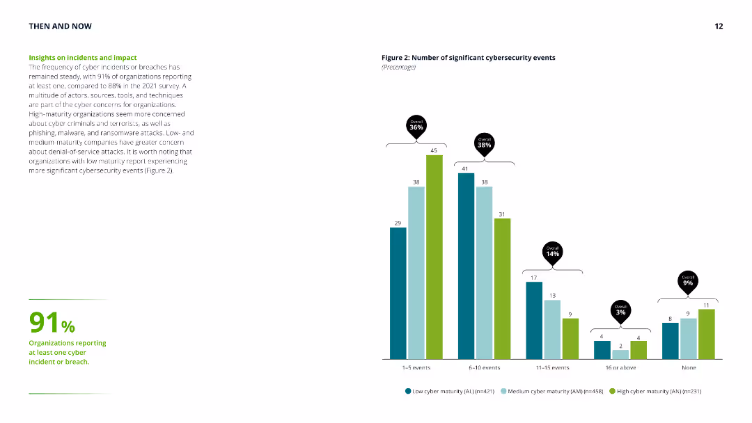
Column chart showing the number of significant cybersecurity events, with accompanying text highlighting the steady frequency of cyber incidents and differences in concerns across maturity levels.
Risk Assessment and Management
Technology & Software
Provides insights into the frequency and impact of cybersecurity incidents, emphasizing the concerns of low, medium, and high-maturity organizations and their experiences with cyber threats.
cyber security, incidents, impact, risk assessment, maturity levels, cyber threats, frequency, organization concerns
Mixed Chart
Deloitte
Saved
The slide includes a bar chart comparing the roles of various corporate leaders in driving SDG initiatives, prominently highlighting the role of CEOs with a backdrop of subtle blue tones.
Market Analysis and Trends
Professional Services
This slide presents survey data on the driving forces behind SDG implementation in companies, emphasizing the significant role of CEOs compared to other leadership roles like CSR managers and sustainability project managers.
SDGs, CEO, leadership, corporate governance
Single Chart
McKinsey
Saved
The slide features a map of Europe highlighting countries participating in the survey, with country names listed on the side.
Market Analysis and Trends
Government & Public Sector
This slide lists the countries participating in the survey, with a map highlighting the geographic distribution of survey participants.
survey, countries, Europe, participants, analysis
Graphic
Deloitte
Saved
Slide depicts individuals in various activities, signifying diverse employment models. Includes circular statistics and is colored in warm red and orange tones.
Strategic Planning
Professional Services
Discusses the shift towards flexible employment models and the readiness of businesses to lead an inclusive workforce.
workforce ecosystem, employment models, business readiness, workforce inclusivity, leadership
Multiple Chart
Deloitte
Saved
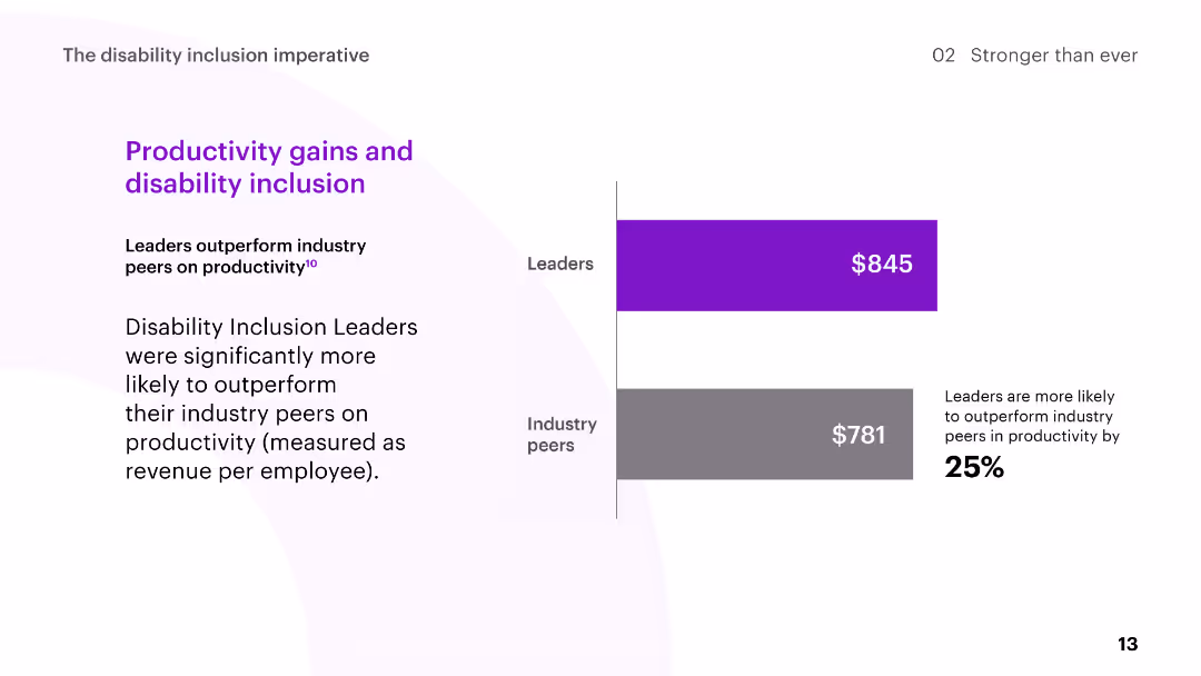
The slide includes a bar chart comparing the productivity of Disability Inclusion Leaders to industry peers, measured as revenue per employee.
Human Resources and Talent Management
Professional Services
The slide highlights the productivity gains of Disability Inclusion Leaders, showing they outperform industry peers in terms of revenue per employee.
disability inclusion, productivity, revenue per employee, leaders, industry peers
Mixed Chart
Accenture
Saved
The slide contains a combination of bar graphs, column charts, and textual information, showcasing financial stability through various metrics like deposits and capital ratios.
Financial Performance
Financial Services
Intended to convey the strong financial position and liquidity of the company, the slide serves as an assurance of stability and strength in various market conditions.
balance sheet, financial stability, liquidity, capital ratio, deposits, fortress principle, strength, market conditions
Multiple Chart
JP Morgan
Saved
Column chart showing other actions taken to manage lower income during the COVID-19 pandemic, comparing May 2020 and December 2020 data.
Financial Performance
Financial Services
Discusses additional measures households took to cope with lower income during the pandemic, such as food banks and grants.
lower income, financial management, food banks, COVID-19, household actions
Single Chart
IPSOS
Saved
Includes a list on the left detailing financial metrics and two column charts on the right visualizing 'Total Assets' and 'Total Equity' over time. The slide uses contrasting colors for easy differentiation between liquid and total assets.
Financial Performance
Financial Services
Exhibits the company’s financial robustness by showcasing key figures such as total assets and equity. The visual data emphasizes liquidity and growth, presenting a snapshot of the company’s financial health and stability without long-term debt.
Financial Strength, Total Assets, Total Equity, Liquidity, Growth, Stability
Multiple Chart
Goldman Sachs
Saved
Two donut charts side by side comparing the share of FDI in Central America from the USA between 2021 and 2022. Each segment is color-coded.
Investment Analysis
Financial Services
The slide compares the share of Foreign Direct Investment in Central America from the USA for the years 2021 and 2022, highlighting the changes in investment distribution by country.
FDI, Central America, USA, donut chart, comparison
Multiple Chart
Deloitte
Saved
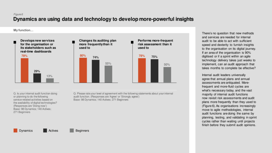
Column charts comparing development of new services, changes in auditing plans, and frequent risk assessments among Dynamics, Actives, and Beginners.
Technology and Digital Transformation
Professional Services
The slide describes how internal audit functions are leveraging data and technology to develop powerful insights, with Dynamics leading in frequent risk assessments and new services.
Data insights, technology, internal audit, new services, risk assessment
Multiple Chart
PwC/Strategy&
Saved
Contains bar charts comparing job losses and gains from 2020 to 2030 across various industries.
Market Analysis and Trends
Transportation & Logistics
Shows projected job market changes within automotive and energy sectors due to shifts in technology and market dynamics, like the rise of electric vehicles and energy production.
Automotive, Energy, Job Market, 2030, Electric Vehicles, Technology Shift, Market Dynamics, Employment Changes
Mixed Chart
BCG
Saved
Diagrams and icons illustrating changes in management behavior and career path strategies within agile frameworks.
Strategic Planning
Professional Services
Outlines the extensive changes required at individual and organizational levels to adopt agile, including new roles and learning paths, essential for strategic transformation initiatives.
agile transformation, management change, professional services, strategic planning, career paths, learning development, organizational change
Header Horizontal
BCG
Saved
This slide presents a structured list with the table of contents for the ESG report, detailing different sections such as leadership, business, and approaches to ESG.
Regulatory and Compliance
Professional Services
The table of contents for the 2022 ESG report, outlining key sections and page numbers, functioning as a navigational guide for readers.
Contents, ESG, Sections, Structure, Professional
Agenda
Booz Allen Hamilton
Saved
The slide features bar charts ranking stock exchanges by the number of IPOs and proceeds for YTD 2023, with a focus on Mainland China and India leading in global fundraising.
Market Analysis and Trends
Financial Services
This slide provides a comparative analysis of global stock exchanges, highlighting Mainland China's dominance in fundraising and India's leading position in deal count for YTD 2023.
IPO, stock exchange, China, India, fundraising
Multiple Chart
EY
Saved
Multiple column charts display financial performance over several years with projections up to 2026, accompanied by textual analysis.
Financial Performance
Financial Services
Reiterates Barclays' financial data focusing on RoTE, income, and other key financial indicators, setting performance targets for 2026 and illustrating past performance trends and future aspirations.
financials, RoTE, targets, 2026, performance
Multiple Chart
Barclays
Saved
Previous
Next
If nothing, comes up, please save your slides first
Create a FREE account to continue browsing
Receive Instant Access to 1,000+ slides from companies like McKinsey, Google, and Goldman Sachs
First Name
Last Name
Email
Password
I agree to all
Terms & Privacy Policy
Thank you! Your submission has been received!
Oops! Something went wrong while submitting the form.
Have an account?
Sign in
Column Chart
Heatmap
Chevron
Org Chart
Infographic
Callouts
Timeline
List
Graphic
Picture
Process Flow
Diagram
Paragraph
Map
Table
Framework
Subtitle
Takeaway Box
Icon
Other Chart
Radar Chart
Waterfall Chart
Mekko Chart
Pie Chart
Scatter Plot
Line Chart
Bar chart
Bullet points