My Account
My Slides
Search by Category
Templates
Leave Feedback
Login
Logout
Get Started
Browse all Slides
Browse all Slides
Create a FREE Account
Instant access to 1,000+ real slides from top companies like McKinsey, BCG, Goldman Sachs, Google and many more!
First Name
Last Name
Email
Password
I agree to all
Terms & Privacy Policy
Thank you! Your submission has been received!
Oops! Something went wrong while submitting the form.
Have an account?
Sign in
Saved Slides
Includes line and scatter plots comparing earnings/coupon yield on a 60/40 portfolio and subsequent 10-year annualized returns.
Financial Performance
Financial Services
Analyzes the relationship between earnings/coupon yield on a 60/40 portfolio and future annualized returns over a period from 1985 to 2014.
earnings, coupon yield, portfolio, returns, annualized
Multiple Chart
JP Morgan
Saved
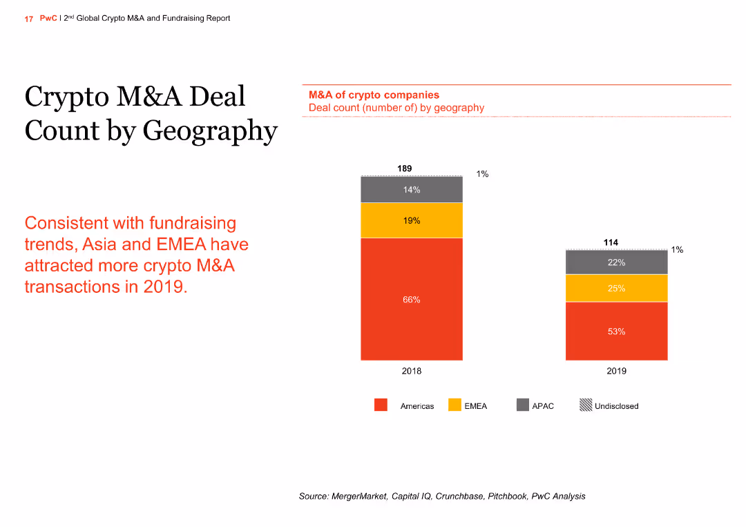
The slide features a column chart comparing the M&A deal count by geography for 2018 and 2019. The regions include the Americas, EMEA, APAC, and undisclosed.
Market Analysis and Trends
Financial Services
The slide shows the geographic distribution of M&A deals in the crypto sector, with an increase in deals in Asia and EMEA in 2019 compared to 2018, aligning with fundraising trends.
crypto, M&A, geography, column chart, comparison
Mixed Chart
PwC/Strategy&
Saved
This slide contains multiple column charts showing the growth of digital financial services, payments, remittance flows, lending, investment, and insurance sectors from 2019 to 2030 with compound annual growth rates (CAGR). There are annotations for specific CAGRs and projected values in billions for future years.
Market Analysis and Trends
Financial Services
The slide presents a forecast of growth in various financial sub-sectors due to the shift from offline to online post-pandemic, highlighting the increasing trend in digital transactions and services with specific focus on CAGRs and future projections.
digital, financial services, CAGR, growth, forecast, pandemic, trends, online, payments, investment
Multiple Chart
Bain
Saved
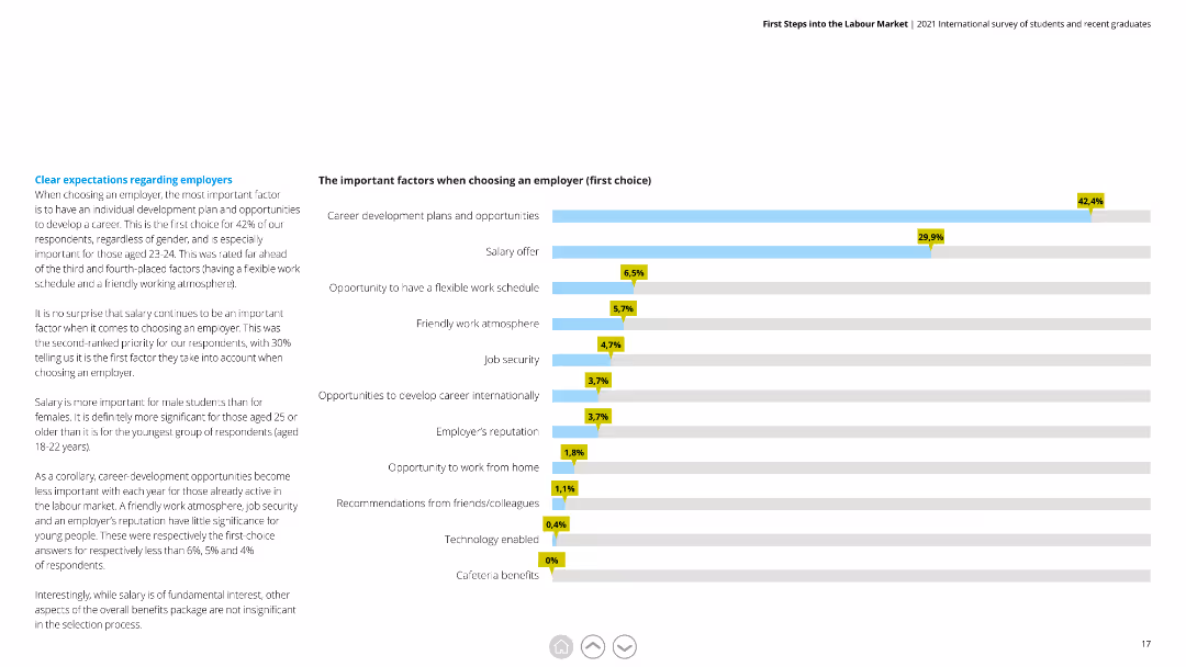
A horizontal bar chart (bar chart) displaying important factors for respondents when selecting their first-choice employer, with percentages highlighted.
Market Analysis and Trends
Professional Services
Shows the priority factors for choosing an employer, emphasizing career development, salary, and work-life balance among respondents.
Employer, Factors, Career Development, Salary, Work-life Balance, Selection, Priorities
Mixed Chart
Deloitte
Saved
Balanced design with a 3D layered block diagram on the left and concise text on the right, using a muted color palette to focus attention on the data representation.
Technology and Digital Transformation
Energy & Utilities
This slide presents an overview of the "Global Energy Perspective 2022," highlighting its scope across segments, energy products, and countries. The accompanying diagram illustrates the report's multidimensional approach, covering a range of sectors from transport to hydrogen supply, emphasizing the depth and breadth of analysis contained within. The text succinctly conveys the report's comprehensiveness and the state-of-the-art tools and models used to project energy demand and trends across the globe.
Energy Systems, Global Analysis, Demand Outlook, Segmentation
Graphic
McKinsey
Saved
Features bar charts showing the difference in data and business intelligence maturity between leaders and laggards.
Operational Efficiency
Technology & Software
Discusses the integration of data sources and the use of analytics in making business decisions, highlighting gaps in daily practices.
data integration, analytics, business intelligence, decision-making, bar chart
Multiple Chart
BCG
Saved
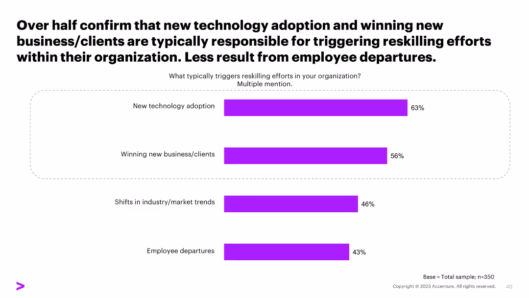
This slide includes a horizontal bar chart showing factors that trigger reskilling efforts within organizations, such as new technology adoption, winning new clients, market trends, and employee departures.
Human Resources and Talent Management
Professional Services
The slide details the primary factors that prompt reskilling efforts in organizations, with new technology adoption and winning new clients being the top triggers.
reskilling, technology adoption, market trends, clients, employee departures
Single Chart
Accenture
Saved
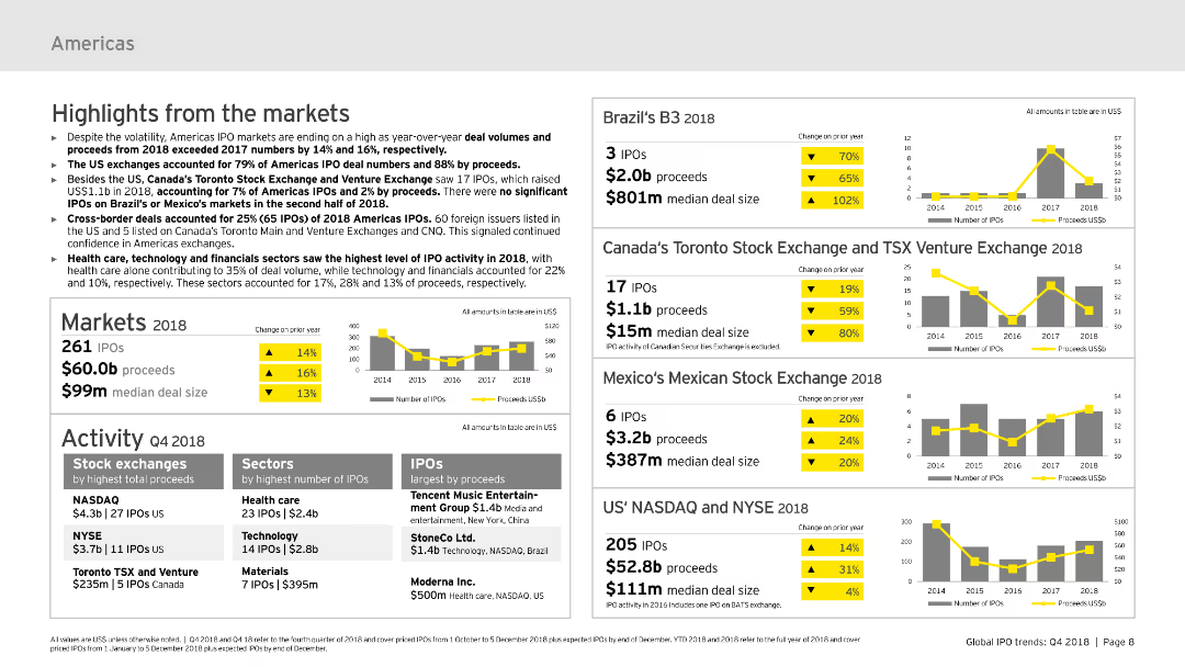
The slide includes text summaries and column charts showing market highlights for the Americas in 2018, focusing on IPO volumes, proceeds, and notable exchanges and sectors.
Market Analysis and Trends
Financial Services
This slide summarizes IPO market highlights for the Americas in 2018, discussing key market metrics, performance by stock exchanges, and sectors with the highest IPO activity.
IPOs, Americas, 2018, market highlights, sectors
Multiple Chart
EY
Saved
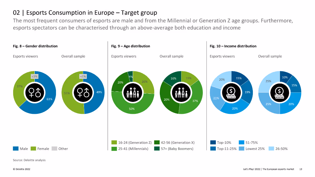
The slide includes pie charts and column charts showing gender, age, and income distribution among esports viewers compared to the overall sample. The visual layout is clear and data-centric.
Customer and Market Segmentation
Media & Entertainment
This slide provides detailed demographic breakdowns of esports viewers in Europe, emphasizing differences in gender, age, and income distribution compared to the general population. It highlights that esports viewers are younger and more male-dominated.
Esports, Demographics, Gender, Age, Income
Multiple Chart
Deloitte
Saved
Features a column chart depicting JPMC's total client asset flows over time with an accompanying dot matrix that breaks down asset class by product, channel, and region. Another section compares 5-year total client asset flows against peers.
Market Analysis and Trends
Financial Services
Analyzes JPMC's diversified platform, showcasing robust asset flow growth across various classes and markets over a decade, comparing favorably with industry peers in market share.
asset flows, diversification, financial services, JPMC, market analysis, investment, regional distribution, product breakdown
Multiple Chart
JP Morgan
Saved
This slide features a scatter plot comparing the current and projected supply risks for various critical materials like barytes, borate, and molybdenum in 2030. Each material is plotted based on its current supply risk against the predicted future risk, emphasizing those with expected increases in risk. The design incorporates a linear trend line to visualize the expected change in risk level, and annotations provide context about the production-to-reserves ratio, which influences these projections.
Risk Assessment and Management
Industrial & Manufacturing
This slide provides a projection of future supply risks for selected critical materials based on their current production practices and reserves. It highlights materials like barytes, borate, and molybdenum, predicting increased risks due to continued heavy reliance on existing reserves without adjustments in production strategies.
critical materials, supply risk, future projections, resource management, mining, production practices, risk assessment, barytes, borate, molybdenum, sustainability
Mixed Chart
Roland Berger
Saved
Slide with five sets of column charts displaying 'Floating Loan Mix', 'Strong Retail Franchise', 'S&P Debt Ratings', and 'Core NIM' data. The charts compare TFC with peer medians and averages, using shades of purple and teal.
Risk Assessment and Management
Financial Services
The slide presents data on how the company manages interest rate risk, with comparisons to industry peers. It offers a look into various financial metrics that indicate the company's strategic positioning in terms of debt ratings and net interest margin.
Interest Rate, Risk Management, Financial Metrics, Debt Ratings, Net Interest Margin
Multiple Chart
Goldman Sachs
Saved
Bullet points and strategic keywords with directional icons.
Strategic Planning
Financial Services
Summarizes strategic initiatives for the global markets division leading into 2026.
Strategy, Global Markets, Initiatives, 2026, Roadmap
Linear Flow
Barclays
Saved
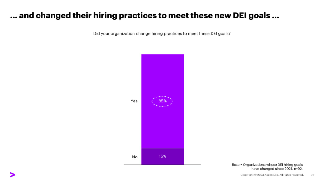
A column chart displaying the results of a survey where 85% of organizations changed their hiring practices to meet DEI goals, with "Yes" and "No" responses.
Human Resources and Talent Management
Professional Services
The slide shows a survey result indicating that 85% of organizations changed their hiring practices to meet DEI goals, useful for HR strategy discussions.
DEI, hiring practices, survey, HR strategy, organizations
Single Chart
Accenture
Saved
Two sets of column charts dominate the slide. The left chart, in a dark to light blue gradient, represents 'OPERATING CASH FLOW AFTER INVESTMENTS' across five quarters. The right chart shows 'CASH FLOW OF INVESTMENTS' in the same period, categorized by associated companies and plot investments. The images in the lower right corner give a glimpse into a well-lit office space and a wooden interior, possibly a café or communal area within a business premise, hinting at the corporate setting.
Financial Performance
Financial Services
Highlights a strong cash flow performance, presenting data suitable for discussions in financial strategy meetings or investor briefings on company health.
cash flow, operating cash flow, investment, financial strategy, financial health, quarterly figures, corporate finance, financial services
Multiple Chart
Goldman Sachs
Saved
Features a column chart comparing responses across different generations (Baby Boomers, Gen X, Millennials) regarding actions taken due to affordability issues in healthcare. The chart uses color coding to differentiate between generations.
Market Analysis and Trends
Healthcare & Pharmaceuticals
This slide explores generational differences in responses to healthcare affordability, which could be critical for market analysis and policy making. It highlights the specific actions different age groups are likely to take when faced with financial barriers to accessing medical care.
healthcare affordability, generational analysis, patient behavior, policy implications, financial barriers
Multiple Chart
Accenture
Saved
The slide features three main components: bar graphs showing industry involvement, a line chart illustrating trend popularity over time, and lists highlighting target demographics and tags.
Market Analysis and Trends
Media & Entertainment
This slide analyzes the impact of cultural heritage on various demographics and industries, illustrating growth in digital engagement with art and traditional crafts.
Seniors, Gen X, Millennials, Art & Design, Craft, Traditions, Preservation, Museum
Multiple Chart
Bain
Saved
The slide contains two bar charts showing the number of high-growth companies per 1,000 people and fundraising per capita, with statistical data and a key.
Market Analysis and Trends
Government & Public Sector
Analyzes high-growth company density and fundraising efficiency per capita across various UK local authorities, providing a comparative economic scale.
local authorities, per capita analysis, high-growth companies, fundraising, economic scale, regional analysis, investment efficiency, population-adjusted metrics
Multiple Chart
Barclays
Saved
Dominated by graphical data, this slide displays two main charts: the Eurozone real GDP forecast and the Eurocoin index, represented by bars and dots respectively. Text is limited, providing only sources and brief descriptions. The color palette includes shades of blue, black, and white. The slide design is clear, with each chart labeled and axis demarcated, promoting easy data interpretation.
Market Analysis and Trends
Financial Services
The slide illustrates IMF's economic forecasts and the Eurozone Eurocoin index, comparing them against other projections and historical data. It's typically used in economic or financial presentations to analyze trends, guide investment decisions, or provide economic forecasts.
IMF, GDP forecast, Eurozone, Eurocoin index, economic indicators
Multiple Chart
McKinsey
Saved
The slide has a large bold title on the left "NO TIME TO WASTE", with a purple circular chart on the right showing 52% in the center. The background is white with minimal design elements, making it clear and easy to read.
Strategic Planning
Professional Services
Highlights the urgency for businesses to innovate and stay relevant. It mentions that 52% of Fortune 500 companies from 2000 no longer exist, emphasizing the need for creating new advantages and remaining relevant in the market.
business innovation, relevance, strategy, survival, transformation
Mixed Chart
Accenture
Saved
A combination of text and a vertical bar chart showing FDI inflows into Greece from 2012-2022. The left side features a background image of olive branches and sunset.
Market Analysis and Trends
Financial Services
This slide details the trends in foreign direct investment in Greece over the last decade, highlighting significant increases and the sectors attracting the most investment.
FDI, Greece, investment, trends, sectors, 2012-2022
Multiple Chart
EY
Saved
Features two line charts: 'AAA Muni-to-Treasury Yield Ratios' and 'Credit Quality Spreads vs. AAA'. Both charts include timelines from 2014 to 2024, color differentiation for clarity, and a data table for current and historical metrics in a clean and organized manner.
Market Analysis and Trends
Financial Services
This slide offers an update on the municipal bond market, focusing on yield ratios and credit quality spreads. Aimed at investors or analysts, it provides a clear visual representation of the market's condition, comparing municipal bonds to treasury yields and assessing credit quality differences, crucial for strategic financial planning or market forecasting.
Yield Ratios, Credit Spreads, Municipal Bonds, Treasury, AAA
Multiple Chart
Morgan Stanley
Saved
The slide has a clean and modern look, featuring a bar chart alongside a text section. The chart displays the percentage of risk teams using various technologies like "Data mesh technology," "Robotic process automation," and "Generative AI." It contrasts the adoption rates between top technology users and others, providing a clear visualization of technology uptake in risk management.
Technology and Digital Transformation
Technology & Software
This slide encourages investment in emerging technologies by showing the adoption rates among risk teams. It highlights the disparity in technology usage, advocating for increased investment to bridge this gap. The data serves to underscore the importance of staying current with technological advances to enhance risk management efficiency and overall business resilience.
emerging technology, investment, risk management, data mesh, automation, AI, column chart, adoption rates
Mixed Chart
Accenture
Saved
The slide presents future projections using a bar chart showing the digital economy's growth, driven by tier 2 and 3 cities, with accompanying explanatory text.
Market Analysis and Trends
Technology & Software
Forecasts the increasing contribution of tier 2 and 3 cities to Indonesia's digital economy by 2025, indicating significant growth in e-commerce and other sectors.
forecast, digital economy, tier cities, Indonesia, growth, e-commerce, payments
Multiple Chart
Kearney
Saved
The slide features text and percentage data, along with a column chart showing the potential for replacing personnel and a triangular chart depicting benefits for marketing leaders.
Strategic Planning
Technology & Software
This slide discusses the perceived benefits of Generative AI for sales and marketing leaders, focusing on productivity, ROI, and speed to market.
Generative AI, Benefits, Sales Leaders, Marketing Leaders, Productivity
Mixed Chart
Gartner
Saved
Previous
Next
If nothing, comes up, please save your slides first
Create a FREE account to continue browsing
Receive Instant Access to 1,000+ slides from companies like McKinsey, Google, and Goldman Sachs
First Name
Last Name
Email
Password
I agree to all
Terms & Privacy Policy
Thank you! Your submission has been received!
Oops! Something went wrong while submitting the form.
Have an account?
Sign in
Column Chart
Heatmap
Chevron
Org Chart
Infographic
Callouts
Timeline
List
Graphic
Picture
Process Flow
Diagram
Paragraph
Map
Table
Framework
Subtitle
Takeaway Box
Icon
Other Chart
Radar Chart
Waterfall Chart
Mekko Chart
Pie Chart
Scatter Plot
Line Chart
Bar chart
Bullet points