My Account
My Slides
Search by Category
Templates
Leave Feedback
Login
Logout
Get Started
Browse all Slides
Browse all Slides
Create a FREE Account
Instant access to 1,000+ real slides from top companies like McKinsey, BCG, Goldman Sachs, Google and many more!
First Name
Last Name
Email
Password
I agree to all
Terms & Privacy Policy
Thank you! Your submission has been received!
Oops! Something went wrong while submitting the form.
Have an account?
Sign in
Saved Slides
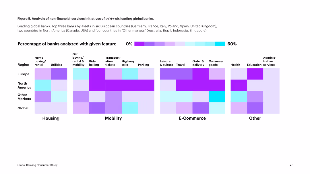
Featuring a series of column charts, the slide depicts the return on tangible equity over the years and distribution amounts.
Financial Performance
Financial Services
Highlights the growth in return on tangible equity over recent years and the increased capital distributions to shareholders.
RoTE, distributions, growth, equity, shareholders
Multiple Chart
Barclays
Saved
Contains three pie charts displaying awareness and usage of Mobility-as-a-Service (MaaS), and its availability.
Market Analysis and Trends
Transportation & Logistics
Analyzes consumer awareness and engagement with Mobility-as-a-Service (MaaS), indicating low familiarity and usage despite available services.
MaaS, awareness, usage, transportation services, availability
Multiple Chart
Deloitte
Saved
This slide displays column charts and world maps indicating improvements in market share across different regions and financial results from 2017 to 2021.
Market Analysis and Trends
Financial Services
This slide details JP Morgan's market share growth and financial outcomes across all business sectors and global regions from 2017 to 2021. It emphasizes their sustained expense management and operational leverage, contributing to their solid financial positioning in various markets.
market share, global, growth, financial
Multiple Chart
JP Morgan
Saved
Pie charts showing consumer preferences for purchasing financial products from banks vs. non-financial companies, with collaboration insights.
Customer and Market Segmentation
Financial Services
Examines consumer attitudes towards purchasing financial products, emphasizing the importance of banks in the purchase process, even when involving non-financial companies.
consumer preferences, financial products, banks, non-financial companies, collaboration, purchase process, insights, survey
Table
Accenture
Saved
This slide has a column chart showing the potential CO2 capture capacity of current announced projects compared to the IEA SDS objectives by 2030. The gap is highlighted in red for emphasis.
Market Analysis and Trends
Energy & Utilities
The slide reveals that current CCUS projects are insufficient to meet the net-zero targets, indicating that the pipeline of projects needs to increase significantly to close the gap by 2030.
CCUS, net zero, CO2 capture, project pipeline, IEA objectives
Multiple Chart
Kearney
Saved
Column chart displaying BEV penetration, depreciation rates, and EV players across European countries
Market Analysis and Trends
Energy & Utilities
The slide highlights Norway's dominance in BEV supply and market penetration compared to other European countries, showing metrics like BEV penetration percentage, top models' depreciation, and the number of pure EV players
BEV supply, market penetration, depreciation, EV players, European market
Multiple Chart
PwC/Strategy&
Saved
The slide uses multiple infographics, including bar graphs and pie charts, to present data on global sustainability efforts.
Industry Overview
Environmental Services & Sustainability
This slide presents a summary of global sustainability efforts, highlighting progress and areas needing improvement. It is useful for discussions on policy development and evaluation of ongoing environmental efforts.
sustainability, global, progress, infographic, environmental
Table
McKinsey
Saved
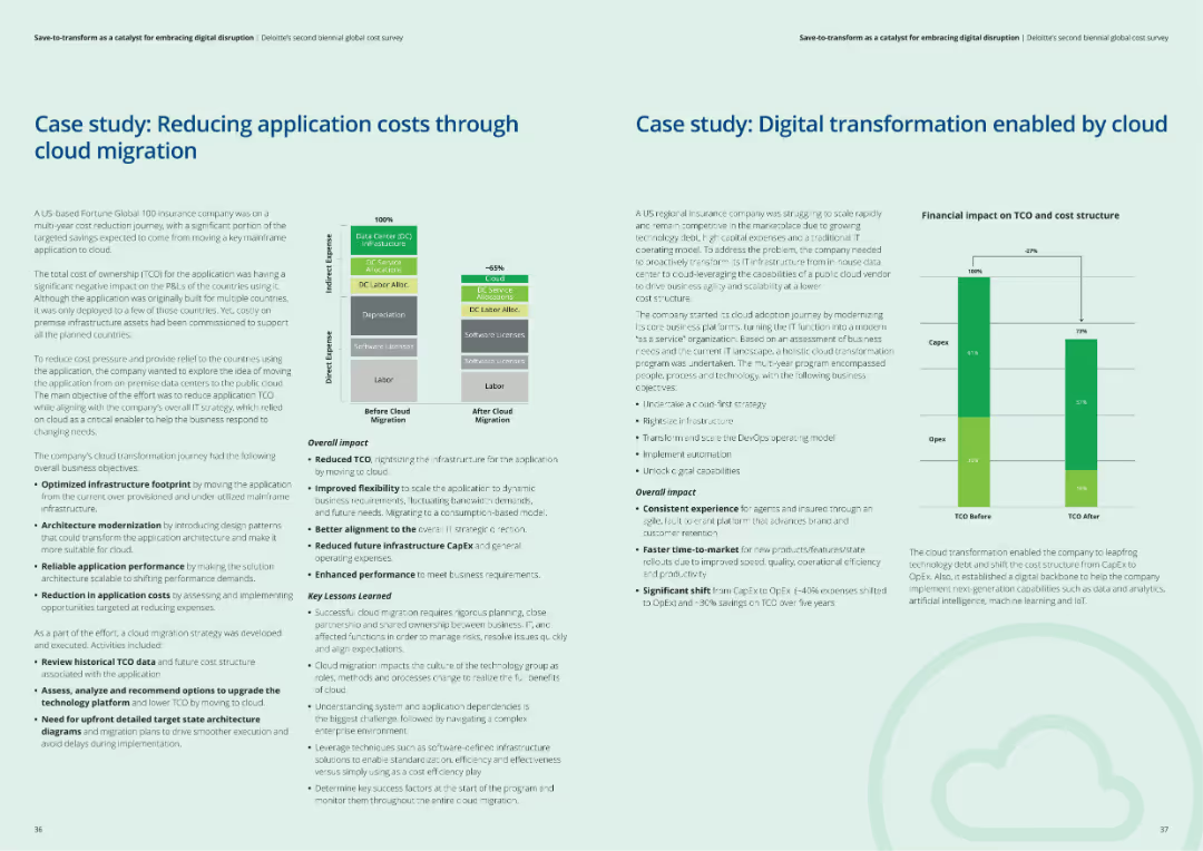
The slide includes two case studies, each with a structured layout showing context, challenges, actions taken, and results of cloud migration and digital transformation efforts.
Client Case Studies
Financial Services
The slide presents two case studies: one on reducing application costs through cloud migration and another on digital transformation enabled by cloud solutions, highlighting key lessons learned.
Cloud migration, digital transformation, case studies, client examples, financial services
Multiple Chart
Deloitte
Saved
Includes a line graph tracking monthly remittance flows in the Philippines during 2020, marking the stability despite the pandemic.
Market Analysis and Trends
Financial Services
Discusses trends in remittance flows to the Philippines during the COVID-19 pandemic, emphasizing the resilience of these transfers.
remittances, Philippines, COVID-19, financial trends, line graph, stability, monthly data, economic resilience
Single Chart
Deloitte
Saved
Several bar charts, well-organized text sections, uses shades of blue and green.
Customer and Market Segmentation
Telecommunications
Examines the effectiveness of various performance metrics in enhancing customer satisfaction.
performance metrics, customer satisfaction, assessment
Multiple Chart
Deloitte
Saved
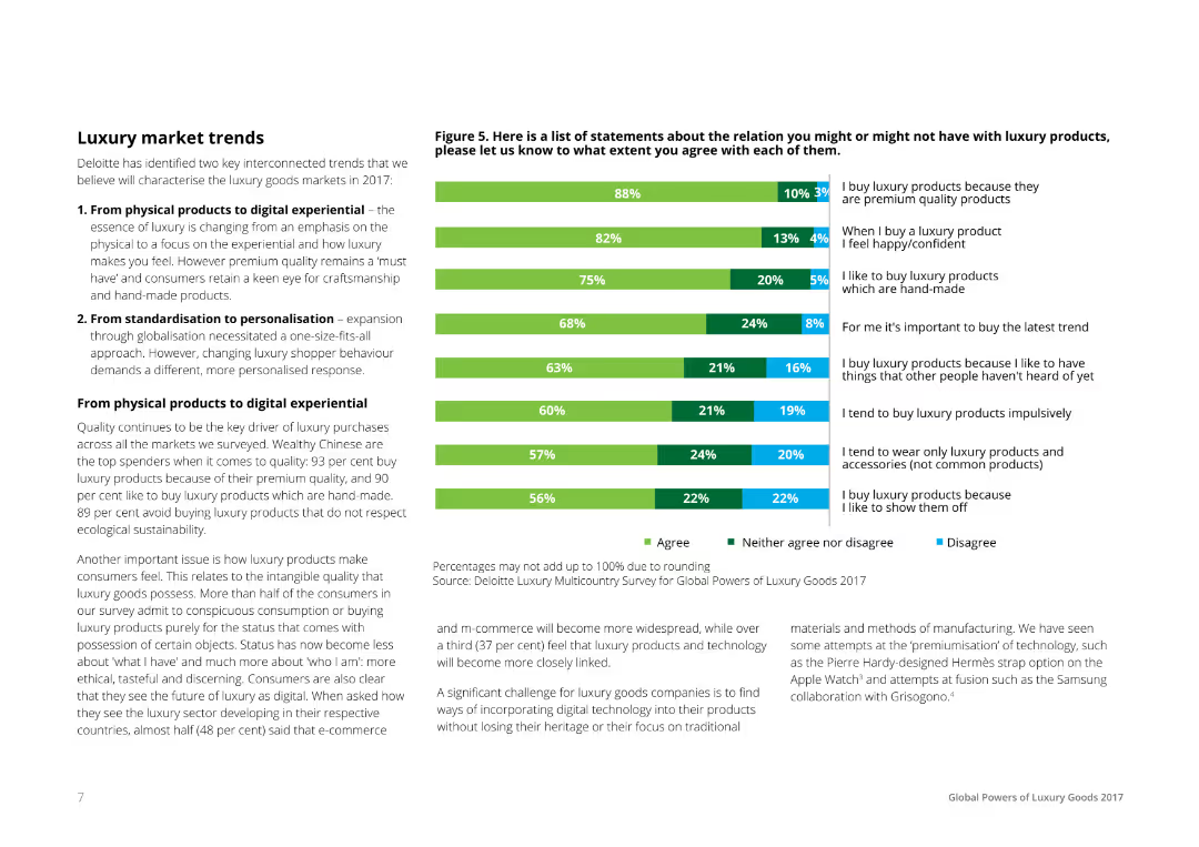
A mix of text and a horizontal bar chart, listing statements about luxury products and consumer agreements. Bars are segmented to show percentages of agreement, neutrality, and disagreement, color-coded in green, gray, and blue respectively.
Market Analysis and Trends
Consumer Goods
The slide discusses luxury market trends identified by Deloitte, focusing on the shift from physical products to digital experiences and from standardization to personalization. It includes consumer survey data on various luxury product statements.
Luxury, Market, Trends, Consumer, Survey
Mixed Chart
Deloitte
Saved
A mix of column chart, a pie chart, and line graph that give an overview of the bank's customer-centric model, geographical diversification, and resilient earnings.
Market Analysis and Trends
Financial Services
This slide outlines BBVA's business model, showing a customer-focused approach, geographical diversification, and steady income. It’s useful for investor presentations and strategic market positioning discussions.
Business Model, Customer-Centric, Diversification, Resilient Earnings, Geographical Spread, Financial Stability
Multiple Chart
Morgan Stanley
Saved
This slide includes a pie chart and a checklist. The pie chart illustrates the composition of total deposits, and the checklist outlines the characteristics of the deposits. The slide is clear and informative with a straightforward presentation of data.
Operational Efficiency
Financial Services
It breaks down the firm's deposit base, showing diversification and insurance coverage. With details on deposit types and insurance, it could be used for presentations on financial stability and deposit strategies.
Deposits, Diversification, FDIC Insured, Funding Liabilities, Deposit Composition
Mixed Chart
Goldman Sachs
Saved
The layout is text-focused with a section for bullet points on the left and a pie chart on the right that shows 'Outstanding Vanilla Debt and Preferred Shares Referencing USD LIBOR as of 1Q20'. The text addresses the firm’s strategy and commitments related to the LIBOR transition.
Regulatory and Compliance
Financial Services
Addresses the upcoming LIBOR transition, outlining the company's preparedness and strategic plans, which is critical for stakeholders monitoring regulatory shifts and risk exposure.
LIBOR transition, regulatory compliance, risk management, pie chart, financial strategy, debt management, preferred shares, corporate strategy, market adaptation, stakeholder assurance
Mixed Chart
Goldman Sachs
Saved
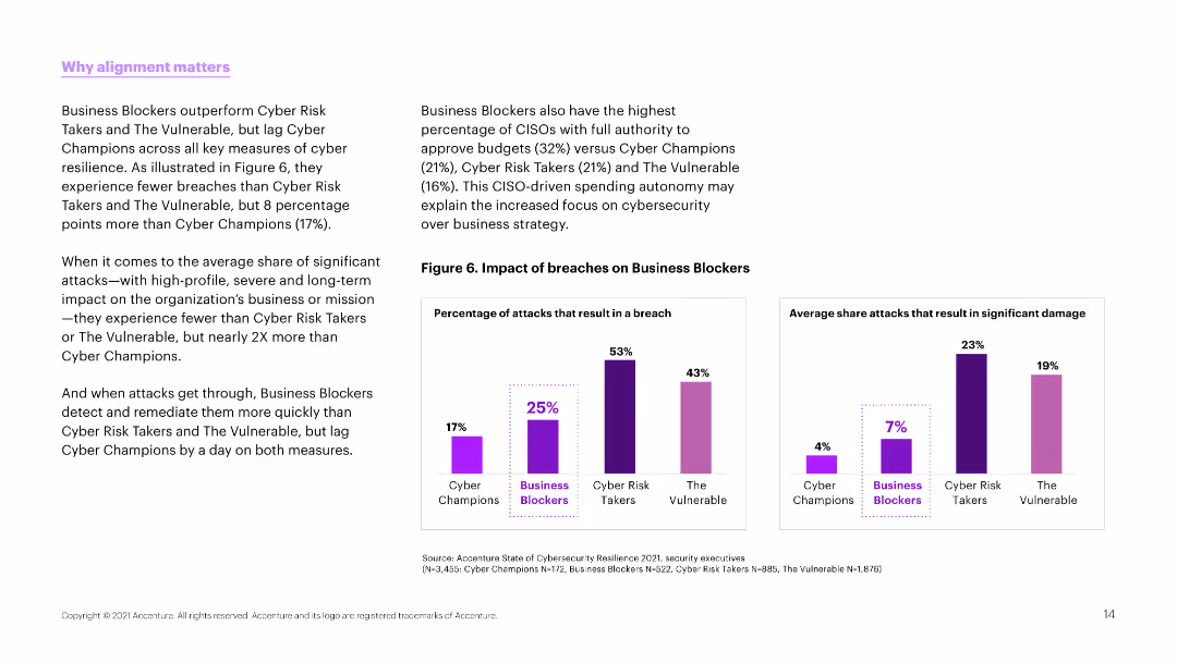
Text and column charts comparing the impact of breaches on different types of organizations. Charts use purple to show percentages of breaches and impacts.
Strategic Planning
Professional Services
The slide emphasizes the importance of alignment in cybersecurity strategies, comparing the breach impacts on different organizational types like Business Blockers and Cyber Champions.
alignment, cybersecurity, breaches, comparison, impact
Multiple Chart
Accenture
Saved
The slide features several bar charts comparing leaders and others in value generation across dimensions like cost, resilience, ESG, and growth.
Operational Efficiency
Financial Services
It highlights how leaders generate value through cost reduction, resilience, ESG, and growth. It is used for showing value dimensions and their impact.
Value generation, cost reduction, resilience, ESG, growth, procurement, financial impact
Single Chart
Kearney
Saved
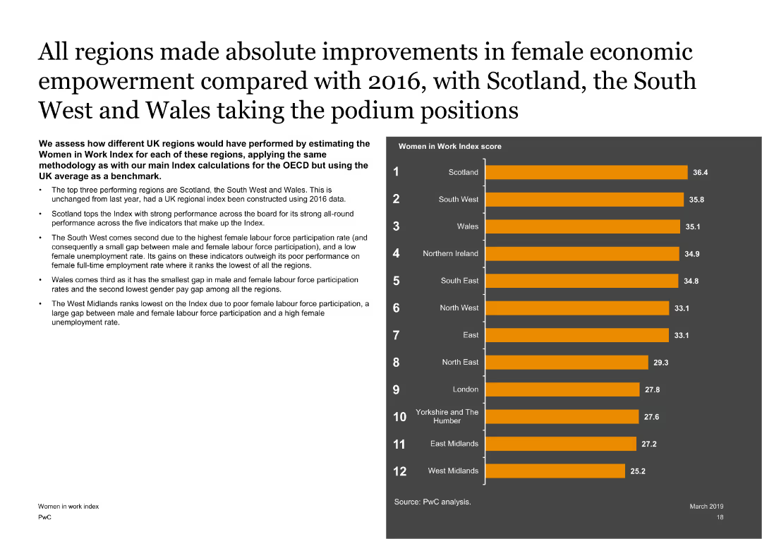
Features a text on the left with a column chart on the right showing Women in Work Index scores for different UK regions. The slide is visually balanced with clear regional comparisons.
Market Analysis and Trends
Government & Public Sector
Assesses the performance of different UK regions on the Women in Work Index, highlighting the top-performing regions like Scotland, the South West, and Wales, and discussing the factors contributing to their scores.
UK regions, Women in Work Index, economic empowerment, regional analysis
Mixed Chart
PwC/Strategy&
Saved
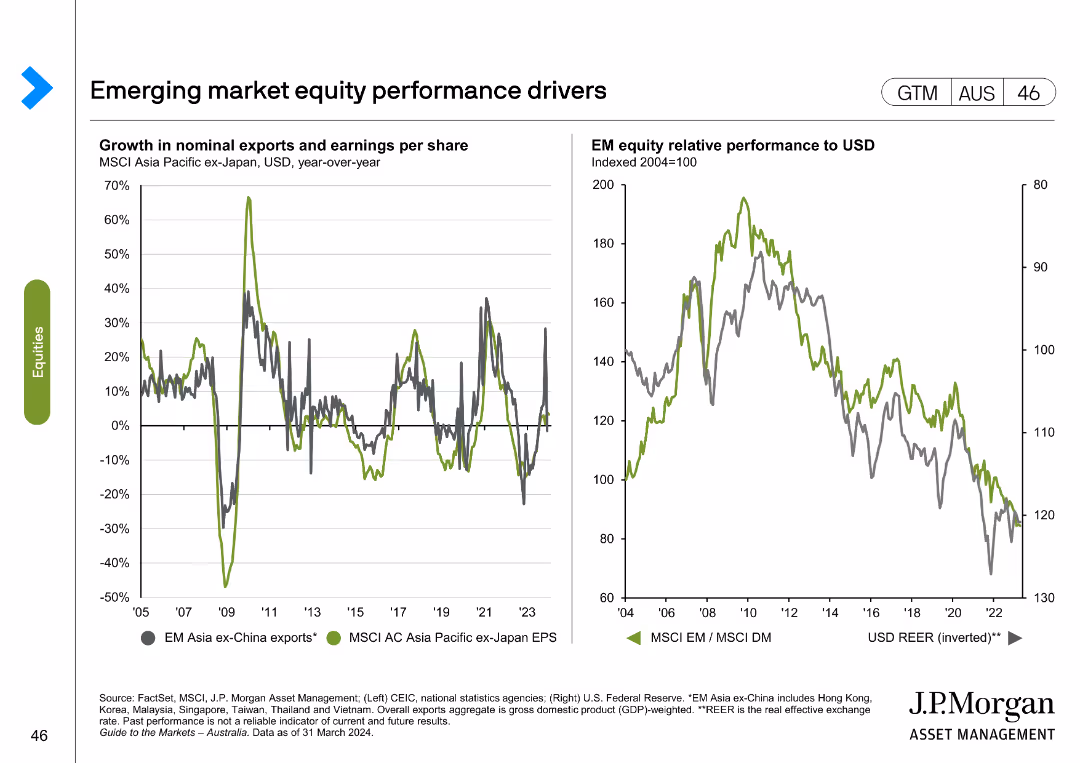
The slide displays two line charts: one showing growth in nominal exports and earnings per share for MSCI Asia Pacific ex-Japan, and another comparing EM equity relative performance to USD.
Market Analysis and Trends
Financial Services
This slide examines key drivers of emerging market equity performance, focusing on exports, earnings per share, and relative performance to USD.
emerging markets, equity performance, exports, earnings per share, MSCI Asia Pacific, USD performance, financial analysis, market drivers
Multiple Chart
JP Morgan
Saved
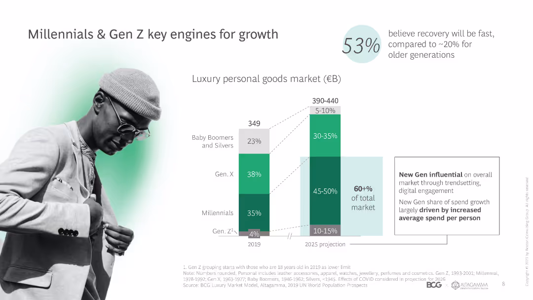
The slide includes a column chart showing market segments by generation and a photo of a young person, highlighting the influence of Millennials and Gen Z on luxury market growth.
Market Analysis and Trends
Retail & E-commerce
The slide discusses the impact of Millennials and Gen Z on the luxury personal goods market, noting their increasing share and influence on market trends and spending.
Millennials, Gen Z, market growth, luxury goods, generational trends, spending patterns, market influence, personal luxury, consumer segments
Mixed Chart
BCG
Saved
Bar chart representing the automation potential and adoption scenarios in New Zealand by 2030.
Strategic Planning
Industrial & Manufacturing
Provides insights into the potential for automation in New Zealand’s workforce, highlighting different adoption scenarios.
Automation, New Zealand, Workforce, 2030, Scenarios
Single Chart
McKinsey
Saved
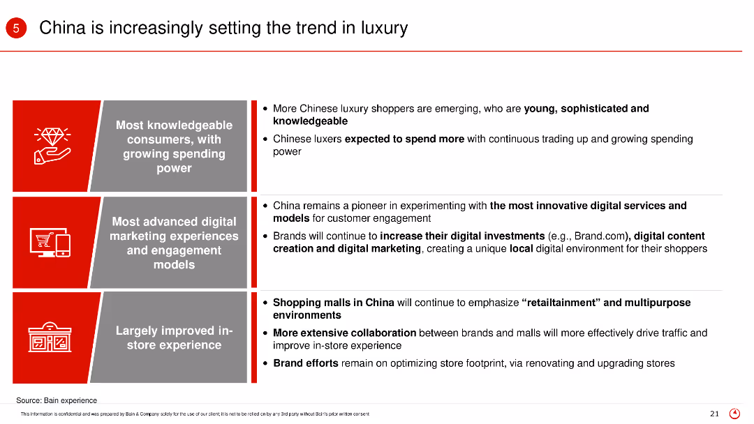
The slide uses a three-column layout with text and icons in each column. Red and gray color scheme is used for emphasis.
Market Analysis and Trends
Retail & E-commerce
The slide discusses how China is leading in luxury market trends with knowledgeable consumers, advanced digital marketing, and improved in-store experience.
China, luxury, consumers, digital marketing, trends
Table
Bain
Saved
Includes column charts depicting potential network cost reductions across various industries after shifting to network modernization.
Strategic Planning
Telecommunications
Advocates for shifting budget allocations towards network modernization to achieve cost savings and efficiency gains in various industries.
budget allocation, cost reduction, network modernization, industry comparison, operational efficiency, strategic decisions
Multiple Chart
Accenture
Saved
Contains a circular flow diagram with icons representing different aspects of diligence such as Valuation, Commercial, and Tax. Clear, simple design with labeled segments and a central title.
Investment Analysis
Professional Services
This slide emphasizes the uniqueness of A&M's integrated diligence approach, showing how it combines various elements like Financial Accounting and Tax to create a comprehensive service.
Integrated, Diligence, Financial, Tax, Solution
Framework
Alvarez & Marsal
Saved
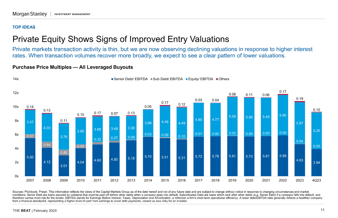
Column chart showing purchase price multiples for all leveraged buyouts over several years, highlighting senior and sub debt/EBITDA ratios.
Investment Analysis
Financial Services
This slide indicates improved entry valuations in private equity, with declining valuations due to higher interest rates, and compares historical purchase price multiples.
private equity, entry valuations, leveraged buyouts, purchase price multiples, investment analysis
Single Chart
Morgan Stanley
Saved
Column chart showing the percentage of respondents agreeing or disagreeing with statements about privacy concerns, highlighting the inevitability of privacy loss due to new technology.
Risk Assessment and Management
Technology & Software
Addresses the global concern about loss of privacy due to technology, with significant agreement that privacy loss is inevitable and concerns about government and corporate data collection.
privacy, technology, concern, survey, inevitability
Mixed Chart
IPSOS
Saved
Previous
Next
If nothing, comes up, please save your slides first
Create a FREE account to continue browsing
Receive Instant Access to 1,000+ slides from companies like McKinsey, Google, and Goldman Sachs
First Name
Last Name
Email
Password
I agree to all
Terms & Privacy Policy
Thank you! Your submission has been received!
Oops! Something went wrong while submitting the form.
Have an account?
Sign in
Column Chart
Heatmap
Chevron
Org Chart
Infographic
Callouts
Timeline
List
Graphic
Picture
Process Flow
Diagram
Paragraph
Map
Table
Framework
Subtitle
Takeaway Box
Icon
Other Chart
Radar Chart
Waterfall Chart
Mekko Chart
Pie Chart
Scatter Plot
Line Chart
Bar chart
Bullet points