My Account
My Slides
Search by Category
Templates
Leave Feedback
Login
Logout
Get Started
Browse all Slides
Browse all Slides
Create a FREE Account
Instant access to 1,000+ real slides from top companies like McKinsey, BCG, Goldman Sachs, Google and many more!
First Name
Last Name
Email
Password
I agree to all
Terms & Privacy Policy
Thank you! Your submission has been received!
Oops! Something went wrong while submitting the form.
Have an account?
Sign in
Saved Slides
The slide contrasts fintech, metaverse, healthtech, and edtech sectors with lists of top drivers and barriers, and a feature image of a woman using a smartphone.
Market Analysis and Trends
Technology & Software
Highlights the main drivers and barriers to adoption for new technologies like e-wallets, AR, VR, and online courses, essential for strategic planning.
Tech Adoption, Drivers, Barriers, Fintech, Metaverse, Healthtech, Edtech, Strategic Planning
Table
Bain
Saved
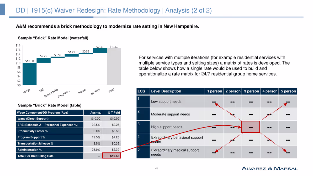
Column chart and table showing a sample "brick" rate model for various residential service types.
Market Analysis and Trends
Government & Public Sector
Recommends a "brick" rate methodology to modernize rate setting in New Hampshire, providing a sample rate model for different residential service types and their respective costs.
rate methodology, brick model, residential services, cost analysis, NH's DD population, funding models, strategic planning, rate setting
Mixed Chart
Alvarez & Marsal
Saved
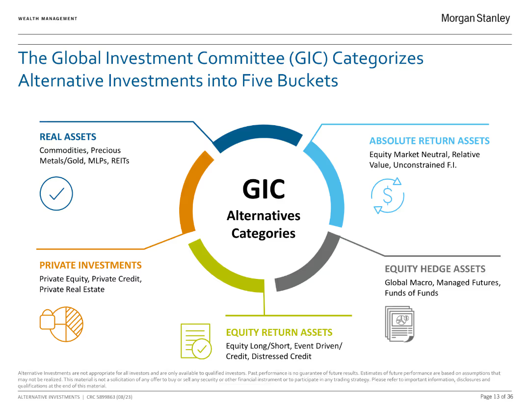
The slide features a circular diagram with five sections representing different categories of alternative investments, each with brief descriptions.
Investment Analysis
Financial Services
The slide explains the five categories of alternative investments as defined by the Global Investment Committee (GIC): Real Assets, Absolute Return Assets, Equity Hedge Assets, Private Investments, and Equity Return Assets.
Alternative Investments, GIC, Real Assets, Equity, Investment Analysis
Framework
Morgan Stanley
Saved
Light background with yellow title banner, text-heavy content, and two charts illustrating cross-border listings and their performance.
Market Analysis and Trends
Financial Services
This slide highlights the outperformance of small cross-border IPOs compared to larger offerings in after-market returns. It features charts showing the number of cross-border listings over years and the percentage of IPOs with current prices above their offer prices.
cross-border listings, IPO performance, after-market returns, 2023, financial trends
Multiple Chart
EY
Saved
Visualizes application timelines using horizontal bars across a timeline from 2020 to 2040, detailing stages like pilot starts and full ramp-ups.
Operational Efficiency
Energy & Utilities
Shows the anticipated domestic rollout of hydrogen applications in sectors like refining and transport.
hydrogen, domestic, application, rollout, mining, trucks, fertilizers
Multiple Chart
McKinsey
Saved
Consists of column charts showing investment return metrics for corporate equity and real estate credit, with clear distinction between post-crisis and since inception data.
Investment Analysis
Financial Services
Presents a detailed analysis of investment returns for alternative strategies, emphasizing performance metrics like IRR.
Investment Returns, Alternatives, Corporate Equity, Real Estate Credit, IRR, Post-Crisis
Multiple Chart
Goldman Sachs
Saved
Features bubble charts and a linear scale to showcase the digital transformation's potential in logistics, including positive and negative value impacts.
Operational Efficiency
Transportation & Logistics
Analyzes how digital transformation could unlock $4 trillion in value for the logistics industry, emphasizing innovations like drones and shared transport capacity.
Logistics, Digital Transformation, Societal Impact, Industry Value, Innovation
Mixed Chart
Accenture
Saved
This slide consists of column charts and detailed financial data tables. It shows annual financial results, comparing current year with previous year, in a clear, structured manner using contrasting blue shades for different divisions.
Financial Performance
Financial Services
The slide provides a year-end review of Deutsche Bank's financial results for 2023, comparing it with 2022 data. It includes details on profits, losses, and divisional revenues, offering a comprehensive annual financial overview.
FY 2023, annual review, financial results, comparison
Mixed Chart
Deutsche Bank
Saved
Diagram with a map of Central America and icons representing various benefits of nearshoring, such as growth in value chains and productivity.
Market Analysis and Trends
Transportation & Logistics
This slide explores the benefits of nearshoring for Central America, including promoting value chains, boosting productivity through R&D, and revitalizing the economy by developing local supply chains.
Nearshoring, Central America, benefits, productivity, economy
Diagram
Deloitte
Saved
Text with a quote and a map of Europe, highlighting the reliability and speed of Ipsos surveys. Three numbered points describing the benefits of knowledge panel expansion.
Product and Service Analysis
Professional Services
Describes the expansion of Ipsos' knowledge panels and their benefits, including brand recognition, market revenue gains, and EU market presence. Emphasizes the reliability of data.
Knowledge Panels, Expansion, Reliability, EU Market, Surveys
Boxed
IPSOS
Saved
Column chart showing attendance numbers for major sporting events in Melbourne in 2015, alongside a case study of the London 2012 Olympics' impact on cultural tourism.
Strategic Planning
Hospitality & Tourism
This slide highlights the potential of leveraging sports events to boost cultural participation, using Melbourne and the London 2012 Olympics as examples.
sports, cultural participation, Melbourne, London, Olympics, tourism, events, collaboration, strategic planning
Mixed Chart
BCG
Saved
Features a bar chart outlining the percentage of consumers willing to adopt MaaS and preferred transport types included in MaaS.
Strategic Planning
Transportation & Logistics
Details consumer willingness to adopt Mobility-as-a-Service as their primary transport, with a focus on age demographics and preferences for transport types.
MaaS, consumer preferences, transportation types, age demographics, adoption rates
Mixed Chart
Deloitte
Saved
Line charts tracking company performance metrics over several years, with highlights on recent increases. Colors are purple and grey.
Financial Performance
Financial Services
Provides a long-term view of company performance metrics, highlighting significant growth in the recent period.
long-term, performance, growth, financial services, trends, metrics
Single Chart
Deloitte
Saved
Bar chart depicting real GDP per employed worker over several years.
Strategic Planning
Professional Services
Introduces PwC’s PPI, which incorporates various forms of capital to measure productivity potential more comprehensively.
Productivity, GDP, Economic Growth, Index, PwC
Mixed Chart
PwC/Strategy&
Saved
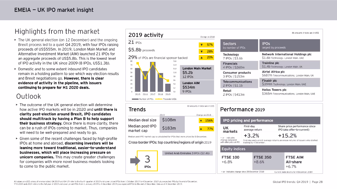
This slide features column charts, numerical data points, and textual highlights. It focuses on the UK IPO market within the EMEIA region, covering activity levels, sectors, and performance metrics for 2019.
Market Analysis and Trends
Financial Services
The slide summarizes the UK IPO market within the EMEIA region for 2019, noting the number of IPOs, proceeds, sector activity, performance metrics, and the outlook for 2020.
UK, IPO, EMEIA, Market Analysis, Financial Services, Trends, Activity, Sectors, 2019
Mixed Chart
EY
Saved
The slide features a bar chart showing the frequency of crypto asset trades over the past 12 months for 2023 and 2022, with categories ranging from 'Never' to 'Daily'.
Financial Performance
Financial Services
This slide illustrates how often crypto asset holders traded their assets in the past year, highlighting differences between 2023 and 2022. It can be used to assess trading activity trends.
Crypto, Trade Frequency, Activity, Comparison, Trends
Multiple Chart
IPSOS
Saved
This slide has a bright and bold aesthetic with a large title, multiple sections with headers, and bullet-pointed lists. It highlights strategies for implementing coding in education curricula worldwide, starting from early education through advanced modules. The design includes national flags as icons and color-coded sections for clarity. The slide is visually engaging and informative.
Regulatory and Compliance
Education & Training
The slide compares various global strategies for integrating technology skills into education systems. It outlines efforts to start coding education early, make it mandatory, and introduce advanced tech modules. It includes specific country examples, providing a comprehensive overview of the progressive steps taken to prepare the next generation for a digital future.
Coding Education, Curriculum, Global Strategies, Mandatory Coding, Advanced Tech, Italy, Singapore, India, International Education, Digital Skills
Header Horizontal
Kearney
Saved
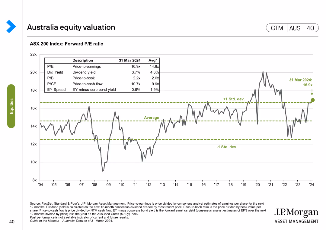
The slide presents a line chart with ASX 200 Index forward P/E ratio over time and a table with different valuation metrics as of March 2024 compared to historical averages.
Financial Performance
Financial Services
This slide evaluates the ASX 200 Index's forward P/E ratio and other valuation metrics, comparing current figures to historical averages.
ASX 200, valuation, metrics, forward P/E, historical
Single Chart
JP Morgan
Saved
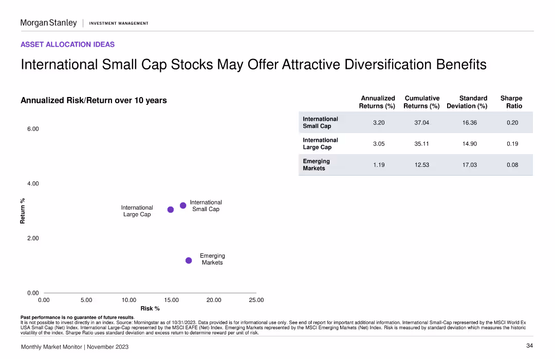
A scatter plot comparing annualized risk/return over 10 years for international small cap, large cap, and emerging markets. Includes a summary table with key statistics.
Investment Analysis
Financial Services
The slide compares the risk and return profiles of international small cap, large cap, and emerging market stocks, highlighting potential diversification benefits for investors.
risk/return, small cap stocks, diversification, emerging markets, investment
Mixed Chart
Morgan Stanley
Saved
This slide displays column chart and line graph with a blue and green color scheme. The column chart shows the rent reversion percentage over time, with a prominent label of a recent increase. A line graph depicts occupancy trends, correlating with the bar graph data.
Financial Performance
Real Estate & Construction
The slide communicates the reversion of office rent, with a focus on the recent 8.1% increase, and the related office portfolio occupancy rates. It mentions specifics like portfolio NLA re-leased and the tenant retention rate. This slide could be used by real estate professionals to analyze portfolio performance or by investors reviewing rent trends for decision-making.
office rent, reversion, occupancy, NLA, tenant retention
Single Chart
Morgan Stanley
Saved
The slide features a dual-axis line chart tracking cumulative flows of US and European high yield bonds from 2013 to 2023. It uses a blue color scheme with two distinct lines, one for each region.
Market Analysis and Trends
Financial Services
This slide presents a comparison of high yield bond funds in the US and Europe, showing a trend of shrinkage since the end of 2020. It is useful for analyzing market movements and investment strategies in the corporate credit sector.
High Yield, Bonds, US, Europe, Trend, Market Analysis, Investment, Corporate Credit, Data Visualization
Single Chart
Morgan Stanley
Saved
The slide presents a large circular progress chart indicating a 67% reduction, accompanied by icons and text detailing the benefits of connected reporting systems.
Operational Efficiency
Professional Services
Highlights the success of a connected reporting system in reducing reporting times and improving data integrity and visibility over financial performance, with an emphasis on standardization and remote capabilities.
Connected reporting, data integrity, financial visibility, reduction in time, standardization, remote reporting, process improvement
Mixed Chart
Deloitte
Saved
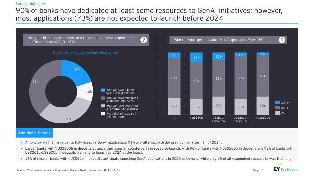
Left: pie chart on resource dedication to GenAI. Right: column chart on expected launch timelines for GenAI applications.
Strategic Planning
Financial Services
Shows that 90% of banks have dedicated resources to GenAI, with most applications not expected to launch before 2024.
resources, GenAI, deployment, launch, timeline
Multiple Chart
EY
Saved
A stacked column chart shows how Canadians managed their investments in 2022 and 2023, with percentages for each method.
Market Analysis and Trends
Financial Services
It presents the ways Canadians managed their investments, comparing different methods between 2022 and 2023.
Management, Investments, Canadians, Methods, 2023, 2022, Column Chart, Financial, Trends
Mixed Chart
IPSOS
Saved
A bar chart with overlaid line graph titled "Global buyout fund capital contributions and distributions". It contrasts contributions and distributions from 2005 to Q3 22, with a red line indicating net cash flows. There's a notable shift towards negative net cash flows in the recent quarter.
Investment Analysis
Financial Services
Highlights the trends in capital contributions versus distributions to Limited Partners (LPs) in global buyout funds, key for analyzing fund performance, investor returns, and market health.
Buyout Funds, LPs, Capital Contributions, Distributions, Cash Flows, Fund Performance
Single Chart
Bain
Saved
Previous
Next
If nothing, comes up, please save your slides first
Create a FREE account to continue browsing
Receive Instant Access to 1,000+ slides from companies like McKinsey, Google, and Goldman Sachs
First Name
Last Name
Email
Password
I agree to all
Terms & Privacy Policy
Thank you! Your submission has been received!
Oops! Something went wrong while submitting the form.
Have an account?
Sign in
Column Chart
Heatmap
Chevron
Org Chart
Infographic
Callouts
Timeline
List
Graphic
Picture
Process Flow
Diagram
Paragraph
Map
Table
Framework
Subtitle
Takeaway Box
Icon
Other Chart
Radar Chart
Waterfall Chart
Mekko Chart
Pie Chart
Scatter Plot
Line Chart
Bar chart
Bullet points