My Account
My Slides
Search by Category
Templates
Leave Feedback
Login
Logout
Get Started
Browse all Slides
Browse all Slides
Create a FREE Account
Instant access to 1,000+ real slides from top companies like McKinsey, BCG, Goldman Sachs, Google and many more!
First Name
Last Name
Email
Password
I agree to all
Terms & Privacy Policy
Thank you! Your submission has been received!
Oops! Something went wrong while submitting the form.
Have an account?
Sign in
Saved Slides
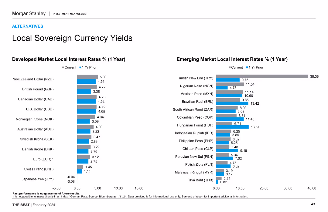
Two vertical column charts comparing developed market local interest rates vs. emerging market local interest rates over a 1-year period, with the current and prior year's rates shown side by side for each currency.
Financial Performance
Financial Services
Compares the local sovereign currency yields for developed and emerging markets, highlighting changes over a one-year period. Useful for understanding interest rate trends and investment opportunities in different markets.
local interest rates, sovereign yields, developed markets, emerging markets, currency comparison
Multiple Chart
Morgan Stanley
Saved
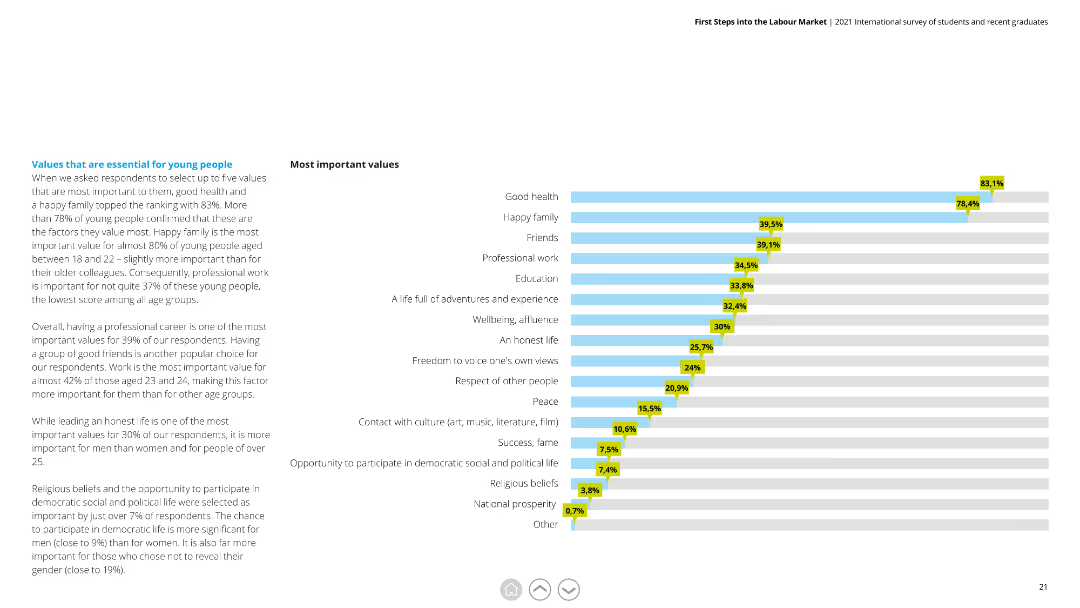
A horizontal bar chart (bar chart) ranking most important values among respondents, such as good health and a happy family.
Market Analysis and Trends
Professional Services
Provides insight into the top values prioritized by respondents, indicating a focus on health, family, and professional work.
Values, Importance, Health, Family, Professional Work, Respondents
Mixed Chart
Deloitte
Saved
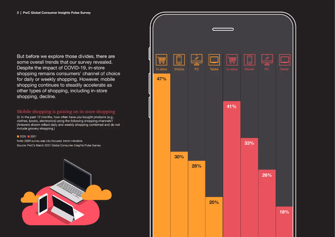
Column chart within a mobile phone outline, comparing in-store and mobile shopping trends between 2020 and 2021.
Market Analysis and Trends
Retail & E-commerce
This slide examines the shift towards mobile shopping compared to in-store shopping during the COVID-19 pandemic.
mobile shopping, in-store, trends, 2020, 2021, COVID-19, comparison
Mixed Chart
PwC/Strategy&
Saved
A dark background is used with three icons representing different innovation areas accompanied by descriptive text and examples in a list format. The green and white color scheme is consistent with the overall presentation theme, and the layout allows each innovation area to be distinct and easily readable.
Strategic Planning
Technology & Software
The slide details different innovation areas CEOs should focus on, providing descriptions and examples. It's a strategic planning tool, useful for discussions on aligning innovation efforts with company objectives and market positioning. The slide is likely intended to help leaders determine where to allocate resources for innovation and how to shape their company's path forward in the market.
innovation areas, strategic focus, company objectives, market positioning, CEOs
Agenda
BCG
Saved
Slide with a column chart detailing underlying PBT for 4Q23, with additional charts showing related metrics and financial performance for the same period.
Financial Performance
Financial Services
The slide provides an overview of UBS's underlying PBT for 4Q23, highlighting key financial metrics and performance indicators.
4Q23 PBT, financial performance, underlying profit, UBS quarterly results
Mixed Chart
UBS
Saved
The slide presents multiple line charts depicting changes in economic optimism over time. Each line represents a different economic sector, allowing for sector-specific trend analysis. Color coding and clear labeling aid in distinguishing between the data.
Market Analysis and Trends
Professional Services
This slide examines the volatility in economic optimism, particularly in response to inflation and other market forces. It compares current sentiments to historical data, providing insights into how different sectors are adapting to ongoing economic challenges.
Economic Optimism, Inflation, Market Forces, Sector Analysis, Trends
Mixed Chart
Deloitte
Saved
Title, several bar charts detailing impacts of digital initiatives in the chemistry sector, mentions of "Digital R&D" and "Digital Plant".
Technology and Digital Transformation
Industrial & Manufacturing
Discusses how digitalization could transform the chemistry and advanced materials industry, emphasizing potential societal benefits like reduced emissions and injury rates.
chemistry, digitalization, societal benefits, emissions reduction, industry transformation
Mixed Chart
Accenture
Saved
Features a red gradient chart showing four waves of adoption of responsible initiatives by luxury brands, overlaid with key strategic concepts.
Strategic Planning
Consumer Goods
Analyzes the adoption of social responsibility by luxury brands across four progressive waves, suggesting a trend towards deeper integration into core business strategies.
responsibility, luxury brands, business strategy, CSR, adoption waves
Linear Flow
Bain
Saved
The slide has multiple icons and a comparative table showing the cost increase for various products if they adopt net-zero supply chains. It uses bright colors and bold text to emphasize key statistics and public opinion data.
Market Analysis and Trends
Professional Services
The slide highlights public demand for corporations to adopt environmental considerations and the average cost increase for products with net-zero supply chains. It also shows the percentage of companies committed to reaching net-zero by 2050.
net-zero, cost increase, public demand, corporations, supply chain
Header Vertical
BCG
Saved
Contains three overlaid line charts under the header 'National Concession Rate by Class', representing classes A, B, and C. The slide uses distinct colors for each class, plotted across a timeline with monthly granularity. The data is well-organized, with the source referenced at the bottom.
Risk Assessment and Management
Real Estate & Construction
This slide is used for analyzing the trends of concession rates in multifamily housing across different property classes over time, which is relevant for investors and property managers assessing market conditions and risks.
Concession Rates, Property Classes, Market Trends, Multifamily Housing, Investment Risk, Data Analysis, Real Estate Market, Time Series, Performance Tracking
Single Chart
Citigroup
Saved
Displays a large curve graph showing the contribution to profit by different classes, annotated for emphasis on key areas, alongside a simple line graph.
Investment Analysis
Financial Services
Focuses on the impact of the lowest performing 10% of classes on overall profitability at Lloyd's, using visual data to identify significant profit erosion points.
profitability, Lloyd's market, decile review, classes, investment
Single Chart
PwC/Strategy&
Saved
The slide includes multiple line graphs tracking historical yields and the volatility index (VIX), with distinct colors for different indices.
Risk Assessment and Management
Financial Services
Provides insight into the market's risk profile by correlating dividend yields with market volatility, valuable for investors managing risk in their portfolios.
dividend yields, volatility, line graphs, market analysis, VIX, risk management
Multiple Chart
Morgan Stanley
Saved
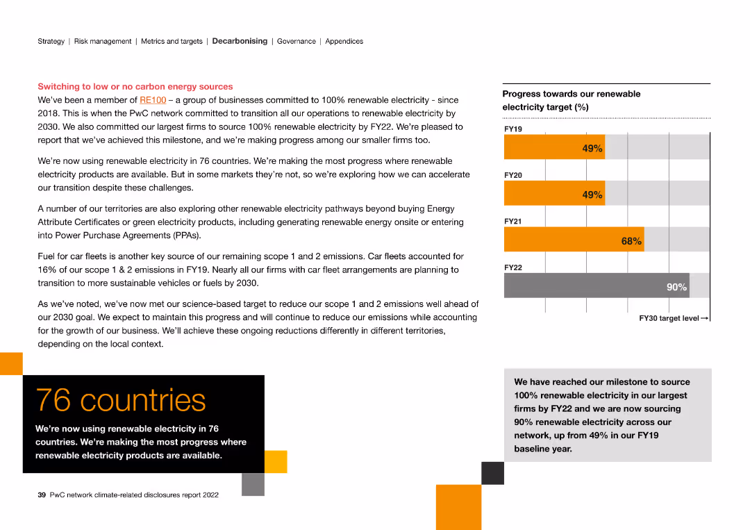
The slide contains a column chart and text, illustrating progress towards renewable electricity targets and exploring alternative energy sources.
Strategic Planning
Energy & Utilities
The slide discusses the transition to 100% renewable electricity, highlighting achievements in 76 countries and exploring further renewable energy pathways.
renewable electricity, carbon energy, transition, targets, achievements, alternative energy
Mixed Chart
PwC/Strategy&
Saved
The slide features a diagram and detailed table presenting the total potential of municipal solid waste (MSW) for energy production by 2060, including theoretical, technical, and sustainable potentials, and various factors affecting its scalability and sustainability constraints.
Technology and Digital Transformation
Energy & Utilities
This slide provides a deep-dive into the potential of municipal solid waste as a feedstock for energy production, analyzing its total potential by 2060 and highlighting the scalability issues and sustainability constraints associated with its use.
municipal solid waste, MSW, feedstock, total potential, energy production, 2060, scalability, sustainability constraints
Mixed Chart
Kearney
Saved
Features a column chart on the left showing global core infrastructure returns from income and capital appreciation, and a table on the right detailing public and private market correlations.
Investment Analysis
Financial Services
This slide highlights the role of alternative investments in inflation protection, analyzing returns from global core infrastructure and examining correlations with public and private markets.
inflation protection, alternative investments, infrastructure returns, market correlations, global
Mixed Chart
JP Morgan
Saved
The slide features a diagram showing the biomass-to-energy carbon cycle, detailing the flow of CO2 from biofuel production to consumption, and its subsequent absorption by biomass through photosynthesis.
Technology and Digital Transformation
Energy & Utilities
This slide explains the carbon neutrality of bioenergy through the natural carbon cycle of biomass, illustrating how CO2 emissions from biofuel production and consumption are balanced by biomass absorption.
biomass, bioenergy, carbon cycle, CO2 emissions, carbon neutrality, biofuel production
Linear Flow
Kearney
Saved
Text-heavy slide with bullet points and icons representing various aspects of healthcare and bioengineering.
Regulatory and Compliance
Healthcare & Pharmaceuticals
Reviews potential healthcare innovations and disruptions due to bioengineering.
Healthcare, Bioengineering, Innovations, Disruptions
Header Vertical
McKinsey
Saved
Contains multiple bar charts and percentage data illustrating growth in marketing organizations by employee count and revenue, set in a purple color scheme.
Organizational Structure and Change
Professional Services
Discusses growth trends in marketing teams, providing data segmented by company size and revenue, helpful for HR and organizational planning.
marketing growth, employee count, revenue, organizational development, HR planning
Multiple Chart
Deloitte
Saved
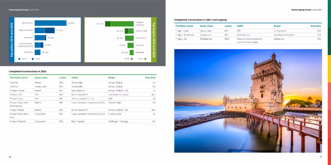
The slide features a table with completed transactions in 2020 and ongoing transactions in 2021, along with bar charts showing top sellers and buyers for 2019 and 2020. The right side contains an image of a historical building.
Market Analysis and Trends
Financial Services
The slide provides a summary of completed and ongoing financial transactions, detailing portfolio names, asset classes, loan types, sellers, buyers, and transaction sizes.
transactions, financial, market, buyers, sellers
Multiple Chart
Deloitte
Saved
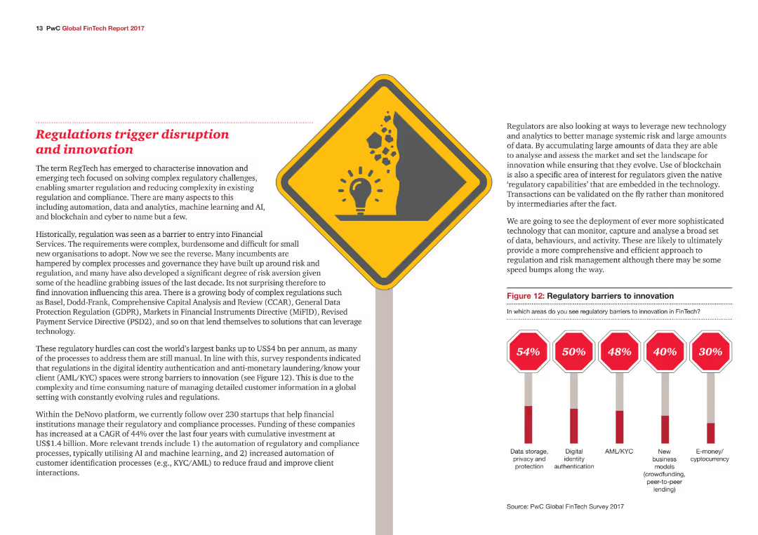
The slide features an icon and a column chart showing the percentage of respondents identifying various regulatory barriers to innovation, with color-coded data points.
Regulatory and Compliance
Financial Services
The slide explains how regulatory challenges in the financial services industry are driving innovation and disruption, focusing on specific regulatory barriers.
Regulations, Innovation, Compliance, Financial Services, Barriers
Mixed Chart
PwC/Strategy&
Saved
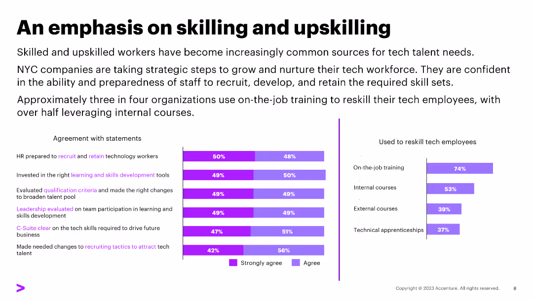
The slide features a column chart displaying percentages of agreement with statements and methods used to reskill employees. The layout is moderately dense with text and visuals.
Human Resources and Talent Management
Professional Services
Discusses the importance of skilling and upskilling workers, with data showing HR preparedness and reskilling methods.
HR, reskilling, training, upskilling, internal courses, external courses, technical apprenticeships
Multiple Chart
Accenture
Saved
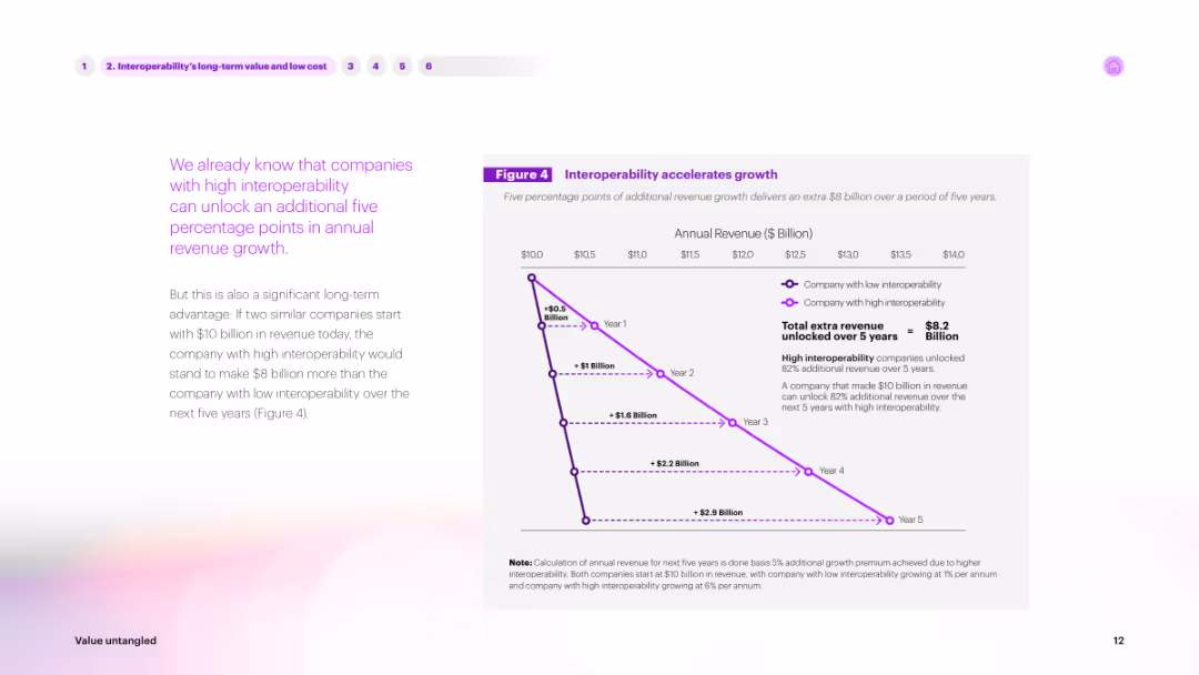
The slide features text on the left and a line graph on the right. The graph shows annual revenue growth over five years for companies with high vs. low interoperability, with a purple line indicating high interoperability advantages.
Market Analysis and Trends
Technology & Software
Describes the long-term value of interoperability. The line graph illustrates how companies with high interoperability can unlock significant revenue growth over five years, making a compelling case for investing in interoperable solutions.
interoperability, long-term value, revenue, growth, trends
Mixed Chart
Accenture
Saved
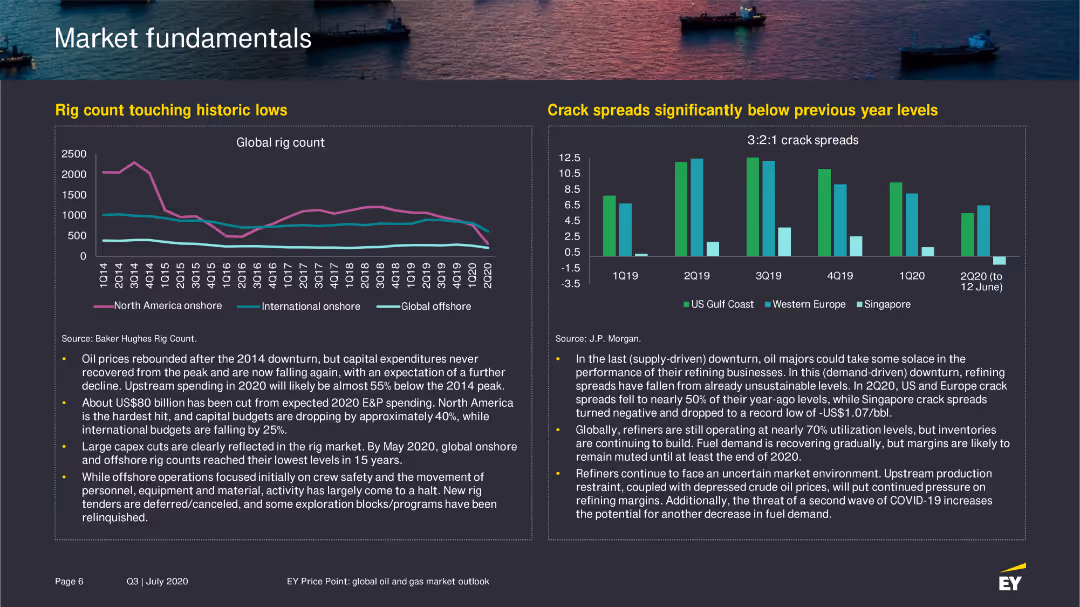
The slide includes a line chart showing the global rig count from Q1 2014 to Q2 2020 and a bar chart comparing crack spreads in different regions from 2019 to 2020.
Market Analysis and Trends
Energy & Utilities
Details the decline in global rig count and the low crack spreads, discussing the implications for the oil and gas industry.
rig count, oil industry, crack spreads, 2020
Multiple Chart
EY
Saved
A diamond-shaped quadrant with four segments shows Goldman Sachs services, juxtaposed with Orsted’s services on the right.
Organizational Structure and Change
Financial Services
Describes Goldman Sachs' comprehensive service structure and how it supports a local client with global capabilities through different services.
Goldman Sachs, Global Markets, Asset Management, Investment Banking, Client Services, Orsted, Financing, Advising
Header Vertical
Goldman Sachs
Saved
The slide contains a structured table on the top outlining proposed capital raises. Below, there's a timeline detailing the indicative timeline for these raises.
Investment Analysis
Financial Services
This slide provides an overview of the proposed capital raises, including a breakdown of the structure and size, followed by a detailed timeline for the execution of these raises.
capital raises, timeline, financial planning, investment, strategy
Linear Flow
Credit Suisse
Saved
Previous
Next
If nothing, comes up, please save your slides first
Create a FREE account to continue browsing
Receive Instant Access to 1,000+ slides from companies like McKinsey, Google, and Goldman Sachs
First Name
Last Name
Email
Password
I agree to all
Terms & Privacy Policy
Thank you! Your submission has been received!
Oops! Something went wrong while submitting the form.
Have an account?
Sign in
Column Chart
Heatmap
Chevron
Org Chart
Infographic
Callouts
Timeline
List
Graphic
Picture
Process Flow
Diagram
Paragraph
Map
Table
Framework
Subtitle
Takeaway Box
Icon
Other Chart
Radar Chart
Waterfall Chart
Mekko Chart
Pie Chart
Scatter Plot
Line Chart
Bar chart
Bullet points