My Account
My Slides
Search by Category
Templates
Leave Feedback
Login
Logout
Get Started
Browse all Slides
Browse all Slides
Create a FREE Account
Instant access to 1,000+ real slides from top companies like McKinsey, BCG, Goldman Sachs, Google and many more!
First Name
Last Name
Email
Password
I agree to all
Terms & Privacy Policy
Thank you! Your submission has been received!
Oops! Something went wrong while submitting the form.
Have an account?
Sign in
Saved Slides
This slide displays a column chart with six sets of bars representing different digital service sectors. It contrasts the incremental adoption in H1 2022 with adoption as of 2021. Annotations provide insights on e-commerce and digital media consumption. Colors vary in shades of blue.
Market Analysis and Trends
Technology & Software
The slide analyzes the normalization of digital adoption growth post-acceleration phase, showing the saturation in various sectors such as e-commerce and digital media. It is a market analysis tool that can be used to gauge the digital service sector's plateau in growth and the potential for market consolidation or diversification.
digital adoption, urban users, SEA, e-commerce, normalization, growth, sector saturation, column chart
Single Chart
Bain
Saved
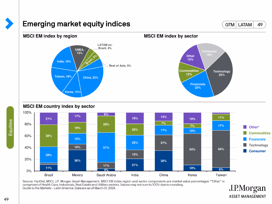
The slide features pie charts showing the MSCI Emerging Market index by region and sector, and bar charts for the index by country and sector. Various colors represent different regions, sectors, and countries.
Market Analysis and Trends
Financial Services
It breaks down the MSCI Emerging Market index, providing insights into the regional and sectoral composition of the index, which can inform investment strategies in emerging markets.
Emerging markets, MSCI index, regional composition, sectoral composition, investment
Multiple Chart
JP Morgan
Saved
Utilizes a bar chart and pie chart, display sector distribution and pie charts for business stage distribution.
Strategic Planning
Technology & Software
Analyzes the sector and development stage distribution of applications, focusing on agriculture, ICT, and education as key sectors.
sector, distribution, applications, stage, analysis
Multiple Chart
Accenture
Saved
The slide features a column chart showing potential annual increase in main banks' revenue per customer across nine countries, indicating additional banking and non-FS revenue. The layout includes a key takeaway box and explanatory text.
Market Analysis and Trends
Financial Services
The slide analyzes the potential revenue increase for banks through product and channel integration. It highlights a 20% uplift in revenue per customer, with country-specific details.
revenue, banking, integration, multiplier effect, financial services, customer advocacy, market analysis
Mixed Chart
Accenture
Saved
Circular graphs, column chart, minimalistic design with green and blue tones. Clear visual hierarchy.
Customer and Market Segmentation
Telecommunications
Focuses on employee satisfaction surveys and their correlation to customer satisfaction across different regions.
employee satisfaction, surveys, customer service, regions
Multiple Chart
Deloitte
Saved
This slide contains a line chart showing trends in U.S. economic optimism from February 2014 to February 2022. It includes labels for each data point, a color-coded key for different economic sectors, and small iconographic elements related to business types. The layout is structured with a clear title at the top and additional insights listed in a separate box on the right.
Market Analysis and Trends
Financial Services
The slide presents a line chart tracking the optimism regarding the U.S. economy over several years, with a focus on various business sectors. Insights regarding specific sectors are provided in a text box, emphasizing shifts in optimism levels and providing a comparative view across different sectors. The slide serves to analyze and communicate trends in economic sentiment.
economy, optimism, trends, economic sectors, historic average
Mixed Chart
Deloitte
Saved
This slide is divided into two main sections, each featuring bar graphs. The left section shows the total claims value and the number of jobs furloughed in the UK with vertical bars growing darker and taller from April to August. The right section compares the monthly number of unemployed people in the US with two trend lines showing temporary and permanent job losses. The design is clear, with data points labeled and a consistent color scheme that distinguishes between different data types, making it easy to track trends and changes over time.
Market Analysis and Trends
Financial Services
This comparative slide visually represents unemployment trends in the UK and the US, showcasing the effectiveness of furlough programs and the progression of job losses, respectively. It's used to analyze the economic impact of COVID-19 on job markets and the effectiveness of government interventions. The comparison between temporary and permanent job losses provides insights into the depth of the employment crisis and potential long-term impacts, crucial for stakeholders planning recovery strategies or assessing the economic climate.
unemployment, job loss, COVID-19, economic impact, government intervention, furlough programs, US, UK
Multiple Chart
BCG
Saved
This slide displays a line chart of CPI inflation in developed markets over a period spanning from the 1970s to the 2020s. The x-axis marks the years while the y-axis shows the percentage change. The chart shows significant fluctuations, with notable peaks and troughs.
Market Analysis and Trends
Financial Services
The slide presents historical data of CPI inflation in developed markets, with an emphasis on the trends over the past five decades. This could be used to analyze economic patterns, predict future inflation trends, and inform investment strategies.
Inflation, CPI, Developed Markets, Economic History, Trends, Data Analysis, Fluctuations
Single Chart
JP Morgan
Saved
Contains a column chart tracking the growth of users on robo-advisory platforms with a future forecast, accompanied by explanatory text on the right side, and color-coded informational bullets.
Market Analysis and Trends
Financial Services
Focuses on the proliferation of digital investment platforms and the democratization of access to wealth management through robo-advisory services. It highlights the trend towards online engagement and the benefits of digital investment services across various user segments.
robo-advisory, digital investment, users growth, online platforms
Mixed Chart
Bain
Saved
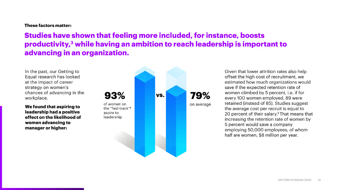
The slide features a column chart comparing the aspirations of women on the "fast-track" to leadership against the average, with text explaining the economic benefits of reducing attrition rates.
Market Analysis and Trends
Professional Services
It emphasizes the importance of feeling included and aspiring to leadership for productivity and advancement, showing how increasing women's retention rates can lead to significant cost savings.
inclusion, leadership ambition, retention, productivity, cost savings
Mixed Chart
Accenture
Saved
This slide includes a combination of column charts and text. The charts show numerical growth in private equity and use shades of blue for visual distinction. The layout is evenly spaced with clear headers.
Investment Analysis
Financial Services
The slide outlines a strategic approach to private equity coverage, highlighting significant opportunities, middle market potential, and the company's capabilities to capture these opportunities. It provides numerical data to support the potential for growth and strategic direction.
Private equity, investment banking, market potential, capabilities
Mixed Chart
JP Morgan
Saved
This slide presents three strategic focus areas—Scale & Efficiency, Comprehensive Client Solutions, and Investing for the Future—each with icons and bullet points. The design is sleek with plenty of whitespace, balancing text and visual elements such as icons.
Strategic Planning
Financial Services
JPMorgan Chase's slide outlines its strategy for business and client growth, detailing operational efficiency through technology, client solution delivery, and investment for future needs. It could be used to communicate to stakeholders about ongoing and future strategic initiatives, emphasizing areas like ETFs, digital assets, and data solutions for sustaining and enhancing market presence.
Growth, Strategy, Efficiency, ETFs, Alternatives, Digital Assets, Data Solutions, Technology, Investment, Clients
Pillar
JP Morgan
Saved
Slide shows a simple, structured layout with a list of strategic goals and initiatives aimed at expanding Experian's market presence.
Strategic Planning
Financial Services
Discusses Experian's mission to expand and innovate within the consumer data space, detailing strategies for financial inclusion and market leadership enhancement.
Experian, market leadership, consumer data, financial inclusion, innovation
Pillar
Barclays
Saved
The slide uses a white background with two large, concentric pie charts contrasting shades of blue and green to depict changes over the years 2020 and 2021. Adjacent to the charts, explanatory text and percentages are provided in a clear, readable font. The layout is simple and focuses the viewer’s attention on the comparative data of the pie charts.
Market Analysis and Trends
Financial Services
The slide highlights the growing importance of innovation and increased budgets for it over the span of one year. It is likely to be used for demonstrating the trend towards innovation in business strategy, showing a substantial percentage increase in companies prioritizing innovation and allocating budgets accordingly. This slide could serve as a tool for convincing stakeholders of the necessity of increased investment in innovation.
innovation importance, budgets, business strategy, trends, year-over-year increase
Multiple Chart
BCG
Saved
Image of the Taj Mahal with accompanying text about India's UPI system, and a line chart showing the exponential growth of UPI transactions.
Market Analysis and Trends
Financial Services
Highlights the growth of UPI in India, showing its increasing use and impact on the payment landscape, with a focus on transaction volumes and values.
India, UPI, payments, growth, transactions, exponential, financial, services, system
Mixed Chart
PwC/Strategy&
Saved
Features a circular diagram with segments highlighting various factors affecting IPO candidates.
Strategic Planning
Financial Services
The slide identifies key factors like market volatility, regulatory changes, and geopolitical tensions that IPO candidates should consider.
IPO candidates, market volatility, regulatory changes, geopolitical tensions, strategic planning
Diagram
EY
Saved
Features bar graphs showing the percentage of metaverse-related tech usage in Southeast Asia by country and a side text explanation.
Market Analysis and Trends
Technology & Software
Analyzes the distribution of metaverse-related technologies across Southeast Asian countries, indicating regional market preferences.
Metaverse, AR, VR, Cryptocurrencies, NFTs, Market Distribution, Southeast Asia, Technology Usage
Multiple Chart
Bain
Saved
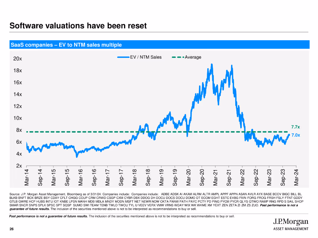
The slide shows a line chart of SaaS companies’ EV to NTM sales multiple from 2014 to 2024, with an average line for comparison.
Market Analysis and Trends
Technology & Software
Analyzes the trend of software valuations, showing the EV to NTM sales multiple for SaaS companies over a decade, indicating a reset in valuations to historical averages.
software, valuations, SaaS, EV, NTM sales, trend, line chart, market analysis
Single Chart
JP Morgan
Saved
Two column charts: one shows China's real GDP growth contributions by GDP growth and investment, and the other shows fixed asset investment by sector.
Market Analysis and Trends
Financial Services
This slide provides insights into the drivers of economic growth in China, highlighting contributions to GDP growth and sector-specific fixed asset investments. Used for market analysis and investment planning.
China, GDP, growth, investment, sectors
Multiple Chart
JP Morgan
Saved
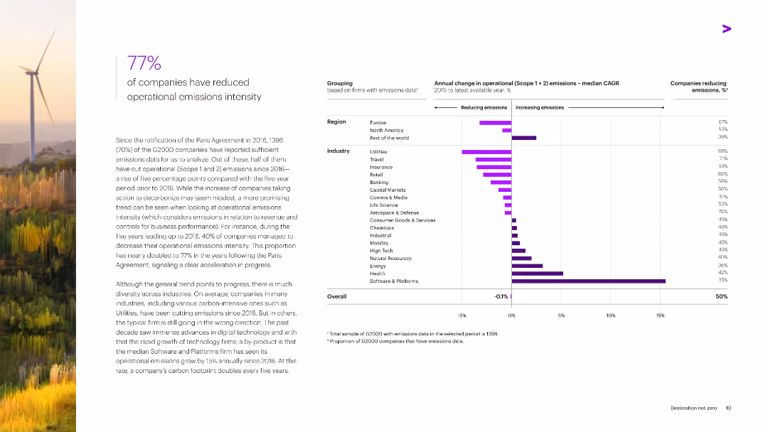
Features a combination of horizontal bar charts depicting annual changes in operational emissions intensity by region and industry from 2010 to the latest available year.
Operational Efficiency
Environmental Services & Sustainability
The slide highlights the reduction in operational emissions intensity by 77% of G2000 companies since the Paris Agreement, with industry and regional breakdowns of emissions changes.
Emissions, Reduction, Operational Efficiency, G2000, Paris Agreement
Mixed Chart
Accenture
Saved
The slide features a column chart detailing the energy consumption forecast for the energy sector by subsectors (power, heat) from 2018 to 2040 under a stated policies scenario. It highlights the cumulative growth of biomass in energy industries and contributions from different fuel types.
Market Analysis and Trends
Energy & Utilities
This slide forecasts energy consumption within the energy sector, emphasizing the role of bioenergies in decarbonizing and electrifying the sector, and projecting the contributions from biomass, fossil fuels, nuclear, and renewables by 2040.
energy sector, consumption forecast, subsectors, power, heat, biomass, fossil fuels, nuclear, renewables
Single Chart
Kearney
Saved
This slide features two column charts showing yearly comparisons, and text boxes with bullet points highlight key statistics. There is a balance of graphics and explanatory text.
Operational Efficiency
Financial Services
Illustrates growth in digital and debit transactions compared to cash and checks, emphasizing the increased use of digital banking capabilities by customers.
Digital Payments, Banking, Customer Engagement, Transaction Trends, Growth
Multiple Chart
JP Morgan
Saved
This slide displays a combination of a line graph and bar chart, detailing incremental cases and tests per day in Italy during the COVID-19 pandemic. Key dates and actions are annotated. It has a blue and black color scheme with text boxes for annotations.
Market Analysis and Trends
Healthcare & Pharmaceuticals
The slide presents data on COVID-19 case numbers and testing frequency in Italy, highlighting the timeline of government actions and their impact. It's useful for analyzing the effectiveness of policy measures in pandemic management.
Italy, COVID-19, Lockdown, Testing, Case Numbers
Single Chart
McKinsey
Saved
Features vertical bar (column) charts representing YoY expense changes, with labels for each category of change, and a side note panel.
Financial Performance
Financial Services
Analyzes year-over-year expense variations for Citi, useful for financial discussions focused on cost management and operational efficiency.
Expenses, Year-over-Year, Analysis, Column Charts, Transformation Investment, Business-led Investment, Citi, Operational Efficiency
Single Chart
Citigroup
Saved
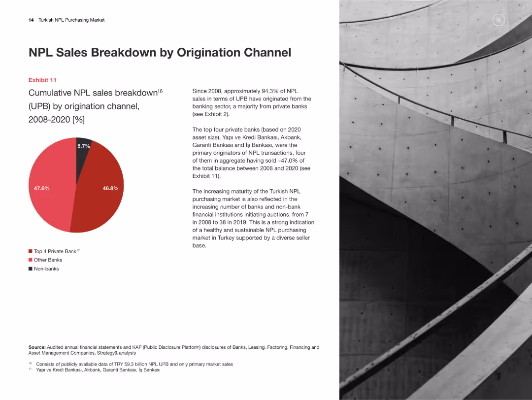
Pie chart showing the breakdown of NPL sales by origination channel (2008-2020). Text details channel contributions.
Market Analysis and Trends
Financial Services
This slide analyzes the breakdown of NPL sales by origination channel, indicating the major contributors and trends over the period.
NPL sales, origination channels, financial breakdown, market trends, Turkey
Mixed Chart
PwC/Strategy&
Saved
Previous
Next
If nothing, comes up, please save your slides first
Create a FREE account to continue browsing
Receive Instant Access to 1,000+ slides from companies like McKinsey, Google, and Goldman Sachs
First Name
Last Name
Email
Password
I agree to all
Terms & Privacy Policy
Thank you! Your submission has been received!
Oops! Something went wrong while submitting the form.
Have an account?
Sign in
Column Chart
Heatmap
Chevron
Org Chart
Infographic
Callouts
Timeline
List
Graphic
Picture
Process Flow
Diagram
Paragraph
Map
Table
Framework
Subtitle
Takeaway Box
Icon
Other Chart
Radar Chart
Waterfall Chart
Mekko Chart
Pie Chart
Scatter Plot
Line Chart
Bar chart
Bullet points