My Account
My Slides
Search by Category
Templates
Leave Feedback
Login
Logout
Get Started
Browse all Slides
Browse all Slides
Create a FREE Account
Instant access to 1,000+ real slides from top companies like McKinsey, BCG, Goldman Sachs, Google and many more!
First Name
Last Name
Email
Password
I agree to all
Terms & Privacy Policy
Thank you! Your submission has been received!
Oops! Something went wrong while submitting the form.
Have an account?
Sign in
Saved Slides
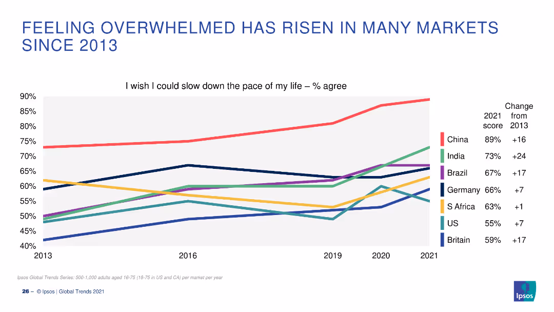
A line graph showing the percentage of people who wish they could slow down the pace of their lives, with data from 2013 to 2021 for several countries.
Market Analysis and Trends
Healthcare & Pharmaceuticals
The slide depicts the increasing trend of people feeling overwhelmed and wishing to slow down their lives in various markets from 2013 to 2021.
Overwhelmed, Life Pace, Trends, Markets, Countries
Single Chart
IPSOS
Saved
Similar to slide 1631, this one is structured with column charts, bar graphs, and a pie chart, showcasing media usage and service adoption rates in Thailand. It uses a color palette of blue and grey, with green highlighting the pie chart for emphasis.
Market Analysis and Trends
Technology & Software
This slide is a comparative analysis of digital consumer behavior in Thailand, detailing usage intent and media consumption. It reveals the adoption rates of digital services and the willingness to pay more for sustainable products and services, vital for understanding consumer priorities and market opportunities in Thailand.
digital consumers, Thailand, media usage, adoption rates, sustainability
Multiple Chart
Bain
Saved
This slide contains two graphical elements: a bar chart showing Eurozone GDP quarter growth and a line chart depicting the Eurocoin index. The design includes textual elements on a white background, with the charts situated centrally for focus.
Financial Performance
Financial Services
The slide provides a comparative analysis of Eurozone GDP growth and the Eurocoin index, highlighting economic performance by country. It's useful for discussions about economic policy or investment strategy in the region.
Eurozone, GDP Growth, Economic Performance, France, Spain, Germany, Italy, Comparative Analysis, Eurocoin Index
Multiple Chart
McKinsey
Saved
Complex visual with column charts tracking quarterly financial data such as income, costs, and profitability metrics, specifically focusing on return on tangible equity (RoTE).
Financial Performance
Financial Services
Highlights the financial performance of Barclays UK in Q423, emphasizing profitability and efficiency in various banking services.
financial performance, RoTE, Barclays, Q423, banking, profitability, costs, income
Multiple Chart
Barclays
Saved
A slide with a balanced mix of text and graphs, featuring a column chart with color differentiation to display market data. It is well-organized, facilitating a quick grasp of complex market performance data.
Financial Performance
Financial Services
The slide provides an analysis of fixed income markets performance with key highlights and market review. It serves to convey critical market trends and data, likely to inform investment decisions or economic forecasts.
Performance, Review, Markets, Data
Multiple Chart
Morgan Stanley
Saved
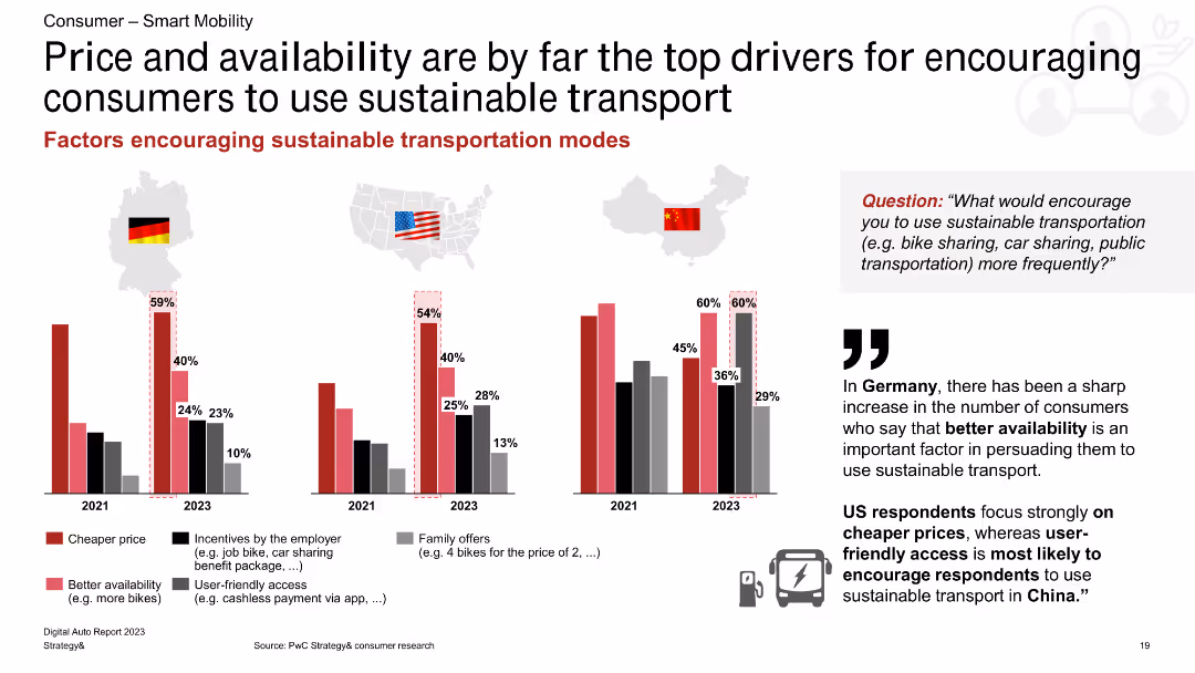
This slide features a column chart showing factors that encourage the use of sustainable transport in Germany, the US, and China, with percentage bars for each factor.
Market Analysis and Trends
Transportation & Logistics
The slide identifies price and availability as the main drivers for encouraging the use of sustainable transport, with regional variations in other motivating factors such as employer incentives and family offers.
sustainable transport, price, availability, incentives, Germany, US, China, consumer behavior, transportation trends
Multiple Chart
PwC/Strategy&
Saved
The slide features a column chart listing financial metrics over three years (2021-2023), such as income, cost, and return on equity.
Financial Performance
Financial Services
Highlights Barclays' financial performance over three years, focusing on metrics like income, costs, and profitability, useful for financial analysis.
performance, financial, metrics, analysis, costs
Multiple Chart
Barclays
Saved
The slide features a list of sectors with rank, three bar graphs representing sub-sectors for 2017-19 and 2020-22 averages, and a pie chart indicating a 20% gap in the global IB industry wallet.
Market Analysis and Trends
Financial Services
Demonstrates sector leadership and growth in priority sub-sectors, highlighting opportunities where there are gaps.
Leadership, Growth, Sub-Sectors, Market Share, Wallet, Energy, Fintech, Retail
Multiple Chart
JP Morgan
Saved
The slide shows two horizontal bar charts comparing how CFOs spend their time on different objectives and in practice, split between formal and informal settings. It also includes a quote from a private equity investor.
Financial Performance
Financial Services
Details the allocation of CFOs' time across various functions, emphasizing differences between formal and informal practices. Highlights the importance of flexibility and adaptability in CFO roles, supported by a quote from a private equity investor discussing the need for versatile financial leadership.
CFO, Time Allocation, Financial Management, Leadership, Priorities
Mixed Chart
Deloitte
Saved
Scatter plot and table comparing return, risk, and ratios of international stock categories.
Investment Analysis
Financial Services
Compares small cap and emerging market stocks, useful for assessing risk and diversification.
Small Cap Stocks, Emerging Markets, Risk Assessment, Diversification, Returns, Data Table, Scatter Plot, Morgan Stanley, Market Monitor
Single Chart
Morgan Stanley
Saved
A column chart comparing the use of various crypto trading platforms in 2023 and 2022, with an additional column chart for 2023 platforms usage not listed in 2022.
Market Analysis and Trends
Financial Services
This slide presents the usage rates of different crypto trading platforms in 2023 compared to 2022, highlighting significant changes and trends in user preferences.
Crypto, trading, platforms, 2023, 2022, comparison
Multiple Chart
IPSOS
Saved
Column charts displaying total TLAC, CET1 capital, and leverage ratios
Financial Performance
Financial Services
Shows capital and leverage ratios, including CET1 capital ratio guidance and leverage ratio guidance
TLAC, CET1, leverage, ratios, capital
Multiple Chart
UBS
Saved
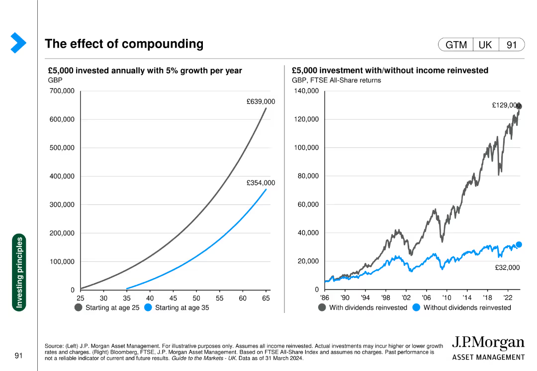
Two charts: a line chart showing investment growth over time and a bar chart comparing returns with/without reinvestment.
Investment Analysis
Financial Services
Illustrates the impact of starting investments early and the benefit of reinvesting income on total returns.
Compounding, investment, growth, reinvestment, returns
Multiple Chart
JP Morgan
Saved
Consists of three pie charts showing the percentage of new Internet economy consumers, their retention post-COVID-19, and changes in online hours spent, respectively, set against a white background.
Market Analysis and Trends
Technology & Software
The slide shows the surge in Vietnam's digital consumer base during COVID-19, the retention rates of digital services post-pandemic, and the increase in average hours spent online.
Digital Consumers, Growth, Vietnam, COVID-19, Retention
Multiple Chart
Bain
Saved
This slide features a pie chart on the left illustrating home lending portfolio by CLTV, a list in the center detailing major markets with forecasted declines, and bar graphs on the right showing NCO estimates for 2024-2025. The design is simple with color coding for easy interpretation.
Risk Assessment and Management
Financial Services
Showcasing the robustness of the Home Lending portfolio, this slide compares current equity and quality levels with anticipated market trends and stress scenarios. It's aimed at providing stakeholders with confidence in the stability and foresight of the company's lending strategies.
Home lending, Portfolio strength, Market trends, Stress scenarios, CLTV, NCO estimates, Equity
Multiple Chart
JP Morgan
Saved
The slide features an elegant design with a bar chart and professional imagery of a business setting. It compares satisfaction levels within an organization concerning various risk management activities, highlighting differences between more capable and less capable groups.
Strategic Planning
Professional Services
This slide explores the effectiveness of risk management practices across different organizational levels. It contrasts the satisfaction rates between groups with varying capabilities, underscoring the strategic benefits of comprehensive risk management training and integration within business processes. This comparison serves to motivate improvements in company-wide risk awareness and proactive management strategies.
risk management, empowerment, organizational levels, satisfaction rates, training, strategic benefits
Mixed Chart
Accenture
Saved
The slide is visually balanced, featuring a customer journey flowchart on the left and two sets of bulleted lists on the right describing commerce experiences and core capabilities.
Strategic Planning
Financial Services
Discusses strategies for engaging customers through commerce, with a focus on providing end-to-end customer experiences and driving merchant value.
customer journey, commerce, engagement, experiences, capabilities, value creation, financial strategy
Diagram
JP Morgan
Saved
Comparative scatter plots examining the relationship between lockdown speed, strictness, and the length of the COVID-19 outbreak.
Risk Assessment and Management
Government & Public Sector
Evaluates the effectiveness of early and strict lockdown measures in controlling the COVID-19 outbreak.
Lockdown Effectiveness, COVID-19, Outbreak Control, Government Policy
Multiple Chart
BCG
Saved
The slide includes a line chart depicting the trend in capital importation from 2015 to Q3 2023, with separate lines for capital importation, FPI, and FDI. Below the chart are key insights and outlooks regarding the cautious investment outlook for 2024.
Investment Analysis
Financial Services
The slide discusses the cautious investment outlook for 2024, emphasizing the impact of ongoing fiscal and monetary reforms. It provides a historical perspective on capital importation trends and forecasts future investment scenarios.
investment outlook, capital importation, fiscal reforms, monetary reforms, investment trends
Mixed Chart
PwC/Strategy&
Saved
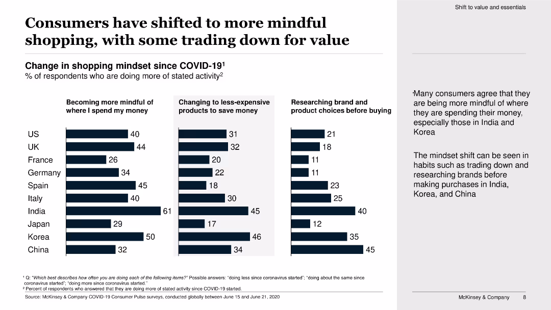
The slide contains three vertical bar charts showing the percentage of respondents becoming more mindful of spending, changing to less-expensive products, and researching before buying.
Market Analysis and Trends
Retail & E-commerce
The slide shows changes in consumer shopping mindsets since COVID-19, highlighting an increase in mindful spending, trading down for value, and product research.
mindful shopping, trading down, value, COVID-19, bar chart, consumer behavior, spending, research, products, survey
Multiple Chart
McKinsey
Saved
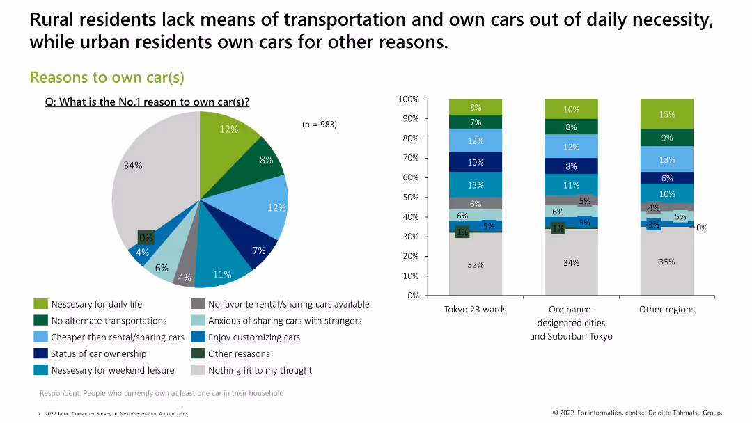
Contains a pie chart and three column charts showing various reasons people own cars, categorized by region.
Market Analysis and Trends
Consumer Goods
The slide highlights the primary reasons for car ownership, such as daily necessity, lack of alternative transportation, and personal preferences.
car ownership reasons, necessity, transportation, preferences
Multiple Chart
Deloitte
Saved
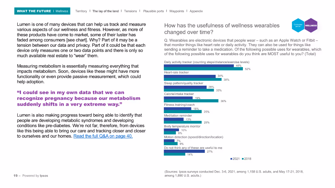
The slide includes a header, a background image, and two main sections: a text block on the left and a column chart on the right. The column chart compares the perceived usefulness of various wellness wearable features from 2018 and 2021, with a focus on features like activity tracking and heart rate monitoring.
Product and Service Analysis
Healthcare & Pharmaceuticals
Discusses the evolution and adoption of wellness wearables, highlighting their increasing functionality and the balance between data privacy and usefulness. The column chart illustrates changes in the perceived usefulness of wellness wearables over time, focusing on features such as activity tracking and heart rate monitoring.
Wellness, wearables, activity tracking, heart rate, survey
Mixed Chart
IPSOS
Saved
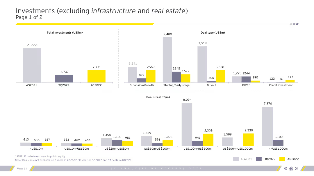
The slide features multiple column charts displaying total investments, deal types, and deal sizes for various quarters. The charts are color-coded to represent different time periods.
Market Analysis and Trends
Financial Services
This slide focuses on investments excluding infrastructure and real estate, showing detailed breakdowns by deal type and size, aiding in understanding specific investment trends.
Investments, deal types, deal sizes, quarterly data
Multiple Chart
EY
Saved
The slide is dense with a mix of column charts and a data table. On the left, a table lists financial metrics with percentages. On the right, a column chart compares the efficiency ratio between 2023 and 2022, below which is a bullet point list of expense highlights.
Financial Performance
Financial Services
The slide presents a detailed financial analysis of quarterly expenses including compensation, transaction fees, and various operational costs, contrasted against previous quarters and years. An efficiency ratio graph highlights improvements in operational costs. This slide could be used in a financial review meeting to discuss cost management strategies and efficiency gains.
Expenses, Financial, Analysis, Efficiency, Cost Management, Operational, Quarterly, Comparison
Mixed Chart
Goldman Sachs
Saved
The slide features a comparative analysis with column charts illustrating refueling speed, space requirements, and investment costs for petrol, H2 station, and electric fast charger.
Operational Efficiency
Energy & Utilities
The slide compares hydrogen refueling with petrol and electric fast chargers in terms of refueling speed, space requirements, and investment costs, highlighting efficiency benefits.
hydrogen, refueling, space, investment, efficiency
Multiple Chart
Kearney
Saved
Previous
Next
If nothing, comes up, please save your slides first
Create a FREE account to continue browsing
Receive Instant Access to 1,000+ slides from companies like McKinsey, Google, and Goldman Sachs
First Name
Last Name
Email
Password
I agree to all
Terms & Privacy Policy
Thank you! Your submission has been received!
Oops! Something went wrong while submitting the form.
Have an account?
Sign in
Column Chart
Heatmap
Chevron
Org Chart
Infographic
Callouts
Timeline
List
Graphic
Picture
Process Flow
Diagram
Paragraph
Map
Table
Framework
Subtitle
Takeaway Box
Icon
Other Chart
Radar Chart
Waterfall Chart
Mekko Chart
Pie Chart
Scatter Plot
Line Chart
Bar chart
Bullet points