My Account
My Slides
Search by Category
Templates
Leave Feedback
Login
Logout
Get Started
Browse all Slides
Browse all Slides
Create a FREE Account
Instant access to 1,000+ real slides from top companies like McKinsey, BCG, Goldman Sachs, Google and many more!
First Name
Last Name
Email
Password
I agree to all
Terms & Privacy Policy
Thank you! Your submission has been received!
Oops! Something went wrong while submitting the form.
Have an account?
Sign in
Saved Slides
Column chart showing asset classes considered for tokenization, alongside a circular diagram detailing motivations for tokenizing assets. Highlights the interest in public funds, private funds, and real estate.
Market Analysis and Trends
Financial Services
Examines the interest in tokenizing various asset classes among institutions, with motivations including increased liquidity, operational efficiencies, and access to new investors and capital.
tokenization, asset classes, institutions, motivations, liquidity
Mixed Chart
EY
Saved
Pie chart and descriptive statistics compare subsector growth rates with and without FGA acquisitions. It uses blue tones and is paired with detailed text explanations.
Market Analysis and Trends
Technology & Software
Comparing subsector growth rates in the presence and absence of FGA acquisitions, this slide provides insights into FGA's market influence, ideal for market segment analysis.
FGA, Subsectors, M&A, Growth Rates, Market Analysis
Mixed Chart
Oliver Wyman
Saved
The slide includes a list of bullet points and two side-by-side data tables comparing financial statistics from two different periods. It's well-structured with a focus on financial data presentation.
Financial Performance
Financial Services
This slide's content offers a detailed view of the company's financial position, showcasing improvements and dividends. It's used for discussing financial health and strategies with stakeholders.
balance sheet, financials, dividends, net cash, assets, liabilities, mining
Table
Morgan Stanley
Saved
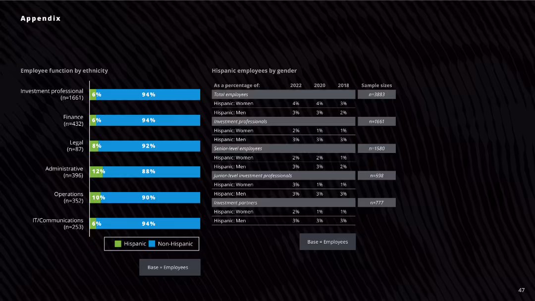
The slide features two column charts displaying the percentage distribution of employees by ethnicity and gender across various functions. The layout is visually dense, with a dark background and blue and green bars.
Human Resources and Talent Management
Professional Services
The slide presents the breakdown of employees by ethnicity and gender across different job functions in a company. It highlights the percentage of Hispanic and non-Hispanic employees and the distribution of Hispanic employees by gender from 2018 to 2022.
ethnicity, gender, employee distribution, column chart, job functions, Hispanic, non-Hispanic, professional services, HR
Mixed Chart
Deloitte
Saved
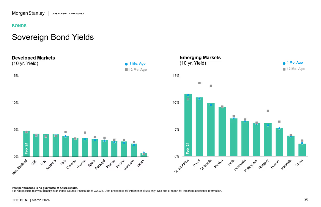
Two column charts comparing 10-year yields of developed and emerging markets over the past month and year, highlighting yield changes and comparisons.
Financial Performance
Financial Services
The slide provides a comparison of sovereign bond yields between developed and emerging markets, showing recent and year-on-year changes, useful for yield analysis and investment decisions.
Sovereign Bonds, Yields, Developed Markets, Emerging Markets, Investment Analysis, Trends
Multiple Chart
Morgan Stanley
Saved
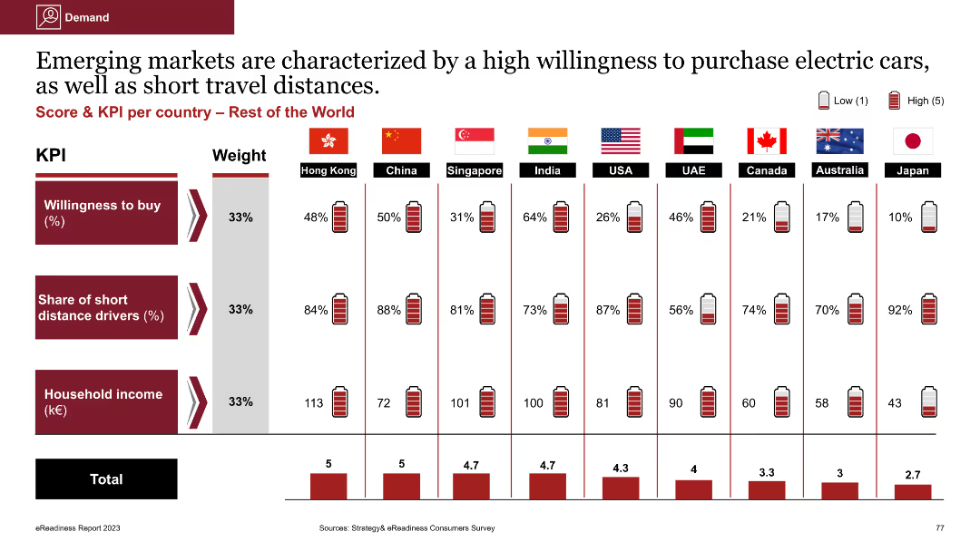
Column chart comparing willingness to buy EVs, share of short distance drivers, and household income across countries
Market Analysis and Trends
Energy & Utilities
The slide emphasizes the high willingness to purchase EVs in emerging markets, showing comparisons of willingness to buy, short travel distances, and household income across various countries
EV purchase, willingness to buy, short distance drivers, household income, emerging markets
Multiple Chart
PwC/Strategy&
Saved
The slide includes multiple column charts comparing projected GDP levels for several countries.
Strategic Planning
Financial Services
Focuses on the projected GDP growth post-COVID-19, with comparative data for countries like the US, Europe, and China, highlighting economic recovery timelines.
GDP, economic recovery, projections, data
Multiple Chart
BCG
Saved
Tables and color-coded data blocks comparing various metrics.
Financial Performance
Financial Services
Provides a comparative analysis of the global economic impact due to the pandemic, including GDP forecasts, stock market performance, and consumer activity.
economic, impact, GDP, market, pandemic
Mixed Chart
BCG
Saved
Two graphs displaying cost trends for space technologies over time, using a simple yet effective visual representation on a dark background.
Market Analysis and Trends
Technology & Software
Explains the reduction in costs for space technology and its implications for industry use cases, with a focus on economic accessibility.
space technology, cost trends, LEO, GEO satellites, data accessibility
Multiple Chart
McKinsey
Saved
Slide with comparative column chart showing corporate income tax rates across ASEAN countries. Professional layout with a focus on clear data presentation.
Regulatory and Compliance
Financial Services
Discusses the changes in corporate income tax in the Philippines and compares it with other ASEAN countries, relevant for financial analysis.
Taxation, ASEAN, Philippines, corporate tax, comparative analysis
Mixed Chart
Deloitte
Saved
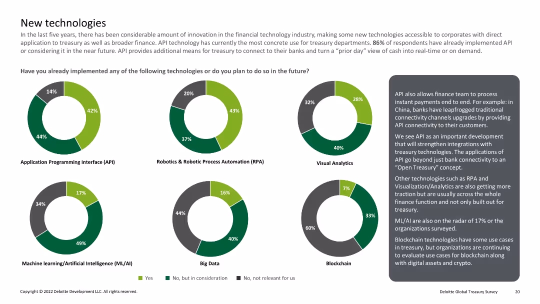
Multiple pie charts showing implementation of technologies like API, RPA, visual analytics, ML/AI, big data, and blockchain
Technology and Digital Transformation
Financial Services
Reviews the implementation of emerging technologies in treasury departments, including APIs, RPA, and blockchain.
New technology, API, RPA, ML/AI, blockchain
Multiple Chart
Deloitte
Saved
A slide showing three circular diagrams representing different times and their associated data points.
Market Analysis and Trends
Technology & Software
Shows the increase in time spent online by consumers before, during, and after lockdowns, providing a comparison.
online behavior, lockdown, time spent, comparison, consumers
Multiple Chart
Bain
Saved
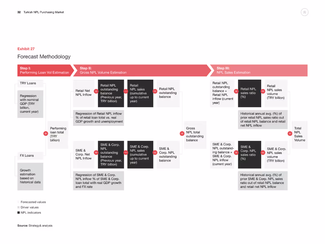
The slide has a flowchart showing the methodology for forecasting NPL volumes, broken down into three steps: loan volume estimation, NPL volume estimation, and NPL sales estimation.
Strategic Planning
Financial Services
This slide explains the methodology for forecasting NPL volumes in Turkey, detailing the steps involved in estimating performing loan volumes, gross NPL volumes, and NPL sales volumes.
forecast, methodology, NPL, estimation, flowchart
Linear Flow
PwC/Strategy&
Saved
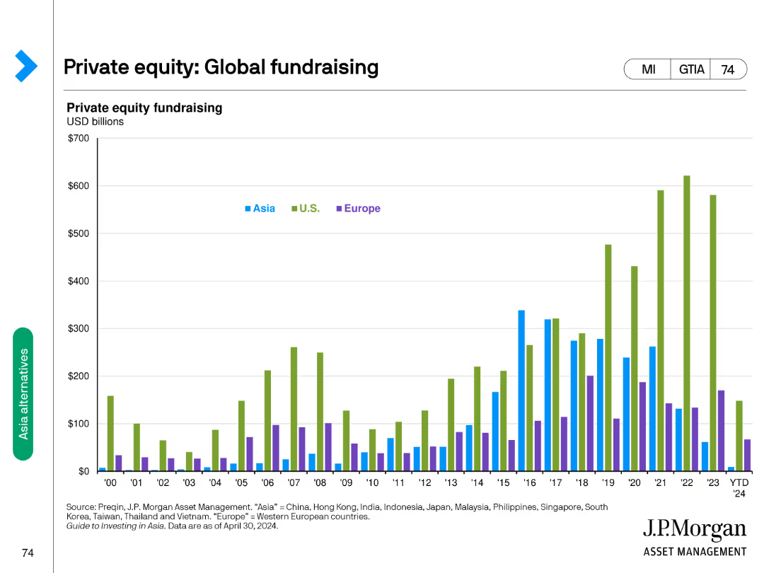
Features a column chart comparing private equity fundraising amounts in USD billions across Asia, U.S., and Europe from 2000 to 2024.
Investment Analysis
Financial Services
Tracks private equity fundraising trends globally, comparing contributions from Asia, U.S., and Europe over a period of 24 years.
private equity, fundraising, global, trends, comparison
Single Chart
JP Morgan
Saved
Includes a stacked chart displaying the levelized cost of hydrogen production over time, comparing different methods.
Financial Performance
Energy & Utilities
Analyzes how incentives impact the cost-effectiveness of hydrogen production methods, useful for financial planning in energy markets.
hydrogen production, cost analysis, incentives, energy market, financial planning, green energy
Multiple Chart
BCG
Saved
Contains column charts, pie charts, bar graph overlay.
Market Analysis and Trends
Retail & E-commerce
Discusses growth in luxury goods retail, market trends.
luxury, retail, growth, 2019, Asia
Multiple Chart
Bain
Saved
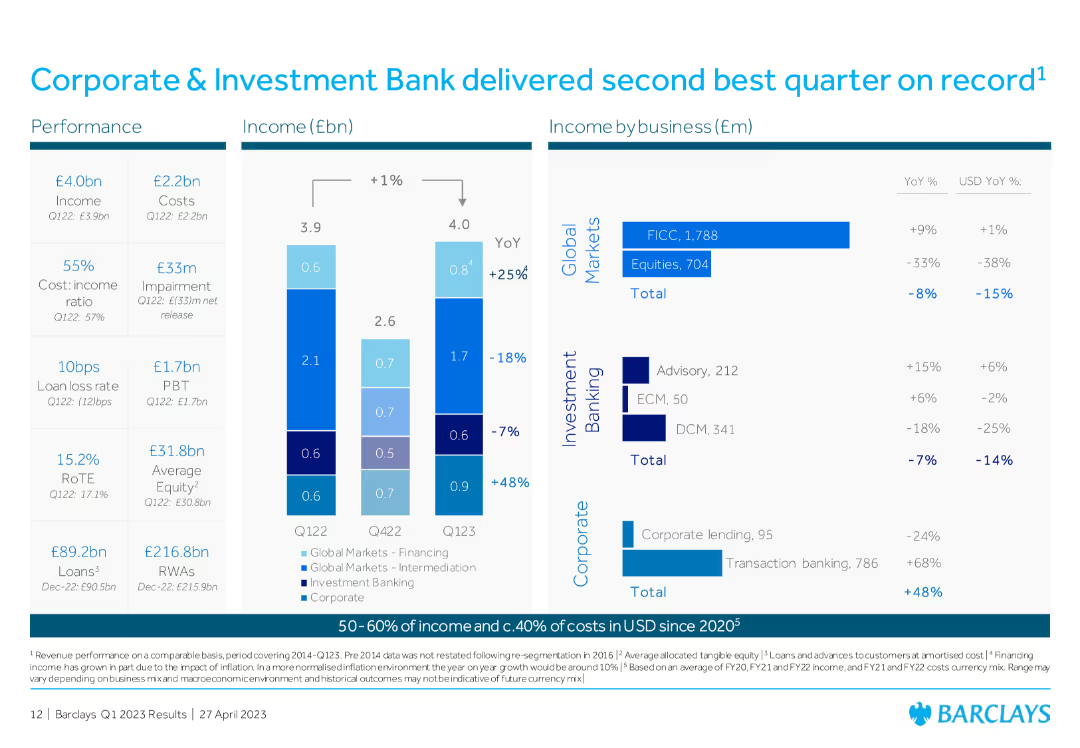
Column chart showing income and costs, with detailed breakdowns by business (Global Markets, Investment Banking, Corporate), including YoY percentage changes.
Financial Performance
Financial Services
The slide showcases the Corporate & Investment Bank's performance, highlighting the second-best quarter on record with detailed financial breakdowns by business sector.
Corporate Investment Bank, financial performance, Global Markets, Investment Banking, quarterly results
Multiple Chart
Barclays
Saved
The slide features a bar chart comparing various research methods (tracking, focus groups, strategic, positioning, copy testing) used by winners, finalists, and those with no award. Bars are vertically oriented.
Market Analysis and Trends
Media & Entertainment
This slide highlights the importance of research methods like tracking and focus groups, showing their prevalence among award winners compared to finalists and non-award recipients.
research methods, tracking, focus groups, bar chart, award winners
Single Chart
IPSOS
Saved
The slide contains a column chart showing changes in CCB revenue from 2012 to 2022 with different factors labeled.
Financial Performance
Financial Services
It presents a decade-long financial trend analysis of the Consumer and Community Banking revenue, including net interest income forecasts.
CCB, revenue, net interest, forecast, financial trend, 2012-2022, JPMorgan Chase & Co, banking
Single Chart
JP Morgan
Saved
A data-rich slide featuring graphs of central bank policy rates and market expectations for future central bank rates.
Risk Assessment and Management
Financial Services
The slide examines monetary policy by illustrating current and historical central bank policy rates and future market expectations.
monetary policy, central bank, market expectations, data-driven, policy rates
Multiple Chart
Morgan Stanley
Saved
Features a set of horizontal bar graphs displaying GDP forecast levels for multiple countries (US, Europe, China, Japan, India) from 2019 to 2021. Each country's forecast is color-coded, and the slide uses a minimalist design to focus on the comparison of economic projections.
Strategic Planning
Financial Services
Predicts the GDP levels for several large economies, comparing projected recoveries to 2019 levels. It highlights the economic resilience and expected recovery timeline, providing a visual comparison of pre and post-COVID economic forecasts.
GDP, economic recovery, 2021, forecast, COVID-19, countries, comparison
Single Chart
BCG
Saved
This slide features multiple column charts comparing global and Hong Kong trade show revenues from 2022 to 2027. It includes detailed annotations and percentage figures for annual growth and CAGR. The slide is designed with a clear separation between the charts and descriptive texts, which provide additional context on market trends and the impact of lifted quarantine measures.
Market Analysis and Trends
Media & Entertainment
Analyzes the growth of trade show revenues in Hong Kong, comparing it to global rates and detailing the factors influencing these trends, such as COVID-19 impacts and policy changes. This is particularly useful for understanding regional market dynamics within the global context.
Hong Kong, global comparison, trade shows, revenue growth, CAGR, market trends, COVID-19
Multiple Chart
PwC/Strategy&
Saved
This slide features a comparative layout with percentage data across various Southeast Asian countries, highlighting the use of business messaging. It uses a mix of text, rectangular elements for data representation, and an image of a woman using her phone, likely to represent the practical use of business messaging. The design is modern and clean with a balance between visual elements and informational content.
Market Analysis and Trends
Retail & E-commerce
The slide presents statistics on business messaging use in Southeast Asia, comparing it by country. It includes a key message about the challenges of integration and automation in business messaging for large organizations and reasons for using business messaging, emphasizing convenience and communication.
Business Messaging, Southeast Asia, Market Comparison, Communication Trends, Automation Challenges, Convenience, Integration, Usage Statistics, Digital Interaction
Boxed
Bain
Saved
Features a column chart comparing the economic impact of tourism in Europe's top countries versus the rest of Europe.
Financial Performance
Hospitality & Tourism
Provides a financial analysis of tourism's economic impact in Europe, focusing on the contribution of key countries.
European tourism, Economic impact, Financial analysis, Germany, Spain, UK, Italy, France
Multiple Chart
Bain
Saved
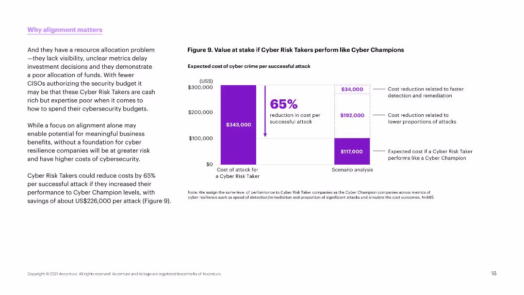
The slide features a column chart on the right side showing the value at stake if cyber risk takers perform like cyber champions. The left side contains detailed explanatory text.
Risk Assessment and Management
Technology & Software
This slide presents a cost analysis, showing a potential 65% reduction in cyber crime costs if cyber risk takers improved their performance to match cyber champions.
Cyber risk, cost reduction, performance, cyber crime, budget, resilience, security, alignment, business
Mixed Chart
Accenture
Saved
Previous
Next
If nothing, comes up, please save your slides first
Create a FREE account to continue browsing
Receive Instant Access to 1,000+ slides from companies like McKinsey, Google, and Goldman Sachs
First Name
Last Name
Email
Password
I agree to all
Terms & Privacy Policy
Thank you! Your submission has been received!
Oops! Something went wrong while submitting the form.
Have an account?
Sign in
Column Chart
Heatmap
Chevron
Org Chart
Infographic
Callouts
Timeline
List
Graphic
Picture
Process Flow
Diagram
Paragraph
Map
Table
Framework
Subtitle
Takeaway Box
Icon
Other Chart
Radar Chart
Waterfall Chart
Mekko Chart
Pie Chart
Scatter Plot
Line Chart
Bar chart
Bullet points