My Account
My Slides
Search by Category
Templates
Leave Feedback
Login
Logout
Get Started
Browse all Slides
Browse all Slides
Create a FREE Account
Instant access to 1,000+ real slides from top companies like McKinsey, BCG, Goldman Sachs, Google and many more!
First Name
Last Name
Email
Password
I agree to all
Terms & Privacy Policy
Thank you! Your submission has been received!
Oops! Something went wrong while submitting the form.
Have an account?
Sign in
Saved Slides
This slide features a horizontal bar chart comparing the capital costs of various renewable and conventional energy technologies.
Financial Performance
Energy & Utilities
The slide provides a comparative analysis of the capital costs required for different energy technologies, offering insights into the financial requirements and economic feasibility of energy projects.
Capital Costs, Energy Technologies, Financial Analysis, LCOE, Comparison
Single Chart
Roland Berger
Saved
This slide features a column chart and a table detailing the breakdown of survey respondents by country, focusing on European countries and a global control set. The layout is structured and uses colors to differentiate between regions.
Market Analysis and Trends
Professional Services
Details the distribution of survey respondents across multiple countries, with specific emphasis on European nations. Useful for analyzing demographic trends and the geographic distribution of survey participation.
survey respondents, demographics, global control, Europe
Single Chart
PwC/Strategy&
Saved
Diagram explaining a holistic approach to managing financial crime, using four icons linked by arrows to represent different areas of focus: anti-bribery, anti-money laundering, anti-tax evasion, and sanctions.
Regulatory and Compliance
Financial Services
The slide describes Barclays' integrated strategy for financial crime prevention, emphasizing the synergy between different compliance areas and highlighting the supporting global finance function.
compliance, financial crime, anti-bribery, AML
Diagram
Barclays
Saved
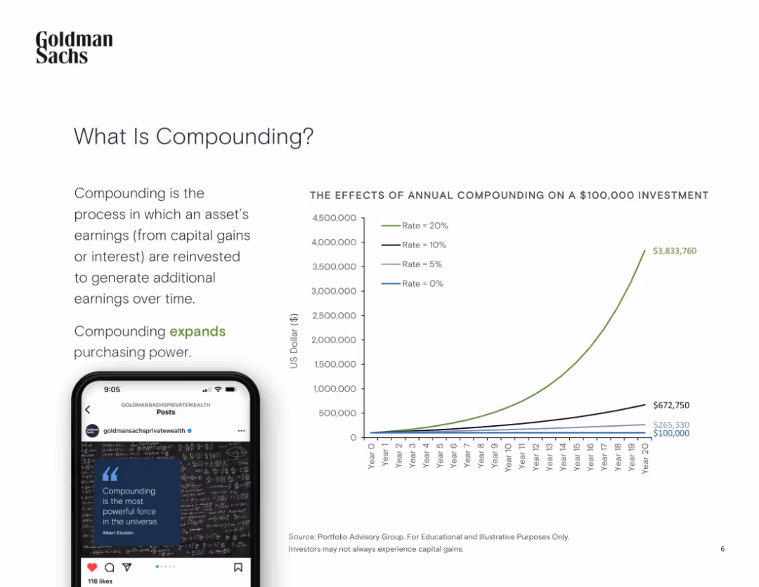
Left-aligned explanation with graph and a smartphone illustration
Organizational Structure and Change
Financial Services
The slide defines compounding and illustrates its exponential effect on investment growth through different annual return scenarios on a $100,000 investment.
Compounding, Investment, Growth, Earnings, Interest, Power
Mixed Chart
Goldman Sachs
Saved
Two pie charts comparing percentages. One for 'Some of the Time' at 57.5% and another for 'All the Time' at 48.7%. Each pie chart is half and half styled, with symbols representing office buildings and a house respectively.
Customer and Market Segmentation
Professional Services
The slide shows the distribution of marketing professionals working remotely, either part-time or full-time, as surveyed in September 2022. It highlights the significant portion of the workforce that operates from home, showing a major shift in work environments.
Remote Work, Marketing, Telecommuting, Survey, Pie Chart, Workforce Distribution, 2022
Multiple Chart
Deloitte
Saved
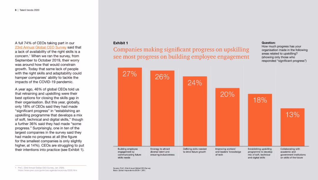
Features a column chart illustrating the correlation between progress in upskilling and improvements in employee engagement, with different percentages for various engagement strategies.
Human Resources and Talent Management
Professional Services
This slide highlights the relationship between significant progress in upskilling programs and the corresponding improvements in employee engagement, showing data from a CEO survey.
upskilling, employee engagement, progress, CEOs, survey
Mixed Chart
PwC/Strategy&
Saved
Column chart showing agreement and disagreement percentages on the belief that all diseases will be curable across countries.
Market Analysis and Trends
Healthcare & Pharmaceuticals
The slide examines the belief in the future curability of all medical conditions, with significant variation across countries.
medical advancements, future expectations, public opinion, global health, curability
Multiple Chart
IPSOS
Saved
The slide presents four numbered strategic imperatives with icons, each on differently colored banners (blue, light blue, red, and green). The layout is clean and uses large, bold fonts for emphasis.
Strategic Planning
Financial Services
This slide outlines strategic imperatives focused on profitability, brand value, narrative about student lending, and capital allocation for shareholder value. Used for presenting core business strategies.
Strategy, Profitability, Brand Value, Capital Allocation, Shareholder Value
Pillar
Morgan Stanley
Saved
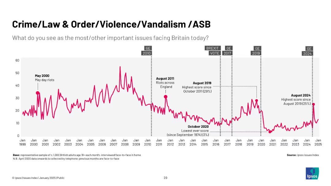
Line graph showing public concern trends in Britain (1999–2025) with event annotations (e.g. May Day riots, Brexit).
Market Analysis and Trends
Government & Public Sector
This slide shows the public’s concern over crime, law and order, violence, and anti-social behavior over time. Peaks in concern correlate with events such as riots or general elections. The data is sourced from Ipsos’ Issues Index.
crime, public concern, trends, riots, elections, Ipsos, ASB, UK, timeline
Single Chart
IPSOS
Saved
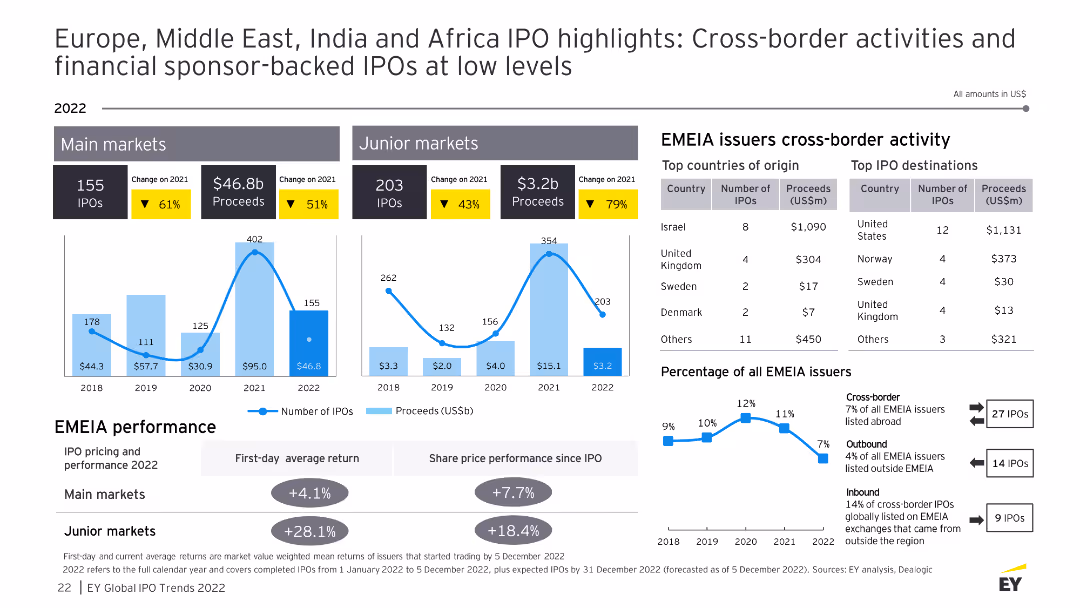
The slide features data visualizations and tables showing cross-border IPO activities in the EMEA region, including top countries of origin, top IPO destinations, and performance metrics.
Market Analysis and Trends
Financial Services
This slide details cross-border IPO activities in the EMEA region for 2022, providing insights into the top countries of origin and destinations for IPOs, as well as performance comparisons and percentage of total issuers.
EMEA, cross-border IPO, top countries, destinations
Multiple Chart
EY
Saved
Donut chart displaying 78% registration with the Office of the Information and Data Protection Commissioner.
Regulatory and Compliance
Professional Services
Assists in understanding compliance levels with data protection standards, crucial for regulatory and compliance discussions.
compliance, data protection, registration, standards, evaluation
Single Chart
PwC/Strategy&
Saved
Market Analysis and Trends
Financial Performance
Technology & Software
Slide includes a variety of column charts showing the projected growth of Indonesia's digital economy by sector. The color blue is predominantly used to highlight the future forecast.
This slide projects the robust growth of Indonesia's digital economy by 2025, focusing on the e-commerce sector despite broader macroeconomic challenges.
Multiple Chart
Bain
Saved
The slide includes a bar chart rating the impact of GenAI on various functions like client service, marketing, and compliance. Commentary at the bottom provides insights from different financial sectors.
Technology and Digital Transformation
Financial Services
This slide shows how Generative AI is expected to impact various business functions based on survey responses. It highlights significant changes anticipated in contact centers, client onboarding, and other areas.
GenAI, impact, business functions, client service, marketing, compliance, survey, financial services
Mixed Chart
EY
Saved
Icons detailing significant sustainability milestones and regional collaboration efforts within SEA nations.
Industry Overview
Government & Public Sector
Reviews recent sustainability progress and ongoing challenges in Southeast Asia, emphasizing the need for further efforts towards achieving Net Zero.
SEA, sustainability, government actions, regional collaboration, Net Zero
Header Vertical
Bain
Saved
The slide contains three charts: a line chart of long-term interest rates, a column chart of global and US M&A activity, and a line chart of exchange rates vs. USD. The layout is organized with a blue and white color scheme, clear labels, and legends.
Market Analysis and Trends
Financial Services
The slide examines how increased market volatility and a rapid global monetary policy tightening cycle impact the cost of capital, highlighting trends in interest rates, M&A activity, and exchange rates.
cost of capital, market volatility, monetary policy, interest rates
Multiple Chart
EY
Saved
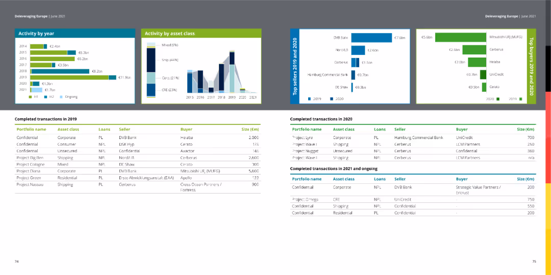
The slide shows column charts of activity by year and asset class, with tables listing completed transactions in 2019 and 2020.
Financial Performance
Financial Services
This slide details completed transactions in 2019, displaying activity by year and asset class in a financial context.
transactions, financial services, column chart, asset class, activity
Multiple Chart
Deloitte
Saved
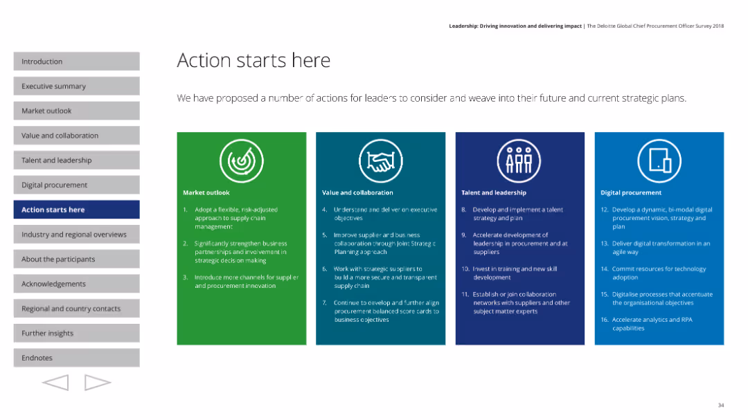
Features a structured layout with four distinct colored sections, each outlining strategic actions across different focus areas like market outlook and leadership.
Strategic Planning
Professional Services
Proposes strategic actions for leaders to integrate into their plans, covering market outlook, collaboration, leadership, and digital procurement.
Strategic actions, market outlook, collaboration, leadership
Pillar
Deloitte
Saved
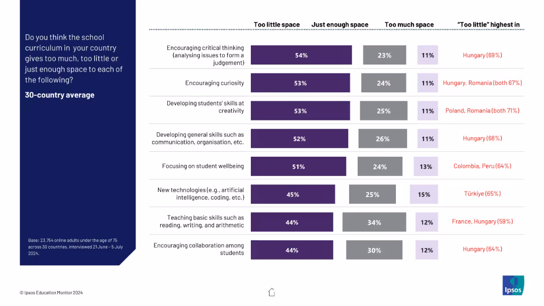
Stacked bar chart for each curriculum area, segmented by “Too little,” “Just enough,” and “Too much.” Highlights “Too little” leaders.
Product and Service Analysis
Education & Training
This slide captures public opinion on the sufficiency of space dedicated to various educational priorities in the curriculum. Most respondents feel areas like critical thinking, curiosity, and creativity receive too little attention.
curriculum content, critical thinking, skill development, public opinion, education design
Mixed Chart
IPSOS
Saved
A donut chart showing 91% of respondents have disciplinary procedures in place.
Strategic Planning
Professional Services
Useful for HR management to evaluate the adoption and effectiveness of disciplinary procedures within organizations.
HR, disciplinary procedures, evaluation, adoption, effectiveness
Single Chart
PwC/Strategy&
Saved
The slide features a bar chart on the left showing the share of global CO2 emissions by country and a column chart on the right showing global CO2 emissions per capita.
Market Analysis and Trends
Environmental Services & Sustainability
It presents the distribution of CO2 emissions by country and compares per capita emissions, offering insights into the global contributions to greenhouse gas emissions.
CO2 emissions, global warming, environmental impact, greenhouse gases, country comparison, per capita emissions, J.P. Morgan, climate data, sustainability, carbon footprint
Multiple Chart
JP Morgan
Saved
The slide presents a comparative column chart depicting the survival rates of US non-financial companies based on their resilience ratings.
Risk Assessment and Management
Financial Services
Demonstrates the survival disparity between companies with high resilience versus those with low resilience over a 19-year period.
Survival rate, Resilience, US companies, Comparative analysis
Single Chart
Bain
Saved
A simple yet informative matrix layout presents the investment positioning with icons indicating trends. Current views on asset classes are provided on the right, adding depth to the analysis.
Risk Assessment and Management
Financial Services
The slide showcases the credit team's current investment positions and outlook, useful for informing strategic asset allocation. It includes a matrix for comparative analysis of different investment classes, intended to guide portfolio adjustments.
Investment, Positioning, Credit, Risk
Table
Morgan Stanley
Saved
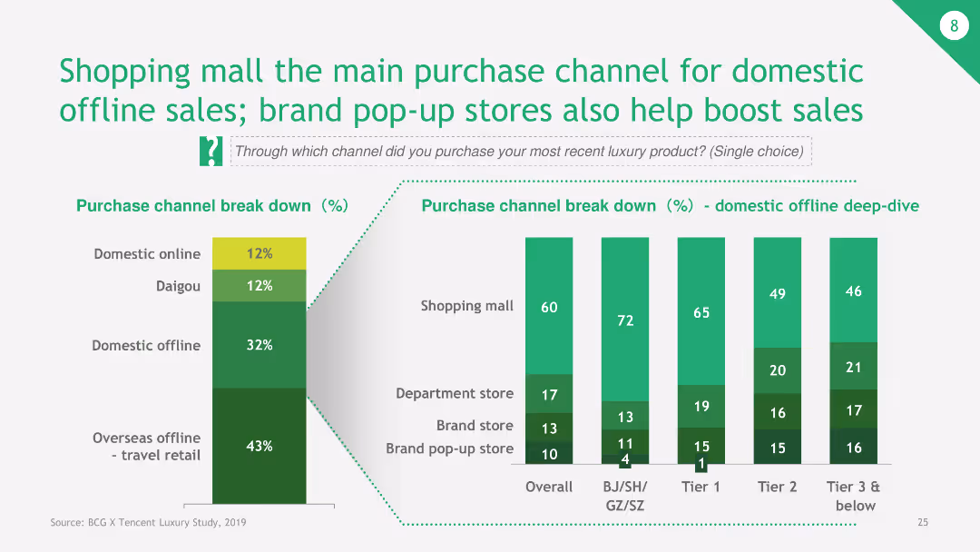
The slide features a combination of bar charts detailing the breakdown of purchase channels for luxury products, with a focus on shopping malls and pop-up stores for offline sales.
Sales and Business Development
Retail & E-commerce
The slide indicates that shopping malls are the primary purchase channels for domestic offline sales in luxury markets, with pop-up stores also contributing significantly. It shows the percentage breakdown for various purchase channels.
shopping mall, purchase channel, domestic offline sales, pop-up stores, luxury products
Multiple Chart
BCG
Saved
Complex flow chart that maps different pandemic phases like Flatten, Fight, and Future with economic implications, asking critical questions for each phase.
Strategic Planning
Financial Services
This slide serves to dissect the potential economic trajectories in response to pandemic phases, providing a strategic framework for assessing impacts.
pandemic response, economic impact, Flatten phase, Fight phase, Future phase, economic trajectories, strategic framework
Mixed Chart
BCG
Saved
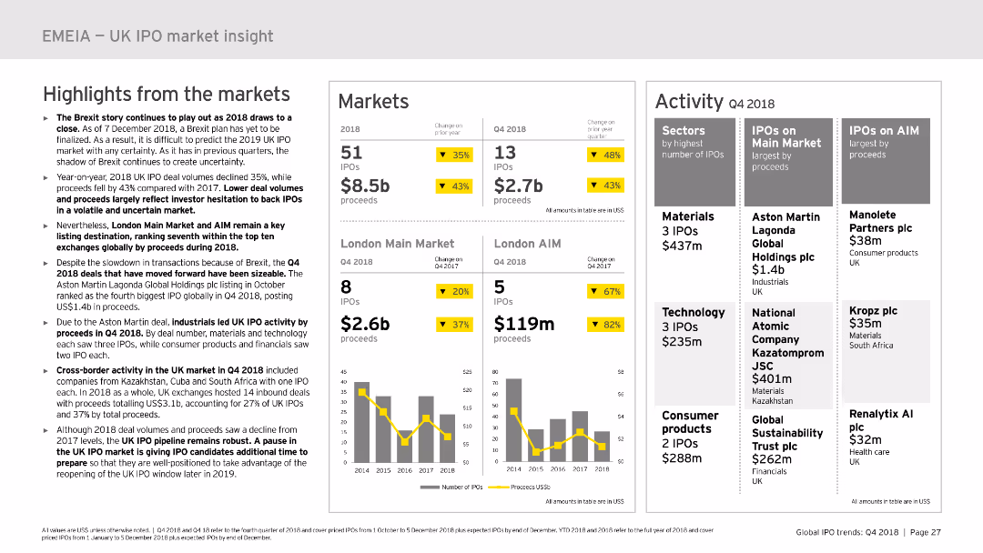
This slide includes multiple sections: highlights from the market, markets, and activity. It uses column charts and data tables to present IPO data and market performance in the UK. The layout is detailed, offering a clear and structured overview of the market insights.
Market Analysis and Trends
Financial Services
Provides insights into the UK IPO market in 2018, including market highlights, performance data, and activity details. Useful for market analysis and strategic planning in the financial sector.
UK, IPO, market insight, performance, trends
Multiple Chart
EY
Saved
Previous
Next
If nothing, comes up, please save your slides first
Create a FREE account to continue browsing
Receive Instant Access to 1,000+ slides from companies like McKinsey, Google, and Goldman Sachs
First Name
Last Name
Email
Password
I agree to all
Terms & Privacy Policy
Thank you! Your submission has been received!
Oops! Something went wrong while submitting the form.
Have an account?
Sign in
Column Chart
Heatmap
Chevron
Org Chart
Infographic
Callouts
Timeline
List
Graphic
Picture
Process Flow
Diagram
Paragraph
Map
Table
Framework
Subtitle
Takeaway Box
Icon
Other Chart
Radar Chart
Waterfall Chart
Mekko Chart
Pie Chart
Scatter Plot
Line Chart
Bar chart
Bullet points