My Account
My Slides
Search by Category
Templates
Leave Feedback
Login
Logout
Get Started
Browse all Slides
Browse all Slides
Create a FREE Account
Instant access to 1,000+ real slides from top companies like McKinsey, BCG, Goldman Sachs, Google and many more!
First Name
Last Name
Email
Password
I agree to all
Terms & Privacy Policy
Thank you! Your submission has been received!
Oops! Something went wrong while submitting the form.
Have an account?
Sign in
Saved Slides
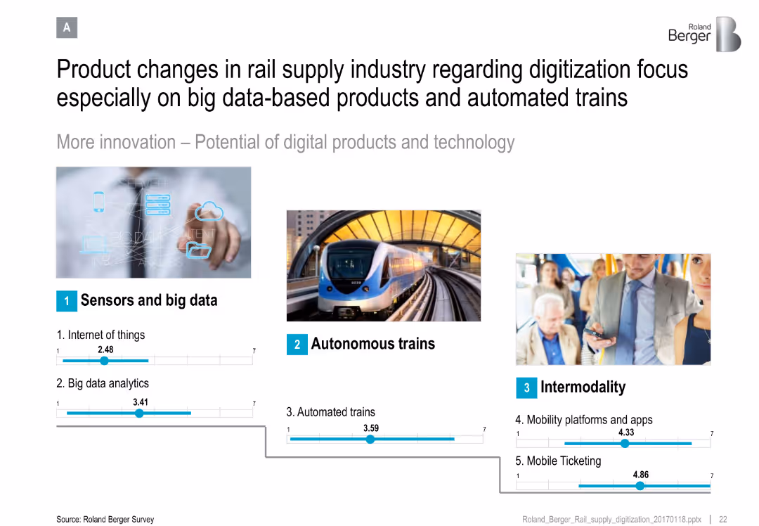
Three-column layout with images and blue icons; numeric sliders rate tech areas like IoT and ticketing
Technology and Digital Transformation
Transportation & Logistics
Highlights the shift in the rail supply industry toward digitization, focusing on IoT, big data, autonomous trains, and intermodal solutions such as mobility platforms and ticketing apps.
IoT, big data, autonomous trains, intermodality, mobility apps, analytics, ticketing
Single Chart
Roland Berger
Saved
A color-coded bar chart compares average salaries in the US, EU, and ASEAN for digital roles. The bars represent different roles and are aligned with flags of each region. The slide background is purple, and there's a key for job roles at the top.
Market Analysis and Trends
Technology & Software
This slide shows salary discrepancies in tech roles across regions, highlighting the challenge of hiring overseas talent in ASEAN due to a large salary gap with the US/EU. It can be used to discuss talent acquisition strategies.
salary, tech roles, ASEAN, hiring, talent gap, digital roles, US, EU, salary comparison
Multiple Chart
Kearney
Saved
Four icons representing different drivers of second-hand luxury.
Market Analysis and Trends
Retail & E-commerce
Highlights the four main drivers influencing the second-hand luxury market: professionalization, consumer preferences, broader access to products, and improved price/quality ratio.
second-hand, luxury, drivers, market, consumer
Pillar
BCG
Saved
This slide features two line charts illustrating UK CPI inflation rates over several years, comparing the traditional core inflation with core excluding COVID-impacted sectors. The orange dashed line represents the traditional core, while the blue line shows the core excluding COVID-impacted sectors.
Market Analysis and Trends
Financial Services
This slide dissects the recent rise in UK inflation by differentiating between traditional core inflation and core inflation excluding sectors impacted by COVID-19. It can be used to discuss the nuances of inflation measurement and the pandemic's specific effects on economic indicators.
UK, Inflation, CPI, COVID-19 Impact, Economic Analysis, Sector Comparison, Line Chart
Single Chart
JP Morgan
Saved
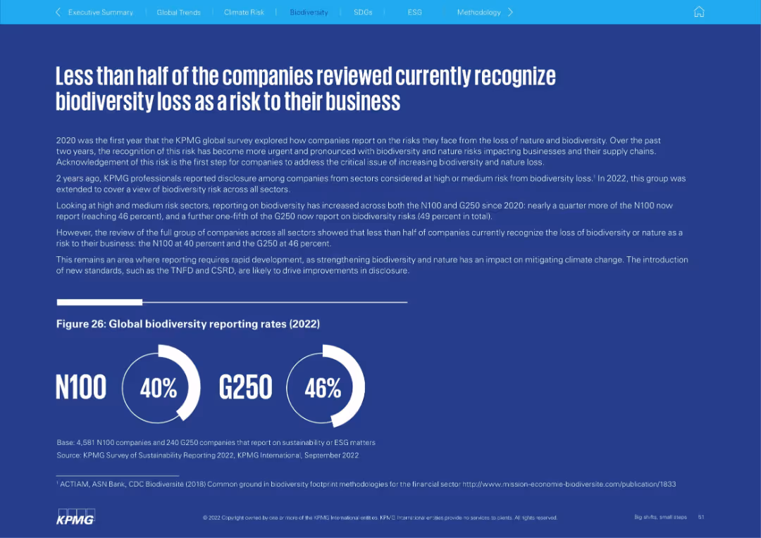
Solid blue background with left-aligned narrative and circular infographic showing biodiversity reporting rates for N100 and G250 in 2022.
Risk Assessment and Management
Environmental Services & Sustainability
The slide discusses how under half of surveyed companies recognize biodiversity loss as a business risk, despite rising urgency. It reports increased biodiversity disclosure in recent years but emphasizes the need for greater recognition and action across sectors.
biodiversity, risk management, disclosure, ESG, sustainability, N100
Mixed Chart
KPMG
Saved
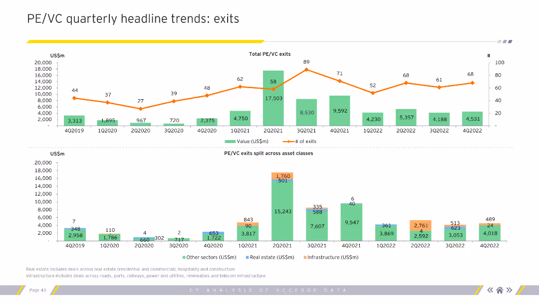
Features line and column charts showing total PE/VC exits by value and number across quarters, split by asset classes. Visual complexity is moderate.
Market Analysis and Trends
Financial Services
Highlights quarterly trends in private equity and venture capital exits, detailing values, number of exits, and sector-specific data. Essential for financial analysts and strategists.
PE, VC, exits, trends, financial, analysis
Multiple Chart
EY
Saved
The slide shows a column chart with projected tax rate reductions from 2024 to 2026, accompanied by principal considerations for these changes.
Regulatory and Compliance
Financial Services
This slide outlines the expected reduction in effective tax rates following key legal entity mergers, detailing the factors contributing to these changes over the next few years.
tax rate, legal mergers, reduction, compliance, 2026
Mixed Chart
UBS
Saved
Uses line and column charts to compare preferences for luxury goods made in Italy, France, and US.
Competitive Landscape
Consumer Goods
Analyzes the growing preference for Italian-made luxury goods among Millennials and Chinese consumers.
luxury goods, Made-in Italy, Millennials, Chinese consumers
Multiple Chart
BCG
Saved
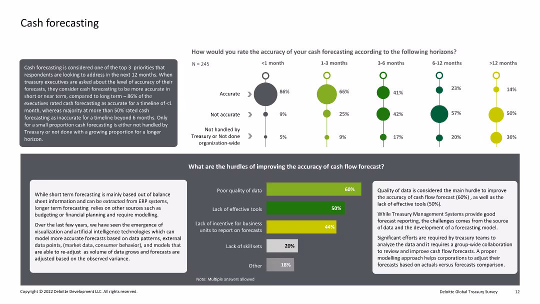
Combination of text, bar charts, and dot plots. The slide evaluates the accuracy of cash forecasting over different time horizons and identifies the main hurdles to improving forecasting accuracy.
Financial Performance
Financial Services
This slide analyzes the accuracy of cash forecasting within organizations over various time horizons and identifies key obstacles to improving this accuracy, such as poor data quality and lack of effective tools.
Cash, Forecasting, Accuracy, Hurdles, Improvement
Multiple Chart
Deloitte
Saved
This slide features two tables and a detailed layout displaying various actions taken by companies in response to changes to third-party data. Contains percentage statistics and sector-specific data.
Market Analysis and Trends
Professional Services
Describes actions taken by companies post third-party cookie changes, segmented by economic sector, showcasing the business focus on enhanced data strategies.
data strategy, third-party data, innovation, marketing, customer engagement
Table
Deloitte
Saved
This slide contains three overlaid line charts comparing projected recovery trajectories for various retail sectors in New York. It uses different colors for each line, with annotations explaining key points.
Strategic Planning
Retail & E-commerce
This slide predicts the retail recovery in New York post-lockdown, focusing on essential and non-essential retailers. It provides insights into the expected timeline for recovery and the ongoing impact of social distancing measures on physical retail spaces.
Retail, New York, Recovery, Projections, COVID-19
Mixed Chart
BCG
Saved
The slide is divided into three sections, each with a white background and bold purple headers, detailing the three pillars to achieve equality: Bold Leadership, Comprehensive Action, and Empowering Environment.
Strategic Planning
Professional Services
It outlines the key strategies identified in 2018 for promoting equality within organizations, categorized into three pillars that include leadership, policies, and empowering environments.
equality, leadership, action, environment, priority
Pillar
Accenture
Saved
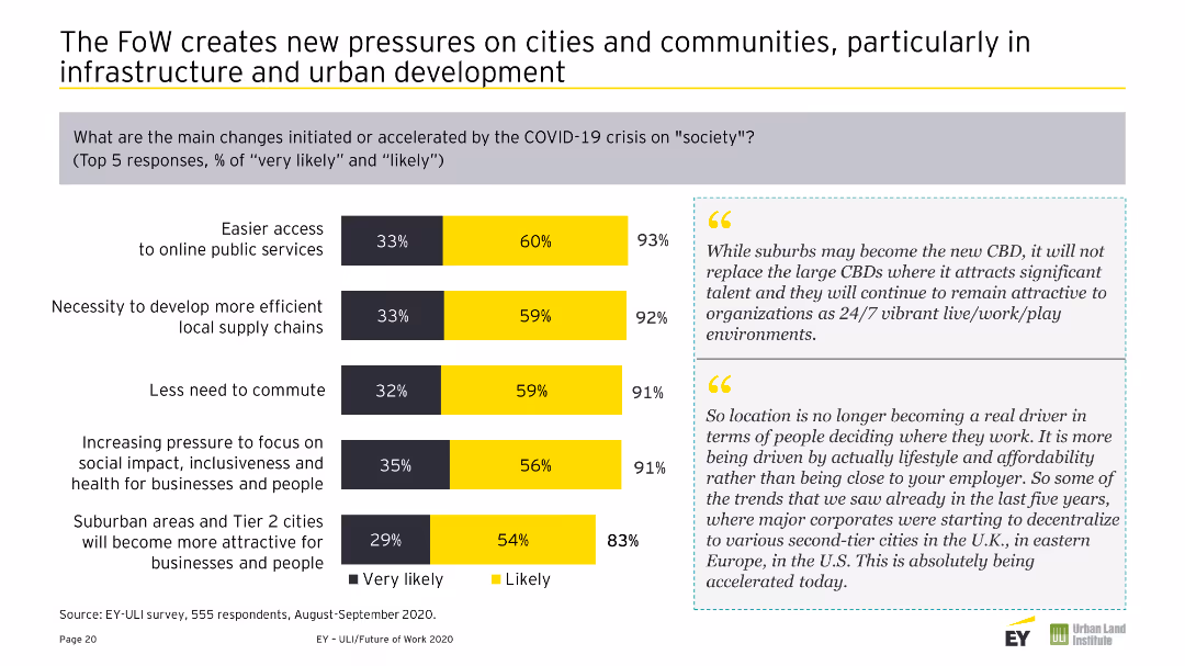
Combination of a column chart and textual information comparing regional expectations of changes in remote work over the next three-to-five years. Colors are yellow and gray.
Market Analysis and Trends
Real Estate & Construction
Compares regional expectations of future work changes, noting significant differences in expectations for remote work between Europe, APAC, and Americas.
Cultural Bias, Europe, Changes, Future of Work, Regional, Comparison, Remote Work, Expectations, Survey
Mixed Chart
EY
Saved
This slide features multiple line charts tracking the net interest margin development for Corporate and Private Banks. It includes column charts showing group NIM development. There's a side panel with key highlights in bullet points.
Financial Performance
Financial Services
The slide illustrates the development of net interest margins within a financial institution, comparing corporate and private banking sectors over several quarters.
NIM, banking, financial analysis, interest rates, quarterly performance
Multiple Chart
Deutsche Bank
Saved
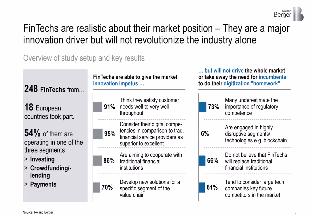
Split-panel layout with statistics, bullet points, and colored bars; simple visual style with balanced white space
Market Analysis and Trends
Financial Services
Highlights the realistic self-assessment of FinTechs in Europe, noting that while they are innovation drivers, they are not expected to revolutionize the market alone. The slide shares percentages on customer satisfaction, cooperation with traditional banks, and regulatory gaps.
FinTech, innovation, regulation, digitalization, cooperation, market drivers, blockchain, technology
Mixed Chart
Roland Berger
Saved
Multiple graphs including a column chart for net revenue performance, and line charts for spreads, unemployment, and household debt.
Financial Performance
Financial Services
This slide showcases SP’s revenue diversification and stable performance through various economic cycles, highlighting key financial metrics.
Revenue diversification, performance, economic cycles, financial metrics, net revenue
Multiple Chart
Credit Suisse
Saved
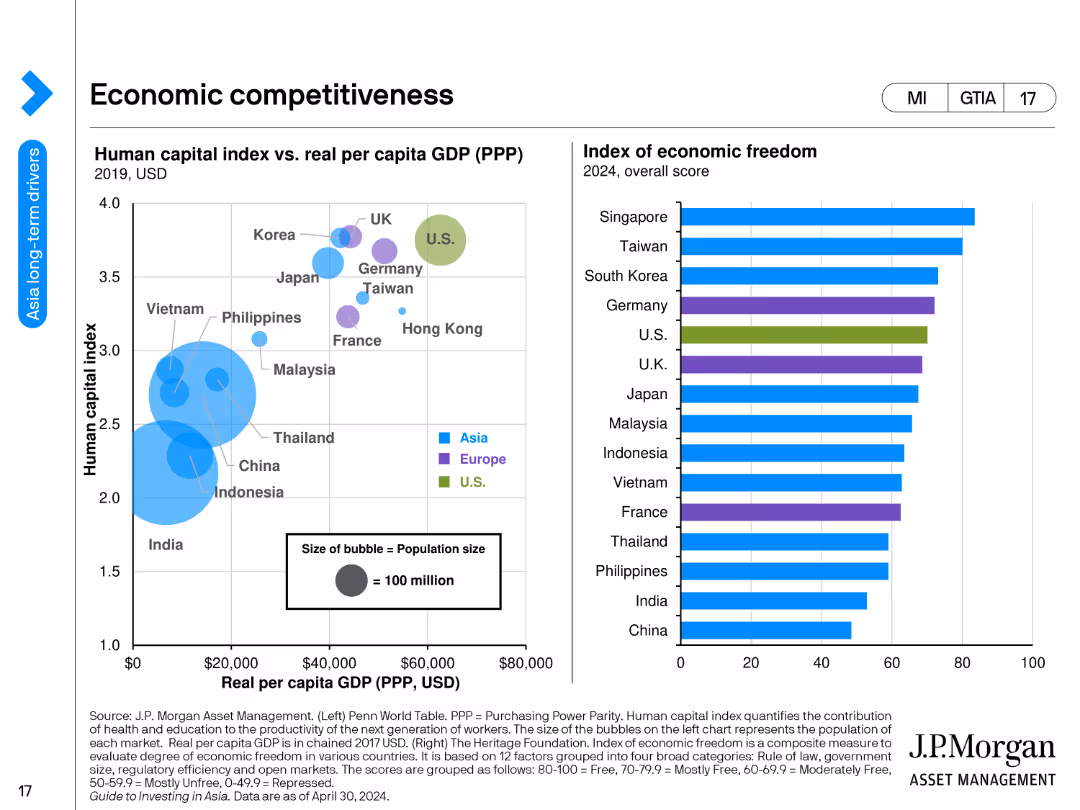
A bubble chart showing the human capital index vs. real GDP per capita and a bar chart showing the index of economic freedom by country.
Market Analysis and Trends
Financial Services
The slide compares countries' economic competitiveness through human capital indices and real GDP per capita, and presents an index of economic freedom scores for 2024.
economic competitiveness, human capital, GDP per capita, economic freedom, countries, financial analysis, indices, economic trends, development, financial insights
Multiple Chart
JP Morgan
Saved
The slide features a bar chart illustrating the adjusted pre-tax income progression in USD mn from 2017 estimate to 2019 target, detailing loss components.
Financial Performance
Financial Services
It estimates the pre-tax loss of less than USD 2.0 bn in 2017 and projects the reduction to USD 500 mn by 2019, detailing loss reduction steps.
pre-tax loss, income progression, financial estimate, loss reduction, strategic planning
Single Chart
Credit Suisse
Saved
A column chart showing the top marketing objectives for the next year, ranked by importance. The chart uses circles of varying sizes to represent different objectives like brand awareness, customer retention, and advocacy.
Market Analysis and Trends
Media & Entertainment
This slide identifies the top marketing objectives for the next year, with brand awareness being the most important. It highlights the relative importance of other objectives like customer retention and advocacy in different regions.
Objectives, Marketing, Awareness, Retention, Advocacy
Mixed Chart
Nielsen
Saved
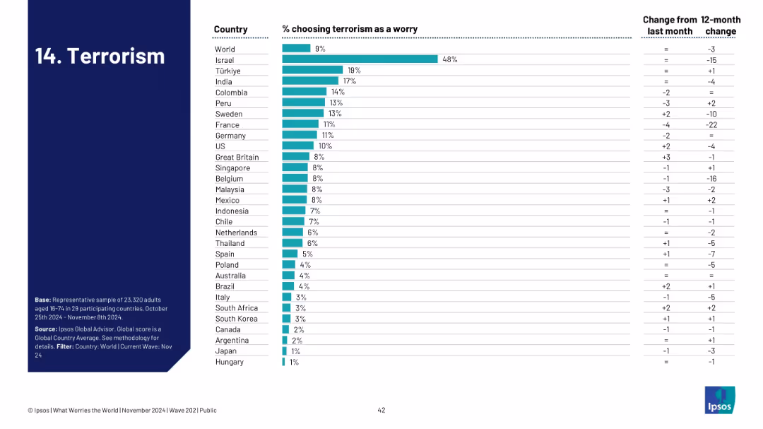
Ranked bar chart by country for terrorism concern; change columns provided.
Risk Assessment and Management
Government & Public Sector
Visualizes how terrorism ranks among public concerns across nations. Israel is highest at 48%, with most countries under 10%. The trend data indicates a general decline in worry, potentially reflecting a shift in geopolitical focus or threat levels.
terrorism, national security, global concern, Ipsos, survey, public safety, threat perception, geopolitical risk
Single Chart
IPSOS
Saved
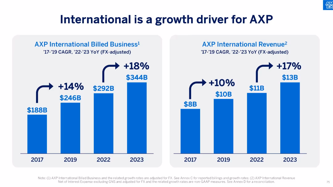
Dual-bar chart slide showing growth in billed business and revenue from 2017 to 2023.
Market Analysis and Trends
Financial Services
The slide illustrates AXP’s strong international growth, with billed business rising from $188B to $344B and revenue increasing from $8B to $13B. It reflects compounded annual growth rates (CAGR) and year-over-year (YoY) increases post-2022.
international growth, AXP, CAGR, billed business, revenue, financial growth, global expansion, FX-adjusted, business strategy
Single Chart
McKinsey
Saved
Includes column charts and bar graphs detailing the growth and segmentation of SEA’s carbon market, highlighted with annotations for clarity.
Market Analysis and Trends
Environmental Services & Sustainability
Analyzes the growth trends of the voluntary carbon market in SEA, emphasizing forestry credits and future projections, useful for investors and policy makers in environmental sectors.
SEA, carbon market, growth, voluntary, forestry credits, projections, column charts, bar graphs, annotations, investment
Multiple Chart
Bain
Saved
The slide displays before and after images of credit cards and rewards web pages, and column charts showing improved metrics. Layout includes images, text, and data representations divided into three columns under headings "From," "To," and "Results." Multiple blue arrows visually connect the comparisons.
Market Analysis and Trends
Financial Services
The slide compares old and new credit card products, highlighting improvements in new account acquisitions, account numbers, spending, and digital redemptions. It visually presents the transition strategy and its impact on performance metrics, aimed at illustrating a successful business model shift.
banking, credit cards, digital transformation, performance metrics, strategy
Linear Flow
Citigroup
Saved
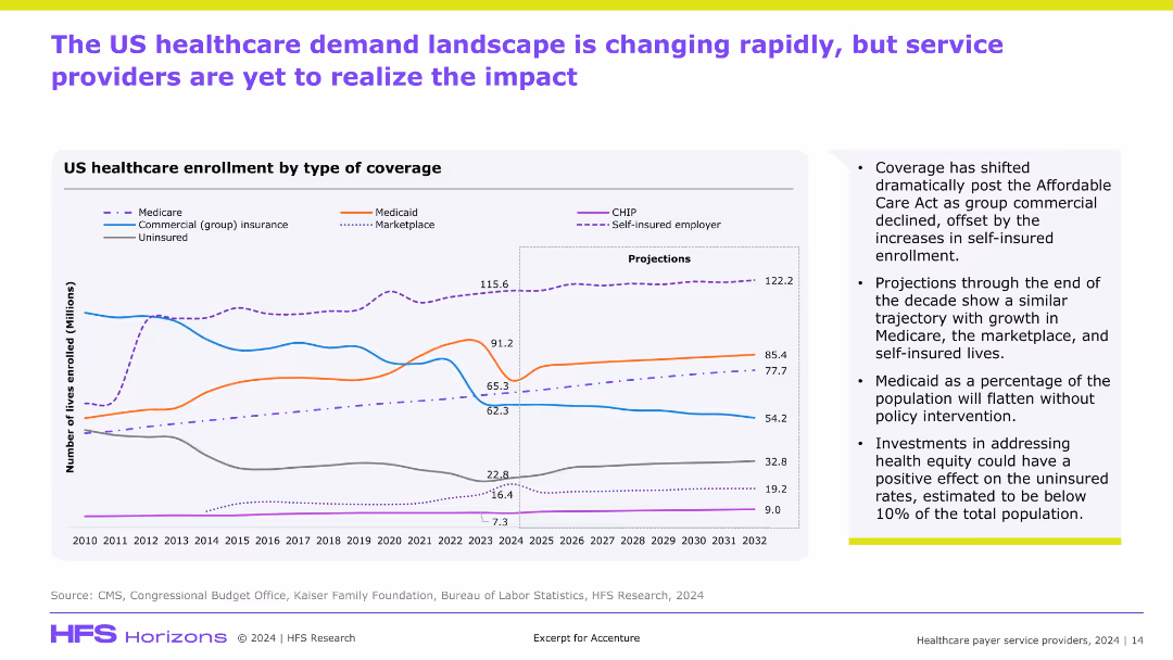
Line graph with multiple colored trend lines and projections (2023–2032); sidebar lists key insights; purple and green accent bars at top and bottom.
Market Analysis and Trends
Healthcare & Pharmaceuticals
Shows changes in U.S. healthcare coverage over time by enrollment type. Highlights shifts post-Affordable Care Act, growth in Medicare and self-insured plans, and implications for health equity. Includes forward-looking projections.
healthcare trends, insurance, projections, ACA, market shift
Mixed Chart
Accenture
Saved
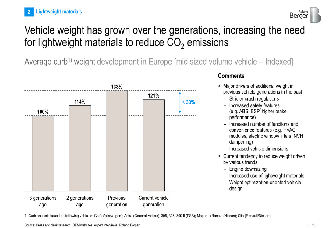
Bar chart illustrating indexed vehicle weight growth across generations. Right panel explains driving factors and emerging lightweighting trends.
Technology and Digital Transformation
Industrial & Manufacturing
This slide tracks the increase in average curb weight of midsize vehicles across generations and discusses the need for lightweighting to meet emissions goals. Key drivers include safety and comfort features, while current trends focus on engine downsizing and advanced materials.
vehicle weight, lightweight materials, emissions reduction, curb weight, automotive engineering
Mixed Chart
Roland Berger
Saved
Previous
Next
If nothing, comes up, please save your slides first
Create a FREE account to continue browsing
Receive Instant Access to 1,000+ slides from companies like McKinsey, Google, and Goldman Sachs
First Name
Last Name
Email
Password
I agree to all
Terms & Privacy Policy
Thank you! Your submission has been received!
Oops! Something went wrong while submitting the form.
Have an account?
Sign in
Column Chart
Heatmap
Chevron
Org Chart
Infographic
Callouts
Timeline
List
Graphic
Picture
Process Flow
Diagram
Paragraph
Map
Table
Framework
Subtitle
Takeaway Box
Icon
Other Chart
Radar Chart
Waterfall Chart
Mekko Chart
Pie Chart
Scatter Plot
Line Chart
Bar chart
Bullet points