My Account
My Slides
Search by Category
Templates
Leave Feedback
Login
Logout
Get Started
Browse all Slides
Browse all Slides
Create a FREE Account
Instant access to 1,000+ real slides from top companies like McKinsey, BCG, Goldman Sachs, Google and many more!
First Name
Last Name
Email
Password
I agree to all
Terms & Privacy Policy
Thank you! Your submission has been received!
Oops! Something went wrong while submitting the form.
Have an account?
Sign in
Saved Slides
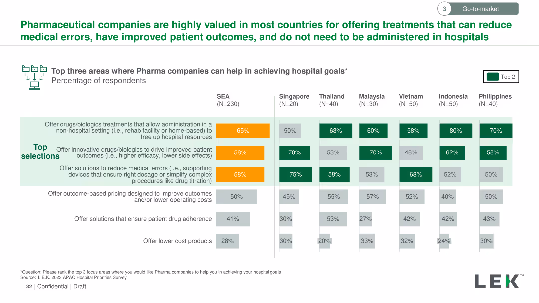
The slide uses a column chart to show the percentage of respondents selecting top areas where pharmaceutical companies can help achieve hospital goals across multiple countries. Key areas highlighted with orange and green colors.
Strategic Planning
Healthcare & Pharmaceuticals
The slide illustrates the top three areas where pharmaceutical companies can aid hospitals, focusing on non-hospital drug administration, innovative drug solutions, and medical error reduction. Data is broken down by country in Southeast Asia.
Pharmaceutical, hospitals, goals, respondents, percentage, non-hospital, innovative, error reduction
Multiple Chart
LEK
Saved
Features multiple line charts tracking the Citi Surprise Index over time for global, US, Europe, and China, highlighting significant data points with circles.
Financial Performance
Financial Services
Analyzes the economic performance during the pandemic, noting regions where economic data has "surprised" positively or negatively against expectations.
economic impact, COVID-19, Citi Surprise Index, global, regions
Multiple Chart
BCG
Saved
The slide shows a dual-axis line chart tracking accelerator attendance and equity investment over time, with text descriptions on accelerator impacts.
Market Analysis and Trends
Technology & Software
It discusses the role and impact of accelerators in Edinburgh, showing trends in equity investment and accelerator attendance from 2011 to 2020, with a focus on local technology growth.
accelerators, investment, Edinburgh, technology, growth, equity, government role, startup support, local ecosystem, economic development
Mixed Chart
Barclays
Saved
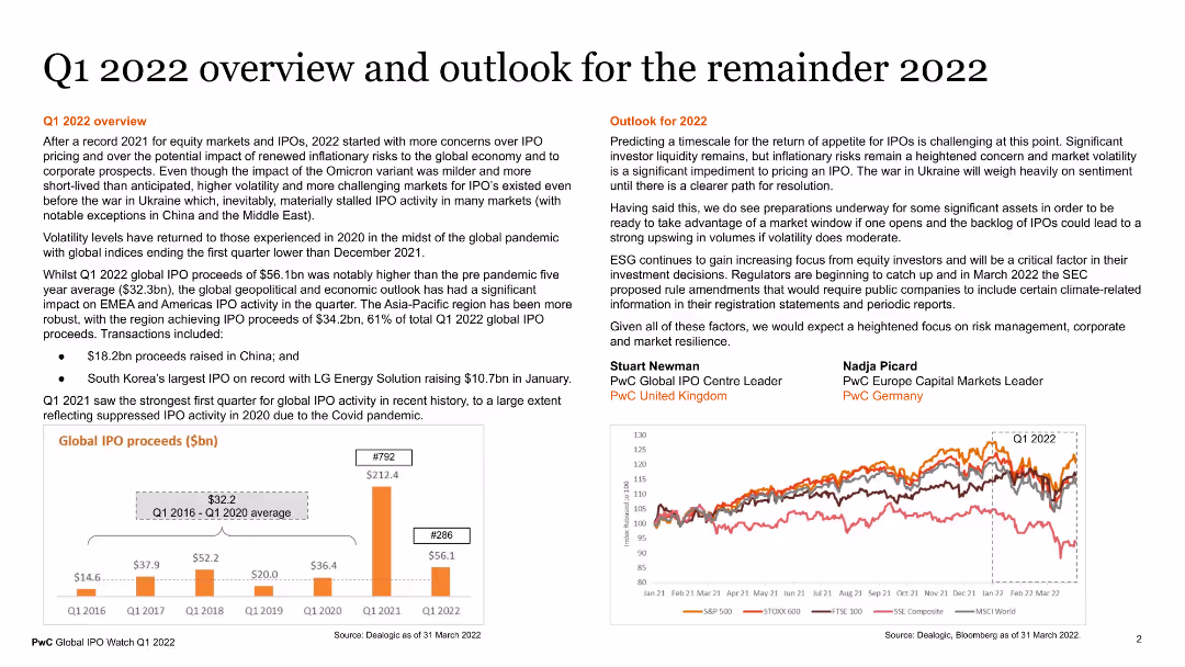
The slide contains a detailed overview of Q1 2022 and the outlook for the remainder of the year. It includes sections on Q1 2022 overview, predicting market trends, and key points from experts. The slide is text-heavy with supporting data on IPO proceeds shown in a column chart, highlighting regions and trends in global IPO activity.
Market Analysis and Trends
Financial Services
This slide provides a comprehensive overview of the financial market performance in Q1 2022 and predictions for the rest of the year. It includes data on IPO proceeds and expert commentary on future trends. It is useful for market analysts and financial strategists to understand recent market dynamics and forecast future developments.
market overview, Q1 2022, IPOs, financial trends, predictions
Multiple Chart
PwC/Strategy&
Saved
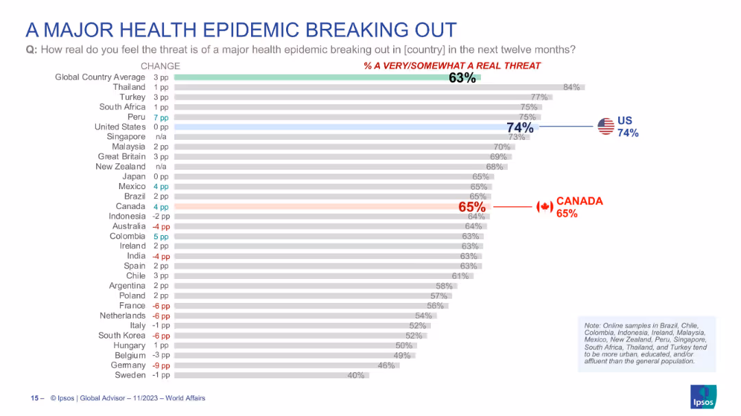
Horizontal bar chart showing how real people perceive the threat of a health epidemic in their country, with countries ranked by concern level.
Risk Assessment and Management
Healthcare & Pharmaceuticals
Country comparison of how real people think the risk of a major health epidemic is. U.S. (74%) ranks highly, with global average at 63%. Canada’s concern is at 65%. Includes % change from previous year, showing shifting perceptions of epidemic threat.
health epidemic, public threat, perception, global concern, pandemic, Ipsos, national comparison, risk
Single Chart
IPSOS
Saved
Column chart presenting revenues, color-coded for different sectors, and easy-to-read layout.
Financial Performance
Financial Services
Details the net revenues of global banking and markets, showcasing the increased wallet share and returns over years.
Revenues, banking, growth
Single Chart
Goldman Sachs
Saved
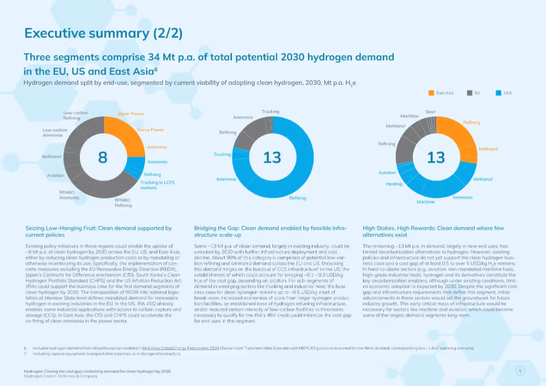
Blue-themed slide with three donut charts labeled with segment values (8, 13, 13). Bottom contains three text blocks summarizing segment potential and clean hydrogen adoption.
Market Analysis and Trends
Energy & Utilities
Summarizes three segments contributing to 2030 hydrogen demand across EU, US, and East Asia. Uses charts to split by feasibility and policy support. Describes strategic implications for hydrogen deployment.
hydrogen demand, clean energy, 2030 projections, East Asia, EU, USA, policy support, energy infrastructure, ammonia, refining
Multiple Chart
McKinsey
Saved
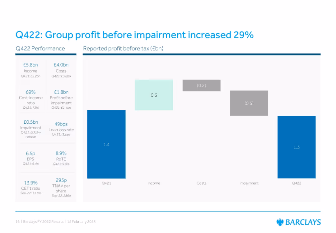
Waterfall chart format comparing Q421 to Q422 reported profit before tax, showing contributions from income, costs, and impairments. Left sidebar lists financial metrics and ratios.
Financial Performance
Financial Services
Shows a 29% YoY increase in group profit before impairment, with detailed breakdowns in cost, income, and impairment changes. Financial ratios like EPS, RoTE, and CET1 are also presented for Q422 vs. Q421.
Q422, profit growth, impairments, EPS, RoTE, CET1, waterfall chart, Barclays group
Single Chart
Barclays
Saved
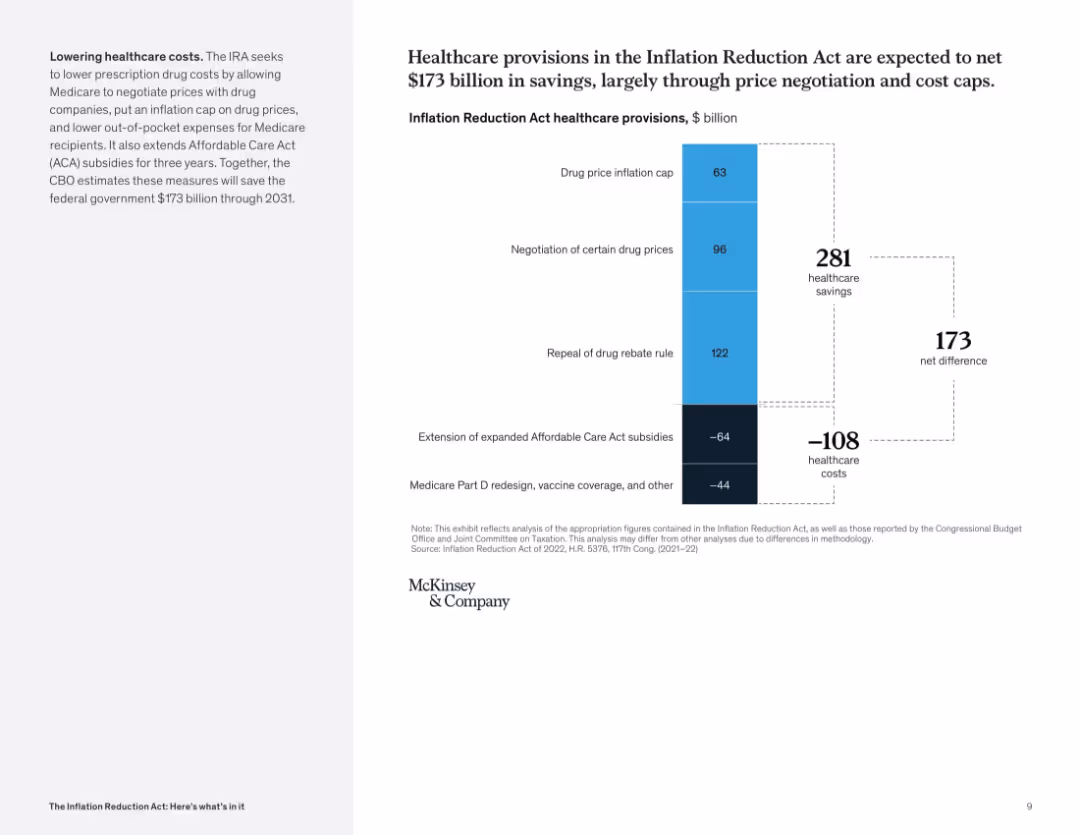
Vertical waterfall chart displaying savings and costs; two-tone column structure with dotted lines marking totals; left panel explains cost-control focus.
Financial Performance
Healthcare & Pharmaceuticals
This slide analyzes projected healthcare savings from the IRA, showing how reforms like drug price caps and rebate repeal contribute to a net savings of $173B. Costs include ACA extension and Medicare redesign.
healthcare savings, drug pricing, ACA, Medicare, subsidies, cost cap, inflation reduction
Mixed Chart
McKinsey
Saved
The slide features a column chart showing preferences for purchasing, leasing, or subscribing to cars in Germany, the US, and China, with percentage bars for each option.
Market Analysis and Trends
Transportation & Logistics
The slide indicates that purchasing new or used cars is the dominant preference among respondents, but interest in car subscription models is growing, especially in China.
car purchase, leasing, subscription, Germany, US, China, consumer preferences, automotive, market trends
Multiple Chart
PwC/Strategy&
Saved
Title at top, large segmented circular graphic in the center divided into strategic and operational parts, various text annotations.
Strategic Planning
Professional Services
Explains the integration of platform strategies and operational capabilities within a digital ecosystem, emphasizing the need for a "platform mindset" and collaboration.
platform strategies, operational capabilities, digital ecosystem, collaboration
Diagram
Accenture
Saved
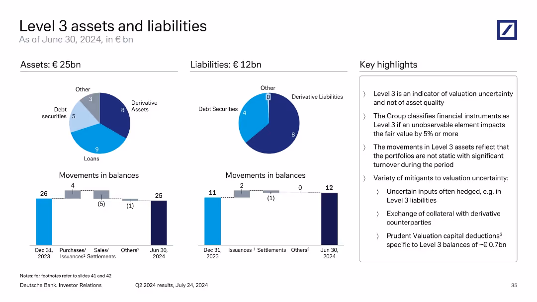
Two donut charts for asset/liability composition; two bar charts for balance movements; right-aligned text summary.
Financial Performance
Financial Services
The slide explains €25bn in Level 3 assets and €12bn in liabilities, categorized into loans, derivatives, and debt securities. It emphasizes valuation uncertainty rather than quality and outlines mitigants like collateral exchange and hedging. Movements in balances suggest active portfolio management despite uncertainty.
Level 3, valuation risk, asset uncertainty, derivatives, loan balances
Multiple Chart
Deutsche Bank
Saved
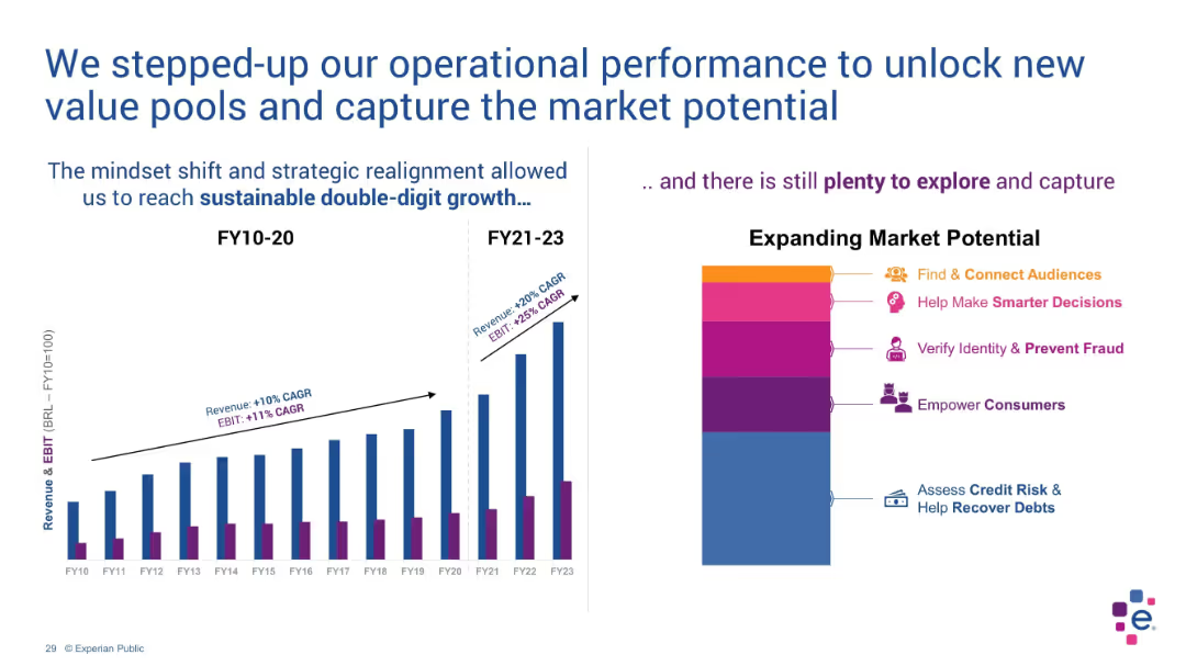
Dual-panel layout with bar chart on left and stylized stacked blocks on right
Operational Efficiency
Technology & Software
The slide illustrates growth acceleration in revenue and EBIT due to strategic shifts. The bar chart compares FY10–20 vs FY21–23 performance. A stylized chart shows market opportunities such as fraud prevention and consumer empowerment.
EBIT, revenue growth, strategy, double-digit, market potential, FY23
Multiple Chart
Barclays
Saved
The slide features tables comparing the number of cross-border IPOs by jurisdiction and destination for YTD 2021 and 2022. It highlights significant changes and includes a textual analysis of geopolitical impacts on IPO activity.
Regulatory and Compliance
Financial Services
This slide reviews cross-border IPO activity, showing a significant decrease from 2021 to 2022. It discusses the influence of geopolitical considerations on IPO markets, with detailed tables comparing jurisdictions of origin and destination.
Cross-border IPOs, Geopolitical impact, Financial services, IPO activity, Market analysis
Table
EY
Saved
This slide contains a column chart showing the operational CO2 capture capacity per utilization and storage from 2015 to 2030, including projections and canceled projects. It uses color coding for geological storage and EOR.
Market Analysis and Trends
Environmental Services & Sustainability
The slide illustrates the growth in operational CO2 capture capacity over the years and projects future increases, with a significant rise expected around 2030 for geological storage.
CO2 capture, capacity, projections, operational, geological storage
Mixed Chart
Kearney
Saved
The slide features two column charts. The left chart displays Eurozone consumer confidence over time. The right chart shows accumulated excess savings as a percentage of 2019 GDP for the US, Eurozone, and UK. The charts are well-annotated with clear trends.
Market Analysis and Trends
Financial Services
This slide examines consumer confidence and savings behavior in the Eurozone, the US, and the UK, useful for consumer behavior analysis and economic forecasting.
eurozone, consumer confidence, savings, GDP, economic forecasting
Multiple Chart
JP Morgan
Saved
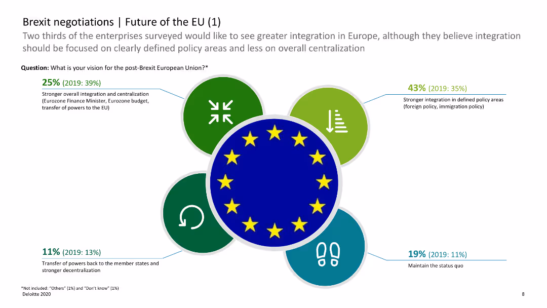
The slide has icons and horizontal bar charts showing opinions on the future of the EU post-Brexit, with categories such as integration and decentralization.
Regulatory and Compliance
Government & Public Sector
This slide shows survey results on the future of the EU, indicating preferences for integration versus decentralization post-Brexit. It helps understand future EU policy directions.
Brexit, EU future, integration, decentralization, survey
Diagram
Deloitte
Saved
A comparative slide with two graphs. The first graph shows 'High yield loans vs. US HY bond, trailing 12m total return,' comparing two line trends. The second graph 'Warming up to emerging market debt as yield premia increase,' compares 'EM USD Agg yield' and 'EM USD HY yield' with a dual-axis for yield percentage and timeline. The slide uses shades of purple and green to distinguish different data sets.
Market Analysis and Trends
Financial Services
This slide examines preferences in fixed income investments, expressing a favorable view towards variable rate loans, TIPS, and emerging market (EM) debt, contrasting them with a negative view on fixed income from Europe, Japan, and areas with negative nominal yields. It provides total return trends for US leveraged loans versus high yield bonds and an analysis of yield premia trends in emerging markets, indicating changing investment sentiments.
fixed income, variable rate loans, TIPS, EM debt, yields, total return, investment preferences, market trends
Multiple Chart
Citigroup
Saved
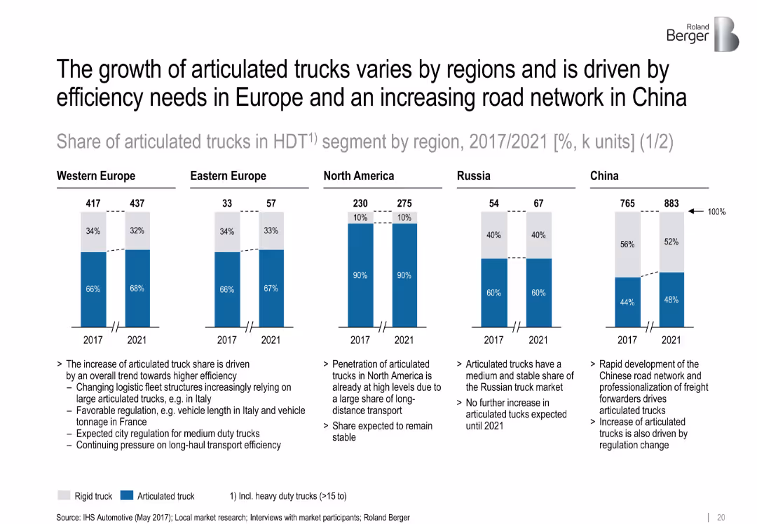
Five regional bar charts with split percentages for articulated vs rigid trucks in 2017 and 2021. Supporting notes below each graph.
Customer and Market Segmentation
Transportation & Logistics
This slide examines the regional differences in articulated truck share, highlighting Europe's efficiency-driven growth and China’s network-driven increase. North America remains stable with high penetration.
['regional trends', 'articulated trucks', 'segmentation', 'logistics', 'fleet efficiency', 'market share', 'forecast']
Mixed Chart
Roland Berger
Saved
Bar graphs depict percentages of AI implementation across different underwriting processes. Purple color scheme, vertical bars.
Technology and Digital Transformation
Financial Services
Discusses the roles and penetration of AI in underwriting, indicating areas with room for increased AI implementation.
AI, underwriting, technology, implementation, analytics, data processing, insight
Mixed Chart
Accenture
Saved
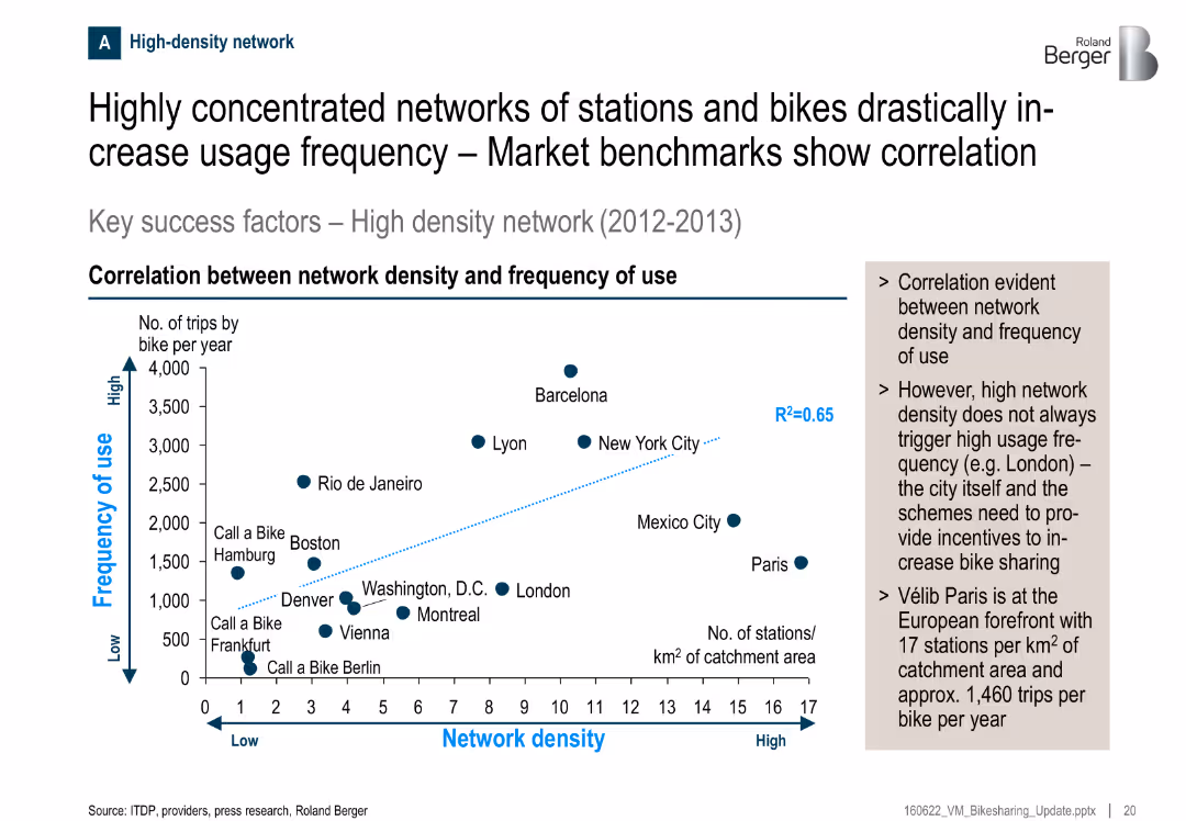
Scatter plot showing correlation between station density and usage frequency; key observations summarized in side box
Performance Metrics and KPIs
Transportation & Logistics
There’s a clear correlation between the density of bike stations and the frequency of use. Cities like Barcelona and New York show high use with dense networks. Paris, despite high density, shows moderate usage, suggesting incentives matter too.
bike sharing, usage frequency, network density, correlation, transportation, Paris, KPIs, stations
Mixed Chart
Roland Berger
Saved
Bar graphs display net income and earnings per share growth over five fiscal years.
Strategic Planning
Financial Services
Highlights financial growth under a strategic plan, with emphasis on net income and earnings per share.
Financial performance, earnings growth, net income, strategic results
Multiple Chart
Booz Allen Hamilton
Saved
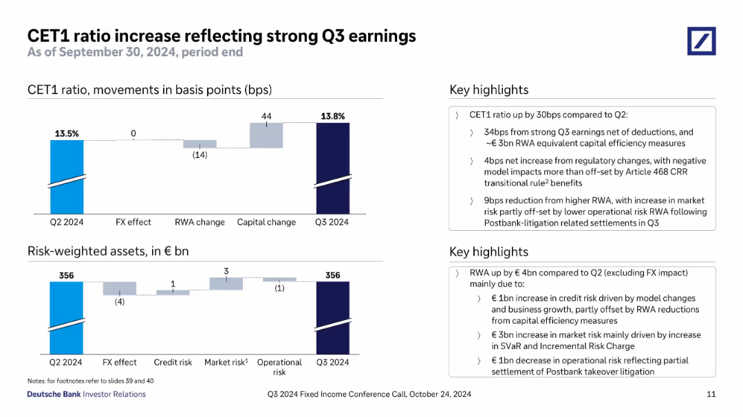
Top chart shows CET1 ratio change in basis points; bottom chart shows changes in risk-weighted assets. Key drivers annotated. Sidebar text summarizes the changes and regulatory impacts.
Regulatory and Compliance
Financial Services
Shows CET1 ratio improvement to 13.8% in Q3 2024, driven by strong earnings and capital efficiency. Regulatory changes and RWA movements are detailed, with breakdowns by credit, market, and operational risks.
CET1 ratio, capital adequacy, Q3 earnings, RWA, risk-weighted assets, regulatory change, Postbank litigation
Multiple Chart
Deutsche Bank
Saved
The slide displays multiple data visualizations including a donut chart showing tax revenue breakdown, and two sets of column charts comparing income and company tax over three years.
Financial Performance
Government & Public Sector
This slide presents Namibia's tax revenue composition and comparisons for income tax on individuals and company tax, illustrating fiscal trends and government financial management.
tax, revenue, Namibia, income tax, company tax, fiscal trends, financial management, government
Multiple Chart
PwC/Strategy&
Saved
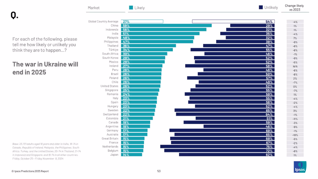
Bar chart showing countries' perceived likelihood; vertical list of countries with teal and navy bars; clean white background
Strategic Planning
Government & Public Sector
This slide depicts survey responses about the expected end of the Ukraine war in 2025. The results are sorted by percentage of people per country who consider it likely, with trends vs. 2023 included for comparison.
Ukraine war, 2025 prediction, global views, peace, likelihood, international sentiment, Ipsos, geopolitics
Mixed Chart
IPSOS
Saved
Previous
Next
If nothing, comes up, please save your slides first
Create a FREE account to continue browsing
Receive Instant Access to 1,000+ slides from companies like McKinsey, Google, and Goldman Sachs
First Name
Last Name
Email
Password
I agree to all
Terms & Privacy Policy
Thank you! Your submission has been received!
Oops! Something went wrong while submitting the form.
Have an account?
Sign in
Column Chart
Heatmap
Chevron
Org Chart
Infographic
Callouts
Timeline
List
Graphic
Picture
Process Flow
Diagram
Paragraph
Map
Table
Framework
Subtitle
Takeaway Box
Icon
Other Chart
Radar Chart
Waterfall Chart
Mekko Chart
Pie Chart
Scatter Plot
Line Chart
Bar chart
Bullet points