My Account
My Slides
Search by Category
Templates
Leave Feedback
Login
Logout
Get Started
Browse all Slides
Browse all Slides
Create a FREE Account
Instant access to 1,000+ real slides from top companies like McKinsey, BCG, Goldman Sachs, Google and many more!
First Name
Last Name
Email
Password
I agree to all
Terms & Privacy Policy
Thank you! Your submission has been received!
Oops! Something went wrong while submitting the form.
Have an account?
Sign in
Saved Slides
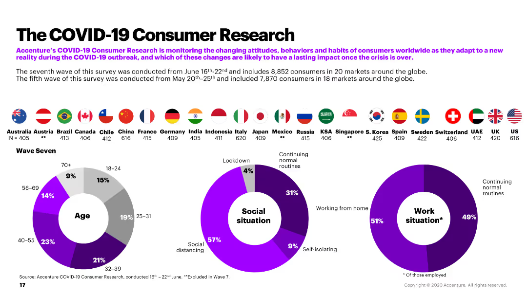
The slide includes a combination of pie charts and country flags, summarizing the demographic and situational data from Accenture's COVID-19 consumer research.
Market Analysis and Trends
Retail & E-commerce
The slide provides an overview of Accenture's COVID-19 consumer research, detailing demographics, social situations, and work situations during the pandemic.
COVID-19, consumer research, demographics, social situation, work situation
Multiple Chart
Accenture
Saved
Horizontal bar chart comparing agreement/disagreement across countries
Market Analysis and Trends
Government & Public Sector
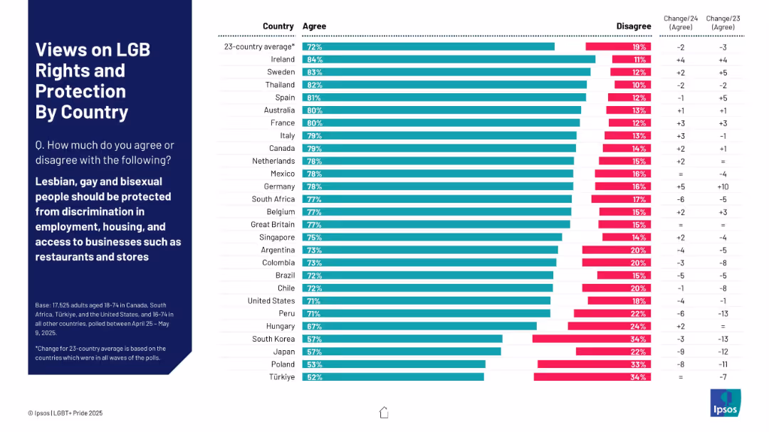
This slide gauges agreement with protecting LGB people from discrimination in employment, housing, and business access. Ireland, Sweden, and Thailand show high levels of agreement (80%+). Notable increases in agreement are seen in countries like Germany and Canada.
LGB, discrimination, agreement levels, protection, global attitudes, Ipsos, policy, social inclusion
Mixed Chart
IPSOS
Saved
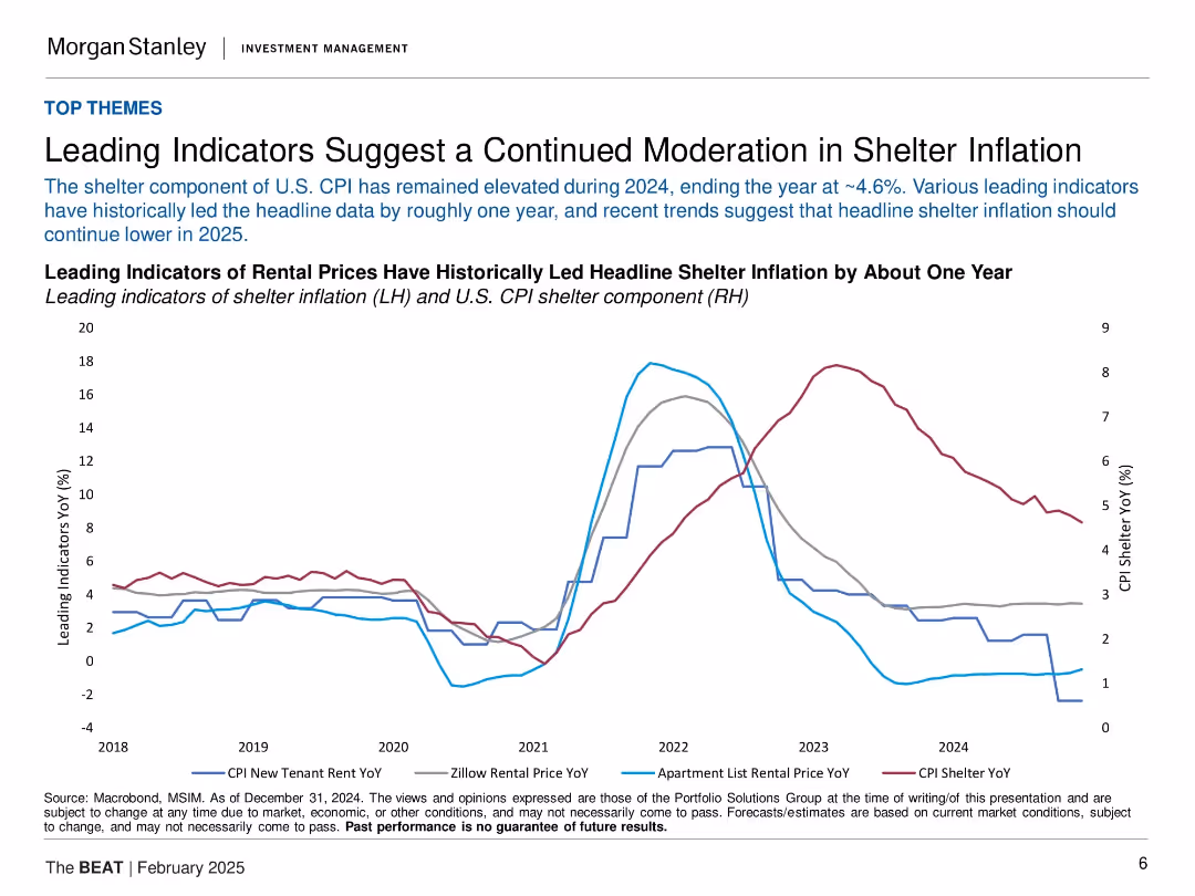
Line chart with four rental indicators and CPI shelter data. Minimal text, data-heavy with historical context.
Market Analysis and Trends
Real Estate & Construction
The slide presents rental price trends as leading indicators for shelter inflation in the U.S. It shows these indicators have declined ahead of CPI shelter, suggesting continued moderation in 2025. This is relevant for inflation expectations and interest rate decisions.
shelter inflation, CPI, rental prices, leading indicators, U.S. housing, macro trends, inflation outlook, interest rates
Single Chart
Morgan Stanley
Saved
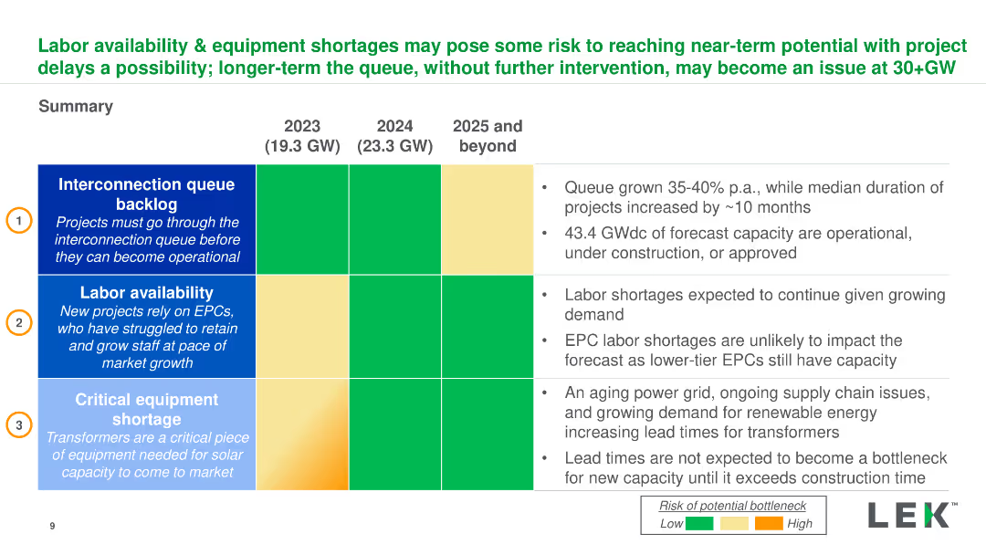
Summary table and bullet points detailing interconnection queues, labor availability, and equipment shortages for 2023-2025. Dense with key insights.
Risk Assessment and Management
Energy & Utilities
Overview of risks to solar project timelines due to labor shortages, interconnection queues, and equipment delays, and their potential impact on capacity.
Labor, Equipment, Solar Projects, Interconnection, Risk Management
Table
LEK
Saved
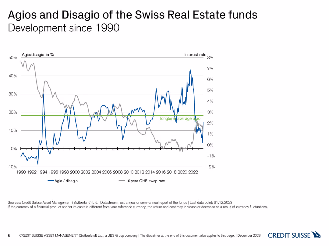
A line chart comparing Agio/Disagio percentages and interest rates over time, with separate lines for each metric and key dates highlighted.
Financial Performance
Financial Services
This slide tracks the historical development of Agio/Disagio percentages and interest rates for Swiss real estate funds since 1990, showing key trends and fluctuations.
Agio, Disagio, Historical Data, Interest Rates, Trends
Single Chart
Credit Suisse
Saved
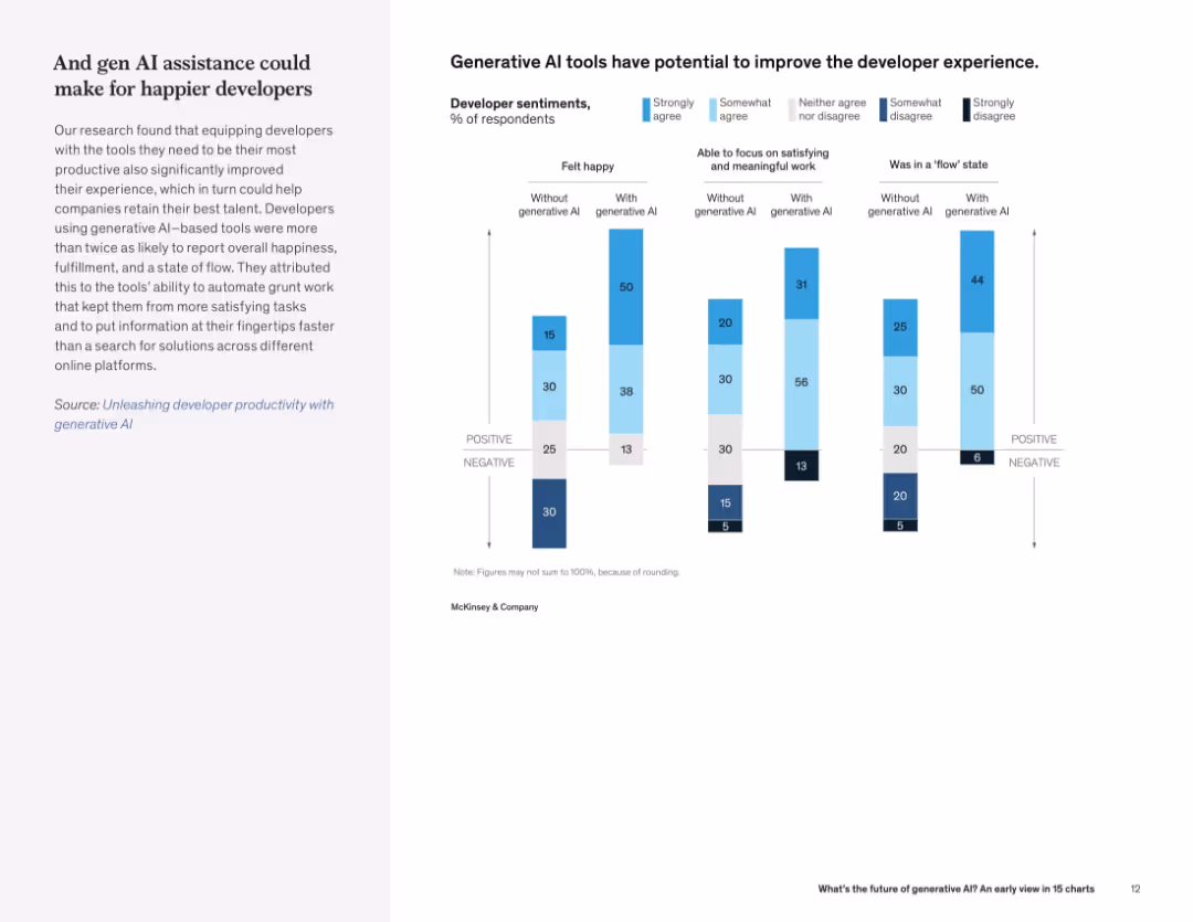
Text on left, and a grouped bar chart on right showing developer sentiment improvements (e.g., happiness, focus, flow state) with and without generative AI.
Human Resources and Talent Management
Technology & Software
Developers using generative AI tools report higher levels of happiness, focus, and "flow" compared to those who don’t. The data highlights gen AI’s potential to enhance the developer experience.
developer experience, generative AI, productivity, flow state, job satisfaction, retention
Mixed Chart
McKinsey
Saved
This slide contains a bar chart titled "Exhibit 18" with multiple bars representing different regions. The bars are segmented by the level of agreement to a statement about transitioning to a greener economy.
Regulatory and Compliance
Government & Public Sector
This slide shows global and regional perspectives on the transition to a greener economy, with data segmented by agreement level. It highlights areas where progress is deemed slowest, implicitly calling for increased action in those regions.
greener economy, regional analysis, CEO survey, environmental progress
Mixed Chart
PwC/Strategy&
Saved
Ranked bar chart by country, with agree/disagree percentages; historical data columns to the right; bold header on left.
Risk Assessment and Management
Environmental Services & Sustainability
Highlights the widespread belief that countries are not doing enough to combat climate change. Indonesia and Philippines top the list in public urgency. Trend data helps track shifts in pressure.
climate urgency, public expectation, government responsibility, Ipsos, environmental risk, international comparison, policy gaps
Mixed Chart
IPSOS
Saved
Two sections with text and images, each section explaining diversity and inclusion and the platform & sharing economy.
Market Analysis and Trends
Consumer Goods
Explains trends in consumer diversity and inclusion, and the growing platform and sharing economy.
Consumerism, diversity, inclusion, platform economy, trends
Multiple Chart
Deloitte
Saved
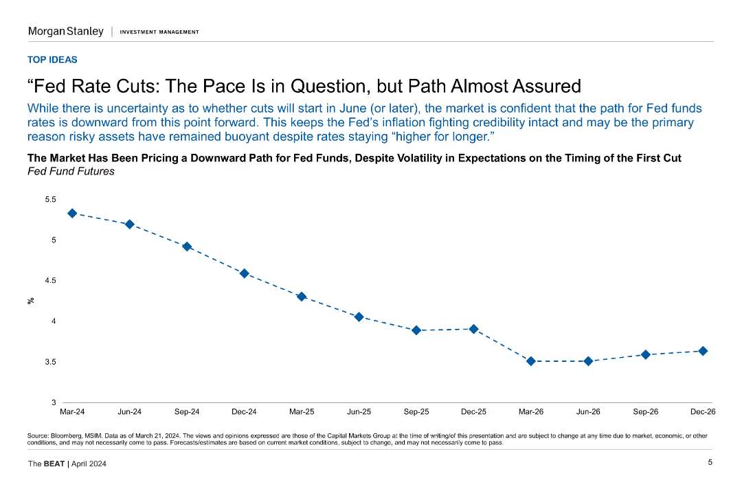
A line chart showing the downward path for Fed fund futures from Mar-24 to Dec-26.
Market Analysis and Trends
Financial Services
This slide discusses the market's expectation of a downward path for Fed funds rates despite volatility, showing projections until December 2026.
Fed Rates, Market Analysis, Futures, Projections, Volatility
Mixed Chart
Morgan Stanley
Saved
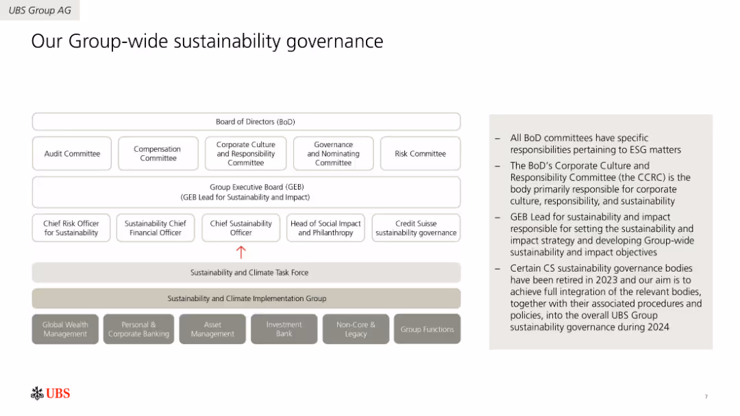
Organizational chart depicting the sustainability governance structure at UBS. Includes boxes for different committees and roles, along with brief descriptions of their responsibilities.
Regulatory and Compliance
Environmental Services & Sustainability
Describes UBS's sustainability governance framework, detailing the roles and responsibilities of various committees and executives. Emphasizes the integration of sustainability into corporate governance.
Governance, Sustainability, Structure, Committees, Responsibilities, Regulatory
Diagram
UBS
Saved
The slide contains a blend of icons and dual-column chart, illustrating the average loans by client segment and the growth rates over three years. The layout is straightforward, focusing on financial growth and risk strategy.
Risk Assessment and Management
Financial Services
The slide presents a comparison of loans across different client segments, highlighting consistent risk management and growth in JPMorgan's portfolio.
risk management, growth, portfolio, client segmentation, financial analysis, loans, expertise, underwriting
Mixed Chart
JP Morgan
Saved
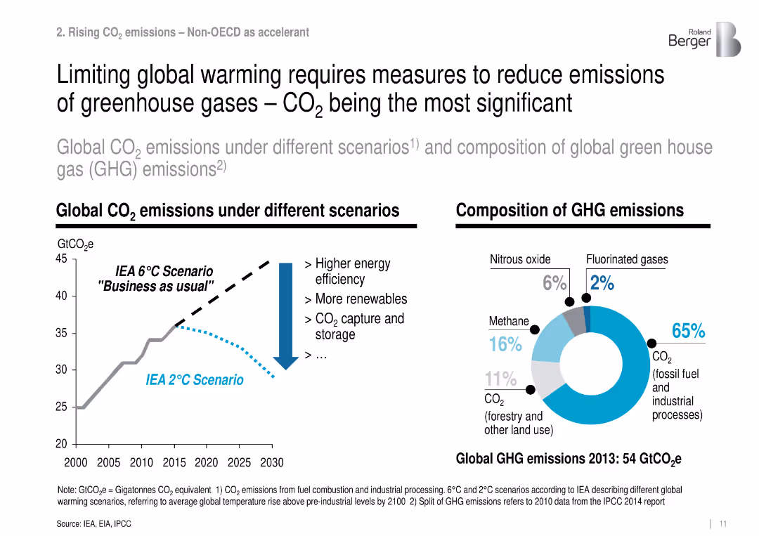
Dual-panel layout: line chart of CO₂ scenarios and donut chart of 2013 GHG composition.
Regulatory and Compliance
Environmental Services & Sustainability
Illustrates the need to reduce global CO₂ emissions by comparing a 2°C vs. 6°C scenario and shows GHG breakdown, with fossil CO₂ making up 65% of emissions.
CO₂ emissions, climate scenarios, GHG, mitigation, fossil fuel
Multiple Chart
Roland Berger
Saved
A structured grid layout with bars and percentages showing projected profits under different market scenarios for BEV adoption. Each OEM type is categorized by strategy alignment.
Strategic Planning
Transportation & Logistics
Analyzes the impact of different electrification strategies on OEM profitability under various market scenarios, providing a strategic overview for stakeholders in the electric vehicle market.
BEV, OEM, profitability, market scenarios, strategy
Table
BCG
Saved
Features text with a line chart showing projected temperature anomalies under different emissions pathways from 2020 to 2100.
Strategic Planning
Environmental Services & Sustainability
Emphasizes the necessity of committing to net zero emissions to prevent climate damage, highlighting the significant impacts of inaction on future temperatures.
Net zero, climate change, emissions, temperature, projection, pathway, 2100, sustainability
Mixed Chart
EY
Saved
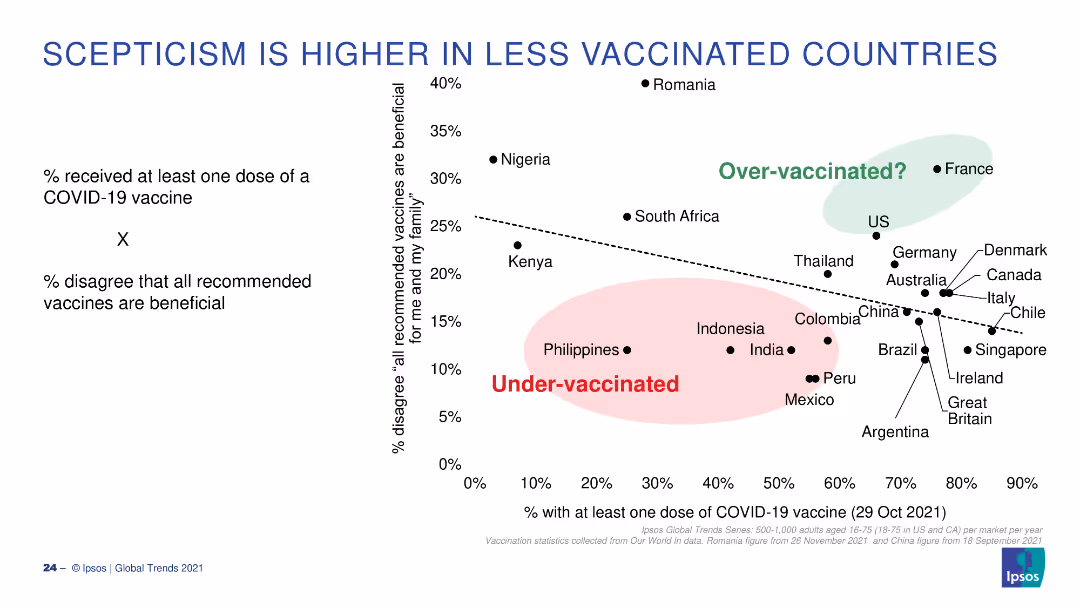
A scatter plot showing the correlation between vaccination rates and vaccine scepticism, with countries categorized as over or under-vaccinated.
Market Analysis and Trends
Healthcare & Pharmaceuticals
This slide illustrates the relationship between the percentage of the population vaccinated and the percentage who disagree that vaccines are beneficial.
Vaccines, Scepticism, Correlation, Vaccination, Over-vaccinated
Single Chart
IPSOS
Saved
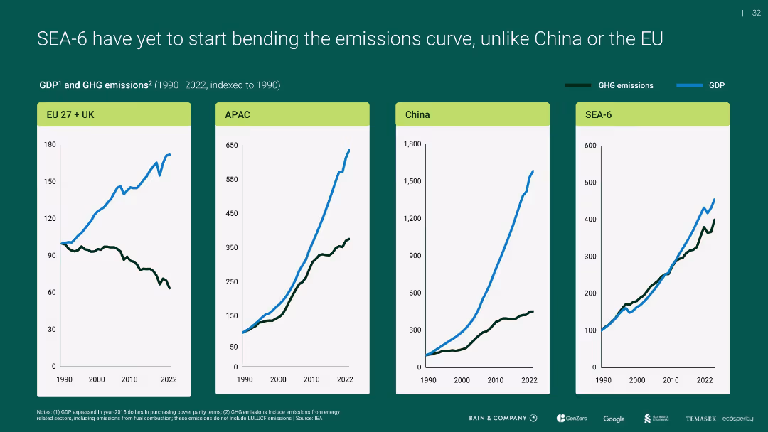
Four-panel line chart showing GDP vs. GHG emissions indexed to 1990 for EU+UK, APAC, China, and SEA-6
Performance Metrics and KPIs
Environmental Services & Sustainability
Compares emissions and economic growth over time, revealing that unlike the EU, SEA-6 and others (like APAC, China) have not decoupled emissions from GDP growth, highlighting a challenge for sustainable development.
emissions curve, GDP, SEA-6, APAC, EU, China
Multiple Chart
Bain
Saved
Contains a column chart comparing the corporate perception of France over the years with key quotes from executives.
Investment Analysis
Professional Services
Evaluates the perception of France as an investment destination among top business executives, reflecting on its strengths and weaknesses.
Investment, Business Environment, Executive Opinions, Corporate Headquarters
Mixed Chart
Bain
Saved
Contains bullet points and iconography. It features a high-level summary of Western Australia's LNG industry, economic contributions, and impact metrics like $220 billion added and 57,000 workers.
Industry Overview
Energy & Utilities
Highlights Western Australia's significant role in the LNG industry, mentioning major projects, economic contributions, and employment impact over the last decade.
LNG, Economic Impact, Western Australia, Energy Industry, Employment, Major Projects, Investment, Tax Revenue
Header Horizontal
EY
Saved
Slide uses flow diagrams to illustrate the hydrogen value chain, detailing production, handling, and final use across various applications.
Operational Efficiency
Energy & Utilities
Explains the comprehensive value chain of hydrogen production and its applications, crucial for operational strategies in energy and manufacturing.
hydrogen, value chain, production methods, industrial applications, energy
Vertical Flow
McKinsey
Saved
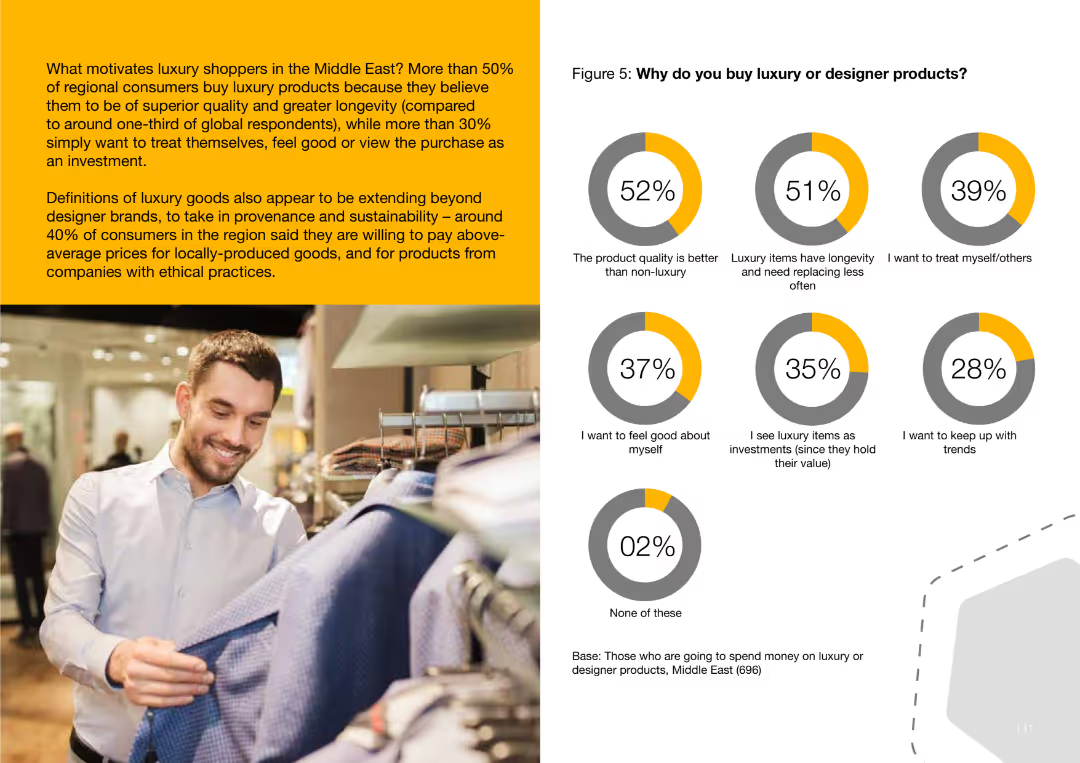
This slide features a pie chart showing reasons why consumers buy luxury goods, including superior quality and longevity, desire to treat oneself, and viewing the purchase as an investment.
Customer and Market Segmentation
Consumer Goods
The slide examines why Middle Eastern consumers buy luxury goods, highlighting motivations such as product quality, longevity, self-treating, and viewing luxury items as investments.
luxury, buying, consumer, Middle East, quality, longevity, investment
Multiple Chart
PwC/Strategy&
Saved
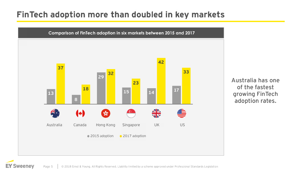
The slide features a column chart comparing FinTech adoption in six markets (Australia, Canada, Hong Kong, Singapore, UK, US) between 2015 and 2017.
Market Analysis and Trends
Financial Services
The slide shows that FinTech adoption has significantly increased in key markets from 2015 to 2017, highlighting Australia's notable growth rate.
FinTech, adoption, markets, comparison, growth
Single Chart
EY
Saved
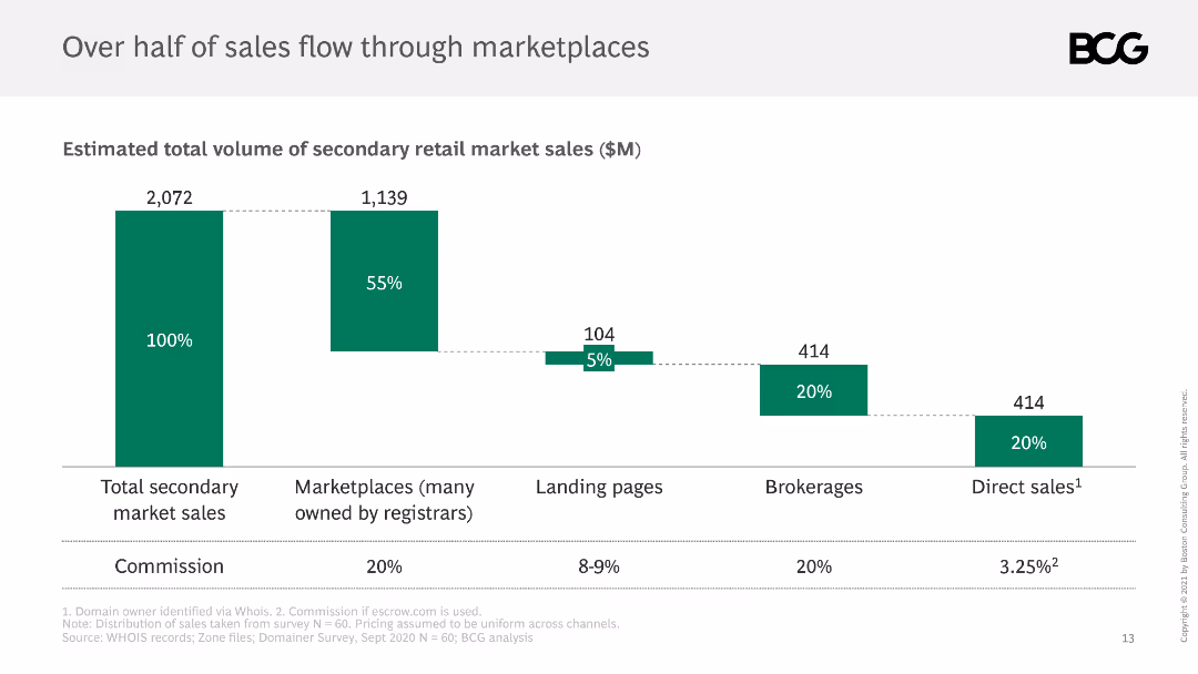
The slide shows a column chart breaking down the total volume of secondary retail market sales, with segments for marketplaces, landing pages, brokerages, and direct sales.
Market Analysis and Trends
Retail & E-commerce
It details the distribution of sales through various channels in the secondary market, noting that marketplaces account for over half of total sales, with commissions listed.
sales distribution, marketplaces, secondary market, channels, volume
Single Chart
BCG
Saved
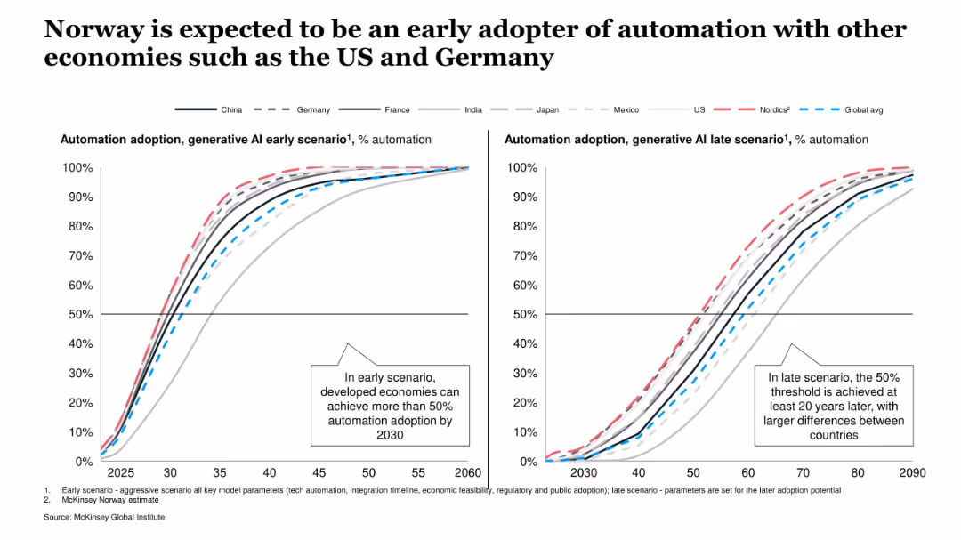
Side-by-side line charts showing AI adoption trajectories under early and late scenarios for various countries. Clear legend and scenario-based comparison.
Technology and Digital Transformation
Artificial Intelligence
This slide compares expected automation adoption under GenAI across multiple countries, showing that Norway and other developed nations are projected to lead adoption under both early and late scenarios.
GenAI, automation, adoption, Norway, early scenario, late scenario, global comparison, productivity
Multiple Chart
McKinsey
Saved
The slide presents a column chart showing global steel demand projections from 2021 to 2030, with regional breakdowns and future growth drivers indicated.
Market Analysis and Trends
Industrial & Manufacturing
This slide forecasts global steel demand up to 2030, noting a decline in Chinese demand but growth driven by ASEAN and India, and highlights regional differences in demand.
Steel demand, projections, 2030, ASEAN, India, China, regional growth, market analysis, future, trends
Single Chart
BCG
Saved
Previous
Next
If nothing, comes up, please save your slides first
Create a FREE account to continue browsing
Receive Instant Access to 1,000+ slides from companies like McKinsey, Google, and Goldman Sachs
First Name
Last Name
Email
Password
I agree to all
Terms & Privacy Policy
Thank you! Your submission has been received!
Oops! Something went wrong while submitting the form.
Have an account?
Sign in
Column Chart
Heatmap
Chevron
Org Chart
Infographic
Callouts
Timeline
List
Graphic
Picture
Process Flow
Diagram
Paragraph
Map
Table
Framework
Subtitle
Takeaway Box
Icon
Other Chart
Radar Chart
Waterfall Chart
Mekko Chart
Pie Chart
Scatter Plot
Line Chart
Bar chart
Bullet points


![[COUNTRY] should do more in the fight against climate change](https://cdn.prod.website-files.com/654e70fb59937215cac87b19/6899c237b729b6bf1162b490_G142XC939YOwIh6V-FijnmHYfAo4-tQfRbPOI0YF184.avif)