My Account
My Slides
Search by Category
Templates
Leave Feedback
Login
Logout
Get Started
Browse all Slides
Browse all Slides
Create a FREE Account
Instant access to 1,000+ real slides from top companies like McKinsey, BCG, Goldman Sachs, Google and many more!
First Name
Last Name
Email
Password
I agree to all
Terms & Privacy Policy
Thank you! Your submission has been received!
Oops! Something went wrong while submitting the form.
Have an account?
Sign in
Saved Slides
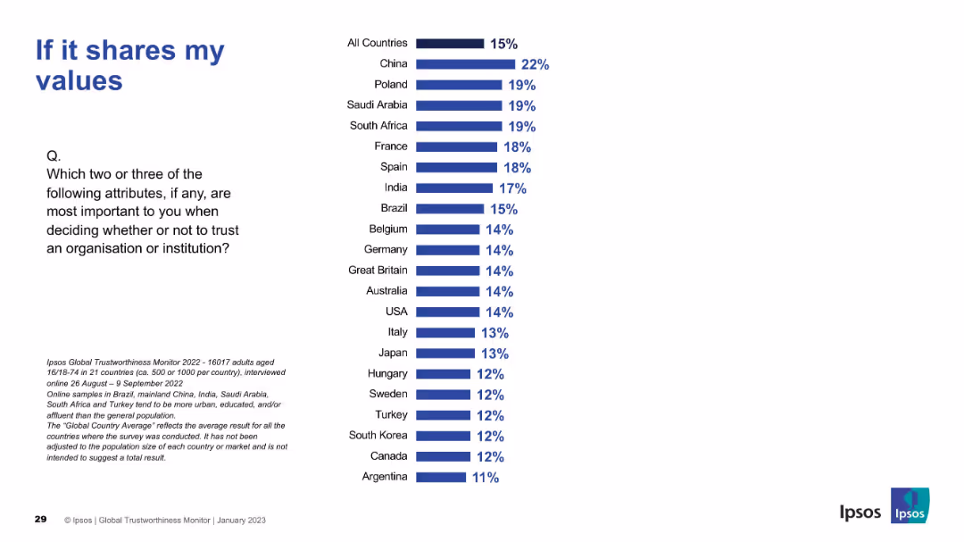
Standard bar chart layout. China, Poland, and Saudi Arabia show higher importance placed on value alignment.
Market Analysis and Trends
Professional Services
This slide evaluates how alignment of values affects trust. Cultural differences are evident, with Western countries generally placing less emphasis than Eastern ones.
shared values, personal beliefs, trust alignment, Ipsos, international differences
Mixed Chart
IPSOS
Saved
Two column charts depicting the number of large-scale CCUS projects and total capture capacity (Mtpa).
Market Analysis and Trends
Energy & Utilities
Shows the expected increase in CCUS projects and capacity by 2030, indicating significant industry growth.
CCUS, capacity, projects, energy, growth, trends
Multiple Chart
Kearney
Saved
Consists of column charts over five years showing the Net Promoter Score for France as a destination for foreign workers, accompanied by qualitative feedback from various professionals.
Market Analysis and Trends
Professional Services
Evaluates France's appeal as a work destination through yearly Net Promoter Scores, providing insights into the perceptions of foreign employees about working and living in France.
NPS, foreign employees, France, work environment, expatriate
Mixed Chart
Bain
Saved
The left side of the slide provides text information on power generation capacity additions in Turkey, while the right side features a stacked column chart showing the breakdown of power generation by source (hydropower, coal, natural gas, etc.) from 2007 to 2022.
Market Analysis and Trends
Energy & Utilities
The slide discusses the significant growth and diversification of power generation capacity in Turkey over the past 15 years, with a focus on renewable energy sources like wind, solar, and geothermal. It includes a column chart showing the changes in power generation sources over time.
Turkey, power, generation, renewable, diversification
Mixed Chart
Kearney
Saved
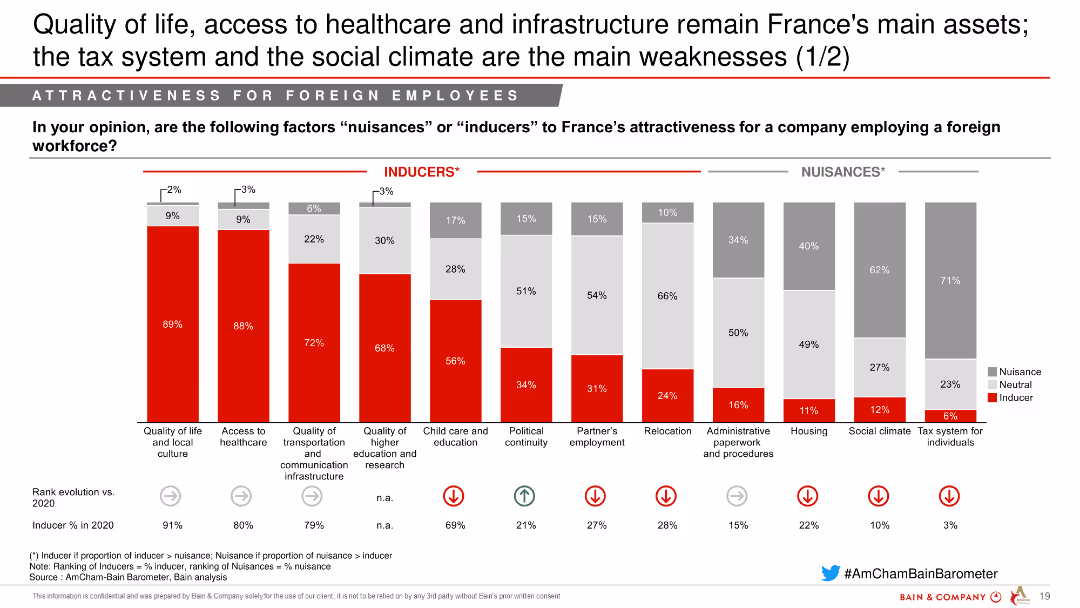
This slide contains a combination of column charts showing factors influencing France's attractiveness for foreign employees. Factors are categorized as Inducers and Nuisances.
Market Analysis and Trends
Professional Services
The slide analyzes various factors that influence France's attractiveness for foreign employees, showing the percentage of respondents who see each factor as an inducer or nuisance.
attractiveness, France, foreign employees, factors, analysis, inducers, nuisances, professional services
Single Chart
Bain
Saved
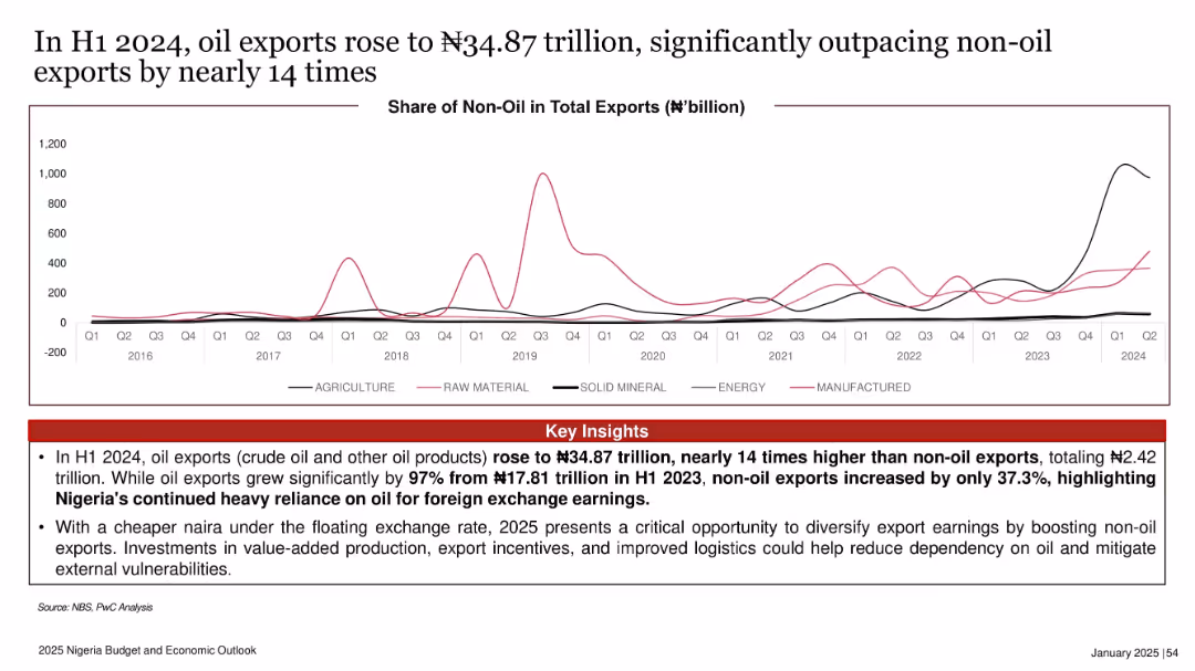
Line graph showing non-oil exports across various categories from 2016 to 2024. Key insights highlighted in red below.
Strategic Planning
Energy & Utilities
This slide emphasizes Nigeria’s overwhelming dependence on oil exports, which in H1 2024 were 14 times higher than non-oil exports. It calls for export diversification through policy reform and investment in non-oil sectors.
oil exports, non-oil exports, trade imbalance, diversification, 2024, foreign exchange, policy reform
Mixed Chart
PwC/Strategy&
Saved
The left side of the slide features a column chart showcasing the balance sheet mix with a positive trend arrow and percentage distribution across categories. On the right, a pie chart delineates the 'Sources of Funding' with a legend explaining the elements within the pie chart.
Financial Performance
Financial Services
This slide provides a visual breakdown of a company's balance sheet and funding sources, indicating a substantial liquidity and a growing balance sheet, useful for financial analysis or investor presentations.
balance sheet, funding sources, liquidity, pie chart, bar chart, financial analysis, trend, asset mix, financial growth, capital management
Multiple Chart
Goldman Sachs
Saved
A continuation from the previous slide, with pie charts and bar graphs illustrating potential financial value from AI and its correlation with financial performance.
Financial Performance
Technology & Software
This slide continues to highlight the financial importance of AI, showing potential value in various business functions and the correlation between AI maturity and financial performance.
AI Value, Financial Forecast, Market Analysis, AI Maturity, Business Impact, Investment Returns
Multiple Chart
McKinsey
Saved
The slide features stacked column charts comparing the proportion of clients in different global regions and their engagement with Barclays’ corporate banking services.
Strategic Planning
Financial Services
Discusses the strategic integration of corporate banking services globally, highlighting client engagement and the potential for capital efficient growth.
corporate banking, global strategy, client engagement, growth, integration
Mixed Chart
Barclays
Saved
Icons and labels representing tourism enablers
Strategic Planning
Hospitality & Tourism
Identifies key factors necessary for enhancing high-end tourism, including luxury accommodations, high-end brands, and safety.
tourism, strategy, enablers, luxury, safety
Table
Bain
Saved
Slide presents various funding methods with corresponding icons and bullet points explaining the suitability of each method for enhancing school connectivity in well-developed regions. A text box details concerns and justifications for each funding strategy.
Strategic Planning
Education & Training
Analyzes potential funding strategies for achieving full school connectivity in developed regions of Indonesia. Discusses the advantages and concerns associated with each method, including government subsidies and private investment models.
funding methods, school connectivity, government subsidy, private investment, developed regions
Table
BCG
Saved
The slide presents moderate visual complexity with a balance of graphical elements showcasing greenhouse gas emissions data and text explaining alternative fuel use and activity footprint reduction. The layout integrates visuals and information effectively, with color coding to highlight different sections.
Technology and Digital Transformation
Industrial & Manufacturing
This slide elaborates on how the process industries' significant greenhouse gas emissions can be managed through the use of alternative fuels or the reduction of activity footprints via automation. It outlines various strategies for improving energy efficiency, reducing emissions, and the role of automation technologies in achieving these goals.
Greenhouse gas management, Automation in emissions reduction, Energy efficiency, Industrial process optimization
Single Chart
LEK
Saved
The slide contains a column chart comparing older worker employment rates across various countries and a text section estimating the potential GDP boost from increased employment rates.
Market Analysis and Trends
Financial Services
The slide discusses the economic impact of increasing older worker employment rates, highlighting the potential GDP boost for OECD countries if they reach New Zealand's levels.
Employment, GDP, Economic impact, OECD, Older workers
Multiple Chart
PwC/Strategy&
Saved
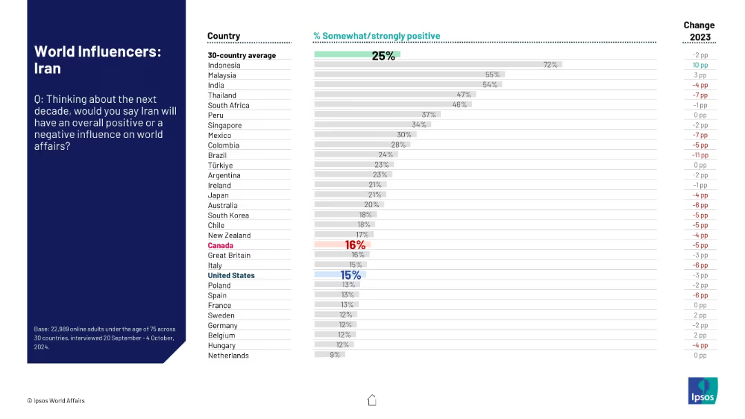
Similar layout to 18861; left-aligned title and question box, right-aligned bar chart with rankings and year-over-year change in positive perception of Iran.
Market Analysis and Trends
Government & Public Sector
This slide presents public sentiment about Iran’s influence on global affairs over the next decade. Results from 30 countries show a generally negative perception with visual emphasis on declining support across regions.
Iran, global influence, public opinion, perception change, survey, geopolitical, Ipsos, world affairs, rankings, sentiment
Mixed Chart
IPSOS
Saved
This slide contains multiple pie charts showing different maturity levels of second-line climate-risk management teams across various organizations. The layout is clean and structured.
Risk Assessment and Management
Financial Services
The slide presents data on how organizations rate the maturity of their second-line climate-risk management teams, distinguishing between G-SIBs and non-G-SIBs.
climate risk, maturity, pie charts, G-SIB, non-G-SIB
Multiple Chart
EY
Saved
Pie chart and column chart displaying commercial real estate exposures and customer loan statistics.
Market Analysis and Trends
Real Estate & Construction
Evaluates commercial real estate exposure, focusing on loan distribution and LTV assessments.
real estate, loans, exposure, LTV, market analysis
Multiple Chart
Barclays
Saved
Circular chart showing the distribution of how employee engagement feedback is communicated within companies.
Strategic Planning
Professional Services
Discusses how effectively companies communicate employee engagement feedback, crucial for HR management improvement.
HR, communication, employee engagement, feedback, management
Single Chart
PwC/Strategy&
Saved
This slide presents a narrative scenario with a moderate visual complexity. It uses a balanced text layout to tell a story about gender diversity issues in a professional setting. Red highlights and silhouette icons emphasize key points. The design includes bullet points, two text blocks, and stylized graphic elements.
Technology and Digital Transformation
Professional Services
The slide narrates a scenario of gender bias in a multinational company, depicting the overlooked leadership potential of a female employee due to stereotypes. It serves to initiate discussions on gender diversity and inclusion within corporate environments, particularly in international mobility opportunities.
Gender bias, Leadership, Diversity, Inclusion, Multinational
Boxed
PwC/Strategy&
Saved
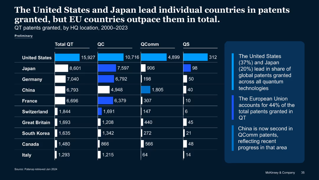
Bar chart layout comparing 10 countries by quantum patent grants (Total QT, QC, QComm, QS) with key insights on the side.
Strategic Planning
Technology & Software
Shows cumulative QT patents granted (2000–2023), where the U.S. leads followed by Japan. EU countries collectively outpace both. It highlights China's rise in quantum communication patents and the distribution of granted patents across subfields.
patents, quantum communication, quantum computing, country comparison, IP, QC, QS
Mixed Chart
McKinsey
Saved
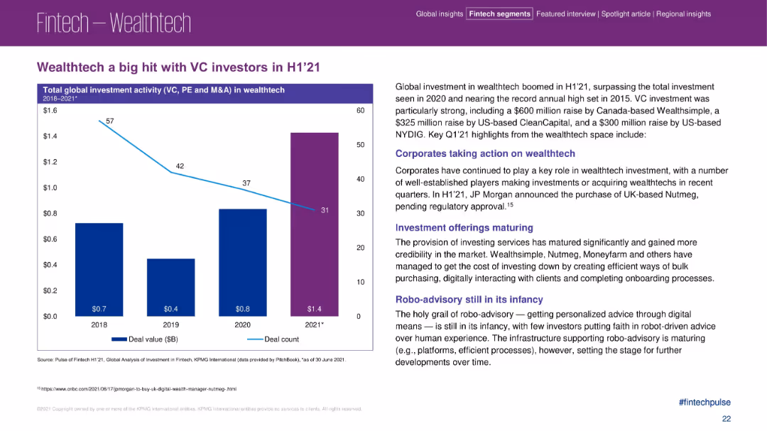
Left-aligned bar and line combo chart with deal value bars and deal count line; right section includes text blocks with bolded headings
Investment Analysis
Financial Services
The slide illustrates a sharp increase in wealthtech investments in H1 2021, reaching $1.4B, outpacing previous years. It highlights key VC deals and trends, including corporate acquisitions and the evolution of investment offerings. The narrative emphasizes the growth and maturing of wealthtech, while pointing out that robo-advisory is still developing.
wealthtech, VC investment, robo-advisory, JP Morgan, CleanCapital, investment trends, Nutmeg, digital onboarding, corporate acquisition
Mixed Chart
KPMG
Saved
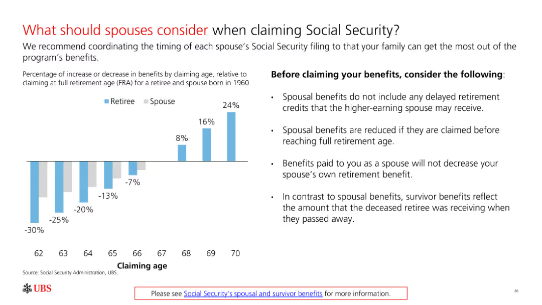
A slide with a bar chart and bullet points explaining what spouses should consider when claiming Social Security. It compares benefits for retirees and spouses at different claiming ages.
Regulatory and Compliance
Government & Public Sector
The slide provides guidance on coordinating Social Security claims between spouses to maximize benefits, using a bar chart to compare impacts at different ages.
Social Security, spousal benefits, retirement planning, claiming age, financial strategy
Mixed Chart
UBS
Saved
A map highlighting Central American countries with icons indicating their roles in the semiconductor production value chain, such as assembly and test or manufacturing equipment.
Human Resources and Talent Management
Education & Training
The slide identifies Central American countries with skilled workforces capable of participating in the semiconductor production value chain, emphasizing roles in assembly, testing, and manufacturing.
Workforce, semiconductor, Central America, skills, map
Graphic
Deloitte
Saved
Column chart show migration volumes between and within regions, using contrasting colors for clarity.
Market Analysis and Trends
Government & Public Sector
Analyzes regional and interregional migration patterns, highlighting European mobility.
migration, Europe, interregional, patterns, analysis
Mixed Chart
Roland Berger
Saved
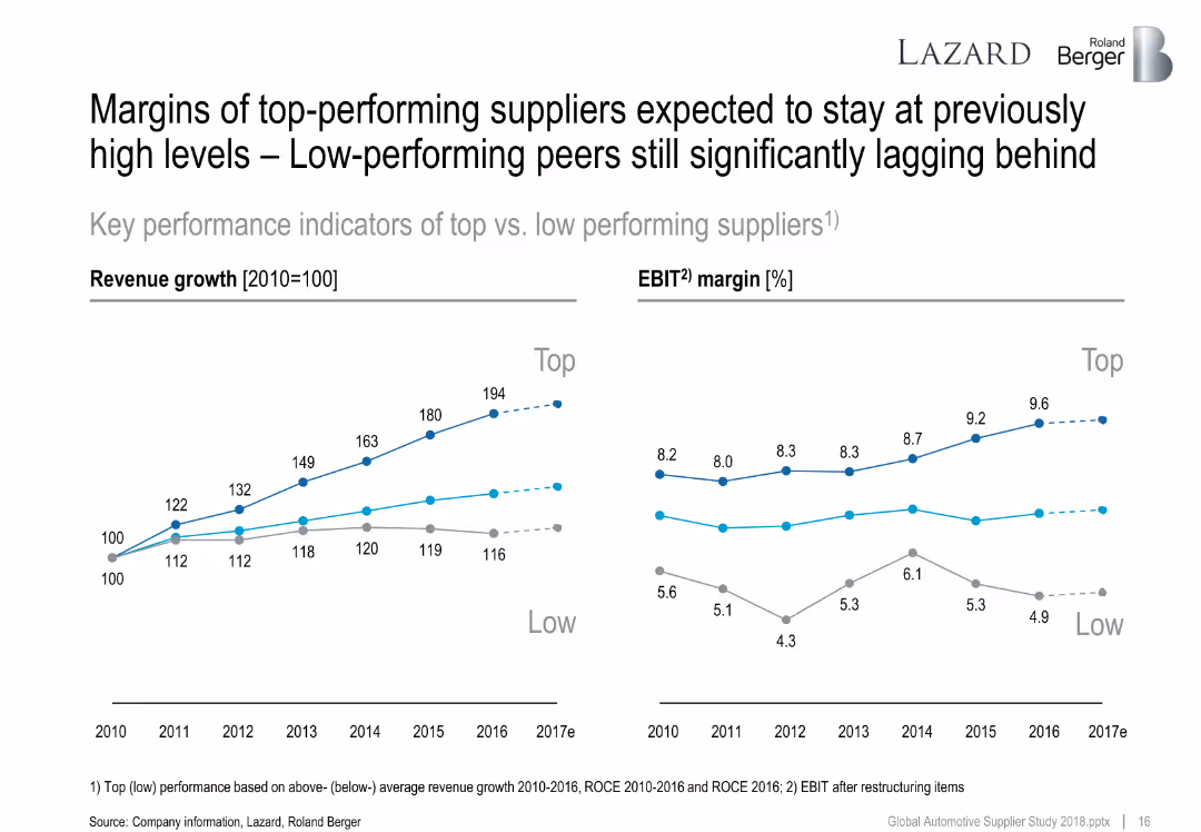
Line graphs showing revenue growth and EBIT margins from 2010–2017 for top vs. low performing suppliers.
Performance Metrics and KPIs
Industrial & Manufacturing
Highlights long-term margin and revenue growth differences between top and low performers. Top players maintain higher EBIT and consistent revenue increases, underscoring structural competitive advantages.
revenue growth, EBIT margin, performance comparison, suppliers, top vs low performers
Multiple Chart
Roland Berger
Saved
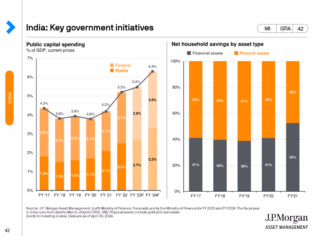
The left side of the slide features a stacked column chart showing public capital spending by federal and state levels from FY17 to FY24F. The right side has a stacked bar chart displaying net household savings by asset type from FY17 to FY21.
Regulatory and Compliance
Government & Public Sector
This slide outlines key government initiatives in India, highlighting trends in public capital spending and household savings to understand fiscal and economic policies.
India, government initiatives, public spending, household savings, fiscal policy
Multiple Chart
JP Morgan
Saved
Previous
Next
If nothing, comes up, please save your slides first
Create a FREE account to continue browsing
Receive Instant Access to 1,000+ slides from companies like McKinsey, Google, and Goldman Sachs
First Name
Last Name
Email
Password
I agree to all
Terms & Privacy Policy
Thank you! Your submission has been received!
Oops! Something went wrong while submitting the form.
Have an account?
Sign in
Column Chart
Heatmap
Chevron
Org Chart
Infographic
Callouts
Timeline
List
Graphic
Picture
Process Flow
Diagram
Paragraph
Map
Table
Framework
Subtitle
Takeaway Box
Icon
Other Chart
Radar Chart
Waterfall Chart
Mekko Chart
Pie Chart
Scatter Plot
Line Chart
Bar chart
Bullet points