My Account
My Slides
Search by Category
Templates
Leave Feedback
Login
Logout
Get Started
Browse all Slides
Browse all Slides
Create a FREE Account
Instant access to 1,000+ real slides from top companies like McKinsey, BCG, Goldman Sachs, Google and many more!
First Name
Last Name
Email
Password
I agree to all
Terms & Privacy Policy
Thank you! Your submission has been received!
Oops! Something went wrong while submitting the form.
Have an account?
Sign in
Saved Slides
Table ranking banks by revenue and market share, column charts showing wallet share, and notable transactions.
Competitive Landscape
Financial Services
Showcases Credit Suisse’s leading position in investment banking, detailing market share, revenue, and notable transactions in 2019.
Investment banking, market-leading, Credit Suisse, revenue, transactions
Mixed Chart
Credit Suisse
Saved
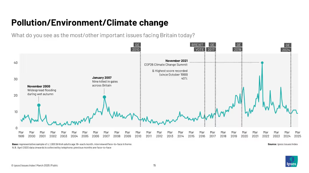
Teal line graph from 1999 to 2025 with key climate and weather-related events annotated.
Market Analysis and Trends
Environmental Services & Sustainability
This slide shows how concern over environmental issues has grown, especially during significant events like COP26 and flooding. The highest concern is noted in late 2021.
climate change, pollution, environment, COP26, UK public concern, sustainability, flooding, green issues, Ipsos
Single Chart
IPSOS
Saved
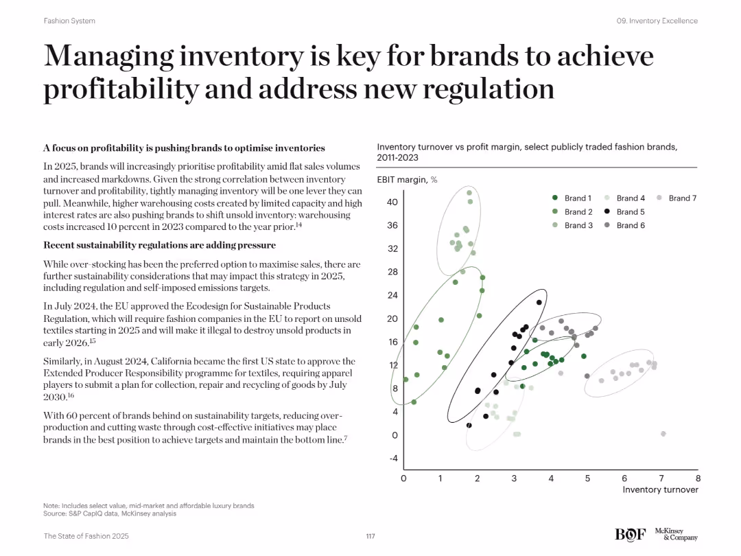
Left side text on profitability and regulation; right-hand scatter plot of inventory turnover vs profit margin
Risk Assessment and Management
Retail & E-commerce
The slide emphasizes how managing inventory effectively supports profitability and compliance with new sustainability regulations. It discusses EU and California policies on unsold textiles and highlights cost pressures. A scatter plot shows the relationship between EBIT margin and inventory turnover across various fashion brands.
inventory management, profitability, regulation, EU, EBIT, turnover, fashion, sustainability
Mixed Chart
McKinsey
Saved
The slide includes column charts showing sales and EBITDA growth for Q2 2020. Bullet points provide details on growth drivers and margin expansion.
Financial Performance
Agriculture & Food Production
This slide reviews Crop Science's financial performance in Q2 2020, focusing on sales and EBITDA growth, driven by regional performance and volume growth, despite challenges in specific markets.
Crop Science, Sales Growth, EBITDA, Margin Expansion, Q2 2020
Multiple Chart
Credit Suisse
Saved
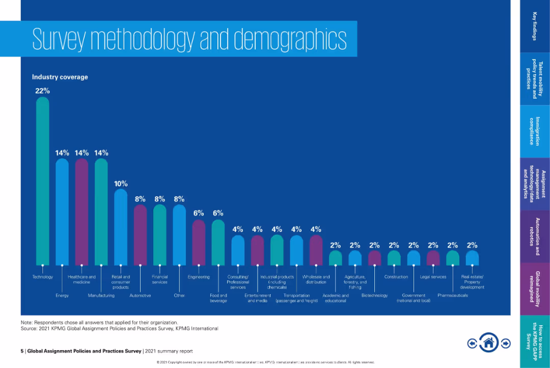
Full-width bar chart showing industry coverage percentages from a global mobility survey. Colorful, minimalist design on a dark blue background.
Human Resources and Talent Management
Professional Services
This slide continues the demographic overview of the global survey, showcasing industry participation distribution. Technology leads, followed by healthcare, energy, and retail. Visual format supports easy comparison across industries.
global mobility, industry analysis, survey results, workforce planning, talent mobility, demographics, industry representation, HR
Single Chart
KPMG
Saved
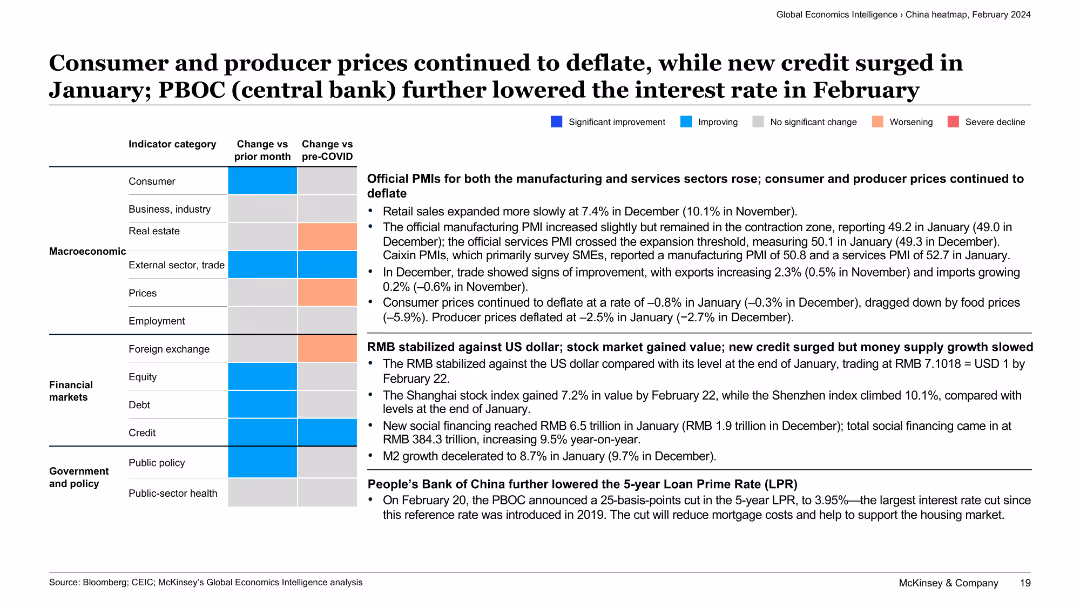
The slide presents a categorized summary of various economic indicators with text descriptions. Color-coded boxes indicate the direction and extent of changes for each category.
Market Analysis and Trends
Financial Services
This slide discusses the continued deflation of consumer and producer prices, the stabilization of RMB against the US dollar, and the People’s Bank of China’s interest rate cut, providing a comprehensive view of economic trends in China.
deflation, consumer prices, producer prices, RMB stabilization, interest rate cut
Table
McKinsey
Saved
A comparative analysis with three line charts showing different market scenarios for BEV shares by region from 2025 to 2040. Color-coded to distinguish scenarios.
Market Analysis and Trends
Transportation & Logistics
Examines three potential growth scenarios for battery electric vehicles depending on regional adjustments like government policies and infrastructure expansion.
BEV, scenarios, growth, policy, infrastructure
Multiple Chart
BCG
Saved
The slide is a combination of pie chart and text blocks outlining income composition for Macquarie Asset Management. It features simplistic color code that differentiates various revenue streams. Despite its data richness, the design maintains clarity and organization.
Financial Performance
Financial Services
The slide breaks down the income sources for Macquarie's asset management arm, displaying various types of earnings and asset classes. Ideal for financial analysis, it helps stakeholders understand the diversity and stability of revenue, crucial for discussions on financial strategy and investment decisions.
income composition, asset management, revenue streams, Macquarie, financial stability, performance fees, asset classes, strategic analysis
Multiple Chart
Morgan Stanley
Saved
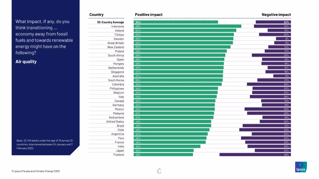
Bar chart showing positive and negative perceptions by country about the impact of energy transition on air quality. Countries are ranked by % positive.
Technology and Digital Transformation
Environmental Services & Sustainability
The slide highlights how people in different countries perceive the impact of moving to renewable energy on air quality. Indonesia, Ireland, and Türkiye show the highest optimism, while Japan and Thailand exhibit the least.
air quality, renewable energy, perception, environmental impact, survey, country comparison, bar chart
Mixed Chart
IPSOS
Saved
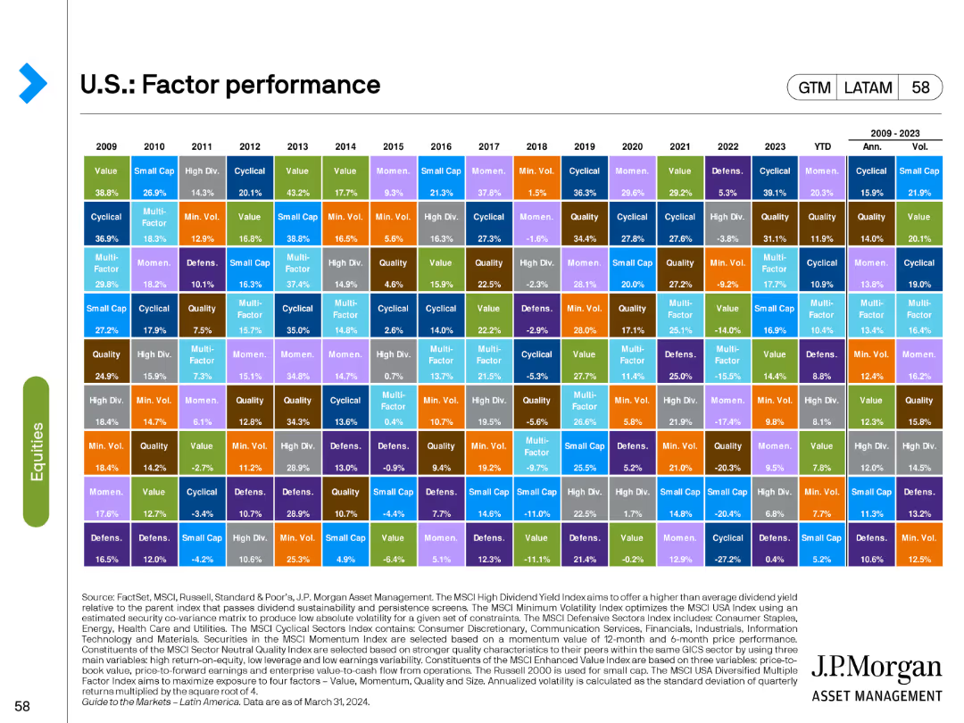
The slide showcases a matrix chart detailing the performance of various factors such as Value, Growth, Quality, etc., from 2009 to 2023.
Financial Performance
Financial Services
This slide provides a comprehensive overview of the annual performance of different investment factors, offering a historical perspective on factor performance.
factor performance, Value, Growth, Quality, annual
Table
JP Morgan
Saved
A comparative bar chart slide with a dark and light purple theme, comparing factors important for successful strategy delivery on the left with practices important for the same on the right, distinguished by shades and percentage labels.
Strategic Planning
Professional Services
This slide offers insights into program governance and related factors for successful delivery of reinvention strategies. It suggests a focus on effective governance, culture, and partnerships, critical for decision-makers and strategy planners.
Program Governance, Strategy Delivery, Success Factors, Organizational Culture, Partnerships, Leadership Engagement, Business Case, Execution Practices
Multiple Chart
Accenture
Saved
This slide includes a simple office backdrop with a bar chart detailing the proactive measures taken by risk teams. It compares data from 2023 and 2021, showing a general decrease in activities such as "Utilized new technology" and "Expanded the range of risks." Percentages are listed next to each category to show the level of engagement in various risk-related activities.
Risk Assessment and Management
Technology & Software
The slide presents comparative data from 2021 and 2023 showing a decline in proactive risk management behaviors. It includes specific activities like technology adoption and risk range expansion, which have seen decreased focus. This visualization helps in identifying areas where risk management may need to bolster its efforts to maintain or enhance the effectiveness and responsiveness of the organization's risk strategy.
decline, proactive, risk management, 2023, 2021, column chart, activities, technology, engagement
Mixed Chart
Accenture
Saved
Combines column charts and line graphs depicting hydrogen uptake volumes and percentages across various applications up to 2050.
Performance Metrics and KPIs
Energy & Utilities
Analyzes projected hydrogen consumption for domestic applications, highlighting growth areas like mining and public transport.
hydrogen, domestic, uptake, mining, trucks, buses, refineries
Multiple Chart
McKinsey
Saved
This slide presents two column charts comparing the usage of brand safety and suitability solutions among podcast publishers. The charts are color-coded to distinguish between active usage and planning stages.
Risk Assessment and Management
Media & Entertainment
Discusses the low adoption rates of brand safety and suitability solutions in podcast advertising and anticipates future growth as AI-driven tools become more prevalent. This slide points towards a necessary evolution in the industry to manage ad content adjacency and maintain brand integrity in a dynamic digital environment.
brand safety, podcast, advertising, AI, 2021
Mixed Chart
PwC/Strategy&
Saved
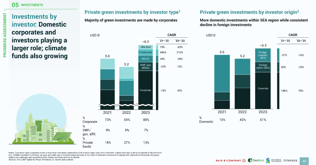
Two side-by-side stacked bar graphs: one by investor type, the other by investor origin; includes CAGR figures and investor role percentages.
Investment Analysis
Financial Services
This slide highlights the shift in green investments toward domestic sources and corporate investors. Corporates dominate recent deals, especially in large-scale and data center projects. Domestic investment grew significantly, while foreign investments declined. Climate funds show strong growth, despite being a smaller segment.
domestic investment, corporate investors, climate funds, SEA green finance, investor origin, financial trends
Multiple Chart
Bain
Saved
Contains multiple horizontal bar charts showing the percentage of respondents engaging in various business functions like Finance, HR, IT, and more. There is also a comparative analysis of these functions over the years 2019, 2021, and 2023.
Market Analysis and Trends
Professional Services
Presents a breakdown of key functions within GBS organizations, tracking changes in function focus and importance over time.
GBS, functions, finance, HR, IT, trend analysis
Mixed Chart
Deloitte
Saved
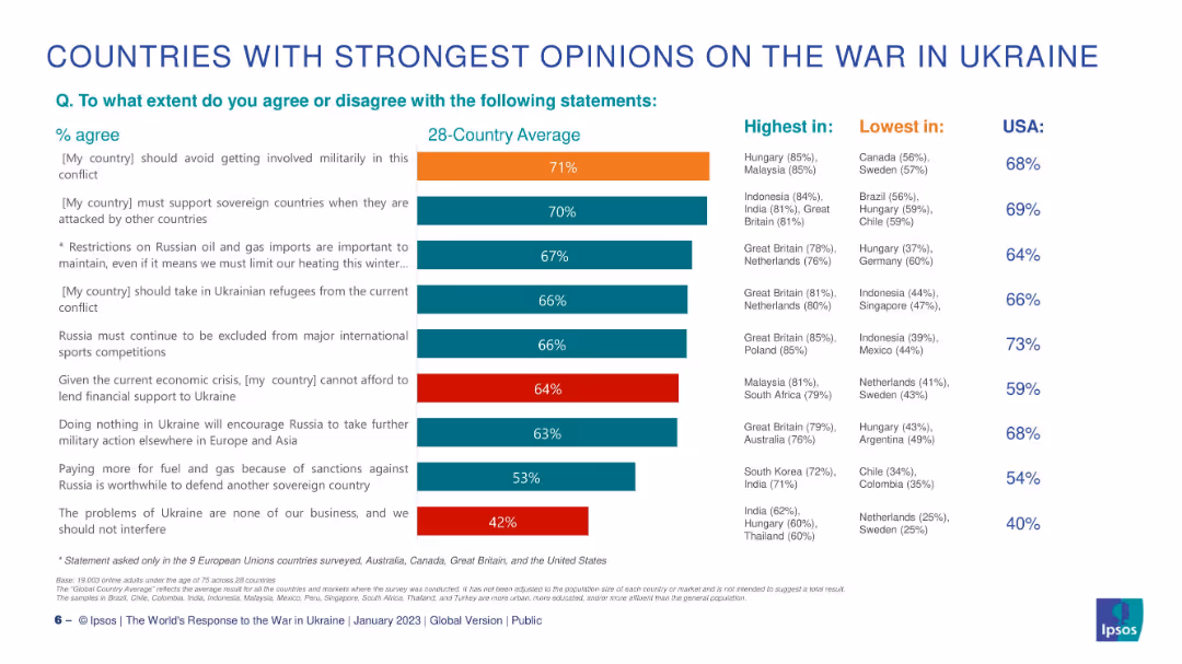
Horizontal bar chart centered, flanked by lists of countries with highest and lowest agreement. U.S. data shown separately.
Market Analysis and Trends
Government & Public Sector
This slide compares the strength of opinions across countries regarding statements about the Ukraine conflict. It highlights where support or opposition is highest and lowest for each statement, showing substantial variation in global sentiment.
country comparison, Ukraine, agreement levels, Ipsos, military, sanctions, support, differences, global
Single Chart
IPSOS
Saved
A comparative layout with two side-by-side sections detailing time saved in remote work and telehealth appointments, using purple and violet hues.
Operational Efficiency
Technology & Software
Compares the biggest time savers for nbn users, specifically remote work and telehealth, detailing time and cost savings for each.
time savings, nbn users, remote work, telehealth, cost savings, efficiency, work from home, health consultations
Table
Accenture
Saved
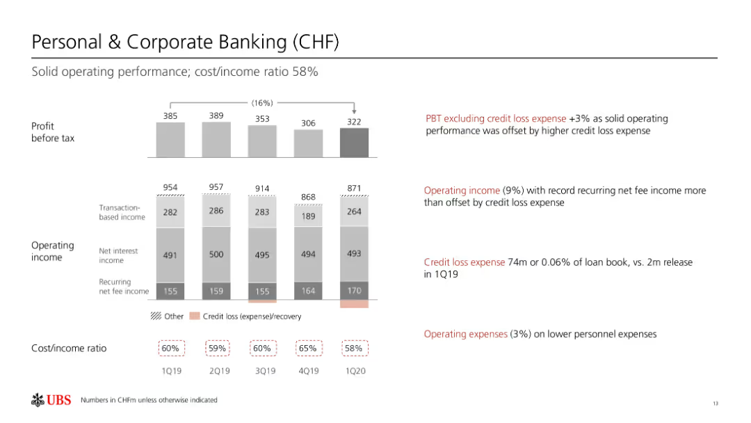
Column chart shows profit before tax, operating income, and cost/income ratios over several quarters.
Financial Performance
Financial Services
Reviews solid operating performance in personal and corporate banking, with a focus on credit loss expenses.
personal banking, corporate banking, financial performance, operating income, credit loss
Multiple Chart
UBS
Saved
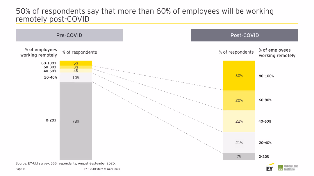
A column chart comparing pre and post-COVID percentages of employees working remotely across different timeframes.
Human Resources and Talent Management
Technology & Software
This slide highlights survey results indicating that a significant portion of employees are expected to work remotely most of the time post-COVID-19.
Remote Work, Post-COVID, Workforce, Survey, Employee Expectations
Multiple Chart
EY
Saved
The slide compares fintech and web3 adoption rates across regions using graphical icons and percentages. The design is moderate with a mix of text and visual data representation.
Competitive Landscape
Financial Services
This slide presents a comparative study of fintech and web3 adoption in Southeast Asia against other regions. It's suitable for discussions on competitive advantage and regional market dynamics in technology sectors.
fintech, web3, adoption, Southeast Asia, comparison, competitive, market dynamics, technology sectors
Boxed
Bain
Saved
Column chart showing the percentage distribution of advertising spots by length for the year 2018 with distinct color bars.
Market Analysis and Trends
Media & Entertainment
Analyzes the popularity of different advertising spot lengths in 2018, highlighting the prevalence of 60-second spots.
Advertising, Spot Length, 2018, 60 Seconds, 30 Seconds, 90 Seconds
Single Chart
PwC/Strategy&
Saved
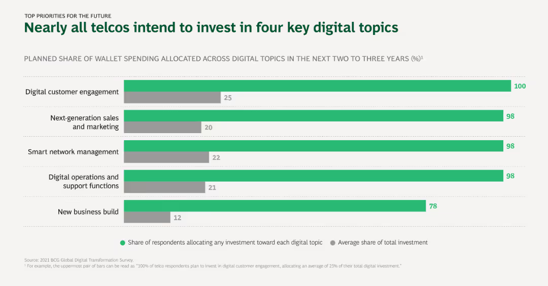
The slide uses horizontal bar charts to depict planned digital investment priorities among telcos, showing the share of wallet spending allocated to different digital topics over the next 2-3 years.
Investment Analysis
Telecommunications
This slide outlines the key digital topics that telcos plan to invest in, with digital customer engagement and next-generation sales and marketing being the top priorities.
Digital investment, Telcos, Priorities, Customer engagement, Sales and marketing
Single Chart
BCG
Saved
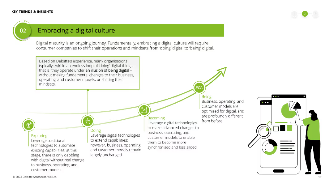
Illustrates a conceptual journey from "Exploring" to "Being" a digital company with a line chart and icons representing different stages. Large text box in the center with a detailed explanation.
Human Resources and Talent Management
Technology & Software
Discusses the stages of digital maturity for organizations, emphasizing the shift from just doing digital tasks to fully being digital in their culture and operations.
digital culture, maturity, organizational change, digital transformation, exploring, doing, becoming, being
Linear Flow
Deloitte
Saved
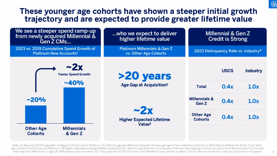
Triple-panel design comparing spend growth, age gap, and delinquency rate by age cohort.
Strategic Planning
Financial Services
Shows that Millennials and Gen Z ramp up spending faster and have lower delinquency rates, with an expected higher lifetime value due to younger acquisition age.
customer lifetime value, millennials, gen Z, spend growth, age gap, credit performance, delinquency
Mixed Chart
McKinsey
Saved
Previous
Next
If nothing, comes up, please save your slides first
Create a FREE account to continue browsing
Receive Instant Access to 1,000+ slides from companies like McKinsey, Google, and Goldman Sachs
First Name
Last Name
Email
Password
I agree to all
Terms & Privacy Policy
Thank you! Your submission has been received!
Oops! Something went wrong while submitting the form.
Have an account?
Sign in
Column Chart
Heatmap
Chevron
Org Chart
Infographic
Callouts
Timeline
List
Graphic
Picture
Process Flow
Diagram
Paragraph
Map
Table
Framework
Subtitle
Takeaway Box
Icon
Other Chart
Radar Chart
Waterfall Chart
Mekko Chart
Pie Chart
Scatter Plot
Line Chart
Bar chart
Bullet points