My Account
My Slides
Search by Category
Templates
Leave Feedback
Login
Logout
Get Started
Browse all Slides
Browse all Slides
Create a FREE Account
Instant access to 1,000+ real slides from top companies like McKinsey, BCG, Goldman Sachs, Google and many more!
First Name
Last Name
Email
Password
I agree to all
Terms & Privacy Policy
Thank you! Your submission has been received!
Oops! Something went wrong while submitting the form.
Have an account?
Sign in
Saved Slides
Bubble chart showing the projected revenue growth from 2018 to 2023 in different media sectors, with size indicating magnitude.
Market Analysis and Trends
Media & Entertainment
Analyzes the future revenue growth in internet access and advertising compared to other media sectors, projecting significant growth for internet sectors.
Internet, Revenue Growth, Media, 2018-2023, Advertising, Access
Multiple Chart
PwC/Strategy&
Saved
Column chart and line chart showing average private credit cashflow/interest expense and distressed debt & special situations dry powder over time.
Investment Analysis
Financial Services
The slide highlights the attractiveness of special situations private credit, with increasing borrower challenges and available capital for flexible solutions.
private credit, special situations, distressed debt, cashflow, interest expense, investment opportunity
Multiple Chart
Morgan Stanley
Saved
The slide features a large image at the top left with text on the right, including a trend assessment with bar charts.
Technology and Digital Transformation
Retail & E-commerce
Discusses voice commerce, highlighting the use of smart speakers and voice commands to enhance online shopping experiences.
Voice Commerce, Smart Speakers, Voice Commands, Retail, Shopping, AI, Personalization, Customer Interaction
Mixed Chart
Deloitte
Saved
Contains multiple line graphs comparing the carbon intensity and emissions per capita for several countries, with projections for 2050 under current policies and ideal targets for a 2°C warming scenario. Each country's trajectory is marked distinctly.
Regulatory and Compliance
Environmental Services & Sustainability
Compares the carbon intensity and emissions per capita of key countries, projecting their future paths and comparing them to the required levels for meeting the 2°C warming limit. Highlights disparities in emissions intensity and the challenges different countries face in achieving climate goals.
Carbon intensity, Emissions, GDP, 2050, Country comparison
Single Chart
BCG
Saved
Slide with bullet points and icons, contrasting implications for different stakeholders in the digital ecosystem.
Strategic Planning
Technology & Software
Addresses the roles and adjustments necessary for various players in the digital transformation landscape.
digital, stakeholders, transformation, policy, investors, digital natives
Header Vertical
Bain
Saved
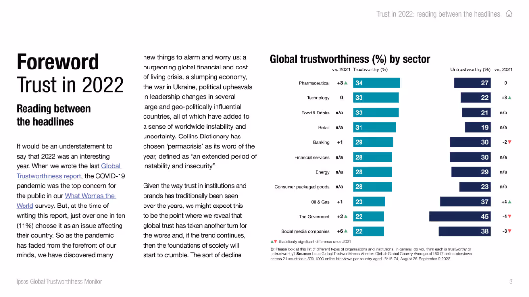
Left side contains text introduction to trust trends with bold title. Right side features a vertical bar chart of trustworthiness by sector.
Industry Overview
Professional Services
The slide introduces the 2022 trust report, highlighting the concept of 'permacrisis' and global unease. The bar chart ranks sectors by perceived trustworthiness, with pharmaceuticals and technology at the top, and government and social media companies at the bottom. Comparisons with 2021 are also shown.
trustworthiness, sectors, 2022 trends, public opinion, pharmaceuticals, technology, government, social media
Mixed Chart
IPSOS
Saved
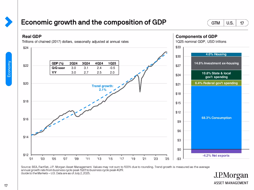
Split layout with a line chart on the left showing real GDP trend from 2001 to 2025 and a stacked bar chart on the right illustrating the components of 1Q25 nominal GDP. Simple design with blue highlights and clean axis labels.
Market Analysis and Trends
Financial Services
The slide shows long-term real GDP growth versus trend growth (2.1%) and Q/Q and Y/Y changes into Q1 2025. The GDP composition highlights consumption (68.3%) as the largest share, followed by investment, government spending, and net exports.
GDP, consumption, trend growth, investment, net exports, government, economy, real GDP, Q1 2025, economic composition
Multiple Chart
JP Morgan
Saved
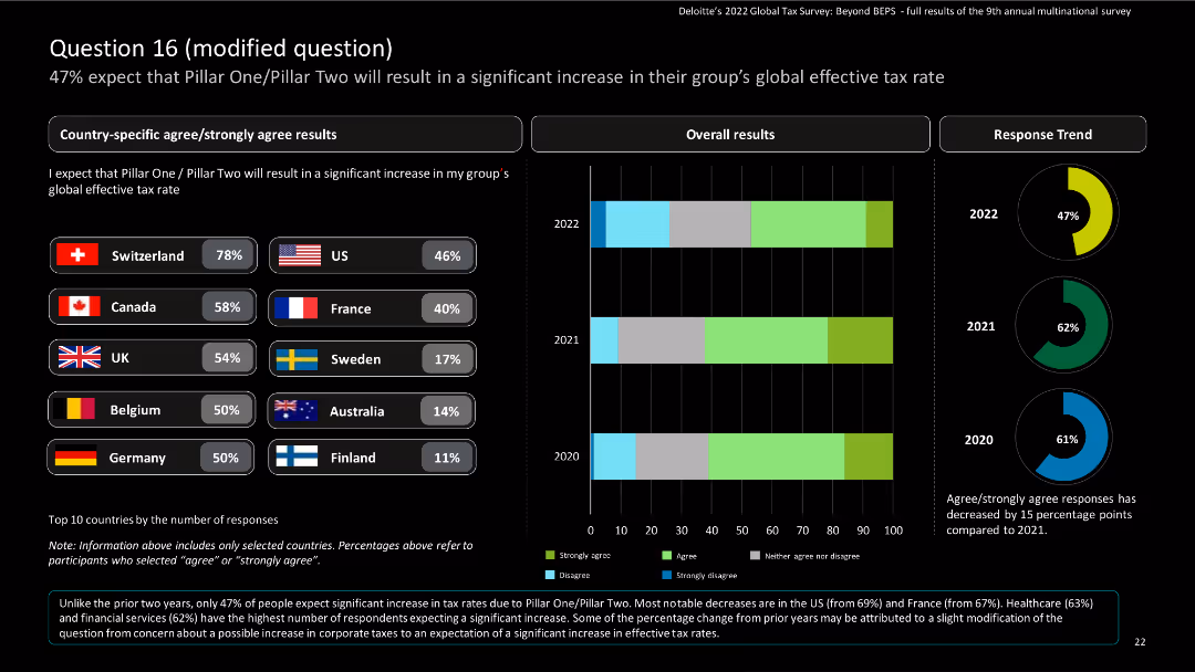
The slide features country-specific results using bar charts and a column chart for overall results, including a donut chart for response trends.
Risk Assessment and Management
Financial Services
The slide provides survey results on the expected increase in global effective tax rates due to Pillar One/Pillar Two. It shows country-specific and overall responses from 2020 to 2022.
Pillar One, Pillar Two, tax rates, survey, financial services
Multiple Chart
Deloitte
Saved
Bar chart comparing top client-facing use cases for retail and commercial banks.
Customer and Market Segmentation
Financial Services
Highlights top client-facing use cases, emphasizing cross-selling and personalized advertising for both retail and commercial banks.
client-facing, retail, commercial, banks, use cases
Multiple Chart
EY
Saved
Line chart showing the year-over-year growth of global personal luxury goods by channel from 2017 to 2023.
Strategic Planning
Consumer Goods
Examines the normalization of channel dynamics post-pandemic, focusing on retail, wholesale, and e-commerce.
Channel, Dynamics, Post-pandemic, Growth, Luxury
Mixed Chart
Kearney
Saved
Slide includes a line graph and bar charts showing the growth of free member enrollments alongside demographic data about the Brazilian population.
Performance Metrics and KPIs
Financial Services
Showcases Serasa's expansion in Brazil, highlighting significant increases in membership enrollments and its impact on financial inclusivity in the Brazilian market.
Serasa, Brazil, membership growth, financial inclusivity, demographic data
Multiple Chart
Barclays
Saved
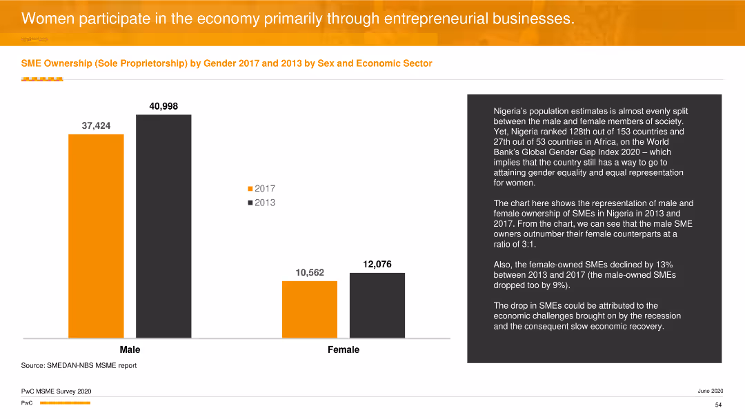
A column chart comparing male and female SME ownership between 2013 and 2017, with a notable gender gap. The bars are in orange and black, representing different years.
Industry Overview
Professional Services
The slide highlights the gender disparity in SME ownership in Nigeria, showing more male-owned businesses compared to female-owned, with data from 2013 and 2017.
gender disparity, SME ownership, professional services, column chart, industry overview
Mixed Chart
PwC/Strategy&
Saved
This slide presents a bar chart detailing expenditure allocations for top 15 ministries for the fiscal year 2019/20, displayed in descending order of funding.
Regulatory and Compliance
Government & Public Sector
Showcases budget allocations across different government ministries, emphasizing financial priorities and allocations.
Budget allocation, government ministries, fiscal management
Single Chart
PwC/Strategy&
Saved
This slide features two column charts. The left chart shows projected global investment in cybersecurity. The right chart shows projected revenue growth of cyber firms.
Market Analysis and Trends
Technology & Software
The slide presents a comparative analysis of investment in cybersecurity versus the revenue growth of cyber firms, demonstrating the sector's financial health.
cybersecurity, investment, revenue growth, technology, finance
Multiple Chart
Citigroup
Saved
Column charts comparing financial ratios and targets over time. Simple and clean layout.
Financial Performance
Energy & Utilities
Analyzes the financial strength of the company, highlighting debt management and financial targets.
financial, strength, debt, targets, management
Mixed Chart
Barclays
Saved
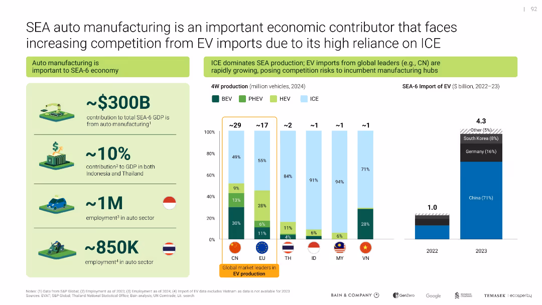
Left side highlights economic contribution; right side contrasts local production with imports via bar graphs and icons
Competitive Landscape
Industrial & Manufacturing
Analyzes the economic importance of auto manufacturing in SEA-6 and the growing competitive pressure from EV imports, especially from China. Compares local ICE-heavy production vs. rising foreign EV supply.
auto manufacturing, ICE, EV imports, SEA economy, competition, China
Multiple Chart
Bain
Saved
The slide utilizes a mix of icons, text, and a three-part list to describe Macquarie's risk management approach. It has a clear and straightforward design, with good use of whitespace and a structured layout. The slide uses a color scheme consistent with the Macquarie brand.
Risk Assessment and Management
Financial Services
It outlines the core principles and model of risk management at Macquarie, emphasizing business accountability and stability. This slide is intended to communicate Macquarie’s established risk culture and its alignment with industry-standard 'three lines of defence' risk management to stakeholders.
risk management, Macquarie, business accountability, stability, principles, three lines of defence, operational risk, corporate governance
Header Horizontal
Morgan Stanley
Saved
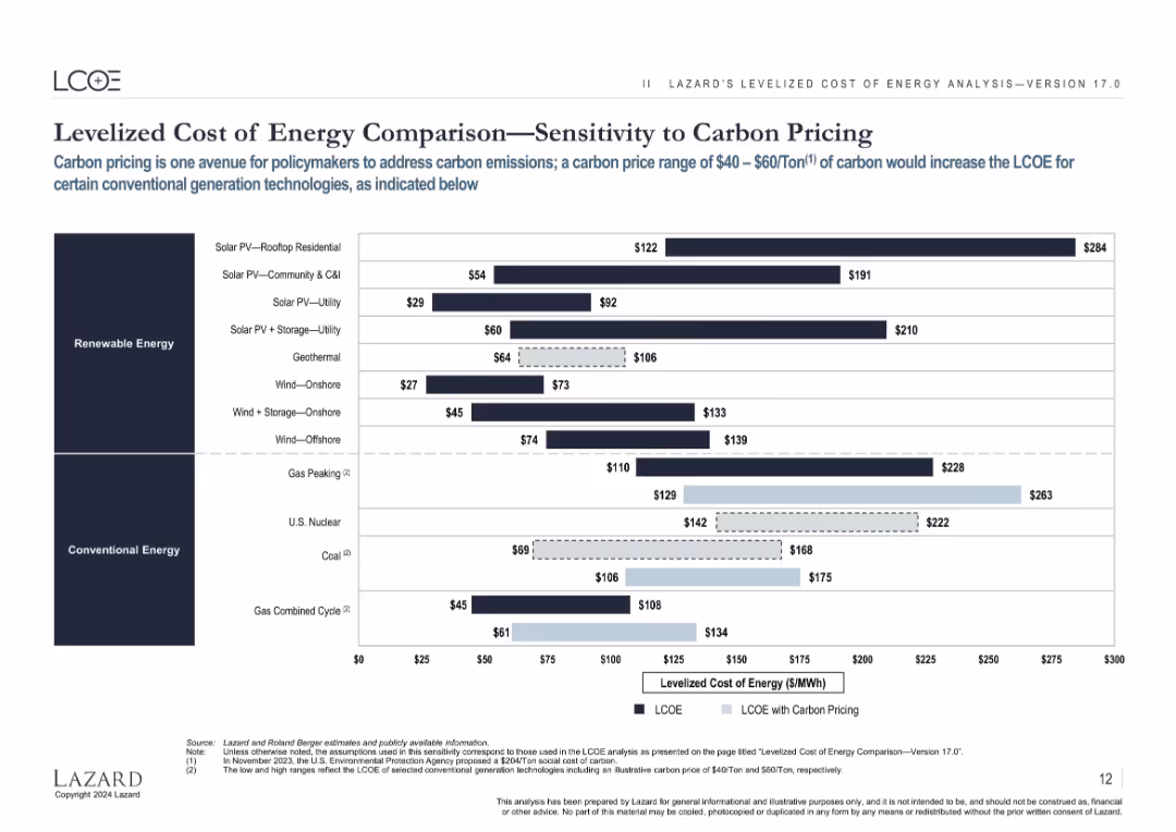
Same layout as previous LCOE slides, with an overlay showing impact of $40–$60/ton carbon pricing on conventional energy LCOEs.
Regulatory and Compliance
Energy & Utilities
Highlights how carbon pricing can raise the LCOE of fossil fuel-based energy sources, making renewables more favorable by comparison in policy-driven environments.
carbon pricing, LCOE, emissions, policy, fossil fuel, cost, sensitivity, regulation
Single Chart
Roland Berger
Saved
Bar chart showing various savings goals among Canadians pre-COVID-19. Bars indicate the percentage of respondents with 'Yes', 'No', and 'Not applicable' responses for each savings goal. Dense text at the top explains the context.
Market Analysis and Trends
Financial Services
The slide presents data on the savings goals of Canadian investors before COVID-19, highlighting the percentage contributing to goals such as retirement, travel, and education. It notes gender differences and the high proportion of younger investors saving for these goals.
Savings, Goals, Canadians, Retirement, Travel, Education
Mixed Chart
IPSOS
Saved
The slide utilizes a clean layout with icons and text to discuss key factors like Equity Story and Financial Reporting in IPO processes.
Strategic Planning
Financial Services
This slide discusses the key elements that maximize value in an IPO, including equity stories, financial reporting, and the importance of internal setup and partners.
IPO, value, equity, financial reporting, partners, transparency, control
Pillar
PwC/Strategy&
Saved
The slide features a flowchart with statistical data, grouped under two categories: formal and informal education users. It includes percentage statistics, positive and negative impact highlights, and color coding for clarity (purple and blue). The right side presents a summary block with overall impact statistics.
Market Analysis and Trends
Telecommunications
This slide explores the impact of nbn broadband on educational outcomes, highlighting both positive and negative aspects as reported by users.
Education, Internet, Broadband, Impact, Statistics, Positive, Negative, Formal, Informal, Telecommunications
Multiple Chart
Accenture
Saved
The slide presents several pie charts and a column chart detailing the types of CRE loans in the US by city and the quarterly changes in CLPs. It includes annotations for risk management strategies and impacts.
Risk Assessment and Management
Real Estate & Construction
Explores the dynamics of the U.S. CRE market, focusing on loan modifications, risk management practices, and recent trends in CLPs. Supports strategic decision-making in managing real estate portfolios, especially in understanding geographic and sector-specific risks.
CRE, US market, loan modifications, risk management, geographic risks, sector-specific risks, CLPs
Multiple Chart
Deutsche Bank
Saved
A column chart with five vertical bars indicating percentages of firm growth rates. The bars are in orange, and the text description on the right side.
Financial Performance
Professional Services
The slide shows the distribution of firm growth rates over the last three years, highlighting the percentage of firms growing over 20%, less than 20%, not applicable, no growth, and those shrinking.
firm growth, percentages, distribution, column chart, professional services
Mixed Chart
PwC/Strategy&
Saved
Line chart tracking 5Y, 7Y, and 10Y breakeven inflation rates vs. post-pandemic averages.
Market Analysis and Trends
Financial Services
This slide discusses the upward trend in inflation expectations as measured by breakeven rates. It shows that 5Y, 7Y, and 10Y breakevens have all moved above post-pandemic averages, indicating market concerns over longer-term inflationary pressures.
inflation expectations, breakeven rates, macroeconomic trends, monetary policy, inflation trend, fixed income
Single Chart
Morgan Stanley
Saved
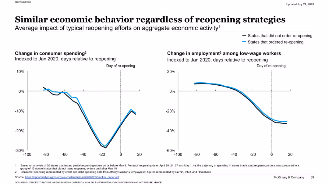
Side-by-side line charts compare consumer spending and employment trends indexed to Jan 2020, with one line for states that reopened and another for those that did not. Minimalist layout with clear labeling.
Operational Efficiency
Government & Public Sector
Analyzes the impact of reopening strategies on economic activity in US states. It finds minimal difference in consumer spending and employment between states that reopened early and those that did not, suggesting reopening had limited economic influence.
reopening impact, consumer spending, low-wage employment, economic behavior, state comparison, reopening strategies, COVID-19, indexed trend, mobility vs economy
Multiple Chart
McKinsey
Saved
Previous
Next
If nothing, comes up, please save your slides first
Create a FREE account to continue browsing
Receive Instant Access to 1,000+ slides from companies like McKinsey, Google, and Goldman Sachs
First Name
Last Name
Email
Password
I agree to all
Terms & Privacy Policy
Thank you! Your submission has been received!
Oops! Something went wrong while submitting the form.
Have an account?
Sign in
Column Chart
Heatmap
Chevron
Org Chart
Infographic
Callouts
Timeline
List
Graphic
Picture
Process Flow
Diagram
Paragraph
Map
Table
Framework
Subtitle
Takeaway Box
Icon
Other Chart
Radar Chart
Waterfall Chart
Mekko Chart
Pie Chart
Scatter Plot
Line Chart
Bar chart
Bullet points