My Account
My Slides
Search by Category
Templates
Leave Feedback
Login
Logout
Get Started
Browse all Slides
Browse all Slides
Create a FREE Account
Instant access to 1,000+ real slides from top companies like McKinsey, BCG, Goldman Sachs, Google and many more!
First Name
Last Name
Email
Password
I agree to all
Terms & Privacy Policy
Thank you! Your submission has been received!
Oops! Something went wrong while submitting the form.
Have an account?
Sign in
Saved Slides
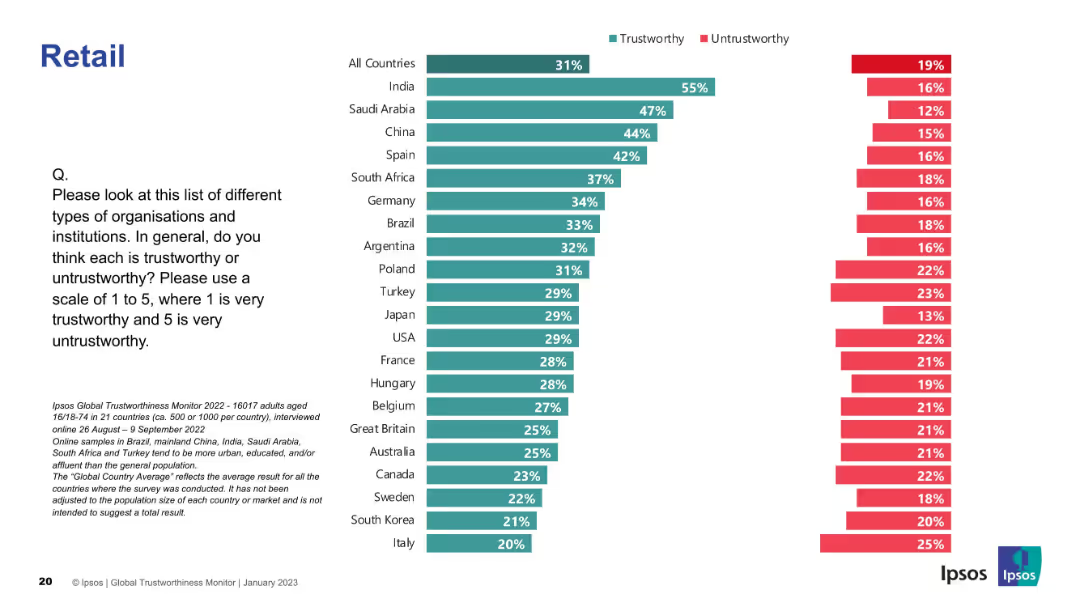
Bar graph layout; trust levels across countries in retail sector; uses standard green/red coding.
Market Analysis and Trends
Retail & E-commerce
The slide analyzes public trust in the retail sector globally. India, Saudi Arabia, and China rank highest for trust; Italy and South Korea are lower.
retail, trust, perception, global survey, Ipsos, countries, ranking, consumer opinion, trustworthy, untrustworthy
Mixed Chart
IPSOS
Saved
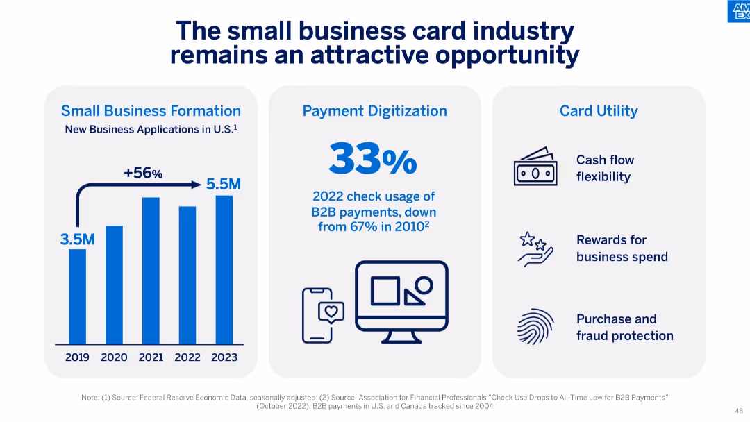
Three-part layout with vertical bar chart on small business formation, a bold percentage on check usage decline, and icons listing card utility benefits.
Market Analysis and Trends
Financial Services
The slide argues the continued attractiveness of the small business card industry, supported by strong new business formation, declining use of checks in B2B payments, and high utility from card features like rewards and fraud protection.
small business, formation, B2B payments, card utility, check decline, rewards, cash flow, digitization, fintech
Mixed Chart
McKinsey
Saved
This slide uses a dark theme with three column charts displaying progress against targets from 2020 to 2022 for metrics like ROE, ROTE, and efficiency ratio. The charts are aligned in a row with descriptive annotations and percentage values. There's a contrasting color for the 2020 bar in each chart to highlight the impact of litigation.
Financial Performance
Financial Services
The slide provides a clear comparison of financial performance against past targets and current achievements, with a specific focus on ROE, ROTE, and efficiency ratio, relevant for stakeholders to assess the firm's financial health and operational efficiency.
ROE, ROTE, efficiency ratio, progress, targets
Multiple Chart
Goldman Sachs
Saved
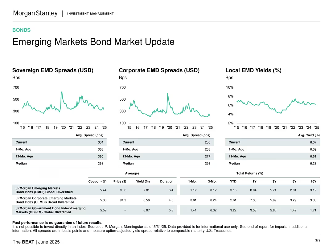
Three time-series graphs for sovereign, corporate, and local EM bonds; tables for spread, yield, and returns.
Market Analysis and Trends
Financial Services
Reviews sovereign and corporate bond spreads and local bond yields in emerging markets, comparing current data vs. past and averages, with return tables.
emerging markets, bond spreads, sovereign debt, corporate bonds, yield, returns, fixed income, investment strategy
Multiple Chart
Morgan Stanley
Saved
The slide includes a column chart depicting the percentage of people receiving various types of help, comparing data from May and December. Text boxes highlight key percentages.
Client Case Studies
Healthcare & Pharmaceuticals
This slide presents data on the types of help received by people in the last month, comparing survey results from May and December, with a focus on the percentage of people receiving different types of help.
help, survey, received, comparison, types of help, column chart, healthcare, public opinion, time periods
Single Chart
IPSOS
Saved
This world map slide highlights specific countries like the USA, China, India, and Japan with red pins, indicating a focus on these regions for the survey. It provides a clear global comparison context.
Industry Overview
Professional Services
Offers a global overview of the countries prioritized in the survey, marking them as critical for understanding varying cultural attitudes across different regions.
global survey, cultural study, USA, China, India, Japan
Graphic
PwC/Strategy&
Saved
Combines column charts and small line graphs with future financial projections and economic indicators.
Financial Performance
Financial Services
Provides financial forecasts based on current economic scenarios with data up to 2026.
financial, forecasts, 2026, economy, scenarios
Multiple Chart
Barclays
Saved
The slide features text, percentage data, and column charts showing the development of ChatGPT policies and discussions on generative AI risks at the executive level.
Regulatory and Compliance
Technology & Software
This slide discusses the development of acceptable use policies for ChatGPT and the board-level discussions on generative AI risks, including percentages of organizations with policies in place.
ChatGPT, Policies, IT Leaders, Generative AI, Risk Management
Multiple Chart
Gartner
Saved
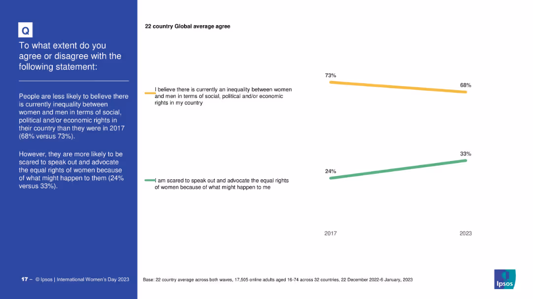
Minimalist design with two trend lines (2017 vs 2023); highlights changes over time for two statements; time comparison is the visual focus
Strategic Planning
Professional Services
This slide compares public opinion in 2017 and 2023 on gender inequality and fear of advocating for women’s rights. It shows that belief in inequality has declined slightly, while fear of advocacy has increased.
time trends, gender equality, opinion shift, advocacy, social change, Ipsos, 2017 vs 2023
Mixed Chart
IPSOS
Saved
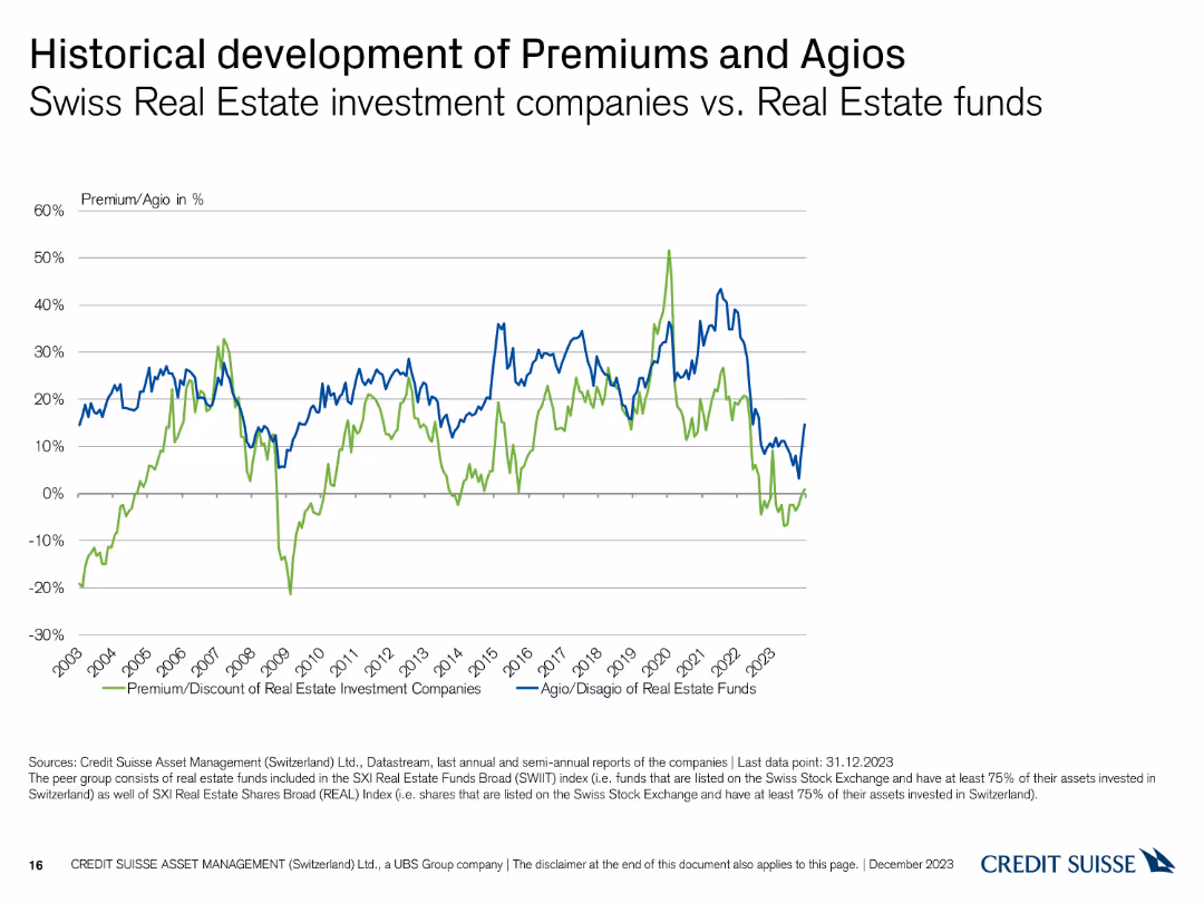
This slide contains a line chart comparing the historical development of premiums and agios for Swiss real estate funds.
Market Analysis and Trends
Real Estate & Construction
It shows the historical trends in premiums and agios for Swiss real estate investment companies versus real estate funds from 2003 to 2023.
historical, premiums, agios, real estate, funds
Single Chart
Credit Suisse
Saved
Features multiple small bar charts in red and green, visually comparing sentiments like burnout and job pride among French workers against other countries.
Organizational Structure and Change
Professional Services
Explores job satisfaction and employee sentiment among French workers compared to other countries, focusing on aspects like burnout and pride, valuable for HR and organizational planning.
French workers, job satisfaction, burnout, bar chart
Multiple Chart
BCG
Saved
Right side contains multi-year bar chart; left has contextual text with a bold quote box. Color-coded by year.
Performance Metrics and KPIs
Professional Services
Highlights the top five most trusted professions from 2018 to 2022: doctors, scientists, teachers, armed forces, and ordinary people. Notes recent dips in trust for teachers and doctors in specific countries but overall consistency near the top of the trust scale.
professions, trust, Ipsos, top trusted, trends, teachers, doctors, global
Mixed Chart
IPSOS
Saved
A triangular diagram divided into three segments (Prediction, Adaptability, Resilience) with descriptive text, emphasizing the importance of each in thriving through uncertainty.
Strategic Planning
Professional Services
Highlights the importance of adaptability, prediction, and resilience in navigating uncertainty in business environments. Useful for strategic planning and change management discussions.
resilience, adaptability, prediction, uncertainty, business strategy, change management, thrive
Framework
Bain
Saved
The slide features a pie chart and bar charts showing the education/employment status and employment types of young people involved in the program.
Performance Metrics and KPIs
Education & Training
The slide evaluates the long-term impact of the program, showing high percentages of participants in education or employment and satisfaction with their jobs.
long-term impact, education, employment, program evaluation
Multiple Chart
EY
Saved
Displays multiple text sections with icons, quotes, and bullet points. There's a graphical element indicating environmental, social, and governance approaches.
Corporate Finance and Valuation
Financial Services
This slide presents the company's commitment to ESG, highlighting scholarship contributions and workforce support, intended for sustainability reports.
ESG, Scholarships, Workforce Support, Environmental Impact, Governance
Mixed Chart
Morgan Stanley
Saved
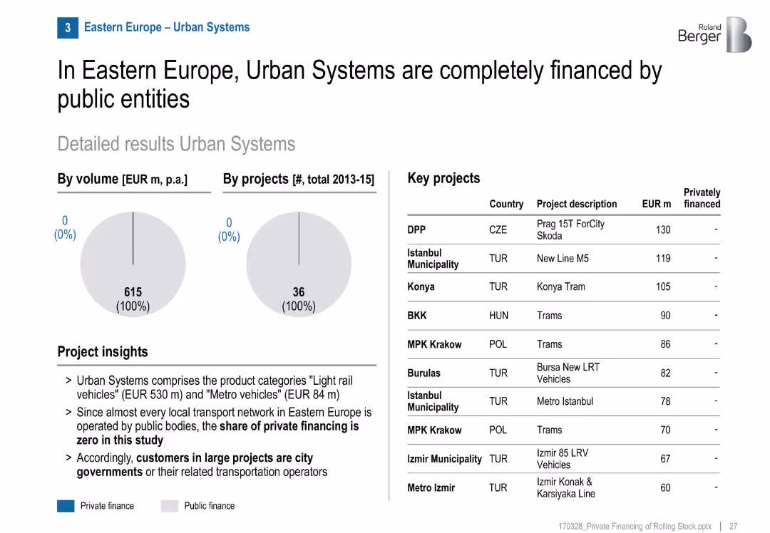
Two pie charts (volume and project count) showing 100% public finance; table listing key projects; project insights in bullet format; clean and structured layout.
Investment Analysis
Transportation & Logistics
The slide shows that from 2013–2015, all urban rail systems in Eastern Europe were publicly financed, with no private investment. Major urban transit projects are listed by cost.
urban systems, public finance, Eastern Europe, rail transport, light rail, metro, investment, municipalities, infrastructure
Mixed Chart
Roland Berger
Saved
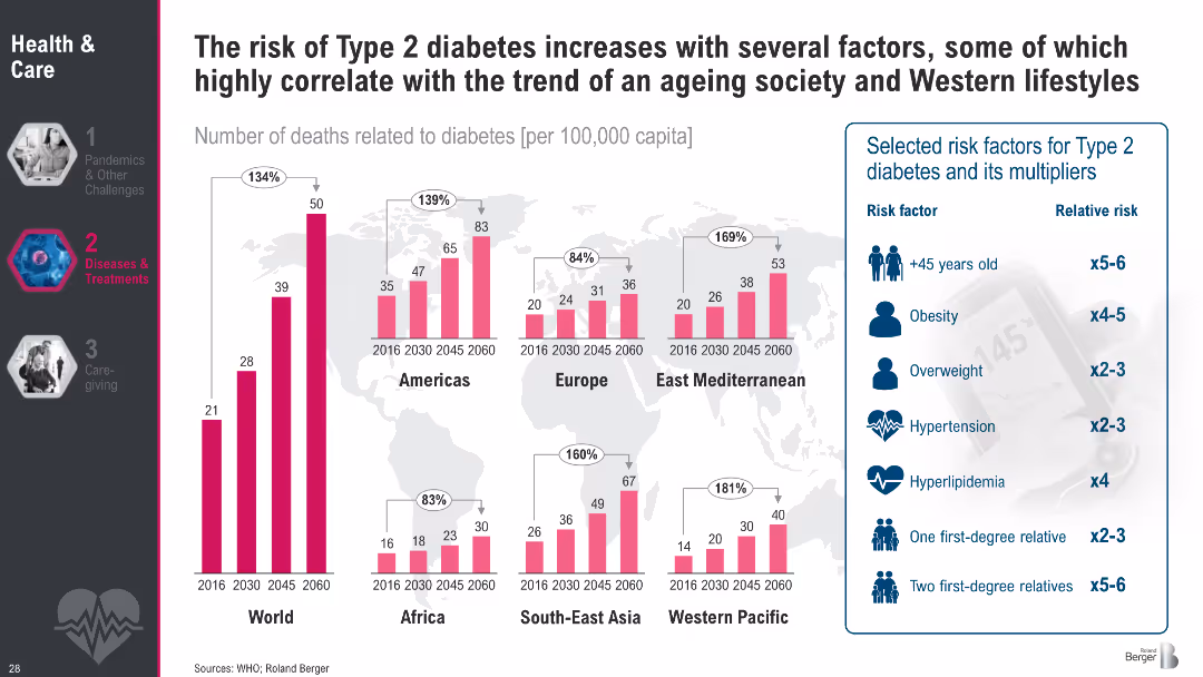
Regional bar charts showing diabetes death rates (2016–2060); sidebar lists key risk factors with relative risks
Risk Assessment and Management
Healthcare & Pharmaceuticals
This slide illustrates the correlation between Type 2 diabetes mortality and contributing risk factors such as age, obesity, and hypertension. It highlights regional trends and emphasizes how modern lifestyles amplify diabetes risk.
Type 2 diabetes, obesity, aging, risk factors, hypertension, mortality, lifestyle diseases, public health, metabolic disorders
Multiple Chart
Roland Berger
Saved
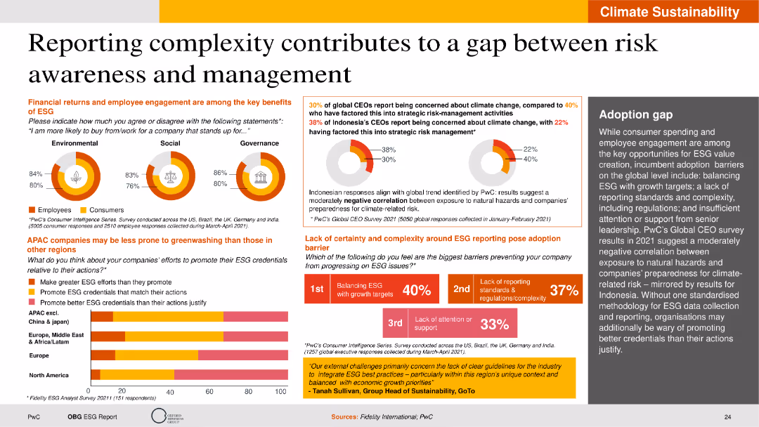
The slide is visually detailed with pie charts, bar charts, and text boxes. It uses a clear layout to present data on CEO concerns about climate change, ESG reporting barriers, and engagement benefits.
Risk Assessment and Management
Financial Services
The slide examines the complexity of ESG reporting and its impact on risk awareness and management. It highlights the concerns of global and Indonesian CEOs regarding climate change, the key benefits of ESG in terms of financial returns and employee engagement, and the barriers to effective ESG reporting. The slide also discusses regional differences in greenwashing susceptibility and adoption gaps.
ESG reporting, risk management, climate change, CEO concerns, greenwashing
Multiple Chart
PwC/Strategy&
Saved
The slide includes a bar chart showing US month-over-month change in total nonfarm employment from January 2021 to June 2023 and a line chart showing US real consumption expenditures and disposable income from January 2020 to May 2023.
Market Analysis and Trends
Financial Services
This slide indicates a resilient US labor market, but predicts a slowdown with reduced hiring and increased layoffs, while examining trends in consumer spending and disposable income.
labor market, employment, consumption, disposable income, slowdown
Multiple Chart
EY
Saved
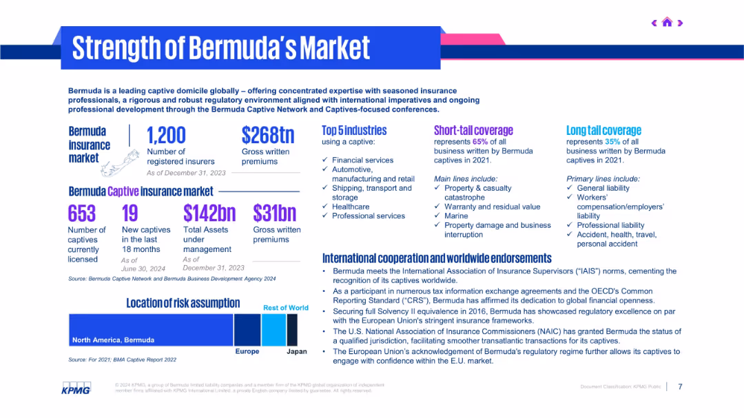
Infographic layout with multiple blocks, charts, and figures using purple and blue tones.
Industry Overview
Financial Services
The slide presents Bermuda’s position as a leading captive insurance market, detailing metrics like number of insurers, gross premiums, and top industries. It highlights coverage types, international endorsements, and geographic risk assumption.
Bermuda, captives, insurance market, premiums, endorsements, coverage
Mixed Chart
KPMG
Saved
A bar graph with a percentage breakout showing the prioritization of personalized product offerings by executives.
Market Analysis and Trends
Professional Services
Evaluates the importance placed on personalized products in business strategy, as seen by different company sizes and executive roles.
Personalization, Executive Priorities, Bar Graph, Product Strategy
Single Chart
Kearney
Saved
The slide contains a line chart of consumer sentiment and a stacked bar chart of household real disposable income growth contributions by source.
Market Analysis and Trends
Financial Services
This slide reviews consumer sentiment trends and household income growth in Australia, providing insights into economic conditions and consumer behavior.
consumer sentiment, disposable income, Australia, economic conditions, household income
Multiple Chart
JP Morgan
Saved
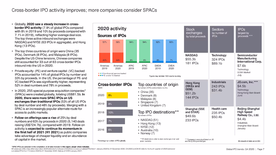
This slide includes column charts and bar charts detailing 2020 IPO activity by region and stock exchange. There are several highlighted text boxes summarizing key figures and top companies by IPO proceeds.
Market Analysis and Trends
Financial Services
The slide provides an overview of cross-border IPO activity in 2020, with a focus on the increasing popularity of SPACs. Key statistics on IPO numbers, proceeds, and top stock exchanges are presented.
IPO, SPAC, stock exchange, proceeds, 2020
Multiple Chart
EY
Saved
The slide presents a column chart showing annual regional CO2 emissions from power generation and industries, compared to the corresponding storage capacity in years. It includes bars representing different regions worldwide.
Market Analysis and Trends
Environmental Services & Sustainability
The slide details the relationship between CO2 emissions and geological storage capacities in different regions, highlighting the storage capacity as not being a constraint in mature areas like North America.
CO2 emissions, storage capacity, regional analysis, global, power generation
Mixed Chart
Kearney
Saved
Features a line chart for mortgage rates, column charts for mortgage market origination projections, and a line chart for home price index against housing inventory, all indicating significant changes and trends.
Market Analysis and Trends
Financial Services
Addresses the current state of the mortgage rates, originations market, and home price trends, signaling a changing macroeconomic environment impacting the home lending landscape.
Mortgage Rates, Market Origination, Home Prices, Inventory Shortage, Macroeconomics
Multiple Chart
JP Morgan
Saved
Previous
Next
If nothing, comes up, please save your slides first
Create a FREE account to continue browsing
Receive Instant Access to 1,000+ slides from companies like McKinsey, Google, and Goldman Sachs
First Name
Last Name
Email
Password
I agree to all
Terms & Privacy Policy
Thank you! Your submission has been received!
Oops! Something went wrong while submitting the form.
Have an account?
Sign in
Column Chart
Heatmap
Chevron
Org Chart
Infographic
Callouts
Timeline
List
Graphic
Picture
Process Flow
Diagram
Paragraph
Map
Table
Framework
Subtitle
Takeaway Box
Icon
Other Chart
Radar Chart
Waterfall Chart
Mekko Chart
Pie Chart
Scatter Plot
Line Chart
Bar chart
Bullet points