My Account
My Slides
Search by Category
Templates
Leave Feedback
Login
Logout
Get Started
Browse all Slides
Browse all Slides
Create a FREE Account
Instant access to 1,000+ real slides from top companies like McKinsey, BCG, Goldman Sachs, Google and many more!
First Name
Last Name
Email
Password
I agree to all
Terms & Privacy Policy
Thank you! Your submission has been received!
Oops! Something went wrong while submitting the form.
Have an account?
Sign in
Saved Slides
Two-column layout with textual content on the left and a table comparing FY20 and FY21 guidance on the right. Shades of gray and blue are used for text and table elements respectively.
Financial Performance
Financial Services
Details fiscal updates, affirms segment profit guidance, and indicates an increase in NPAT guidance. It's a deep dive into financial adjustments, explaining changes in projections with a focus on integration and transition costs.
NPAT, Segment Profit, Guidance, ETR, ROIC
Mixed Chart
Goldman Sachs
Saved
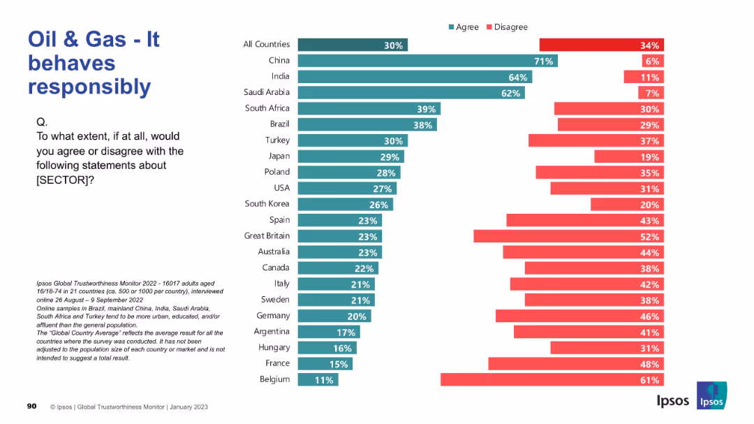
Horizontal bar graph; “agree” and “disagree” percentages visualized for each country. Clean visual with left-aligned question and Ipsos footer.
Market Analysis and Trends
Energy & Utilities
Respondents were asked whether they believe the oil & gas sector behaves responsibly. High agreement in China, India, and Saudi Arabia contrasts with skepticism in Western countries such as Belgium, France, and Germany.
Responsibility, Oil & Gas, Global Opinion, Ipsos, Ethics, Country Survey, Trust, Corporate Behavior, Accountability, Energy Industry
Mixed Chart
IPSOS
Saved
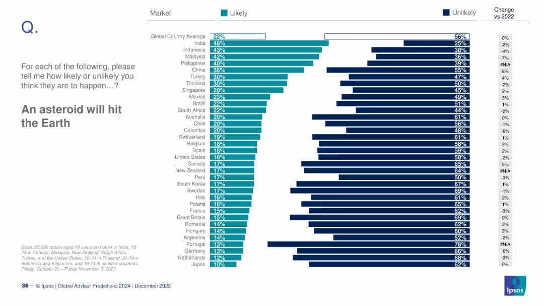
Bar chart ranked by countries on perceived asteroid impact risk; includes changes vs 2022.
Risk Assessment and Management
Government & Public Sector
The slide explores global public belief in the likelihood of an asteroid striking Earth. India shows the highest concern, while Japan shows the least. The global average is 22%, with minimal change since 2022.
asteroid, risk, global disaster, Ipsos, public belief, 2024 prediction
Mixed Chart
IPSOS
Saved
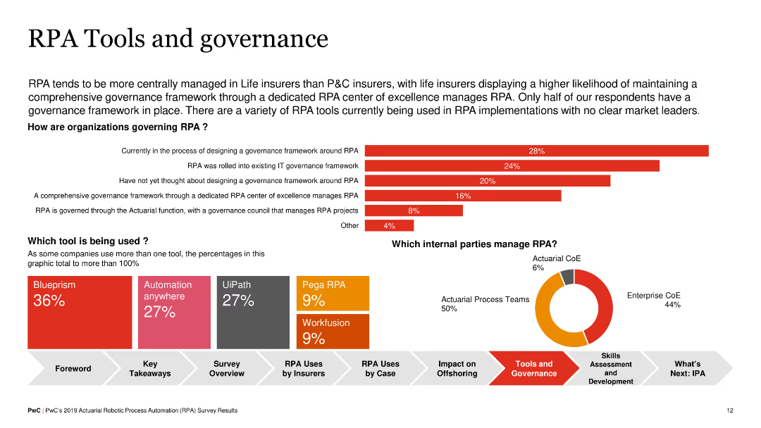
Combination of horizontal bar chart showing how organizations govern RPA and a pie chart of tools used (e.g., Blueprism, UiPath). Also includes a text box detailing the comprehensive governance frameworks in life insurers.
Operational Efficiency
Financial Services
This slide details the governance of RPA implementations in insurance, noting that life insurers often have dedicated RPA centers of excellence, and highlights popular RPA tools and their adoption rates among organizations.
RPA, Governance, Tools, Insurance, Blueprism
Multiple Chart
PwC/Strategy&
Saved
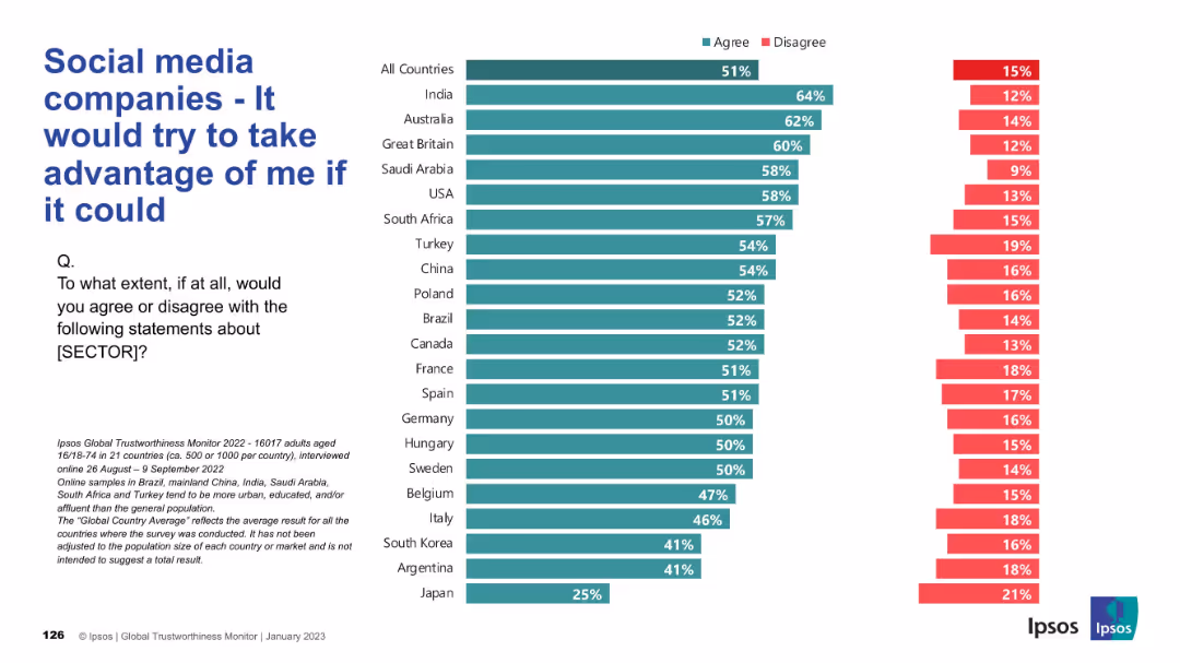
Inverted trust bar chart showing higher agreement (green) indicating negative sentiment; same horizontal layout as others.
Market Analysis and Trends
Technology & Software
This slide shows the proportion of respondents who believe social media companies would exploit users if given the chance. Unlike earlier slides, higher agreement reflects distrust. Most countries show a majority agreement, underscoring widespread user wariness and perceived exploitation.
exploitation, distrust, user sentiment, manipulation, global perception, social media
Mixed Chart
IPSOS
Saved
This slide shows a column chart assessing public opinion on reforms implemented during President Macron's second term, with detailed quotes from business leaders on the reforms' impacts.
Market Analysis and Trends
Government & Public Sector
Evaluates public and corporate opinions on various reforms implemented by President Macron, focusing on economic and social impacts, with diverse viewpoints from industry leaders.
Macron, political reforms, public opinion, France, government policy, corporate opinion, social impact, economic reforms, leadership evaluation
Mixed Chart
Bain
Saved
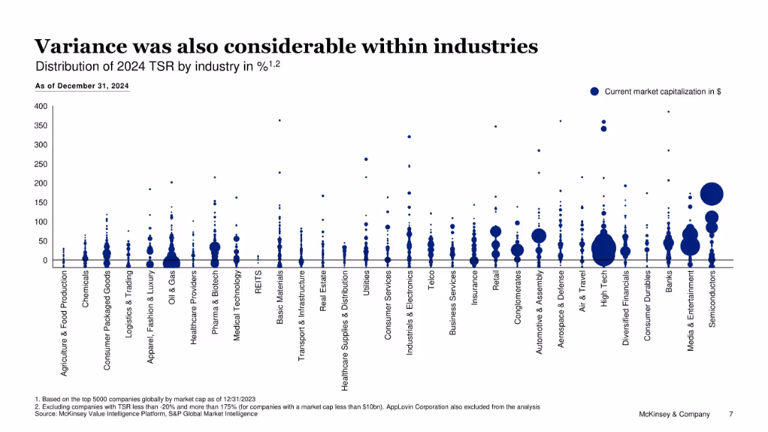
Bubble chart showing TSR distribution by industry with bubble size for market cap
Performance Metrics and KPIs
Financial Services
Shows intrasectional TSR variability within industries for 2024, suggesting dispersion in company performance despite sector trends; large bubbles show capital concentration.
TSR distribution, market cap, industry analysis, dispersion, company performance
Single Chart
McKinsey
Saved
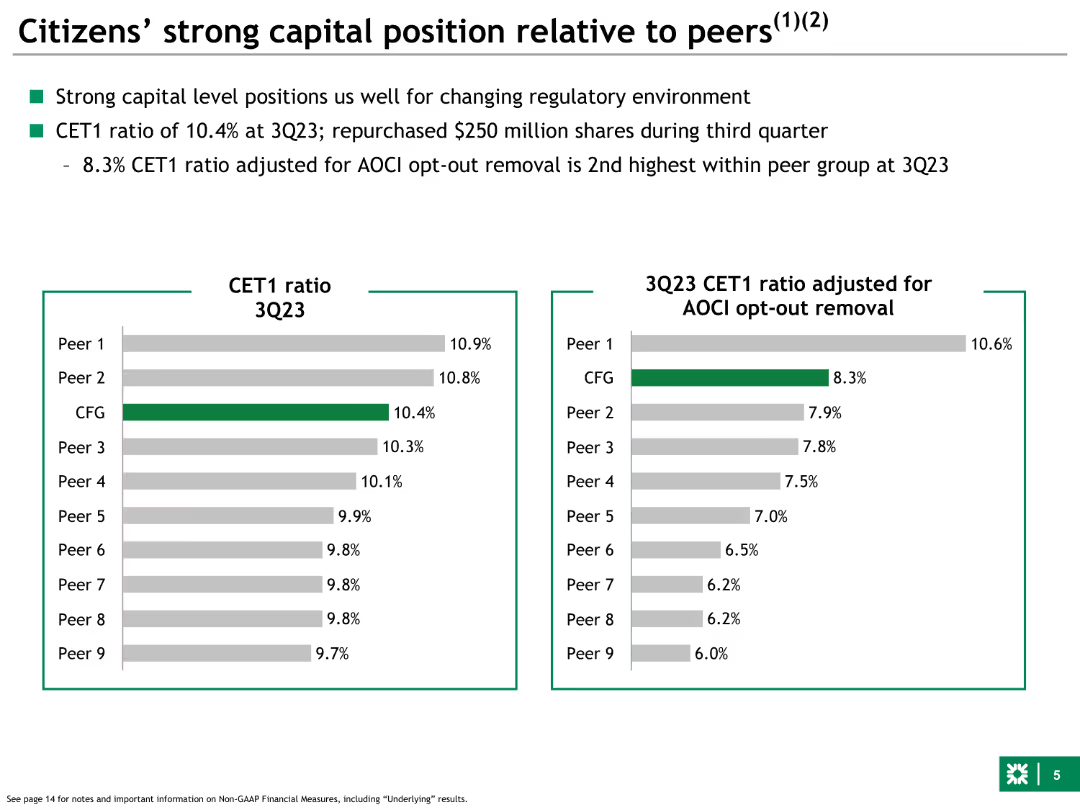
Left side features a bar chart comparing CET1 ratios of Citizens and peers. Right side adjusts CET1 ratios for AOCI opt-out removal, showing comparative financial positions.
Competitive Landscape
Financial Services
Compares Citizens' CET1 capital ratios to peers, both standard and adjusted for AOCI opt-out removal, highlighting strong capital positioning within the industry.
capital, position, Citizens, peers, CET1, comparative, AOCI, financial, ratios
Multiple Chart
Goldman Sachs
Saved
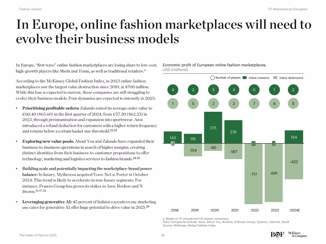
Two-column layout with bullet points on the left and a bar chart with icons and labels on the right; minimalistic design
Strategic Planning
Retail & E-commerce
This slide outlines the pressure on European online fashion marketplaces to adapt amid declining profits and market share loss. It identifies four strategic focus areas: prioritizing profitable orders, exploring B2B opportunities, balancing marketplace-brand power, and leveraging generative AI. A bar chart tracks economic profit and number of players from 2018 to 2024E, showing a downward trend.
fashion, marketplaces, Zalando, profitability, AI, B2B, Europe, Shein, Temu, trends
Mixed Chart
McKinsey
Saved
Displays line charts tracing the growth of major religious groups globally, with clear annotations and a blue monochrome color scheme for visual distinction.
Market Analysis and Trends
Education & Training
Examines the projected growth and demographic shifts among the world's major religious groups, offering insights into future religious and social dynamics.
religion, demographics, growth, global, trends, Christianity, Islam, data, future, society
Multiple Chart
Roland Berger
Saved
Bar chart showing the estimated time for financial recovery among households post-COVID-19. Categories range from one year to more than five years.
Risk Assessment and Management
Financial Services
The slide details the estimated time for Canadian households to recover financially from COVID-19, with responses indicating a range from one year to more than five years. It also notes a small percentage of respondents who feel their finances were not significantly impacted.
COVID-19, Financial Recovery, Canadian, Households, Pandemic
Mixed Chart
IPSOS
Saved
Column chart detailing adjusted pre-tax income/loss and adjustments for various divisions.
Financial Performance
Financial Services
Analyzes the financial performance of Credit Suisse in 4Q22, focusing on losses due to Investment Bank performance.
financial performance, net loss, investment bank, client activity, pre-tax income
Single Chart
Credit Suisse
Saved
Features a sequence of column chart illustrating changes in the leverage ratio over a period, complemented by a smaller bar chart depicting tier 1 capital data. Key highlights are noted on the right for quick reference.
Financial Performance
Financial Services
Focuses on the stability of the leverage ratio within a financial institution over time, emphasizing changes in regulatory treatment and capital adjustments. It provides insights into strategic financial planning and regulatory compliance.
leverage, capital, financial, compliance, stability
Mixed Chart
Deutsche Bank
Saved
The slide contains a mix of text and icons describing primary end markets, demand drivers, and outlook for the waste and recycling segment.
Market Analysis and Trends
Environmental Services & Sustainability
It details the resilience of the waste and recycling segment against commercial volume reduction, highlighting residential, commercial, and industrial demand.
Waste, recycling, demand, commercial, residential, industrial, segment, outlook, primary markets
Table
LEK
Saved
A comprehensive chart illustrating online retail penetration in SEA with comparisons to India and China.
Market Analysis and Trends
Retail & E-commerce
Projects the growth of online retail penetration in SEA, analyzing the contribution of ecommerce to total retail and highlighting the expected rise in groceries.
online retail, growth, SEA, ecommerce contribution, retail penetration
Multiple Chart
Bain
Saved
Slide includes a large pie chart illustrating time spent on various activities by insurance underwriters, accompanied by a breakdown of activities in percentages.
Operational Efficiency
Financial Services
Analyzes how insurance underwriters allocate their time across different activities such as risk analysis, data entry, and sales development, highlighting operational efficiencies.
time allocation, insurance, underwriters, operational efficiency, risk analysis, sales development, data management
Multiple Chart
Accenture
Saved
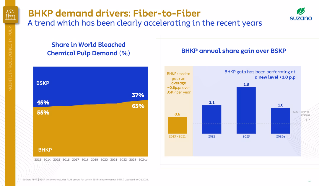
Left graph shows BHKP vs. BSKP share trend; right bar chart compares share gain. Uses a dual-panel data layout.
Market Analysis and Trends
Industrial & Manufacturing
The slide shows BHKP’s growing share in world pulp demand from 55% in 2013 to 63% in 2024, surpassing BSKP. Highlights increasing annual gains, particularly post-2022, signaling a market shift to hardwood pulp.
BHKP, BSKP, market share, demand growth, pulp, Suzano, fiber substitution
Multiple Chart
Goldman Sachs
Saved
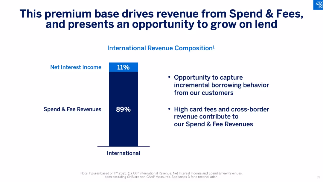
Bar chart with two categories; text emphasizes future lending opportunity and current revenue composition.
Financial Performance
Financial Services
The slide shows that 89% of international revenue comes from spend and fee revenues, with only 11% from net interest income. It highlights an opportunity to expand into lending, building on a strong base of premium, fee-paying customers.
revenue composition, net interest income, spend revenue, fee revenue, lending opportunity, premium base, financial breakdown
Mixed Chart
McKinsey
Saved
The slide presents a segmented bar chart with text explanations on inflation impact responses and various cost increase management strategies.
Risk Assessment and Management
Consumer Goods
It explains how food & beverage companies manage inflation-driven cost increases through margin reduction, passing costs to customers, and other strategies.
Inflation, cost management, food & beverage, margin reduction, passing costs, supplier interventions, hedging, demand management
Mixed Chart
Kearney
Saved
The slide features the title of a report on digital growth in a bold, large font. The left side of the slide contains text while the right side displays a background image of two children looking at a screen. The design is minimal, focusing attention on the report's title and the image that hints at inclusivity and future-oriented perspectives.
Industry Overview
Technology & Software
The slide serves as the title for a report on digital growth in Indonesia, setting the stage for a detailed discussion on expanding digitalization efforts beyond metropolitan areas. The visual and textual elements combined aim to evoke curiosity and engage stakeholders in exploring the strategies for harnessing digital growth opportunities in the broader Indonesian context.
Digital Growth, Indonesia, Metropolitan Areas, Technology Inclusion, Education, Future Trends, Digitalization, Market Expansion, Strategic Development, Report Title
Title
Kearney
Saved
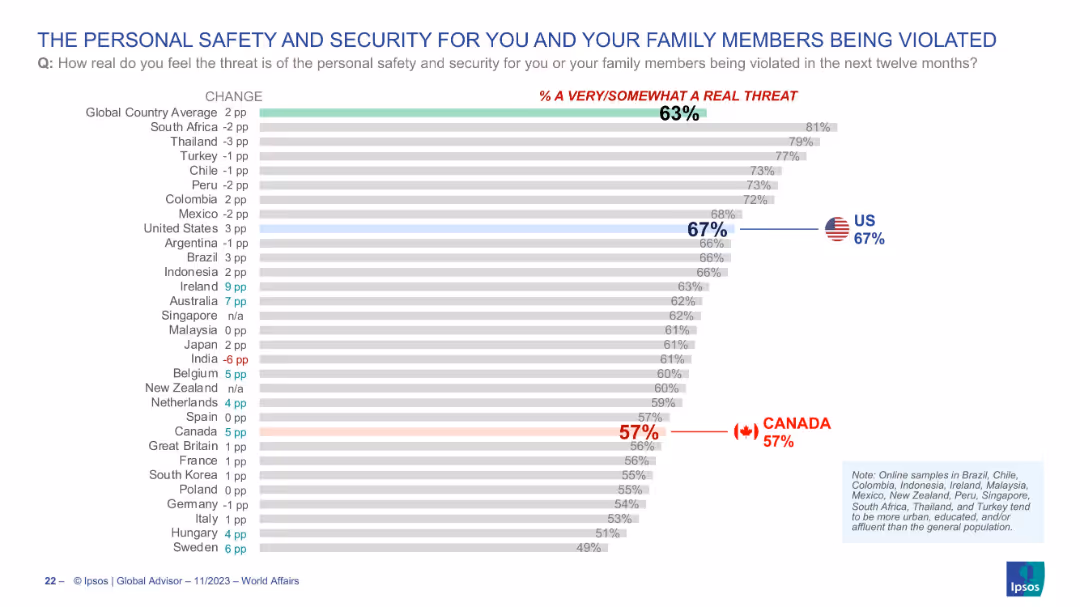
Horizontal bar chart showing country-wise public sentiment on personal/family safety; Canada and US highlighted with flags and bolded percentages.
Risk Assessment and Management
Government & Public Sector
This slide explores public fears regarding personal safety or that of family members being violated within the next year. The US stands at 67% and Canada at 57%, while the global average is 63%. It provides insight into societal perceptions of crime and domestic insecurity.
personal security, family safety, crime risk, perception, Canada, USA, Ipsos, threat, public opinion
Single Chart
IPSOS
Saved
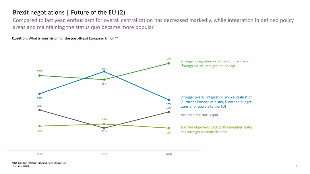
The slide includes a line chart comparing changes in opinions on the future of the EU over time, with data points for integration and decentralization preferences.
Regulatory and Compliance
Government & Public Sector
This slide compares survey data over time, showing trends in preferences for EU integration versus decentralization. It provides insights into changing opinions on EU policies post-Brexit.
Brexit, EU future, trends, integration, decentralization
Mixed Chart
Deloitte
Saved
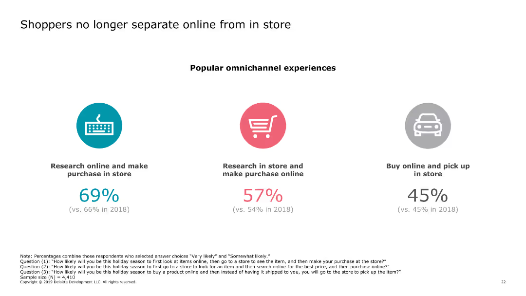
The slide contains three circular icons, each representing a different shopping behavior (research online and make purchase in store, research in store and make purchase online, buy online and pick up in store). Each icon has a corresponding percentage below it.
Market Analysis and Trends
Retail & E-commerce
The slide highlights the trend of shoppers blending online and in-store experiences, showing the percentages of different omnichannel shopping behaviors. This indicates growing integration between online and offline shopping.
online shopping, in-store shopping, omnichannel, consumer behavior, retail trends
Pillar
Deloitte
Saved
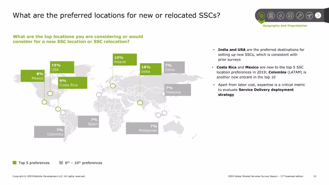
A world map highlighting preferred locations for SSCs with colored blocks indicating percentages. Right side contains bullet points summarizing the key insights.
Market Analysis and Trends
Professional Services
The slide shows the preferred locations for new or relocated SSCs with India, USA, and Costa Rica being the top choices. It includes a world map with highlighted countries and percentage preferences. Additional bullet points summarize trends and insights.
SSC, preferred locations, market trends, insights, geography
Graphic
Deloitte
Saved
Includes several line graphs showing predicted infection paths under different immunity and infection rate scenarios, annotated for clarity and comparison.
Strategic Planning
Healthcare & Pharmaceuticals
Analyzes potential COVID-19 infection trajectories for Austria under various public health response scenarios, aiding in policy decision-making and strategy adjustment.
COVID-19, Austria, scenario analysis, infection rates, public health response, policy planning
Multiple Chart
McKinsey
Saved
Previous
Next
If nothing, comes up, please save your slides first
Create a FREE account to continue browsing
Receive Instant Access to 1,000+ slides from companies like McKinsey, Google, and Goldman Sachs
First Name
Last Name
Email
Password
I agree to all
Terms & Privacy Policy
Thank you! Your submission has been received!
Oops! Something went wrong while submitting the form.
Have an account?
Sign in
Column Chart
Heatmap
Chevron
Org Chart
Infographic
Callouts
Timeline
List
Graphic
Picture
Process Flow
Diagram
Paragraph
Map
Table
Framework
Subtitle
Takeaway Box
Icon
Other Chart
Radar Chart
Waterfall Chart
Mekko Chart
Pie Chart
Scatter Plot
Line Chart
Bar chart
Bullet points