My Account
My Slides
Search by Category
Templates
Leave Feedback
Login
Logout
Get Started
Browse all Slides
Browse all Slides
Create a FREE Account
Instant access to 1,000+ real slides from top companies like McKinsey, BCG, Goldman Sachs, Google and many more!
First Name
Last Name
Email
Password
I agree to all
Terms & Privacy Policy
Thank you! Your submission has been received!
Oops! Something went wrong while submitting the form.
Have an account?
Sign in
Saved Slides
The slide features a line graph tracking CEO optimism versus pessimism over time, alongside a detailed analysis. The layout is clean with a balance of text and visual data.
Market Analysis and Trends
Professional Services
Depicts a shift in CEO sentiment towards economic growth, showcasing an increasing trend in pessimism. Useful for discussions on market sentiment and planning.
CEO, Pessimism, Optimism, Economic Growth, Survey
Mixed Chart
PwC/Strategy&
Saved
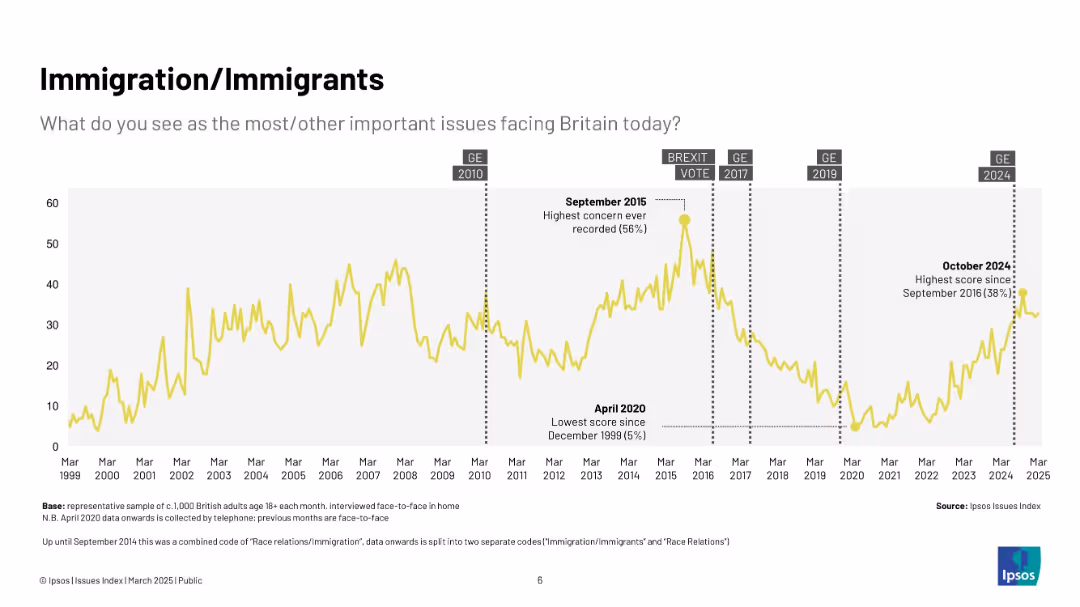
Yellow line chart (1999–2025) showing concern about immigration over time; highlights key dates like Brexit vote and 2015 peak.
Market Analysis and Trends
Government & Public Sector
Displays long-term trends in public concern around immigration in the UK, with major spikes during political debates and crises, notably Brexit and the 2015 refugee crisis.
immigration, Ipsos, Brexit, refugees, public concern, UK, politics, timeline
Single Chart
IPSOS
Saved
Column and line charts correlating deal activity in the transport and logistics sector with global GDP growth.
Mergers and Acquisitions
Transportation & Logistics
Discusses the correlation between economic performance and merger activities in the transportation sector.
Transportation, Logistics, GDP, Deals, Mergers, Acquisitions, Economic, Correlation
Mixed Chart
PwC/Strategy&
Saved
Features a column chart on the left showing global electric vehicle sales and market penetration, and a bar chart on the right showing the mineral content of EVs vs. conventional cars.
Market Analysis and Trends
Transportation & Logistics
It presents data on the growth of electric vehicle sales globally and the mineral requirements compared to conventional vehicles, indicating trends in the EV market.
electric vehicles, market penetration, mineral content, EV vs conventional cars, transportation, J.P. Morgan, sustainability, market trends, automotive industry, green technology
Multiple Chart
JP Morgan
Saved
The slide features three vertical column charts comparing 'GS' to 'Peer avg.' for book value per share growth, dividend per share growth, and total shareholder return.
Financial Performance
Financial Services
This slide presents the growth metrics of a financial institution compared to its peers, highlighting its performance since a past event. It could be used for investor relations to show progress and outperformance in key financial areas.
growth, shareholder return, financial performance, benchmark, dividends
Multiple Chart
Goldman Sachs
Saved
Contains a circular ecosystem diagram showcasing connections between different roles like Circular Designer, and IT-sharing platform provider, supported by icons and arrows.
Operational Efficiency
Industrial & Manufacturing
Discusses the collaboration across the value chain to maximize resource efficiency in machinery and equipment, featuring role descriptions and industry examples.
ecosystem, collaboration, value chain, circular economy, roles
Diagram
Accenture
Saved
The slide contains a line chart displaying the progress on Scope 2 goals from 2014 to 2023. The left side includes text with detailed emissions data and trends. The layout is dense with detailed graphs and comprehensive text.
Risk Assessment and Management
Environmental Services & Sustainability
The slide provides an overview of Booz Allen's progress on reducing Scope 2 emissions. It includes year-over-year GHG emissions data, detailed percentage reductions, and verification methods for emissions inventory.
emissions, GHG, Scope 2, reduction, environmental performance
Mixed Chart
Booz Allen Hamilton
Saved
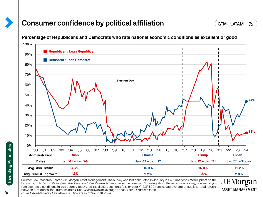
Line chart comparing the percentage of Republicans and Democrats rating national economic conditions as excellent or good. The chart spans multiple administrations.
Market Analysis and Trends
Financial Services
This slide shows the fluctuation in consumer confidence among political affiliations across different U.S. presidential administrations. It uses data to indicate partisan perspectives.
consumer confidence, political affiliation, economic conditions, administration, trend analysis
Single Chart
JP Morgan
Saved
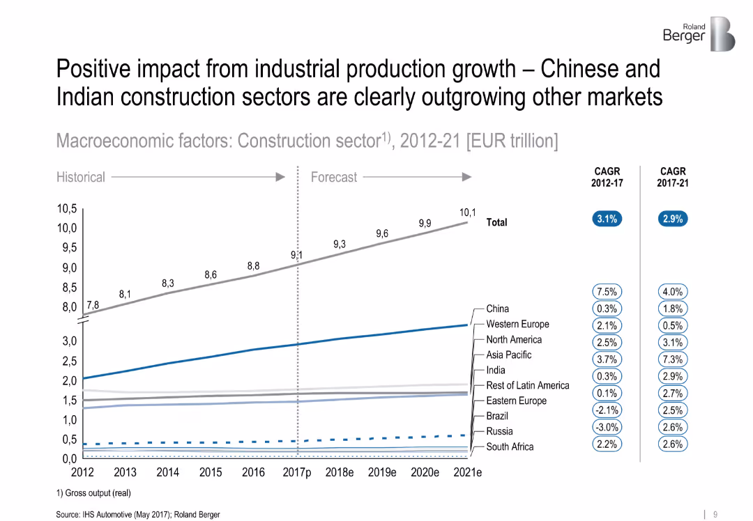
Line chart showing historical and forecasted construction sector output by region (2012–2021), with CAGR figures in side legends. Clean layout with subtle color coding and segmentation by region.
Market Analysis and Trends
Industrial & Manufacturing
The slide presents growth projections for the global construction sector, highlighting that China and India are significantly outpacing other regions. It includes CAGR data from 2012–2017 and forecasts for 2017–2021, showing clear segmentation by geographic region.
['construction', 'industrial production', 'growth forecast', 'China', 'India', 'CAGR', 'regional comparison', 'market trend']
Single Chart
Roland Berger
Saved
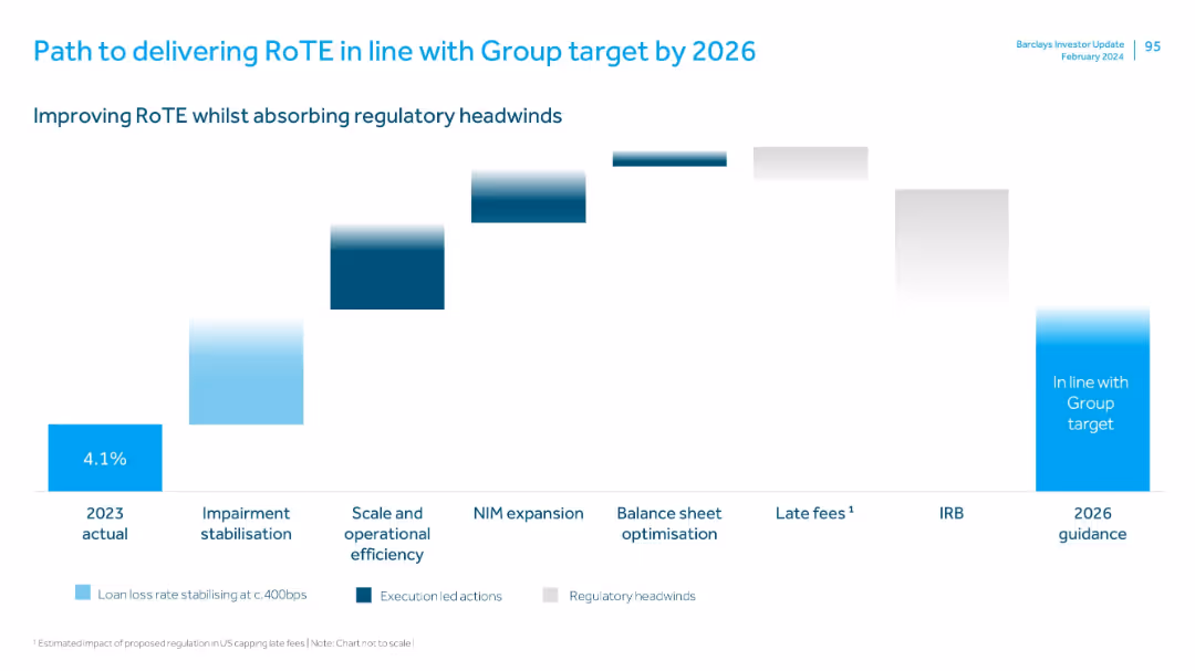
Waterfall chart format with stages marked below, each bar showing incremental impact; uses colors to differentiate action types.
Strategic Planning
Financial Services
Outlines Barclays’ roadmap for improving RoTE to meet Group targets by 2026. Includes execution strategies like impairment stabilization, operational efficiency, NIM expansion, and offsetting regulatory headwinds such as IRB changes and capped late fees.
RoTE, regulatory impact, operational efficiency, NIM, impairment, late fees, IRB, roadmap
Single Chart
Barclays
Saved
Features a line chart tracking seaborne cash costs against pricing margins over time, with detailed annotations and a timeline from 2012 to 2018.
Financial Performance
Industrial & Manufacturing
This slide examines the cost dynamics within the iron ore industry, focusing on seaborne cash costs and their relationship to pricing margins over several years.
iron ore, cost analysis, cash costs, pricing margins, line chart
Single Chart
McKinsey
Saved
Column chart illustrating the distribution of podcast ad inventory by spot length (up to 15 seconds to over 91 seconds) across three years.
Product and Service Analysis
Media & Entertainment
Compares the standardization of podcast ad lengths to those typical in digital media, highlighting industry adoption of shorter ad formats.
Podcast, Ads, Digital Media, Ad Lengths
Single Chart
PwC/Strategy&
Saved
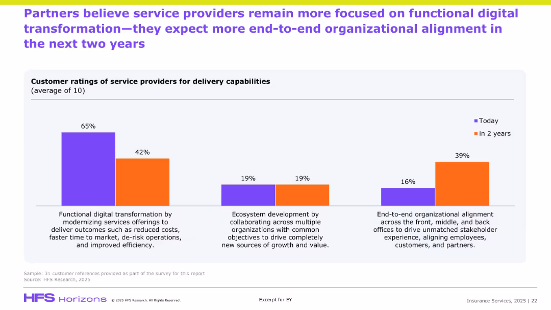
Similar bar chart format to previous slide but focused on partner perceptions; compares current and future priorities in service delivery.
Customer and Market Segmentation
Financial Services
Partners echo a sentiment similar to clients, indicating a strong current focus on cost-efficient transformation but predicting growth in end-to-end organizational alignment and ecosystem-based collaboration. The shift highlights strategic evolution in partner expectations of service delivery, aiming for deeper stakeholder integration.
Partner ratings, transformation, ecosystem, alignment, efficiency, service expectations
Single Chart
EY
Saved
Presents a bar chart illustrating the change in global buyout value over years, with the latest year highlighted in red.
Investment Analysis
Financial Services
Discusses the significant drop in global buyout value in 2022, providing insights into the private equity market conditions.
Private Equity, Buyout Value, Market Analysis, 2022 Drop, Investment Trends, Bar Chart, Equity Market Conditions
Mixed Chart
Bain
Saved
Slide features a mix of text and bar graphs, with a focus on the increase in consumers purchasing groceries online across different markets. Clear presentation of data trends with the right amount of textual explanation for context.
Customer and Market Segmentation
Retail & E-commerce
The slide highlights the growth of online grocery shopping across Southeast Asian markets, indicating a significant shift in consumer behavior and the success of omnichannel retail strategies.
online shopping, grocery market, consumer trends, Southeast Asia, omnichannel retail, market growth, digital transformation
Multiple Chart
Bain
Saved
Donut chart showing the share of global R&D expenditure by region in 2017, with North America, Europe, and East & Southeast Asia as the major contributors. Text discusses the investment gap between regions.
Technology and Digital Transformation
Technology & Software
This slide presents the distribution of global R&D expenditure by region, highlighting significant disparities between the Global North and South. It emphasizes the impact of these investment gaps on innovation performance and economic prosperity.
R&D Expenditure, Regions, Investment Gap
Mixed Chart
Roland Berger
Saved
A line graph tracking expenditure execution rate over several years, marked with specific years and percentage values at data points.
Financial Performance
Government & Public Sector
Analyzes historical and projected government spending efficiency, which is crucial for fiscal management and accountability assessments.
expenditure rate, fiscal efficiency, government accountability
Single Chart
PwC/Strategy&
Saved
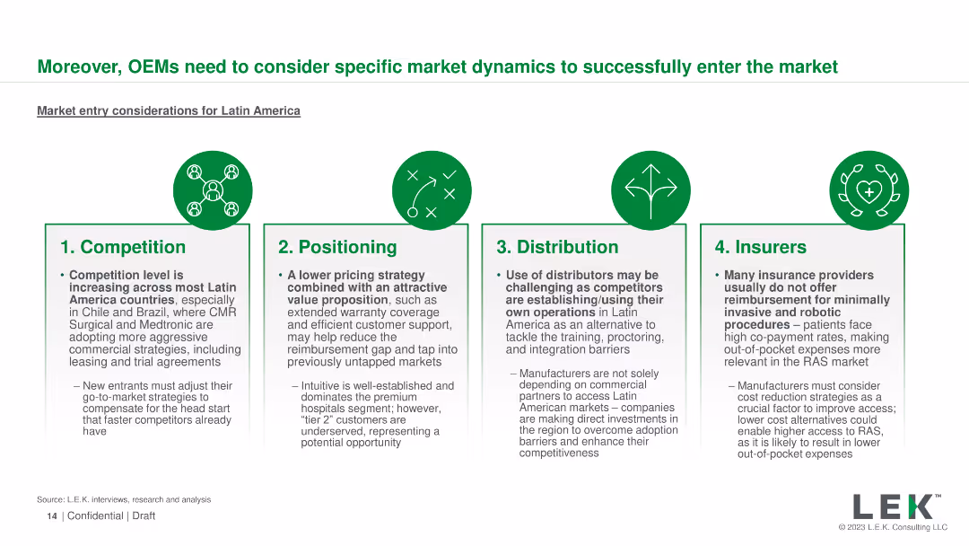
Four sections with icons detailing competition, positioning, distribution, and insurers
Market Analysis and Trends
Healthcare & Pharmaceuticals
Outlines key market entry considerations for OEMs in Latin America, including competition, positioning, and insurance coverage
OEMs, market entry, Latin America, competition, positioning
Pillar
LEK
Saved
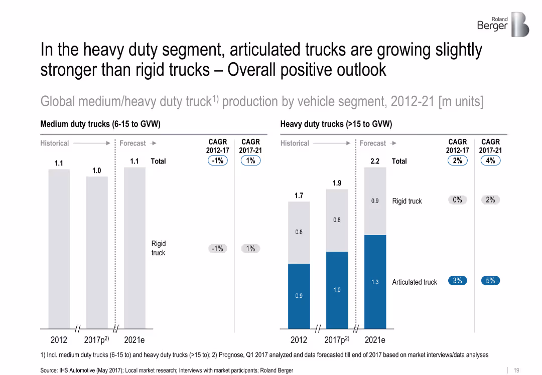
Side-by-side bar charts split by truck type and time period. Forecast period clearly indicated with CAGR metrics.
Product and Service Analysis
Transportation & Logistics
The chart compares growth trends in medium and heavy-duty truck production, emphasizing the rising preference for articulated trucks over rigid trucks in the forecast period (2017–2021).
['articulated trucks', 'rigid trucks', 'segment analysis', 'heavy duty', 'vehicle production', 'CAGR', 'forecast']
Multiple Chart
Roland Berger
Saved
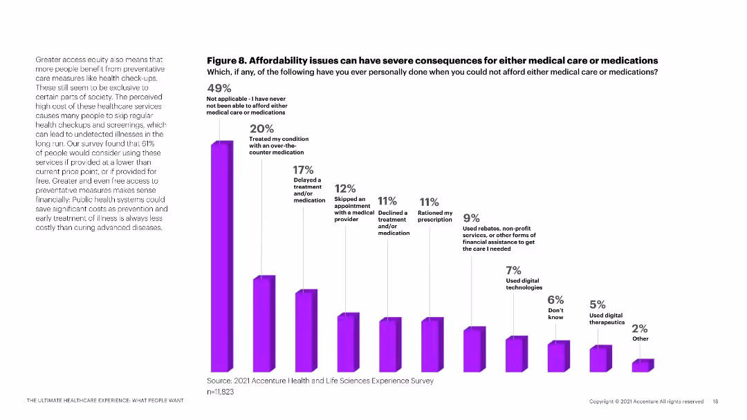
A column chart illustrating the consequences of affordability issues in healthcare, with a detailed explanation on the left.
Risk Assessment and Management
Healthcare & Pharmaceuticals
This slide explores the impact of affordability issues on medical care and medication access, based on survey data.
healthcare affordability, medical care, medication access, patient survey, cost impact
Mixed Chart
Accenture
Saved
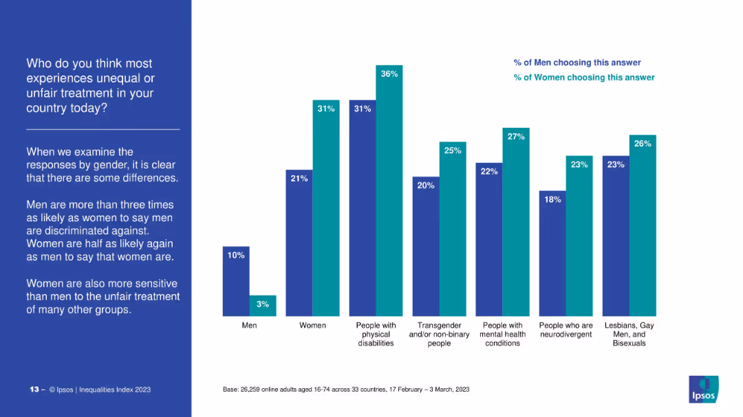
Bar chart comparison of men’s and women’s survey responses across various groups (e.g., people with disabilities, LGBTQ+, neurodivergent individuals). Left-side commentary explains gender differences in perceptions.
Market Analysis and Trends
Government & Public Sector
The slide contrasts how men and women perceive discrimination faced by various groups. Women show higher sensitivity to the unfair treatment of others, while men are more likely to believe that men face discrimination. Significant gender gaps are noted across most categories.
discrimination, gender gap, minorities, disability, LGBTQ+, survey results, public perception, inequality, Ipsos
Mixed Chart
IPSOS
Saved
Incorporates line charts comparing global SVOD revenue against traditional box office figures from 2015 to 2024, with a separate focus on India. The chart uses contrasting colors to highlight the overtaking of box office revenue by SVOD, underscoring a significant industry shift.
Competitive Landscape
Media & Entertainment
Discusses the impact of digital streaming services on traditional cinema, marking a pivotal shift as SVOD revenue surpasses box office collections globally and in India. This slide is vital for analyzing market dynamics, consumer behavior changes, and the strategic implications for content distributors and film producers.
SVOD, box office, digital transformation, cinema
Multiple Chart
PwC/Strategy&
Saved
Contains column charts with a trend line illustrating the bank's 10-year performance, including ROE, pretax income, and card sales market share. The layout is data-centric with a clear hierarchy.
Financial Performance
Financial Services
The slide is a retrospective view of the bank's decade-long performance metrics and market share growth, demonstrating sustained profitability and market presence.
growth metrics, profitability, market share, financial analysis, long-term performance
Single Chart
JP Morgan
Saved
This slide contains a series of horizontal bar charts comparing responses between LGBTQIA+ employees and the overall employee population at Deloitte on various aspects like pride in the company, respect at work, authenticity, and support.
Human Resources and Talent Management
Professional Services
The slide presents survey results showing differences in feelings of authenticity and support at work between LGBTQIA+ professionals and their peers at Deloitte, highlighting a testimonial and the company's commitment to LGBTQIA+ inclusivity.
LGBTQIA+, survey, Deloitte, inclusion, authenticity, support, testimonial, commitment
Mixed Chart
Deloitte
Saved
A bar graph slide with horizontal bars of varying lengths indicating levels of focus on different types of work and collaboration. The background is clean, allowing the graph and the descriptive text on the left to stand out. The use of grayscale with selective yellow highlights creates visual interest.
Organizational Structure and Change
Professional Services
This slide examines shifts in collaboration and independent work trends over the past two years. It employs a bar graph to display the proportionate change in focus, serving as an analytical tool for companies reassessing their collaborative practices in light of remote and hybrid work experiences.
Collaboration, Trends, Remote Work, Hybrid Work, Organizational Change
Single Chart
EY
Saved
Previous
Next
If nothing, comes up, please save your slides first
Create a FREE account to continue browsing
Receive Instant Access to 1,000+ slides from companies like McKinsey, Google, and Goldman Sachs
First Name
Last Name
Email
Password
I agree to all
Terms & Privacy Policy
Thank you! Your submission has been received!
Oops! Something went wrong while submitting the form.
Have an account?
Sign in
Column Chart
Heatmap
Chevron
Org Chart
Infographic
Callouts
Timeline
List
Graphic
Picture
Process Flow
Diagram
Paragraph
Map
Table
Framework
Subtitle
Takeaway Box
Icon
Other Chart
Radar Chart
Waterfall Chart
Mekko Chart
Pie Chart
Scatter Plot
Line Chart
Bar chart
Bullet points