My Account
My Slides
Search by Category
Templates
Leave Feedback
Login
Logout
Get Started
Browse all Slides
Browse all Slides
Create a FREE Account
Instant access to 1,000+ real slides from top companies like McKinsey, BCG, Goldman Sachs, Google and many more!
First Name
Last Name
Email
Password
I agree to all
Terms & Privacy Policy
Thank you! Your submission has been received!
Oops! Something went wrong while submitting the form.
Have an account?
Sign in
Saved Slides
Includes a bar chart comparing the sector weight analysis of the Japan industry and company-specific mix over time, with text explaining the analysis.
Market Analysis and Trends
Financial Services
This slide refreshes the sector weight analysis for Japan, comparing company-specific and industry-wide mixes to highlight material differences.
Japan, sector weight, financial services, market analysis, comparison
Mixed Chart
Oliver Wyman
Saved
Two line charts comparing the percentage change in air passenger traffic and air freight from 2008 to 2019. Lines are color-coded red and blue on a green gradient background.
Market Analysis and Trends
Transportation & Logistics
Slide compares growth in global air passenger traffic, which remains positive, against air freight which fluctuates and is impacted negatively by trade issues.
air passenger, air freight, transportation, growth, trade
Single Chart
Deutsche Bank
Saved
A set of stacked column chart with a high amount of detail, comparing global market sizes and concentration for agricultural inputs.
Market Analysis and Trends
Agriculture & Food Production
The slide compares the fragmented and concentrated sectors within the agricultural input provider market, highlighting major players.
agriculture, input providers, market concentration, fragmentation, fertilizers, seeds, equipment
Mixed Chart
EY
Saved
Three column charts comparing net new money/assets and net new deposits across different quarters and businesses.
Market Analysis and Trends
Financial Services
The slide compares wealth management and Swiss business flows, showing positive contributions from Credit Suisse quarter-to-date.
wealth, management, deposits, UBS, Credit Suisse
Multiple Chart
UBS
Saved
Slide has bullet points, timelines for data analytics evolution, and column charts showing spend and balance retention with big data. Blue is the primary color.
Technology and Digital Transformation
Financial Services
Focuses on the evolution and future potential of data analytics in enhancing targeting capabilities and the impact of big data on customer retention.
Big Data, Analytics, Targeting, Retention, Spend Behavior, Omni-Channel
Multiple Chart
Citigroup
Saved
Slide contains three column charts displaying financial performance over time, including changes in revenue, loan growth, and market share between 2015 and 2016 among major competitors. Colored in various shades of blue, and includes key textual annotations for clarity.
Financial Performance
Financial Services
Focuses on the financial performance and market position of Citigroup's branded cards. It highlights revenue growth, loan volume increases, and market share against competitors, using a projected CAGR through 2020. Designed to emphasize the strength and growth potential of Citigroup's card services.
financial growth, market share, revenue, loans, branded cards
Multiple Chart
Citigroup
Saved
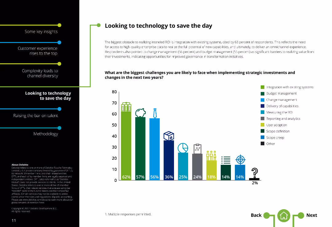
Two-column layout with text on the left and a column chart illustrating challenges on the right. There is moderate text density.
Market Analysis and Trends
Technology & Software
Highlights challenges in implementing strategic investments in contact centers, such as system integration, change management, and budget constraints.
Technology challenges, Contact centers, System integration, Change management, Budget constraints, Strategic investments
Single Chart
Deloitte
Saved
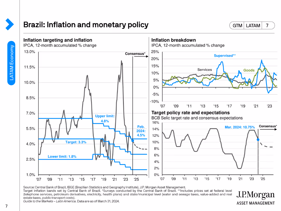
The slide features a line chart for inflation targeting and accumulated change, another line chart breaking down inflation into goods and services, and a line chart showing target policy rate and expectations.
Market Analysis and Trends
Financial Services
The slide discusses Brazil's inflation trends, monetary policy targets, and the breakdown of inflation between goods and services.
Brazil, inflation, monetary policy, target rate, economic trends
Multiple Chart
JP Morgan
Saved
This slide presents a world map illustrating the geographic distribution of respondents from the pulse survey. Green and blue dots of various sizes represent the number of Millennials and Gen Z participants from different regions.
Market Analysis and Trends
Media & Entertainment
The slide shows the geographical distribution of respondents from the pulse survey conducted between April and May 2020. It helps in understanding the global coverage of the survey and the regional variations in responses, providing a basis for analyzing changes in sentiment over time and the impact of the pandemic across different locations.
Geographic Distribution, Pulse Survey, Millennials, Gen Z, Map
Graphic
Deloitte
Saved
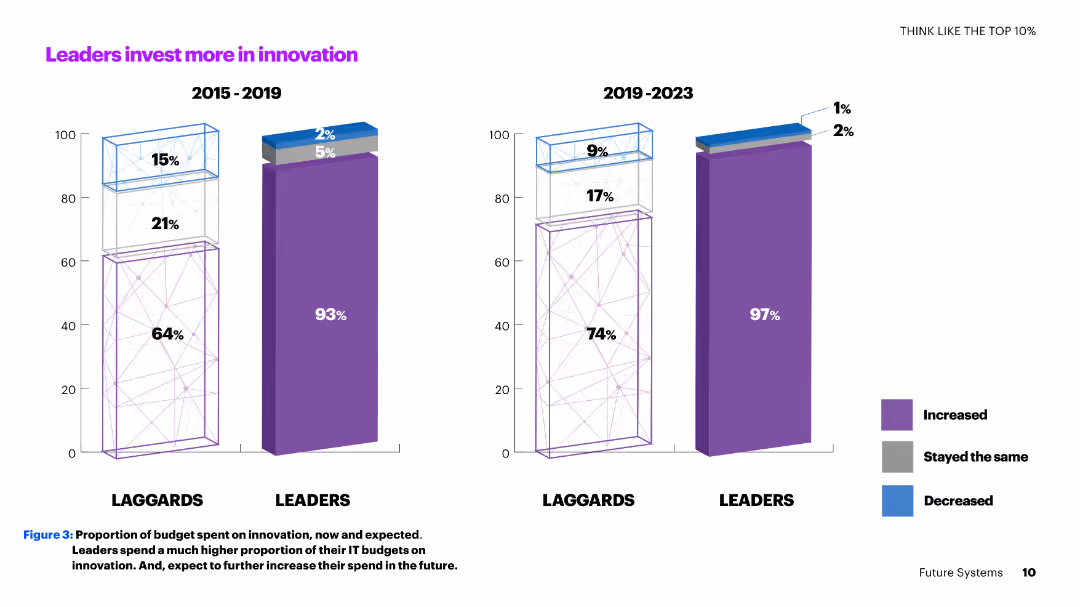
A two-column slide with vertical bar charts comparing the innovation investment percentages of leaders and laggards from 2015-2019 and 2019-2023.
Investment Analysis
Technology & Software
The slide shows how leaders consistently invest more in innovation compared to laggards, with a significant portion of their IT budgets allocated to innovation now and in the future.
innovation, investment, leaders, laggards, IT budgets, comparison, future, percentages, trends, analysis
Multiple Chart
Accenture
Saved
The slide features a column chart displaying satisfaction levels (percentage very/somewhat satisfied) with various technologies like identity solutions, DCRs, CMPs, etc.
Technology and Digital Transformation
Technology & Software
The slide compares user satisfaction across different privacy-preserving technologies, indicating that satisfaction with DCRs is comparable to more established solutions.
satisfaction, DCRs, privacy technologies, comparison
Mixed Chart
IPSOS
Saved
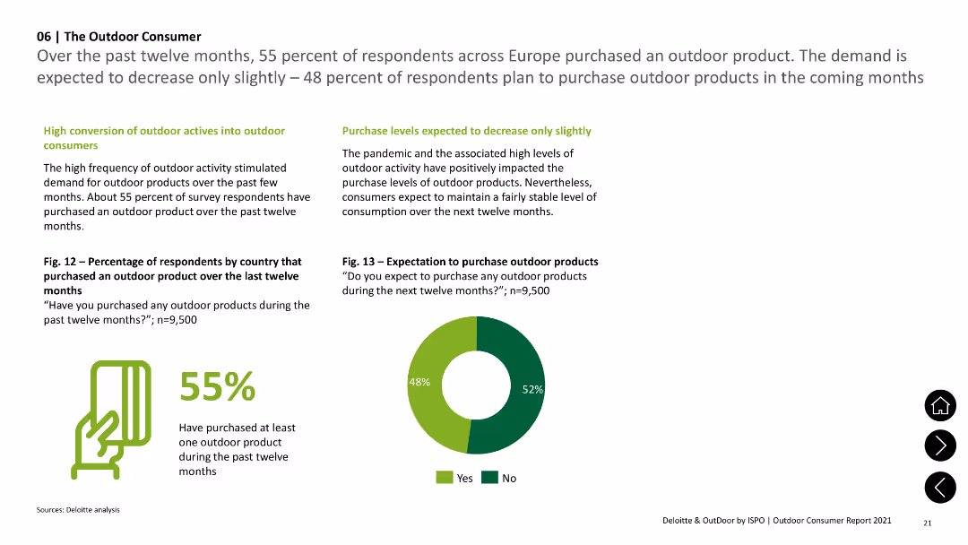
A pie chart and column chart showing the percentage of respondents who purchased outdoor products and future purchase expectations.
Market Analysis and Trends
Consumer Goods
Shows that 55% of respondents purchased outdoor products in the past twelve months and 48% expect to purchase in the next twelve months.
Consumer, Products, Purchases, Future, Outdoor
Mixed Chart
Deloitte
Saved
Displays comparative data on the average study hours per week for students in Nigerian boarding schools before and after solar power implementation, using column charts for visual comparison.
Strategic Planning
Education & Training
Evaluates the impact of improved power supply on study hours in Nigerian schools, illustrating a significant increase in study time due to better lighting conditions enabled by solar power, linking this to potential academic performance improvements.
education, solar power, Nigeria, study hours, boarding schools, academic performance, lighting
Single Chart
BCG
Saved
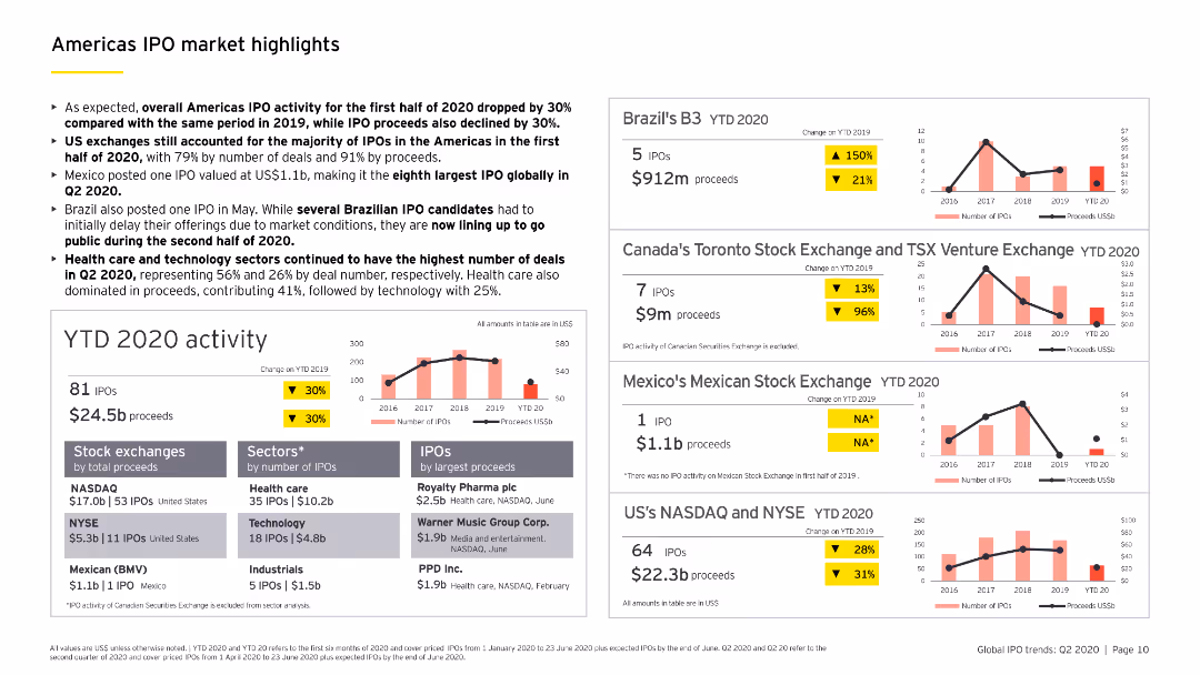
Contains multiple column charts and a bar chart detailing YTD 2020 IPO activity in the Americas, including sector-specific analysis and major stock exchanges.
Market Analysis and Trends
Financial Services
Highlights key IPO market trends in the Americas for the first half of 2020, including a breakdown by sectors, stock exchanges, and notable IPOs.
IPO, Americas, YTD 2020, sector analysis, stock exchanges
Multiple Chart
EY
Saved
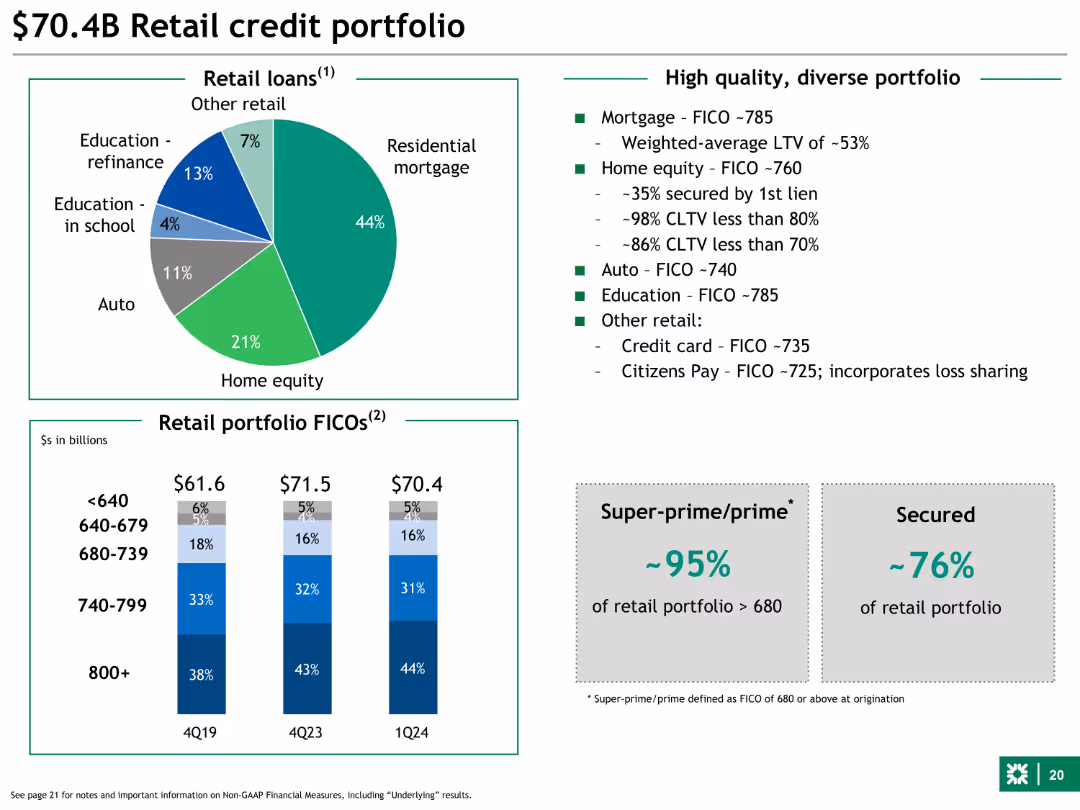
This slide features a pie chart and a column chart. The pie chart breaks down the retail loans by category, and the column chart shows the distribution of retail portfolio FICO scores across different time periods. The slide is moderately dense with detailed textual information.
Financial Performance
Financial Services
The slide provides a detailed breakdown of the retail credit portfolio, highlighting the composition of retail loans and FICO score distributions. It emphasizes the high-quality, diverse nature of the portfolio and mentions specific FICO scores for different loan categories.
Retail loans, FICO scores, mortgage, home equity, auto
Multiple Chart
Barclays
Saved
Horizontal bar chart comparing public agreement and disagreement on corporate versus government action on climate change across different markets.
Market Analysis and Trends
Government & Public Sector
Shows that the public believes both corporate and government actions are crucial in combating climate change, with high levels of agreement across many countries.
climate change, corporate action, government action, public mandate, survey
Multiple Chart
IPSOS
Saved
This slide juxtaposes "Before" and "Future" scenarios with two images, representing the shift from manufacturing to a consumer-driven economy. Includes bar graphs showing GDP contribution changes over decades.
Strategic Planning
Financial Services
Discusses China's economic transformation from a global manufacturing hub to a more diversified, consumption-driven economy. Useful for understanding shifts in economic strategies.
manufacturing, consumption, China, economic transformation, GDP, services sector
Mixed Chart
BCG
Saved
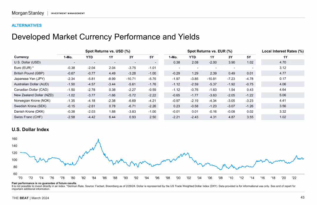
The slide features a detailed table comparing spot returns and yields of various developed market currencies against USD and EUR, along with a line chart showing the historical performance of the U.S. Dollar Index.
Market Analysis and Trends
Financial Services
The slide provides an analysis of developed market currency performance and yields, including spot returns versus USD and EUR, and historical performance of the U.S. Dollar Index, aiding in currency market analysis and investment strategy formulation.
currency performance, yields, USD, EUR, developed markets, U.S. Dollar Index, spot returns, financial analysis
Mixed Chart
Morgan Stanley
Saved
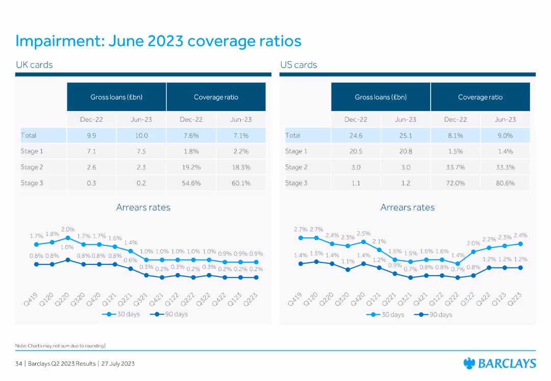
This slide displays two tables comparing UK and US cards for gross loans and coverage ratios for Dec 2022 and Jun 2023. Below the tables, there are two line charts showing arrears rates for 30 days and 90 days for both regions.
Financial Performance
Financial Services
The slide compares the coverage ratios and gross loans of UK and US cards for Dec 2022 and Jun 2023. It includes line charts to show the arrears rates over several quarters, providing insight into the financial health of these assets.
UK cards, US cards, gross loans, coverage ratio, arrears rates
Multiple Chart
Barclays
Saved
Includes a column chart and text describing trends in satellite payload manufacturing and launches globally.
Market Analysis and Trends
Technology & Software
Explores global trends in the Earth Observation upstream market, including investments and technological advancements.
Market trends, satellite payloads, global scale, investments
Mixed Chart
PwC/Strategy&
Saved
Contains multiple column charts and graphs, modern layout with clear separation of sections, vibrant use of teal and gray
Customer and Market Segmentation
Telecommunications
Explains tool rating by employees and how inquiries are assigned. Discusses the balance of automatic vs manual tasks.
customer service, technology, tools, inquiries, automation
Multiple Chart
Deloitte
Saved
The slide features a large red column chart showing growth rates of maximalist and minimalist brands in the luxury market from 1996-2019, juxtaposed against key historical periods and trends.
Market Analysis and Trends
Consumer Goods
This slide examines trends in the luxury market, focusing on the growth of maximalist versus minimalist brands, suggesting a shift towards more self-expressive consumption patterns.
luxury, market trends, brand growth, consumer behavior, maximalism, minimalism, self-expression
Mixed Chart
Bain
Saved
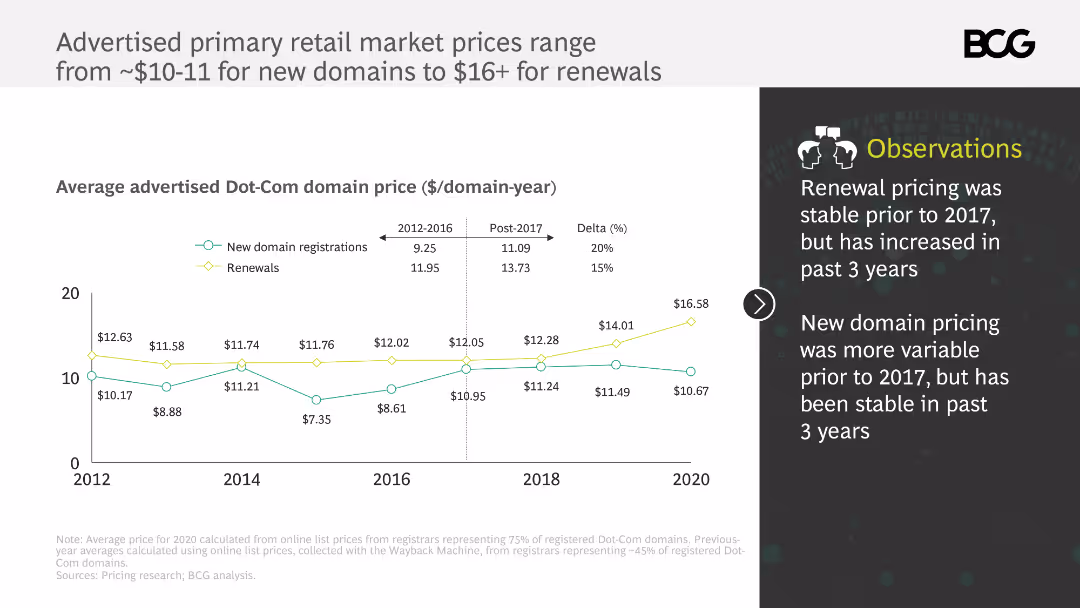
This slide includes a line chart showing the advertised primary retail market prices for Dot-Com domains from 2012 to 2020. It uses different colors to differentiate between new domain registrations and renewals, with annotations explaining price trends.
Pricing Strategies
Telecommunications
The slide analyzes the advertised primary retail market prices for Dot-Com domains, noting that renewal prices have increased since 2017 while new domain prices have remained stable. It provides insights into pricing stability and recent trends.
Dot-Com domains, pricing, renewals, new registrations, price trends
Mixed Chart
BCG
Saved
The slide features a central diagram with layered elements labeled "ALGORITHMS," "SMART ORDER ROUTERS," and "DIRECT MARKET ACCESS," representing a trading platform. Surrounding this are various inputs and outputs labeled with terms such as "Systematic Clients," "Fundamental Hedge Funds," and "Broker Dealers" on one side, and "External Liquidity" sources like "Exchanges" and "Dark Pools" on the other. The design is moderately complex with a focus on connectivity and flow between elements.
Market Analysis and Trends
Financial Services
The slide presents an overview of a trading platform's strength in execution within global markets. It details the systematic process from clients and funds through smart order routing and algorithms, to access various liquidity sources, both internal and external. This slide is likely used to explain how a trading platform integrates different market participants and liquidity sources to optimize trading execution.
Trading, Liquidity, Algorithms, Execution, Markets, Platform, Clients, Funds, Broker-Dealers, Exchanges
Diagram
Goldman Sachs
Saved
The slide is densely packed with multiple column charts detailing the growth of various segments within the digital economy. Each chart is accompanied by growth percentages and future projections. The design employs a color scheme of blue shades and yellow highlights to distinguish between the segments and years.
Market Analysis and Trends
Technology & Software
It discusses the year-over-year growth of Singapore's digital economy, emphasizing the contribution of e-commerce and the recovery of the travel sector. The slide can be used to assess past performance and future expectations for the overall digital economy and its individual components, highlighting compound annual growth rates and expected market sizes.
digital economy, growth, e-commerce, travel, Singapore
Multiple Chart
Bain
Saved
Previous
Next
If nothing, comes up, please save your slides first
Create a FREE account to continue browsing
Receive Instant Access to 1,000+ slides from companies like McKinsey, Google, and Goldman Sachs
First Name
Last Name
Email
Password
I agree to all
Terms & Privacy Policy
Thank you! Your submission has been received!
Oops! Something went wrong while submitting the form.
Have an account?
Sign in
Column Chart
Heatmap
Chevron
Org Chart
Infographic
Callouts
Timeline
List
Graphic
Picture
Process Flow
Diagram
Paragraph
Map
Table
Framework
Subtitle
Takeaway Box
Icon
Other Chart
Radar Chart
Waterfall Chart
Mekko Chart
Pie Chart
Scatter Plot
Line Chart
Bar chart
Bullet points