My Account
My Slides
Search by Category
Templates
Leave Feedback
Login
Logout
Get Started
Browse all Slides
Browse all Slides
Create a FREE Account
Instant access to 1,000+ real slides from top companies like McKinsey, BCG, Goldman Sachs, Google and many more!
First Name
Last Name
Email
Password
I agree to all
Terms & Privacy Policy
Thank you! Your submission has been received!
Oops! Something went wrong while submitting the form.
Have an account?
Sign in
Saved Slides
A single gauge diagram in orange to yellow gradient, measuring the balance between reactive and proactive HR approaches, marked by a needle pointing towards 'Balanced-Proactive'.
Market Analysis and Trends
Professional Services
This slide examines the strategic orientation of HR functions, whether they are more reactive or proactive, aiding in discussions on strategic planning and operational effectiveness in HR practices.
HR, strategies, reactive, proactive, planning, effectiveness, orientation
Single Chart
PwC/Strategy&
Saved
Includes text boxes and icons emphasizing the strategic benefits of cell manufacturing in Australia.
Market Analysis and Trends
Energy & Utilities
Advocates for prioritizing cell manufacturing in Australia due to its strategic importance to the battery value chain.
cell manufacturing, strategic importance, Australia, battery industry
Pillar
Accenture
Saved
The slide features a pie chart and a column chart depicting the portfolio growth and composition of the corporate bank.
Strategic Planning
Financial Services
The slide details how the corporate bank supports IBCM and GM clients through loan origination and portfolio management, showing growth data.
corporate bank, IBCM, GM, loans, portfolio, relationships, revenue, strategic planning, growth
Multiple Chart
Credit Suisse
Saved
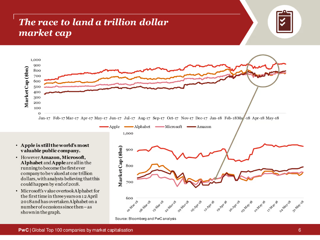
The slide features a line chart tracking the market caps of Apple, Alphabet, Microsoft, and Amazon from 2017 to 2018. The lines are color-coded for each company, with a magnified section highlighting recent trends. The layout includes a brief text summary on the left, explaining the race to a trillion-dollar valuation.
Market Analysis and Trends
Financial Services
This slide analyzes the market cap trends of major tech companies competing to reach a trillion-dollar valuation. The line chart provides a visual comparison of Apple, Alphabet, Microsoft, and Amazon over time, highlighting the competitive landscape and significant milestones in their market cap growth.
Trillion-dollar market cap, tech companies, market trends, Apple, Alphabet, Microsoft, Amazon, line chart
Multiple Chart
PwC/Strategy&
Saved
Utilizes pie charts and circular diagrams to showcase investment distributions and asset classes.
Investment Analysis
Financial Services
Analyzes the asset mix in equity investments and lending, as well as debt investments, by various categorizations such as industry and region.
Asset, Management, Mix, Equity, Investments, Lending, Debt, Pie Chart, Diagram, Region, Industry, Allocation
Multiple Chart
Goldman Sachs
Saved
This slide presents a map and diagram of Ukraine's grain supply chain, showing major production areas and transport routes, along with comparative logistics data.
Operational Efficiency
Transportation & Logistics
The slide discusses Ukraine's grain supply chain, comparing transport distances and port infrastructure with those of Australia, and highlighting areas for potential improvement and investment.
Supply chain, Ukraine, logistics, transport distances, port infrastructure, grain production, harvest, storage, transportation, efficiency
Graphic
LEK
Saved
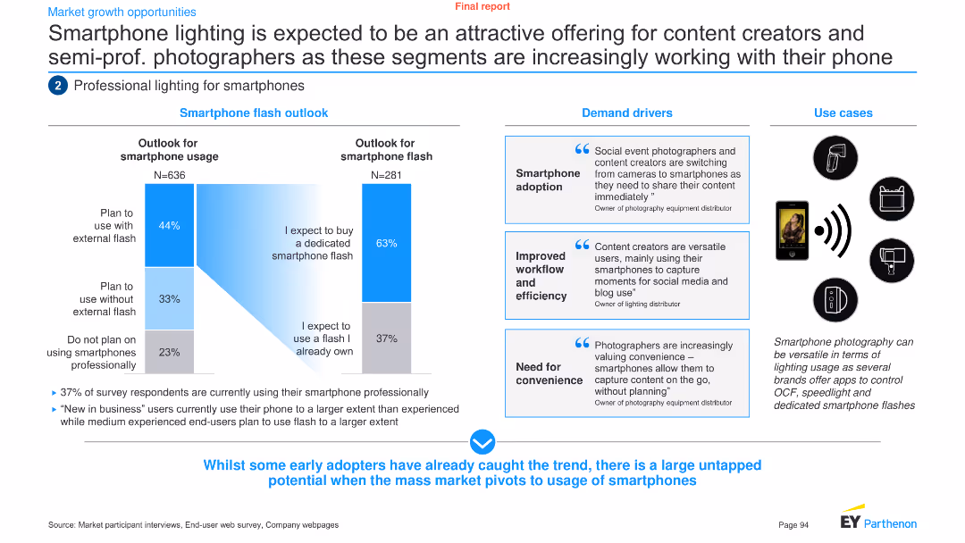
The slide uses a combination of column charts and text boxes to analyze the outlook and demand drivers for smartphone lighting among content creators and semi-professional photographers.
Product and Service Analysis
Technology & Software
It discusses the potential of smartphone lighting for content creators and semi-professional photographers, highlighting demand drivers and use cases.
Smartphone lighting, content creators, semi-professional, demand drivers, outlook, technology, analysis, trends, product, service
Multiple Chart
EY
Saved
The slide displays a combination of a column chart and a matrix of colored dots indicating asset classes, products, channels, and regions. It is blue and red themed with a key to symbols.
Financial Performance
Financial Services
This slide illustrates the relationship between JPMorgan's asset diversification and client asset flows over a decade, aiming to show the benefits of diversification.
diversification, asset flows, JPMorgan, column chart, asset classes, client assets, financial analysis
Mixed Chart
JP Morgan
Saved
This slide includes a bar graph displaying missed growth opportunities due to lack of resiliency across various industries like high-tech, utilities, and automotive. The graph uses shades of purple to distinguish between industries.
Risk Assessment and Management
Industrial & Manufacturing
Highlights the revenue loss across different industries due to insufficient resiliency and the importance of investing in capabilities that counteract disruptions in engineering, supply, and production.
resiliency, industry comparison, revenue loss, growth opportunities, engineering, supply chain, disruption management, Accenture Research
Mixed Chart
Accenture
Saved
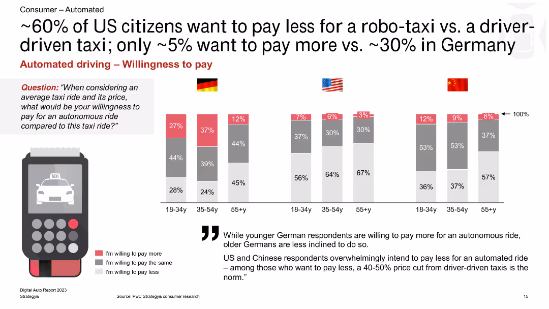
The slide shows a column chart depicting willingness to pay for autonomous vs. driver-driven taxis among different age groups in Germany, the US, and China, with percentage bars for each category.
Market Analysis and Trends
Transportation & Logistics
The slide compares the willingness to pay for autonomous taxis versus driver-driven taxis, revealing that a significant portion of US respondents prefer lower costs for autonomous rides compared to Germany.
robo-taxi, willingness to pay, driver-driven taxi, Germany, US, China, autonomous rides, pricing, consumer preferences
Multiple Chart
PwC/Strategy&
Saved
Displays a series of column charts that compare net profit contribution, BFS deposits, and loan portfolios over several fiscal years and periods.
Financial Performance
Financial Services
Evaluates the financial growth and performance of Macquarie's banking services, using comparative data on profits, deposits, and loans, essential for financial trend analysis and strategic planning.
financial services, profit contribution, deposits, loans, growth, banking, performance
Multiple Chart
Goldman Sachs
Saved
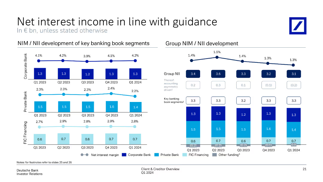
Includes line charts and column charts showing NIM/NII development across key banking book segments and the group as a whole from Q1 2023 to Q1 2024.
Financial Performance
Financial Services
Tracks net interest income and margin development, comparing key banking segments over several quarters. The slide aligns with financial guidance, demonstrating consistent performance and interest margin trends within the banking book segments and group level.
net interest income, NIM, banking segments, financial performance, guidance
Multiple Chart
Deutsche Bank
Saved
This slide presents a dual bar chart comparing the daily costs of cold storage as a percentage of a farmer's income in Nigeria, India, and Rwanda, illustrating the significant financial strain on Nigerian farmers.
Strategic Planning
Agriculture & Food Production
This slide assesses the economic impact of cold storage costs on smallholder farmers in Nigeria, comparing it with other countries to highlight the disproportionate burden. It advocates for more affordable and accessible storage solutions to aid farmers and reduce food loss.
Cold Storage, Costs, Farmers, Nigeria, Comparative Analysis
Multiple Chart
BCG
Saved
The slide features a simple, dark background with a large, centered column chart showing underwriting revenues over several years.
Financial Performance
Financial Services
This slide presents a trend analysis of underwriting revenues in the Global Banking & Markets sector, using a column chart to show changes over time.
banking, markets, revenue, trend, underwriting
Single Chart
Goldman Sachs
Saved
Contains a column chart showcasing the growth of deposits over time segmented by different business units within the organization.
Financial Performance
Financial Services
Used to demonstrate the consistent increase in deposits across various segments of a financial institution, reflecting healthy financial growth and stability.
Deposits, Growth, Trends, Line Graph, Financial Stability, Banking, Performance, Analysis
Single Chart
Citigroup
Saved
A line chart showing the difference between central bank policy rates and banks' average deposit rates in the Euro area and the UK over time, with commentary on the right.
Market Analysis and Trends
Financial Services
This slide explains the impact of central bank policy rate changes on bank deposit rates in Europe and the UK, highlighting implications for corporate cash balances and bank earnings.
Deposit pricing, central bank rates, Euro area, UK, bank earnings, corporate implications
Mixed Chart
Accenture
Saved
Two large bar charts comparing revenue and EBIT variations of luxury brands from 2014 to 2017, emphasizing the cost of growth.
Financial Performance
Consumer Goods
Highlights the increasing cost of growth for luxury brands over recent years, using revenue and profit metrics to discuss financial sustainability.
Growth, Cost, Luxury Brands
Multiple Chart
Bain
Saved
Contains two line graphs showing non-farm payrolls and job openings versus unemployment, respectively. The slide is divided into two equal parts with a clear title and source indication.
Human Resources and Talent Management
Financial Services
The slide compares job growth data and job openings to unemployment rates, indicating a tight labor market, likely used in human resources planning or risk management.
Labor Market, Employment, Job Growth, HR, Unemployment, Job Openings, Non-Farm Payrolls, Market Analysis
Multiple Chart
Citigroup
Saved
Includes two side-by-side section of texts and a table listing tax incentives for domestic and export enterprises under CREATE, with concise bullet point comparisons.
Investment Analysis
Financial Services
Provides details on different tax incentives available for registered enterprises, outlining specific conditions and tax rates.
tax incentives, enterprises, CREATE, fiscal, domestic, export, Philippines
Table
Deloitte
Saved
Slide contains column charts tracking litigation provisions and contingent liabilities across multiple quarters, complemented by textual highlights that summarize key changes and implications for the bank.
Regulatory and Compliance
Financial Services
Offers an update on the bank's litigation provisions and contingent liabilities, essential for legal and financial risk management. Provides insights into potential financial impacts and compliance issues, aiding in strategic planning and investor relations.
litigation, contingent liabilities, risk management, financial impact, legal compliance
Multiple Chart
Deutsche Bank
Saved
Bar graphs displaying user reliance levels on nbn™ network during COVID-19, visual markers for household upgrades, and supportive text on the side.
Strategic Planning
Technology & Software
Details the critical role of the nbn™ network in keeping users connected for entertainment and support during the pandemic, leading to many upgrading their plans.
COVID-19, nbn network, family connectivity, entertainment reliance, plan upgrades, pandemic response, user reliance, household data
Multiple Chart
Accenture
Saved
A simple blue title slide with the date and categories of banking services offered by JPMorgan Chase, aimed at introducing the firm's structure and offerings.
Industry Overview
Financial Services
Serving as an introduction, this slide provides a firm overview for JPMorgan Chase, setting the stage for a presentation on corporate and investment banking services.
firm overview, JPMorgan Chase, banking, investment, asset management, commercial, introduction, corporate services
Title
JP Morgan
Saved
A segmented bar chart showing expected changes in social media spending by market (APAC, LATAM, North America, EMEA). Each market is divided into segments indicating the percentage of expected increase or decrease in spending.
Market Analysis and Trends
Media & Entertainment
This slide analyzes the expected changes in social media budgets across different regions. It shows the percentage of marketers planning to increase, decrease, or maintain their social media spending over the next year.
Social Media, Spending, Market, Budget, Change
Mixed Chart
Nielsen
Saved
This slide includes two main visual elements: a column chart showing household solar penetration by country for several African nations, and another projecting the growth in installed solar capacity in Nigeria from 2021 to 2030. Both use a clean layout with clear annotations.
Regulatory and Compliance
Energy & Utilities
Analyzing solar energy adoption, this slide predicts a significant increase in installed solar capacity in Nigeria, reaching approximately 4 GW by 2030, aligning with regional trends in solar penetration. It highlights potential growth in household solar installations, contributing to broader energy goals.
solar, energy, adoption, Nigeria, 2030, growth, capacity, household, projections, Africa
Multiple Chart
BCG
Saved
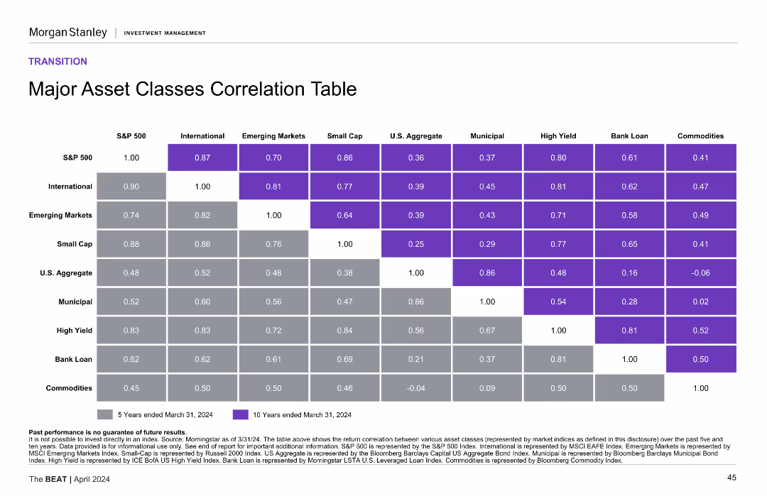
The slide presents a correlation table with color-coded cells, comparing major asset classes over 5 and 10-year periods.
Financial Performance
Financial Services
It shows the correlation between different major asset classes over five and ten years, helping to understand their interrelationships.
asset classes, correlation table, financial performance, 5-year, 10-year
Table
Morgan Stanley
Saved
Previous
Next
If nothing, comes up, please save your slides first
Create a FREE account to continue browsing
Receive Instant Access to 1,000+ slides from companies like McKinsey, Google, and Goldman Sachs
First Name
Last Name
Email
Password
I agree to all
Terms & Privacy Policy
Thank you! Your submission has been received!
Oops! Something went wrong while submitting the form.
Have an account?
Sign in
Column Chart
Heatmap
Chevron
Org Chart
Infographic
Callouts
Timeline
List
Graphic
Picture
Process Flow
Diagram
Paragraph
Map
Table
Framework
Subtitle
Takeaway Box
Icon
Other Chart
Radar Chart
Waterfall Chart
Mekko Chart
Pie Chart
Scatter Plot
Line Chart
Bar chart
Bullet points