My Account
My Slides
Search by Category
Templates
Leave Feedback
Login
Logout
Get Started
Browse all Slides
Browse all Slides
Create a FREE Account
Instant access to 1,000+ real slides from top companies like McKinsey, BCG, Goldman Sachs, Google and many more!
First Name
Last Name
Email
Password
I agree to all
Terms & Privacy Policy
Thank you! Your submission has been received!
Oops! Something went wrong while submitting the form.
Have an account?
Sign in
Saved Slides
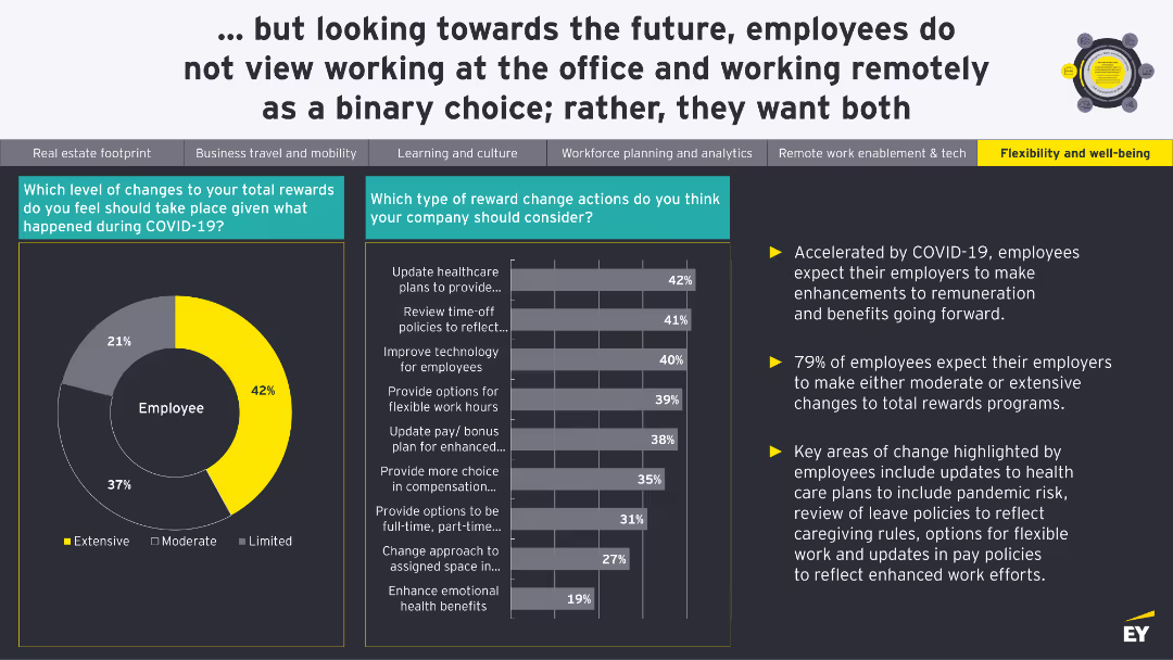
A pie chart shows the level of changes needed in total rewards. A bar chart details specific reward change actions employees think companies should consider.
Human Resources and Talent Management
Financial Services
The slide discusses the expected changes in total rewards and benefits due to COVID-19, with a focus on healthcare plans, leave policies, and flexible work options.
Rewards, Benefits, Compensation, COVID-19, Employee Expectations
Multiple Chart
EY
Saved
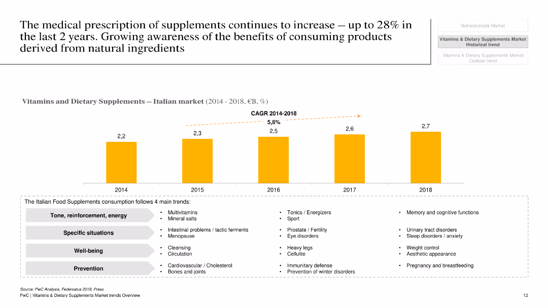
The slide has a white background with a column chart showing market growth of vitamins and dietary supplements in Italy from 2014 to 2018, along with key trends.
Market Analysis and Trends
Healthcare & Pharmaceuticals
This slide presents the growth of the vitamins and dietary supplements market in Italy, highlighting key trends, growth rate, and market drivers.
Vitamins, dietary supplements, Italy, market growth, trends, healthcare, pharmaceuticals, analysis, growth rate
Mixed Chart
PwC/Strategy&
Saved
The slide includes a line chart showing trends in USD/LCU exchange rates for various currencies from 2020 to 2025, indicating volatility and headwinds for the USD in 2022, with projected trends up to 2025.
Market Analysis and Trends
Technology & Software
The slide provides an overview of exchange rate trends for various currencies, highlighting increased volatility through 2025 and the expected impact on USD, with detailed line charts for visual clarity.
FX overview, volatility, exchange rates, USD, currencies, trends, 2020-2025, line chart, headwinds, projection
Mixed Chart
Gartner
Saved
Uses pie charts and a column chart to depict mortgage portfolio statistics and maturity profiles.
Investment Analysis
Financial Services
Details the composition and health of the mortgage portfolio, including LTV ratios and fixed rates.
mortgages, LTV, risk management, portfolio, rates
Multiple Chart
Barclays
Saved
Column chart indicating VCs' deal activity expectations with associated quotes on the right, structured under a descriptive title.
Investment Analysis
Technology & Software
Surveys VC expectations for increased deal activity in healthtech, SaaS, and Web3 from 2025-2030, and reduced focus on edtech.
healthtech, SaaS, Web3, edtech, VCs, long-term focus, deal activity, 2025-2030
Mixed Chart
Bain
Saved
A photo of the Colosseum with circular charts showing NPE stock growth expectation and a detailed text explanation.
Market Analysis and Trends
Financial Services
This slide analyzes Italy's banking system and NPE stock growth expectations, discussing economic impacts and future outlooks.
Italy, NPE stock, banking, financial services, market analysis
Multiple Chart
Deloitte
Saved
The slide features an organizational chart with portraits and names of key management team members, alongside a text summary of management strategies.
Organizational Structure and Change
Professional Services
Overview of the joint management structure following a merger, highlighting leadership roles and strategic integration efforts.
management, organizational structure, leadership, merger, strategic planning, team integration
Diagram
Barclays
Saved
A collection of column charts and feedback statements evaluating the pace of governmental reforms and sentiments towards governmental actions in France.
Regulatory and Compliance
Government & Public Sector
Analyzes opinions on the pace and effectiveness of governmental reforms in France, including insights into public sentiment and expectations from business leaders.
reforms, France, government, pace, public opinion
Multiple Chart
Bain
Saved
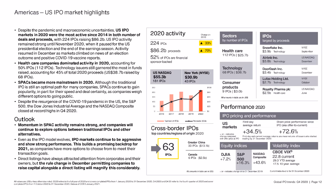
The slide includes column charts and bar charts highlighting US IPO market performance, key sectors, and top IPOs by proceeds in 2020.
Market Analysis and Trends
Financial Services
The slide analyzes the US IPO market in 2020, highlighting the dominance of healthcare and technology sectors, the rise of SPACs, and overall market performance despite the pandemic.
US IPO, healthcare, technology, SPAC, market
Mixed Chart
EY
Saved
Divided into two sections, the left side presents column charts for e-Commerce, and the right side shows column charts for Transport & Food and Online Media. The slide utilizes shades of blue, with clear labels and percentage changes. Bain Analysis source.
Market Analysis and Trends
Technology & Software
Highlights how e-Commerce growth compensates for travel sector losses in Thailand, offering insights for strategic adjustments in business models post-pandemic.
Thailand, E-Commerce Growth, Travel Decline, Sector Comparison, Digital Economy, COVID-19 Impact, Market Strategy, Adaptation, Resilience
Multiple Chart
Bain
Saved
The slide shows a line chart with four different colored dotted lines labeled as Technology, Individuals, Businesses, Public Policy. Each line shows an upward trend over time from the 1970s to today.
Market Analysis and Trends
Technology & Software
This slide depicts the varying rates of change and adoption in technology, individuals, businesses, and public policy over the years, illustrating how the future is unequally distributed. It could be used to discuss technology adoption patterns.
Change, Adoption, Technology, Policy, Trends
Single Chart
Deloitte
Saved
The slide is structured with a column chart and a line graph, where the column chart represents the portfolio occupancy percentages and the line graph tracks rent reversion percentage. The color scheme used is uniform for the columns, with a clear legend and time period indicators. It also includes an explanatory footnote about the data comparison.
Market Analysis and Trends
Real Estate & Construction
Analyzes the high occupancy levels and tenant retention rates within the light industrial/logistics portfolio, indicating effective management and market demand.
Logistics Portfolio, Occupancy Rates, Tenant Retention, Rent Reversion, Asset Management, Market Demand
Single Chart
Morgan Stanley
Saved
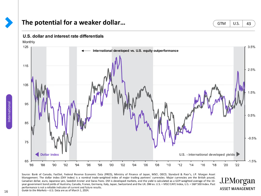
A line chart comparing the U.S. dollar index with international developed yields over time, highlighting differential trends.
Market Analysis and Trends
Financial Services
Discusses potential weakening of the U.S. dollar in relation to international yields, focusing on market trends.
U.S. dollar, international yields, market trends, differential, weakening, analysis, index, potential
Single Chart
JP Morgan
Saved
Slide contains multiple line graphs depicting infection fatality rates and immunity duration scenarios, color-coded for severity impact, with detailed explanatory text and references.
Strategic Planning
Healthcare & Pharmaceuticals
Provides a scenario analysis of long-term COVID-19 impacts based on infection fatality rates and immunity durations, critical for future healthcare strategy and policy planning.
COVID-19, long-term impact, infection fatality rate, immunity duration, scenario planning, healthcare strategy
Mixed Chart
McKinsey
Saved
Features a mekko chart analyzing investment flows by theme in Vietnam, alongside icons and smaller charts detailing types of investments and key investors.
Investment Analysis
Energy & Utilities
Discusses Vietnam's investment trends in solar and wind energy, with a focus on government support and mobility projects.
Vietnam, solar, wind, government support, investments
Single Chart
Bain
Saved
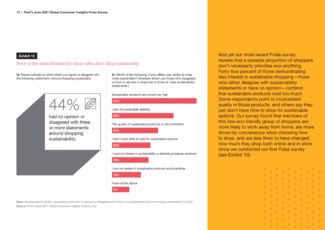
A line chart comparing the percentage of remote workers versus those working away from home who engage in sustainable shopping behaviors, such as buying eco-friendly products and checking for sustainability certifications.
Market Analysis and Trends
Consumer Goods
The slide analyzes the sustainable shopping behaviors of remote workers compared to those who work away from home, showing trends in eco-friendly purchasing and awareness of product sustainability.
sustainable behaviors, remote workers, eco-friendly, shopping habits, sustainability awareness
Mixed Chart
PwC/Strategy&
Saved
The slide is minimalistic with a single bar chart depicting the growth of the internet economy in the Philippines. The projected growth is also indicated.
Financial Performance
Technology & Software
Highlights the doubling of the Philippines' internet economy in 2021 and its expected future value, emphasizing the impact of the pandemic and government initiatives.
Internet economy, Growth forecast, Government initiatives, Pandemic impact
Single Chart
Bain
Saved
Line chart showing the year-over-year growth of global personal luxury goods by channel from 2017 to 2023.
Strategic Planning
Consumer Goods
Examines the normalization of channel dynamics post-pandemic, focusing on retail, wholesale, and e-commerce.
Channel, Dynamics, Post-pandemic, Growth, Luxury
Mixed Chart
Kearney
Saved
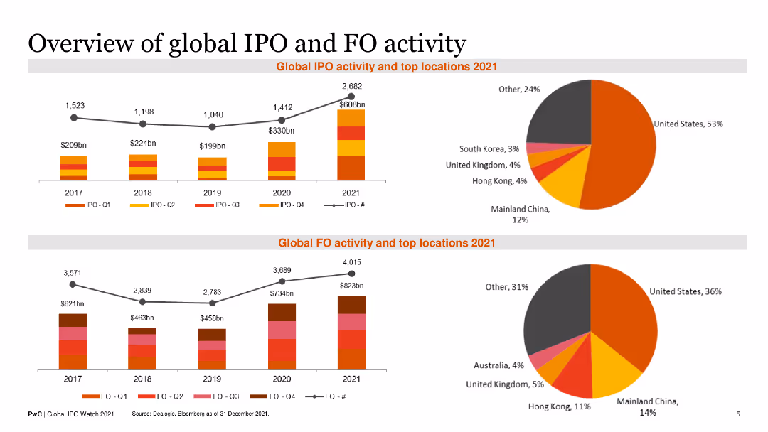
Contains two line charts showing historical IPO and FO activity with accompanying pie charts for top locations in 2021. Text blocks provide summary insights.
Financial Performance
Financial Services
It provides an overview of global IPO and FO activities over recent years, highlighting top regions and growth trends for 2021.
Global IPO, FO Activity, Historical Trends, Top Locations, 2021 Overview
Multiple Chart
PwC/Strategy&
Saved
Features multiple bubble charts overlaid on a light blue background. Each bubble represents a different challenge or inefficiency in AI implementation, with varying sizes indicating prevalence. The layout is uncluttered, focusing on the visual data representation.
Technology and Digital Transformation
Technology & Software
This slide highlights the various challenges and inefficiencies faced by organizations in scaling AI initiatives. It is useful for understanding barriers to technology adoption and strategizing on overcoming these challenges.
AI challenges, inefficiencies, technology adoption, scaling AI, barriers, strategic planning, technology implementation
Multiple Chart
Deloitte
Saved
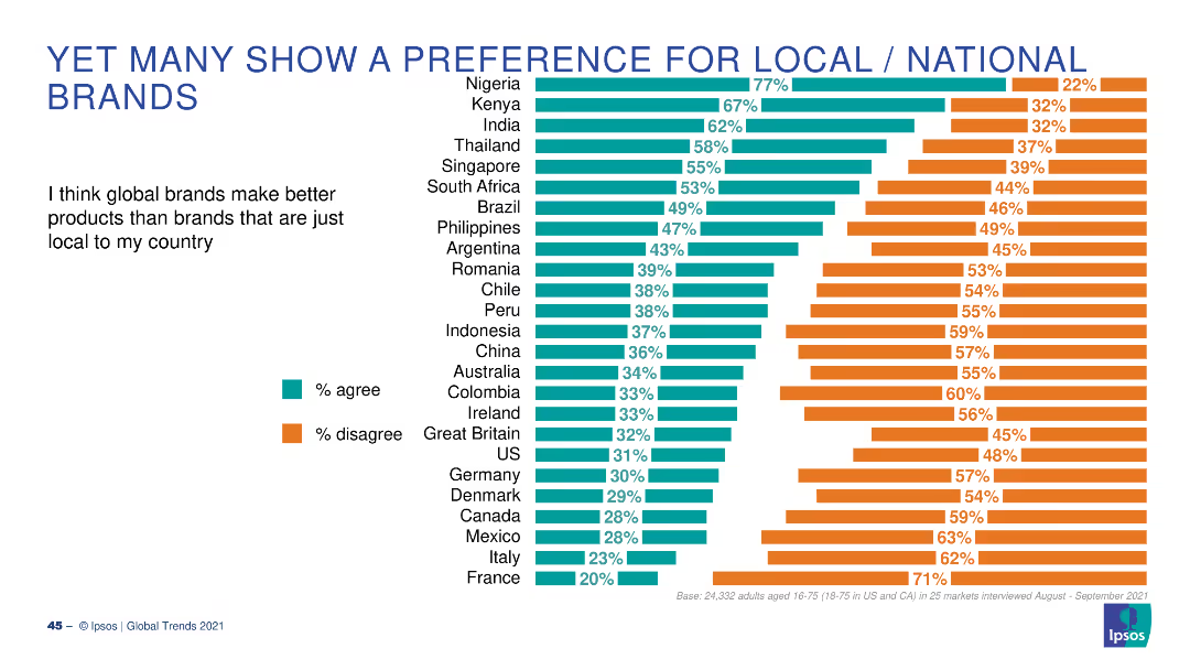
A bar chart with horizontal bars showing the percentage of people who agree or disagree that global brands make better products than local brands, across various countries.
Market Analysis and Trends
Consumer Goods
This slide presents survey results on consumer preferences for global vs. local brands, with data from multiple countries highlighting varying opinions.
local brands, global brands, preferences, consumer, survey
Multiple Chart
IPSOS
Saved
The slide displays two column charts showing survey responses by country with varying data-to-ink ratios.
Technology and Digital Transformation
Professional Services
The slide explains Tufte's data-to-ink ratio principle, demonstrating how reducing non-data ink can make charts clearer and more efficient.
Tufte, data-to-ink, ratio, survey, responses, visualization, chart, efficiency, clarity, design
Multiple Chart
EY
Saved
Uses a bar graph to compare the CAGR of off-grid solar PV installed capacity across several countries.
Market Analysis and Trends
Energy & Utilities
Compares the growth rates of off-grid solar PV capacity across multiple countries, highlighting Nigeria's position relative to its peers.
solar market, CAGR, comparative analysis, off-grid, international markets
Single Chart
BCG
Saved
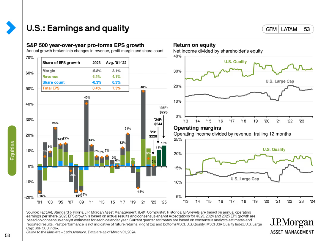
The slide features a bar chart for S&P 500 EPS growth components and line charts for return on equity and operating margins. Different colors and markers highlight various aspects of earnings growth and quality.
Financial Performance
Financial Services
It analyzes the components of EPS growth, return on equity, and operating margins for U.S. equities, providing insights into the quality and sustainability of earnings in the S&P 500 index.
EPS growth, return on equity, operating margins, S&P 500, financial quality
Multiple Chart
JP Morgan
Saved
Column chart presenting revenues, color-coded for different sectors, and easy-to-read layout.
Financial Performance
Financial Services
Details the net revenues of global banking and markets, showcasing the increased wallet share and returns over years.
Revenues, banking, growth
Single Chart
Goldman Sachs
Saved
Previous
Next
If nothing, comes up, please save your slides first
Create a FREE account to continue browsing
Receive Instant Access to 1,000+ slides from companies like McKinsey, Google, and Goldman Sachs
First Name
Last Name
Email
Password
I agree to all
Terms & Privacy Policy
Thank you! Your submission has been received!
Oops! Something went wrong while submitting the form.
Have an account?
Sign in
Column Chart
Heatmap
Chevron
Org Chart
Infographic
Callouts
Timeline
List
Graphic
Picture
Process Flow
Diagram
Paragraph
Map
Table
Framework
Subtitle
Takeaway Box
Icon
Other Chart
Radar Chart
Waterfall Chart
Mekko Chart
Pie Chart
Scatter Plot
Line Chart
Bar chart
Bullet points