My Account
My Slides
Search by Category
Templates
Leave Feedback
Login
Logout
Get Started
Browse all Slides
Browse all Slides
Create a FREE Account
Instant access to 1,000+ real slides from top companies like McKinsey, BCG, Goldman Sachs, Google and many more!
First Name
Last Name
Email
Password
I agree to all
Terms & Privacy Policy
Thank you! Your submission has been received!
Oops! Something went wrong while submitting the form.
Have an account?
Sign in
Saved Slides
The slide includes a world map with highlighted regions and text boxes indicating market size and growth rates.
Market Analysis and Trends
Education & Training
Highlights the private K-12 market growth with enrollment numbers and CAGR between 2015 and 2019.
K-12, private market, enrollment, growth, global
Mixed Chart
LEK
Saved
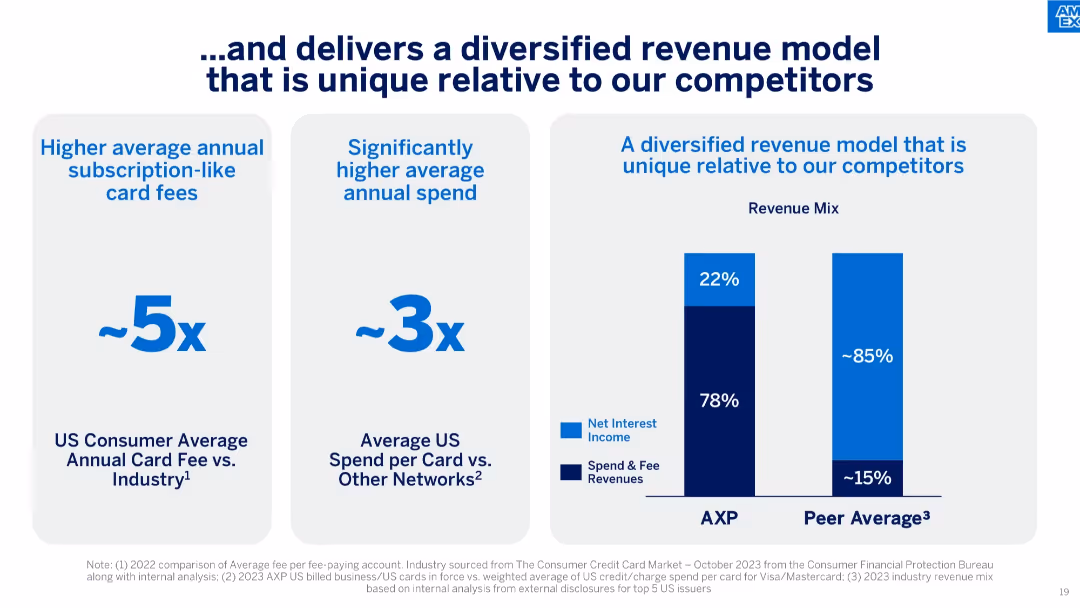
Three-column layout with quantitative comparisons and a bar graph showing revenue mix between AXP and peers.
Financial Performance
Financial Services
Emphasizes AXP's unique revenue structure, showing significantly higher card fees and spending per card compared to peers, resulting in a greater share of revenue from spend and fees.
revenue mix, diversified income, card fees, spending behavior, subscription revenue, peer comparison, financial structure
Mixed Chart
McKinsey
Saved
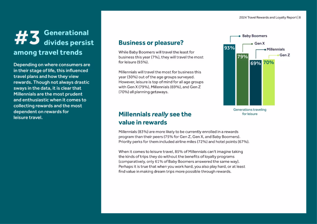
Green and white color block layout with charts and segmented text. Emphasizes generational travel habits and reward usage.
Customer and Market Segmentation
Financial Services
Analyzes how different generations use and value travel rewards—highlighting Millennials' strong reward dependence and Baby Boomers' preference for leisure travel over business.
generations, Millennials, Baby Boomers, Gen Z, travel rewards, leisure, business travel, loyalty enrollment
Mixed Chart
Barclays
Saved
Contains multiple column charts showing market share from 2014 to 2018 for JP Morgan and peers, and product performance changes in Cash Equities, Equity Derivatives, and Prime Finance.
Financial Performance
Financial Services
This slide analyzes the market share growth of JP Morgan's equities franchise, highlighting significant gains in specific financial products.
equities, market share, financial growth, performance analysis
Multiple Chart
JP Morgan
Saved
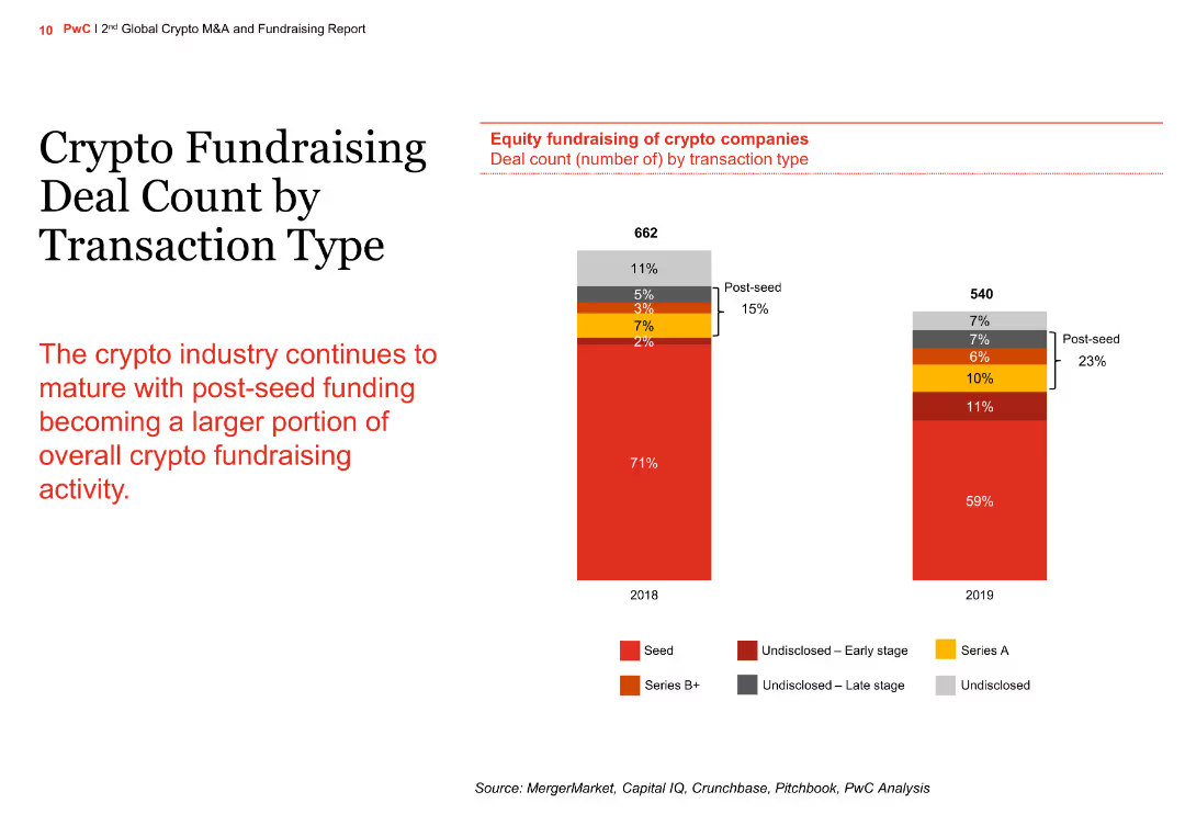
The slide contains a column chart comparing crypto fundraising deal counts by transaction type for the years 2018 and 2019. The chart shows the distribution of seed, Series A, Series B+, and undisclosed funding stages.
Market Analysis and Trends
Financial Services
The slide illustrates the maturation of the crypto industry with an increasing portion of post-seed funding. It compares the number of deals across different funding stages between 2018 and 2019, highlighting the growth in post-seed funding.
crypto, fundraising, transaction type, column chart, comparison
Mixed Chart
PwC/Strategy&
Saved
Scatter plot comparing purchase volume vs outstandings YoY growth; with supporting commentary
Performance Metrics and KPIs
Financial Services
This slide compares credit card issuers based on growth in purchase volume and outstandings for Q1 2023. While overall growth is strong, some issuers like Discover and Chase lead both metrics, whereas PLCC-heavy firms like Synchrony and Citi PLCC lag behind. Commentary highlights issuer-level differences.
credit growth, issuers, outstandings, purchase volume, performance, Synchrony, Discover, McKinsey
Mixed Chart
McKinsey
Saved
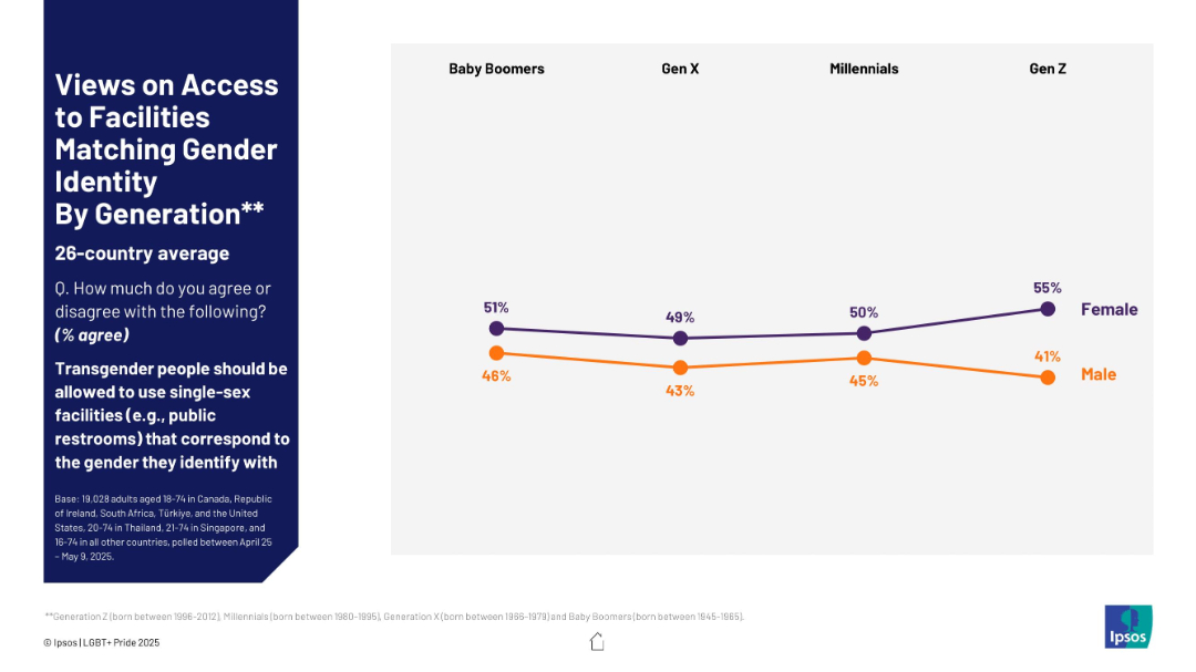
Line chart by generation and gender (male/female), showing % agreement with transgender access to gendered facilities. Simple layout with chart right-aligned.
Regulatory and Compliance
Government & Public Sector
The slide presents generational trends in support for transgender individuals using gendered facilities. It highlights agreement levels across Baby Boomers, Gen X, Millennials, and Gen Z, broken down by gender, showing a consistent gender gap.
gender gap, generational trends, Gen Z, Baby Boomers, gender identity, transgender rights, survey, access, restrooms, opinion trends
Mixed Chart
IPSOS
Saved
Includes detailed demographic data of the survey respondents, presented in a series of charts and graphs that cover aspects such as gender distribution, age groups, and industry sectors.
Industry Overview
Government & Public Sector
Summarizes the demographic characteristics of participants in the PwC survey, providing insights into the composition of the workforce across various industries and demographic groups. This data is essential for understanding the context of the survey results and tailoring future policies and practices to these diverse groups.
workforce demographics, industry distribution, age groups, gender ratio
Multiple Chart
PwC/Strategy&
Saved
Contains a table categorizing various financial processes like Accounts Receivable and Payroll by their potential for digitization, represented in a gradient scale.
Operational Efficiency
Financial Services
Provides a categorization of finance-related tasks and their suitability for digitization based on past project experiences, serving as a reference for digital transformation initiatives in finance.
Finance, digitization, reference cases, digital transformation, accounts receivable, payroll, inventory management, process automation
Table
Deloitte
Saved
Blue title area, large pie chart showing evaluation channels.
Customer and Market Segmentation
Retail & E-commerce
Analysis of social media and messaging as key channels in online evaluation during shopping.
social media, messaging, online evaluation, consumer behavior, retail
Single Chart
Bain
Saved
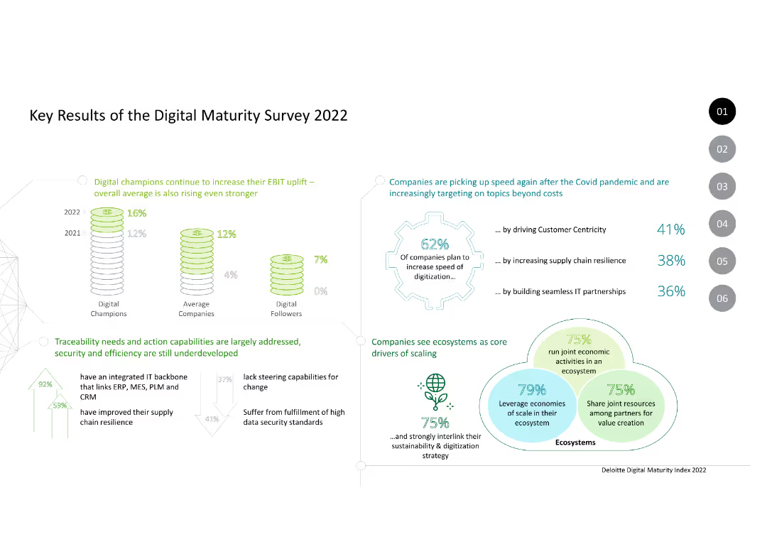
Column charts and text. Data on EBIT uplift, digitization speed, ecosystem drivers, and digital maturity levels of companies.
Market Analysis and Trends
Technology & Software
Summarizes the key results of the Digital Maturity Survey 2022, highlighting trends in digital transformation and ecosystem scaling among companies.
digital maturity, EBIT uplift, digitization, ecosystem, trends, survey, 2022, companies, technology
Mixed Chart
Deloitte
Saved
The slide outlines the machinery and equipment value chain with detailed icons and text descriptions for each stage: raw material processing, manufacturing, and logistics. It includes several company logos representing various stakeholders.
Operational Efficiency
Industrial & Manufacturing
Explains the process and stages in the machinery and equipment value chain, emphasizing the efficiency and longevity of products. It mentions specific companies and their roles in the circular economy.
Supply Chain, Efficiency, Longevity, Machinery, Equipment
Linear Flow
Accenture
Saved
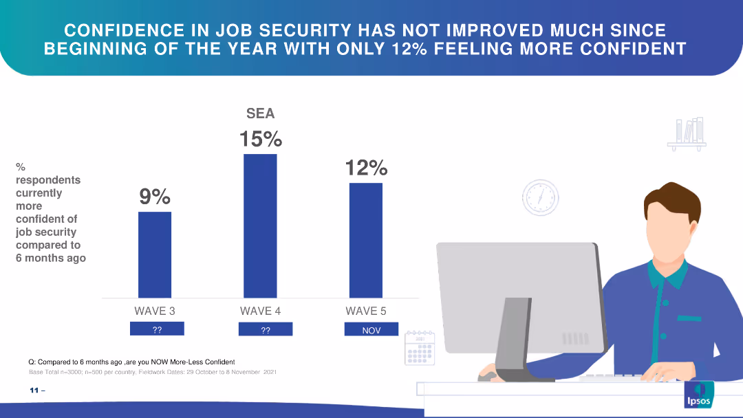
Bar chart showing changes in confidence in job security over three waves in SEA.
Market Analysis and Trends
Financial Services
The slide highlights respondents' confidence in job security over time, showing slight improvements.
job security, confidence, SEA, bar chart, trends
Single Chart
IPSOS
Saved
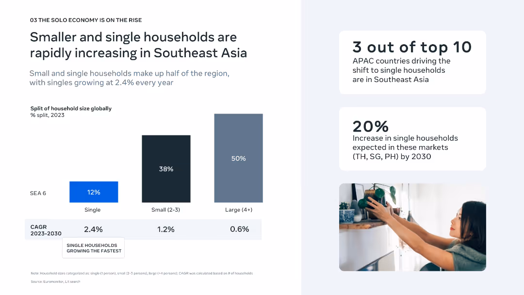
Left-aligned bar chart comparing household sizes and growth rates; stat callouts on right with minimal visuals.
Market Analysis and Trends
Consumer Goods
This slide highlights the rising trend of single-person and small households in Southeast Asia, noting a 2.4% CAGR growth in singles. It also states that SEA includes three of the top 10 APAC countries shifting toward solo households.
household trends, single households, SEA, demographics, CAGR, market shift, APAC, solo economy, urbanization, living patterns
Mixed Chart
Bain
Saved
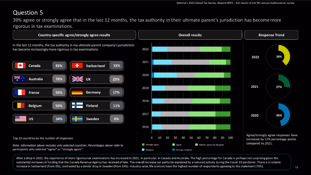
The slide features country-specific results and a column chart showing overall and response trend results over the years.
Regulatory and Compliance
Financial Services
The slide highlights the increasing rigor of tax examinations by the tax authority in the parent company’s jurisdiction.
Tax examinations, rigor, global tax, Deloitte, agree, strongly agree, survey, multinational
Multiple Chart
Deloitte
Saved
Features column charts and a complex table. The design utilizes shades of blue, gray, and white and is dense with both graphics and text.
Financial Performance
Financial Services
It provides a detailed account of net interest income and loan distribution, offering insights into the financial health and lending practices of the firm.
Interest, Income, Loans, Financial, Health, Lending, Practices, Insights, Distribution, Firm
Mixed Chart
Goldman Sachs
Saved
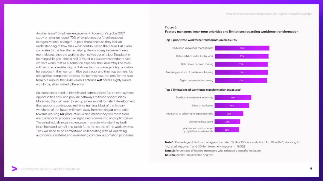
Two bar charts on the right, paragraph text on the left. Purple bars indicate percentages.
Human Resources and Talent Management
Industrial & Manufacturing
Discusses workforce transformation needs including skills training, data literacy, and knowledge management. Highlights barriers like cost, job fears, and adaptation resistance through factory manager survey results.
Workforce, transformation, upskilling, barriers, training, AI adaptation
Mixed Chart
Accenture
Saved
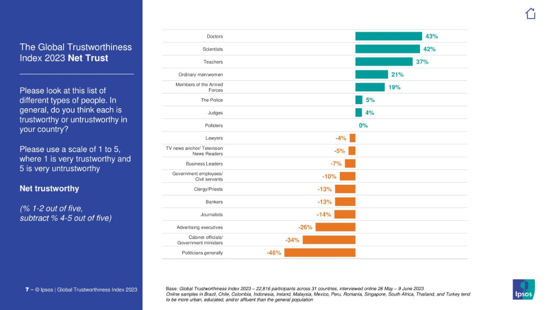
Vertical bar chart showing net trust score (positive % minus negative %) for various professions. Includes color-coded bars for positive and negative values.
Market Analysis and Trends
Professional Services
This slide summarizes the net trustworthiness of different professions based on global survey results. Doctors, scientists, and teachers are the most positively viewed, while politicians and advertisers hold highly negative scores.
net trust, public perception, professions, global survey, Ipsos, credibility, media trust, political distrust
Mixed Chart
IPSOS
Saved
The slide features a column chart depicting participants' ability to correctly identify crypto assets, with categories for correct, incorrect, and unknown.
Market Analysis and Trends
Financial Services
This slide presents data on participants' knowledge and understanding of what constitutes a crypto asset.
Identification, crypto assets, knowledge, survey, participants
Mixed Chart
IPSOS
Saved
Slide includes multiple column charts comparing COVID-19 death rates and case growth across top countries, emphasizing European and North American data.
Risk Assessment and Management
Healthcare & Pharmaceuticals
Analyzes COVID-19 death rates per capita in top affected countries, particularly in Europe and North America, and discusses the trends in new cases, offering insights into the pandemic's regional impacts as of June 2020.
COVID-19, death rates, Europe, North America
Mixed Chart
McKinsey
Saved
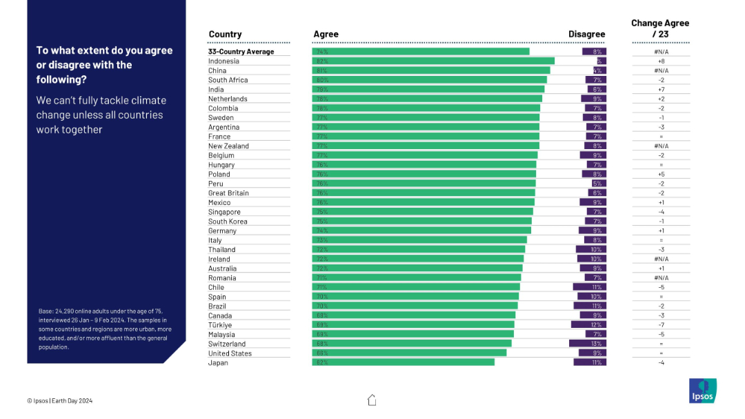
Horizontal bar chart showing agreement levels by country on global cooperation being essential for tackling climate change.
Strategic Planning
Environmental Services & Sustainability
This slide demonstrates widespread consensus on the need for international cooperation to address climate change. Agreement is high across all countries, led by Indonesia and China. The data reflects global acknowledgment that climate change requires collective, cross-border solutions.
international cooperation, climate action, global strategy, public opinion, environmental unity, policy consensus, Ipsos, Earth Day
Mixed Chart
IPSOS
Saved
Line graphs comparing profitability trends relative to market disruptions between profitable growth companies and their peers.
Financial Performance
Financial Services
Discusses how companies that focus on profitability manage to grow despite facing significant disruptions, with comparative data over time.
profitability, market disruptions, growth companies, financial crisis, pandemic, comparative data, profitability trends
Mixed Chart
Accenture
Saved
Features multiple line charts tracking the Citi Surprise Index over time for global, US, Europe, and China, highlighting significant data points with circles.
Financial Performance
Financial Services
Analyzes the economic performance during the pandemic, noting regions where economic data has "surprised" positively or negatively against expectations.
economic impact, COVID-19, Citi Surprise Index, global, regions
Multiple Chart
BCG
Saved
The slide features a step-by-step guide for CEOs to build cyber capabilities, including setting cyber ambition levels (bronze, silver, gold) and integrating cybersecurity into business strategy.
Strategic Planning
Professional Services
This slide provides a framework for CEOs to enhance their organization's cybersecurity by setting appropriate cyber ambition levels and integrating cybersecurity measures into broader business strategies.
cyber ambition, CEOs, cybersecurity, business strategy, framework, professional services, BCG
Linear Flow
BCG
Saved
This slide displays a table chart comparing the cost of data breaches across various industries from 2021 to 2022. It uses a blue color scheme for the bars, making it easy to differentiate between the years. The layout is clear, with each industry listed alongside its corresponding data breach cost.
Risk Assessment and Management
Technology & Software
The slide provides a detailed comparison of data breach costs by industry for 2021 and 2022, highlighting the financial impact of security incidents across sectors. It serves as a valuable resource for discussions on cybersecurity risk management and financial implications of data security breaches.
Data Breach, Cost, Industry Comparison, Cybersecurity, Risk Management, Table Chart
Single Chart
PwC/Strategy&
Saved
Previous
Next
If nothing, comes up, please save your slides first
Create a FREE account to continue browsing
Receive Instant Access to 1,000+ slides from companies like McKinsey, Google, and Goldman Sachs
First Name
Last Name
Email
Password
I agree to all
Terms & Privacy Policy
Thank you! Your submission has been received!
Oops! Something went wrong while submitting the form.
Have an account?
Sign in
Column Chart
Heatmap
Chevron
Org Chart
Infographic
Callouts
Timeline
List
Graphic
Picture
Process Flow
Diagram
Paragraph
Map
Table
Framework
Subtitle
Takeaway Box
Icon
Other Chart
Radar Chart
Waterfall Chart
Mekko Chart
Pie Chart
Scatter Plot
Line Chart
Bar chart
Bullet points