My Account
My Slides
Search by Category
Templates
Leave Feedback
Login
Logout
Get Started
Browse all Slides
Browse all Slides
Create a FREE Account
Instant access to 1,000+ real slides from top companies like McKinsey, BCG, Goldman Sachs, Google and many more!
First Name
Last Name
Email
Password
I agree to all
Terms & Privacy Policy
Thank you! Your submission has been received!
Oops! Something went wrong while submitting the form.
Have an account?
Sign in
Saved Slides
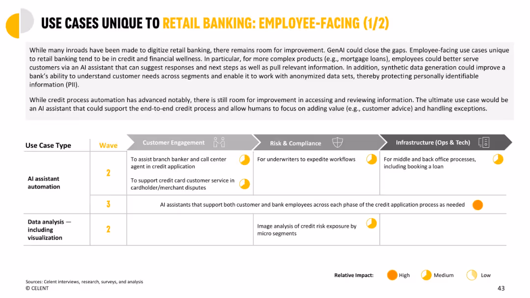
Grid chart organizing use cases across business functions like risk, engagement, and infrastructure.
Human Resources and Talent Management
Financial Services
Focuses on how GenAI can support employees in credit and dispute processes. Shows cross-functional benefits in workflows like underwriting and back-office processing. Medium to high impact predicted.
employee-facing, GenAI, credit application, underwriting, customer service, infrastructure
Mixed Chart
Oliver Wyman
Saved
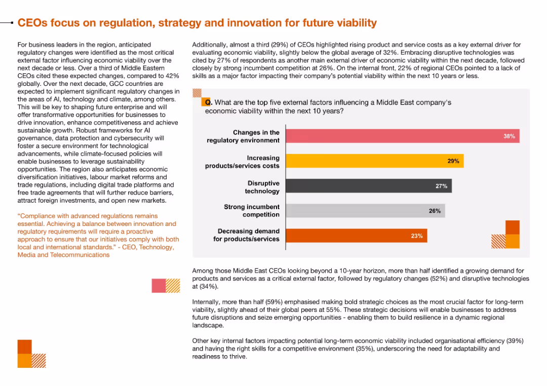
Bar chart of top five external factors influencing viability, with accompanying narrative on right; top section uses orange and gray color palette
Regulatory and Compliance
Technology & Software
The slide identifies the main external challenges facing Middle East businesses—particularly regulatory changes and rising costs—and the internal need to adapt through innovation and strategic decisions.
Regulation, Economic Viability, Disruptive Technology, Strategic Planning, Cost Pressures, Compliance
Mixed Chart
PwC/Strategy&
Saved
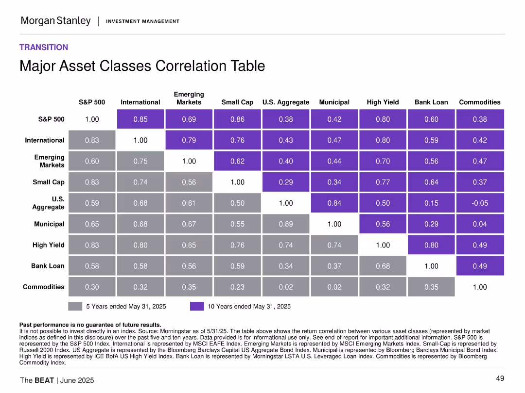
Matrix-style table of 5-year and 10-year correlations among asset classes with color-coding for correlation strength.
Investment Analysis
Financial Services
This slide presents a correlation matrix across major asset classes, revealing diversification benefits and co-movement trends. It shows strong correlations among equities and weaker ties to commodities, helping to inform portfolio construction and risk mitigation.
asset class correlation, portfolio construction, diversification, equities, fixed income, commodities
Table
Morgan Stanley
Saved
It features tables and a column chart summarizing legacy franchises' results, with blue accents. It presents net income, revenues, and loans and deposits statistics.
Operational Efficiency
Financial Services
Outlines financial and operational results for legacy franchises, detailing revenues, credit costs, and changes in loans and deposits. Suitable for discussions on operational efficiency or historical performance analysis in financial reviews.
Legacy, Franchises, Financial Results, Revenues, Credit Costs, Operational Efficiency
Mixed Chart
Citigroup
Saved
Text and circular graph detailing online marketplace spend.
Customer and Market Segmentation
Retail & E-commerce
Examines the dominance of online marketplaces and alternative eCommerce at the purchase stage.
online marketplaces, eCommerce, purchase stage, consumer trends, retail
Single Chart
Bain
Saved
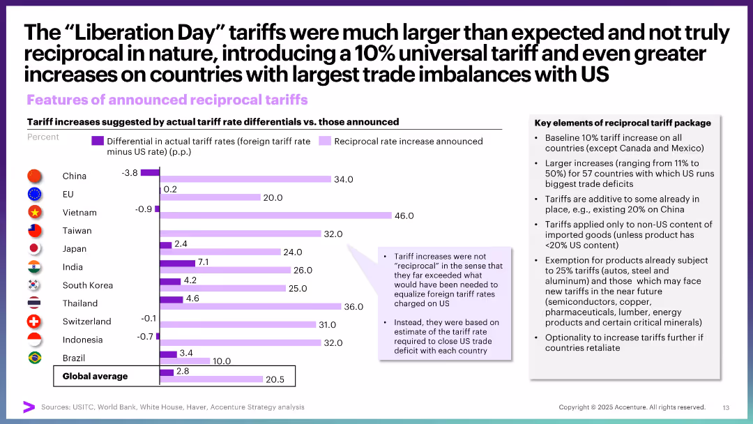
Bar chart comparing tariff rate differentials vs. announced reciprocal increases by country, with a sidebar summarizing key points.
Strategic Planning
Government & Public Sector
This slide evaluates how US reciprocal tariffs deviate from true reciprocity. It shows that tariffs imposed far exceed foreign rates, reflecting imbalances based on US trade deficits rather than mutual rate parity.
tariffs, reciprocal, trade imbalances, Liberation Day, policy analysis, strategic planning, rate differentials
Mixed Chart
Accenture
Saved
A comparative slide with a grid layout, comparing offline and online channels for different stages of vehicle purchase and aftersales, including information gathering, testing, purchase, and care.
Sales and Business Development
Retail & E-commerce
The slide compares online and offline channels for different stages of the vehicle purchase process, highlighting that online channels dominate for information gathering, but offline for testing and purchase.
car buyers, online channel, offline channel, vehicle purchase, customer lifecycle, information gathering, pre-purchase testing, purchase, customer care
Multiple Chart
EY
Saved
Includes several line graphs showing predicted infection paths under different immunity and infection rate scenarios, annotated for clarity and comparison.
Strategic Planning
Healthcare & Pharmaceuticals
Analyzes potential COVID-19 infection trajectories for Austria under various public health response scenarios, aiding in policy decision-making and strategy adjustment.
COVID-19, Austria, scenario analysis, infection rates, public health response, policy planning
Multiple Chart
McKinsey
Saved
Slide includes financial results tables and a column chart showing net revenues from FICC and equities. The layout is data-heavy with a clear distinction between the segments. Blue and grey bars represent the different revenue streams.
Market Analysis and Trends
Financial Services
Analyzes the financial results in global markets, presenting year-over-year and year-to-date comparisons. Useful for evaluating market trends, and understanding performance in FICC and equities for strategic decision-making.
Global Markets, FICC, Equities, Net Revenue
Mixed Chart
Goldman Sachs
Saved
Contains a large pie chart detailing the frequency of Generative AI usage among users, accompanied by a bar graph showing specific usage rates from daily to less frequent.
Market Analysis and Trends
Technology & Software
Discusses the infrequent use of Generative AI tools by those who have tried them, pointing to potential usability or interest barriers.
Generative AI, usage frequency, user engagement, technology utilization, survey data
Mixed Chart
Deloitte
Saved
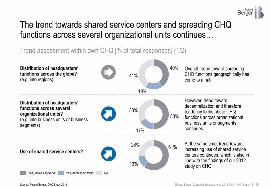
Three donut charts show survey results on distribution and shared services; arrows and commentary text provided
Organizational Structure and Change
Professional Services
This slide highlights survey responses on CHQ functional distribution trends. While global spreading has stagnated, decentralization into business units and the use of shared service centers are rising. Commentary explains strategic implications.
shared services, CHQ, decentralization, trend analysis, headquarters
Multiple Chart
Roland Berger
Saved
This slide features a title at the top, a multi-bullet point section on the left outlining key assumptions, and a line graph depicting unemployment rate scenarios. On the right is a data table with net credit loss projections.
Risk Assessment and Management
Financial Services
Discussing the impact of various unemployment rates on credit card loss scenarios, the slide provides an analysis for planning under different economic conditions.
stress scenario, credit card, unemployment rate, loss projections, economic conditions, baseline, moderate recession
Mixed Chart
JP Morgan
Saved
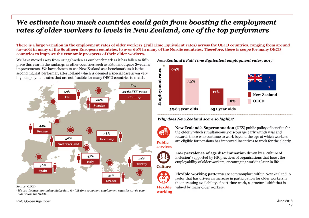
Contains a combination of maps, column charts, and text blocks. Mainly red color scheme.
Market Analysis and Trends
Government & Public Sector
Estimates the potential GDP gains for OECD countries by increasing older worker employment rates to match those of New Zealand.
GDP, employment, older workers, New Zealand, OECD, potential gains, trends, comparison, countries, economic analysis
Mixed Chart
PwC/Strategy&
Saved
A simple text-based layout listing topics: industry overview, investment themes, and value chain segmentation.
Operational Efficiency
Agriculture & Food Production
This agenda slide outlines the main topics of the presentation, serving as a navigation guide for the discussion on the crop market.
agenda, crop market, industry overview, investment themes, value chain
Agenda
EY
Saved
The slide features a column chart showing FY23 greenhouse gas emissions by category and a text description of the company's efforts to reduce carbon footprint and enhance sustainability.
Regulatory and Compliance
Environmental Services & Sustainability
This slide presents data on Booz Allen's FY23 greenhouse gas emissions, categorized by scope, and discusses initiatives to reduce the company's carbon footprint and enhance sustainability.
Booz Allen, greenhouse gas emissions, sustainability, FY23, carbon footprint
Multiple Chart
Booz Allen Hamilton
Saved
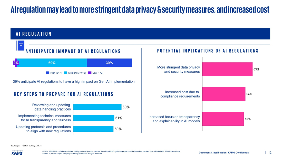
Split-panel layout showing regulatory impact, implications, and preparation steps using bar charts
Regulatory and Compliance
Artificial Intelligence
This slide discusses the anticipated impact of AI regulations. 39% expect high impact, with implications such as stricter data privacy measures and higher compliance costs. It also lists preparation strategies like updating protocols and implementing transparency measures.
AI regulation, compliance, data privacy, cost, preparation, transparency
Multiple Chart
KPMG
Saved
This slide features a line chart displaying equity, interest rate, and foreign exchange volatility, and a scatter plot showing hedge fund returns versus short-term US T-bill yields over various decades.
Risk Assessment and Management
Financial Services
The slide explores the relationship between market volatility, interest rates, and hedge fund returns, providing a historical perspective on investment performance.
volatility, interest rates, hedge fund returns, T-bill yields, market analysis
Multiple Chart
JP Morgan
Saved
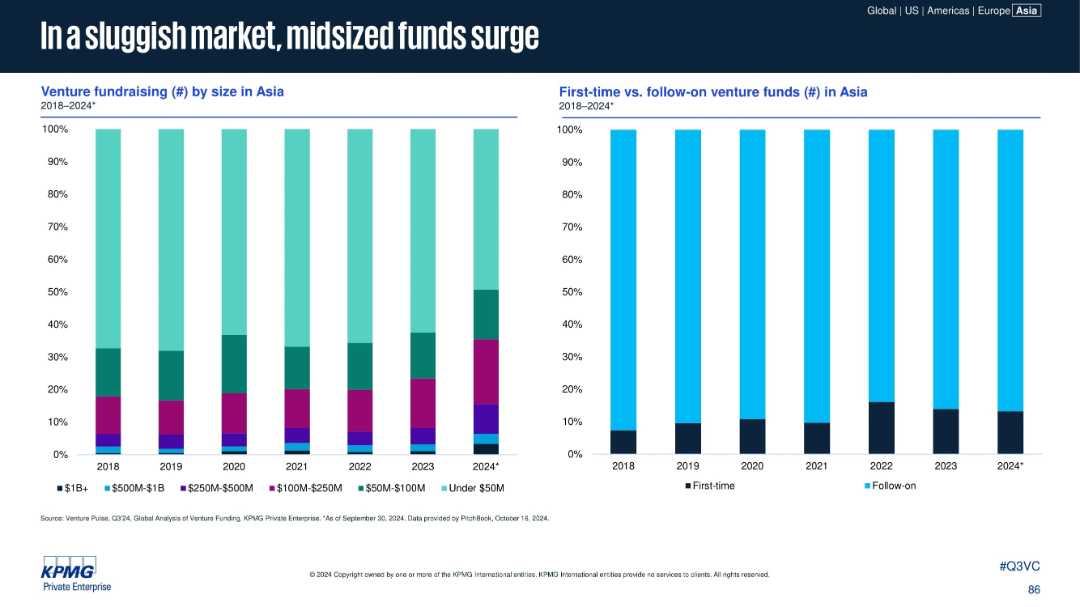
Two vertical stacked bar charts: left shows venture fundraising by size; right compares first-time vs. follow-on funds in Asia (2018–2024).
Market Analysis and Trends
Financial Services
The slide reveals a rise in mid-sized funds ($100M–$500M) and a consistent dominance of follow-on funds over first-time venture funds. The market favors experienced fund managers in a more cautious fundraising environment, with under-$50M funds also growing in proportion in 2024.
midsize funds, first-time funds, follow-on funds, Asia, venture capital, fundraising
Multiple Chart
KPMG
Saved
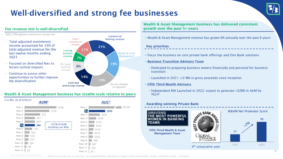
The slide features a pie chart showing the mix of noninterest income, and column charts comparing AUM and AUC with peers. Bullet points discuss the growth of the wealth and asset management business and key priorities for future growth.
Financial Performance
Financial Services
The slide highlights Fifth Third Bank’s diversified fee revenue streams, with a detailed breakdown of noninterest income sources. It showcases their wealth and asset management business growth, comparing AUM and AUC with peers, and outlines key priorities for future growth and client advisory services.
Fee businesses, noninterest income, diversified revenue, AUM, AUC, wealth management, asset management, revenue growth, client advisory, Fifth Third Bank
Multiple Chart
Goldman Sachs
Saved
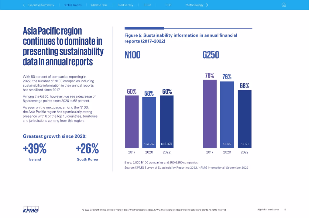
Left-aligned text block with bold statistics; right side features dual vertical bar charts comparing N100 and G250 (2017–2022)
Performance Metrics and KPIs
Professional Services
This slide focuses on the inclusion of sustainability data in annual financial reports. It contrasts N100 and G250 trends, showing a plateau for N100 and a decline for G250. The Asia Pacific region is highlighted as dominant in data presentation.
annual reporting, N100, G250, sustainability data, Asia Pacific, transparency, trend analysis
Mixed Chart
KPMG
Saved
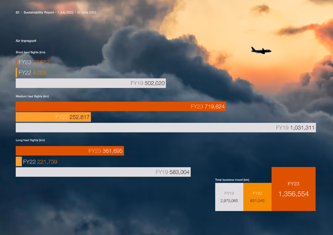
The slide features multiple horizontal bar charts comparing air transport metrics over different fiscal years. The design is visually engaging with a clear hierarchy and color-coded data.
Operational Efficiency
Transportation & Logistics
The slide compares the number of short, medium, and long-haul flights over fiscal years, showing trends and changes in business travel for the company.
Air Transport, Flights, Comparison, Fiscal Years
Single Chart
PwC/Strategy&
Saved
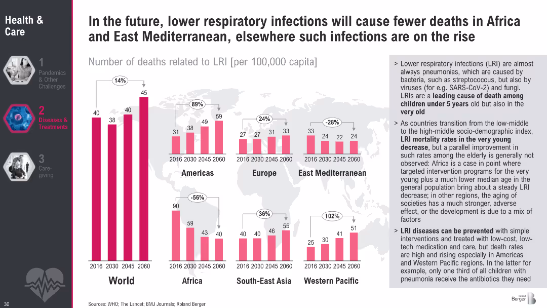
Bar charts with death rates from lower respiratory infections by region (2016–2060); sidebar with insights
Market Analysis and Trends
Healthcare & Pharmaceuticals
This slide highlights divergent trends in deaths from lower respiratory infections. While Africa and East Mediterranean are projected to see decreases, other regions—especially Western Pacific—will experience rising mortality.
respiratory infections, LRI, pneumonia, global trends, infectious diseases, WHO, mortality rate, projections
Multiple Chart
Roland Berger
Saved
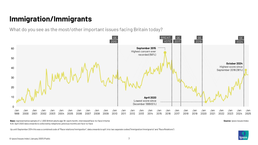
Timeline line chart from 1999 to 2025 showing concern levels over time, with annotations
Market Analysis and Trends
Government & Public Sector
This slide charts rising and falling public concern about immigration, showing spikes around 2015–2016 during Brexit discourse, and a renewed rise in 2024.
immigration, UK, concern, Brexit, Ipsos, timeline, survey, politics, opinion, chart
Single Chart
IPSOS
Saved
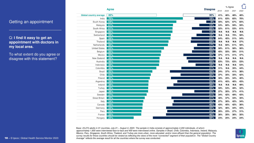
Horizontal bar chart showing agreement on ease of getting local medical appointments; question on the left.
Performance Metrics and KPIs
Healthcare & Pharmaceuticals
The chart measures the perceived ease of scheduling doctor appointments. India, South Korea, and Malaysia report the highest ease, while Hungary and France are at the bottom. The slide helps assess accessibility of primary healthcare services.
doctor appointments, access, primary care, healthcare efficiency, Ipsos, patient experience, global survey
Mixed Chart
IPSOS
Saved
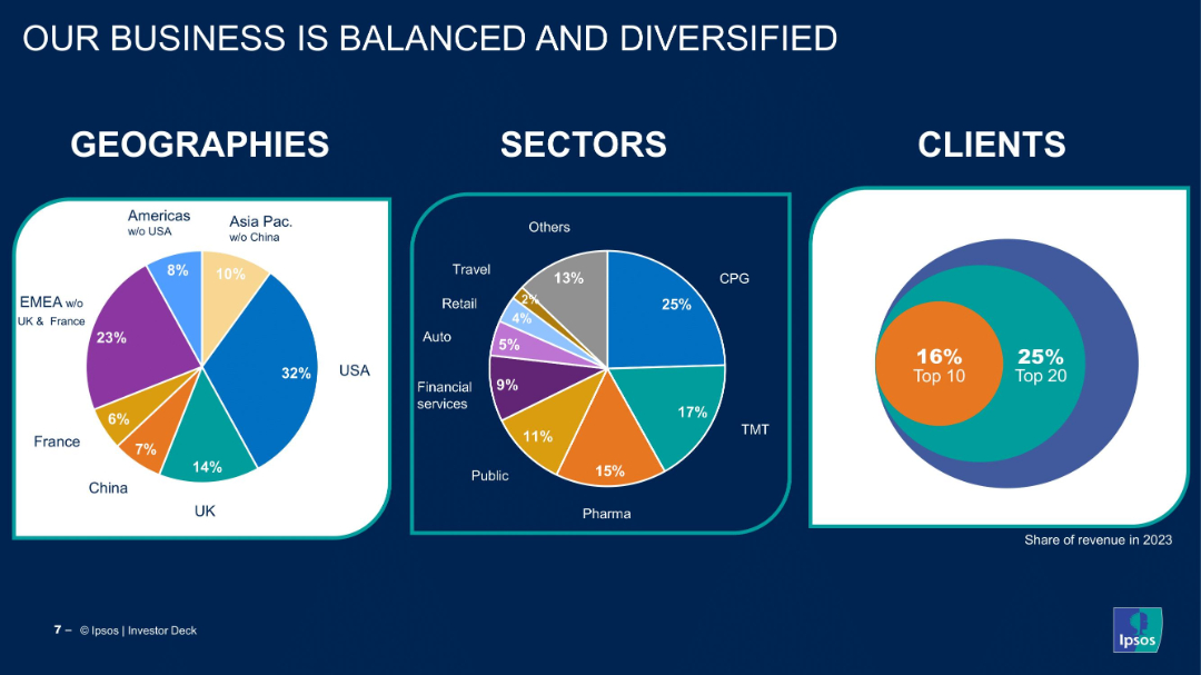
Three pie charts showing breakdown by geography, sector, and client concentration.
Strategic Planning
Professional Services
The slide showcases Ipsos’ business distribution across regions, industry sectors, and clients. It emphasizes the company’s diversified portfolio and minimal client concentration risk.
diversification, global presence, client base, revenue mix, pie chart, sector analysis, geographic split, Ipsos, balanced business
Multiple Chart
IPSOS
Saved
Previous
Next
If nothing, comes up, please save your slides first
Create a FREE account to continue browsing
Receive Instant Access to 1,000+ slides from companies like McKinsey, Google, and Goldman Sachs
First Name
Last Name
Email
Password
I agree to all
Terms & Privacy Policy
Thank you! Your submission has been received!
Oops! Something went wrong while submitting the form.
Have an account?
Sign in
Column Chart
Heatmap
Chevron
Org Chart
Infographic
Callouts
Timeline
List
Graphic
Picture
Process Flow
Diagram
Paragraph
Map
Table
Framework
Subtitle
Takeaway Box
Icon
Other Chart
Radar Chart
Waterfall Chart
Mekko Chart
Pie Chart
Scatter Plot
Line Chart
Bar chart
Bullet points