My Account
My Slides
Search by Category
Templates
Leave Feedback
Login
Logout
Get Started
Browse all Slides
Browse all Slides
Create a FREE Account
Instant access to 1,000+ real slides from top companies like McKinsey, BCG, Goldman Sachs, Google and many more!
First Name
Last Name
Email
Password
I agree to all
Terms & Privacy Policy
Thank you! Your submission has been received!
Oops! Something went wrong while submitting the form.
Have an account?
Sign in
Saved Slides
Features a world map highlighting the top five carbon-emitting countries, using color coding and percentages to show the proportion of emissions each country contributes.
Regulatory and Compliance
Environmental Services & Sustainability
Analyzes the carbon emission contributions of the top five countries, highlighting the significant role of major economies in global emissions. Useful for discussions on international cooperation and policy-making for emission reduction.
Carbon emissions, Countries, Global share, Climate policy
Multiple Chart
BCG
Saved
This slide is a split layout with a title section, a left-hand bullet list, and a right-hand bar chart with a 0-10 scale. The color scheme includes blue, yellow, and green. There is a balance of textual information and visual data, with a clear presentation of the Net Promoter Score.
Market Analysis and Trends
Retail & E-commerce
The slide communicates merchants' satisfaction with digital platforms and their likelihood to recommend these platforms to peers, backed by a bar chart visualizing Net Promoter Score (NPS). It highlights the top reasons for merchant satisfaction, such as simplicity, ease of transaction, and customer base, serving as a persuasive data point for platform reliability.
digital platforms, merchants, satisfaction, NPS, ease of transaction, customer base, simplicity
Mixed Chart
Bain
Saved
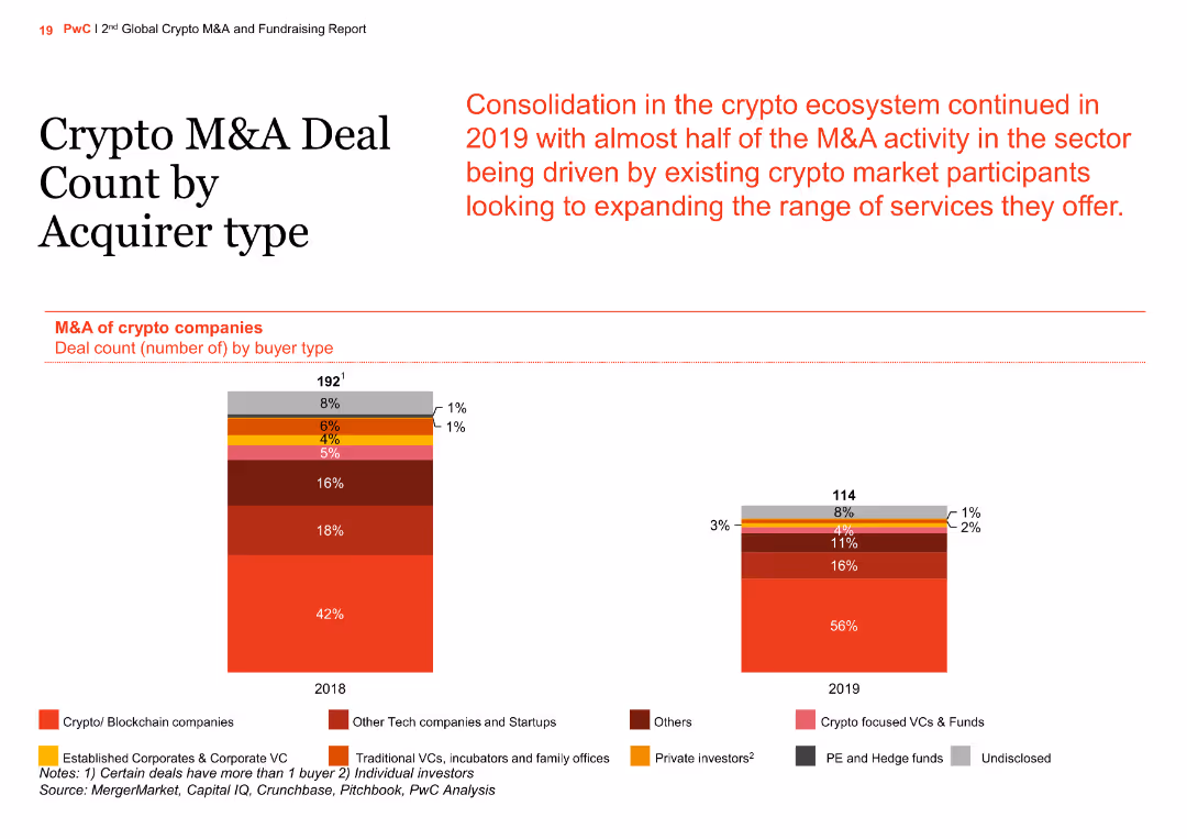
The slide shows a column chart comparing M&A deal counts by acquirer type for 2018 and 2019. Acquirer types include crypto/blockchain companies, tech startups, established corporates, VCs, and private investors.
Market Analysis and Trends
Financial Services
The slide provides an overview of the types of acquirers involved in crypto M&A deals, noting a significant increase in acquisitions by crypto/blockchain companies and a consolidation trend in the ecosystem.
crypto, M&A, acquirer type, column chart, comparison
Multiple Chart
PwC/Strategy&
Saved
Displays column charts and startup logos, organized in a visually engaging and informative manner to showcase growth and investment trends.
Investment Analysis
Environmental Services & Sustainability
Examines the booming startup ecosystem in SEA focused on sustainability, detailing the rapid increase in startups and investments in the sector since 2015.
Startups, sustainability, SEA, growth, investments
Multiple Chart
Bain
Saved
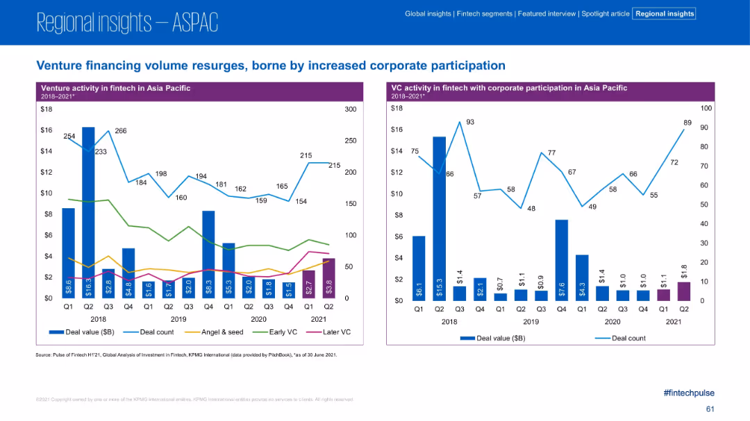
Dual charts showing deal value trends by financing stage and corporate participation.
Strategic Planning
Financial Services
The left chart disaggregates venture financing by stage, while the right shows corporate participation trends in VC deals. The slide highlights resurgence in corporate-backed VC deals after a decline, signaling renewed strategic interest.
VC, Corporate Participation, Financing Stages, Early VC, Later VC
Multiple Chart
KPMG
Saved
The slide presents a comparative analysis of hiring difficulties across sectors in the UK, US, and EU, with color-coded arrows indicating improving or worsening trends. Sectors include mining, manufacturing, and healthcare among others. Commentary highlights key insights.
Human Resources and Talent Management
Professional Services
The slide analyzes talent shortages in the US, UK, and EU, noting that hiring difficulties are highest in the US. It highlights specific sectors experiencing significant challenges and improvements, emphasizing the persistent labor shortages in healthcare and hospitality industries.
talent shortages, hiring, US, UK, EU, sectors, trends
Table
Accenture
Saved
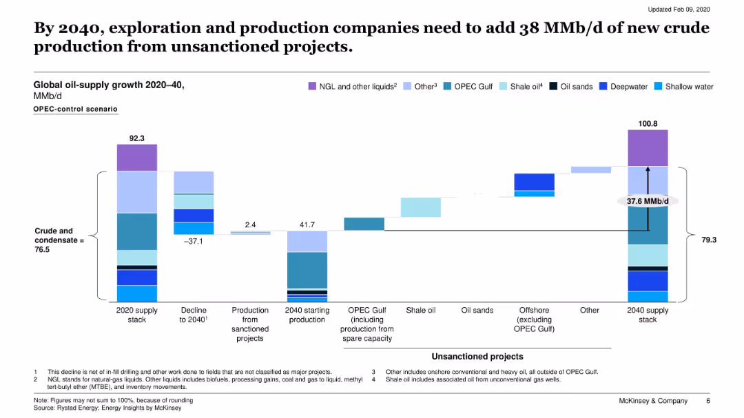
Waterfall chart showing oil supply growth from 2020 to 2040, segmented by project type and status (sanctioned, unsanctioned).
Strategic Planning
Energy & Utilities
This slide outlines the projected gap in global oil supply by 2040, requiring significant input from unsanctioned projects. It breaks down supply contributions by type (OPEC, shale, deepwater, etc.).
crude supply, unsanctioned projects, oil production, 2040 forecast, OPEC, shale
Single Chart
McKinsey
Saved
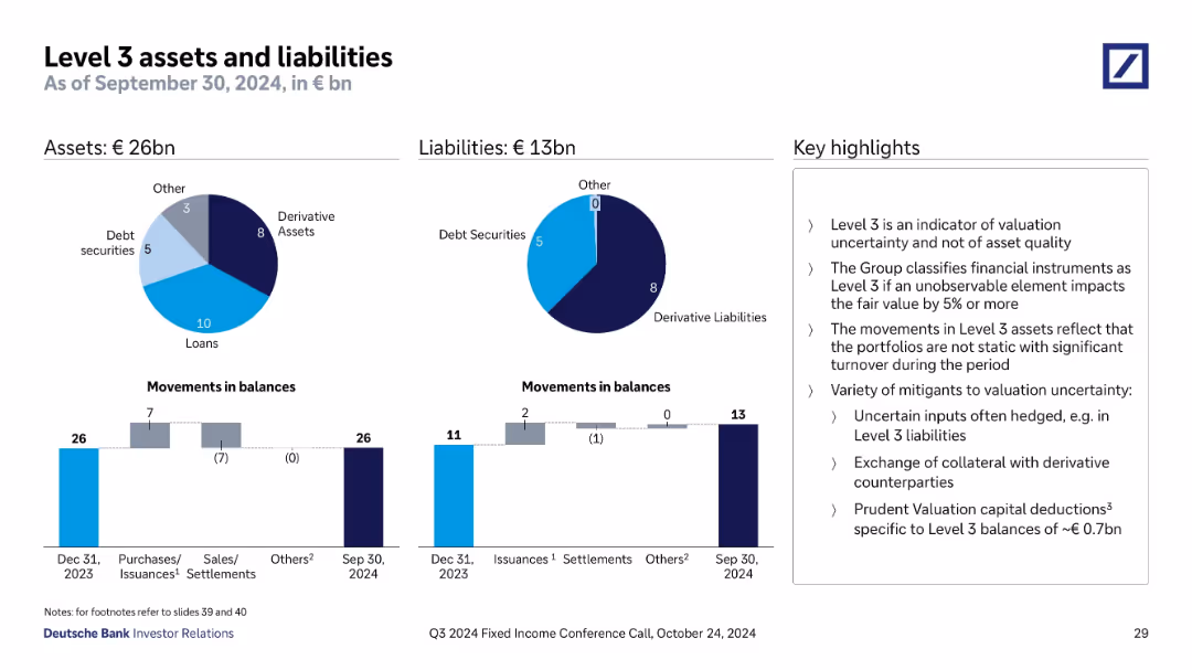
Pie charts for assets and liabilities; bar charts for movements; boxed key highlights on the right; circular and vertical bar visuals
Regulatory and Compliance
Financial Services
Shows Deutsche Bank’s Level 3 assets and liabilities as of September 30, 2024, emphasizing valuation uncertainty. Includes breakdowns by asset class and tracks changes in balances, along with commentary on mitigating valuation risks.
Level 3, valuation uncertainty, derivative assets, financial reporting, liabilities, Deutsche Bank, balance sheet, asset classification
Multiple Chart
Deutsche Bank
Saved
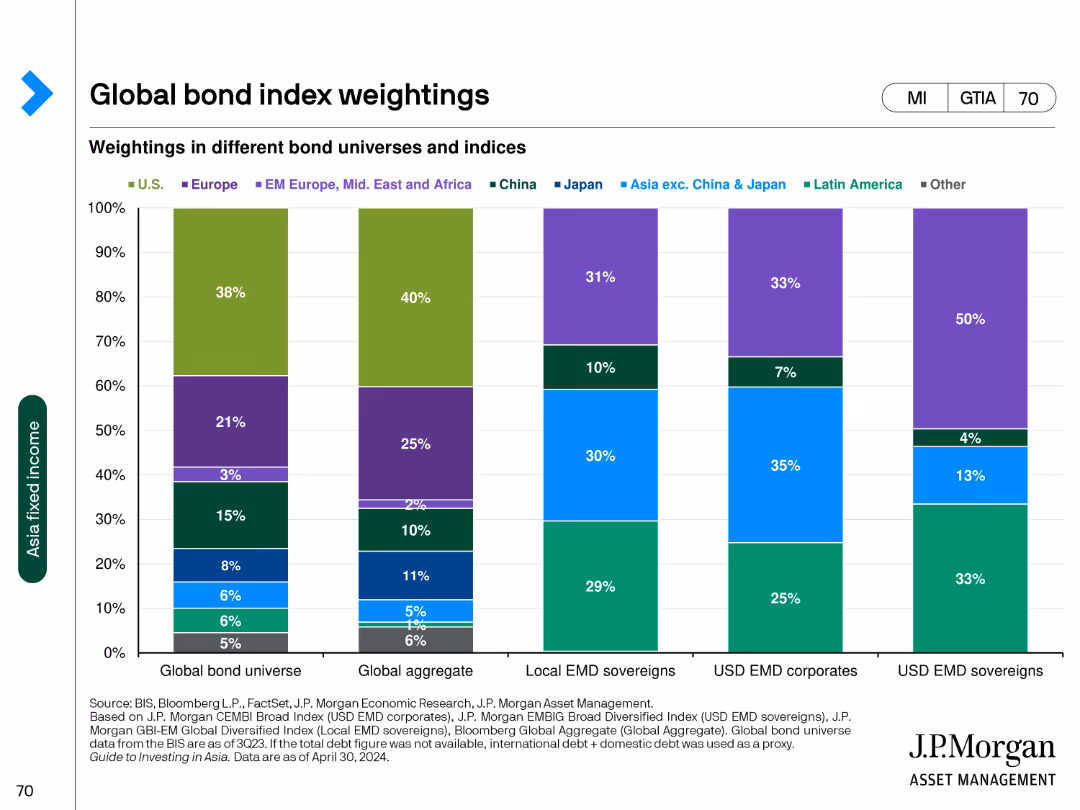
The slide features a column chart displaying the weightings in different bond universes and indices across various regions such as the U.S., Europe, and China.
Market Analysis and Trends
Financial Services
The slide presents the weight distribution in global bond universes, aggregate bonds, local EMD sovereigns, and USD EMD corporates and sovereigns.
bond, weightings, global, indices, regions
Single Chart
JP Morgan
Saved
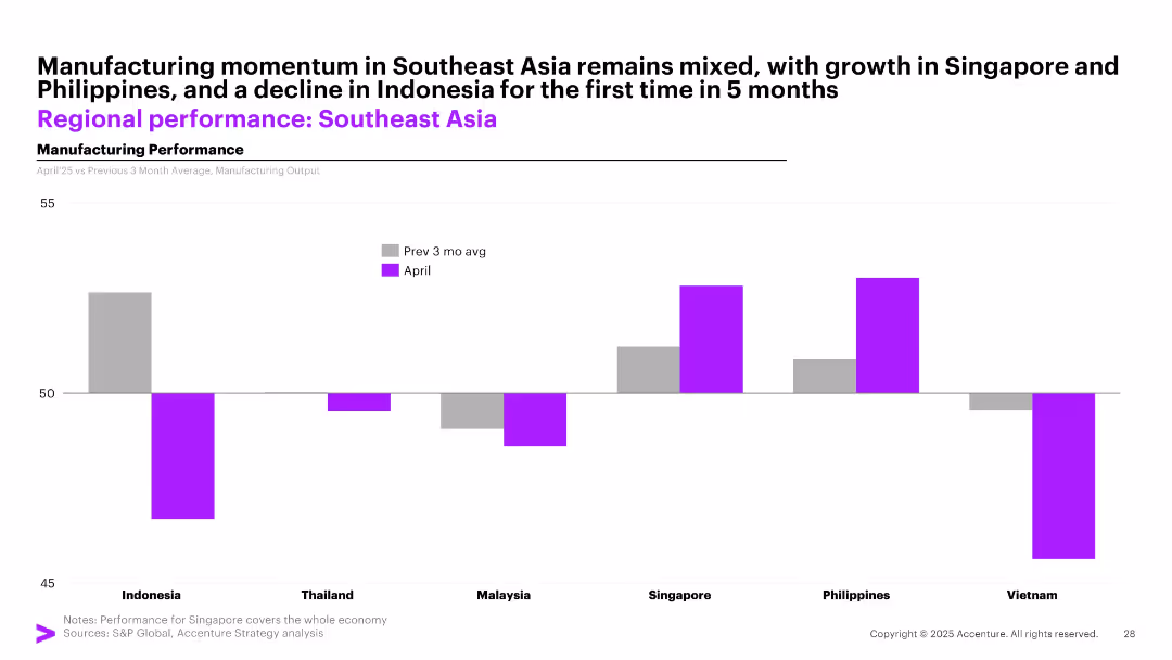
Bar chart with vertical bars comparing April manufacturing performance against the previous 3-month average for 6 Southeast Asian countries.
Performance Metrics and KPIs
Industrial & Manufacturing
The slide compares April 2025 manufacturing output with the previous 3-month average across Southeast Asia, showing mixed performance with growth in Singapore and the Philippines, and declines in countries like Indonesia and Vietnam.
manufacturing, Southeast Asia, Singapore, Indonesia, PMI, output, April, comparison, trends, performance
Single Chart
Accenture
Saved
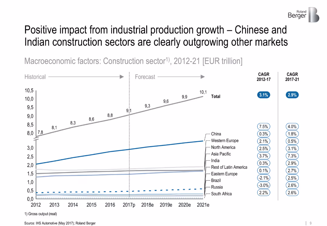
Line chart showing historical and forecasted construction sector output by region (2012–2021), with CAGR figures in side legends. Clean layout with subtle color coding and segmentation by region.
Market Analysis and Trends
Industrial & Manufacturing
The slide presents growth projections for the global construction sector, highlighting that China and India are significantly outpacing other regions. It includes CAGR data from 2012–2017 and forecasts for 2017–2021, showing clear segmentation by geographic region.
['construction', 'industrial production', 'growth forecast', 'China', 'India', 'CAGR', 'regional comparison', 'market trend']
Single Chart
Roland Berger
Saved
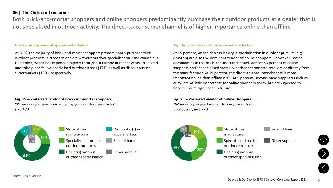
Two pie charts showing preferred vendors for brick-and-mortar and online shoppers, with text on specialized vs non-specialized dealers.
Market Analysis and Trends
Consumer Goods
Shows preferences for purchasing from specialized vs. non-specialized vendors among brick-and-mortar and online shoppers, noting the dominance of online dealers.
Vendors, Preferences, Specialized, Online, Brick-and-Mortar
Multiple Chart
Deloitte
Saved
A column chart shows the trend of rail ridership over the years, highlighting specific years with significant changes, providing a clear visual of ridership trends.
Industry Overview
Transportation & Logistics
Focuses on the significant decline in rail ridership over several years, offering insights into potential causes and implications for the transportation industry.
rail ridership, decline, transportation industry, trend analysis
Single Chart
BCG
Saved
This slide utilizes a complex array of column charts detailing the 2019 GDP contributions and unemployment claims across various sectors in NY, segmented by industry and visualized with distinct colors.
Market Analysis and Trends
Financial Services
Offers a comprehensive snapshot of the New York economy, detailing each industry's contribution to the state's GDP and its unemployment figures in early 2020, reflecting the pandemic's impact.
NY economy, 2019 GDP, unemployment claims, industry analysis, pandemic, bar charts
Single Chart
BCG
Saved
Features a line chart and a large, detailed column chart comparing generational focus of wealth firms currently and predictions for the next three years across different sectors. The design is data-intensive yet clearly structured for easy interpretation.
Market Analysis and Trends
Financial Services
Analyzes the anticipated wealth transfer across generations and its impact on investment strategies, with a focus on how firms plan to adapt to these demographic shifts.
generational wealth, investment focus, wealth transfer, demographic shifts, financial strategy
Multiple Chart
Deloitte
Saved
This slide presents a column chart comparing unlinked metro rides annually. Annotations and year markers provide a clear depiction of trends and significant data points.
Risk Assessment and Management
Transportation & Logistics
Offers a decade-long review of rail ridership, illustrating trends and discussing the factors influencing these patterns.
metro rides, annual trends, ridership data, transportation analysis
Single Chart
BCG
Saved
This slide features a line chart comparing sales and new listings for January over several years. The lines represent sales (blue) and new listings (gray) with clear data points and trend lines.
Market Analysis and Trends
Real Estate & Construction
The slide shows historical data on sales and new listings for January, providing insights into market trends and performance over time.
January 2021, sales, new listings, line chart, market trends
Single Chart
IPSOS
Saved
Slide presents a column chart comparing challenges within underwriting function by account size, using various colors to denote different account ranges.
Strategic Planning
Financial Services
The slide outlines the top challenges faced by underwriters in achieving business objectives with specific focus on different account sizes, highlighting issues like ineffective systems and lack of information.
underwriting, challenges, business objectives, account sizes, systems, information
Mixed Chart
Accenture
Saved
Multiple stacked column charts depict the divisional currency mix for net revenues and noninterest expenses, using a clear color-coded scheme to indicate various currencies.
Financial Performance
Financial Services
Provides a detailed breakdown of Deutsche Bank's currency exposure across different divisions for Q2 2023, illustrating how revenues and expenses are allocated by currency.
Currency exposure, financial analysis, revenue allocation, expense distribution, Deutsche Bank, Q2 2023
Multiple Chart
Deutsche Bank
Saved
Slide displays column charts for 'Loans by Segment' and 'Net Interest Income by Segment', as well as a table detailing loan types with corresponding metrics.
Financial Performance
Financial Services
This slide examines the distribution and performance of loans across different segments, including the net interest income, to provide insights on the financial health and lending effectiveness of the organization.
Loans, Net Interest Income, Segment Distribution, Corporate Lending, Securities-based Lending, Loan Performance, Interest Metrics
Multiple Chart
Goldman Sachs
Saved
Slide contains a large, colorful multi-line chart comparing foundational, programmatic, strategic, and integrated & sustainable D&I targets across industries. Icons and a strategic intent note are placed at the top. Line colors are distinct for each sector.
Strategic Planning
Retail & E-commerce
This slide analyzes how the retail sector compares with others like CGS, Auto/IE, LS/Pharma/Biotech, and Travel/Hospitality in establishing Diversity and Inclusion targets across four categories: Foundational, Programmatic, Strategic, and Integrated & Sustainable.
Retail, Diversity, Inclusion, Comparison, Sector, Targets, Performance, Strategic, Programmatic, Integrated
Mixed Chart
Accenture
Saved
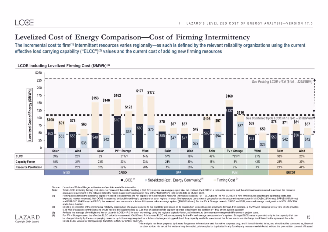
Clustered bar chart showing LCOE including cost to firm intermittency; multiple regional datasets (MISO, CAISO, etc.) are included.
Risk Assessment and Management
Energy & Utilities
Analyzes additional costs for renewable energy to provide reliable capacity (firming), using ELCC and capacity factor data across multiple grid regions, which impact the total economic feasibility of intermittent sources.
firming, intermittency, ELCC, capacity factor, reliability, renewables, solar, wind
Single Chart
Roland Berger
Saved
Split layout: left side features bold blue text message; right side has a vertical product ladder with gradient-colored boxes representing different services, indicating revenue growth over time.
Strategic Planning
Financial Services
This slide highlights Experian’s revenue doubling over five years, attributing growth to a diversified range of financial products and tools. It presents a visual stack of offerings, progressing from foundational services like free scores to advanced tools like insurance and bill management. The chart shows revenue growth from $0.8B to $1.5B.
revenue growth, product expansion, financial services, Experian, credit tools, insurance, fintech, market potential, financial journey, digital services
Single Chart
Barclays
Saved
A split comparative slide, with top 5 factors for customer satisfaction listed on the left under green and red icons for promoters and detractors respectively, with simple icons and short texts.
Market Analysis and Trends
Retail & E-commerce
This slide compares customer satisfaction factors, with "Variety", "Price", and "Availability" being top drivers, and "Promotions" and "Quality" noted as well.
satisfaction, customer, variety, price, availability, promotions, quality, factors, comparison, e-commerce
Boxed
Bain
Saved
The slide uses a comparative layout with color-coded sections for each major spending area: Health, Finance, Education, Public Safety, and Social Welfare. Each section has key financial figures.
Financial Performance
Government & Public Sector
Summarizes the fiscal priorities of the government, emphasizing areas of significant financial input and strategic importance.
budget priorities, fiscal strategy, public spending
Pillar
PwC/Strategy&
Saved
Previous
Next
If nothing, comes up, please save your slides first
Create a FREE account to continue browsing
Receive Instant Access to 1,000+ slides from companies like McKinsey, Google, and Goldman Sachs
First Name
Last Name
Email
Password
I agree to all
Terms & Privacy Policy
Thank you! Your submission has been received!
Oops! Something went wrong while submitting the form.
Have an account?
Sign in
Column Chart
Heatmap
Chevron
Org Chart
Infographic
Callouts
Timeline
List
Graphic
Picture
Process Flow
Diagram
Paragraph
Map
Table
Framework
Subtitle
Takeaway Box
Icon
Other Chart
Radar Chart
Waterfall Chart
Mekko Chart
Pie Chart
Scatter Plot
Line Chart
Bar chart
Bullet points