My Account
My Slides
Search by Category
Templates
Leave Feedback
Login
Logout
Get Started
Browse all Slides
Browse all Slides
Create a FREE Account
Instant access to 1,000+ real slides from top companies like McKinsey, BCG, Goldman Sachs, Google and many more!
First Name
Last Name
Email
Password
I agree to all
Terms & Privacy Policy
Thank you! Your submission has been received!
Oops! Something went wrong while submitting the form.
Have an account?
Sign in
Saved Slides
The slide presents two sets of column charts. The left chart shows a slight increase in technology expenses from 2019 to 2022. The right side shows infrastructure costs remaining steady from 2015 to 2021 alongside a dramatic doubling of compute and storage volumes. Each chart includes annotations like percentage changes.
Financial Performance
Financial Services
The slide illustrates control over banking operational expenses against a backdrop of doubling technology volumes, indicating efficient resource allocation.
Banking, Expense Management, Technology Investment, Operational Efficiency, Growth, Infrastructure, Financial Services, Cost Control, Computational Volume, Scalability
Multiple Chart
JP Morgan
Saved
The slide features percentage statistics in a column chart format with explanatory text beside each chart. Color coding is used to differentiate between the likelihood of increasing or maintaining usage.
Strategic Planning
Technology & Software
Focuses on the technological readiness of digital merchants in the Philippines and their anticipated adoption of digital platforms and financial services in the future.
Digital platforms, Financial services, Technological adoption, Future trends
Multiple Chart
Bain
Saved
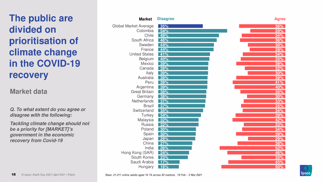
Horizontal bar chart comparing agreement and disagreement levels on prioritizing climate change in COVID-19 recovery across global markets.
Market Analysis and Trends
Government & Public Sector
Highlights divided public opinion on whether climate change should be prioritized during economic recovery from COVID-19, with varying levels of agreement by country.
climate change, COVID-19, economic recovery, public opinion, survey
Multiple Chart
IPSOS
Saved
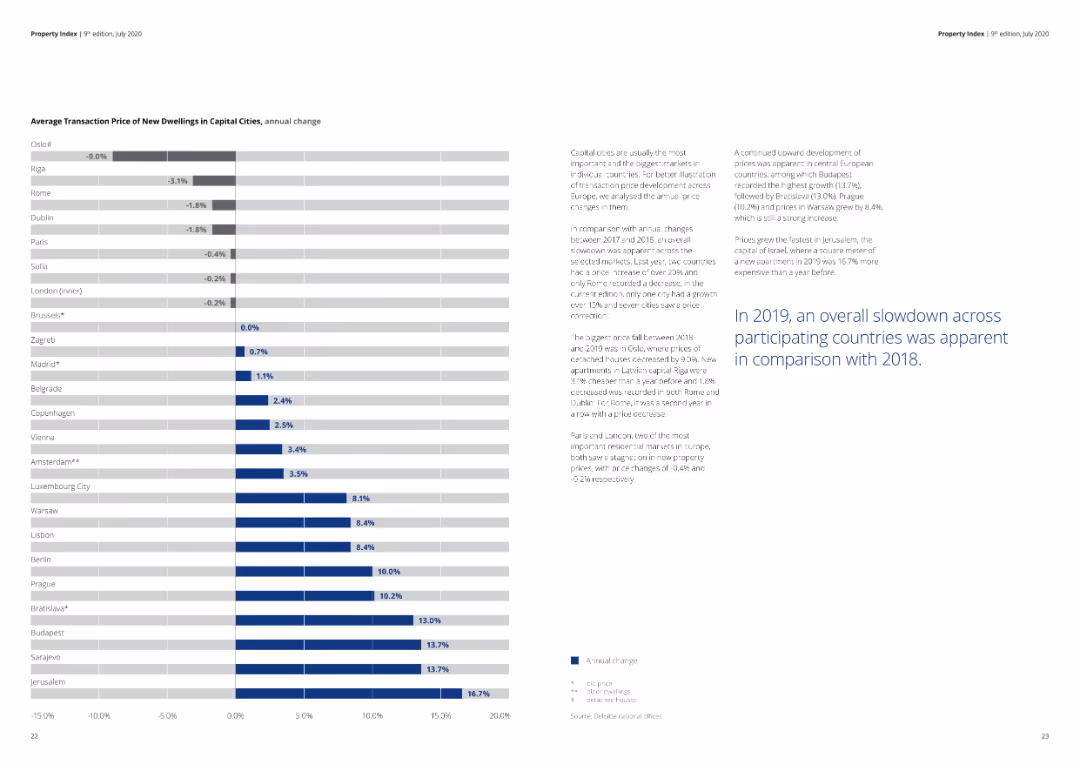
A detailed column chart illustrating the average transaction prices and annual changes in capital cities.
Market Analysis and Trends
Real Estate & Construction
The slide shows the average transaction prices and their annual change for new dwellings in various capital cities, indicating market trends.
real estate, capital cities, housing prices, transaction, annual change, market analysis
Mixed Chart
Deloitte
Saved
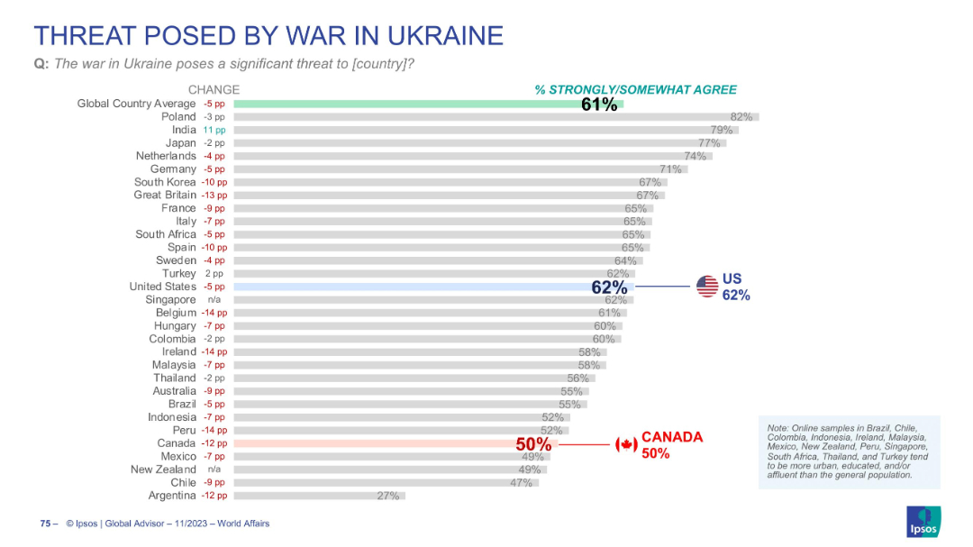
Bar chart with % agreement by country; change indicators in red/blue; US and Canada flagged. Clean, neutral color palette.
Risk Assessment and Management
Government & Public Sector
Depicts global perceptions of the war in Ukraine as a threat to one’s own country. 61% globally agree, 62% in the US, but only 50% in Canada. The slide suggests waning concern, especially in some Western countries.
Ukraine war, threat perception, geopolitical conflict, Canada, US
Single Chart
IPSOS
Saved
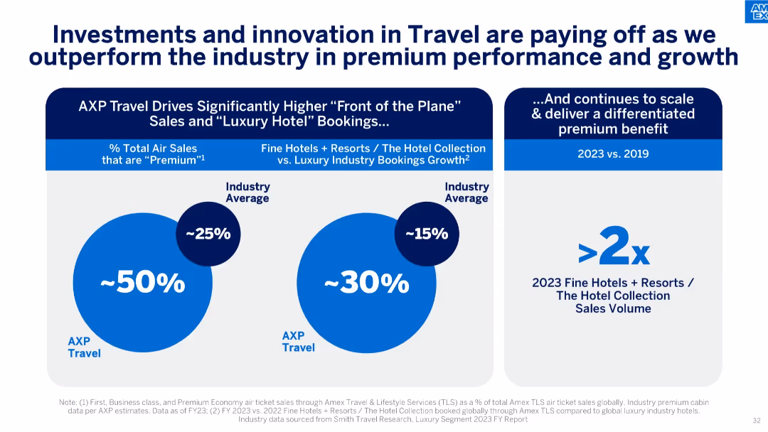
Three-panel design using large circular charts and callouts. Visual emphasis on AXP travel performance vs. industry.
Product and Service Analysis
Financial Services
Demonstrates AXP’s strength in travel services, with higher percentages of premium air sales and luxury hotel bookings, significantly outperforming industry benchmarks.
travel bookings, premium travel, luxury hotels, industry benchmark, travel innovation, Amex travel
Mixed Chart
McKinsey
Saved
This slide contrasts two sets of data visualizations: a bar graph showcasing the shift in payment method preferences on the right, and detailed explanatory text on the left. The design is clean and the visualizations are easy to interpret.
Customer and Market Segmentation
Financial Services
Analyzes the growing preference for contactless payment methods, particularly e-wallets, over traditional cash transactions among Southeast Asian consumers, highlighting the influence of societal shifts on payment behaviors.
contactless payments, e-wallets, consumer trends, cash transactions, Southeast Asia, payment methods, digital payments, societal shifts
Multiple Chart
Bain
Saved
Two content sections for different green finance initiatives. Logos of OCBC and Standard Chartered.
Financial Performance
Financial Services
Discusses green finance achievements such as a significant trade finance facility and a sustainability-linked loan. Used for financial strategy communication related to sustainability efforts.
green finance, sustainability, trade finance, loan, decarbonization, banking
Header Horizontal
Morgan Stanley
Saved
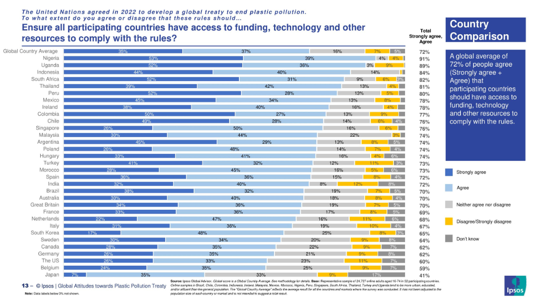
Country comparison via horizontal stacked bars with clear response categories.
Regulatory and Compliance
Environmental Services & Sustainability
The slide explores support across nations for ensuring equitable access to resources for treaty compliance. Highest support comes from Nigeria, Uganda, and South Africa. The global average for agreement is 72%.
global equity, treaty implementation, resource access, plastic rules, funding support, Ipsos survey, environmental policy, country views
Mixed Chart
IPSOS
Saved
Column chart predicting net SME and corporate NPL inflow volume from 2010-2023, with different growth scenarios.
Market Analysis and Trends
Financial Services
The slide forecasts net SME and corporate NPL inflow volumes in Turkey from 2010-2023, analyzing various economic impacts and scenarios.
SME NPL, corporate NPL, growth forecast, economic analysis, financial projections, Turkey
Mixed Chart
PwC/Strategy&
Saved
The slide features a diagram of the Snowy 2.0 hydro scheme, with various reservoirs and flow directions indicated, accompanied by text explanations.
Strategic Planning
Energy & Utilities
Outlines the operational assumptions for the Snowy 2.0 project, including inflows, outflows, and storage capacities, highlighting key sensitivities in the model.
Snowy 2.0, hydro scheme, assumptions, inflows, outflows, storage, sensitivity, operational
Diagram
EY
Saved
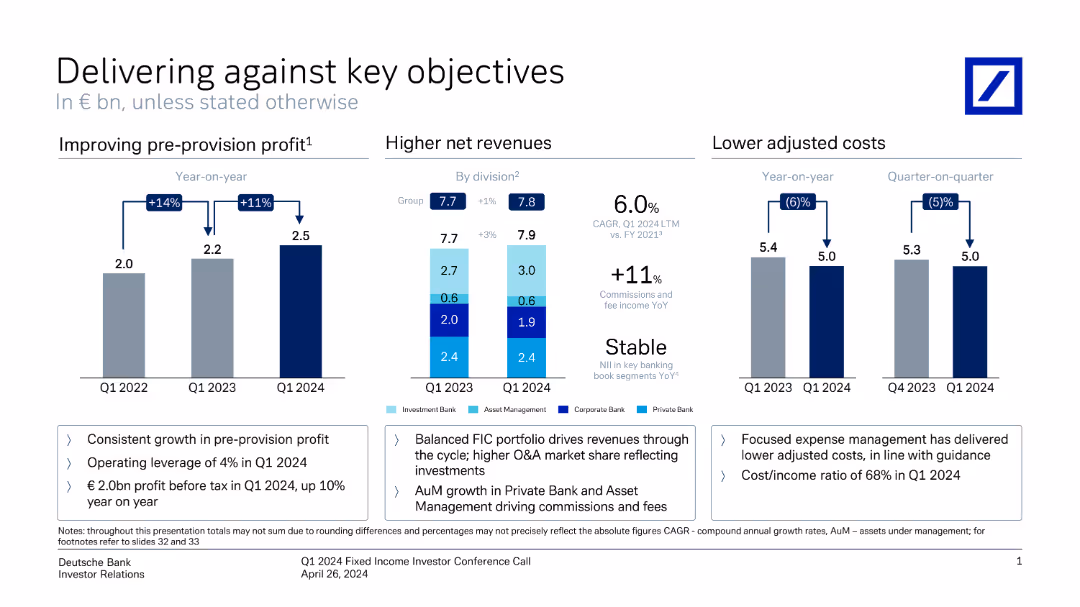
This slide contains three vertical column charts comparing pre-provision profit, net revenues, and adjusted costs over different periods. Annotations provide key metrics.
Financial Performance
Financial Services
It shows Deutsche Bank's performance metrics, highlighting improvements in profit, revenue, and cost management from Q1 2022 to Q1 2024.
profit, revenue, costs, financial performance, metrics, comparison, Deutsche Bank, investor relations, growth, Q1 2024
Multiple Chart
Deutsche Bank
Saved
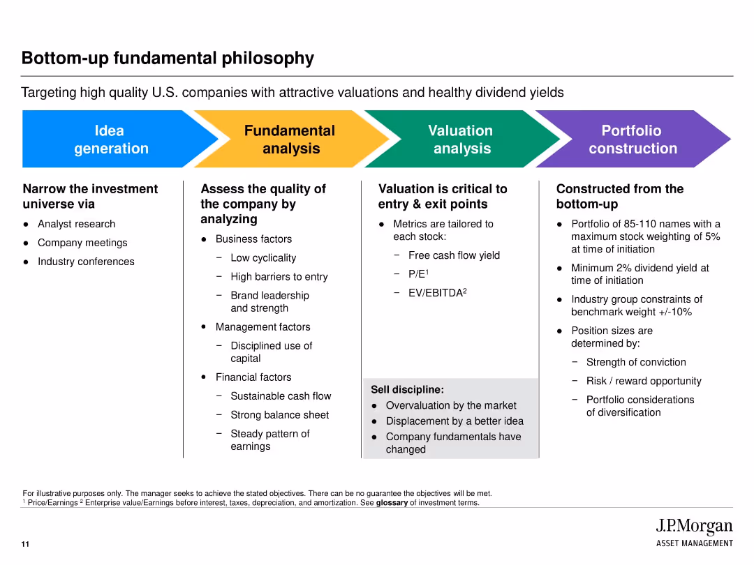
Horizontal multi-section layout with colored blocks representing process steps from idea generation to portfolio construction.
Strategic Planning
Financial Services
Outlines the step-by-step bottom-up investment process at JPMorgan. Focuses on narrowing the investment universe, analyzing company fundamentals, conducting valuations, and finalizing portfolio construction based on risk, conviction, and diversification.
investment strategy, valuation, bottom-up, stock selection, due diligence, portfolio construction, analysis
Linear Flow
JP Morgan
Saved
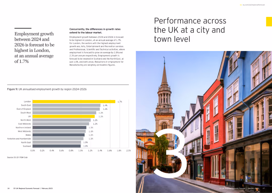
Includes a large number "3" with an image of a cityscape, and a column chart showing annualized employment growth by region for 2024-2026.
Market Analysis and Trends
Government & Public Sector
Examines city and town level performance across the UK, forecasting employment growth from 2024 to 2026, with a focus on regional disparities.
city performance, UK, employment growth, regions, column chart
Mixed Chart
EY
Saved
This slide displays a bar chart with horizontal bars illustrating survey responses about remote working preferences among Millennials and Gen Z. The bars are color-coded for each group, accompanied by explanatory text on the left.
Market Analysis and Trends
Professional Services
The slide highlights survey findings on the growing preference for remote work among Millennials and Gen Z, with detailed insights into their views on work-life balance, productivity, and the desire to continue remote work post-pandemic. It provides valuable data for employers planning future work arrangements.
Remote Work, Millennials, Gen Z, Work-Life Balance, Survey
Multiple Chart
Deloitte
Saved
This slide presents two column charts comparing the usage of brand safety and suitability solutions among podcast publishers. The charts are color-coded to distinguish between active usage and planning stages.
Risk Assessment and Management
Media & Entertainment
Discusses the low adoption rates of brand safety and suitability solutions in podcast advertising and anticipates future growth as AI-driven tools become more prevalent. This slide points towards a necessary evolution in the industry to manage ad content adjacency and maintain brand integrity in a dynamic digital environment.
brand safety, podcast, advertising, AI, 2021
Mixed Chart
PwC/Strategy&
Saved
The slide features four illustrated avatars with descriptions below each one. The layout is clean, with ample white space and consistent design elements.
Market Analysis and Trends
Education & Training
Describes four key respondent groupings based on attitudes to work, family life, money, society, and other factors, providing insights into their characteristics.
Respondents, Groupings, Attitudes, Work, Family Life, Money, Society, Well-being, Success, Fame
Pillar
Deloitte
Saved
Column chart showing rolling three-year net new assets with a $1Tn target line. Years listed below each bar. Graph has blue color coding and is simple in design.
Financial Performance
Financial Services
Outlines Morgan Stanley's achievement of a $1 trillion target for net new assets over three-year periods, showing consistent growth.
Net new assets, financial target, Morgan Stanley, growth, wealth management, three-year period, $1Tn
Single Chart
Goldman Sachs
Saved
Horizontal bar chart ranked by agreement level; colors show agree/neutral/disagree; dark blue sidebar with bold prompt text
Market Analysis and Trends
Government & Public Sector
This slide presents public perceptions of immigrants taking jobs from natives across 31 countries. It categorizes responses into agree, neutral, and disagree, and includes change data from 2016 to 2025. Agreement levels are highest in Thailand and lowest in Sweden and Germany.
job displacement, immigration perception, native workers, public opinion, global attitudes, employment, Ipsos, xenophobia
Mixed Chart
IPSOS
Saved
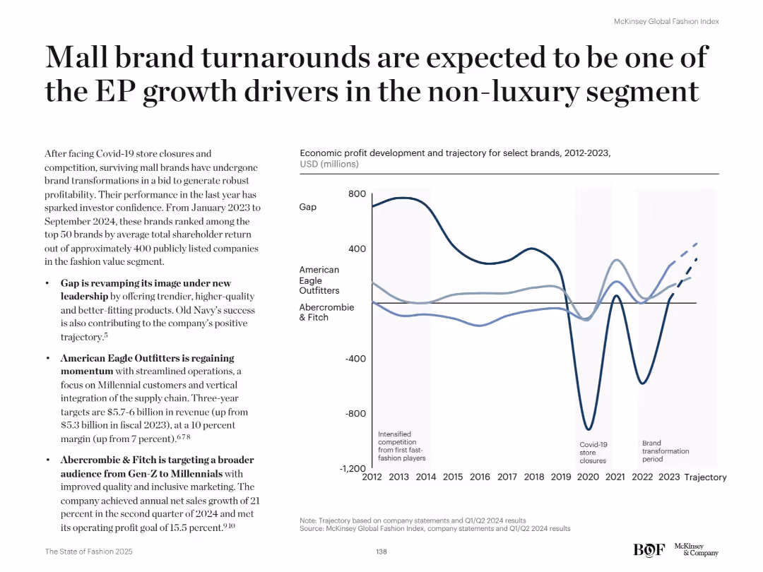
Two-column layout: left side with bullet points and summary text; right side with a multi-line graph (2012–2023) tracking economic profit of select brands. Clean white background, black serif header, and thin black graph lines.
Strategic Planning
Retail & E-commerce
The slide highlights how mall-based brands like Gap, American Eagle, and Abercrombie & Fitch are recovering and transforming post-COVID to drive economic profit in the non-luxury segment. Brand revamps, customer targeting, and streamlined operations are fueling positive shareholder returns and positioning them as top EP performers in the value fashion segment.
economic profit, retail, brand turnaround, Gap, American Eagle, Abercrombie, fashion, transformation, shareholder returns, Gen-Z
Mixed Chart
McKinsey
Saved
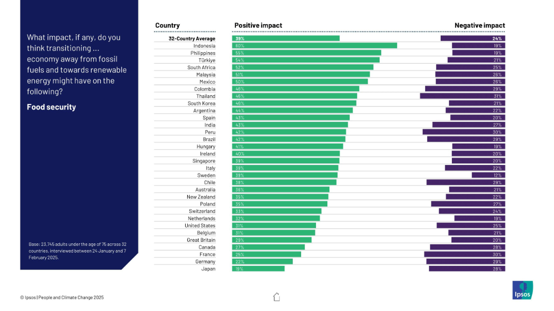
Bar chart of 32 countries ranking positive and negative expectations about the energy transition’s effect on food security.
Technology and Digital Transformation
Environmental Services & Sustainability
This slide captures global attitudes toward how moving to renewable energy affects food security. Indonesia, the Philippines, and Türkiye are most optimistic, while Japan and Germany rank lowest. Net positive views dominate across most countries.
food security, renewables, perception, climate, energy transition, bar chart, Ipsos, global opinion
Mixed Chart
IPSOS
Saved
Contains a line graph depicting the increase in trade-restrictive measures over time, complemented by bullet points discussing the challenges facing free trade agreements, including political and social influences.
Risk Assessment and Management
Financial Services
Focuses on the increasing challenges to global free trade, including political impacts and restrictive measures. Valuable for risk assessment in international markets and strategic planning sessions.
trade, challenges, agreements, restrictions
Multiple Chart
Roland Berger
Saved
The slide includes a world map with arrows indicating expected recovery rates for different regions, along with textual analysis on recovery insights by geography.
Market Analysis and Trends
Retail & E-commerce
Discusses expected recovery rates for the luxury market by geographical area post-COVID, highlighting variations in recovery speed and market segments.
recovery, geographical area, luxury, market, post-COVID, retail, e-commerce, regions, analysis
Mixed Chart
Deloitte
Saved
The slide includes a map of the United States with overlays indicating the company's footprint and prospective client density. It also has graphical elements such as circles of varying sizes representing data points, with a key to interpret these visual elements. The design is straightforward, focusing on market potential and presence.
Market Analysis and Trends
Financial Services
Aimed at demonstrating market strength and opportunities, the slide features a map visualizing the firm’s market presence and prospective client density in the middle market segment. It uses graphical representations to highlight the scale and scope of the company’s reach, underscoring the strategic positioning for growth within this segment.
middle market, market opportunity, banking, client prospects, presence, strategic positioning, footprint, growth potential
Diagram
JP Morgan
Saved
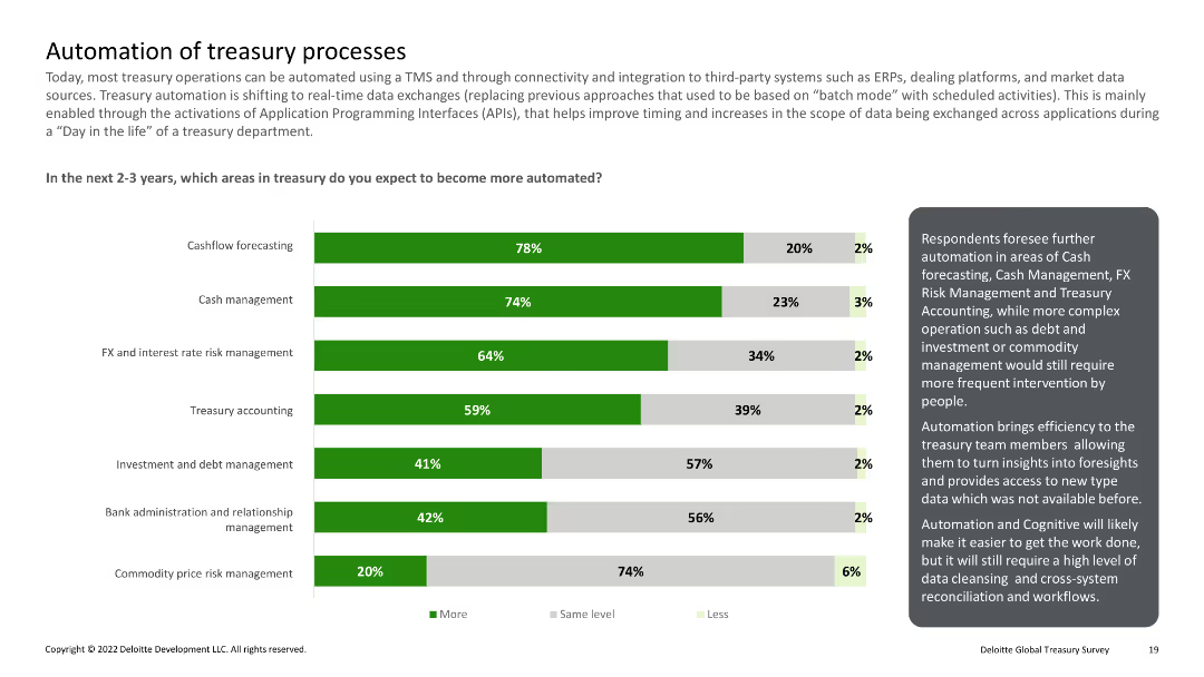
Column chart showing areas expected to be automated in the next 2-3 years, including cashflow forecasting and FX management
Technology and Digital Transformation
Financial Services
Predicts increased automation in various treasury processes over the next few years, emphasizing efficiency improvements.
Automation, treasury, processes, forecasting, management
Mixed Chart
Deloitte
Saved
Previous
Next
If nothing, comes up, please save your slides first
Create a FREE account to continue browsing
Receive Instant Access to 1,000+ slides from companies like McKinsey, Google, and Goldman Sachs
First Name
Last Name
Email
Password
I agree to all
Terms & Privacy Policy
Thank you! Your submission has been received!
Oops! Something went wrong while submitting the form.
Have an account?
Sign in
Column Chart
Heatmap
Chevron
Org Chart
Infographic
Callouts
Timeline
List
Graphic
Picture
Process Flow
Diagram
Paragraph
Map
Table
Framework
Subtitle
Takeaway Box
Icon
Other Chart
Radar Chart
Waterfall Chart
Mekko Chart
Pie Chart
Scatter Plot
Line Chart
Bar chart
Bullet points


![Exhibit 21 Net SME and Corporate NPL inflow volume expected growth [TRY bn, 2010-23]](https://cdn.prod.website-files.com/654e70fb59937215cac87b19/6877e20fe12f348b3c826c6c_tkMlruY99zc1fTgrR_-gzjy8w1cEAcGj7PCF5vr-SHw.avif)


![Immigrants take jobs away from real… [NOUN FOR PEOPLE FROM COUNTRY, PLURAL]](https://cdn.prod.website-files.com/654e70fb59937215cac87b19/6899bb070727c755a855c9e4_LIRvwiBq7v2DhJKlZcy5pDdtCKh3z00KctiiUcKSrL4.jpeg)