My Account
My Slides
Search by Category
Templates
Leave Feedback
Login
Logout
Get Started
Browse all Slides
Browse all Slides
Create a FREE Account
Instant access to 1,000+ real slides from top companies like McKinsey, BCG, Goldman Sachs, Google and many more!
First Name
Last Name
Email
Password
I agree to all
Terms & Privacy Policy
Thank you! Your submission has been received!
Oops! Something went wrong while submitting the form.
Have an account?
Sign in
Saved Slides
This slide includes two column charts comparing the budget outlook and profitability/EBITDA margin outlook for public hospitals by region and private hospitals.
Financial Performance
Healthcare & Pharmaceuticals
This slide compares the financial performance of public and private hospitals across different regions, highlighting Vietnam and Indonesia as top performers.
financial performance, public hospitals, private hospitals, regional comparison, budget outlook
Multiple Chart
LEK
Saved
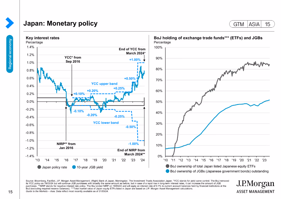
The slide features two column charts. The left chart shows Japan's key interest rates over time, with various milestones and trends annotated. The right chart illustrates the BoJ's holdings of ETFs and JGBs, with two lines indicating ownership percentages.
Market Analysis and Trends
Financial Services
The slide provides an analysis of Japan's monetary policy, highlighting key interest rates and the Bank of Japan's holdings in exchange trade funds and government bonds. It is used to discuss monetary trends and their implications on the financial market.
Japan, monetary policy, interest rates, BoJ, ETFs, JGBs, financial trends, market analysis, central bank, government bonds
Multiple Chart
JP Morgan
Saved
Timeline showing the phases of Germany's hydrogen strategy from 2020-2050 with key targets for electrolysis capacity and infrastructure development.
Strategic Planning
Energy & Utilities
This slide covers the timeline and phases of Germany’s evolving hydrogen strategy, focusing on increasing production and infrastructure expansion.
Germany, hydrogen, strategy, timeline, 2020-2050, production, infrastructure
Mixed Chart
McKinsey
Saved
Features column charts and lists comparing regions (North America, Europe, Asia) with their prioritized actions for 2023, emphasizing differences in approach to EVP enhancement and supply chain actions.
Market Analysis and Trends
Financial Services
The slide contrasts how different regions prioritize actions against global phenomena for 2023, such as layoffs, enhancing EVP, and innovations in supply chain management, highlighting regional strategies to address economic uncertainties.
global phenomena, layoffs, EVP enhancement, supply chain, regional strategies
Multiple Chart
BCG
Saved
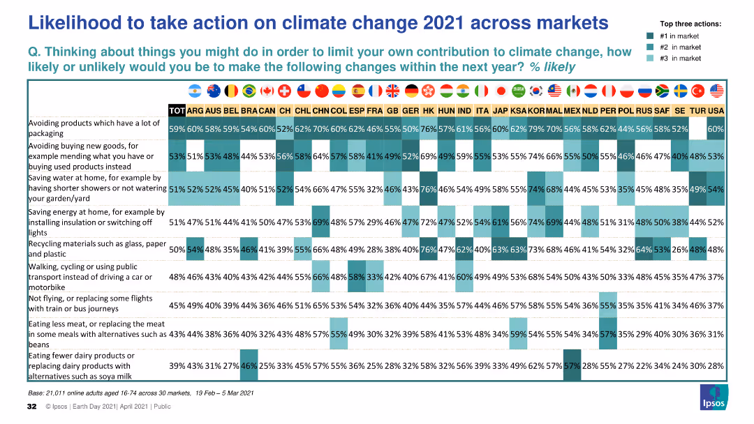
This slide presents a matrix chart displaying the likelihood of taking various climate change actions across multiple global markets in 2021. The chart uses color coding to indicate the likelihood and highlights top three actions per market.
Market Analysis and Trends
Environmental Services & Sustainability
The slide shows a comprehensive comparison of the likelihood of individuals taking specific climate change actions in 2021 across different global markets, with top actions highlighted for each market.
climate change, actions, likelihood, global markets, 2021
Table
IPSOS
Saved
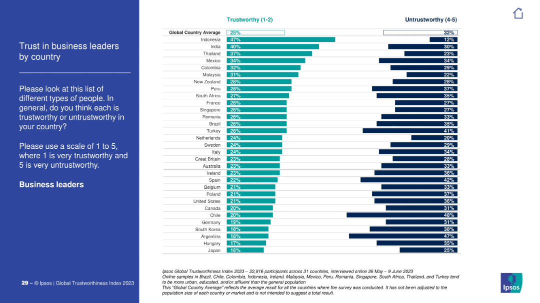
Ipsos-standard slide design. Countries' scores are shown in horizontal bars comparing trust and distrust in business leaders.
Strategic Planning
Professional Services
The slide provides a global comparison of trust in business leaders. Indonesia scores highest, Japan and Hungary lowest. Most countries show more distrust than trust.
CEOs, business leaders, executive trust, public opinion, Ipsos, country comparison, leadership
Mixed Chart
IPSOS
Saved
A column chart showcases commercial work done in Australia from FY07 to FY25 with actual data and projections. The chart includes annotations and a legend explaining scenario colors.
Market Analysis and Trends
Real Estate & Construction
Analyzes the growth trends in the Australian commercial sector, projecting future activities and the influence of economic changes on market conditions.
commercial, Australia, growth trends, projections, economic changes
Mixed Chart
Deloitte
Saved
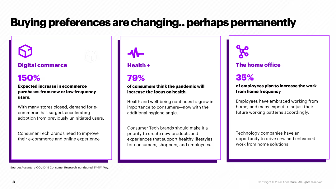
This slide presents three sections comparing changes in consumer preferences: Digital commerce, Health, and Home office, each with a percentage and brief description.
Market Analysis and Trends
Retail & E-commerce
It outlines how consumer buying preferences have shifted due to the pandemic, with increases in digital commerce, health focus, and remote work, suggesting strategic areas for companies to address.
buying preferences, digital commerce, health, home office, pandemic impact
Pillar
Accenture
Saved
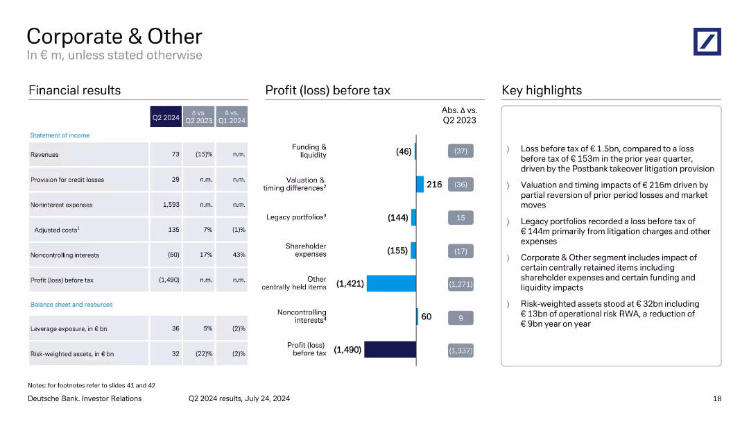
Two-column format with financials on the left and profit breakdown via bar chart on the right. Uses segmented bars to explain losses and impacts by area.
Financial Performance
Financial Services
Reports a Q2 2024 loss of €1.49bn mainly due to Postbank litigation and centrally retained items. Segmented bar chart breaks down contributions by area. Highlights valuation reversals and operational risk RWA reduction.
corporate, loss, Postbank, litigation, noninterest expenses, Q2 2024
Mixed Chart
Deutsche Bank
Saved
Line and column chart showing characteristics of bull and bear markets in the US from 1926 to 2021, including recessions and market corrections.
Market Analysis and Trends
Financial Services
This slide details the characteristics of bull and bear markets in the US, indicating market corrections, recessions, and the impact on the market from 1926 to 2021.
bull markets, bear markets, corrections, recessions, US
Mixed Chart
JP Morgan
Saved
Includes bar graphs and pie charts analyzing the internet coverage and connectivity needs across Indonesian districts, focusing on school connectivity.
Strategic Planning
Telecommunications
Discusses potential strategies for improving internet coverage and network quality in Indonesian schools, essential for enhancing educational outcomes.
internet coverage, network quality, Indonesia, schools, connectivity improvement, educational outcomes
Multiple Chart
BCG
Saved
Two bar charts comparing PMPM costs in New England and with comparable enrollees. Text boxes explain key points and data. Moderate layout.
Financial Performance
Government & Public Sector
Comparison of MMIS spending per member per month (PMPM) in New Hampshire versus other states, suggesting cost minimization strategies.
PMPM, MMIS, Costs, Comparison, Strategy
Multiple Chart
Alvarez & Marsal
Saved
Includes a line graph and a pie chart showing market share and revenue mix with institutional and corporate clients from 2014 to 2018.
Financial Performance
Financial Services
Analyzes JP Morgan's market share growth with institutional and corporate clients, showing sustained growth and client diversity.
market growth, institutional clients, corporate clients, revenue
Multiple Chart
JP Morgan
Saved
This slide contains a complex combination of line charts and bar graphs displaying CEO confidence levels and global economic growth trends, with annotations and a key question section on the right side.
Market Analysis and Trends
Financial Services
Analyzes CEO confidence in relation to global economic growth, showing trends over several years and indicating a decline in confidence not seen since 2009.
CEO confidence, economic growth, revenue, decline, survey, 2009
Mixed Chart
PwC/Strategy&
Saved
Column chart showing changes in expenses year-over-year, broken down by categories like transformation and technology investment.
Financial Performance
Financial Services
Analyzes Citigroup's operational expenses throughout 2021, detailing specific investments in technology and other strategic areas.
Expenses, Investment, Technology, Banking, Efficiency
Single Chart
Citigroup
Saved
Includes a timeline-like graphic showing the varying levels of satisfaction with remote work over time, alongside an image of a working mother.
Human Resources and Talent Management
Professional Services
Explores evolving challenges in remote work environments, from initial struggles to finding successful strategies for managing remote teams, emphasizing the need for adaptability in remote policies.
Remote Work, Challenges, Adaptability, Work Environment, Strategies
Linear Flow
McKinsey
Saved
The slide features multiple bar graphs and line charts showing percentage changes in IT costs over time. It uses a clean, professional layout with color differentiation for various data points.
Market Analysis and Trends
Technology & Software
The slide analyzes IT cost changes in the technology sector, showing trends in TCO, Opex, and Capex from 2021 to 2026. It indicates how costs are projected to change over time.
IT, TCO, Opex, Capex, technology costs, financial trends
Multiple Chart
Accenture
Saved
Features tables and lists describing efficiency measures, capital efficiency, and revenue growth strategies, with a breakdown of financial figures.
Strategic Planning
Financial Services
This slide outlines the bank's strategic initiatives aimed at enhancing operational efficiency, optimizing capital use, and driving revenue growth, along with specific financial targets and achievements.
Strategy, Efficiency, Capital, Revenue, Financial Targets, Operational, Growth
Mixed Chart
Deutsche Bank
Saved
This slide features horizontal bar charts comparing the importance of companies paying the correct amount of tax versus reducing environmental harm. The bars are color-coded for clarity, accompanied by text highlighting the key findings.
Market Analysis and Trends
Environmental Services & Sustainability
The slide shows that a higher percentage of respondents prioritize companies reducing environmental harm over paying the correct amount of tax. This can be used to discuss corporate social responsibility, public expectations from companies, and the prioritization of environmental issues over traditional financial concerns.
corporate responsibility, environmental harm, tax compliance, public opinion, sustainability
Multiple Chart
IPSOS
Saved
Features a bar chart showing the rise in importance of various risk categories between 2021 and 2023, focusing on operational, financial, and regulatory risks.
Risk Assessment and Management
Financial Services
Highlights the growing prominence of technology and regulatory risks in the business landscape since 2021, based on responses from risk professionals across industries.
risk categories, operational risks, regulatory changes, financial risks
Mixed Chart
Accenture
Saved
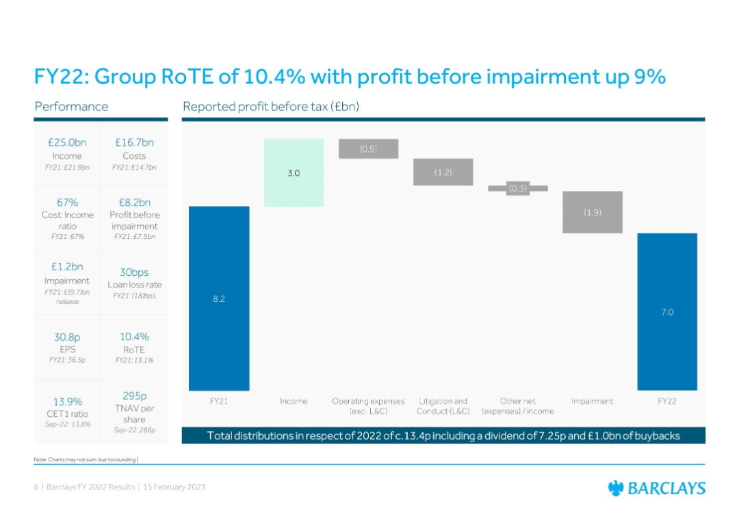
Bar chart + waterfall chart showing profit flow; left column of key performance metrics
Financial Performance
Financial Services
Summarizes Barclays’ FY22 performance with key metrics like income, costs, impairment, and RoTE. A waterfall chart outlines profit drivers and detractors from FY21 to FY22, providing transparency in financial movements.
RoTE, Profit, FY22, Barclays, Impairment, Earnings, EPS, Cost Ratio, Loan Loss
Single Chart
Barclays
Saved
Various bar charts showing percentages of different demographics (gender, race, ethnicity) among investment professionals and partners, correlated with the presence of diversity strategies.
Risk Assessment and Management
Financial Services
This slide correlates diversity and inclusion strategies with the demographics of investment professionals and partners. It provides insights into the effectiveness of diversity strategies in the financial sector.
diversity, inclusion, gender, race, ethnicity
Multiple Chart
Deloitte
Saved
Column chart showing hospital survey respondent mix by country, type of hospital, and hospital size.
Market Analysis and Trends
Healthcare & Pharmaceuticals
This slide presents survey data from APAC hospital executives on various factors, including respondent roles and hospital types.
hospital, survey, APAC, healthcare, respondents
Single Chart
LEK
Saved
The slide is divided into two main sections, with a large column chart on the left showing noninterest revenue growth, and a smaller area on the right with textual data and percentage increases.
Financial Performance
Financial Services
Highlights the growth of noninterest revenue at JPMorgan Chase & Co., with a focus on volume-driven revenue components, useful for financial analysis or investor presentations.
noninterest revenue, CAGR, growth, financial, banking, JPMorgan
Multiple Chart
JP Morgan
Saved
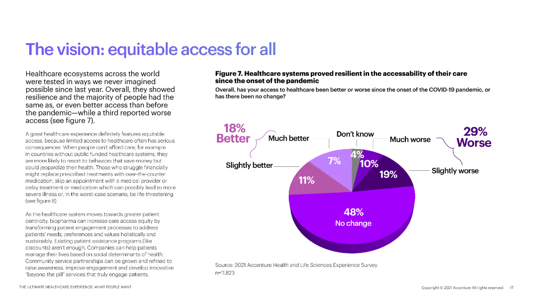
The slide includes a pie chart showing changes in healthcare access since the pandemic, with explanatory text.
Market Analysis and Trends
Healthcare & Pharmaceuticals
This slide analyzes the resilience of healthcare systems in maintaining access to care during the COVID-19 pandemic.
healthcare resilience, pandemic impact, access to care, COVID-19, patient access
Mixed Chart
Accenture
Saved
Previous
Next
If nothing, comes up, please save your slides first
Create a FREE account to continue browsing
Receive Instant Access to 1,000+ slides from companies like McKinsey, Google, and Goldman Sachs
First Name
Last Name
Email
Password
I agree to all
Terms & Privacy Policy
Thank you! Your submission has been received!
Oops! Something went wrong while submitting the form.
Have an account?
Sign in
Column Chart
Heatmap
Chevron
Org Chart
Infographic
Callouts
Timeline
List
Graphic
Picture
Process Flow
Diagram
Paragraph
Map
Table
Framework
Subtitle
Takeaway Box
Icon
Other Chart
Radar Chart
Waterfall Chart
Mekko Chart
Pie Chart
Scatter Plot
Line Chart
Bar chart
Bullet points