My Account
My Slides
Search by Category
Templates
Leave Feedback
Login
Logout
Get Started
Browse all Slides
Browse all Slides
Create a FREE Account
Instant access to 1,000+ real slides from top companies like McKinsey, BCG, Goldman Sachs, Google and many more!
First Name
Last Name
Email
Password
I agree to all
Terms & Privacy Policy
Thank you! Your submission has been received!
Oops! Something went wrong while submitting the form.
Have an account?
Sign in
Saved Slides
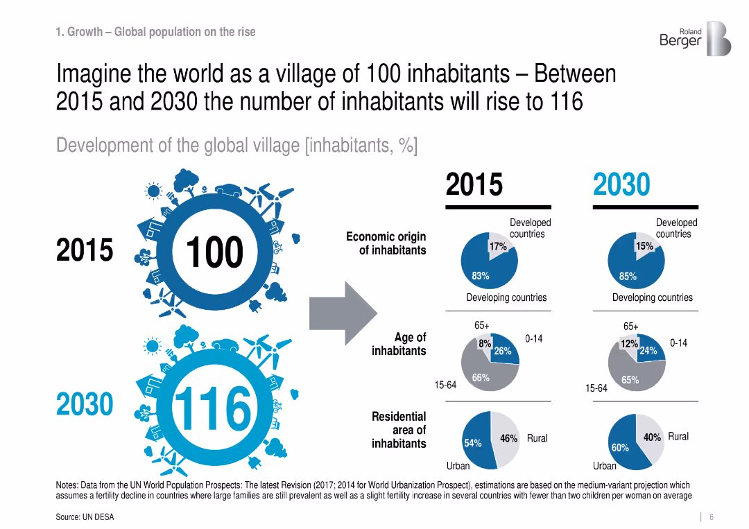
Infographic comparing 2015 vs. 2030: population structure by region, age, and residence.
Industry Overview
Government & Public Sector
Visualizes global demographic changes in a simplified 100-person village analogy, projecting more urbanization and aging population, especially in developing countries.
population growth, urbanization, demographics, global trends
Mixed Chart
Roland Berger
Saved
Contains column charts, world map visualization.
Market Analysis and Trends
Retail & E-commerce
Focus on ultra-high-net-worth individuals' spending.
UHNWI, luxury, Americas, APAC, 2019
Multiple Chart
Bain
Saved
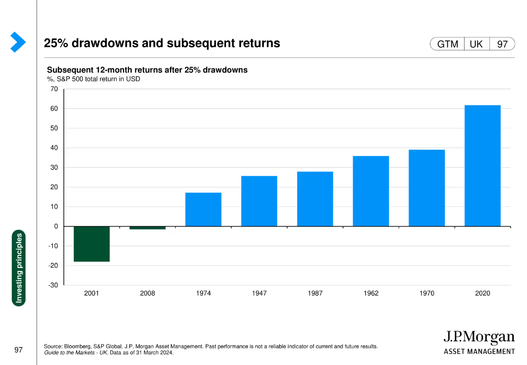
The slide shows a column chart with subsequent 12-month returns after 25% drawdowns in the S&P 500, with specific years highlighted for comparison.
Investment Analysis
Financial Services
This slide demonstrates the performance of the S&P 500 following major drawdowns, providing insights into market recovery patterns.
drawdowns, S&P 500, subsequent returns, market recovery, investment analysis
Single Chart
JP Morgan
Saved
The slide presents column charts and statistics on the aging of the global population, focusing on the median age increase and the shift in population age structures between 2020 and 2050.
Market Analysis and Trends
Healthcare & Pharmaceuticals
Highlights the increase in global median age and the expected demographic shifts that will place more demand on healthcare systems and affect global workforce dynamics.
aging, healthcare, demographics, median age, global trends
Mixed Chart
Roland Berger
Saved
Features a female character next to a large table with data explaining reforms in passive income taxation.
Regulatory and Compliance
Financial Services
Summarizes major tax reforms, focusing on changes in tax rates for foreign and domestic corporations, highlighting exemptions and reductions.
taxation, reforms, corporate, passive income, tax rates, CREATE, Philippines
Table
Deloitte
Saved
Left: stacked column chart showing front-office use cases. Right: pie chart of prioritization of front-office applications.
Market Analysis and Trends
Financial Services
Indicates majority of viable use cases are front-office focused, with many banks awaiting further testing before prioritizing.
front-office, use cases, prioritization, GenAI, testing
Multiple Chart
EY
Saved
Features bar charts and pie charts detailing the savings from automation and challenges faced during its implementation, including a breakdown of ownership across organizational departments.
Operational Efficiency
Professional Services
Provides insights into the financial impact and common challenges of implementing automation in GBS organizations.
automation, savings, challenges, GBS, implementation
Multiple Chart
Deloitte
Saved
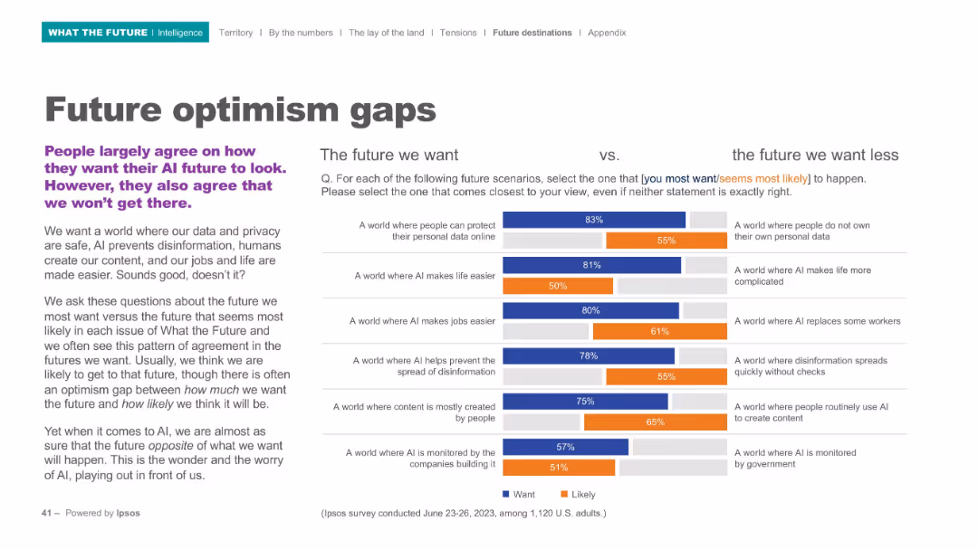
Two-column bar graph comparison with headline text on left, descriptive text below, and detailed survey bars to the right.
Market Analysis and Trends
Artificial Intelligence
The slide contrasts ideal AI futures ("the future we want") with the futures people expect ("the future we want less"). It reveals consistent optimism gaps, where people desire a safer, more helpful AI future but don't believe it will happen.
optimism gap, AI future, expectations vs reality, privacy, disinformation, automation, human content, Ipsos survey
Mixed Chart
IPSOS
Saved
This slide includes a horizontal bar chart displaying the distribution of job titles among respondents. The chart uses a green color scheme with a clear legend and percentages marked along each bar.
Market Analysis and Trends
Technology & Software
The slide shows the percentage of survey respondents with various job titles, emphasizing that a significant portion are owners/partners, presidents, CEOs, and CIO/CTOs.
titles, respondents, survey, chart, job
Mixed Chart
Deloitte
Saved
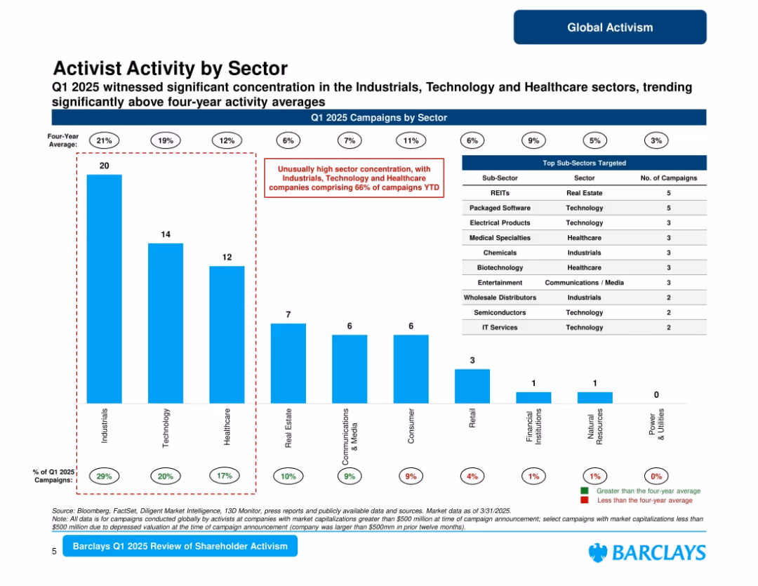
Bar chart ranking sectors by number of campaigns in Q1 2025, with sub-sector table on the right; red callout flags overrepresented sectors.
Market Analysis and Trends
Financial Services
Shows high concentration of activism in Industrials, Technology, and Healthcare sectors, which together make up 66% of campaigns YTD. Includes top targeted sub-sectors such as REITs and software. Highlights deviation from long-term averages.
sector trends, activist sectors, Q1 2025, industrials, healthcare, technology, Barclays
Mixed Chart
Barclays
Saved
Line chart with annotations for actual and projected expenditure rates from 2018/19 to 2023/24.
Financial Performance
Government & Public Sector
Shows the consistency and changes in government spending efficiency over six fiscal years.
Government, Public Sector, Expenditure, Efficiency, Spending, Financial, Rate, Actuals, Projections
Single Chart
PwC/Strategy&
Saved
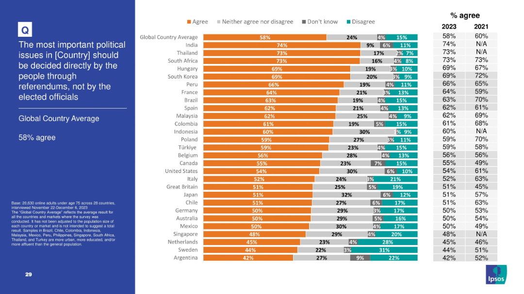
Slide presents bar chart and trend data on agreement with citizen-led decision-making via referendums; left panel contains title and global average.
Regulatory and Compliance
Government & Public Sector
This slide reveals a 58% global average agreeing that political decisions should be made directly by the people rather than elected officials. It illustrates global democratic participation attitudes, with India and Thailand expressing especially strong support for referendums. This trend supports a rise in interest toward direct democracy mechanisms over representative systems.
referendums, democracy, political reform, public decision, governance, Ipsos, civic engagement
Mixed Chart
IPSOS
Saved
The slide features a two-column, three-row structure. Each cell contains a dark blue header, a thematic icon, and two bullet points in white font. A numerical page indicator is present in the bottom right corner.
Industry Overview
Financial Services
This slide lists nine themes central to the presenter's sustainable finance commitment. These include clean energy, sustainable transport, and accessible healthcare, among others. Each theme is supported by specific goals, like reducing energy consumption or increasing the affordability of healthcare. It's a strategic overview that can be used to communicate the company's priorities in sustainability to stakeholders or in corporate strategy meetings.
Sustainability, Finance, Healthcare, Clean Energy, Transport, Education, Community, Inclusion, Growth
Table
Goldman Sachs
Saved
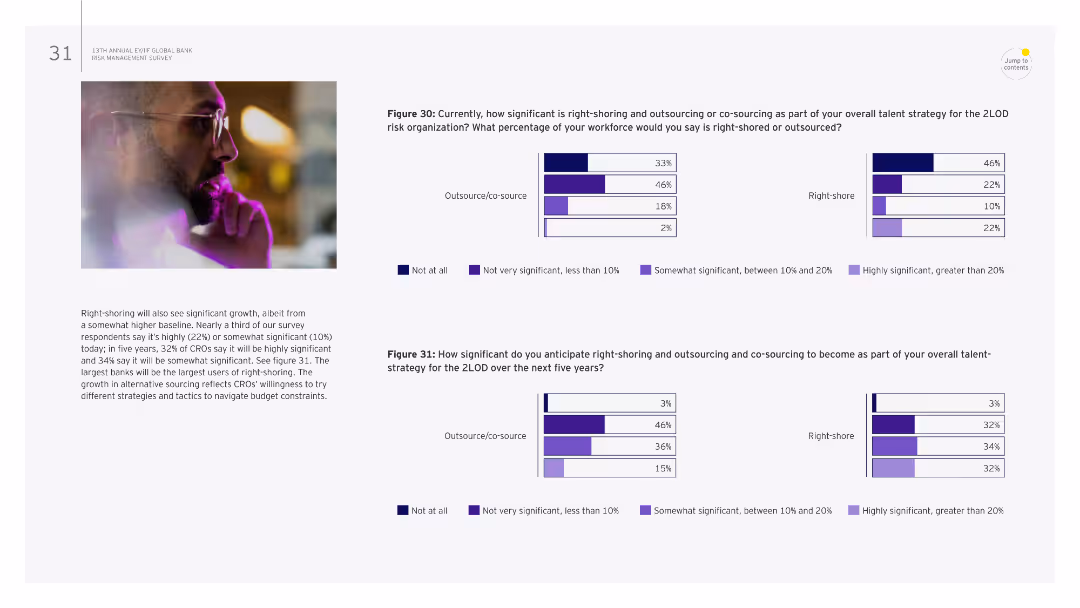
The slide contains two sets of bar charts comparing the significance of right-shoring and outsourcing strategies within a risk organization. There is a left-aligned image of a man thinking, and the rest of the slide is text and charts explaining the survey results.
Risk Assessment and Management
Financial Services
This slide discusses the current and anticipated significance of right-shoring and outsourcing in risk management. It presents survey results indicating the percentage of workforce right-shored or outsourced and projections for future right-shoring strategies.
right-shoring, outsourcing, risk management, survey, financial services, charts, workforce, significance, projections
Multiple Chart
EY
Saved
The slide is split into two main sections, with a red theme. On the left, bullet points are aligned vertically, detailing the SASB standard. On the right, bullet points explain the TCFD standard, alongside their respective logos.
Financial Performance
Industrial & Manufacturing
This slide explains LANXESS’s improvement in reporting standards according to SASB and TCFD, outlining key performance indicators and acknowledging the need for better climate-related financial disclosures.
LANXESS, SASB, TCFD, sustainability, reporting standards, climate-related disclosures, KPIs, financial information, environmental, governance
Table
Morgan Stanley
Saved
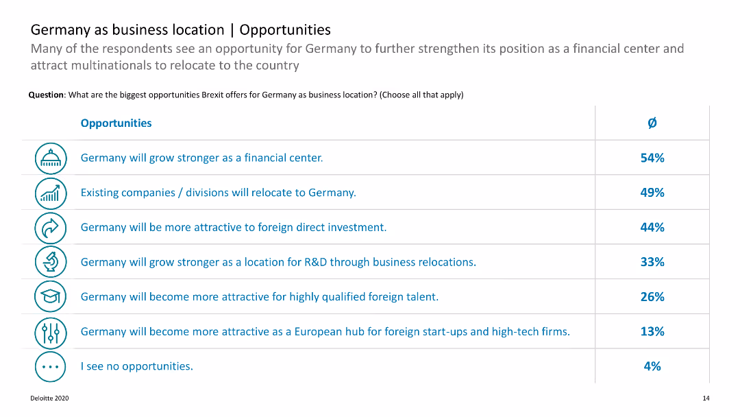
The slide features a list of opportunities with accompanying percentages. It uses icons and a horizontal layout.
Market Analysis and Trends
Financial Services
Describes various opportunities Brexit offers for Germany as a business location, focusing on sectors such as financial services and R&D.
Germany, business, Brexit, opportunities, relocation
Table
Deloitte
Saved
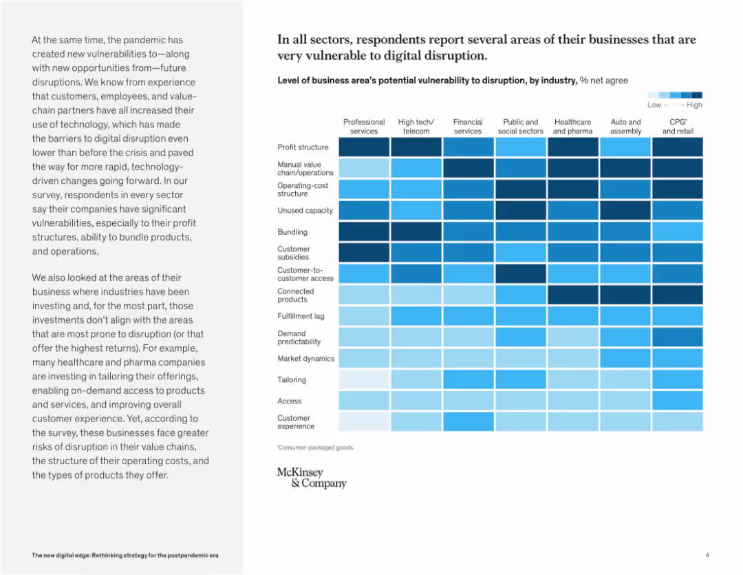
Heatmap chart dominates the right side, showing digital vulnerability levels by business area and industry. Left panel provides context and insights.
Risk Assessment and Management
Technology & Software
This slide presents a heatmap revealing how vulnerable different industries are to digital disruption. Profit structures, customer access, and bundling are common weak points. The chart emphasizes where companies may face operational or structural threats.
digital disruption, business risk, vulnerability, industry comparison, technology impact, customer access, operations, transformation
Mixed Chart
McKinsey
Saved
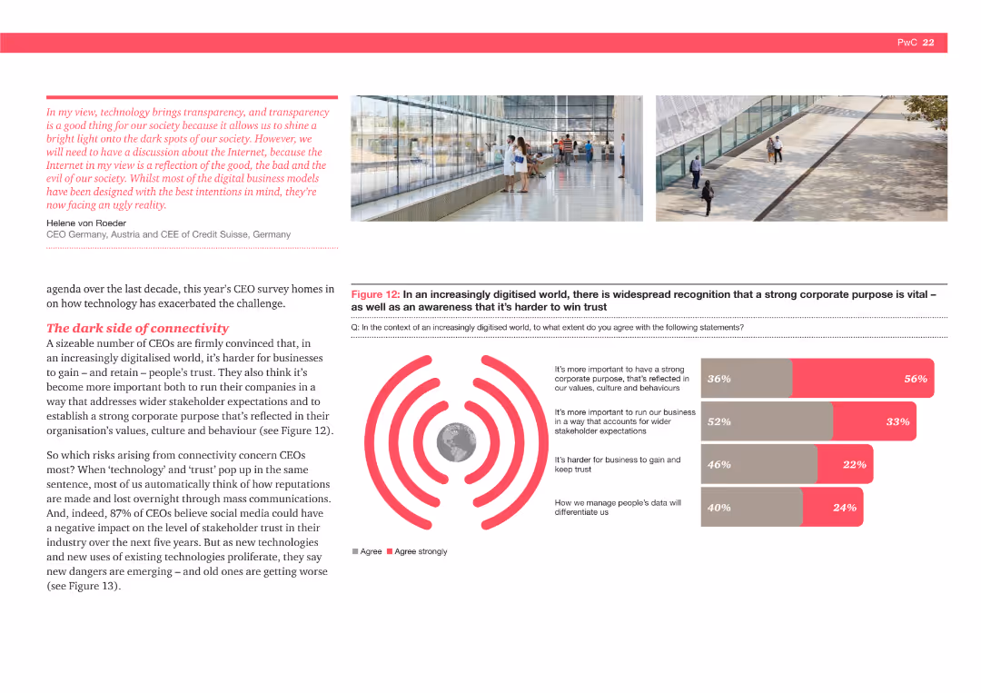
The slide shows a bar chart indicating the percentage of CEOs agreeing with statements about the importance of a strong corporate purpose and trust in a digitized world, highlighting various concerns and priorities.
Strategic Planning
Technology & Software
This slide highlights the importance of corporate purpose and trust in a digitized world. It shows that CEOs believe maintaining a strong corporate purpose and managing data privacy and stakeholder expectations are crucial in the digital age.
Corporate purpose, trust, digital age, data privacy, stakeholder expectations, CEOs
Multiple Chart
PwC/Strategy&
Saved
The slide combines text and a line chart. The text details the capital structure and free cash flow deployment, while the chart shows share repurchases over time.
Financial Performance
Financial Services
It discusses capital structure, financial leverage, free cash flow deployment, including strategic acquisitions, and debt ratings.
Capital Structure, Leverage, Free Cash Flow, Share Repurchases, Debt Ratings, Investment Grade
Mixed Chart
Gartner
Saved
Features a column chart comparing the importance of risk analysis views and third-party data by account size, using different colors for clarity.
Strategic Planning
Financial Services
Focuses on how underwriters of various account sizes value different aspects of risk analysis and data availability for enhancing underwriting quality.
risk analysis, data availability, account sizes, underwriting enhancement
Mixed Chart
Accenture
Saved
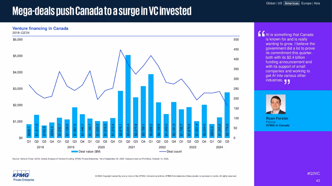
Bar and line graph of Canadian deal values and counts, with a text box quoting a KPMG partner.
Financial Performance
Financial Services
The chart shows quarterly Canadian VC deal activity, highlighting recent spikes due to mega-deals. A quote from a KPMG partner emphasizes Canada’s strategic investment in AI and the government's role in enabling ecosystem growth.
Canada, VC, mega-deals, AI, funding spike, government support, KPMG, deal value, ecosystem, investment
Mixed Chart
KPMG
Saved
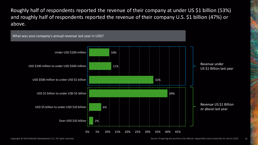
This slide presents a combination of a horizontal bar chart and stacked bar chart, depicting company revenue distributions. The green and black color scheme is used, with revenue ranges clearly labeled.
Financial Performance
Financial Services
It provides insights into the revenue distribution of companies, showing that about half reported revenues under $1 billion, while the other half reported revenues of $1 billion or more.
revenue, distribution, financial, chart, company
Single Chart
Deloitte
Saved
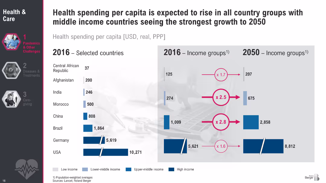
Comparative bar chart split by country and income groups (2016 vs. 2050 projections). Uses blue shades to represent income levels.
Financial Performance
Healthcare & Pharmaceuticals
This slide shows projected growth in per capita health spending across countries and income groups from 2016 to 2050. Low- and middle-income countries like India and China are projected to see the steepest increases, while high-income countries grow modestly. The visualization underlines disparities and expected convergence in global health investment.
Health expenditure, per capita, country comparison, income groups, projections, global health
Multiple Chart
Roland Berger
Saved
Data visualizations include a pie chart and column charts with consistent color palette and icons.
Operational Efficiency
Financial Services
Data on customer acquisition channels, balance distribution, and banker productivity to showcase branch network importance.
Branch Network, Digital Engagement, Customer Service, Banker Productivity, Data Visualization, Strategic Asset
Multiple Chart
JP Morgan
Saved
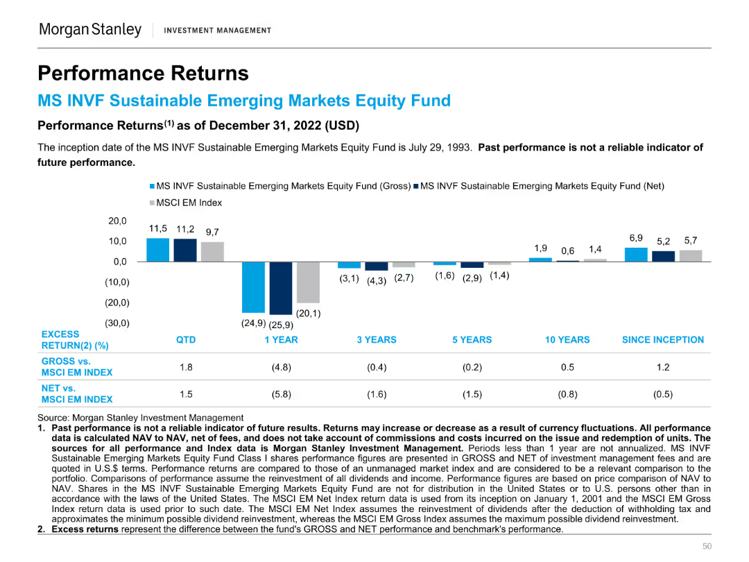
A column chart showing the performance returns of the MS INVF Sustainable Emerging Markets Equity Fund against the MSCI EM Index over different periods.
Financial Performance
Financial Services
This slide compares the performance returns of the MS INVF Sustainable Emerging Markets Equity Fund to the MSCI EM Index, highlighting excess returns.
Performance, Returns, Sustainable, Emerging Markets, Equity Fund, MSCI, Index, Financial, Comparison, Investment
Mixed Chart
Morgan Stanley
Saved
Previous
Next
If nothing, comes up, please save your slides first
Create a FREE account to continue browsing
Receive Instant Access to 1,000+ slides from companies like McKinsey, Google, and Goldman Sachs
First Name
Last Name
Email
Password
I agree to all
Terms & Privacy Policy
Thank you! Your submission has been received!
Oops! Something went wrong while submitting the form.
Have an account?
Sign in
Column Chart
Heatmap
Chevron
Org Chart
Infographic
Callouts
Timeline
List
Graphic
Picture
Process Flow
Diagram
Paragraph
Map
Table
Framework
Subtitle
Takeaway Box
Icon
Other Chart
Radar Chart
Waterfall Chart
Mekko Chart
Pie Chart
Scatter Plot
Line Chart
Bar chart
Bullet points