My Account
My Slides
Search by Category
Templates
Leave Feedback
Login
Logout
Get Started
Browse all Slides
Browse all Slides
Create a FREE Account
Instant access to 1,000+ real slides from top companies like McKinsey, BCG, Goldman Sachs, Google and many more!
First Name
Last Name
Email
Password
I agree to all
Terms & Privacy Policy
Thank you! Your submission has been received!
Oops! Something went wrong while submitting the form.
Have an account?
Sign in
Saved Slides
The slide presents a line chart comparing delinquency rates of Barclays against its peers from 2013 to 2023. It features a clean, professional look with a consistent use of blue tones, ensuring easy comparison of data points.
Risk Assessment and Management
Financial Services
Highlights Barclays' favorable position in managing delinquency rates compared to other leading US card issuers, emphasizing its strength in risk management.
delinquency rates, risk management, US card issuers, comparison
Mixed Chart
Barclays
Saved
The slide consists of a left panel with text discussing entrepreneurial support and a right panel with a horizontal bar chart showing regional differences in support for intrapreneurs.
Human Resources and Talent Management
Professional Services
This slide addresses the organizational support needed for intrapreneurship, presenting survey data on regional variations in providing avenues for innovative ideas and their implementation.
Intrapreneurship, entrepreneurial support, innovation, regional differences, survey data
Mixed Chart
PwC/Strategy&
Saved
Includes bullet points and case study examples from various sectors showing AI's role in team dynamics.
Human Resources and Talent Management
Technology & Software
Discusses AI's role in enhancing team effectiveness, learning, and morale across different organizational contexts.
AI, Team Effectiveness, Organizational Learning, Role Clarity, Morale Boost, Case Studies, Human Resources
Table
BCG
Saved
The slide displays a column chart showing the growth in digital consumption in India from 2019 to 2022, including television, digital video, and other media types. It also compares pay TV households and OTT SVoD subscriber growth in India, the US, and China.
Market Analysis and Trends
Media & Entertainment
This slide highlights the rapid growth of digital content consumption in India, driven by increases in television and digital video usage. It compares India's trends with those in the US and China, emphasizing India's entertainment market potential.
India, Entertainment, Digital Consumption, Television, OTT
Multiple Chart
BCG
Saved
This slide includes two main visual elements: a column chart detailing the share of total exports to Ukraine, Russia, and Belarus from 2015-2021, and a column chart depicting trade in goods from January to April in billion ISK at constant exchange rates from 2018-2022. Both charts use distinct colors to represent different commodities and metrics.
Market Analysis and Trends
Financial Services
Analyzes the direct effects of the Ukraine conflict on Iceland's exports, particularly focusing on commodities like seafood and aluminum. It indicates minimal impact on the overall trade, supported by high production prices, and provides a yearly and monthly breakdown of trade volumes and values in the context of geopolitical tensions.
Ukraine, exports, trade, seafood, aluminum, geopolitical impact
Multiple Chart
Deutsche Bank
Saved
Features a central diagram categorizing strategic areas of focus, including strategy, performance, and capital, using a balanced and clear layout with segment-specific icons.
Operational Efficiency
Professional Services
This slide outlines the broad areas to consider in a transformation strategy, useful for comprehensive strategic planning or training sessions on corporate restructuring.
transformation, strategy, performance, capital, organizational health, professional services, diagram
Framework
McKinsey
Saved
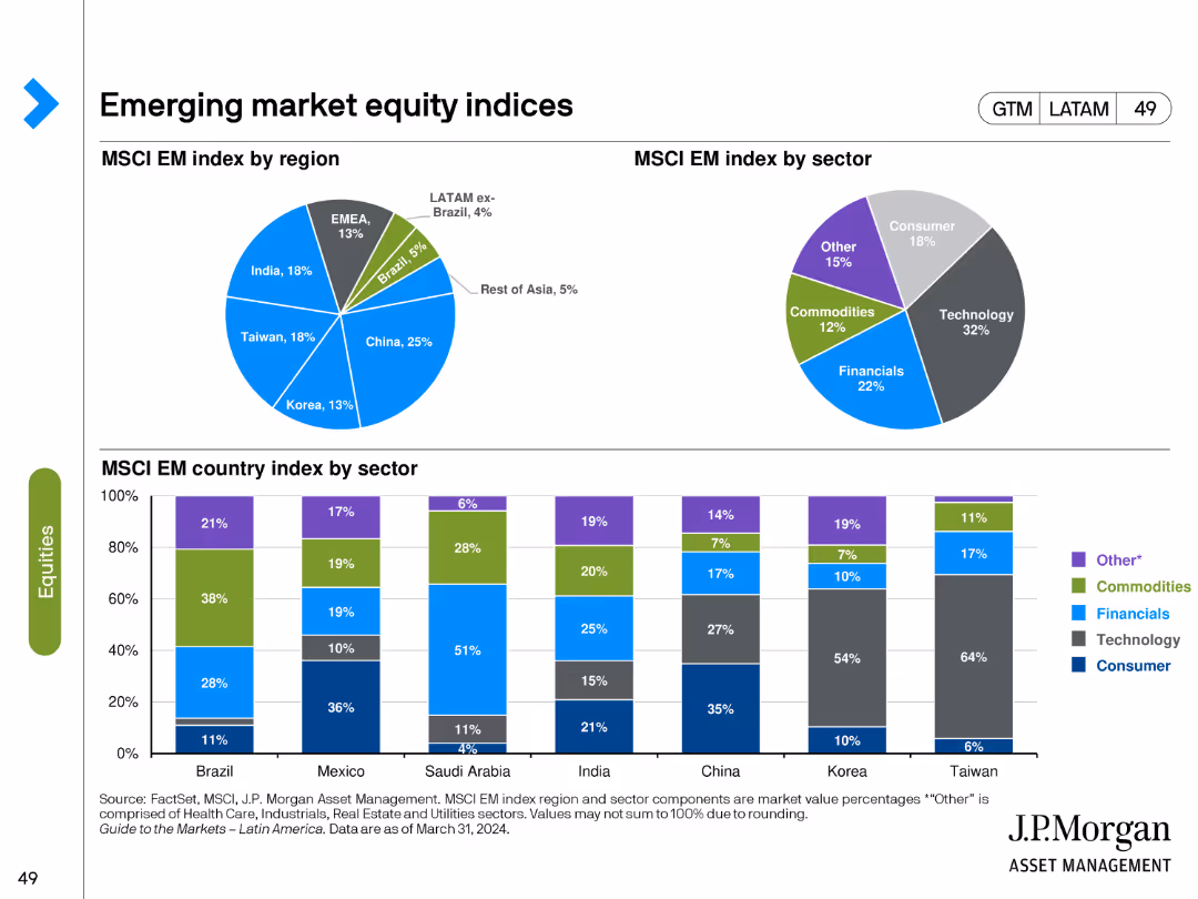
The slide features pie charts showing the MSCI Emerging Market index by region and sector, and bar charts for the index by country and sector. Various colors represent different regions, sectors, and countries.
Market Analysis and Trends
Financial Services
It breaks down the MSCI Emerging Market index, providing insights into the regional and sectoral composition of the index, which can inform investment strategies in emerging markets.
Emerging markets, MSCI index, regional composition, sectoral composition, investment
Multiple Chart
JP Morgan
Saved
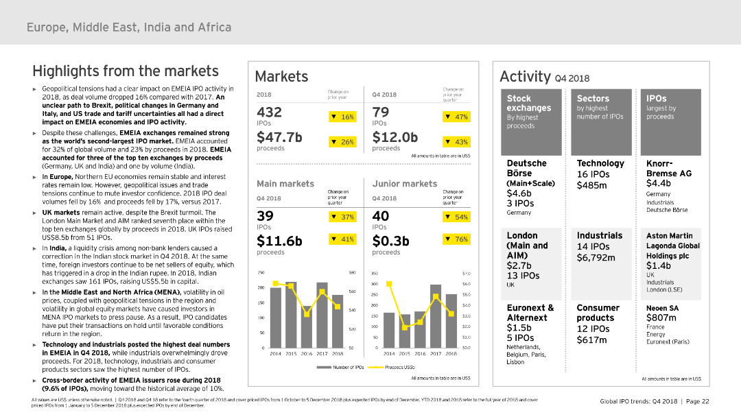
Divided into sections: highlights from the market, markets, and activity. It uses column charts and tables to present IPO data and market performance in EMEIA. The slide is detailed but well-organized, with a moderate level of visual complexity to convey information effectively.
Market Analysis and Trends
Financial Services
Covers the IPO market trends and activities in EMEIA for 2018, highlighting key market performances, sector-specific data, and overall market trends. Useful for regional market analysis and strategic insights.
EMEIA, IPO, market trends, sectors, market performance
Multiple Chart
EY
Saved
This slide has two parts: the upper part features a bar graph comparing governance effectiveness between Australia, the US, China, and the EU; the lower part includes two maps highlighting Australia's free trade agreements in North and South America and the Asia-Pacific region. The maps are colored in purple to denote countries with active trade agreements. Annotations provide additional context on the importance of these agreements.
Competitive Landscape
Energy & Utilities
Explains Australia's strong governance and the strategic benefit of its widespread free trade agreements, positioning Australia as a reliable partner for diversifying supply chains internationally.
governance, trade agreements, reliability, export markets, Australia, diversification, Asia-Pacific, North America, free trade, global strategy
Mixed Chart
Accenture
Saved
A comprehensive chart illustrating online retail penetration in SEA with comparisons to India and China.
Market Analysis and Trends
Retail & E-commerce
Projects the growth of online retail penetration in SEA, analyzing the contribution of ecommerce to total retail and highlighting the expected rise in groceries.
online retail, growth, SEA, ecommerce contribution, retail penetration
Multiple Chart
Bain
Saved
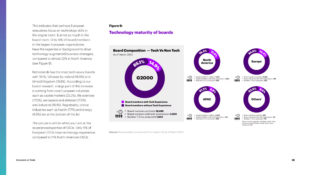
Circular diagrams comparing the tech experience of board members in North America, Europe, APAC, and other regions.
Organizational Structure and Change
Professional Services
The slide compares the technology maturity of boards across regions, highlighting the percentage of board members with tech experience.
technology, boards, North America, Europe, APAC, tech experience, board composition
Multiple Chart
Accenture
Saved
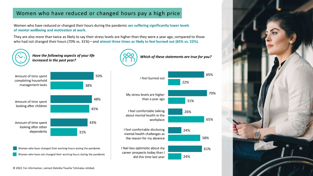
Light background with teal and black text. It features two column charts on stress levels and burnout, and increased time spent on household tasks, with a woman's photo.
Human Resources and Talent Management
Healthcare & Pharmaceuticals
Analyzes the impact of reduced or changed working hours on women's stress levels, burnout, and mental well-being, showing higher stress among those who changed hours.
burnout, stress, working hours, women, mental well-being
Multiple Chart
Deloitte
Saved
The slide provides a straightforward layout with a column of text on the left and a corresponding column with icons and examples of impacts on the right. It utilizes images to represent different industries, which complements the textual information provided and allows for quick visual association.
Industry Overview
Technology & Software
Addressing the cross-industry impact of quantum technologies, this slide outlines specific applications in fields ranging from IT to pharmaceuticals. The slide's structured format aids in communicating the broad relevance of quantum innovations and their transformative potential, making it useful for a diverse business audience.
Quantum Technologies, Industries, IT, Pharmaceuticals, Impact
Header Vertical
McKinsey
Saved
Two graphs displaying goods consumption against services and raw material input prices, using line charts with recessions marked. Text annotations complement the data.
Investment Analysis
Financial Services
Evaluates the potential for long-term inflation considering the consumption patterns of goods vs. services and the cost of raw materials, useful for economic forecasting and strategy.
Inflation, Goods Consumption, Services, Raw Material Costs, Economic Forecasting, Market Strategy
Multiple Chart
Citigroup
Saved
Donut charts comparing sub-segments of internet advertising in Scandinavia for 2018 and projected for 2023, showing growth in revenues.
Market Analysis and Trends
Media & Entertainment
Discussing the dynamics of internet advertising in Scandinavia, this slide forecasts growth driven by mobile and video advertising.
internet advertising, mobile advertising, video advertising, Scandinavian market
Multiple Chart
PwC/Strategy&
Saved
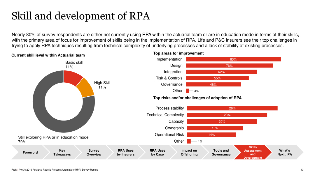
Pie chart showing skill levels within actuarial teams, and horizontal bar charts indicating top areas for improvement and challenges in RPA adoption (e.g., implementation, design, process stability).
Human Resources and Talent Management
Financial Services
The slide discusses the current skill levels in RPA among actuarial teams and identifies key areas for improvement, such as implementation and design, as well as challenges like process stability and technical complexity, aiming to enhance RPA adoption.
RPA, Skills Development, Insurance, Challenges
Multiple Chart
PwC/Strategy&
Saved
This slide utilizes a red and white color palette and presents four circle diagrams showing net revenue and operating profit for 2016/2017 and 2017/2018 in euros. Text boxes detail the financial performance metrics and relevant business commentary.
Financial Performance
Financial Services
The slide provides a comprehensive overview of PwC's Assurance business unit's financial results over two fiscal years, highlighting increased demand and investments in quality and workforce. It's aimed at stakeholders reviewing fiscal health and strategic decisions made in the Assurance domain.
assurance, financial results, investments, growth, PwC
Multiple Chart
PwC/Strategy&
Saved
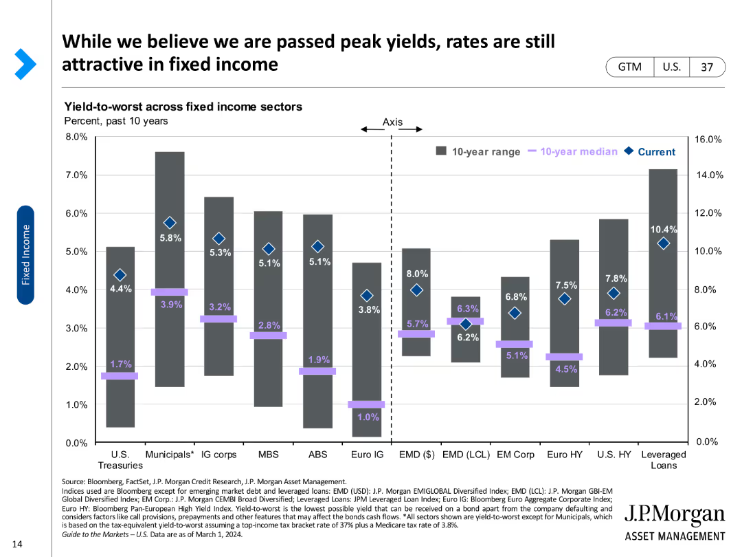
A column chart comparing yield-to-worst across various fixed income sectors, marked with current rates and historical medians.
Investment Analysis
Financial Services
Reviews yield-to-worst metrics across different fixed income sectors, highlighting investment attractiveness in the current market.
Fixed income, yield-to-worst, investment, bonds, sectors, median, current rates, attractiveness, analysis
Single Chart
JP Morgan
Saved
Includes a column chart on global mobile data traffic growth from 2015 to 2021, emphasizing the rapid increase in digital connectivity.
Technology and Digital Transformation
Professional Services
Examines how digitalization and data flows are reshaping globalization, focusing on the increasing role of digital connections over physical trade.
digitalization, data traffic, globalization, market transformation, technology impact
Header Vertical
Roland Berger
Saved
The slide compares two aspects: market trends and defense budgets across different regions, using a map and red text boxes. A red outline frames the slide's main message.
Market Analysis and Trends
Industrial & Manufacturing
Analyzes defense market trends and budget growth to identify commercial opportunities. It provides a global outlook on market potential and the company’s position in it. This slide is likely used in market analysis and strategic planning sessions.
Defense Market, Trends, Commercial Opportunities, Budget Growth, Strategic Planning
Boxed
Goldman Sachs
Saved
This slide presents a bar chart categorizing fixed income yields by asset class subsector, arranged in descending order of yield percentage. It is a colorful slide with sections labeled 'PRIVATE CREDIT,' 'ALTERNATIVE FIXED INCOME SECTORS,' and 'TRADITIONAL CORE SECTORS.' Each category uses a different color to differentiate between the various asset subsectors and corresponding yields, making the data easily discernible.
Investment Analysis
Financial Services
The slide provides a detailed breakdown of fixed income yields across different asset class subsectors. It highlights the disparities in yields within private credit, alternative fixed income sectors, and traditional core sectors. The viewer can compare yields among consumer loans, corporate loans, mortgages, bonds, and treasuries, allowing for an informed analysis of potential investment areas based on yield differences.
fixed income, yields, private credit, alternative sectors, traditional cores, asset class, investment, subsectors
Single Chart
Citigroup
Saved
This slide features a bar graph and a list of action points. The graph provides a visual comparison of performance outcomes based on planning strategies, using a clear color differentiation for each category. The layout is straightforward, focusing on clarity and ease of interpretation.
Strategic Planning
Professional Services
The slide compares the effectiveness of scenario-based and dynamic planning in achieving performance targets, offering actionable insights on strategic planning processes. It's used to advocate for proactive and data-driven decision-making in business strategies.
Strategic Planning, Scenario Planning, Performance, Data-Driven, Bar Graph
Mixed Chart
PwC/Strategy&
Saved
The slide presents a silhouette of a person's head with a digital overlay, alongside vertical lines converging into a bright focal point. The background is dark with a blue tint, accentuating the digital motif.
Industry Overview
Technology & Software
The title slide for McKinsey's technology trends report, providing a thematic introduction to discussions on evolving tech trends in 2022.
Technology, Trends, Outlook, 2022, Report, Digital, Innovation, Future, McKinsey
Title
McKinsey
Saved
This slide presents two scatter plots showing the projected decrease in capex for AE and PEM electrolyzers from 2010 to 2030.
Market Analysis and Trends
Energy & Utilities
The slide projects significant reductions in capex for AE and PEM electrolyzers by 2030, supported by historical and forecasted data points.
capex, electrolyzer, AE, PEM, cost reduction, market trends
Multiple Chart
Kearney
Saved
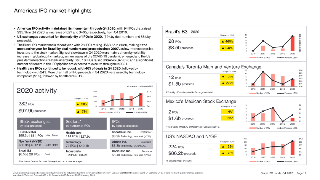
The slide includes column charts and bar charts summarizing IPO activity in the Americas, with specific focus on Brazil, Canada, and the US.
Market Analysis and Trends
Financial Services
The slide highlights key IPO trends in the Americas, focusing on the performance of various stock exchanges, sectors, and top IPOs by proceeds in 2020.
Americas, IPO, Brazil, Canada, US
Multiple Chart
EY
Saved
Previous
Next
If nothing, comes up, please save your slides first
Create a FREE account to continue browsing
Receive Instant Access to 1,000+ slides from companies like McKinsey, Google, and Goldman Sachs
First Name
Last Name
Email
Password
I agree to all
Terms & Privacy Policy
Thank you! Your submission has been received!
Oops! Something went wrong while submitting the form.
Have an account?
Sign in
Column Chart
Heatmap
Chevron
Org Chart
Infographic
Callouts
Timeline
List
Graphic
Picture
Process Flow
Diagram
Paragraph
Map
Table
Framework
Subtitle
Takeaway Box
Icon
Other Chart
Radar Chart
Waterfall Chart
Mekko Chart
Pie Chart
Scatter Plot
Line Chart
Bar chart
Bullet points