My Account
My Slides
Search by Category
Templates
Leave Feedback
Login
Logout
Get Started
Browse all Slides
Browse all Slides
Create a FREE Account
Instant access to 1,000+ real slides from top companies like McKinsey, BCG, Goldman Sachs, Google and many more!
First Name
Last Name
Email
Password
I agree to all
Terms & Privacy Policy
Thank you! Your submission has been received!
Oops! Something went wrong while submitting the form.
Have an account?
Sign in
Saved Slides
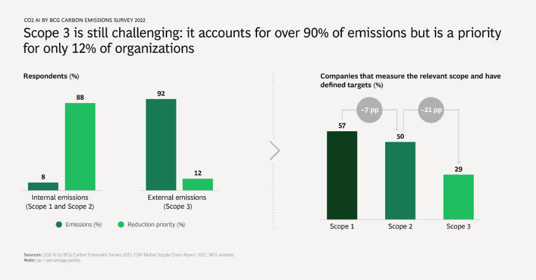
The slide has two bar charts: one showing the distribution of emissions between internal (Scope 1 and 2) and external (Scope 3), and the other showing the prioritization of reduction efforts. Highlights the significant challenge of addressing Scope 3 emissions.
Risk Assessment and Management
Environmental Services & Sustainability
Addresses the difficulty organizations face in managing Scope 3 emissions, which make up the majority of total emissions but are prioritized by a minority of companies. Stresses the importance of focusing on these external emissions.
Scope 3, emissions, internal, external, reduction priority, survey results
Multiple Chart
BCG
Saved
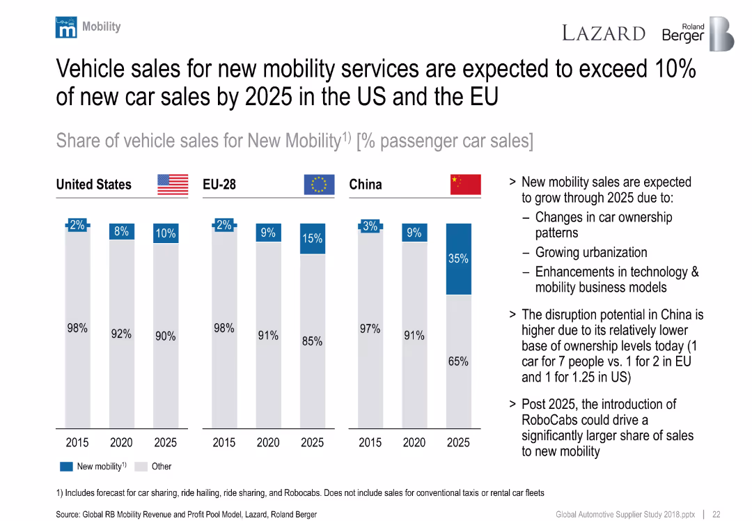
Clustered column chart showing forecasted share of new mobility vehicle sales by region (US, EU, China) from 2015–2025.
Market Analysis and Trends
Industrial & Manufacturing
Forecasts sharp growth in new mobility vehicle sales, especially in China. Drivers include urbanization, tech innovation, and ownership changes. China expected to leap ahead due to low current car ownership.
new mobility, car sharing, China, EU, US, ownership, future trends
Mixed Chart
Roland Berger
Saved
The slide contains a column chart showing market concentration levels across different access modes, including direct, search, and social media referrals. Annotations explain the concentration differences across access modes.
Market Analysis and Trends
Telecommunications
This slide examines market concentration levels (HHI) by access mode, comparing direct traffic with traffic referred by search engines, social media, and other channels, highlighting the concentration patterns in the media market.
Market Concentration, Access Mode, HHI, Column Chart, Media Market
Mixed Chart
IPSOS
Saved
The slide features three line charts illustrating Australia's y/y real GDP, unemployment rate, and y/y CPI from 2005 to 2025. The layout is clear with minimal text.
Market Analysis and Trends
Financial Services
Discusses Australia's economic outlook, including GDP growth, unemployment, and inflation, in response to the Reserve Bank's monetary policy tightening.
Australia, GDP, Unemployment, CPI, RBA
Multiple Chart
EY
Saved
A pie chart shows the prioritization of different areas by CFOs since the start of COVID-19. The chart uses shades of green and blue to represent areas like cashflow management and people and talent, with cashflow management taking the largest portion (43%).
Risk Assessment and Management
Financial Services
Discusses the shifting priorities of CFOs during the COVID-19 pandemic, emphasizing the focus on cashflow management as the highest priority, followed by forecasting and people management. This indicates a strategic pivot towards essential financial management and resilience building in uncertain times.
CFO, COVID-19, financial priorities, cashflow management, risk management
Single Chart
Deloitte
Saved
The slide features a column chart comparing CET1 ratio progression, supported by text explaining capital raises and significant capital release actions.
Financial Performance
Financial Services
The slide presents decisive actions to strengthen capital, including capital raises and significant capital releases, aiming to improve the CET1 ratio to about 14%.
capital, actions, CET1, ratio, strengthening
Mixed Chart
Credit Suisse
Saved
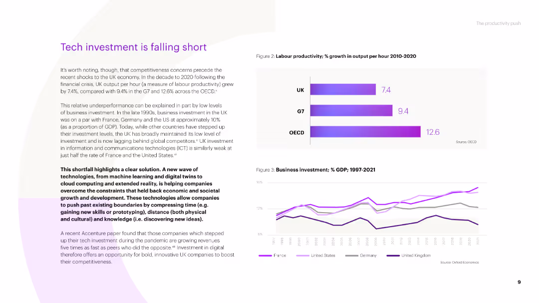
Text-based slide with a title, several paragraphs of text, and two column charts. The charts show labor productivity growth and business investment as a percentage of GDP from 1997 to 2021 for the UK, G7, and OECD.
Market Analysis and Trends
Technology & Software
The slide discusses the challenges in tech investment in the UK, highlighting lower productivity growth compared to G7 and OECD countries, and the impact of business investment on economic performance.
tech investment, productivity, business investment, UK economy, G7, OECD
Multiple Chart
Accenture
Saved
Features a pie chart and icon indicators, illustrating the optimal allocation of a hypothetical 5% increase in media spend, with the majority allocated to TV.
Investment Analysis
Media & Entertainment
Suggests strategies for optimizing media spend over the next four years, focusing on the advantageous allocation to TV for maximizing ROI.
media spend, ROI, TV advertising, strategic allocation, future planning
Mixed Chart
Accenture
Saved
Contains multiple column charts ranking the key factors influencing transportation mode choice before and after a health crisis.
Market Analysis and Trends
Transportation & Logistics
Ranks the primary factors influencing transportation choices before and after a health crisis.
transportation, health concerns, mode choice, rankings
Multiple Chart
McKinsey
Saved
Contains a complex comparative chart tracking percentage changes in visits and stay duration against a restriction stringency index.
Market Analysis and Trends
Retail & E-commerce
Analyzes the impact of lifting restrictions on retail footfall across various markets, highlighting how consumer behavior has changed in comparison to pre-event levels.
Retail footfall, Market analysis, Restriction stringency, Consumer behavior, Comparative chart, Visits duration, Global impact, Grocery & Pharmacy
Mixed Chart
Accenture
Saved
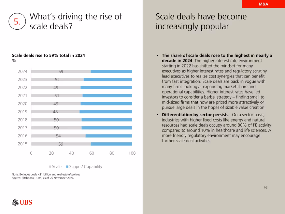
Horizontal bar chart on scale vs. scope deals; explanatory commentary on the right
Mergers and Acquisitions
Financial Services
Explores why scale deals (59% in 2024) are gaining popularity due to interest rates, regulatory pressure, and the need for rapid integration. Notes sector-specific advantages in energy and fixed cost industries.
scale deals, M&A trends, interest rates, regulatory scrutiny, value creation, private equity
Mixed Chart
UBS
Saved
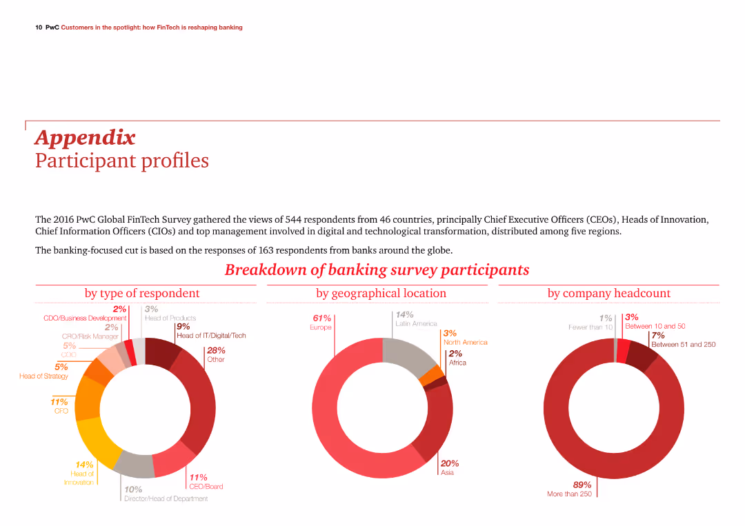
The slide features three column charts showing participant breakdowns by type, geographical location, and company headcount. It is visually balanced with text and visuals in harmony.
Client Case Studies
Financial Services
The slide provides an overview of the 2016 PwC Global FinTech Survey participants, focusing on those from the banking sector, with detailed participant demographics.
demographics, survey, banking, participants, PwC
Multiple Chart
PwC/Strategy&
Saved
Contains a single, bold line graph with different scenario projections, showing natural gas demand trends over time.
Strategic Planning
Energy & Utilities
Projects growth in natural gas demand across various scenarios, with implications for strategic energy planning, particularly concerning decarbonization efforts.
Natural Gas, Demand Growth, Scenario Analysis, Strategic Energy Planning, Decarbonization
Single Chart
McKinsey
Saved
The slide uses vertical bar charts to compare the top five concerns deterring EV adoption over three years (2021, 2022, 2023), each with different colors.
Market Analysis and Trends
Transportation & Logistics
This slide identifies the main concerns preventing consumers from buying EVs, such as lack of charging stations, limited range, and high purchase costs, across different years.
EV concerns, charging stations, purchase cost, range anxiety, consumer deterrents
Multiple Chart
EY
Saved
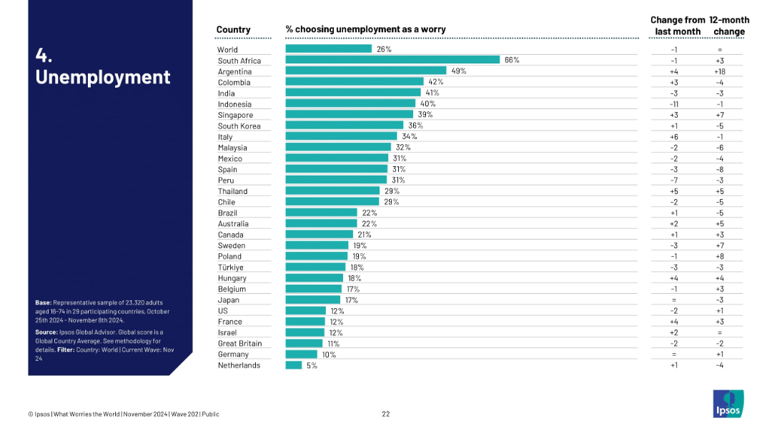
Bar chart ranked by country, showing % of people concerned with unemployment; includes monthly and yearly changes.
Market Analysis and Trends
Government & Public Sector
This slide visualizes unemployment as a global concern, ranked by country. South Africa leads with 66%, followed by Argentina and Colombia. It tracks month-over-month and 12-month shifts, showing evolving public sentiment on job insecurity.
unemployment, public concern, global trends, Ipsos, labor market, sentiment, survey, economic stress, job loss, perception
Single Chart
IPSOS
Saved
The slide features a combination of column charts showing top concerns for Gen Zs and Millennials, with text explanations on the left. It uses a clear layout to present statistical data on societal concerns.
Risk Assessment and Management
Financial Services
This slide discusses the primary societal concerns for Gen Zs and Millennials, highlighting the top worries including cost of living, unemployment, and climate change, with statistical comparisons between the two groups.
Societal concerns, cost of living, unemployment, climate change
Multiple Chart
Deloitte
Saved
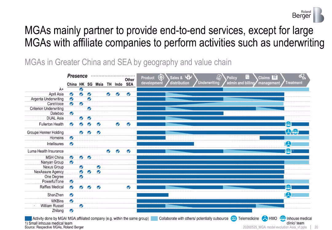
Matrix showing MGAs in Greater China and SEA by geography and value chain activities, emphasizing their partnerships to provide end-to-end services.
Strategic Planning
Financial Services
Analyzes how MGAs in Greater China and Southeast Asia partner with other companies to offer comprehensive services across the value chain, focusing on end-to-end service provision.
MGA partnerships, end-to-end services, Greater China, SEA
Table
Roland Berger
Saved
Displays a table comparing sin tax rates for various products over two years, alongside an illustrative crowd of diverse people.
Regulatory and Compliance
Government & Public Sector
Provides details on the adjustments in sin tax rates for alcoholic beverages and cigarettes in Namibia, reflecting policy changes in consumer taxation.
sin taxes, tax rates, Namibia, alcoholic beverages, cigarettes, consumer taxation
Table
PwC/Strategy&
Saved
A series of comparative charts analyzing the profit potential for different OEM archetypes across various BEV market scenarios. Uses a green-to-red gradient to indicate performance.
Investment Analysis
Transportation & Logistics
Discusses the profit potential for European and American OEMs in the BEV market under different electrification scenarios, highlighting the risks and opportunities associated with each market condition.
BEV, OEM, profits, market scenarios, electrification
Table
BCG
Saved
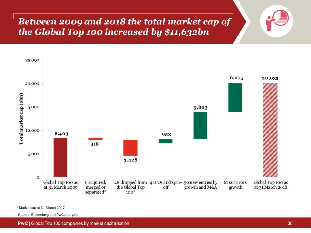
Column chart depicting the total market cap increase of the Global Top 100 companies from 2009 to 2018, highlighting growth areas and key contributors.
Financial Performance
Financial Services
Analysis of the market cap increase of the Global Top 100 companies over a decade, emphasizing significant growth and contributing factors.
market cap, global top 100, 2009, 2018, increase
Single Chart
PwC/Strategy&
Saved
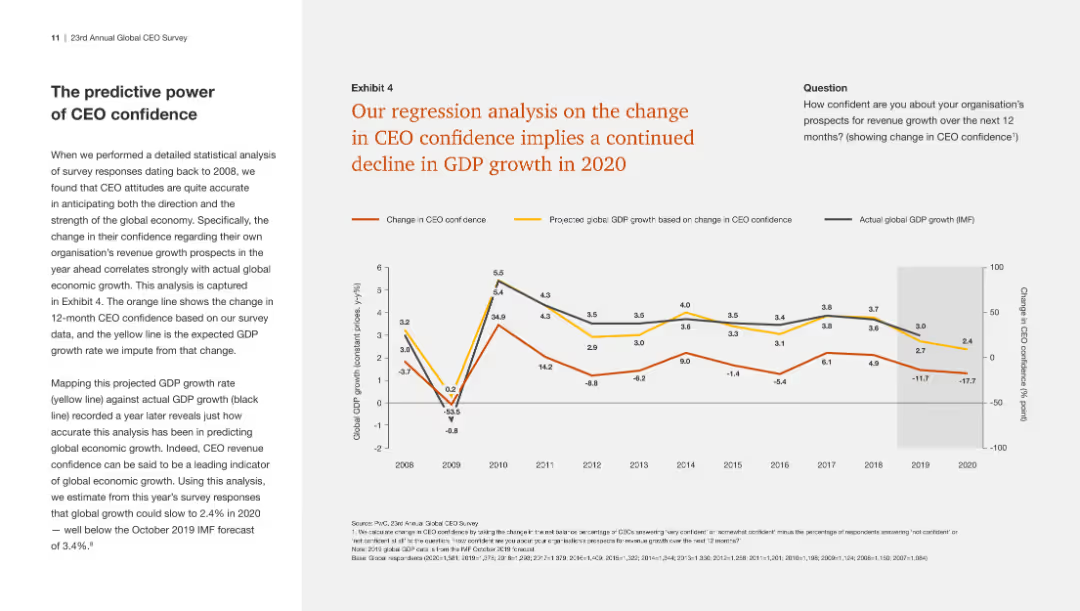
The slide has a line chart showing a regression analysis of CEO confidence and projected GDP growth, indicating a continued decline in GDP growth based on changing confidence.
Market Analysis and Trends
Financial Services
This slide presents a regression analysis showing a direct correlation between declining CEO confidence and projected GDP growth, predicting further economic downturn in 2020.
CEO confidence, GDP growth, regression analysis, economic projection
Mixed Chart
PwC/Strategy&
Saved
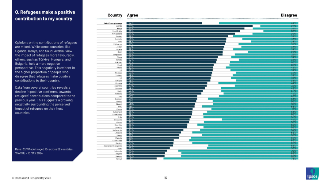
Horizontal bar chart by country showing agreement and disagreement. Explanatory paragraph on left, data on right. Title in bold, structured layout.
Regulatory and Compliance
Government & Public Sector
This slide examines the belief that refugees positively contribute to their host countries. Uganda and Kenya show highest agreement (67%), while Türkiye and Hungary show the least (under 20%). Overall global average agreement is 44%, indicating relatively low positive sentiment. The chart also suggests declining optimism compared to previous years.
refugee contribution, societal benefit, negative sentiment, Ipsos, immigration, public opinion, global attitudes, national rankings
Mixed Chart
IPSOS
Saved
Presents a detailed abatement cost curve for a steel plant, categorizing various decarbonization technologies and their potential impacts.
Operational Efficiency
Industrial & Manufacturing
Focuses on decarbonization strategies for the steel industry, highlighting cost-effective measures and technology shifts. Useful for operational planning and cost management.
decarbonization, steel industry, cost management, operational efficiency, technology, sustainability
Mixed Chart
BCG
Saved
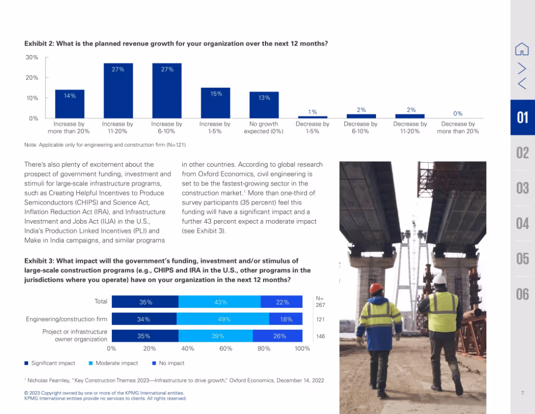
Dual-chart slide with bar graphs and image of construction workers; text explains implications of stimulus programs
Investment Analysis
Real Estate & Construction
Details planned revenue growth and anticipated impact of government infrastructure programs like CHIPS and IRA. Bar charts show varying growth expectations and perceived impact by firm type.
revenue forecast, stimulus impact, infrastructure funding, CHIPS Act, IRA, construction growth, investment outlook
Multiple Chart
KPMG
Saved
A world map colored in shades of blue indicating the percentage of activities that can be automated in different regions, accompanied by a pie chart showing economic figures for key regions.
Market Analysis and Trends
Industrial & Manufacturing
Analyzes the potential impact of automation globally, presenting the percentage of activities that can be automated by region and the economic impact in terms of total full-time equivalents (FTEs) and dollars.
Global, Automation, Economy, Impact, Regions
Multiple Chart
McKinsey
Saved
Previous
Next
If nothing, comes up, please save your slides first
Create a FREE account to continue browsing
Receive Instant Access to 1,000+ slides from companies like McKinsey, Google, and Goldman Sachs
First Name
Last Name
Email
Password
I agree to all
Terms & Privacy Policy
Thank you! Your submission has been received!
Oops! Something went wrong while submitting the form.
Have an account?
Sign in
Column Chart
Heatmap
Chevron
Org Chart
Infographic
Callouts
Timeline
List
Graphic
Picture
Process Flow
Diagram
Paragraph
Map
Table
Framework
Subtitle
Takeaway Box
Icon
Other Chart
Radar Chart
Waterfall Chart
Mekko Chart
Pie Chart
Scatter Plot
Line Chart
Bar chart
Bullet points