My Account
My Slides
Search by Category
Templates
Leave Feedback
Login
Logout
Get Started
Browse all Slides
Browse all Slides
Create a FREE Account
Instant access to 1,000+ real slides from top companies like McKinsey, BCG, Goldman Sachs, Google and many more!
First Name
Last Name
Email
Password
I agree to all
Terms & Privacy Policy
Thank you! Your submission has been received!
Oops! Something went wrong while submitting the form.
Have an account?
Sign in
Saved Slides
This slide features a table comparing drivers of health system performance across various countries, including factors like ease of use, access to care, and community health improvements.
Industry Overview
Healthcare & Pharmaceuticals
It provides an overview of factors driving health system performance as rated by consumers across different countries, focusing on ease of use, access to care, and community health.
health system performance, drivers, country comparison, healthcare, consumer ratings
Multiple Chart
EY
Saved
This slide features a world map with highlighted cities and corresponding icons that denote specific water supply challenges. There are bullet points with percentage statistics for each city, indicating problems like pollution, water use inefficiency, and infrastructure issues. It includes data visualizations like icons and a simple color code to represent various data points about water accessibility and issues in megacities like Mexico City, Buenos Aires, Nairobi, Kolkata, Karachi, and Shanghai.
Market Analysis and Trends
Environmental Services & Sustainability
The slide presents a comparison of water-related challenges faced by megacities across the globe. It highlights issues such as pollution, water use inefficiency, and inadequate infrastructure, providing a clear snapshot of major urban water management challenges.
water supply, pollution, megacities, infrastructure, sanitation, global health, urban planning, sustainability, resource management, water accessibility
Graphic
Roland Berger
Saved
The slide contains a line chart comparing the volume of wheat exports from Canada, Australia, and Ukraine from 1999 to 2018. It also includes key data points and CAGR.
Market Analysis and Trends
Agriculture & Food Production
The slide illustrates the significant growth in wheat exports from Ukraine compared to Canada and Australia, with data highlighting Ukraine's competitive edge in recent years.
Wheat exports, Canada, Australia, Ukraine, CAGR, market trends, export volume, agriculture, food production, growth rate
Mixed Chart
LEK
Saved
The slide features multiple pie charts representing various consumer behaviors related to food consumption over 12 months.
Market Analysis and Trends
Agriculture & Food Production
Highlights the recent changes in consumer behavior regarding food consumption, emphasizing sustainable and health-conscious choices.
consumer behavior, food consumption, pie charts, sustainability, health
Multiple Chart
Deloitte
Saved
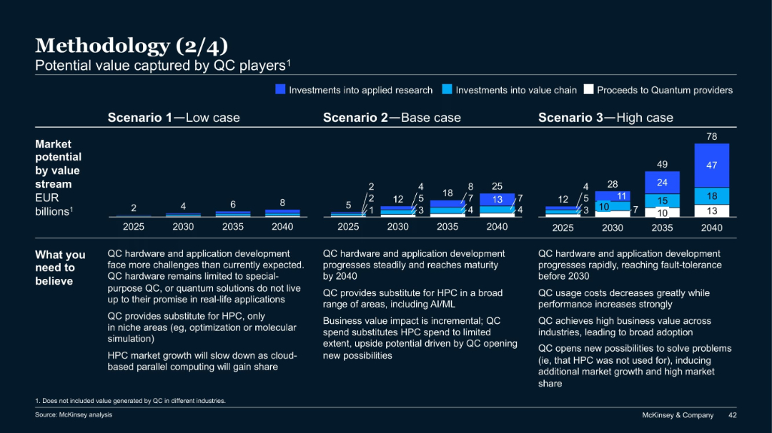
Three-scenario bar projection charts from 2025 to 2040; colored segments indicate investments and proceeds; notes on assumptions below charts.
Investment Analysis
Artificial Intelligence
This slide projects quantum computing (QC) market potential under low, base, and high scenarios, broken down by value stream. It explains what must be believed in each case and estimates value in EUR billions up to 2040 for each path.
quantum computing, market potential, investment, scenarios, projections, McKinsey
Mixed Chart
McKinsey
Saved
The slide contains a mix of text and column charts. The left side has a textual overview while the right side includes two column charts with horizontal bars.
Risk Assessment and Management
Financial Services
The slide discusses the top emerging risks identified by CROs, including climate change and AI, and how these risks are viewed by risk organizations and boards.
Emerging risks, CRO, climate change, AI, risk management
Multiple Chart
EY
Saved
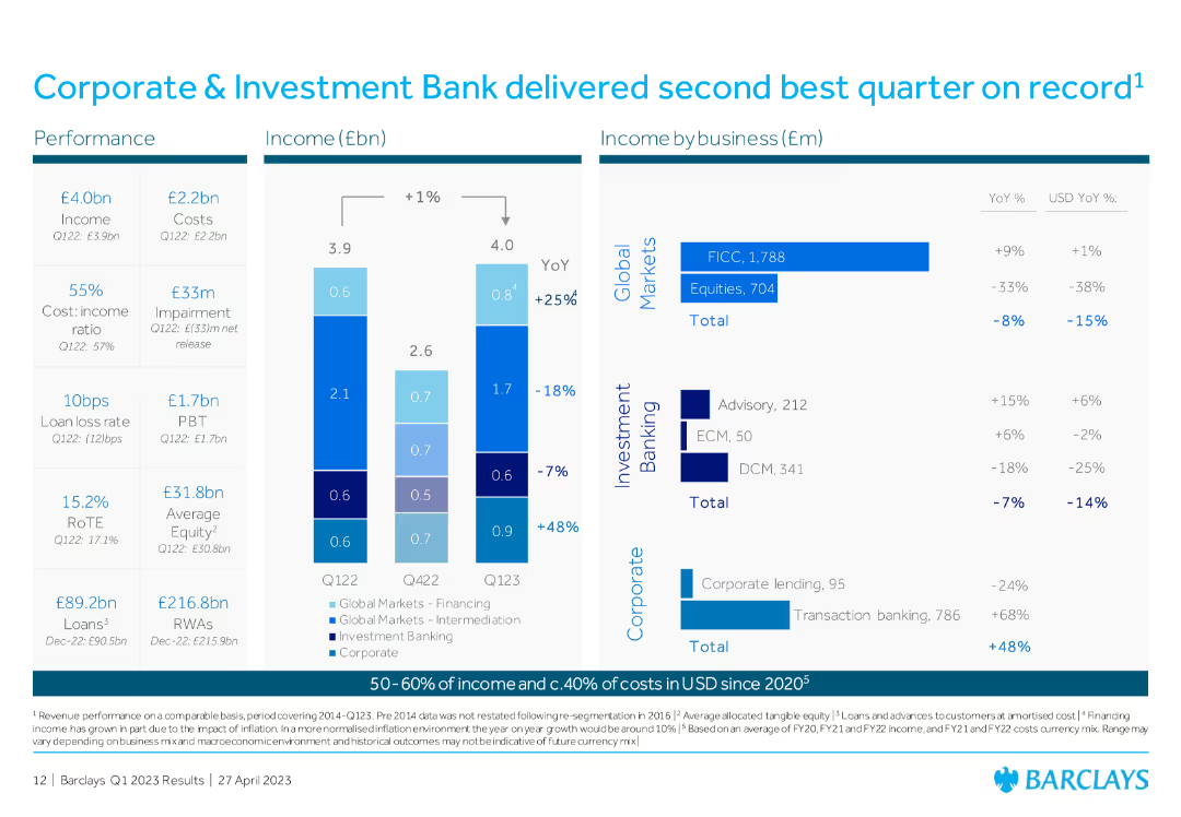
Column chart showing income and costs, with detailed breakdowns by business (Global Markets, Investment Banking, Corporate), including YoY percentage changes.
Financial Performance
Financial Services
The slide showcases the Corporate & Investment Bank's performance, highlighting the second-best quarter on record with detailed financial breakdowns by business sector.
Corporate Investment Bank, financial performance, Global Markets, Investment Banking, quarterly results
Multiple Chart
Barclays
Saved
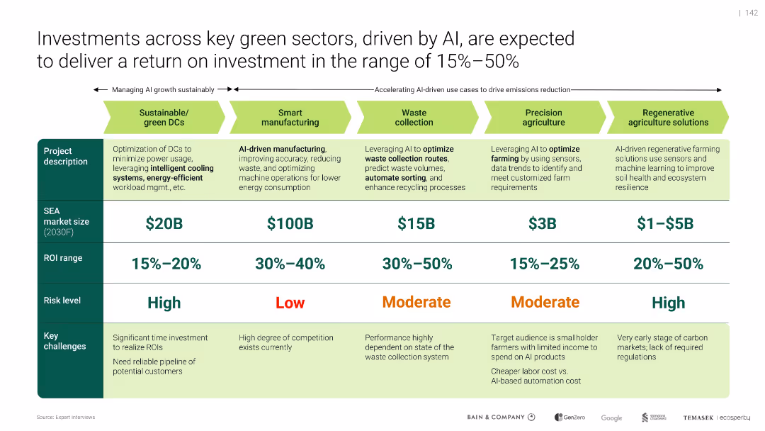
Horizontal sector comparison table with color coding for risk, ROI, and SEA market size
Investment Analysis
Artificial Intelligence
Compares five green investment sectors influenced by AI, such as smart manufacturing and sustainable DCs. Details expected market size, ROI ranges, risk levels, and barriers. Highlights ROI from 15% to 50% and the role of AI in enabling efficiency, particularly in waste collection and regenerative agriculture.
green investments, ROI, AI, smart manufacturing, sustainability, regenerative agriculture, SEA, energy savings
Table
Bain
Saved
Contains multiple pie charts showing consumer behavior by city tier, icons depicting shopping behaviors, and text annotations.
Market Analysis and Trends
Retail & E-commerce
Analyzes consumer purchase behaviors in different city tiers, focusing on online and offline preferences, useful for understanding market dynamics and tailoring regional marketing strategies.
consumer behavior, city tiers, online shopping, retail strategies, market analysis, digital conversion, ROPO, tiered marketing, consumer journey
Multiple Chart
BCG
Saved
The slide features a detailed table with additional small bar charts and icons, representing different industries like Consumer, Automotive, and Energy. It includes textual content and a summary area.
Industry Overview
Technology & Software
This slide presents the potential value digital transformation could unlock across various industries by 2025, estimating the societal and industry-specific financial impacts, with additional insights on CO2 emissions reduction and job implications.
digital transformation, industry impact, CO2 emissions, job creation, financial analysis
Single Chart
Accenture
Saved
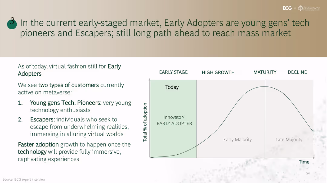
Left side lists customer personas (Tech Pioneers & Escapers); right side includes a classic innovation adoption curve from Early Stage to Decline with annotations.
Market Analysis and Trends
Consumer Goods
Defines current adopters of virtual fashion as tech-savvy young users and escapists seeking immersive experiences. Emphasizes that mass adoption will require advancements in immersive technologies and user experience quality.
early adopters, innovation curve, metaverse users, immersive experience, Gen Z, Escapers
Mixed Chart
BCG
Saved
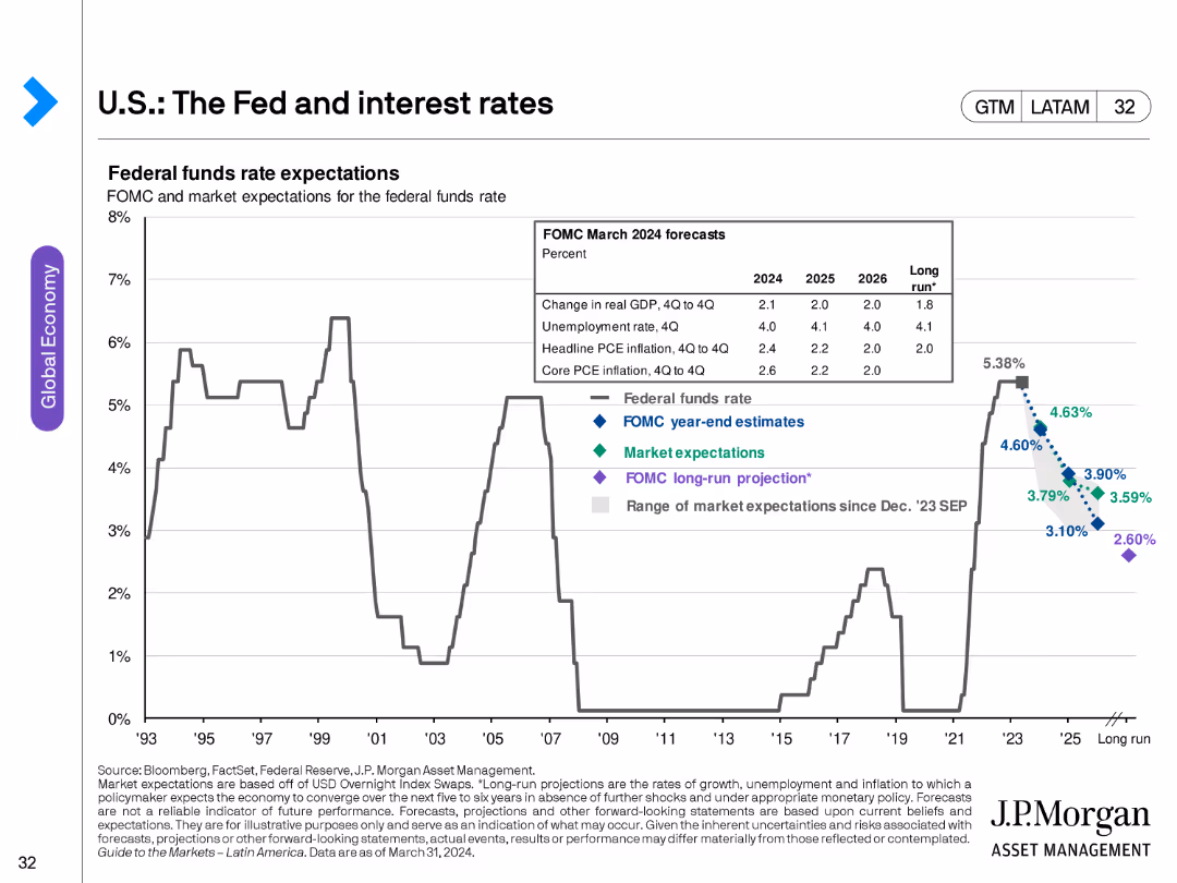
The slide contains a line chart showing federal funds rate expectations from FOMC and market projections, with historical data for context.
Market Analysis and Trends
Financial Services
This slide analyzes expectations for the federal funds rate, providing insights into monetary policy projections and their implications for the economy.
interest rates, Fed, FOMC, market projections, monetary policy, economic forecast
Single Chart
JP Morgan
Saved
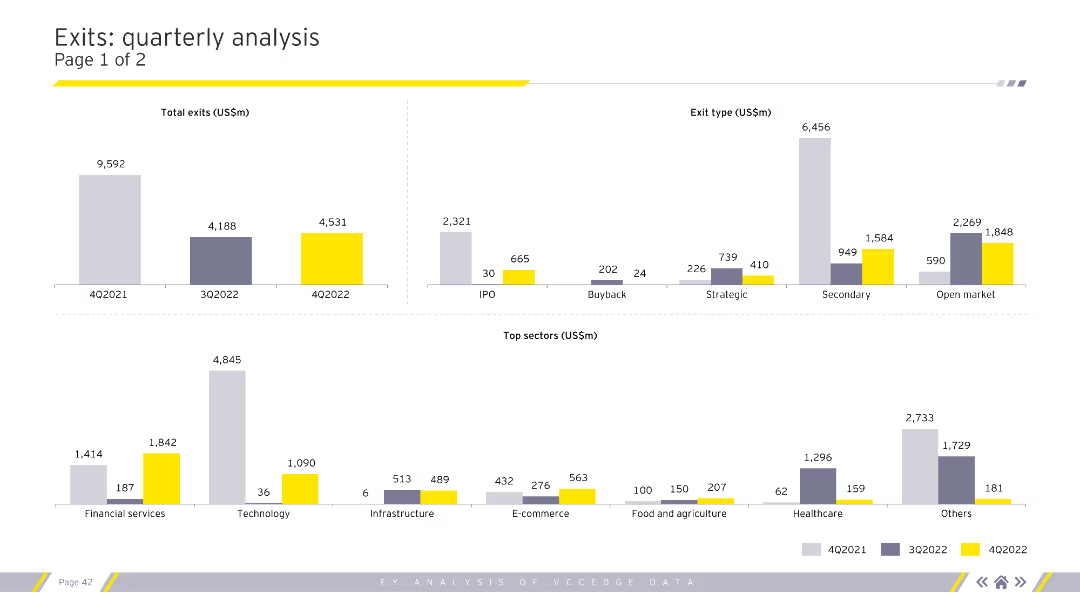
Displays column charts for total exits, exit types, and top sectors by exit value. Uses grey, purple, and yellow for color coding. Visual complexity is moderate.
Market Analysis and Trends
Financial Services
Provides a detailed analysis of quarterly exit trends, categorizing by exit type (IPO, buyback) and highlighting top sectors. Useful for market analysts and financial advisors.
exits, quarterly, analysis, sectors, financial
Multiple Chart
EY
Saved
The layout includes a title and two columns of text, one for economic contribution details and the other for graphic representation of the same. The design is streamlined, with clear differentiation between sections.
Financial Performance
Government & Public Sector
Provides a comprehensive breakdown of the economic contributions of the Tempest partners’ activities, focusing on job creation and GVA contributions, making it apt for discussions on economic strategies in defense and related financial planning.
Combat Air, Tempest, GVA, Jobs, Economic Strategy, Defense
Text Only
PwC/Strategy&
Saved
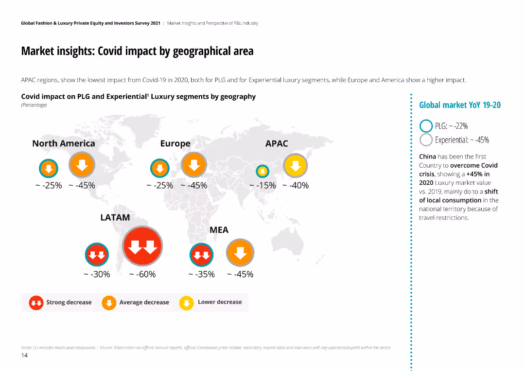
The slide includes a world map with color-coded arrows indicating the degree of COVID-19 impact on luxury markets by region, along with textual analysis.
Market Analysis and Trends
Retail & E-commerce
Examines the geographical impact of COVID-19 on the luxury market, comparing regions such as North America, Europe, APAC, LATAM, and MEA.
COVID-19, geographical impact, luxury, market, retail, e-commerce, regions, analysis
Graphic
Deloitte
Saved
Features images of EV charging and regulatory icons, with quotes from major automotive CEOs about shifts towards electrification.
Strategic Planning
Transportation & Logistics
Discusses the accelerating factors and strategic responses of automotive industries toward electrification, including regulatory impacts and market dynamics.
electrification, automotive industry, regulations, battery costs, OEM strategies, market dynamics
Pillar
BCG
Saved
Slide shows two column charts comparing the growth of the luxury second-hand market against the total personal luxury market.
Market Analysis and Trends
Retail & E-commerce
Examines the growth of the second-hand luxury market, projecting significant increases and discussing market share.
Second-hand luxury, market growth, market analysis, trends, market share, projections, personal luxury
Multiple Chart
BCG
Saved
Contains two line charts. The left chart depicts policy rate trends of the Fed, ECB, and BoJ from January 2020 to April 2024. The right chart shows the return-on-equity of US, European, and Japanese banks from 2010 to 2024.
Market Analysis and Trends
Financial Services
Discusses how global economic resilience and higher inflation expectations affect central bank policies, influencing the profitability of banks, particularly in the US, Europe, and Japan.
Banks, Fed, ECB, BoJ, Return-on-Equity, Policy Rates, Inflation, Market Analysis
Multiple Chart
Morgan Stanley
Saved
Bar chart comparing the levelized cost of energy for various renewable and conventional energy sources. Separate analysis showing the impact of U.S. federal tax subsidies.
Market Analysis and Trends
Energy & Utilities
Compares the cost-effectiveness of renewable energy technologies versus conventional ones, emphasizing the cost benefits under different scenarios including U.S. federal tax subsidies.
levelized cost of energy, renewable energy, conventional energy, cost comparison, tax subsidies, energy analysis
Single Chart
Roland Berger
Saved
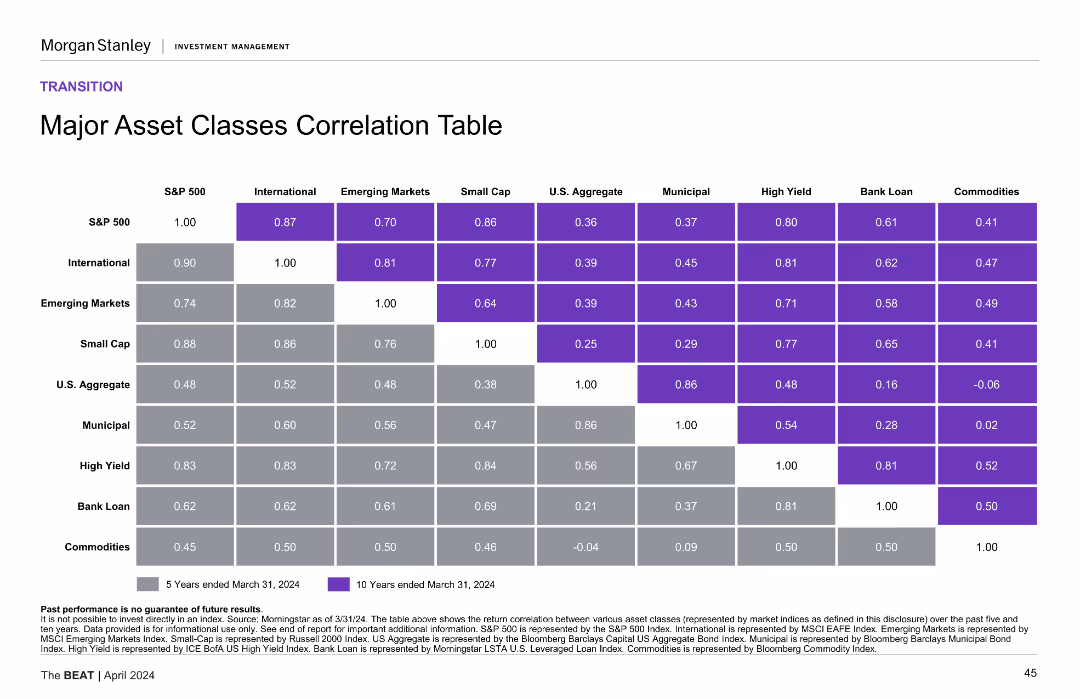
The slide presents a correlation table with color-coded cells, comparing major asset classes over 5 and 10-year periods.
Financial Performance
Financial Services
It shows the correlation between different major asset classes over five and ten years, helping to understand their interrelationships.
asset classes, correlation table, financial performance, 5-year, 10-year
Table
Morgan Stanley
Saved
Displays a bar graph comparing NEV models planned by various OEMs for 2025, with selected quotes on electrification strategies from CEOs.
Strategic Planning
Transportation & Logistics
Details the strategic planning of OEMs for NEV rollouts by 2025, with insights into commitments to vehicle electrification and market readiness.
NEVs, OEM strategies, electrification, automotive industry, 2025 projections, CEO quotes
Mixed Chart
BCG
Saved
Contains stacked column charts for leverage exposure and risk-weighted assets, split into categories such as trading and lending.
Financial Performance
Financial Services
Analyzes the bank's exposure to different types of financial risk at the end of Q3 2023, presenting quantitative leverage and risk data. Used for evaluating financial stability.
leverage, risk, financial analysis, Q3 2023
Multiple Chart
Deutsche Bank
Saved
Features pie charts and a stacked bar chart illustrating the breakdown of deposits by business type and region, along with long-term debt and other liabilities.
Operational Efficiency
Financial Services
Provides insights into the deposit structure and liability distribution of a financial institution, emphasizing operational efficiency in managing diverse financial resources.
Deposits, Diversification, Pie Charts, Banking, Operational Efficiency, Liabilities, Financial Management
Multiple Chart
Citigroup
Saved
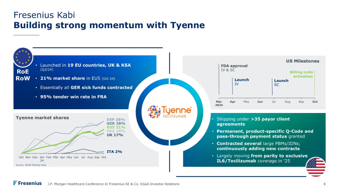
Centered logo with four surrounding blocks detailing regional launches, market shares, US milestones, and payer agreements. Includes small timeline and market share chart at bottom.
Sales and Business Development
Healthcare & Pharmaceuticals
Focuses on the rollout of Tyenne (tocilizumab), including European and U.S. market entry. Details regulatory milestones, growing payer adoption, and market share penetration across EU countries. Emphasizes expansion into exclusive contracts and favorable reimbursement terms.
Tyenne, tocilizumab, biosimilar launch, payer access, market share, Fresenius, EU launch
Mixed Chart
JP Morgan
Saved
The slide has two line graphs, one showing the high yield index spread to worst and the other showing capital markets revenues.
Financial Performance
Financial Services
The slide highlights Credit Suisse's resilience in maintaining positive revenue through various credit shocks since 2011, supported by visual data trends.
credit shocks, revenue, Credit Suisse, high yield index, capital markets, resilience, trends, financial performance
Multiple Chart
Credit Suisse
Saved
Previous
Next
If nothing, comes up, please save your slides first
Create a FREE account to continue browsing
Receive Instant Access to 1,000+ slides from companies like McKinsey, Google, and Goldman Sachs
First Name
Last Name
Email
Password
I agree to all
Terms & Privacy Policy
Thank you! Your submission has been received!
Oops! Something went wrong while submitting the form.
Have an account?
Sign in
Column Chart
Heatmap
Chevron
Org Chart
Infographic
Callouts
Timeline
List
Graphic
Picture
Process Flow
Diagram
Paragraph
Map
Table
Framework
Subtitle
Takeaway Box
Icon
Other Chart
Radar Chart
Waterfall Chart
Mekko Chart
Pie Chart
Scatter Plot
Line Chart
Bar chart
Bullet points