My Account
My Slides
Search by Category
Templates
Leave Feedback
Login
Logout
Get Started
Browse all Slides
Browse all Slides
Create a FREE Account
Instant access to 1,000+ real slides from top companies like McKinsey, BCG, Goldman Sachs, Google and many more!
First Name
Last Name
Email
Password
I agree to all
Terms & Privacy Policy
Thank you! Your submission has been received!
Oops! Something went wrong while submitting the form.
Have an account?
Sign in
Saved Slides
Slide shows a column chart comparing VAT rates across Southern African countries, using different colors for each country to facilitate comparison.
Competitive Landscape
Government & Public Sector
This slide provides a comparative analysis of VAT rates across Southern African countries, highlighting Namibia's position and its implications for trade and consumer prices in a regional context.
VAT, Rates, Comparison, Trade, Regional
Single Chart
PwC/Strategy&
Saved
This slide presents a global map highlighting Seadrill’s operational and office locations worldwide. Each location is marked with icons representing different types of rigs or offices, color-coded for clarity. The map is accompanied by bullet points summarizing key statistics, such as the total number of employees and office locations. The layout is spacious and well-organized, making it easy to identify key information quickly.
Strategic Planning
Energy & Utilities
The slide illustrates Seadrill's global operational footprint, emphasizing its extensive reach and strategic positioning in 24 countries. This would be particularly relevant in discussions about market expansion, investor presentations, or internal strategy meetings, showcasing Seadrill’s strength and capability in global operations. It provides a visual representation of the company's scale and the geographical diversity of its assets and personnel, underscoring its role as a major player in the global energy sector.
global presence, Seadrill, operations, map, employees, offices, rigs, international, strategic positioning, energy sector
Graphic
Barclays
Saved
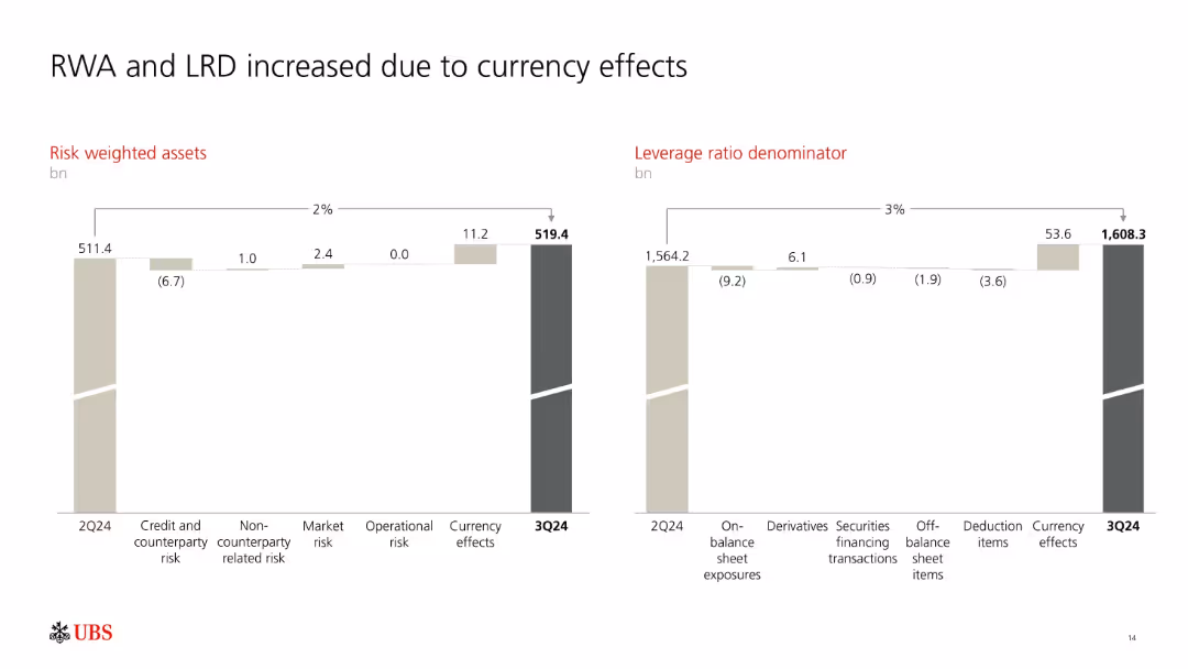
Two side-by-side waterfall charts illustrating changes in RWA and LRD from 2Q24 to 3Q24.
Risk Assessment and Management
Financial Services
Shows how UBS's Risk Weighted Assets (RWA) and Leverage Ratio Denominator (LRD) rose mainly due to currency effects. Breakdowns include operational and market risks, as well as changes in off-balance sheet and deduction items.
RWA, LRD, currency effects, risk metrics, UBS, leverage ratio
Multiple Chart
UBS
Saved
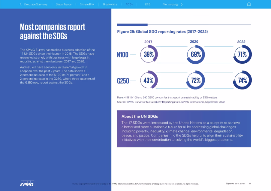
Left: narrative explanation; Right: circular infographic showing SDG reporting rates (2017–2022) for N100 and G250. Bottom panel explains SDGs.
Regulatory and Compliance
Environmental Services & Sustainability
The slide shows a high and gradually increasing rate of corporate reporting against the UN Sustainable Development Goals (SDGs). It explains the relevance of SDGs and highlights that three-quarters of G250 companies now report against them.
SDGs, sustainability goals, reporting, UN, ESG, corporate responsibility
Mixed Chart
KPMG
Saved
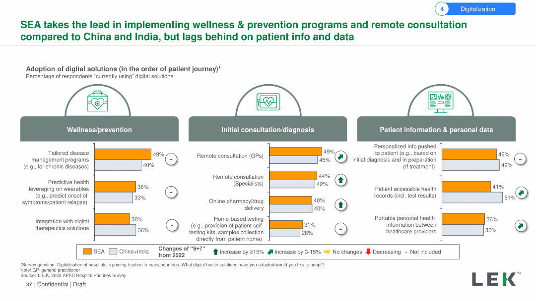
The slide uses a combination of bar charts and icons to show the adoption rates of digital solutions in wellness/prevention, initial consultation/diagnosis, and patient information/personal data. Changes from 2022 are indicated with arrows and symbols.
Market Analysis and Trends
Healthcare & Pharmaceuticals
The slide showcases SEA's leadership in adopting wellness and prevention programs and remote consultations compared to China and India. It highlights the percentage changes in digital solutions adoption rates from 2022 for different stages of the patient journey.
Wellness, prevention, remote consultation, digital solutions, SEA, China, India, adoption, patient journey, comparison
Multiple Chart
LEK
Saved
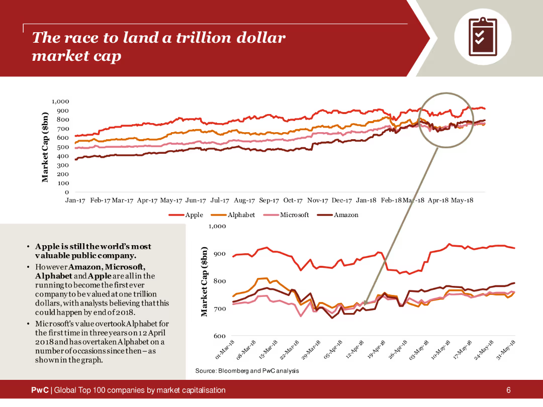
The slide features a line chart tracking the market caps of Apple, Alphabet, Microsoft, and Amazon from 2017 to 2018. The lines are color-coded for each company, with a magnified section highlighting recent trends. The layout includes a brief text summary on the left, explaining the race to a trillion-dollar valuation.
Market Analysis and Trends
Financial Services
This slide analyzes the market cap trends of major tech companies competing to reach a trillion-dollar valuation. The line chart provides a visual comparison of Apple, Alphabet, Microsoft, and Amazon over time, highlighting the competitive landscape and significant milestones in their market cap growth.
Trillion-dollar market cap, tech companies, market trends, Apple, Alphabet, Microsoft, Amazon, line chart
Multiple Chart
PwC/Strategy&
Saved
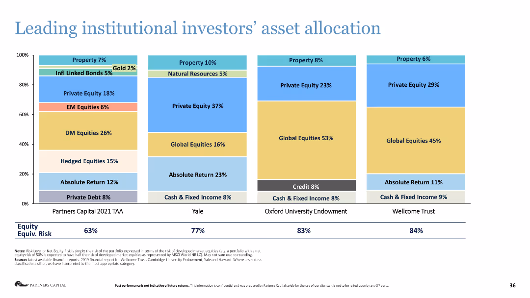
Stacked bar chart showing the asset allocation of leading institutional investors.
Investment Analysis
Financial Services
The slide presents the asset allocation strategies of major institutional investors, highlighting their investment preferences.
asset allocation, institutional investors, investment strategy, financial analysis, equities
Single Chart
Deloitte
Saved
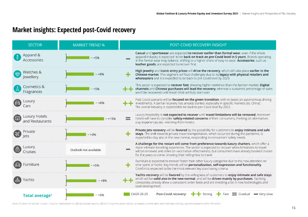
The slide features bar charts and textual analysis to project market recovery trends post-COVID-19, including expected growth rates for different sectors.
Market Analysis and Trends
Retail & E-commerce
Projects the post-COVID recovery of the luxury market, detailing expected recovery rates and key insights across various sectors like apparel and watches.
post-COVID, recovery, market, luxury, retail, e-commerce, growth, projections, sectors
Mixed Chart
Deloitte
Saved
This slide includes a detailed table of financial metrics and a line chart illustrating contract value and free cash flow over several years.
Financial Performance
Financial Services
It provides a comprehensive summary of financial performance, including revenue, growth rates, margins, EBITDA, and free cash flow trends.
Revenue, Growth, EBITDA, Free Cash Flow, Contract Value, Financial Metrics
Multiple Chart
Gartner
Saved
Features a line graph showing the relationship between broadband speed and GDP changes. Graph is color-coded to illustrate different time periods and predicted impacts, accompanied by a detailed legend and textual insights on the left.
Market Analysis and Trends
Technology & Software
Highlights statistical findings on broadband's effect on GDP from historical data and projected future trends. Compares these results to other international studies.
GDP, broadband, statistics, projections, line graph
Mixed Chart
Accenture
Saved
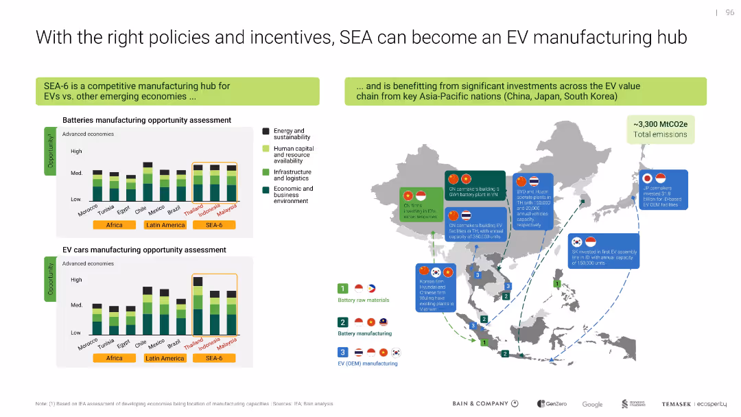
Map and bar charts show manufacturing opportunities and key investments; clear segmentation of countries and metrics
Strategic Planning
Industrial & Manufacturing
Highlights SEA-6's potential to become an EV manufacturing hub given supportive policies and investment flows from regional powers. Compares competitive advantages across battery and EV car manufacturing sectors.
EV hub, SEA-6, manufacturing, batteries, policy, incentives, investment
Multiple Chart
Bain
Saved
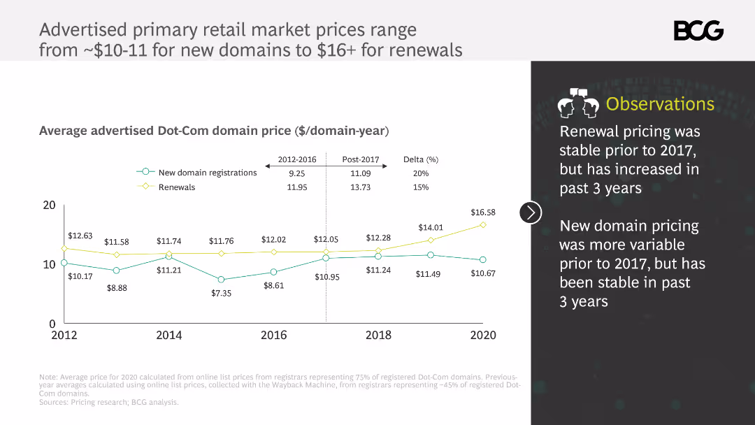
This slide includes a line chart showing the advertised primary retail market prices for Dot-Com domains from 2012 to 2020. It uses different colors to differentiate between new domain registrations and renewals, with annotations explaining price trends.
Pricing Strategies
Telecommunications
The slide analyzes the advertised primary retail market prices for Dot-Com domains, noting that renewal prices have increased since 2017 while new domain prices have remained stable. It provides insights into pricing stability and recent trends.
Dot-Com domains, pricing, renewals, new registrations, price trends
Mixed Chart
BCG
Saved
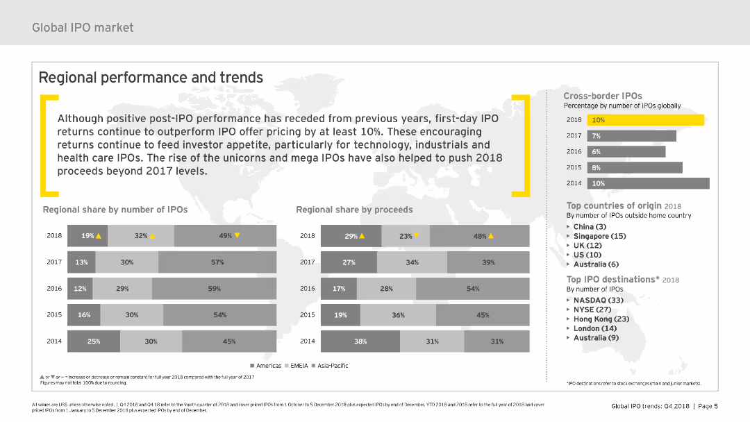
The slide features column charts and maps showing regional performance in the IPO market, with metrics on number of IPOs and proceeds by region for 2018.
Market Analysis and Trends
Financial Services
This slide reviews the regional distribution of IPOs and their proceeds, highlighting performance trends and key countries of origin for cross-border IPOs in 2018.
regional performance, IPOs, trends, proceeds, regions
Multiple Chart
EY
Saved
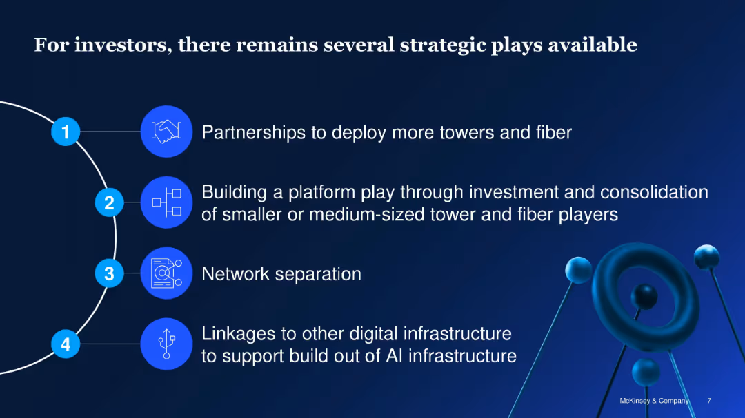
Vertical list with icons and numbered segments; clean blue design
Investment Analysis
Telecommunications
Identifies four strategic opportunities for telecom infrastructure investors: partnerships, platform plays, network separation, and integration with AI infrastructure to enhance scalability and ROI.
telecom investment, infrastructure, strategic plays, fiber, AI, partnerships, platform consolidation
Vertical Flow
McKinsey
Saved
Mixed column and table showing funding execution and requirements over a period, alongside textual details.
Corporate Finance and Valuation
Energy & Utilities
Outlines the funding strategy and execution for Enbridge, emphasizing sources and uses of capital.
funding, strategy, capital, execution, planning
Multiple Chart
Barclays
Saved
Comprises percentage tables summarizing executive views on technology strategies. The design is structured and uses purple shades for visual emphasis.
Strategic Planning
Technology & Software
Outlines the significance and maturity of various tech strategies like AI, Cloud Integration, and Cybersecurity in organizational transformation.
tech strategy, digital transformation, AI, cybersecurity
Table
Accenture
Saved
Contains a large column chart split between SMB and consumer lending, followed by in-depth textual analysis on the state of digital lending and associated risks.
Risk Assessment and Management
Financial Services
Explores the challenges faced by the digital lending sector, such as credit quality concerns and non-performing loans, while offering a glimpse into the government's mitigating actions and future growth.
Digital Lending, Credit Quality, NPLs, Future Growth
Mixed Chart
Bain
Saved
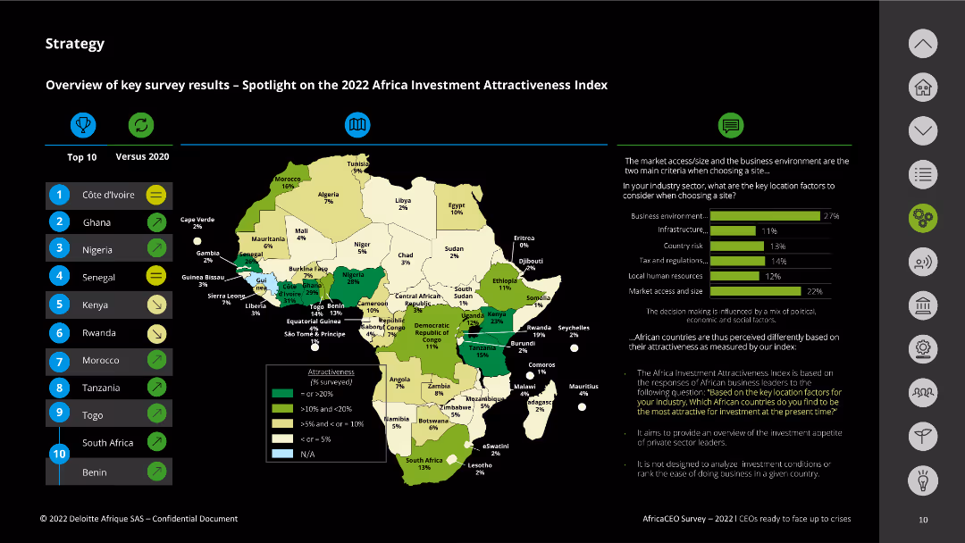
The slide displays a map of Africa with different countries highlighted based on their investment attractiveness. The slide also includes a bar chart showing key location factors for business decisions, with accompanying text explanations.
Market Analysis and Trends
Real Estate & Construction
This slide highlights the 2022 Africa Investment Attractiveness Index, showcasing countries with the most favorable business environments. It also details key location factors such as business environment, infrastructure, and market access/size.
investment, attractiveness, Africa, location factors, business environment
Mixed Chart
Deloitte
Saved
Column chart slide showing weekly and monthly reach percentages across various platforms like TV, radio, and internet. Uses distinct colors for clarity.
Market Analysis and Trends
Media & Entertainment
Analyzes content consumption across different platforms, showing high reach percentages and frequent use of TV and radio by adults.
content consumption, reach, platforms, TV, radio, internet, analysis
Single Chart
Nielsen
Saved
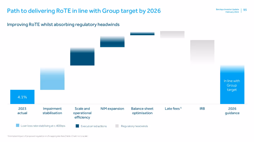
Waterfall chart format with stages marked below, each bar showing incremental impact; uses colors to differentiate action types.
Strategic Planning
Financial Services
Outlines Barclays’ roadmap for improving RoTE to meet Group targets by 2026. Includes execution strategies like impairment stabilization, operational efficiency, NIM expansion, and offsetting regulatory headwinds such as IRB changes and capped late fees.
RoTE, regulatory impact, operational efficiency, NIM, impairment, late fees, IRB, roadmap
Single Chart
Barclays
Saved
Features line graphs and column charts detailing economic indicators, interest rates, and credit cycle concerns.
Risk Assessment and Management
Financial Services
Examines the potential cyclical headwinds faced by the industry and the economic growth forecasts.
Economic indicators, interest rates, credit cycle, economic growth, cyclical headwinds
Multiple Chart
JP Morgan
Saved
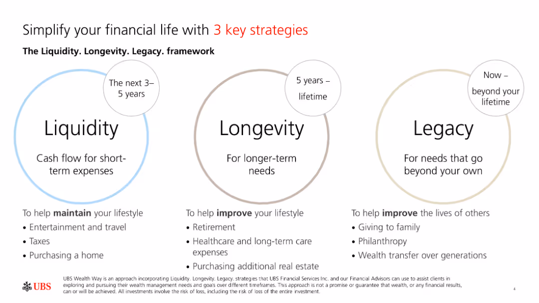
The slide contains three circular diagrams labeled Liquidity, Longevity, and Legacy, each representing different financial strategies over timeframes.
Strategic Planning
Financial Services
The slide introduces the Liquidity, Longevity, and Legacy framework, highlighting strategies for maintaining lifestyle, long-term needs, and beyond lifetime.
Liquidity, Longevity, Legacy, Strategies, Finance
Framework
UBS
Saved
Column chart showing operating expense reduction from 2015 to 2019. Each year has distinct bars with a color legend.
Financial Performance
Financial Services
This slide illustrates a year-on-year expense reduction with estimated savings for 2018 and 2019. It is used to highlight cost-saving achievements and future targets.
expense, reduction, financial, savings, goals
Single Chart
Credit Suisse
Saved
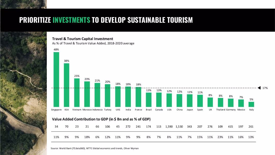
Bar chart comparing travel and tourism capital investment as % of GDP by country; background nature imagery
Strategic Planning
Hospitality & Tourism
A comparison of how countries invest in sustainable tourism relative to GDP, highlighting Singapore, Saudi Arabia, and Vietnam as leaders, and showing a global average benchmark.
tourism investment, sustainable development, travel, capital allocation, GDP share
Single Chart
Oliver Wyman
Saved
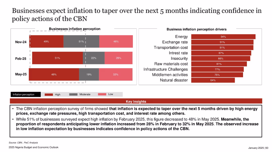
Bar chart showing inflation perception over three months on the left and another showing drivers on the right. Bottom section contains red key insights box.
Market Analysis and Trends
Financial Services
The slide presents businesses’ inflation expectations, indicating a decline in high inflation sentiment from Feb to May 2025. Increased optimism in policy actions by the Central Bank of Nigeria (CBN) is evident, driven by major cost factors like energy and exchange rates.
business inflation, perception, CBN, energy costs, Nigeria, confidence, inflation drivers, May 2025
Multiple Chart
PwC/Strategy&
Saved
Previous
Next
If nothing, comes up, please save your slides first
Create a FREE account to continue browsing
Receive Instant Access to 1,000+ slides from companies like McKinsey, Google, and Goldman Sachs
First Name
Last Name
Email
Password
I agree to all
Terms & Privacy Policy
Thank you! Your submission has been received!
Oops! Something went wrong while submitting the form.
Have an account?
Sign in
Column Chart
Heatmap
Chevron
Org Chart
Infographic
Callouts
Timeline
List
Graphic
Picture
Process Flow
Diagram
Paragraph
Map
Table
Framework
Subtitle
Takeaway Box
Icon
Other Chart
Radar Chart
Waterfall Chart
Mekko Chart
Pie Chart
Scatter Plot
Line Chart
Bar chart
Bullet points