My Account
My Slides
Search by Category
Templates
Leave Feedback
Login
Logout
Get Started
Browse all Slides
Browse all Slides
Create a FREE Account
Instant access to 1,000+ real slides from top companies like McKinsey, BCG, Goldman Sachs, Google and many more!
First Name
Last Name
Email
Password
I agree to all
Terms & Privacy Policy
Thank you! Your submission has been received!
Oops! Something went wrong while submitting the form.
Have an account?
Sign in
Saved Slides
The slide shows a column chart under the title "Family law application breakdown, ('000) 2016-17". It contains a legend explaining the colors representing different types of applications for FCC and FCoA. At the bottom, the source is referenced as PwC with the date of April 2018.
Regulatory and Compliance
Government & Public Sector
The slide analyzes different types of family law applications and their distribution between FCC and FCoA, with emphasis on the caseload and order types processed by each court. The column chart illustrates the predominance of divorce applications in the FCC and consent orders in the FCoA.
family law, caseload, applications, orders, FCC, FCoA, column chart, PwC, analysis
Mixed Chart
PwC/Strategy&
Saved
The slide features vertical bar charts comparing survey responses by age groups on their concerns about technology and internet reliance.
Market Analysis and Trends
Technology & Software
The slide presents data showing that younger people are more likely to express concerns about technology and their dependency on the internet.
Technology concerns, age groups, internet reliance, public opinion, survey
Multiple Chart
IPSOS
Saved
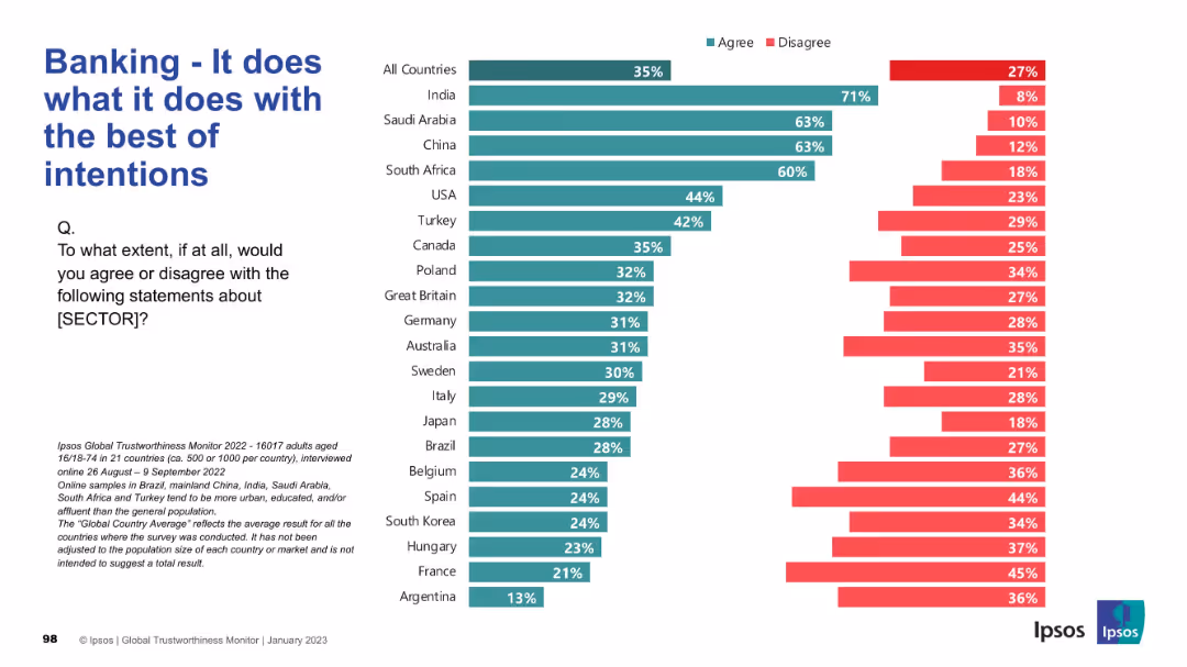
Standard bar chart format comparing agreement and disagreement globally. Green for agreement; red for disagreement.
Market Analysis and Trends
Financial Services
This slide presents whether the banking sector is perceived to operate with good intentions. High agreement is seen in India, Saudi Arabia, and China. Western countries display more critical views, with higher disagreement rates.
Banking, Intentions, Ethics, Global Survey, Financial Trust, Ipsos, Country Comparison, Public Perception
Mixed Chart
IPSOS
Saved
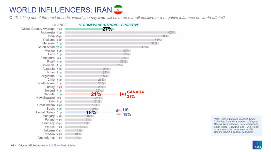
Bar chart displaying global perception of Iran’s influence, with flags highlighting US and Canada views and % changes.
Market Analysis and Trends
Government & Public Sector
Global perception of Iran’s influence is low (27% on average). Indonesia shows the highest approval, while the US (18%) and Canada (21%) are significantly below average.
Iran, global influence, international perception, Ipsos data, world affairs, rankings
Single Chart
IPSOS
Saved
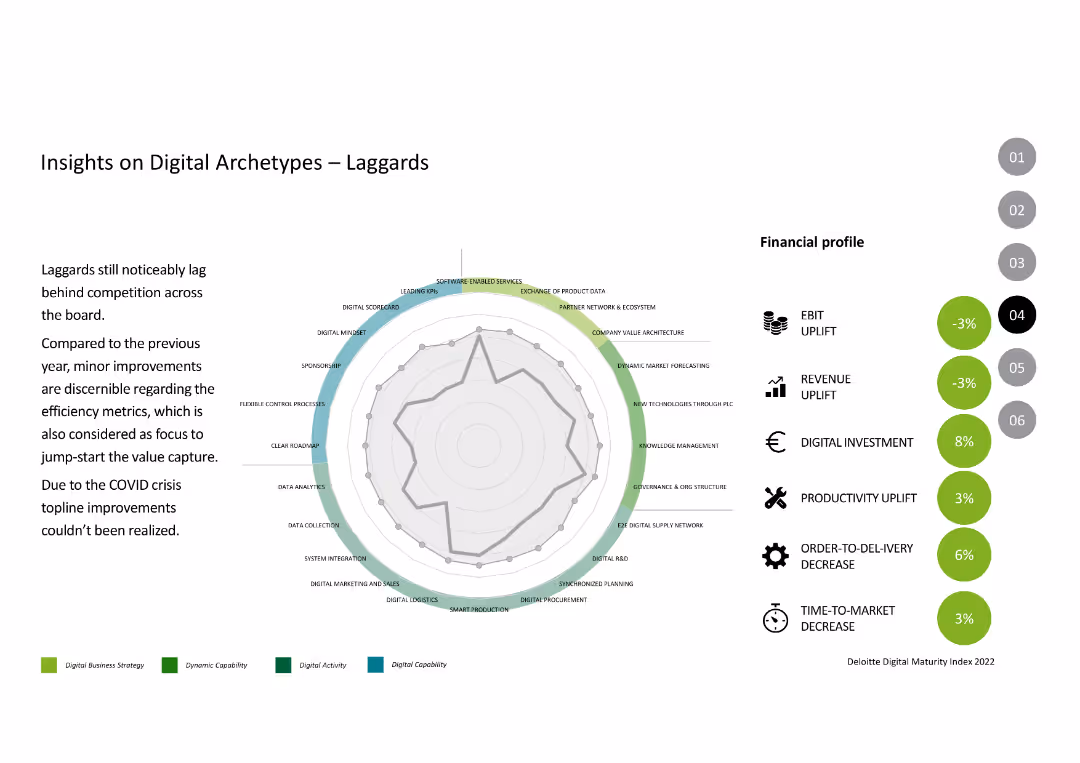
The slide features a radar chart and financial profile metrics like EBIT uplift, revenue uplift, and productivity uplift, similar to previous archetype slides.
Competitive Landscape
Industrial & Manufacturing
This slide discusses the "Laggards" archetype, focusing on their lagging performance compared to competition, highlighting their minor improvements and impact of the COVID crisis.
Digital Archetypes, Laggards, Performance, Digital Capabilities, Financial Metrics
Mixed Chart
Deloitte
Saved
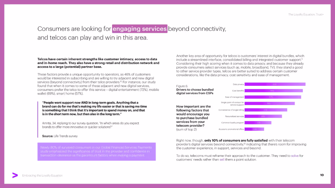
Two-column layout with bold headers, a quote in a purple box, and a horizontal bar chart on the right. Purple accent colors and highlighted keywords add emphasis.
Customer and Market Segmentation
Telecommunications
Highlights consumers’ demand for engaging services like digital entertainment, mobile wallets, and smart home devices. Emphasizes trust and bundled digital services as key drivers, with data from customer surveys and usage preferences.
digital services, CSPs, telco, bundling, trust, engagement, loyalty, privacy
Mixed Chart
Accenture
Saved
This slide shows a scatter plot similar to the previous, but focuses on the impact of "SafeTrack" on WMATA's performance by comparing its data with other transport entities like MTA and CTA, using differently colored circles for each.
Market Analysis and Trends
Transportation & Logistics
Here, the slide presents the impact of the "SafeTrack" initiative on WMATA's bus ridership in 2015, juxtaposed with other transit systems, useful for evaluations of specific interventions in public transport.
transit, WMATA, SafeTrack, impact, comparison, 2015, ridership
Single Chart
BCG
Saved
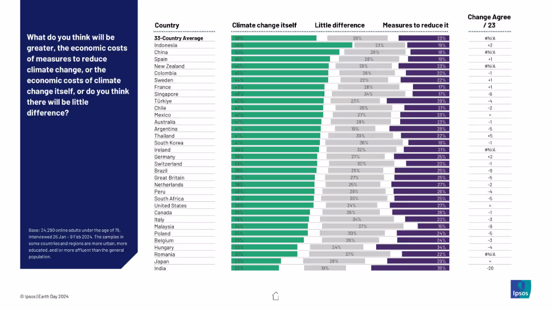
Horizontal stacked bar chart comparing beliefs on whether climate change itself or the measures to reduce it will cost more. Countries listed on the left with agreement levels for each opinion.
Strategic Planning
Environmental Services & Sustainability
The slide presents perceptions across various countries regarding whether the economic cost of addressing climate change outweighs the cost of climate change itself. Most respondents believe climate change is the more costly threat, though views vary by country.
economic costs, climate change, mitigation measures, global perception, Ipsos, cost analysis, country comparison, sustainability policy
Mixed Chart
IPSOS
Saved
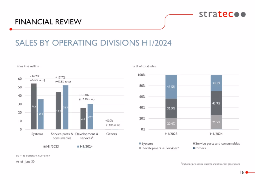
Dual bar charts: left shows YoY change in € sales by division; right shows % of total sales by category. Clean business-style design.
Performance Metrics and KPIs
Healthcare & Pharmaceuticals
Illustrates the H1/2024 revenue composition by operating division. Notable changes include a 34% decline in systems sales and growth in service parts and development services. Visualizes both absolute and proportional sales mix.
sales by division, diagnostics, consumables, systems, revenue mix, H1/2024, KPIs, STRATEC
Multiple Chart
Goldman Sachs
Saved
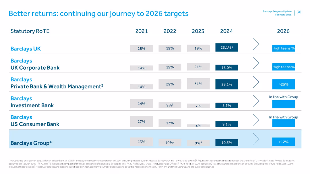
Table comparing RoTE by Barclays divisions from 2021–2024 with 2026 targets. Uses horizontal alignment with industry-specific goals and strategy callouts.
Strategic Planning
Financial Services
Lays out RoTE performance and 2026 targets across Barclays’ divisions. Barclays UK shows strong 2024 gains (23.1%), while Investment Bank and US Consumer Bank show modest improvements. Group target RoTE is >12% by 2026.
RoTE, targets, strategy, Barclays UK, investment bank, 2026 outlook
Single Chart
Barclays
Saved
Basic visual complexity, contrasting textual information with a relatable image.
Strategic Planning
Professional Services
Discusses the need for businesses to adapt to changes and disruptions, hinting at strategies for maintaining competitiveness and relevance.
business strategy, adaptability, global trends, disruptions
Mixed Chart
Bain
Saved
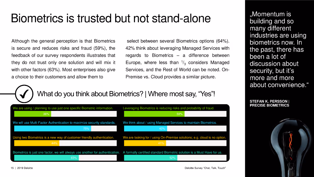
A text slide with small graphical icons and a black box showing survey results on biometric usage and opinions.
Strategic Planning
Technology & Software
This slide discusses the perception and usage of biometrics, highlighting its role in security and customer authentication preferences.
biometrics, security, customer authentication, survey results, technology adoption
Multiple Chart
Deloitte
Saved
Features a dark backdrop with flow charts and boxes outlining ROE simulation for 2022, including past averages and target ranges, as well as selective levers that impact ROE.
Investment Analysis
Financial Services
This slide is used to simulate return on equity (ROE) for the year 2022, showing past performance and future targets, and discussing various financial levers.
ROE, Simulation, Management, Growth, Solutions, Efficiency, Financial, Investment
Mixed Chart
Goldman Sachs
Saved
The slide features a vertical column chart showing energy and hydrogen requirements for DRI-EAF production route from 2018 to 2030 and projected demand to 2050.
Market Analysis and Trends
Energy & Utilities
The slide projects the growth in demand for dedicated hydrogen production in steelmaking, showing energy and hydrogen requirements and projected demand through charts and text.
hydrogen, steelmaking, DRI-EAF, production, demand, projection, energy requirements, chart
Multiple Chart
Kearney
Saved
This slide features multiple graphs and data visualizations: a column chart showing mainline volumes, another column chart illustrating cost synergies, a line graph for FX hedging program, and a text list of projects. Colors like yellow, blue, and gray dominate. Overall, the design is clean with data neatly organized.
Financial Performance
Energy & Utilities
The slide presents Enbridge’s financial performance and projections, emphasizing the growth through the second half of 2017. It includes information on mainline volumes, cost synergies, FX hedging, and upcoming projects, clearly targeting stakeholders interested in the company's financial outlook and strategic direction.
Energy, Utilities, Finance, Growth, Cost, FX Hedging
Multiple Chart
Barclays
Saved
The slide contains two columns with bulleted text, a chart titled "FIGURE 2: ROLE CLUSTERS OFFER A UNIQUE LENS ON EVOLVING WORK PATTERNS", and a section with a detailed explanation.
Market Analysis and Trends
Technology & Software
The slide discusses the impact of intelligent technologies on job roles, skill demands, and automation, emphasizing the reconfiguration of roles and the emergence of new patterns in work.
Automation, Workforce, Technology, Skills, Roles
Header Horizontal
Accenture
Saved
This slide uses a combination of icons, bar charts, and descriptive text to outline the risks associated with generator use in Nigerian markets, including fire risks and operational safety hazards, using visual elements to emphasize key data points.
Regulatory and Compliance
Industrial & Manufacturing
Detailing the safety issues related to generator use in Nigerian markets, this slide outlines how improper use and lack of safety measures contribute to a significant number of market fires, advocating for improved safety practices and alternative energy sources to mitigate these risks.
generators, safety, market fires, Nigeria, risks, operational safety, fire hazards, energy
Mixed Chart
BCG
Saved
A laptop screen displaying a dashboard with a pie chart and list of financial data, mostly in white and gray colors.
Financial Performance
Financial Services
The slide demonstrates a workbench for relationship managers, showcasing client information, asset allocation, and portfolio details.
Relationship manager, dashboard, financial data, pie chart, portfolio
Mixed Chart
Credit Suisse
Saved
A bubble chart showing the timeline and capacity of natural gas processing combined with CCUS projects.
Market Analysis and Trends
Energy & Utilities
Highlights the historical and future significance of natural gas processing in CCS applications.
Natural gas, CCS, timeline, capacity, projects
Single Chart
Kearney
Saved
The slide includes a gender breakdown, an age distribution pie chart, and a regional distribution bar chart. The layout is clean and visually balanced.
Customer and Market Segmentation
Financial Services
The slide shows demographic data of survey respondents, including gender, age, and regional distribution, providing a snapshot of the survey sample.
demographics, gender, age, region, survey
Multiple Chart
IPSOS
Saved
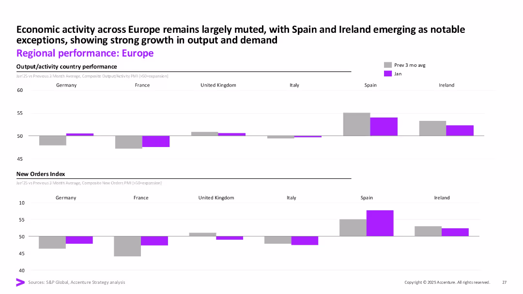
Two stacked bar sections showing composite output and new orders for major European economies. Purple bars indicate January values vs previous 3-month average.
Market Analysis and Trends
Financial Services
This slide compares economic activity in Europe by country, showing muted growth overall with notable strength in Spain and Ireland. Both output and new orders show divergence across the region, offering a granular look at regional demand and recovery.
Europe, output, new orders, Spain, Ireland, Germany, PMI, activity
Multiple Chart
Accenture
Saved
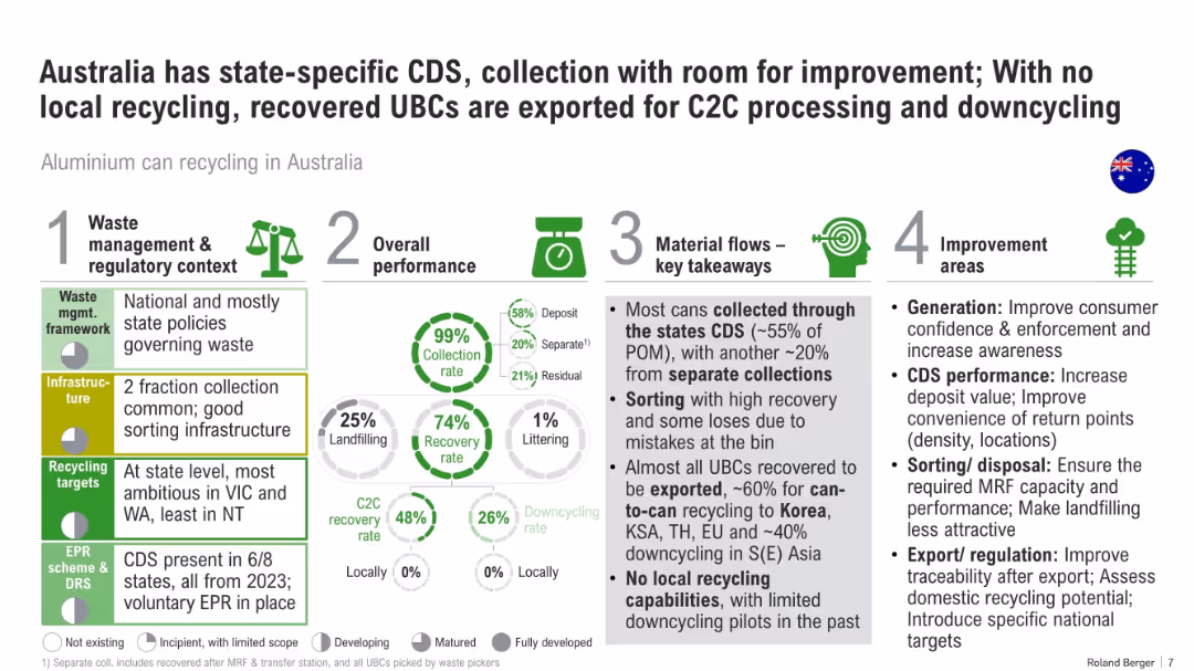
Infographic layout with four vertical blocks: policy, performance, material flow, and improvement. Includes percentages and pie charts.
Regulatory and Compliance
Environmental Services & Sustainability
This slide critiques Australia’s recycling system for aluminum cans. It notes high collection but low local processing, with most material exported. It outlines regulatory structures and areas needing improvement like infrastructure and sorting.
recycling, Australia, CDS, aluminum, policy, downcycling, C2C, export, waste management
Multiple Chart
Roland Berger
Saved
The slide features a column chart showcasing the growth of Consumer Banking customers over four years, with additional statistics on average deposits and debit card sales. The chart and statistics use a simple color scheme to differentiate the years.
Financial Performance
Financial Services
Highlighting the bank's growth in Consumer Banking, this slide uses a column chart and associated statistics to demonstrate the increase in customers and financial activities like checking accounts, deposits, and debit card sales, showcasing the bank's upward trajectory in customer acquisition and retention.
Consumer growth, Banking customers, Checking accounts, Deposits, Debit card sales, Financial activity
Single Chart
JP Morgan
Saved
This Text and Image Slide presents three sections titled 'PEOPLE', 'PROFIT', and 'PLANET' each with a dedicated icon and bullet points. It's well-organized, with a clear visual hierarchy that guides the viewer through each section. The use of icons and strategic spacing of content facilitates comprehension and provides an engaging visual experience.
Strategic Planning
Professional Services
The slide outlines Michelin's commitment to enhancing performance in three areas: people, profit, and the planet. It discusses career opportunities, engagement and safety in 'PEOPLE', revenue growth and financial metrics in 'PROFIT', and sustainability efforts in 'PLANET'. The slide effectively conveys Michelin's integrated approach to success, balancing human, financial, and environmental considerations.
performance, people, profit, planet, opportunities, growth, sustainability, R&D, materials, safety
Pillar
Morgan Stanley
Saved
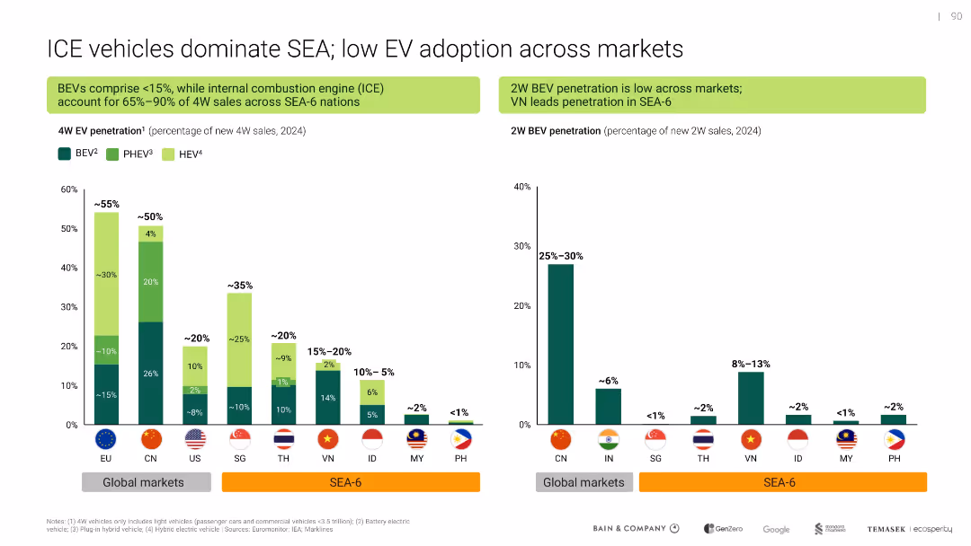
Dual-panel bar chart comparing 4W and 2W EV penetration across SEA and global markets; green color theme for EV types
Market Analysis and Trends
Transportation & Logistics
Shows that internal combustion engine (ICE) vehicles still dominate in SEA-6 countries, with low adoption of battery electric vehicles (BEVs), especially in 2-wheelers. Highlights lag in EV transition compared to global markets.
EV adoption, ICE dominance, BEV, SEA-6, 2W EV, penetration, vehicle market
Multiple Chart
Bain
Saved
Previous
Next
If nothing, comes up, please save your slides first
Create a FREE account to continue browsing
Receive Instant Access to 1,000+ slides from companies like McKinsey, Google, and Goldman Sachs
First Name
Last Name
Email
Password
I agree to all
Terms & Privacy Policy
Thank you! Your submission has been received!
Oops! Something went wrong while submitting the form.
Have an account?
Sign in
Column Chart
Heatmap
Chevron
Org Chart
Infographic
Callouts
Timeline
List
Graphic
Picture
Process Flow
Diagram
Paragraph
Map
Table
Framework
Subtitle
Takeaway Box
Icon
Other Chart
Radar Chart
Waterfall Chart
Mekko Chart
Pie Chart
Scatter Plot
Line Chart
Bar chart
Bullet points