My Account
My Slides
Search by Category
Templates
Leave Feedback
Login
Logout
Get Started
Browse all Slides
Browse all Slides
Create a FREE Account
Instant access to 1,000+ real slides from top companies like McKinsey, BCG, Goldman Sachs, Google and many more!
First Name
Last Name
Email
Password
I agree to all
Terms & Privacy Policy
Thank you! Your submission has been received!
Oops! Something went wrong while submitting the form.
Have an account?
Sign in
Saved Slides
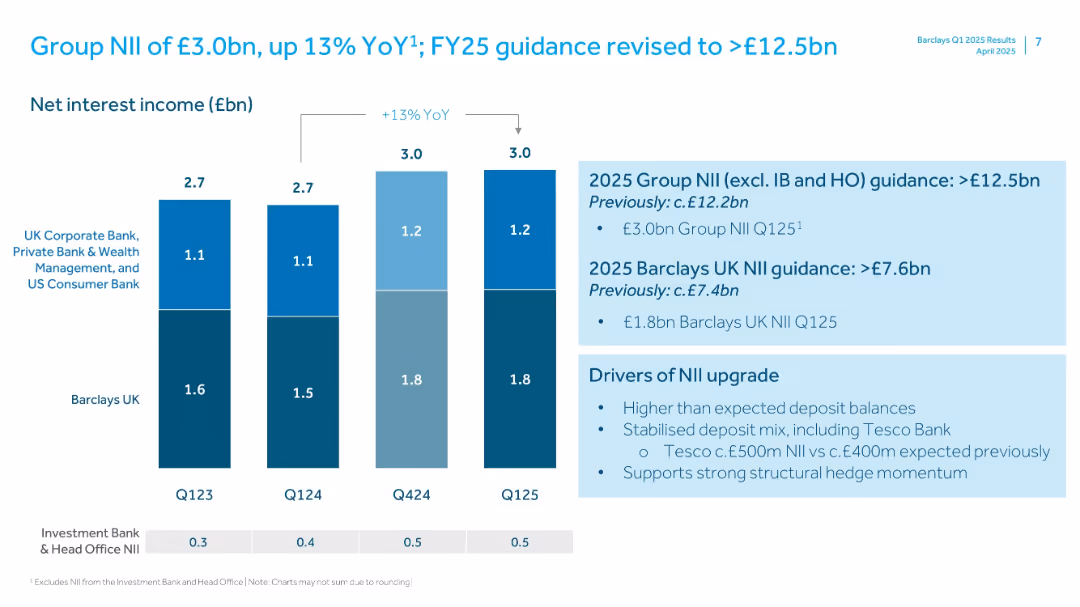
Stacked bar chart showing Net Interest Income by segment with projections.
Strategic Planning
Financial Services
Barclays outlines net interest income (NII) trends across business segments and upgrades FY25 guidance. The slide includes key drivers for the upward revision, including Tesco Bank’s contribution.
NII, net interest income, Barclays, UK bank, financial guidance, deposits, income projections, growth drivers
Mixed Chart
Barclays
Saved
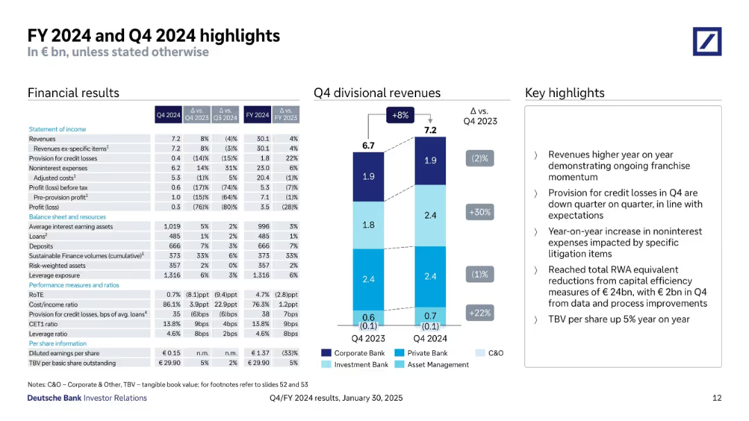
Left-aligned table with financials, center stacked bar chart for revenue breakdown, and key highlights on the right. Uses light blue and navy blue for segment distinctions.
Financial Performance
Financial Services
Provides detailed financial results for Q4 and FY 2024, including revenues, expenses, profits, and balance sheet items. Emphasizes growth areas and year-over-year comparisons with focus on divisional revenues and key operational highlights.
financials, revenue, banking, Q4 results, FY2024, Deutsche Bank
Mixed Chart
Deutsche Bank
Saved
A triangular diagram showing various services EY offers to private equity clients. Categories include Funds, Strategy and Transaction Services, and Portfolio Services.
Organizational Structure and Change
Professional Services
This slide outlines the range of services provided by EY to private equity clients, covering areas like fund assurance, buy and sell side advisory, tax, and legal services.
EY, services, private equity, advisory, portfolio
Framework
EY
Saved
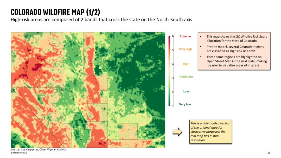
Full-screen heat map of wildfire risk zones using gradient from green (low) to red (extreme); includes a small annotation panel explaining data origin and purpose; clean, map-focused layout with minimal text.
Risk Assessment and Management
Financial Services
This slide shows a detailed wildfire risk map of Colorado, based on GC Wildfire Risk Scores. Two prominent high-risk bands are visible running north-south. The slide helps visualize geographic exposure for insurers and supports analysis of ZIP-level underwriting decisions.
wildfire risk, Colorado map, geographic exposure, heat map, GC score, insurance risk, spatial analysis, underwriting map, high-risk zones
Mixed Chart
Oliver Wyman
Saved
The slide offers a comparative analysis using bar charts and color-coded text to differentiate between countries' responses to COVID-19. The "Early China model" and "South Korea model" are contrasted, with testing rates and actions taken highlighted.
Strategic Planning
Healthcare & Pharmaceuticals
It compares strategies of various countries in responding to COVID-19, focusing on movement restriction and testing rates. It's meant to guide strategic planning in immediate containment and scaling up testing.
Containment, Testing, COVID-19, Countries, Strategy
Header Horizontal
McKinsey
Saved
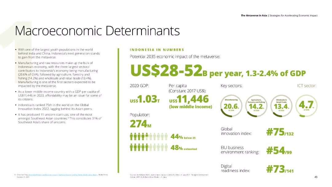
A data-driven slide with key economic indicators for Indonesia, including GDP, population, and sector contributions.
Financial Performance
Financial Services
The slide presents Indonesia’s macroeconomic determinants, highlighting the potential economic impact of the metaverse by 2035.
Indonesia, GDP, economic impact, metaverse, financial indicators
Mixed Chart
Deloitte
Saved
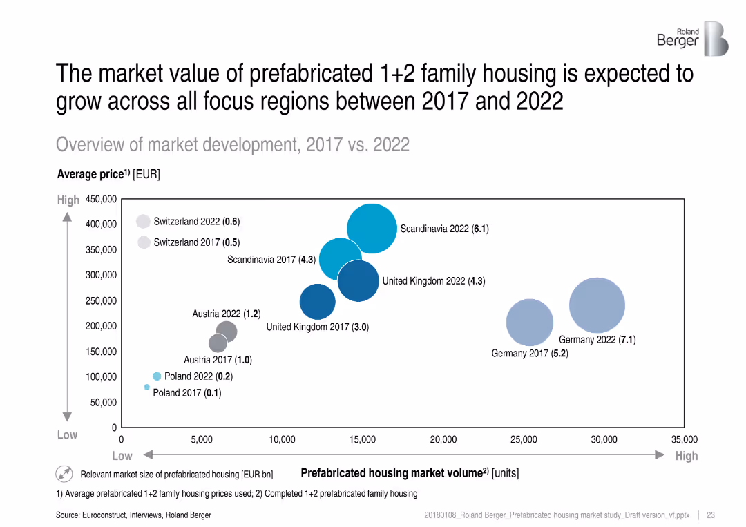
Bubble chart showing market volume vs. price comparison for 2017 and 2022, with bubble size indicating market size.
Investment Analysis
Real Estate & Construction
This slide forecasts market expansion for prefabricated family housing by 2022 across various regions. It shows both price and volume growth, identifying Germany and Scandinavia as leading markets with strong value and scale.
market value, prefabricated housing, forecast, regional comparison, family housing, price trends, volume
Single Chart
Roland Berger
Saved
The slide is organized into sections detailing fuel cell R&D funding, key improvement levers, areas improved, and benefits/challenges. Includes a bar chart on R&D funding breakdown.
Risk Assessment and Management
Energy & Utilities
Discusses the challenges in fuel cell technology related to cost and durability, and outlines key improvement areas with corresponding benefits and challenges.
Fuel cells, cost reduction, durability, performance, challenges, R&D funding, improvement levers, benefits
Mixed Chart
Kearney
Saved
Complex flow chart that maps different pandemic phases like Flatten, Fight, and Future with economic implications, asking critical questions for each phase.
Strategic Planning
Financial Services
This slide serves to dissect the potential economic trajectories in response to pandemic phases, providing a strategic framework for assessing impacts.
pandemic response, economic impact, Flatten phase, Fight phase, Future phase, economic trajectories, strategic framework
Mixed Chart
BCG
Saved
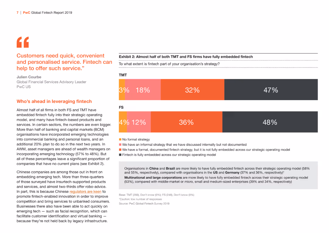
This slide contains a bar chart showing the extent of fintech strategy adoption between TMT and FS sectors. The color scheme is orange and red.
Market Analysis and Trends
Financial Services
Analyzes the level of fintech strategy adoption in TMT and FS sectors, highlighting the differences in embedding fintech within strategic operating models.
fintech, strategy, TMT, FS, adoption
Mixed Chart
PwC/Strategy&
Saved
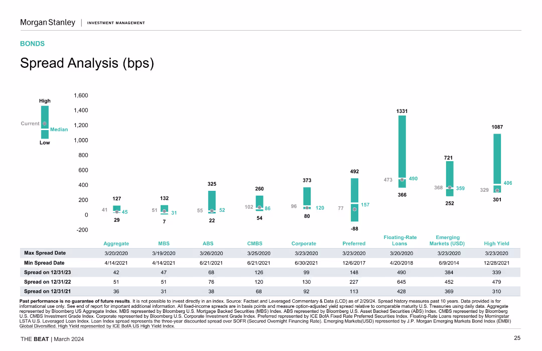
A column chart compares the spread analysis of various financial securities, including aggregates, MBS, ABS, CMBS, and more, over different time periods.
Market Analysis and Trends
Financial Services
The slide analyzes spread history and current spreads across various security types. Useful for understanding risk and return in bond markets.
spread analysis, bonds, financial securities, risk, return
Single Chart
Morgan Stanley
Saved
Uses pie charts and column charts in blue tones. Visualizes complex financial data about asset levels and movements.
Risk Assessment and Management
Financial Services
Details the uncertainty in asset valuation and changes in level 3 assets and liabilities, with focus on risk management.
Level 3 assets, liabilities, financial risk, valuation, asset management, financial reporting
Multiple Chart
Deutsche Bank
Saved
This slide provides a diagram and bullet points to explain the tangible impacts of company culture, featuring icons and a blue and teal color palette. Text is well organized and visually distinct.
Organizational Structure and Change
Professional Services
Emphasizing the practical effects of company culture, this slide could be part of a presentation advocating for the development of a strong organizational culture and its positive outcomes.
company culture, impact, organizational, development, outcomes, engagement, satisfaction, performance, motivation, improvement
Header Vertical
Kearney
Saved
This slide contrasts the perception of work/life balance over two years using pie charts and text descriptions, effectively depicting changes over time. The design is clean, with high contrast for readability.
Regulatory and Compliance
Professional Services
Focused on the perceived impacts of flexible working on career advancement, this slide offers insights into employee retention factors and can guide discussions on company policies to support work/life balance.
work/life balance, career, flexibility, women
Mixed Chart
Deloitte
Saved
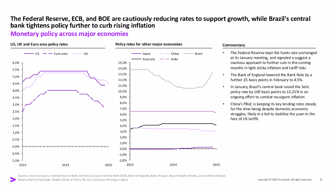
Two comparative line charts by region on policy rates with textual commentary.
Strategic Planning
Financial Services
The slide contrasts monetary policy decisions across major economies in response to inflation and growth concerns. The Fed, ECB, and BOE show rate reductions, while Brazil tightens and China remains steady.
Interest rates, inflation, central banks, Fed, ECB, BOE, Brazil, China, monetary policy
Multiple Chart
Accenture
Saved
Complex visual layout with annotated diagrams of BEV components and systems across a transparent car diagram. Highlights areas like battery, thermal management, and sensors with different color coding for clarity.
Technology and Digital Transformation
Industrial & Manufacturing
Outlines the specific components and systems involved in battery electric and autonomous vehicles, indicating areas of growth and innovation for TI Fluid Systems in these emerging technologies.
BEV, autonomous vehicles, thermal management, diagrams
Diagram
Deutsche Bank
Saved
The slide features a flowchart diagram that outlines the main pathways of CCUS technologies, including both utilization (CCU) and storage (CCS) processes. Different applications and processes are clearly labeled.
Technology and Digital Transformation
Energy & Utilities
This slide provides a comprehensive overview of the various pathways through which CCUS technologies can either utilize or store carbon dioxide, illustrating the diversity and complexity of these technologies.
CCUS, carbon utilization, carbon storage, pathways, technology overview
Diagram
Kearney
Saved
Detailed diagrams and calculations explaining the methodology to estimate economic impact of COVID-19 by combining sectoral data with expected duration of crisis measures.
Strategic Planning
Financial Services
Explores the methodology to estimate economic impacts of COVID-19, combining industry-specific data with projected lengths of lockdowns and restrictions.
COVID-19, economic impact, sectoral analysis, lockdown duration, crisis measures, economic methodology
Multiple Chart
BCG
Saved
Bar graphs comparing credit ratings and CDS spreads
Risk Assessment and Management
Financial Services
Santander's credit profile in comparison to European peers
Credit Profile, CDS Spreads, Banking, Risk Management, Ratings
Multiple Chart
Morgan Stanley
Saved
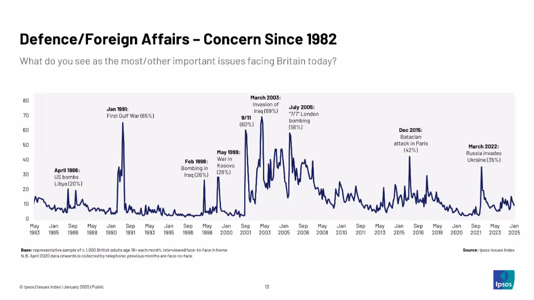
Extended timeline (1983–2025) showing peaks at major geopolitical events; annotations for each surge, consistent line style, large data span.
Risk Assessment and Management
Government & Public Sector
Demonstrates long-term trends in public concern over foreign affairs, with peaks linked to Gulf War, Iraq invasion, 9/11, and Ukraine conflict.
conflict, public opinion, UK, war, terrorism, global events, Ipsos, long-term trends
Single Chart
IPSOS
Saved
Features column charts and annotations emphasizing the growth in industry gross balances and systematic wallet growth.
Investment Analysis
Financial Services
The slide details the expansion in client financing for equities, highlighting significant increases and revenue gap bridging strategies.
equities, client financing, gross balances, systematic growth, revenue gap, market analysis, investment banking
Multiple Chart
Goldman Sachs
Saved
Pie chart displaying the distribution of approaches to ML governance among various firms.
Regulatory and Compliance
Technology & Software
Provides an overview of how different organizations are handling ML governance and framework adaptation.
ML governance, framework, adaptation, distribution
Single Chart
PwC/Strategy&
Saved
Line graph comparing deposit franchise performance among peers, and a scatter plot representing deposit relationships. Text explanation on the side.
Market Analysis and Trends
Financial Services
Comparative performance analysis of the deposit franchise with peers, highlighting growth and operational relationships. Used for market positioning and competitive analysis.
deposits, performance, comparison, peers, banking industry, market analysis
Multiple Chart
Morgan Stanley
Saved
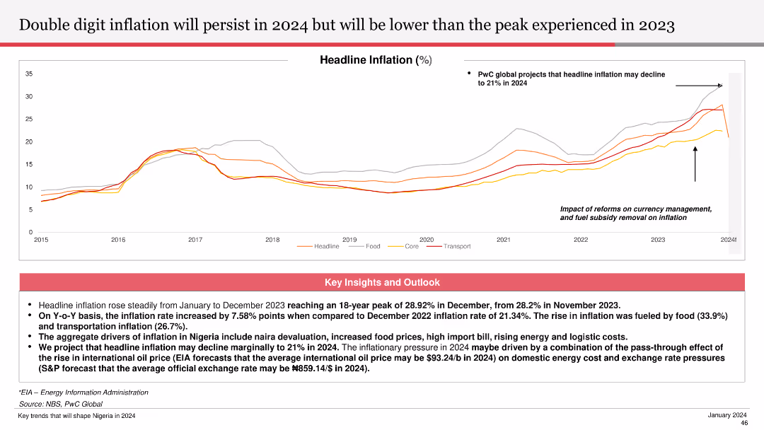
Shows a line chart depicting headline inflation from 2015 to 2024, with projections and annotations highlighting key points.
Financial Performance
Financial Services
Forecasts the continuation of double-digit inflation in 2024, lower than the 2023 peak. Explains factors driving inflation and potential future trends.
inflation, 2024, headline inflation, projections, financial services, trends, 2023 peak
Mixed Chart
PwC/Strategy&
Saved
Slide compares remote work policies before and during COVID-19 through a column chart and bar graph detailing city-specific work-from-home statistics.
Organizational Structure and Change
Professional Services
Reviews the transition to remote work across various cities, indicating a significant increase in work-from-home adoption due to COVID-19, with comparative insights on employee distribution.
Remote Work, COVID-19, Work From Home, Cities, Transition
Multiple Chart
McKinsey
Saved
Previous
Next
If nothing, comes up, please save your slides first
Create a FREE account to continue browsing
Receive Instant Access to 1,000+ slides from companies like McKinsey, Google, and Goldman Sachs
First Name
Last Name
Email
Password
I agree to all
Terms & Privacy Policy
Thank you! Your submission has been received!
Oops! Something went wrong while submitting the form.
Have an account?
Sign in
Column Chart
Heatmap
Chevron
Org Chart
Infographic
Callouts
Timeline
List
Graphic
Picture
Process Flow
Diagram
Paragraph
Map
Table
Framework
Subtitle
Takeaway Box
Icon
Other Chart
Radar Chart
Waterfall Chart
Mekko Chart
Pie Chart
Scatter Plot
Line Chart
Bar chart
Bullet points